Search the Community
Showing results for tags 'grey-blue'.
Found 9 results
-
Pen Pit Stop : Pelikan Souverän M101N Grey Blue Welcome to the Pen Pit Stop. Here you will find reviews of pens that already have some mileage on them. More specifically, these reviews are of pens that are in my personal collection, and that have been in use for at least a year. I thought it would be fun to do it this way – no new & shiny pens here, but battered vehicles that have been put to work for at least a year. Let’s find out how they have withstood the ravages of time. The fountain pen entering the pit stop today is the “Pelikan M101N Grey Blue”. Pelikan is one of the best-known European pen-makers, with a long history dating all the way back to 1832 when the company was founded in Hanover, Germany. The brand offers both semi-entry-level pens (like the M200 series) all the way up to their flagship M1000 model. All Pelikan pens adhere to the same classical style, and as such are immediately recognizable. I bought this pen in March 2019, mainly because I like the M101N look. It’s usually paired with a nice blue or purple ink. Pen Look & Feel The M101N series are Special Edition pens that Pelikan produces for a limited time only. The design of these pens is derived from pens dating back to the 1930’s. This particular Grey Blue design was released in March 2019. At that time, I already owned three other M101N pens, and I just couldn’t pass the opportunity to extend my collection. It’s not that pics of the pen especially wow-ed me, but I really like the M101N general design, and couldn’t resist the temptation to add another Pelikan to the nest. The M101N Blue Grey has a blue-grey binde, complemented with black accents for cap top, piston knob and grip section. A matching grey ink window is built into the design, making it easy to check the ink level in the pen. The pen is complemented by silver trimmings for the double cap ring and clip. The silver trim is a good choice, and works well with the cool tones of the barrel. A rhodium-plated monotone 14-carat gold nib completes the design. The grey-blue barrel pattern failed to fully appeal to me in the beginning. Today, after more than three years, it still fails to convince me. The colour scheme is nice enough, but my biggest gripe is the uneven nature of the wavy blue-grey pattern. First, it’s not aligned along the length of the barrel but at an angle with it. Second, the stripes in the pattern are not continuous but can suddenly stop at random positions. It’s not that it is ugly, but it jars with my mathematical mind… and it still disturbs me after all this time. My M101N family consists of four members: the seducing Red Tortoise, the stunning Lizard, the frolicky Bright Red, and this more or less dull and boring Grey Blue. As you might have guessed, the Grey Blue is my least favourite pen of the range. Like all Pelikans, the cap unscrews with about three quarters rotation, so it’s quickly ready for action. The M101N is a smaller pen, but can be posted, giving it a substantial size that is very comfortable to write with, even if you have larger hands. I’ve got smaller hands myself, and typically use the pen unposted. For me, this M101N is just the right size and weight (i.e. featherweight). The pictures above illustrate the size of the M101N Grey Blue in comparison with a standard Lamy AL-Star. The pen is definitely smaller than the Lamy, but still reasonable in size – not so small that it is uncomfortable (and if you find it too small uncapped, you can simply post it). Be careful when posting though – the M101N model doesn’t post as deeply and securely as the similar-sized M200/M400. If you use too much force, you might crack the cap. Pen Characteristics Build Quality : build quality is excellent. The pen looks really polished and refined. It also withstands the passing of time without any problem. After three years of use, it looks good as new. I really appreciate the grey ink window incorporated in the design, that makes it easy to judge ink level. Weight & Dimensions : about 125 mm when capped – and as such a rather small pen. It’s also definitely a featherweight. If you prefer pens with some heft to them, the M101N model will not be your thing. Posted – the pen becomes about 155 mm long, and fits even larger hands. Filling System : this is a piston-filler, that holds quite some ink. The piston is made from plastic, but works really well. Pelikan pens are known for their excellent piston mechanism. Nib & Performance : the M101N Souverän pens have gold nibs. This one comes with a monotone rhodium-plated gold nib, that really suits the aesthetics of the pen. The nib unit can be exchanged quite easily, and is compatible between the M120/M200/M400/M101N models. Being able to change nibs is a significant plus in my book! Price : I got this pen for 400 EUR, including taxes. These are definitely more expensive than the regular M400 pens. For this, you get a limited production pen, with a vintage-inspired design. Conclusion My Pelikan Souverän M101N Blue Grey is a vintage-looking pen, but one with a fairly uninspiring barrel colour, and with a wavy pattern that grates my nerves – the latter being the reason that the pen never grew on me. Would I buy this pen again? Surprisingly my answer is yes … but mainly to complete my set of M101N pens. If I had to choose only one M101N, this one would never make it. That would become a duel between the Lizard and the Red Tortoise.
-
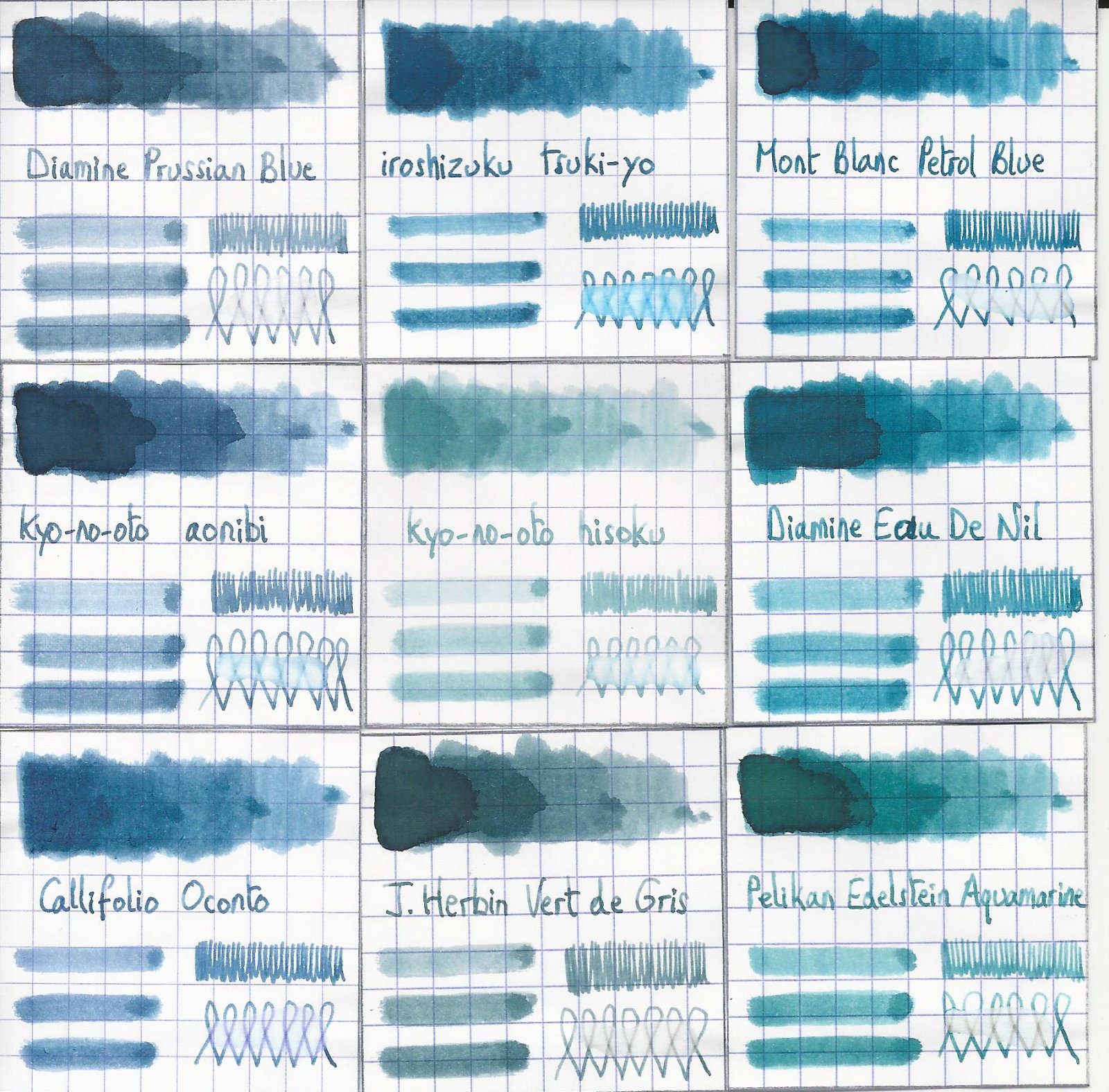
TAG Kyoto – kyo-no-oto – aonibi TAG is a stationary shop in Kyoto (Japan) that produces some interesting soft watercolour-style inks. With the kyo-no-oto series they produce a line of inks that replicates traditional Japanese dye colours. According to available only info, the manufacturing process of the kyo-no-oto inks follows traditional dying techniques dating back to the Heian era between the years 794 and 1185. The inks come in 40 ml bottles, packaged in luxurious thick paper with a texture that feels like heavy watercolour paper. For this review, the spotlight shines on aonibi. And I can tell you up front that this ink fully deserves to be the centre of your attention. Kyo-no-oto aonibi is a soft dark blue, more of a muted blue-grey instead of the typical blue-black. The colour is inspired by the light of the moon floating in a blue-grey sky above Kyoto. Tranquility, harmony, softness, elegance… a pastel-like toned-down dark blue that looks great on paper. I guess you can already tell that I like this ink a lot 😉 The ink writes fairly dry with moderate flow in my standard Lamy Safari M-nib test pen. With broader nibs or wetter pens, the dryness disappears. Although fairly dry, the ink writes with sufficient saturation even in EF nibs. Contrast with the paper is good across all nib sizes. Being a dark blue, aonibi offers a business-friendly colour that is not out-of-place at the office. It’s quite an elegant blue with lots of character, that will certainly draw attention… be prepared for some oohs and aahs. The TAG Kyoto inks share a common gene-pool, which consistently delivers nicely muted, elegant, good-looking inks. They totally fit my taste, and I’m quite glad that I discovered them. To show you the impact of saturation on the ink’s look & feel on paper, I made some scribbles where I really saturated portions of the Tomoe River paper with ink. This gives you a good idea of what the ink is capable of in terms of colour range. Aonibi has a fairly broad dynamic range, ranging from light-blue to a fairly dark blue-black-grey. Despite this broad range, there is no harsh contrast between the light and darker parts. This translates to subtle shading, definitely present but never too strong. This aesthetic shading adds character to your writing. The ink’s chromatography shows the pastel-like nature of the dye-mix. The chroma reflects the soft elegance of the ink. It looks simple and monochromatic at first sight, but a closer look shows hidden beauty and complexity. The bottom part of the chromatography indicates a measure of water-resistance. In practice, aonibi is just borderline water-resistant. It can survive a small accident, but that’s about it. Definitely not a water-resistant ink. I’ve tested the ink on a wide variety of paper – from crappy Moleskine to high-end Tomoe River. On every small band of paper I show you: An ink swab, made with a cotton Q-tip 1-2-3 pass swab, to show increasing saturation An ink scribble made with an M-nib Lamy Safari The name of the paper used, written with a B-nib Lamy Safari A small text sample, written with the M-nib Safari Source of the quote, with a Pelikan M205 Demonstrator with M cursive italic nib Drying times of the ink on the paper (with the M-nib Safari) Aonibi looks best on pure-white paper. With more creamy paper, the ink loses quite a bit of its beauty (in my opinion). The ink performs well on my test papers, even on the Moleskine paper (which is quite an accomplishment). Drying times are mostly around the 10 second mark. I’ve also added a few photos to give you another view on the ink. Scanned images and photos often capture different aspects of an ink’s colour & contrast. That’s why I present them both. In this case, the scanner captures the colour best, while the photos give a more accurate impression of the ink’s shading. Writing with different nib sizes The picture below shows the effect of nib sizes on the writing. Kyo-no-oto aonibi always provides enough contrast with the page, even in EF nibs. But with finer nibs in dry pens, the ink writes too scratchy and with bad lubrication, not pleasant at all. Once you move to broader nibs or wetter pens, the dryness disappears and aonibi becomes much nicer to write with. I really like the way the ink looks in the Pelikan with M cursive italic nib. This pen/nib combination brings out the best the ink has to offer: beautiful colour and really elegant shading. Related inks To compare this dark blue-grey aonibi with related inks, I use my nine-grid format with the currently reviewed ink at the center. This format shows the name of related inks, a saturation sample, a 1-2-3 swab and a water resistance test – all in a very compact format. This kyo-no-oto ink is different from my other blue-greys – Prussian Blue comes close, but has more grey to it. Inkxperiment – blue mountain With every review, I try to create an inkxperiment using only the ink I am presenting. Such a one-ink drawing works great to show off the colour-range nuances that are present in the ink. These inkxperiments are the favourite part of my reviews: always great fun and a perfect way to experiment with inks using a number of different techniques. The drawing started with a doodle in my journal. I used an A4 piece of HP photo paper, and taped off the bars with masking tape. Next I painted in the background and sun. I then added texture to the mountain using multiple ink/water ratios and some Q-tips. Once dried, I removed the masking tape, and used a piece of cardboard and pure aonibi to paint in the bars. Finally, I used my Safari M-nib fountain pen to add the trees and birds, and to add some extra texture to the mountain. I cropped the scan of the drawing to a square format, because it looked stronger that way. The resulting picture shows really well what can be achieved with aonibi in a more artistic context. Conclusion TAG kyo-no-oto aonibi is a great ink – a muted grey-blue with a unique colour that is both soft and elegant. The ink works best with broader/wetter nibs – it’s really too dry for finer nibs. Aonibi fully blossoms with pure white paper – it loses quite a bit of its beauty on more creamy paper. In my opinion, you can’t go wrong with this one: the beauty of Japan in a bottle! Technical test results on Rhodia N° 16 notepad paper, written with Lamy Safari, M-nib Back-side of writing samples on different paper types
-
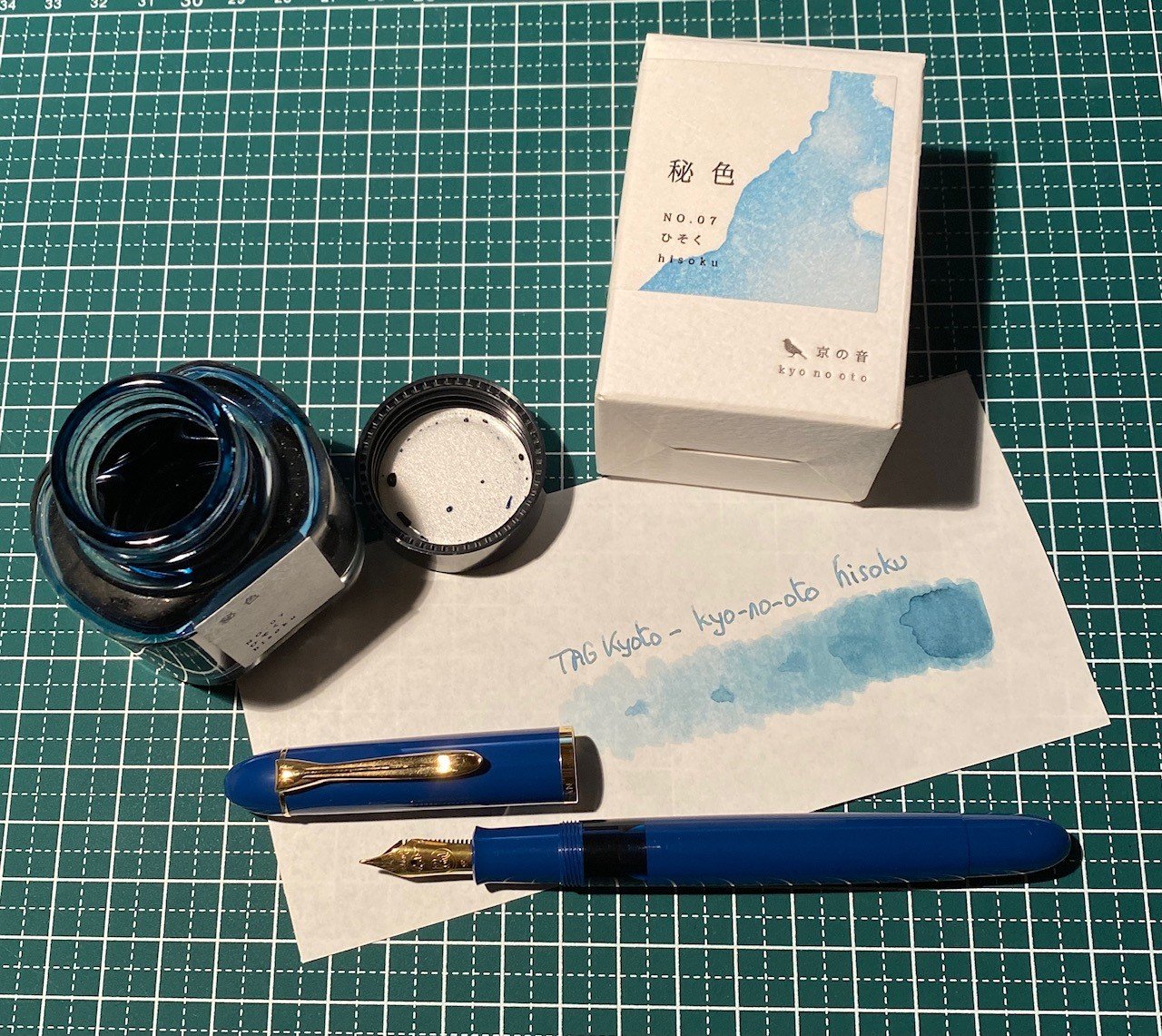
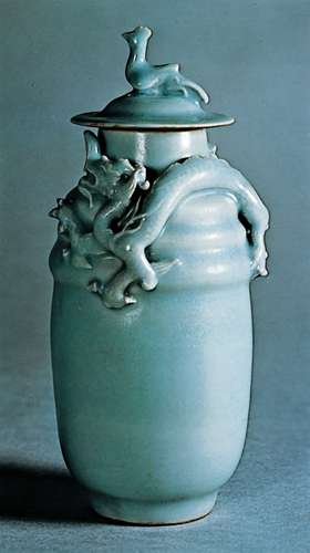
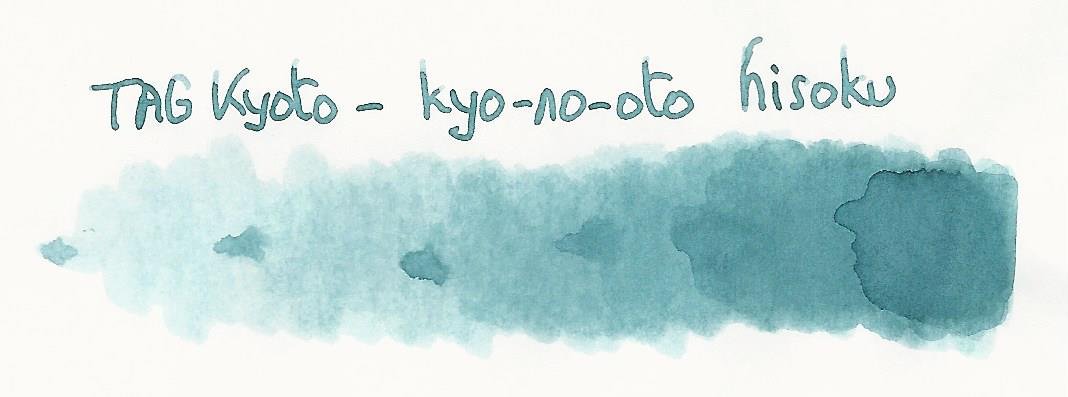
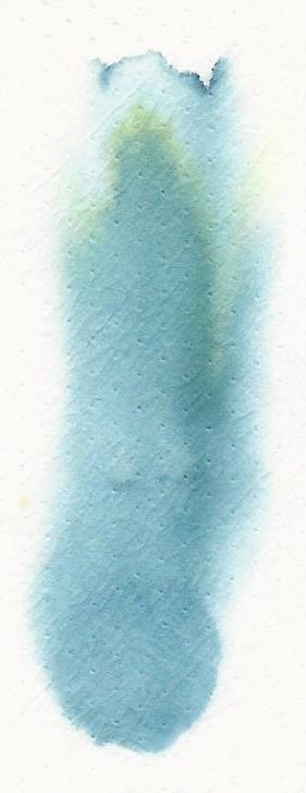
TAG Kyoto - kyo-no-oto - hisoku TAG is a stationary shop in Kyoto (Japan) that produces some interesting soft watercolour-style inks. With the kyo-no-oto series they produce a line of inks that replicates traditional Japanese dye colours. According to available only info, the manufacturing process of the kyo-no-oto inks follows traditional dying techniques dating back to the Heian era between the years 794 and 1185. The inks come in 40 ml bottles, packaged in luxurious thick paper with a texture that feels like heavy watercolour paper. In this review I take a closer look at hisoku, a grey steel-blue with green undertones. An interesting colour this one, soft and pale, but at the same time delicate as the seijit porcelain from which it draws its inspiration. Another TAG Kyoto ink that’s right up my alley. Hisoku translates to “secret colour”. It is named after the mysterious beauty of the ash-coloured blue-green unique to Celadon pottery (also known as greenware). The colour of this ink catches the porcelain’s colour perfectly. Very nicely done! The ink writes really dry with my standard Lamy Safari test pens. Saturation is also quite low, especially with the finer nibs. Nevertheless, it still leaves a very readable line even with the Lamy EF nib. This may be a soft and pale ink, it still provides enough contrast with the paper to ensure very legible writing. With wetter pens, the writing experience improves significantly. I would personally avoid this ink with drier pens. To show you the impact of saturation on the ink’s look & feel on paper, I made some scribbles where I really saturated portions of the Tomoe River paper with ink. This gives you a good idea of what the ink is capable of in terms of colour range. Hisoku has a fairly broad dynamic range, but being a pale ink, there is no harsh contrast between the light and darker parts. This translates to strong but still elegant shading. Be aware that my scanner tends to exaggerate the contrast, making the shading look harsher than in reality. I’ve therefore added some photo’s to the writing samples below, to allow you to get a better feel for the ink. The chromatography shows the soft and delicate nature of this kyo-no-oto ink. The bottom part of the chroma suggests a fair amount of water resistance, but this is not reflected in the real world. With water tests, there does remain ink on the paper, but it’s not easily readable and requires patience deciphering. Slightly accident-proof would be more accurate to characterise hisoku’s water resistance. I’ve tested the ink on a wide variety of paper — from crappy Moleskine to high-end Tomoe River. On every small band of paper I show you: An ink swab, made with a cotton Q-tip 1-2-3 pass swab, to show increasing saturation An ink scribble made with an M-nib Lamy Safari The name of the paper used, written with a B-nib Lamy Safari A small text sample, written with the M-nib Safari Source of the quote, with a wet-writing Lamy Dialog 3 with M-nib Drying times of the ink on the paper (with the M-nib Safari) Hisoku looks great on all my test papers, with no visible feathering even with the horrible Moleskine paper. Show-through and bleed-through are quasi absent — only the Moleskine gets some minor bleed-through, but still not too bad. Drying times cluster around the 5 second mark with my Lamy Safari M-nib pen. I personally prefer hisoku with pure white paper, where it looks its best. A beautiful soft & delicate pale-blue that simply looks wonderful. I really appreciate the beauty of this ink. I’ve also added a few photos to give another view on the ink. In the scanner samples above, the shading contrast in the written text is a bit exaggerated, making it look too harsh. The photos below show a more realistic view of the ink’s shading. Writing with different nib sizes The picture below shows the effect of nib sizes on the writing. Kyo-no-oto hisoku has low saturation, but still manages enough contrast with the page to make for very legible writing, even with the EF nib. Be aware that it is a dry ink, and as such no good match for dry pens like the Lamy Safari. I suggest you use this ink with wetter pens and/or broader nibs to get a more enjoyable experience. And the ink’s elegant shading is always present, enhancing your writing, no matter what pen/nib combination you choose. Related inks To compare this soft grey-blue hisoku with related inks, I use my nine-grid format with the currently reviewed ink at the centre. This format shows the name of related inks, a saturation sample, a 1-2-3 swab and a water resistance test — all in a very compact format. I really have no other ink that comes close in colour. J. Herbin Vert De Gris is from the same family but way more saturated. It doesn’t even try to match hisoku’s soft delicacy. Inkxperiment — angry Mother Earth With every review, I try to create an inkxperiment using only the ink I’m working on. These one-ink drawings are a great way to bring out the colour-range nuances that are present in the ink. I really enjoy doing them: it’s fun, and a good way to stretch my creativity and drawing skills. Inspiration comes from the evermore visible results of climate change: climbing temperature, melting icecaps, stronger storms, … Mother Earth is not happy! I started with a piece of HP photo paper on which I drew a sketch of Mother Earth with my fountain pen. I then used a rolled-up piece of kitchen paper as a stamp, and filled in the background with water-diluted hisoku. I then added the radiance using Q-tips dipped in multiple water/ink mixes, and filled in the goddess figure with a Q-tip dipped in pure ink. Extra accents were added with my fountain pen. I’m not totally satisfied with the result, but the resulting picture does give you an idea of what can be achieved with hisoku as a drawing ink. Conclusion I’ve tried a number of TAG Kyoto inks to date, and love them all. This line of inks really fits my taste – I’m glad I discovered them. Hisoku is an ink that totally nails it: a soft and delicate pale grey-blue with green undertones. A truly beautiful ink that works really well with all my test papers. Be aware that it definitely is a dry ink, and that it needs wet pens and/or broad nibs for a pleasant writing experience. Hisoku’s colour and toned-down appearance are probably not for everyone, but if you enjoy soft inks, this one is another winner from the TAG Kyoto stable. Technical test results on Rhodia N° 16 notepad paper, written with Lamy Safari, M-nib Back-side of writing samples on different paper types

-
Robert Oster 1980 - Grey Seas Robert Oster is an Australian ink maker that is well-known for its unique range of colours. With this mini-series he gives us a conglomeration of colours inspired by the anything goes world of the 1980s. The inks include muted pastel-type colours along with some eye-popping disco-style hues. Definitely an interesting series. The centerpiece of this review is Grey Seas, a toned-down grey-blue with definite purple undertones. This pastel-style dusty blue certainly fits my taste - the colour is simply beautiful. The ink provides good contrast with the paper, even in finer nibs. Like many Robert Oster inks, this one feels rather dry and definitely needs a wet pen or broader nib to gain decent lubrication. To show you the impact of saturation on the ink's look & feel on paper, I made some scribbles where I really saturated portions of the Tomoe River paper with ink. This gives you a good idea of what the ink is capable of in terms of colour range. Grey Seas goes from a faint purple-blue at the light end of the spectrum, up to a much darker grey-blue at the most saturated part. The purple undertones are strongly present, especially in the swab. The broad tonal range indicates that this is a strong shading ink. For my personal taste, shading is even a bit too strong and harsh, with too much contrast between the light and darker parts of the text. Like most Robert Oster inks, Grey Seas has zero water resistance. Short exposures to water completely obliterate the text, leaving next to nothing on the page. This is also apparent from the lower part of the chromatography. The chroma clearly shows the purple & cerulean-blue components of the ink. You can also see that the dyes migrate away with water, and that only some faint light-purple smudges remain on the paper. I've tested the ink on a wide variety of paper - from crappy Moleskine to high-end Tomoe River. On every small band of paper I show you: An ink swab, made with a cotton Q-tip 1-2-3 pass swab, to show increasing saturation An ink scribble made with an M-nib Lamy Safari fountain pen The name of the paper used, written with a B-nib Lamy Safari A small text sample, written with an M-nib Lamy Safari Origin of the quote, written with a wet Parker Sonnet with M-nib Drying times of the ink on the paper (with the M-nib Lamy) With the writing samples, Grey Seas exhibits some technical shortcomings. The ink seems to be prone to a small amount of feathering. This typically happens on the lower quality printing paper, but I also noticed a small amount of feathering on some high quality paper, like OCM vellum paper. Drying times are in the 5 to 10 second range with my M-nib Lamy Safari. Contrast with the paper is excellent and easy on the eyes. I don't like the way Grey Seas interacts with more yellowish paper - it just doesn't look good. In my opinion, this is an ink to use with pure white paper. Writing with different nib sizes The picture below shows the effect of nib sizes on the writing. All samples were written with a Lamy Safari, which is typically a dry pen. I also added a visiting pen: a wet-writing Parker Sonnet with M-nib. As you can see, Grey Seas has no problem with even the finest nibs, exhibiting some shading even with the EF-nib. This ink is a really heavy shader. For my tastes shading is even a bit too pronounced - I prefer more subtle shading myself. Related inks To compare Grey Seas with related inks, I use my nine-grid format with the currently reviewed ink at the center. This format shows the name of related inks, a saturation sample, a 1-2-3 swab and a water resistance test - all in a very compact format. Inkxperiment – waiting for the princess With every review, I try to create an interesting drawing using only the ink I'm working on. Limiting myself to one ink allows me to showcase its colour-range nuances. It's often quite a challenge, but always great fun. Inspiration for this inkxperiment comes from the Brothers Grimm fairy tale "The Frog Prince". I started off with a piece of 300 gsm rough watercolour paper, on which I painted the background using water-diluted ink. Next I used some Q-tips dipped in 1:2 diluted Grey Seas to stamp in the trees and paint in the castle. I then used a Q-tip with a bit of ink to darken up the foreground. For the frog prince I used my Lamy Safari pens and pure Grey Seas. Finally I used a Q-tip with heavily water-diluted ink to add some texture to the path leading up to the castle. The resulting drawing is only so-so, but it does give you an idea of what can be achieved with Grey Seas as a drawing ink. Conclusion Robert Oster 1980 Grey Seas gives you a beautiful muted grey-blue colour with strong purple undertones. Unfortunately this ink has some shortcomings, the most serious of which is its tendency to feather on a number of papers. Grey Seas also needs pure-white paper - it doesn't look good on more yellowish paper. This is an ink you need to combine with the right pen and paper - if you do so, you are rewarded with a really good-looking muted grey-blue. But make the wrong choice, and you will probably be disappointed. Technical test results on Rhodia N° 16 notepad paper, written with Lamy Safari, M-nib Back-side of writing samples on different paper types
-
Papier Plume - Bayou Nightfall (New Orleans Collection) Papier Plume is a stationary shop in New Orleans, that’s been getting some attention lately on this forum with their “New Orleans Inks”, that celebrate the rich colours and history of the city. One of their inks in this series is Bayou Nightfall, an ink with a grey-green-blue hue, that’s unlike any colour in my collection. Definitely an ink with a unique personality. Bayou Nightfall’s colour is rather unique – it’s kind of a dark blue-leaning teal with heavy grey undertones, a mix of grey-green-blue that’s hard to describe. But the resulting mix is beautiful, and captures the ambiance of a nightfall, when the Bayou landscape’s colours fade away, and darkness descends. The shading is really noticeable, but well executed. There’s quite a bit of contrast between the light and darker parts, which tends to be exaggerated in a scan (in real-life I find the shading to be quite pleasing). The ink itself writes quite wet, but lacks a bit of lubrication (which I found to be true of other Papier Plume inks I tested). Saturation is quite good though, even in finer nibs. I did notice however that the ink behaves very differently in dry and wet pens. With drier pens, saturation depends on the speed of your writing, resulting in heavily shaded text, with a broader contrast range between light and dark parts. With wet pens, the text is more evenly saturated, and shading is more subtle. Personally, I prefer the way the ink looks in my wetter pens. The writing sample below shows the ink with my dry Lamy Safari pens, and with my wet Parker and Pelikan pens. The difference in saturation is really obvious. The ink has a wonderfully dynamic colour span. To illustrate this, I did a swab where I really saturated portions of the paper with ink, pooling it on. This beautifully illustrates the dynamics of Bayou Nightfall. The range moves from a very light blue-grey to a deep dark blue-black colour, capturing the dynamics of a nightfall. On the smudge test – rubbing text with a moist Q-tip cotton swab – the ink behaved perfectly. Water resistance is amazing – the ink effortlessly survived even longer exposures to water. Kudos! This is also apparent from the lower part of the chromatography, which shows that the grey components of the ink remain on the paper. Only the light-blue dies in the ink are very water-soluable. If you need a water-resistant ink, Bayou Nightfall certainly fits the bill. Be aware though that this is a slow-drying ink, especially in wetter pens. With my Safari M test pen, drying times were acceptable, with a decent 20-25 seconds on the slow-drying Tomoe River paper. With wet pens though, drying times on Tomoe River climb to over a minute, with some parts of the text requiring almost a full two minutes to dry completely. This is something to keep in mind. I’ve tested the ink on a wide variety of paper – from crappy Moleskine to high-end Tomoe River. On each scrap of paper I show you:An ink swab, made with a cotton Q-tip1-2-3 pass swab, to show increasing saturationAn ink scribble made with a Lamy Safari M-nib fountain penThe name of the paper used, written with a Lamy Safari B-nibA small text sample, written with an M-nibThe source of the quote, written with a wet Parker Sonnet (F-nib)Drying times of the ink on the paper (with the M-nib)Bayou Nightfall looks really nice on most papers in my test set. I don’t like the way it looks on the very yellow Life Noble notebook paper, and I find it to be too pale on Moleskine en Leuchtturm 1917. On the other papers though, the text looks stunning, with very good contrast to the paper. There’s one but though… the ink exhibits some small but noticeable feathering on the more absorbent papers. This is especially noticeable where a wet pen is used - take a look at the quote sources written with a wet Parket Sonnet (F-nib) on the Fantasticpaper, Paperblanks and Moleskine writing samples. At the end of the review, I also show the back-side of the different paper types, in the same order. The ink behaved superbly on most paper types. Only with Moleskine and Graf von Faber Castell was there significant show-through and some bleed-through. Bayou Nightfall is a well-behaving ink in this respect. Inkxperiment – Nazca spiderI’ve recently started to experiment with ink drawings, keeping things simple and more-or-less abstract. I find it to be a fun extension of the hobby, and have found single-ink drawings a nice challenge. It also gives you an idea of what the ink is capable of in a more artistic setting. For this drawing I used 300 gsm rough watercolour paper. I started off with water-diluted ink for the lighter parts in the drawing, gradually adding more ink to the mix for the darker parts. The spider square is painted with pure Bayou Nightfall. After drying, I used a small brush with a 25% bleach-solution to draw in the Nazca spider. The bleach reacts quite nicely with this ink, leaving a golden-yellow trace. The end result gives you a good idea of the colour span that Bayou Nightfall is capable of. ConclusionBayou Nightfall from Papier Plume is a grey-green-blue ink, with a unique colour that really captures the ink’s name. The ink has excellent contrast with the paper, shades nicely, and is water-resistant to boot. On the downside, the ink is rather slow-drying and can exhibit some minor feathering on more absorbent papers. Overall though, I’m quite pleased with this ink despite its minor shortcomings. I can forgive a lot for the unique colour I get in return. Well worth your attention! Technical test results on Rhodia N° 16 notepad paper, written with Lamy Safari, M-nib Backside of writing samples on different paper types
-
L'Artisan Pastellier Callifolio - Bosphore L'Artisan Pastellier is a small company in southern France that specialises in natural pigments, and offers customers authentic and reliable products in beautiful colours based on mineral or vegetable pigments. In a collaboration with Loic Rainouard from Styloplume.net, the chemist Didier Boinnard from L'Artisan Pastellier created the line of Callifolio fountain pen inks. These pastel-coloured inks are traditionally crafted, and can be freely mixed and matched. Overall these inks are only moderately saturated, and have low water-resistance. The inks were specifically designed to work well with all types of paper, and all types of fountain pens. Being pastel-tinted, these inks have a watercolour-like appearance, and are not only fine inks for journaling, but are also really excellent inks for doodling & drawing. I only recently discovered them, and they are already the inks I gravitate towards for personal journaling. In this review the center stage is taken by Bosphore, one of the many blue inks of the series. The blue Callifolio inks are named after rivers, lakes and oceans. In this case the ink takes its name from the Bophorus or "The Strait of Istanbul", which forms part of the continental boundary between Europe and Asia. The ink's colour is best described as a dark grey-blue. I'm known to be a fan of muted colours, and this one doesn’t disappoint... a bit gloomy, a bit vintagy... and the greyish undertones are just lovely. I immediately took a liking to Bosphore as a writing ink. I found the ink to be a bit on the dry side in my Lamy Safari test pens, with lubrication being somewhat subpar. Saturation is good though, even with finer nibs. Shading is subtle, and becomes more pronounced with broader nibs. There is not too much contrast between the light and darker parts of the text, which makes it aesthetically pleasing. Well executed! To show you the impact of saturation on the ink's look & feel on paper, I made some scribbles where I really saturated portions of the paper with ink. This gives you a good idea of what the ink is capable of in terms of colour range. As you can see, this ink has a moderately wide colour span ranging from a light greyish blue to a reasonably dark blue-black. On the smudge test - rubbing text with a moist Q-tip cotton swab - Bosphore shows its weakness. Lots of smearing, although the text remains legible. Water resistance is also quite low. Almost all of the colour quickly disappears, but a light grey ghost image of the text remains that is still readable without too much trouble. The chromatography shows that this is a rather monochromatic ink, without much colour variation in the component dyes. I've tested the ink on a wide variety of paper - from crappy Moleskine to high-end Tomoe River. With this review, I have added several new papers to my test set. Among these are Semikolon notebook paper (a laid paper from Leuchtturm), Endless Recorder notebook paper (which is Tomoe River 68 gsm paper), Ciak notebook paper, and Optiimage 100 gsm printing paper. On every small band of paper I show you: An ink swab, made with a cotton Q-tip 1-2-3 pass swab, to show increasing saturation An ink scribble made with an M-nib fountain pen The name of the paper used, written with a B-nib A small text sample, written with an M-nib Drying times of the ink on the paper (with the M-nib) Bosphore behaved perfectly on all the paper types, with no apparent feathering even on the lower quality papers in my test set. Even Moleskine paper behaved quite well with this ink! Drying times are mostly around the 10 second mark. The ink looks nice on both white and more yellowish paper. The ink also shows a remarkably consistent appearance across a wide range of paper types - very well done! At the end of the review, I show you the back-side of the different paper types, in the same order. With the low-end Moleskine there is prominent show-through and a bit of bleed-through. With the other papers, Bosphore's behaviour is impeccable. The ink copes really well with a wide variety of paper types. Writing with different nib sizes The picture below shows the effect of nib sizes on the writing. All samples were written with a Lamy Safari, which is typically a dry pen. I also added a visiting pen - a wet-writing Pelikan M101N Grey-Blue with a fine nib. With this wet nib, the ink writes much more pleasantly. It also shows a substantially darker line. Related inks To compare Bosphore with related inks, I use my nine-grid format with the currently reviewed ink at the center. This format shows the name of related inks, a saturation sample, a 1-2-3 swab and a water resistance test - all in a very compact format. Compared to blue-blacks like Tanzanite and Midnight Blue, Bosphore is definitely greyer. Inkxperiment – dark & gloomy castle As a personal challenge, I try to create interesting drawings using only the ink I'm reviewing. For me, this brings extra fun to the hobby, and these single-ink drawings are great for stretching my creativity. With these small pictures, I try to give you an idea of what the ink is capable of in a more artistic setting. For this drawing, I got my inspiration from some drawings I saw on Pinterest. I started off with HP Premium photo paper, and painted in the background with heavily water-diluted ink. I then started a process of layering on ever more saturated ink. Apply a layer, let it dry, and repeat with the next layer. Finally I penciled in the birds with my Lamy Safari, and added the windows with a fine brush and some bleach. The end result is not too bad, and gives you an idea of what can be obtained with Bosphore as a drawing ink. Conclusion Callifolio Bosphore is at its best as a writing ink. It has a vintage-looking grey-blue colour, that manages to look very pleasing on all my test papers. Water resistance is quite low though, which makes the ink unsuitable for the workplace. I found the ink quite challenging to draw with - this is definitely an ink that's best used for writing. Overall, Bosphore is a great writing ink, and the greyish undertones set it apart from other blue-blacks. Technical test results on Rhodia N° 16 notepad paper, written with Lamy Safari, M-nib Back-side of writing samples on different paper types
-
We are happy to announce another addition to the fascinating Pelikan M101N series. The Pelikan Special Edition M101N Grey-Blue fountain pen will be available by mid March 2019. The 14-K gold nib is fully rhodinized and comes in four nib sizes (EF, F, M and . The clip and the rings are palladium coated. As usual for the M101N Pelikan delivers the Pelikan Special Edition M101N Grey-Blue fountain pen in a special gift box, which includes a glas bottle of the 4001 royal blue ink. We offer this pen for pre-order for € 332,77 without VAT for the F, M and B nib sizes. Pelikan still charges an extra for the EF nib, our price for EF therefore is € 359,66 without VAT. Please find here the link to our offer: https://www.fritz-schimpf.de/Neuheiten/Pelikan-Special-Edition-M101N-Grey-Blue-Kolbenfuellhalter.html Best regards Fritz Schimpf
-
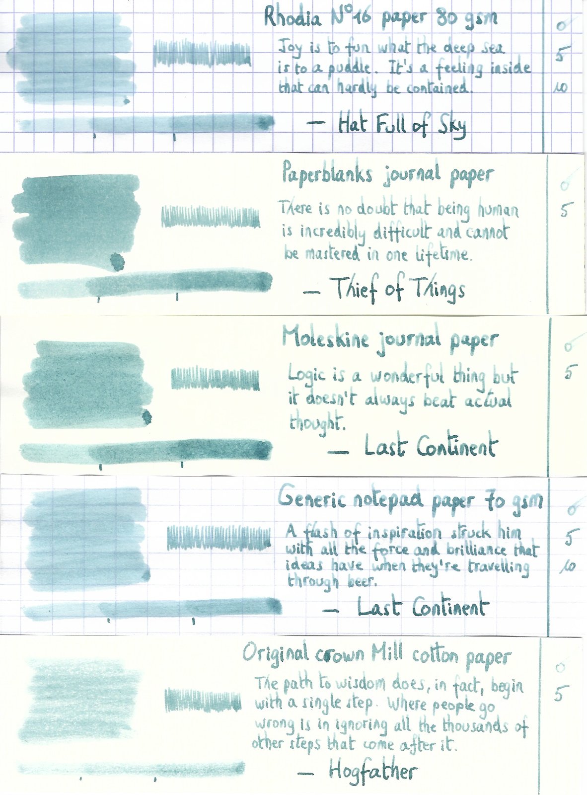
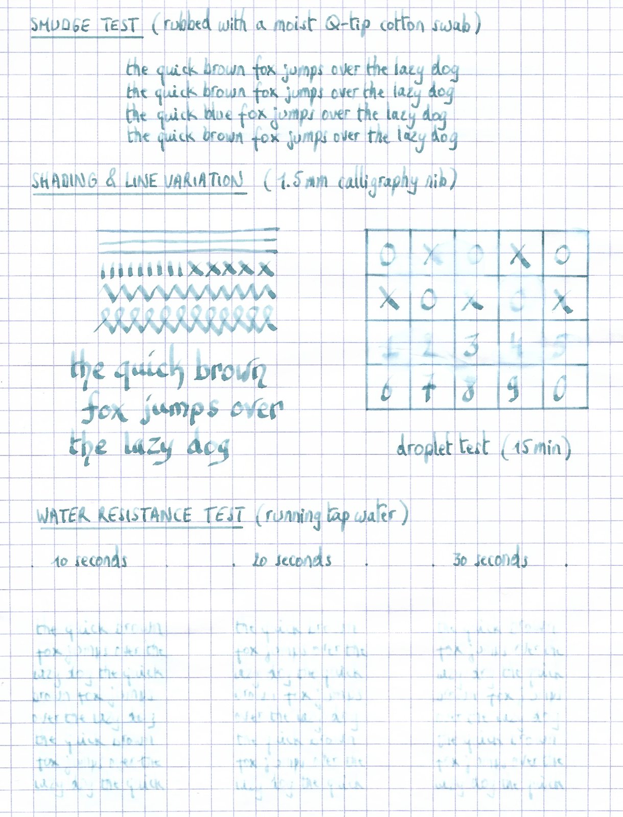
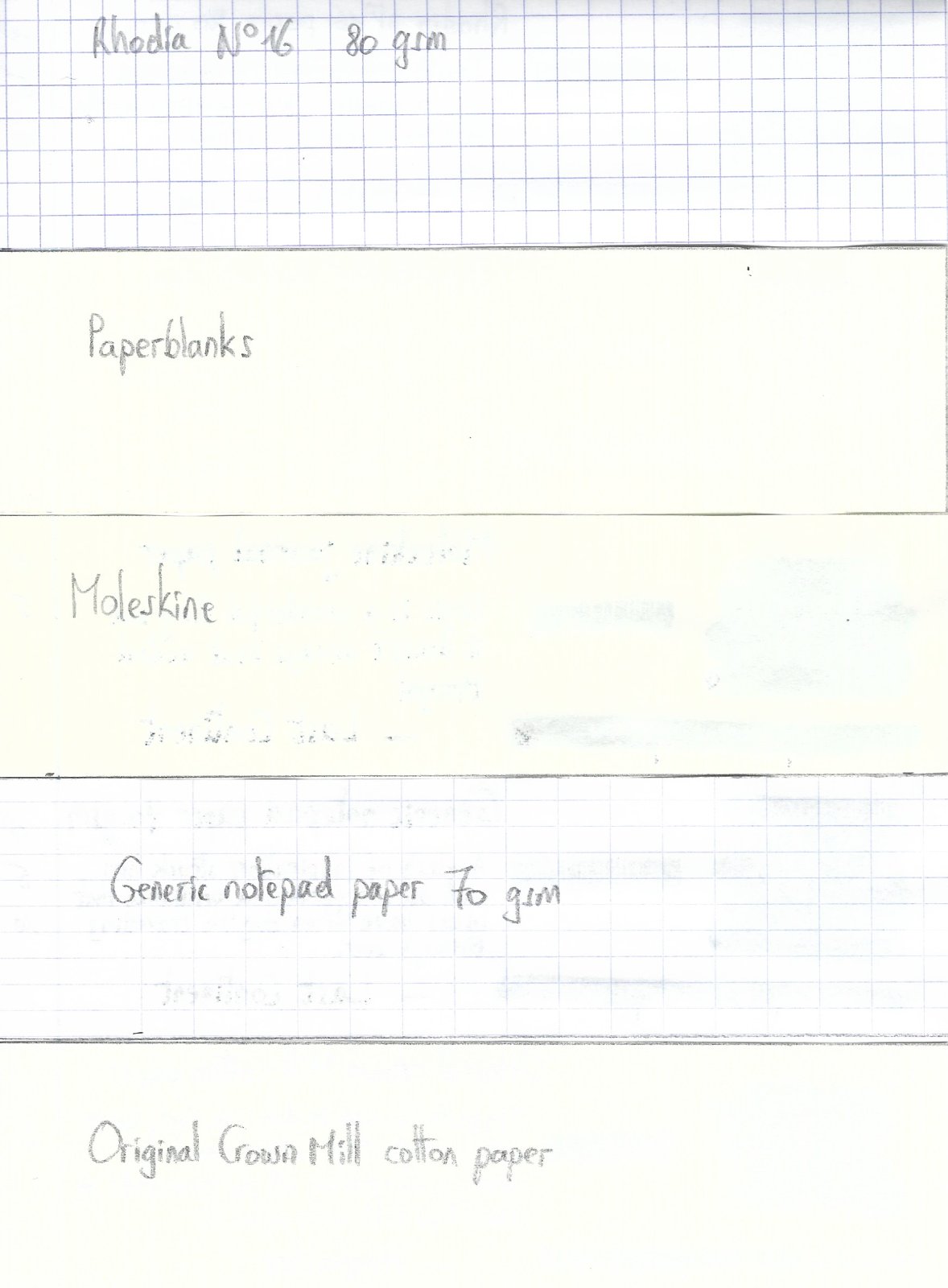
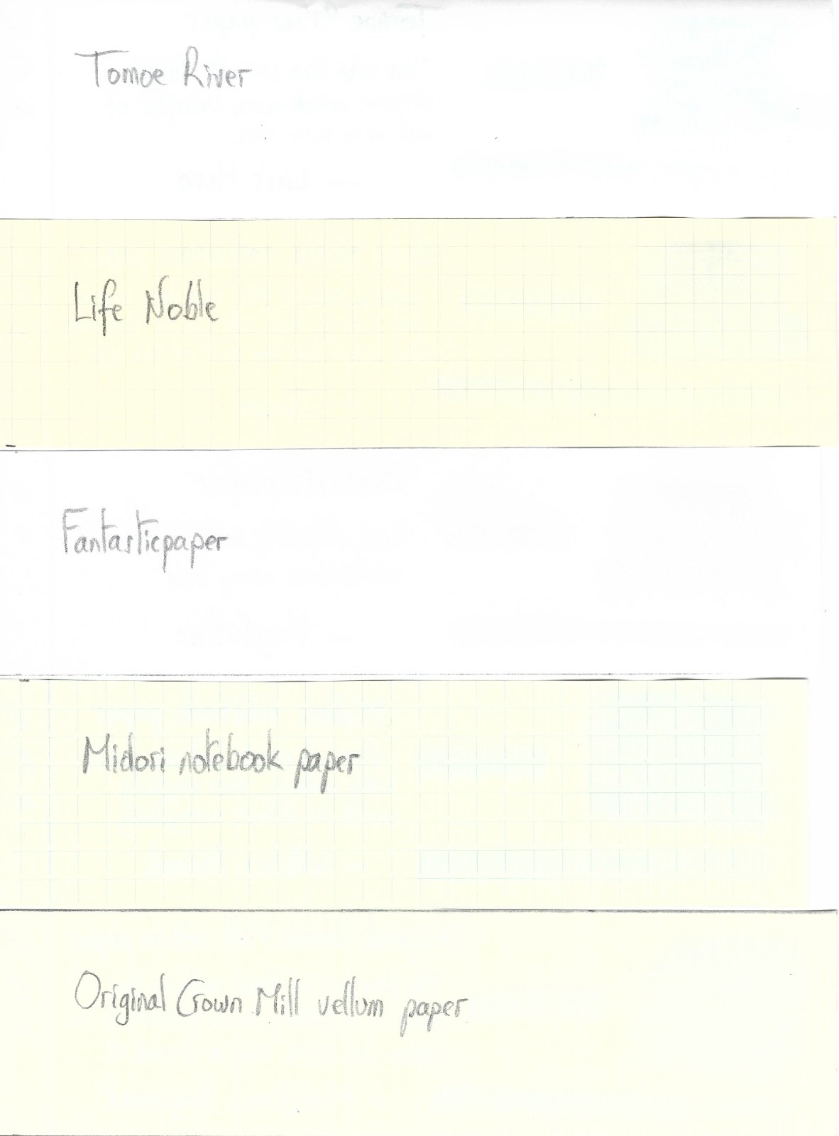
Ink Review : Diamine Chopin (Music Collection) Pen : Lamy AL-star, M-nib Paper : Rhodia N°16 notepad 80 gsm Review Paris, winter of 1839 Winter... and I'm cold to the bone. The river Seine shines a dull grey, the leaden sky a blue-grey carpet of monotony. I feel really depressed, this atmosphere suffocates me with a feeling of despair. But this setting inspires my muse - I'll capture this dreary moment in the 4th prelude of my Opus 28. In 2015 Diamine released the Music Collection, a set of 10 subdued ink colours named after well-known composers. In this review, we take a look at Chopin. After the above introduction, you're sure to remember that this is a blue-grey ink. Diamine Chopin is a really nice blue-grey - I place it right in the middle between those two colours. The colour is subdued, and has a vintage feeling. It's a colour that really appeals to me, and one that can be used in all circumstances, both at work and for personal use. It's not a festive colour though - more an ink to use when you're in a serious mood. There is some subtle shading going on, which gives your writing extra character. Chopin exhibits good flow and performs well on a wide variety of paper. I really like this ink ! Rhodia N°16 notepad 80 gsm - drying time 15-20 seconds, no feathering, no show-through nor bleed-through.Paperblanks journal paper - drying time ~15 seconds, no feathering, no show-through and no bleed-through. Nice vintage look on this off-white paper.Generic notepad paper 70 gsm - drying time ~15 seconds, no feathering, a hint of show-through, no bleed-through.Moleskine journal - drying time ~5 seconds ! No feathering, significant show-through, minimal bleed-through. Impressive !Tomoe River paper - drying time ~25 seconds, no feathering, minimal show-through, no bleed-through.Original Crown Mill cotton paper - drying time 15-20 seconds, no feathering, no show-through nor bleed-through. Very nice vintage look.Impressive behaviour ! Even on the lower-quality paper. This is an ink you can use on the cheaper paper in the workplace. There is no avoiding comparison of this ink with Vivaldi, also from the Music Collection. Vivaldi is a purple-grey, and also a really nice ink. I like the colour of Chopin a bit better, but Vivaldi beats Chopin solidly on the water-resistance front. Chopin has almost zero water resistance - after water has touched the ink, the text remaining requires effort to decipher (there is a readable residue, but not what I would call easily readable text). Conclusion Diamine Chopin is a very vintage-y blue-grey colour that looks great in all nib sizes and on all types of paper. It behaves surprisingly well on cheaper paper, which is a big plus at the office. Chopin has an aesthetically pleasing colour that I enjoy very much. In my opinion, this is one of the better inks in the Music Collection. A pity though that the ink has really low water resistance. If you like greys and blues, this definitely is an ink to consider. I think you will like it ! my overall score: A
-
L'Artisan Pastellier Califolio - Botany Bay L’Artisan Pastellier is a small company in southern France that specialises in natural pigments, and offers customers authentic and reliable products in beautiful colours based on mineral or vegetable pigments. In a collaboration with Loic Rainouard from Styloplume.net, the chemist Didier Boinnard from L’Artisan Pastellier created the line of Callifolio fountain pen inks. These pastel-colored inks are traditionally crafted, and can be freely mixed and matched. Overall these inks are only moderately saturated, and have low water-resistance. The inks were specifically designed to work well with all types of paper, and all types of fountain pens. Being pastel-tinted, these inks have a watercolor-like appearance, and are not only fine inks for journaling, but are also really excellent inks for doodling & drawing. I only recently discovered them, and they are already the inks I gravitate towards for personal journaling. In this review the spotlight is on Botany Bay, one of the many blue inks of the series. The blue Callifolio inks are named after rivers, lakes and oceans – this blue-black liquid gets its name from the famous Australian bay. Visvamitra did an excellent review, but is not a fan: “the color is supposed to be deep blue/black. It isn’t. It’s a washed out greyish thing. Not really exciting.” Well… de gustibus non est disputandum. Me, I like the ink a lot lot lot ! Right up my alley. I love blue-blacks, I love greys, I love a vintage feel. This ink ticks all the right boxes for me. A vintage-y dark blue-grey. Yummie! Technically, the ink behaves rather poorly. It’s rather dry, and dries too quick on the nib. When left uncapped, I experienced hard starts after a minute or two. Not so good. Botany Bay exhibits prominent shading in the broader nibs. It is much more restrained in finer nibs, which I find more aesthetically pleasing. And since I typically use the finer nibs… lucky me ;-) On the smudge test – rubbing text with a moist Q-tip cotton swab – Botany Bay behaved acceptably. Water resistance however is almost non-existent. All that lovely colour disappears very very quickly. A real shame. When using a water-brush with doodling & drawing, you get a nice blue-grey shading effect. Like all Callifolio inks, Botany Bay is a very fine choice for inky drawings. I’ve tested the ink on a wide variety of paper – from crappy Moleskine to high-end Tomoe River. For the Callifolio reviews, I’m using a new format to show you the ink’s appearance and behaviour on the different paper types. On every small band of paper I show you: An ink swab, made with a cotton Q-tip1-2-3 pass swab, to show increasing saturationAn ink scribble made with an M-nib fountain penThe name of the paper used, written with a B-nibA small text sample, written with an M-nibDrying times of the ink on the paper (with the M-nib)Botany Bay behaved perfectly on all the paper types, with no apparent feathering even on the lower quality papers in my test set. Drying times are mostly around the 15 second mark, with a low of 5 seconds on the more absorbent paper. The ink is equally at home with both white and off-white creamy paper. When writing, the ink lays a dark blue/black line, that dries to a lovely blue/grey colour – a really nice and interesting effect. I also show the back-side of the different paper types, in the same order. With the low-end Moleskine there is very prominent show-through and bleed-through. With the other papers, Botany Bay’s behaviour is impeccable. The ink copes really well with a wide variety of paper types. Conclusion Botany Bay is not your average blue-black. This ink should be taken at face value – it’s a lovely dark blue-grey with a vintage feel. The ink works well with all nib sizes, with really prominent shading in the broader nibs. Technically, this is not a good ink : it feels dry and is susceptible to hard starts when left uncapped for short periods of time. The ink also has zero water resistance. But me… I’m in love with the colour, and don’t mind these shortcomings. Technical test results on Rhodia N° 16 notepad paper, written with Lamy Safari, M-nib