Search the Community
Showing results for tags '2025'.
Found 8 results
-
I wanted to remind myself of the names that Waterman uses for its different colours of ink, so I have just looked at the Waterman website. https://www.waterman.com/inks/ To my horror and disgust, I found the following: There is NO mention of ANY ink in bottles, ONLY ink in cartridges! Even worse, ALL the colours appear to have been discontinued, except for: 'Intense Black'; 'Serenity Blue' (whose name still appears as 'Florida Blue' when one clicks on the swatch that indicates its colour); 'Mysterious Blue' (whose name appears as 'Blue and Black' when one clicks on the swatch). Furthermore, 'Mysterious Blue' is NOT listed as being available in the 'extensive' range of inks that are available in Waterman's short cartridges! We are currently living in the 'golden age' of inks. More companies that make fountain pen ink are appearing, existing ink makers are producing ink in more colours. But, if the company's website is anything to go by, it seems that the genius Executive class at Newell-Rubbermaid has decided to wave a little white flag, and abandon making nearly all of Waterman's offerings - just as it has with the varieties of Parker 'Quink' other than 'Black', 'Washable Blue', and 'Blue and Black'. 🤯 So, if you are especially fond of any of the bottled inks that Waterman has made up until now, I advise you to buy one soon! Unless, of course, the fact that their bottled inks AND most colours of ink have recently been deleted from the Waterman website merely indicates the unique level of competence of the Marketing and/or multimedia employees who have been hired by Newell-Rubbermaid. Do any of you know which of the two possible interpretations is the correct one? Slàinte, M.
-
My Year in Ink – 2025 I got relatively few new inks this year, working my way slowly-but-surely through my stash of unopened ink bottles. I’ve enjoyed the journey of exploring these inks a lot. Some of them were excellent writers. Some were wildly beautiful… but nerve-wracking bad for writing (yes, I’m looking at you kyo-no-oto usugumo). And some of them were just “meh”, and didn’t excite me. I had fun savouring all of these different inks, but some I obviously preferred more than others. This end-of-year comparison shows off my inks of 2025, and I select my personal top 3 in multiple categories. Enjoy… and maybe you’ll even find an ink you weren’t aware of, but that ticks the right boxes and yearns to be bought 😉 Category 1 : most beautiful writing ink Inks are primarily designed for writing in fountain pens. Here I select the top 3 inks that I loved most for personal journaling. This proved to be more difficult than I thought, because I enjoyed so many of the inks I used. Below I present swabs & writing samples (in B-nib) of all 13 inks. And the winners are: Pelikan Edelstein Tanzanite Graf von Faber-Castell Olive Green Wearingeul Mad Hatter In 2025, I did a more thorough re-review of Pelikan Edelstein Tanzanite. In my opinion still the best blue-black out there. It’s one of the few inks that started me on my inkxplorations journey, and it still remains one of the best I ever used. One you cannot go wrong with, and still easily available. Technically a solid ink, and a beauty on paper. As such, it rightfully deserves first place for 2025. Graf von Faber-Castell is a well-known ink brand, but I hadn’t explored them yet. The first of their inks I tried was Olive Green. Wow… that is one beautiful yellow-leaning green! Good writing properties, looks beautiful on all types of paper, and also a superb drawing ink. A wonderful first experience. I’m sure going to explore more of their inks. This Olive Green certainly deserves second place. Third place proved to be a difficult choice: so many inks I enjoyed, and then to be forced to make a decision. This essentially became a toss-up between Teranishi Orchestra Tangerine, Taccia fukaki hanada and Wearingeul Mad Hatter. I finally decided to go with Mad Hatter. A dusty, melancholic and muted green that totally won me over. Worst of the bunch: kyo-no-oto usugumo. Oh so beautiful. Oh so badly executed: lubrication, flow, saturation… this ink made me cry in desperation. An ink for drawing. But a grief-inducing experience in most pens when trying to use it for writing. Category 2 : lovely dissection Inks are built from dyes and can differ greatly in complexity. When doing a chromatography, you get two results: you get to see how easily the dyes dissolve in water, plus you get an idea of the component dyes that are used for constructing the ink. Useful information, but these chromas are also beautiful objects of art. Here I select the top 3 inks with the loveliest chroma. And the winners are: Sailor Manyo ukikusa Teranishi Orchestra Tangerine Wearingeul Mad Hatter Sailor Manyo ukikusa is a delicate yellow-green, and that frail beauty is reflected in its chromatography. I like the way that the chroma expresses the dies used in its composition. Teranishi Orchestra Tangerine is a fiery red-orange at heart, but tamed down a bit with a grey component in the mix. The chroma shows the passion simmering beneath this ink’s surface. Finally, Wearingeul Mad Hatter’s chroma is just that: a mad mix of dyes, that together manage to coalesce into that wonderful muted & dusty-looking green. Worst of the bunch: J. Herbin Iris Sagesse. A beautiful purple-leaning blue, but the chroma doesn’t add anything new. Not much going on there. Category 3 : artsy inkxperiment With every ink review, I try to do an “inkxperiment” where I simply enjoy myself exploring the colour range nuances of the ink while making a more or less abstract drawing. Some of these worked well, others less so. But all of them were fun to do, and allowed me to stretch my drawing skills. Here I select the top 3 inks with the most successful inkxperiment (my personal opinion). Inks are obviously for writing but are also excellent material for drawing. I’ve found that these inkxperiments show quite well what can be achieved with the inks in a more artistic setting. HP photo paper has become my medium of choice for these drawings: this is a combination that works really well and makes almost any ink look good. And the winners are: TAG Kyoto kyo-no-oto usugumo Teranishi Guitar Orchestra Tangerine Jacques Herbin Shogun Kyo-no-oto usugumo is a horrible writing ink, but it is a real gem when used for drawing. This grey ink shows lots of depth with hints of blue, green and red just below the surface. It’s a joy to draw with, and I really like the way it worked out in the “skyscrapers” inkxperiment. The “spaceflowers” inkxperiment with Teranishi Orchestra Tangerine shows off the ink in all its fiery beauty. I like the composition of this one. Finally, the steampunk airship in the Jacques Herbin Shogun drawing gets third place. I like the gritty feel of this one. Worst of the bunch: Pelikan Edelstein Tanzanite. I did the drawing without a concept in mind, just doodling around. And it shows… I don’t like the composition of this one. Tanzanite deserves better. Category 4 : inkxpired computational art For some time now, I am exploring computational art based on the ink drawings I do with my ink reviews. Using digital techniques, I tweak my monochromatic ink paintings. The original painting often dictates the direction of these digital manipulations: abstracting it a bit, shifting the colour tone, emphasizing some details. In many cases, that works quite well – and the resulting pieces are often great as screen-savers on my laptop. And the winners are: Pelikan Edelstein Tanzanite Jacques Herbin Rouge d’Orient The trilogy – J. Herbin Terre de Feu, Teranishi Orchestra Tangerine, GvFC Olive Green Some heavy digital manipulation saved the Tanzanite drawing. I lifted out a small detail, blowing up contrast and shifting the colour a bit to arrive at this abstract “blue moon rising”. I made a 90x90cm canvas poster of this one, and it looks great on a white wall. Second place goes to the Jacques Herbin Rouge d’Orient drawing. Again an abstract interpretation, starting from a detail in the original inkxperiment. Third place goes to the trilogy of “spaceflower” paintings. I like the common theme across these paintings, and the colour-palettes work well together. Worst of the bunch: Sailor Manyo ukikusa. I couldn’t manage to digitally create something worthwhile. It’s just the original drawing with a different colour theme. I’ve enjoyed myself immensely doing these ink reviews. And there are still lots of inks on my shelf to continue doing reviews in 2026. I will certainly explore more of the Sailor Manyo series, and will also add some of the remaining TACCIA and Teranishi inks. I continue to be surprised by the broad variety of inks that are available for us to enjoy: so much inks to choose from! Great job and a big thank you to all ink makers across the globe! Let’s keep our fingers crossed, and hope that 2026 will bring us some other great new inks to play around with. Best wishes for 2026.
-
From the album: Mercian’s Miscellany
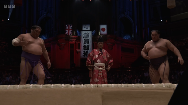
A screenshot from the BBC coverage of Day One (2025-10-15) of the official Grand Sumo 5-day (non-championship) tournament at the Royal Albert Hall in London. While this isn't an actual Honbasho, the RAH is the only venue outside of Japan that has ever hosted an official Grand Sumo tournament. It first hosted one in 1991, and now it is hosting its second! I chose this image to capture in a screenshot because I liked the juxtaposition of the Union Flag with the Nisshōki/Hinomaru.© Mercian
- 0 B
- x
-
I wanted to remind myself of the names that Waterman uses for its different colours of ink, so I have just looked at the Waterman website. https://www.waterman.com/inks/ To my horror and disgust, I found the following: There is NO mention of ANY ink in bottles, ONLY ink in cartridges! Even worse, ALL the colours appear to have been discontinued, except for: 'Intense Black'; 'Serenity Blue' (whose name still appears as 'Florida Blue' when one clicks on the swatch that indicates its colour); 'Mysterious Blue' (whose name appears as 'Blue and Black' when one clicks on the swatch). Furthermore, 'Mysterious Blue' is NOT listed as being available in the 'extensive' range of inks that are available in Waterman's short cartridges! We are currently living in the 'golden age' of inks. More companies that make fountain pen ink are appearing, existing ink makers are producing ink in more colours. But, if the company's website is anything to go by, it seems that the genius Executive class at Newell-Rubbermaid has decided to wave a little white flag, and abandon making nearly all of Waterman's offerings - just as it has with the varieties of Parker 'Quink' other than 'Black', 'Washable Blue', and 'Blue and Black'. 🤯 So, if you are especially fond of any of the bottled inks that Waterman has made up until now, I advise you to buy one soon! Unless, of course, the fact that their bottled inks AND most colours of ink have recently been deleted from the Waterman website merely indicates the unique level of competence of the Marketing and/or multimedia employees who have been hired by Newell-Rubbermaid. Do any of you know which of the two possible interpretations is the correct one? Slàinte, M.
-
Hi, this Sunday (22nd June) is the day on which this year's 'Birmingham International' Pen Show is occurring! The venue is basically just across the road from the SW exit of New Street station, and so it is very easy to find https://ukpenshows.co.uk/birmingham-international-pen-show/ So, are any of you thinking of going? I may attend myself, as it is the nearest Pen Show to where I live - but please don't let the prospect of potentially bumping-into me put you off from attending! If I do attend, I shall wear my 'Mercian Flag' badge, so that you will know that you need to avoid me when you see me Slàinte, M.
-
Hi all, the people behind 'UK Pen Shows' have decided to branch-out this year, and they are advertising a Pen Show in Singapore - the 'Home of the Merlion' - in November! The show will be held on the 28th & 29th November 2025. For full details - location, times, prices of admission - here is a link to the webpage for the show. Slàinte, M.
-
For those who are interested in attending pen shows in the UK, here is the list of dates for the 'UK Pen Shows' organised by UkPenShows.co.uk in 2025 (and links to the relevant pages on their website). London Spring Pen Show - 02nd March 2025 Click me for details. Northern Pen Show (in Chester) - 27th April 2025 Click here Birmingham Pen Show - 22nd June 2025 Linky Newcastle Pen Show - 31st August 2025 Details here London Autumn Pen Show - 11th & 12th October 2025 The biggest UK pen show of the year. Singapore Pen Show - 28th & 29th November 2025 As its name suggests, this one is not going to be in the UK, but is in 'the home of the Merlion'! Details here. I don't know why the organisers don't advertise these events here themselves - it seems like an obvious way to drum-up interest to me 🤷♂️ Then again, I suppose that as I'm doing it for them already, there isn't that much need for them to bother Slàinte, M.
-
2025 Planners - Hobonichi Previews and More! Let's talk about it!
j.aimi posted a topic in Paper and Pen Paraphernalia
Planners and paper are my original love, because without them there is nothing to write on with my pens. 😉 Planner season is hot on our heels at the moment. Midori planners are announced, and Hobonichi is doing their August stadium previews with September 1 orders coming up. I have used a Hobonichi Original for the past 2 years, but as I have been loving my Travelers journal and it's weekly vertical insert, I want to change it up and get a weeks I can slip into my clear pocket when I want to carry everything. I miss the tomoe river paper when I am using it, but I am really reaching for it as a practicality. Let's talk about upcoming planners what everyone likes to use and wants to try! Post your favorite vendors to get planners. Share your bullet journal methods. Make sure our pens have plenty of work to do. Hobonichi previews thus far are all below in case anyone hasn't seen them yet ... 👀 I'm surprisingly really liking the gold fabric but we are yet to see what happens ...


