Search the Community
Showing results for tags 'jacques herbin'.
-
Jacques Herbin Bouqet d’Antan Ink Review # 236 --- 🧾 Description Bouquet d’antan translates to Bouquet of Yesteryear. All classic J Herbin inks are now marketed as Jacques Herbin. This belongs to original La Perle des encres series (now 40 inks). It’s a lovely, legible pastel pink with gentle shading. The ink behaves wonderfully on copy paper. While lubrication is below average, the writing experience was surprisingly pleasant. A wonderful surprise. --- 🧪 Chroma --- ✍️ Writing Samples (scan & photo) Quotes: Translations from the original French are provided for reference only. They are unofficial and may differ slightly from published translations. Rhodia “Perfume heralds a woman’s arrival and prolongs her departure.” — Coco Chanel Iroful “Love does not consist in gazing at each other, but in looking together in the same direction.” — Antoine de Saint-Exupéry Midori “Memory is the perfume of the soul.” — George Sand Tomoe River 68gsm “Nostalgia is the desire for we know not what.” — Antoine de Saint-Exupéry Hammermill 20 lb “Time does not protect you from love, but love, to some extent, protects you from time.” — Jeanne Moreau - Pens Used: Pilot F3A, Lamy (EF/F/M/B/ stub 1.1), Kanwrite with a FPR Flex. JEF denotes Japanese EF, roughly equivalent to a European extra-extra-fine. Rhodia Iroful Midori Tomoe River 68gsm Note: Tomoe River used here is 68 gsm, not the thinner 52 gsm version commonly referenced in reviews. Hammermill 20lb Closeup 🔍 Comparison Col-O-ring swatch cards. Scans are approximative. --- 💧 Water Test --- 🎨 Artwork INKTOBER 52, Day 10: Lift Mouse is terrified at the option of a lift off. Kitty Inkpot Unstoppable Snake, Jinchen Lantau Dream, Jacques Herbin: Vert Pré, Bleu Azur, Bouquet d'antan, Orange Indien, Uniball Signo White Gel, Talens Mixed Media Sketchbook. Covered Cat & Mouse take their first shower together. Cat wears its wellingtons and grabs an umbrella. I wonder if, 20 years later, Cat will get used to water and take a shower instead of grooming itself, while Mouse adapts to Cat’s grooming. Jinchen Purple Forest, J. Herbin Bouquet d’Antan, Uniball Signo, Talens Mixed Media Sketchbook. Great Maiden’s Blush Inspired by my love of Old Garden Roses, in this instance Great Maiden’s Blush, known since 1593. When Mouse kissed Cat for the first time, she blushed and saw pink. Lennon Tool Bar Bixi, J. Herbin Bouquet d’Antan, Talens Mixed Media Sketchbook. --- - What I Liked: Muted dusky colour, legible. - What I Did Not Like: I’m still thinking about it. - Writing Experience: Quite good. 🧷 Ink Characteristics - Shading: Subtle. - Ghosting: Only with a primed flex nib. - Bleed Through: Same as above. - Flow Rate: Average. - Lubrication: Below average, but nice to write with. - Nib Dry-out: Did not notice - Start-up: No problems. - Saturation: No. - Sheen: No. - Spread / Feathering / Woolly Line: Only when the flex was primed. - Nib Creep / Crud: Did not notice. - Staining (Pen): No. - Clogging: No. - Cleaning: Relatively easy, but it’s a pink dye, so maybe overtime it’ll take more time to clean. - Water Resistance: Decent. --- 🛒 Availability - Available in 10, 30 ml bottles worldwide. Cartridges and 100 ml bottles in select stores. --- 💬 Closing I was pleasantly surprised by this elegant rose colour and enjoyed writing and drawing with it. The pastel colour softens the soul and is a balm for those seeking inner peace in turbulent times. No fountain pens were harmed in preparing this review. Please don’t hesitate to share your experience, writing samples, or any other comments — the more the merrier.
-
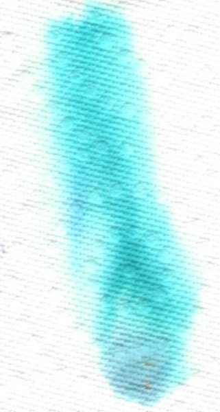
Jacques Herbin Bleu Azur Ink Review # 234 --- 🧾 Description As of this date, all J Herbin inks are marketed as Jacques Herbin. Bleu Azur is a light, bright turquoise. It has decent lubrication and was pleasant with most nibs. I preferred it with F, M, and B. It would not be legible with Japanese and Western EF nibs, as it’s pale and harsh under some lights (normally, with finer nibs, lines are darker, but not in this case). It needs a wet pen, soft, wide nib, and white paper to shine. It was most pleasant on white paper, especially Iroful and Tomoe River 68gsm. It has no water resistance and is awful on copy paper. If I were to choose one turquoise from Herbin, it would be Bleu Calanque. --- 🧪 Chroma --- ✍️ Writing Samples (photos only) - Pens Used: Pilot F3A EF, Lamy (EF/F/M/B/ stub 1.1), Kanwrite Desire I took only LED and daylight photos. Quotes: English translations provided by ChatGPT; they may differ from published translations. Rhodia “Light illuminates things, but it is shadow that gives them depth.” — Paul Cézanne, French painter Iroful “One must imagine the sky as a promise that begins again each morning.” — Albert Camus, French writer and philosopher Midori “In the blue of the sky there is a gentleness nothing can disturb.” — Victor Hugo, French writer and poet Tomoe River 68gsm “Each dawn is a birth, each blue sky a recovered innocence.” — Romain Rolland, French writer and Nobel laureate Hammermill “The sky, always the sky, reminds us that all things pass and all things begin again.” — André Gide, French writer and Nobel laureate Rhodia Iroful Midori Tomoe River Note: This is the 68 gsm paper, not the thinner 52 gsm version commonly referenced in reviews. Hammermill 20 lb copy paper Closeup 🔍 Comparison Col-O-ring swatch cards. Scans are approximative. --- 💧 Water Test --- 🎨 Artwork In my previous reviews there were several artworks (either skies or balloons with this ink). Here is one final art work with this ink. La Madrague Inspired by photographs of Brigitte Bardot at La Madrague on the Mediterranean coast, and moments with Roger Vadim. Jacques Herbin, Bleu Azur, Bouquet d'Antan, Kitty InkPot, Unstoppable Snake. Talens Mixed Media Sketchbook. --- - What I Liked: Descent lubrication, small bottles, easy to clean. Price availability. - What I Did Not Like: Paleness, fluorescent quality, lack of water resistance. - Writing Experience: Decent. 🧷 Ink Characteristics - Shading: Yes. - Ghosting: Yes. - Bleed Through: Yes. - Flow Rate: Wet - Lubrication: Decent. - Nib Dry-out: Did not notice. - Start-up: No problems. - Saturation: Pale. - Sheen: None. - Spread / Feathering / Woolly Line: Did not notice. - Nib Creep / Crud: Did not notice. - Staining (Pen): No. - Clogging: No. - Cleaning: Very easy - Water Resistance: None. --- 🛒 Availability - Available in 10/30 ml bottles, and cartridges. --- 💬 Closing Jacques Herbin has managed to capture the brightness of a summer vacation at the Mediterranean with this bright turquoise, which is perfect for those who like punchy colours. No fountain pens were harmed in preparing this review. Please don’t hesitate to share your experience, writing samples, or any other comments — the more the merrier.
-
Jacques Herbin Vert Pré (Meadow Green) Ink Review # 233 --- 🧾 Description As of the posting of this review, all J Herbin inks are now branded Jacques Herbin. This ink belongs to the 40-ink Les Perles des Encres series. It’s a yellow-green with a neon quality. It is legible. Lubrication is slightly below average; water resistance is nil on coated paper. As it’s not a colour I appreciate much, I’ll stop here. --- 🧪 Chroma --- ✍️ Writing Samples (photos only) - Pens Used: Pilot Elite EF, Lamy (EF/F/M/B/ stub 1.1), vintage Sailor flex. Quotes: Translations from the original French are provided for reference only. Rhodia “Until one has loved an animal, a part of one’s soul remains unawakened.” Anatole France, novelist and essayist. Iroful “One does not discover new lands without consenting to lose sight of the shore.” André Gide, novelist and essayist. Midori A5 “What makes the desert beautiful is that somewhere it hides a well.” Antoine de Saint-Exupéry, writer and aviator. Tomoe River 68gsm A5 “The best way to make your dreams come true is to wake up.” Paul Valéry, poet and philosopher. Hammermill “Only the mediocrity of the human spirit could devise a civilization that destroys what it loves.” Jean Giraudoux, playwright and diplomat. Rhodia Iroful Midori Tomoe River 68gsm Note: Tomoe River used here is 68 gsm, not the thinner 52 gsm version commonly referenced in reviews. Hammermill 20lb Closeup h 🔍 Comparison Col-O-ring swatch cards. Scans are approximative. --- 💧 Water Test --- 🎨 Artwork I Feel Pretty! Cat & Mouse go for a ride with the prettiest horse in the world. Kitty Ink Pot Unstoppable Snake, Jacques Herbin Vert Pré, Bleu Azur, Bouquet d'antan (pink), Talens Mixed Media Sketchbook. Makhabesh & Essri Many thanks to @LizEF for creating such memorable characters. Makhabesh lifted its wings while Essri the Snek took a lift the staff to admire Quin being awarded Wizard of the Year. Jinchen Lantau Dream, Kitty Ink Pot Unstoppable Snake, Jacques Herbin Vert Pré, Bleu Azur, Uniball White gel pen, Talens Mixed Media Sketch book. Lift Off? INKTOBER 52, Day 10: Lift Mouse is terrified at the option of a lift off. Kitty Inkpot Unstoppable Snake, Jinchen Lantau Dream, Jacques Herbin: Vert Pré, Bleu Azur, Bouquet d'antan, Orange Indien, Uniball Signo White Gel, Talens Mixed Media Sketchbook. --- - What I Liked: Bright green colour. Available in small bottles. - What I Did Not Like: Colour is too harsh for my liking. - Writing Experience: Ok. 🧷 Ink Characteristics - Shading: Subtle to extreme depending on paper. - Ghosting: Yes, on copy paper. - Bleed Through: Yes on copy paper unless you use an EF nib. - Flow Rate: Wet. - Lubrication: Slightly below average. - Nib Dry-out: Did not notice. - Start-up: No problems. - Saturation: No. - Sheen: No. - Spread / Feathering / Woolly Line: Did not notice. - Nib Creep / Crud: Did not notice. - Staining (Pen): No. - Clogging: No. - Cleaning: More or less easy. - Water Resistance: Not with coated paper. --- 🛒 Availability - Available in 10/30 ml bottles and cartridges worldwide. --- 💬 Closing This is very bright meadow green. Fun after a long cold winter, but too bright for my taste. No fountain pens were harmed in preparing this review. Please don’t hesitate to share your experience, writing samples, or any other comments — the more the merrier.
-
Jacques Herbin – Iris Sagesse Ink Review # 229 --- 🧾 Description This ink is part of a new series available in 10 and 30 ml bottles. It appears that newer bottles in the classic line are now labelled “Jacques Herbin.” This ink is just gorgeous. With dry pens like a Lamy, it writes a pinkish colour and dries into a lovely spring iris blurple. The writing experience is out of this world, especially after reviewing several inks lacking in the lubrication department. It made most of my nibs sing. The ink can stain transparent sections and it’s a pain to clean. I needed a cleaning solution. Despite that, I really enjoyed writing, sketching, and drawing with it. --- 🧪 Chroma --- ✍️ Writing Samples (scan) Quotes: “The greatest thing in the world is to know how to belong to oneself.” Albert Camus, (1913–1960) — philosopher, novelist “Perfection is achieved not when there is nothing more to add, but when there is nothing left to take away.” Jean Giono (1895–1970) — novelist “The beauty of a flower lies in its fragility.” Paul Valéry (1871–1945) — poet, essayist “To see is to forget the name of the thing one sees.” Paul Valéry (1871–1945) — poet, essayist “The greatest thing in the world is to know how to belong to oneself.” Michel de Montaigne (1533–1592) — philosopher, essayist Rhodia / Iroful Midori /Tomoe River 68gsm Note: Tomoe River used here is 68 gsm, not the thinner 52 gsm version commonly referenced in reviews. Hammermill 20lb 📸 Photo Rhodia/ Iroful Midori / Tomoe River 68 gsm Hammermill 20 lb copy paper Closeup 🔍 Comparison Col-O-ring. Scans are approximative. --- 💧 Water Test --- 🎨 Artwork Too Much Sake in the Iris Garden! I copied and combined two different Japanese art forms with my cat & mouse theme. Jacques Herbin Iris Sagesse (purple), Gris Galet (grey), and Vert Forêt (green), Octopus WD Bunny Orange, Uniball Signo White gel pen, Fabriano watercolor paper. Dreaming of Spring I used a mix of water colour and ink with my Cat & Mouse theme. Watercolour, mauve and yellow, Inks: Jacques Herbin Iris Sagesse, Vert Fôret, Girs Galet, Sailor Shikiori Sasabune, Tintenlabor Lärchengold, Fabriano watercolour paper. Iris Miniature: A play of words with iris. Ackerman fountain pen with Leonardt Principal nib, Diamine Grey, Jacques Herbin Iris Sagesse, Bleu Azur, Talens Mixed Media Square Sketchbook. Inktober Prompt 8: Pretend Cat & Mouse love to pretend they are heroes from a different time & age. Inspired by an 18th century painting. Ackerman fountain pen fitted with Leonardt Principal EF nib. Jacques Herbin Iris Sagesse (purple), Inkebara Sand (golden tan), Fanyantan Sakura Blizzard (murky tan), Diamine Grey. --- - Pens Used: Pilot Kakuno EF, Lamy (EF/F/M/B/ Stub 1.1), Hongdian Forrest Blade nib, Noodler’s Nib Creaper with Waterman W2 nib - What I Liked: Lubrication, Lovely colour. - What I Did Not Like: Lack of water resistance. Cleaning. - Writing Experience: Cushiony, pillowy. - Pros: Beautiful rich colour, lubrication. Price, small bottles. - Cons: Can stain and needs cleaning solution. 🧷 Ink Characteristics - Shading: Subtle. - Ghosting: Faint - Bleed Through: A bit on copy paper. - Flow Rate: Wet. - Lubrication: Out of this world. - Nib Dry-out: No. - Start-up: No. - Saturation: Gorgeous. - Sheen: No. - Spread / Feathering / Woolly Line: Did not notice. - Nib Creep / Crud: Did not notice. - Staining (Pen): - Clogging: No. - Cleaning: A pain. Ok with a cleaning solution. - Water Resistance: No. --- 🛒 Availability - Available in 10/30 ml bottles worldwide. --- 💬 Closing I enjoyed using this ink despite its flaws. The lubrication and the vibrancy of the colour were a pleasure to use, and I was sorry to flush my pens. It’s for those who look for a vibrant purple. No fountain pens were hurt in preparing this review. Please don’t hesitate to share your experience, writing samples, or any other comments — the more the merrier.
-

-
Jacques Herbin Vert Forêt (Forest Green) Ink Review # 230 --- 🧾 Description This is the last ink in the new Jacques Herbin lineup. Here are the swatches of the whole series: It is a dark teal with F and finer nibs; with M to stub nibs it becomes a brighter teal. The wetter and finer the nib, the darker the ink. It is not suited for copy paper and will ghost, bleed through, feather and have some woolly lines. Shading is subtle and paper dependent; lubrication is below average with the Safari, but surprisingly nice with the Pilot F3A, a 1970s pen with a semi-flex nib. The ink has no water resistance. While I’m not a fan of dark greens, I appreciated using it for ink washes, extracting subtle sea-glass shades from the initial dark base colour. --- 🧪 Chroma --- ✍️ Writing Samples (scan) Quotes: Translations from the original French are done by ChatGPT. 1. Jules Renard (French writer and diarist) “The forest precedes man; the desert follows him.” 2. Gaston Bachelard (French philosopher) “The forest is a place where one learns slowness.” 3. Jean Giono (French novelist) “Trees have a slow, patient life, foreign to our human restlessness.” 4. François-René de Chateaubriand (French writer) “Forests are man’s first temples, and their voices are older than the gods.” 5. Maurice Genevoix (French writer) “The forest teaches man what he has forgotten: duration, humility, and patience.” Rhodia / Iroful JEF corresponds to Japanese EF or EEF if you prefer. Midori /Tomoe River 68gsm Note: Tomoe River used here is 68 gsm, not the thinner 52 gsm version commonly referenced in reviews. Hammermill 20lb 📸 Photo Rhodia/ Iroful Midori / Tomoe River 68 gsm Hammermill 20 lb copy paper Closeup 🔍 Comparison Col-O-ring. Scans are approximative. --- 💧 Water Test --- 🎨 Artwork Cat and Mouse Forest I had fun with some fountain pen ink to draw a forest with my cat & mouse theme. Good luck finding the mouse. Jacques Herbin Vert Forêt, Bleu Diamant, Inkebara Sand, Titnelabor Lärchegold, Uniball Signo White gel, Talens Mixed Media Sketchbook. Iris Cat & mouse testing new inks. Tintenlabor Lärchengold, Jacques Herbin Iris Sagesse, Vert Forêt, Talens Mixed Media Square Notebook. --- - Pens Used: Pilot F3A EF semi flex, Lamy (EF/F/M/B/ Stub 1.1), - What I Liked: Drawing with. Ink washes. - What I Did Not Like: Color, lack of lubrication and water-resistance. - Writing Experience: I’ve had better. 🧷 Ink Characteristics - Shading: Subtle and paper/nib dependant. - Ghosting: Yes, on copy paper. - Bleed Through: Same as above. - Flow Rate: Wet - Lubrication: Depends on pens. - Nib Dry-out: Did not notice. - Start-up: Did not notice. - Saturation: Yes. - Sheen: No. - Spread / Feathering / Woolly Line: Yes on copy paper. - Nib Creep / Crud: Did not notice. - Staining (Pen): - Clogging: No. - Cleaning: Needs a bit more effort. It’s a saturated green. - Water Resistance: Nope. --- 🛒 Availability - Available in 10/30 ml bottles worldwide. --- 💬 Closing This is my least favorite ink in this series, so I'm biased. I’m neither a fan of the colour nor the lubrication with the Lamy Safari. If I were to choose one green ink from Herbin, it would be Vert Métropolitaine for its lubrication and more vibrant colour. No fountain pens were hurt in preparing this review. Please don’t hesitate to share your experience, writing samples, or any other comments — the more the merrier.
-
Jacques Herbin – Gris Galet Ink Review # 225 --- 🧾 Description Jacques Herbin Gris Galet (Grey Pebbles) is part of a new series of inks, presented in J Herbin 10 ml and 30 ml bottles. This is the darkest grey ink in the Herbin lineup. The dark green and turquoise visible in the chromatography create a lovely grey that depending on the paper can veer from neutral grey to blue-black. It has lovely shading, ranging from subtle on Rhodia to extreme on Iroful. The ink is wet with slightly below average lubrication depending on the nib size. It sings with B nibs. There is some show-through and bleed-through on copy paper, but despite that it looks gorgeous. I’ve added Logical Notebook Japanese paper to the lineup. 🧪 Chroma --- ✍️ Writing Samples (scan) Quotes: “Everything that endures becomes polished.” — André Gide, French writer “The sea is what remains when everything fades.” — Marguerite Duras, French writer “Pebble shores, slowly polished by the sea, speak a very ancient language.” — Pierre Loti, French novelist “In the depth of winter, I finally learned that there was in me an invincible summer.” — Albert Camus, French writer “The sea is a vast desert where man is never alone.” — Victor Hugo, French writer Rhodia / Iroful Midori /Tomoe River 68gsm/Logical Note: Tomoe River used here is 68 gsm, not the thinner 52 gsm version commonly referenced in reviews. Hammermill 20lb 📸 Photo Rhodia/ Iroful Midori / Tomoe River 68 gsm/Logical Hammermill 20 lb copy paper Close-up 🔍 Comparison Col-O-ring. Scans are approximative. --- 💧 Water Test --- 🎨 Artwork Inktober 52 - Sunset Combining the previous prompt Capricorn and the final one, Sunset It was dawn. Cat was warming himself on the Suḫurmāšu (Goat-fish). His heart skipped a beat at the sight of Princess Mouse of the House of Ur, striding toward the great ziggurat to pray that the floods would temper their exuberance this year. But when her eyes met Cat’s, her step faltered, her faith trembled. The Suḫurmāšu broke the silence. “Today is the sunset of my era. Soon I will be nothing but a myth. Other gods will come, other temples will be built, and I will remain only a constellation.” Cat was saddened to see the Princess in tears. “Do not cry, Princess. Faiths will rise and fall, but love will be eternal.” Jacques Herbin Gris Galet & Vert Cactus, Lennon Tool Bar Cat General, Tintenlabor Mystery ink, Talens Mixed Media Notebook. Breaking News! Mouse was jealous of Cat, who seemed to be hypnotized by a new TV presenter. Jacques Herbin Gris Galet, Tintenlabor Rothorn , Tannenwald, Pelikan Edelstein Apricot Achat, unknown blue ink, Talens Mixed Media Sketchbook. The First Declaration! We all remember our first declaration, the vulnerability, the fear of rejection, the fear of acceptance, the fear of growing. Jacques Herbin Gris Galet (blue grey), Hosia Ink Studio An Nang (light grey with a hint of bronze), Tintenlabor Rothorn (iron gall red), Pelikan Edelstein Apricot Achat (yellow), Talens Mixed Media --- - Pens Used: Pilot Kakuno EF, Lamy (EF/F/M/B/ stub 1.1), Noodler’s Nib creaper with a Waterman W2 vintage flex nib. - What I Liked: Lovely dark grey. Chameleon ink. Shading. - What I Did Not Like: Nothing much. - What Some Might Not Like: - Writing Experience: Lovely. - Pros: Dark grey. Lovely colour, price range, small bottles. - Cons: If I want nitpick, not as lubricated as Bleu Calanque. 🧷 Ink Characteristics - Shading: Yes. Extreme with Iroful, subtle on Rhodia. - Ghosting: Depending nib size and wetness. - Bleed Through: Depending nib size and wetness. - Flow Rate: Wet - Lubrication: Below average to average depending on pen. - Nib Dry-out: Did not notice. - Start-up: Good. - Saturation: Lovely. - Sheen: No. - Spread / Feathering / Woolly Line: Did not notice. - Nib Creep / Crud: Did not notice. - Staining (Pen): No - Clogging: No. - Cleaning: Easy. - Water Resistance: Ok. --- 🛒 Availability - Available in 10/30 ml bottles worldwide. --- 💬 Closing This was a great surprise. I really enjoy the multiple personality of this ink, it’s different colour temperature and shading. It is my favorite grey ink from Herbin. No fountain pens were hurt in preparing this review. Please don’t hesitate to share your experience, writing samples, or any other comments — the more the merrier.
-
Jacques Herbin Vert Cactus Ink Review # 219 --- 🧾 Description Jacques Herbin Vert Cactus is part of a new series of five inks, available in classic 10 ml and 30 ml J. Herbin bottles. The ink is wet and has lovely lubrication. The colour varies from a yellowish, murky green to a dark murky green, depending on the wetness of the pen and the nib size. If you want a darker version of R&K Alt-Goldgrün, this can be a good candidate. The ink has often surprised me with its dark green colour. For artists, this ink offers a wide range, from dark green to yellow-green, and one can achieve lovely golden greens when diluted. --- 🧪 Chroma --- ✍️ Writing Samples (scan) 1. “A cactus is just a really aggressive cucumber.” — Matthew Inman, American cartoonist. 2. “The whole world is a cactus. It’s impossible to sit down.” — Jacques Dutronc, French singer. 3. “What makes the desert beautiful is that somewhere it hides a well.” — Antoine de Saint-Exupéry, French writer. 4. “The desert tells a different story every time one ventures into it.” — Paulo Coelho, Brazilian novelist. 5. “Colors, like features, follow the changes of the emotions.” — Pablo Picasso, Spanish painter. Rhodia / Iroful Midori /Tomoe River 68gsm Note: Tomoe River used here is 68 gsm, not the thinner 52 gsm version commonly referenced in reviews. Hammermill 20lb 📸 Photo Rhodia/ Iroful Midori / Tomoe River 68 gsm Hammermill 20 lb copy paper Close-up Iroful paper. 🔍 Comparison Col-O-ring. Scans are approximative. --- 💧 Water Test --- 🎨 Artwork Cow-Cat and Cow-Mouse! Cat & Mouse went to play cowboys in the desert. They should have stayed home and kept their illusions intact. An étude exploring Vert Cactus, White clouds added with a Uni-ball Signo gel pen. Talens Mixed Media Notebook. INKTOBER52 PROMPT NO.49 : GATOR Sheriff Kitty was standing off with Bad Green Gator. Mouse was tired of the posturing and was worried of having a sun stroke. Tintenlabor Basalt, Jacques Herbin Vert Cactus, De Atramentis Document Cyan, Uniball Signo White pe., Talens Mixed Media Notebook. My Favourite Gift! Jacques Herbin Vert Cactus & Gris Galet, Noodler's Eel Red Rattler's Red, Apache Sunset, Tintenlabor Mystery ink, Pēbēo Silver marker, Talens Mixed Media Notebook. --- - Pens Used: Pilot F3A EF, Lamy (EF/F/M/B/ Stub 1.1) , - What I Liked: Lovely dark green. Darker version of Alt-Goldgrün. Price, small bottles. - What I Did Not Like: Lack of water resistance. - Writing Experience: Excellent. 🧷 Ink Characteristics - Shading: Subtle, depending on paper and pen. - Ghosting: Yes on copy paper. - Bleed Through: With some pens and nib. - Flow Rate: Wet. - Lubrication: Excellent. - Nib Dry-out: Did not notice. - Start-up: Ok. - Saturation: Dark. - Sheen: No. - Spread / Feathering / Woolly Line: Did not notice. - Nib Creep / Crud: Did not notice. - Staining (Pen): No. - Clogging: No. - Cleaning: Easy. - Water Resistance: None. --- 🛒 Availability - Available in 10/30 ml J Herbin bottles. --- 💬 Closing This is a lovely dark murky green ink with excellent lubrication. IF you want a darker version of R&K Alt-Goldgrün this one will fit the bill. No fountain pens were hurt in preparing this review. Please don’t hesitate to share your experience, writing samples, or any other comments — the more the merrier.
-
Jacques Herbin Rouge Amarante (Red Amaranth) Ink Review # 216 --- 🧾 Description This is one of the 5 new inks by Jacques Herbin presented in the classic J Herbin 10/30 ml bottles. Here are the 5 suspects: Rouge Amarante, (Red Amaranth): Amarante in ancient Greek symbolized the eternal flower of the gods. The sacred Aztec plant with unfading flowers was given this name. Its nutritious grains were used in sacred ceremonies binding the Aztecs to Huitzilopochtli, God of the rising sun, who reincarnated the fallen soldiers as hummingbirds. Because of its similarity to the act of communion, Spanish conquistadors banned its use and tried their best to erase it, like many conquerors do. Ink, depending on nib size, wetness, varies between a home brew wine to a rich burgundy. Ink has slightly below average lubrication with drier pens. The normally scratchy Pilot Kakuno was lovely, Lamy Safari EF/F nibs slightly scratchy. M, B nibs lovely. Ink shines with M to Stub nibs. Shading is well present though disappears with the over wet flex nib. Ink is well-behaved with most nibs on copy paper. Cleaning needs more flushing, it’s a red dye after all. --- 🧪 Chroma --- ✍️ Writing Samples (scan) 1. Voltaire “The amaranth flower grows forever.” 2. Jean-Jacques Rousseau “Amaranth withers only in unworthy hands.” 3. Marcel Proust “The true paradises are the paradises we have lost.” 4. René Char “The essential is constantly threatened by the insignificant.” Rhodia / Iroful Midori /Tomoe River 68gsm Hammermill 20lb 📸 Photo Rhodia/ Iroful Midori / Tomoe River 68 gsm Hammermill 20 lb copy paper 🔍 Comparison Col-O-ring. Scans are approximative. --- 💧 Water Test --- 🎨 Artwork INKTOBER52 PROMPT NO.48 SAGITTARIUS Inspired by a Persian miniature; reinvented with my cat and mouse theme. https://www.invaluable.com/auction-lot/persian-miniatures-anonymous-19th-cent-sagittarius-5074-c-8474dd68ab Jacques Herbin Rouge Amarante, 1798 Bleu Diamant Shimmer ink, Tintenlabor Basalt iron gall ink, Uniball Signo white pen, Talens MIxed Media Notebook. Dream of the Fallen Warriors Cat dreamt of being reborn as an ocelot, calling all hummingbirds to join him in honouring the fallen ancestors of a conquered & forgotten people, known for "cruel" ceremonies. He later reflected: what is crueler, sacrificing on an altar or being sacrificed and forgotten as a culture? Jacques Herbin Rouge Amarante, Vert Cactus, Bleu Calanque, Noodler's Apache Sunset, Tintenlabor Basalt iron gall, Talens Mixed Media Notebook. --- - Pens Used: Pilot Kakuno EF, Lamy (EF/F/M/B/ Stub 1.1) , Flex. - What I Liked: Colour, writing experience, drawing experience. - What I Did Not Like: Lack of water resistance. - Writing Experience: Lovely. - Pros: Beautiful colour, well-behaved. Darker with wetter pens. Small 10 ml bottles. - Cons: Lack of water resistance. 🧷 Ink Characteristics - Shading: Subtle. - Ghosting: Faint - Bleed Through: Only with wet and wide nibs. - Flow Rate: Wet - Lubrication: Quite good. - Nib Dry-out: Did not notice. - Start-up: Good. - Saturation: Deep with wet pens, mild with dry pens. - Sheen: Did not notice. - Spread / Feathering / Woolly Line: Did not notice. - Nib Creep / Crud: Did not notice. - Staining (Pen): I don’t think so. But it might. - Clogging: No. - Cleaning: Needed more flushing than usual. - Water Resistance: It seems that if the ink has cured enough, there might be some water resistance. --- 🛒 Availability - Available in 10/30 ml Herbin ink bottles world-wide. --- 💬 Closing I really enjoyed this ink and was tempted to buy a small bottle. No fountain pens were hurt in preparing this review. Please don’t hesitate to share your experience, writing samples, or any other comments — the more the merrier.
-
Jacques Herbin 1798 Diamant Bleu Ink Review # 213 --- 🧾 Description This is gorgeous, well-lubricated, wet navy ink with silver shimmer. Dry times are quite short on Rhodia. It’s excellent on copy paper with most nibs, but there’ll be some bleed-through with wet pens. The 1798 series celebrates the date Herbin started making inks. The shading is most striking on all the Japanese papers shown below. --- 🧪 Chroma --- ✍️ Writing Samples (scan) Rhodia / Iroful The quotes are: “The blue of the sky is wider than our dreams.” — Victor Hugo “Beauty is a promise of happiness.” — Stendhal “Blue has no dimensions.” — Yves Klein “The real voyage is to see with new eyes.” — Marcel Proust “The heart has its reasons which reason does not know.” — Blaise Pascal Midori /Tomoe River 68gsm Hammermill 20lb 📸 Photo (artificial light) Rhodia/ Iroful Midori / Tomoe River 68 gsm Hammermill 20 lb copy paper Close-up 🔍 Comparison Col-o-Ring paper. Scans are approximate. --- 💧 Water Test --- 🎨 Artwork The curse of the blue diamond Mouse's ancestors lived in the Louvre Palace when it was just a castle. Over the centuries, they amassed many shiny objects during the intrigues, duels, and the Liaisons dangereuses. On one of his explorations, Mouse came upon a unique diamond, the Diamant Bleu. Some say it was a gift brought by Louis IX during the Crusades, that it was cursed, as attested by Nostradamus, Catherine de Medici’s secret soothsayer: when the brilliant blue leaves the darkness, red will follow after. Was it the end of the Valois dynasty under her regency or was it the red of St. Bartholomew’s massacre? Some point to the recent heist of the Crown Jewels of France from the Louvre. Mouse thought that by bringing it to the cat jeweler, he might change the course of history; after all blue is the colour of calm. Jacques Herbin 1798 - Diamant Bleu, 1670 - Opal Nocturne, Tintenlabor Basalt Irongall ink, Talens Mixed Media Notebook. INKTOBER52 PROMPT NO.46 - Sneaker It has been said that when the Portuguese court absconded to Brazil during the Napoleonic Wars, there was no one to care for the many orphans. So when an orphaned Kitty (assuming a Scottish sailor as a father) cried itself out at the shores of Belém Tower in Lisbon and lamented its fate, one of the monks sneaked out a Pastéis de Nata, reserved only for monks and kings. The sweetness of the pastry forged a friendship and changed their fate (fado). Inspired by @catbert's João V! drawings. 🙏 Jacques Herbin 1798 - Bleu Diamant Shimmer ink, J Herbin Bouton d'or, Tintenlabor Basalt iron gall ink. Talens Mixed media notebook. --- - Pens Used: Pilot Kakuno EF, Kaweco Sprt (EF/F/M/B/BB/Stub 1.9) , Noodler’s Nibcreaper fited with a Waterman M2 flex nib. - What I Liked: Wetness, lubrication, colour on most papers, price. - What I Did Not Like: Shimmer, colour on other papers. - What Some Might Not Like: Price, shimmer. - Writing Experience: Excellent. - Pros: Wetness, lubrication, colour. - Cons: Not waterproof, shimmer, price, 🧷 Ink Characteristics - Shading: Good on most papers. - Ghosting: With wet/ wide nibs. - Bleed Through: With wet/ wide nibs. - Flow Rate: Wet - Lubrication: Excellent. - Nib Dry-out: Did not notice. - Start-up: Excellent - Saturation: Saturated. - Sheen: Very faint red sheen where ink puddles. - Spread / Feathering / Woolly Line: Did not notice. - Nib Creep / Crud: Did not notice. - Staining (Pen): - Clogging: No. - Cleaning: I used a pen jacuzzi to clean my pens. But I’m guessing it should be easy to clean. - Water Resistance: None. --- 🛒 Availability - Available in 50 ml bottles worldwide. --- 💬 Closing I’m not a fan of shimmer inks. However, I enjoyed writing with this one, there’s something subtle about silver and navy. And writing with it on Iroful was like a dream in heaven. No fountain pens were hurt in preparing this review. Please don’t hesitate to share your experience, writing samples, or any other comments — the more the merrier.
-
Jacques Herbin 1670 - Opal Nocturne (Night Opal) Ink Review # 212 --- 🧾 Description One of the newest 1670 inks with gold shimmer, is a blue-green-grey ink, nicely lubricated and excellent on copy paper. Dry time is fast on Rhodia. Ink colour is very close to Vert de Gris; the only difference is shimmer and lubrication. 1670 inks are gold shimmer inks that celebrate the creation of Herbin company. 1798 inks are silver shimmer inks that honor the date when they started making inks. --- 🧪 Chroma --- ✍️ Writing Samples (scan) Rhodia / Iroful Midori /Tomoe River 68gsm Scan was off. Check photos. Hammermill 20lb 📸 Photo Rhodia/ Iroful Midori / Tomoe River 68 gsm Hammermill 20lb Note: see how ghosting and bleed-through is minimal. Close-up 🔍 Comparison --- 💧 Water Test --- 🎨 Artwork Muse Mouse missing Kitty carved his likeness into Opal. Jacques Herbin 1670 - Opal Nocturne ink, Uniball white gel pen, Talens Mixed Media Notebook. INKTOBER52 PROMPT NO.46 – Sneaker There are many theories about the word Sneaker. This is one of the lesser-known ones: It is said that when the Portuguese court abandoned Lisboa for Rio during the Napoleonic Wars, the fate of the nation changed when a young orphan sang at the foot of the Belém monastery, where her father had abandoned her on one of the ships of cowardice. In her voice, she captured the intangible golden moment of belonging, saudade. On the other side, behind the thick walls, a young monk felt the sacred for the first time in her voice and abandoned the dusty monastery, to join her, sneaking into the guitarra’s sound hole to be close to ecstasy. When her voice rose above the hollow songs of the monks and the indifferent roar of the ocean, he couldn’t help but pluck the chords and change the history of a nation; it was fate. (fado). Jacques Herbin 1670 - Opal Nocturne, Diamine Earl Grey, Octopus WD Bunny Orange, Talens Mixed Media Notebook. Inspired by @catbert's imaginative art, and fado. --- - Pens Used: Pilot Kakuno EF, Kaweco Sport (EF/F/M/B/BB/Stub 1.9) Noodler’s Nibcreeper fitted with a vintage Waterman flex nib. - What I Liked: Colour, lubrication. - What I Did Not Like: Shimmer, price. - Writing Experience: Excellent with most nib. A bit difficult with 1.9 stub, Probably I didn’t have enough ink. - Pros: Same as liked. - Cons: Idem. 🧷 Ink Characteristics - Shading: Subtle. - Ghosting: Faint - Bleed Through: Only with 1.9 and flex. - Flow Rate: Good. - Lubrication: Very good. - Nib Dry-out: Did not notice. - Start-up: Did not notice - Saturation: Soft. - Sheen: Did not notice - Spread / Feathering / Woolly Line: Did not notice. - Nib Creep / Crud: Did not notice. - Staining (Pen): Didn’t keep long enough in pen. - Clogging: Didn’t keep long enough in pen. - Cleaning: I used a pen jacuzzi for the shimmer part. - Water Resistance: Decent. --- 🛒 Availability - Available in 50 ml bottle worldwide. --- 💬 Closing I’m not into shimmer inks, so this ink isn't for me. However, if you like the colour of Vert de Gris and want nice lubrication and shimmer, and the price isn’t an obstacle, go for it. Life is too short. No fountain pens were hurt in preparing this review. Please don’t hesitate to share your experience, writing samples, or any other comments — the more the merrier.
-
Jacques Herbin – Shogun La Société Herbin, Maître Cirier à Paris, was established in 1670. This makes J. Herbin probably the oldest name among European ink makers. Today, Herbin produces a range of beautiful fountain pen and calligraphy inks, writing instruments, gift sets and accessories. Herbin inks are made in France, and the finishing touches on the bottles are still done by hand in Paris. Jacques Herbin Shogun by Kenzo Takada is part of the "Creations d'Artistes" fountain pen ink collection, fruit of a close collaboration between renowned artists and Herbin. Each unique shade in this collection honors a different personality, drawing from the sensitivity and soul of the artist who inspired it. This ink comes in a 50 ml glass bottle at about 23.50 EUR (taxes included). Shogun is a black ink at heart, which takes on a brown-patina tone due to the red and gold glitter it contains. The resulting hue is reminiscent of certain armours from the Shogun era, for which Kenzo Takada held a fine appreciation. For this review, I will ignore the glitter component, and take a closer look at the base ink. I know that many people will discard black inks as boring, but they are wrong! This one in particular is full of character and complexity, and a joy to use for both writing and drawing. While writing, this Jacques Herbin ink lays down a brownish-black line, that quickly dries to a lovely textured black with soft and elegant shading. Saturation is nicely executed with a fairly broad range, going from medium grey to black. This translates to great aesthetics in the shading department, making the ink look elegant and sophisticated on the page. Being a “samurai ink”, it’s no surprise that it works best with katana-nibs … i.e. stub nibs which swing broadly and deliver a fine cut. Seriously, this ink really shines when using it in a pen with an italic nib. It makes the ink pop from the page, exhibiting great personality. On the smudge test – rubbing text with a moist Q-tip cotton swab – there was very little smearing. Water resistance is quite good too: some of the dyes wash away, but you are left with a perfectly readable grey-black image of your writing. This is clearly visible in the chromatography: the bottom part shows that a lot of ink remains well-attached to the paper. The chroma also excels at showing Shogun’s inherent complexity: there’s a lot going on beneath the surface… I see blue and purple and yellow components, that easily surface when using this Jacques Herbin ink for drawing. The ink behaved really well on all my test papers, both white and cream. With lower-quality paper there is some bleed-through, but that is to be expected. But even on Moleskine, you don’t get any visible feathering. Overall, an excellent writing ink. I’ve tested the ink on a wide variety of paper – from crappy Moleskine to high-end Tomoe River. On each scrap of paper I show you: An ink swab, made with a cotton Q-tip 1-2-3 pass swab, to show increasing saturation An ink scribble made with a Lamy Safari M-nib fountain pen The name of the paper used, written with a Lamy Safari B-nib A small text sample, written with the Lamy M-nib The source of the quote, written with a Pelikan M600 with M-nib Drying times of the ink on the paper (with the M-nib Safari) The writing samples above are photos, which seem to provide the most accuracy in capturing the colour of this ink. Below you’ll find a scan of some writing samples: here the contrast is a bit too harsh, and fails to capture the softness of the shading. Below you can find some enlarged details of writing samples. It shows the crispness of the lines and the soft shading really well. With Moleskine, you can detect a tiny bit of feathering, but that’s almost invisible on a normal scale. Writing with different nib sizes The scan below shows the effect of nib sizes on the writing. All samples were written with a Lamy Safari, which is typically a dry pen. I also added some visiting pens, with a combination of nib sizes. It’s clear that Shogun can handle the complete nib range with ease. I especially like the ink when paired with the italic nibs – you get a crispness and elegance that fits the samurai theme. Related inks To allow for a good comparison with related inks, I employ my nine-grid format, with the currently reviewed ink at the center. Each grid cell shows the name of the ink, a saturation sample, a 1-2-3 swab and a water resistance test – all in a very compact format. As you can see, I inadvertently switched the positions of Shogun and Noir Abyssal – which I only noticed while writing this review text. They look nearly identical… maybe Noir Abyssal is a touch more black. Makes me wonder whether Shogun is identical to Noir Abyssal with added glitter? Inkxperiment – Flying Machines II As a personal challenge, I try to create interesting drawings using only the ink I’m reviewing. With these monochromatic pieces, I get to explore all the colour-range nuances that are present in the ink. This is always my favourite part of the review: experimenting with the ink, and trying to be creative… pure quality time! I’ve been reading some steampunk novels lately, with complex mechanical machines, gears and levers and Babbage engines. And flying airships! That’s where the inspiration for this inkxperiment comes from. A flying machine manoeuvering its way to the landing bay. For this drawing I used an A4 piece of HP photo paper, which is my favourite medium for doing inkxperiments. The photo paper really brings out the best from the ink. I first created the background with a dish-washing sponge dipped in heavily water-diluted ink. Here the ink really shows its under-the-surface purple and yellow tones. The yellow components are particularly visible in the mountain range. I then painted in the airship, with its landing cables, and the small crowd moving it into position for docking. The resulting piece gives you a good idea of the contrast range that can be coaxed out of this Jacques Herbin black. Just lovely! Inkxpired – computational art I love experimenting with pen/ink/paper, and have added another layer as part of the hobby. I’m exploring computational art, inspired by the ink drawings I do during ink reviews. Another fun offshoot of the hobby… and all that starting with a few drops of dye-coloured water on paper. I started by overexposing the picture, creating a bit more texture in the sky. I then used a colour filter, and finally a composition filter to arrive at the end result. Conclusion Jacques Herbin Shogun pleasantly surprised me. Not only is it a technically solid ink, but it’s also a beautiful one for both writing and drawing. Elegant. Sophisticated. Shogun dominates the page with its presence: a true samurai. Never let it be said that black inks are boring! Technical test results on Rhodia N° 16 notepad paper, written with Lamy Safari, M-nib Backside of writing samples on different paper types Doodle While creating the inkxperiment drawing, I used a small piece of photo paper to test saturation of water/ink combinations. There was not much I could coax out of it, so I was ready to throw it away. Just then, I thought: let’s see how it reacts with bleach. Woah! What the heck! This Shogun ink’s reaction to bleach is utterly amazing. You get a golden-glowing result that is simply astounding. With just a few strokes of the dip pen, the bleach transformed a piece of ready-for-the-dustbin trash into a dynamic ghostwalker scene.
-

Jacques Herbin – Les toits de Paris / Gris toits (couleurs de Paris)
yazeh posted a topic in Ink Reviews
Jacques Herbin – Les toits de Paris/Gris toit (couleurs de Paris) The last of the Paris inks, in J Herbin packaging. Again the naming is confusing, it's sold under Gris Toits (Grey roofs) but on the bottle, It's written Paris rooftops in French, bien sûr! You can find the previous reviews here: Rue de la Verrerie Jacques Herbin - Moulin Rouge Jacques Herbin – Tour Eiffel/ Brun Eiffel (Couleurs de Paris) Jacques Herbin – (Vert) Métropolitain (Couleurs de Paris) The name is a nod to the zinc rooftops of Paris. When the colour is applied lavishly with a brush you get that, but in writing it's a pale blue grey. I was looking forward to this ink. But it turned out to be my least favourite for writing. It’s pale and lacks lubrication (think Kyoto Tag). It was so bad, that I didn’t want to touch the pens anymore. When I filled a vintage Conway Stewart with an oblique flex nib the ink redeemed itself. Now the interesting part, when I tried the pens a few week later, they writing experience was much, much better. Maybe @InesF can shed some science, about that. Evaporation? 🤫 So to make it work you need a nice soft, smooth nib, preferably wet pen and good paper (absorbent or Iroful), and patience This would be an instant hit with @mizgeorge & @namrehsnoom As for the colour it’s a gorgeous blue grey, somewhere between the J Herbin Vert de gris and Diamine Celadon Cat. I enjoyed it most on Rhodia (it became darker, thus legible) and Iroful, (the line become wider) and the pastel colour more pronounced. Chroma: Writing Samples: Photo: Comparison: This is the blue version of Diamine Celadon Cat. Water test: Left side 10 seconds under running water. Not bad. Art Work: A room at the top (a nod to the tiny rooms at the rooftop in Paris) Jacques Herbin Les toits de Paris (rooftop), Moulin Rouge, Rue de la Verrerie, Tour Eiffel and Noolder's Lexingtion Gray · Pens used: Pilot F3A Ef, Lamy (EF/F/M/B), vintage Conway Steward Oblique flex. · What I liked: Colour for drawing. Writing experience after forgetting it in a pen. · What I did not like: Very dry, long dry times. Lack of lubrication. · What some might not like: Very dry, long dry times. Lack of lubrication. · Writing experience: Awful in the beginning, ok after letting the pen rest for a while, good with a soft vintage nib · Shading: Subtle on most papers. Extreme on Iroful · Ghosting: Yes, on cheap paper. · Bleed through: Yes, on cheap paper. · Flow Rate: Wet with a wet pen, restrained with a dry pen. · Lubrication: Non-existent. But surprisingly if you forget your pen it gets better. · Nib Dry-out: Did not notice. · Start-up: Ok · Saturation: Pastel · Shading Potential: Very good, even on copy paper · Sheen: No. · Spread / Feathering / Woolly Line: A bit on copy paper. · Nib Creep / “Crud”: Did not notice. · Staining (pen): No. · Clogging: Did not notice. · Cleaning: Very easy · Water resistance: Not bad. · Availability: 10 ml bottles/ 30 ml bottles, or a set of 5 X 10 ml bottles Please don't hesitate to share your experience, writing samples or any other comments. The more the merrier -
Jacques Herbin 1670 - Turquoise de Perse A pure turquoise with gold shimmer, the 8th in the 1670 series. Ink is very wet, slightly below average lubrication (like most turquoises), long dry times on Rhodia, feeble water resistant. Color can both be reminiscent of turquoise gems or domes of mosques in Persia aka, Iran. I would’ve preferred it with a silver shimmer, I cannot see turquoise with gold, but then I don’t like shimmer, so it’s immaterial. A note on the word, Perse (French for Persia) vs. Iran. Persia is derived from the word Pārsa, Pars, Fars (name of a province in modern Iran), the Iranian tribe from which, Cyrus the Great, established the first Persian empire, in 550 BC. Note how the P evolved to F. The language spoken by Persians/Iranians is Persian aka Farsi. Iran (pronounced Ēran), is derived from the Aryan, aka the lands of the Aryans (Iranian tribes), which refers to the tribes of Central Asia, who colonized India and the Iranian Plateau, some 2500 years ago, give or take. It is my understanding when one uses the word Persia, one refers to the ancient empire, much like the Roman Empire. Back to the ink, this is a pure turquoise, I don't see any green in it, despite what the scan wants you to believe. Check the photo of Iroful paper to get a good idea of the colour range. Chroma: Writing Samples: Colour is off. There's no green. Photo: Comparison: Water test: Left side 10 seconds under running water. Sample written with a B nib. Art Work: Surprisingly when added in copious amounts, there seems to be a hint of green. Note about the size of the papers. The first one is close to an A4 whilst the 2nd drawing is pocket size Part of Inktober challenge 2024. I lumped the 5 last prompts into one drawing, on a Bristol Paper. The prompt are in bold. Jumbo the elephant, took to the road with the skilled Navigator, Mr. Cat and mouse who played the Violin in search of one of most iconic Landmarks, the Eiffel tower. I used the following fountain pen inks on Bristol Paper Jacques Herbin - Turquoise de Perse (applied generously) Noodler's Apache Sunset/ Lexington Gray (Elephant/ mouse), Polar Brown (the road) Diamine Celadon Cat (landscape) Sailor Kiwa Guro (Mr. Cat) Barock Umbra (Eiffel Tower) Lighter application. Lady Tatiana having a cup of tea Paper is Talens mixed media pocket book. Jacques Herbin Turquoise de Perse, J Herbin Lie de Thé Monblanc Origin Coral/ and mixed with a bit of Lie de Thé. Noodler's Lexington Gray · Pens used: Lamy (Reverse EF/EF/F/M/B/ Stub 1.1, Kanwrite with an Ahab flex nib. · What I liked: Studying history/ etymology. · What I did not like: It’s another turquoise, price 😛 · What some might not like: Long dry times, shimmer. · Shading: Good. · Ghosting: Yes, on Hammermill paper. · Bleed through: Yes, on cheap paper. · Flow Rate: Very wet · Lubrication: Slightly below average. · Nib Dry-out: Did not notice. · Start-up: Ok · Saturation: Pastel · Shading Potential: It’s there. · Sheen: No. · Spread / Feathering / Woolly Line: Did not notice. · Nib Creep / “Crud”: Did not notice. · Staining (pen): No. · Clogging: Did not notice. · Cleaning: Ok. But the shimmer might take some time · Water resistance: Non-existent · Availability: 50 bottles. Please don't hesitate to share your experience, writing samples or any other comments. The more the merrier
-
-

-

-

-

-

-

-

-
Jacques Herbin – (Vert) Métropolitain/ Métro Parisien (Couleurs de Paris)
yazeh posted a topic in Ink Reviews
Jacques Herbin – (Vert) Métropolitain (Couleurs de Paris) This is the 4th of the new Jacques Herbin inks, Colors of Paris, in J Herbin packaging. The ink bottle or on the Herbin website I don't see "Vert"=Green mentionned and to add to the confusion it's named Métro Parisien. You can find the other three here: Jacques Herbin - rue de la Verrerie Jacques Herbin - Moulin Rouge Jacques Herbin – Tour Eiffel/ Brun Eiffel (Couleurs de Paris) Named after the Paris Métro (subway/underground), the colour evokes the the Art Noveau entrances of the Paris Métro. Photo: Courtesy of Wikipedia This is an unusual ink, the wetter the pen the darker becomes. It has a teals element, much like a mallard and a monster shader. I could even discern shading on copy paper, and while reverse writing an Ef nib. It's one of those inks, that the writing experience is so pleasant (read lubrication ) that you just want to use your pen over and over again. If you like shading, miss Paris, it’s crowded métro, enjoy art nouveau or want to travel without breaking the bank, this ink might be for you. Photo: Courtesy of Wikipedia Chroma: Writing Samples: Photo: Comparison: Water test: Left side 10 seconds under running water. Lamy Safari M nib Art Work: Paper in both works in a Talens mixed media pocket book. Strangers: Jacques Herbin (Vert) Métropolitain Jacques Herbin Toit de Paris Noodler's Lexingtion Gray Lost in Paris (or where is that Cat) Jacques Herbin Métropolitain, Moulin Rouge/Tour Eiffel, Toits de Paris (background) and Sailor Kiwa-guro · Pens used: Lamy (Reverse Ef/ EF/F/M/B) Waterman W2 vintage flex · What I liked: Shading, colour, drawing with. Writing experience. · What I did not like: Actually I really liked this ink, despite the colour · What some might not like: Colour? · Shading: Extreme even some on copy paper. · Ghosting: Yes, on cheap paper. · Bleed through: Yes, on cheap paper. · Flow Rate: Wet · Lubrication: Good · Nib Dry-out: Did not notice. · Start-up: Ok · Saturation: Pastel · Shading Potential: Massive · Sheen: No. · Spread / Feathering / Woolly Line: A bit on copy paper. · Nib Creep / “Crud”: Did not notice. · Staining (pen): No. · Clogging: Did not notice. · Cleaning: Very easy · Water resistance: Depends on the.amount of water but don't bank on it · Availability: 10/30 ml J Herbin bottles or a set of 10 ml bottles. Please don't hesitate to share your experience, writing samples or any other comments. The more the merrier -
Jacques Herbin – Tour Eiffel/ Brun Eiffel (Couleurs de Paris) This is the 3rd review of the new Jacques Herbin set, Colors of Paris, in J. Herbin packaging. You can find the previous two reviews here: Jacques Herbin - rue de la Verrerie Jacques Herbin - Moulin Rouge Ink is sold as Brun (Brown) Eiffel but I don't see any mention of it as such on the Herbin website. According to the Stylo.ca website, "The yellow-brown refers to the Eiffel Tower, repainted from 2019 to 2022 in its original color (1907 - 1953)" The tour (=Tower in French) was built for the Exposition Universelle of 1889 to o celebrate the 100th anniversary of the French revolution. It was planned to be dismantled in 1909 but thankfully it wasn't it Photo: Courtesy of Wikipedia Ink is a golden sepia, lovely, especially on Japanese Paper, with beautiful shading. It really doesn’t like copy paper. It’s wet and not surprisingly low in lubrication, with very long dry times on Rhodia, so not suitable for lefty over writers. In my initial water test, with an Ef nib, most of the test washed away. When I redid the test, with a glass nib the result was the contrary. I'm concluding the more ink you lay on the paper, the better the water resistance. I wonder what our professor @InesF thoughts, hypothesis are about it It was slightly a pain to clean, which truly surprised me. I had to resort to a short soaking in cleaning solution All in all it’s a lovely colour, for those who want to have a memento of La Dame de fer (Iron Lady) as its nicknamed in France. Chroma: Writing Samples: Photo: Comparison: Water test: I lost my first water test. So I did a new one with a glass dip pen, which lays way more ink. In my first test, most of the ink disappeared, hence my surprise for the cleaning difficulty. In my second test ink is water resistant, so now I get it why it was difficult to clean. Left side 10 seconds under running water. The water test was done 12 hours after writing. I left the pad under the fan Art Work: Liberté Jacques Herbin Tour Eiffel /Moulin Rouge, rue de la Verrerie Noodler's Polar Brown (The cat) Sailor Kiwa-guro · Pens used: Lamy (Reverse Ef/ EF/F/M/B), Kanwrite with an Ahab nib. · What I liked: Shading, colour, drawing with. · What I did not like: The colour isn’t that of the Eiffel Tower, cleaning · What some might not like: Low lubrication, needs a soft smooth nib, cleaning · Shading: Lovely. · Ghosting: Yes, on cheap paper. · Bleed through: Yes, on cheap paper. · Flow Rate: Wet · Lubrication: Below average. · Nib Dry-out: Did not notice. · Start-up: Ok · Saturation: Pastel · Shading Potential: Great. · Sheen: No. · Spread / Feathering / Woolly Line: Yes on copy paper. · Nib Creep / “Crud”: Did not notice. · Staining (pen): No. · Clogging: Did not notice. · Cleaning: I needed to soak it for 15 minutes in cleaning solution. · Water resistance: The wetter the pen, the better the water resistance. · Availability: 10/30 ml J Herbin bottles or a set of 5 x10 ml bottles. Please don't hesitate to share your experience, writing samples or any other comments. The more the merrier
-
Jacques Herbin – Moulin Rouge (Couleurs de Paris) This is the 2nd ink, of the new Jacques Herbin collections, Couleurs de Paris (Colors of Paris), sold in J Herbin 10 ml or 30 ml bottles. The first ink of the series I reviewed is Rue de la Verrerie. Moulin Rouge is the famous French cabaret, birthplace of can-can etc. 💃 Photo Courtesy of Wikipedia I cannot describe the colour; it hovers between red/ orange and a touch of pink. I believe the Herbin inkmeisters have managed to capture the Moulin Rouge mystique It changes depending pen, paper & nib. Shading is paper dependant, but best with M/B nibs, extreme on Iroful paper, subtle on Rhodia and Midori. Ink is not as wet as Rue de la Verrerie and lubrication is slightly below average. It ghosts and there is some bleed through on copy paper. Long dry times on Rhodia, makes it unsuitable for lefty over-writers and water resistance is ok, but it won't survive a swim Chroma: Writing Samples: Quotes are by the French painter Touluse-Lautrec commissioned to do posters for Moulin Rouge. Photo: Comparison: Water test: Left side 10 seconds under running water. Art Work: My artwork serves to show case the inks, I tired to include as many as the new Herbin inks Paper is a Talens mixed media paper. Here is a tiny homage to the Moulin Rouge Cabaret: Jacques Herbin Moulin Rouge / rue de la Verrerie (Royal blue), Les toits to Paris (grey blue) Noodler's Lexington Gray, and Sailor Kiwa-guro rue de Chat. Apparently the narrowest street in Paris is named rue du chat qui pêche (the cat that fishes ) Jacques Herbin rue de la Verrerie (Blue) Métropolitain (Green), Moulin Rouge and Tour Eiffel (golden Brown). And Sailor Kiwa-guro for the outlines · Pens used: Pilot Kakuno Ef, Lamy (EF/F/M/B), Waterman W2 vintage flex. · What I liked: Undefinable colour. · What I did not like: Long dry times. · What some might not like: Long dry times. · Shading: Paper dependant. Best with M/B nibs. · Ghosting: Yes, on cheap paper. · Bleed through: A bit on cheap paper. · Flow Rate: Wet · Lubrication: Pen dependant. Agreeable with M/B nibs. · Nib Dry-out: Did not notice. · Start-up: Ok · Saturation: Pastel · Shading Potential: Paper/nib/ pen dependant. · Sheen: No. · Spread / Feathering / Woolly Line: Did not notice. · Nib Creep / “Crud”: Did not notice. · Staining (pen): No. · Clogging: Did not notice. · Cleaning: Surprisingly alright. · Water resistance: A lot of ink washed away. · Availability: 10/30ml J Herbin bottles. Please don't hesitate to share your experience, writing samples or any other comments. The more the merrier
