

-
Forum Statistics
358.1k
Total Topics4.7m
Total Posts -
Member Statistics
131,411
Total Members54,423
Most Online Newest Member
Ian83
Joined -
Images
-
Albums
-

USG 29
- By USG,
- 0
- 0
- 18
-
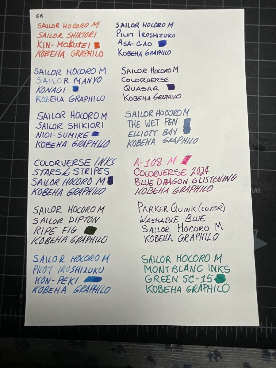
Ink Testing Pages 2026
- By Penguincollector,
- 0
- 0
- 77
-

TIPS2026
- By hari317,
- 0
- 0
- 55
-

TIPS2026
- By hari317,
- 0
- 0
- 100
-
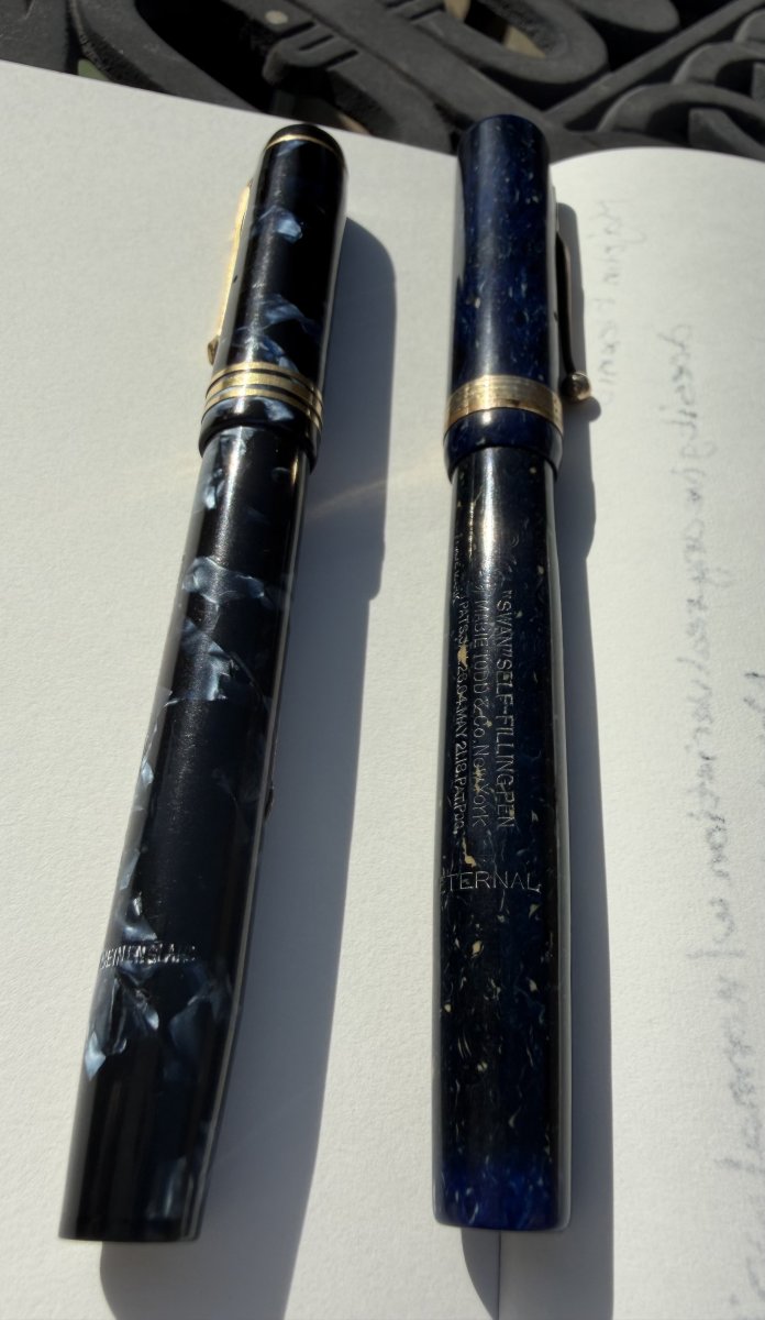
JasonR Photos
- By JasonR,
- 0
- 0
- 19
-


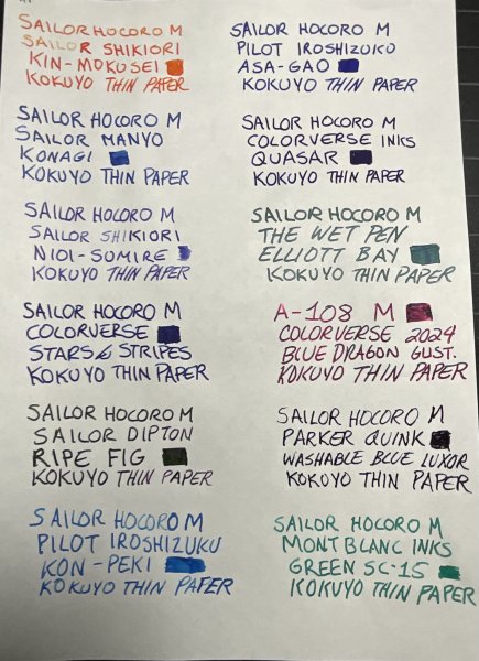


-
-
Most Contributions
-
 amberleadavis
43972 -
.thumb.jpg.f07fa8de82f3c2bce9737ae64fbca314.jpg) PAKMAN
PAKMAN
35687 -
 inkstainedruth
31772 -
 Ghost Plane
28220 -
 Bo Bo Olson
27748
-
-
Upcoming Events
-
Blog Comments
-
By Misfit · Posted
Oh to have that translucent pink Prera! @migo984 has the Oeste series named after birds. There is a pink one, so I’m assuming Este is the same pen as Oeste. Excellent haul. I have some Uniball One P pens. Do you like to use them? I like them enough, but don’t use them too much yet. Do you or your wife use Travelers Notebooks? Seeing you were at Kyoto, I thought of them as there is a store there. -
desaturated.thumb.gif.5cb70ef1e977aa313d11eea3616aba7d.gif)
By A Smug Dill · Posted
It's not nearly so thick that I feel it comprises my fine-grained control, the way I feel about the Cross Peerless 125 or some of the high-end TACCIA Urushi pens with cigar-shaped bodies and 18K gold nibs. Why would you expect me or anyone else to make explicit mention of it, if it isn't a travesty or such a disappointment that an owner of the pen would want to bring it to the attention of his/her peers so that they could “learn from his/her mistake” without paying the price? -

By szlovak · Posted
Why nobody says that the section of Tuzu besides triangular shape is quite thick. Honestly it’s the thickest one among my many pens, other thick I own is Noodler’s Ahab. Because of that fat section I feel more control and my handwriting has improved. I can’t say it’s comfortable or uncomfortable, but needs a moment to accommodate. It’s funny because my school years are long over. Besides this pen had horrible F nib. Tines were perfectly aligned but it was so scratchy on left stroke that collecte -

By stylographile · Posted
Awesome! I'm in the process of preparing my bag for our pen meet this weekend and I literally have none of the items you mention!! I'll see if I can find one or two! -
By inkstainedruth · Posted
@asota -- Yeah, I think I have a few rolls in my fridge that are probably 20-30 years old at this point (don't remember now if they are B&W or color film) and don't even really know where to get the film processed, once the drive through kiosks went away.... I just did a quick Google search and (in theory) there was a place the next town over from me -- but got a 404 error message when I tried to click on the link.... Ruth Morrisson aka inkstainedruth
-
-
-
Files
-


Recommended Posts
Create an account or sign in to comment
You need to be a member in order to leave a comment
Create an account
Sign up for a new account in our community. It's easy!
Register a new accountSign in
Already have an account? Sign in here.
Sign In Now