Jump to content

Sanzen Tomoe River behaving differently on each side of the sheet


Harold

Recommended Posts

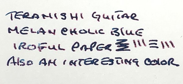
Have any of you tried Sanzen's Tomoe River and found that the colour reproduction is completely different between the front and the back of the paper? I was just writing on it with Pilot Iroshizuku Syo-ro & Ku-jaku, and I noticed that both inks look much greener on the backside of the paper than the front. It's so bad that when I compare the back of the page written with Ku-jaku to the front of the page written with Syo-ro, I have to look at the slight difference in saturation to be able to tell the two inks apart. Then when I compare the front of the page written with Ku-jaku to the back of the page written with Syo-ro, they are literally a complete shade(30 degrees on the colour wheel) apart.


Comparing Tomoegawa's old TR(or something similarly ink resistant like Kobeha's Graphilo) to Sanzen's TR, the colour reproduction of the old paper seems very close to the front side of the Sanzen paper. The back of Sanzen's paper is much more in line with pretty much any other decent-but-not-godly paper I own, like Rhodia or Kokuyo Sarasara. It really seems like the back of Sanzen's paper is more absorbent than the front. It really looks like some wild inconsistency in the sizing or calendering of the paper that is allowing more of the yellow paper colour to show through the ink on the back.

Link to comment
Share on other sites

  • Replies 4
  • Created
  • Last Reply

Top Posters In This Topic

  • Harold

    2

  • Baggins

    2

  • Karmachanic

    1

Top Posters In This Topic

You could be looking at a batch of machine 9 or 10 TR paper. When Sanzen made the deal, they took all the stock. I read there were problems when they moved TR from the num. 7 machine .

Link to comment
Share on other sites

11 hours ago, Baggins said:

You could be looking at a batch of machine 9 or 10 TR paper. When Sanzen made the deal, they took all the stock. I read there were problems when they moved TR from the num. 7 machine .

A good thought, but I'm 100% sure it's the new Sanzen-produced stuff.


4 hours ago, Karmachanic said:

It is common for recto and verso sides of a sheet to have different characteristiscs

Definitely; it's one of the many reasons I don't use Rhodia. I have not seen this much of a difference in any paper I've ever used though. It's the kind of colour shift you observe when viewing the same ink under yellow incandescent lighting versus bright white daylight. I can only conclude that I will be looking for a new notebook paper if this isn't just an issue with early batches of a new product they're still learning the ins and outs of.

Link to comment
Share on other sites

Yep. Rhodia! Does not only look different, it feels different to write on as well. Clairefountaine Triomphe is also afflicted by this. I think most papers will be. Please share if you come across any paper that does not have the 

Karmachanic  effect 😀

Link to comment
Share on other sites

Create an account or sign in to comment

You need to be a member in order to leave a comment

Create an account

Sign up for a new account in our community. It's easy!

Register a new account

Sign in

Already have an account? Sign in here.

Sign In Now


×
×
  • Create New...