Jump to content

Script size.


Darryl Foster

Recommended Posts

Untill recently I've been adapting my cursive  script size and writing pace  to suit whatever grade of  nib I use. However, I've now opted for using only one style for all nibs (EF-B western) I now write at a medium (to me, at least) size and pace. I am unsure, though, whether this style would suit a cursive italic or stub nib.

Edited by Darryl Foster
Addition.
Link to comment
Share on other sites

  • Replies 19
  • Created
  • Last Reply

Top Posters In This Topic

  • Darryl Foster

    10

  • amberleadavis

    3

  • txomsy

    3

  • arcfide

    3

Top Posters In This Topic

Posted Images

Why shouldn't it?


The relevant value here is the x-height. So, to know, just estimate the height of an average 'o' in the size you write now, and dividing this x-height by the number of nib widths in the script you want to use will give you the italic/stub nib width that will best match your current handwriting.


For example, italic is typically written at 5:5:5 (i.e. 5 nib-widths for the ascender, 5 for the x-height and 5 for the descender). So, if you write an 'o' that is 5mm high, then a 1.1mm italic should more or less fit your needs for italic writing at that size.


If you are to be ephemeral, leave a good scent.

Link to comment
Share on other sites

BTW, this led me to a search that raised the following interesting paper


https://www.researchgate.net/publication/256557704_Portuguese_Calligraphy_of_the_XVI_Century


and from it, led me to the following writing book


https://permalinkbnd.bnportugal.gov.pt/records/?refine[Creator][]=Barata%2C+Manuel%2C+fl.+15--

If you are to be ephemeral, leave a good scent.

Link to comment
Share on other sites

Thank you. I was refering to handwriting, rather than calligraphy but your reply certainly gave me an insight into the technicalities of calligraphy. Re. my italic and stub nibs: I'll just use my newly adopted style with them and see how it goes. The off-putting thing is all those YouTube videos which stress the importance of matching nib grade with size and pace.

Link to comment
Share on other sites

21 minutes ago, Darryl Foster said:

The off-putting thing is all those YouTube videos which stress the importance of matching nib grade with size and pace.


It makes sense to do so. Why is it off-putting? I mean, you can — and it is your perogative, to — insist on not making adjustments to your handwriting size and pace irrespective of the nib used, but certainly you wouldn't expect the outcomes to look the same, comparable, or “as good”, right?

I endeavour to be frank and truthful in what I write, show or otherwise present, when I relate my first-hand experiences that are not independently verifiable; and link to third-party content where I can, when I make a claim or refute a statement of fact in a thread. If there is something you can verify for yourself, I entreat you to do so, and judge for yourself what is right, correct, and valid. I may be wrong, and my position or say-so is no more authoritative and carries no more weight than anyone else's here.

Link to comment
Share on other sites

You have a point. I do get a little tired, though, of the slow pace I use when writing with a fine nib. But then, the script produced looks better than when I write quickly. I suppose I'll stick to my former regime...and stop doing SBREBROWN impersonations! 😅

Link to comment
Share on other sites

8 hours ago, Darryl Foster said:

Thank you. I was refering to handwriting, rather than calligraphy


The distinction between formal Italic "calligraphy" or Roundhand or Ornamental scripts and "normal" every day handwriting isn't actually too far off. In fact, many of these were in fact connected with a daily handwriting at one time, especially roundhand, and ornamental scripts, but nowadays, there's an even greater connection between modern Italic calligraphy and everyday writing, in no small part due to the influence of people like Lloyd Reynolds. 


For many of the modern "Italic handwriting" texts, the shapes and proportions of the letters are largely the same, but the ascenders and descenders are modified to be 1/2 of the x-height. So, for instance, Getty-Dubay and Briem Italic both teach their Italic handwriting with a more or less 1:2:1 ratio as discuss by @txomsy above. This lacks the extra "grace" that the long ascenders and descenders can give you, but it makes the writing a little more practical in every day. Even so, the idea of judging the height of your letters by the width of the nib is a good one. Briem uses a 3:2 box as its core, which can further help you gauge writing size. 


In my experience, stubs and italic nibs work well using the traditional height requirements, and possibly a little smaller for a stubbier style. That would put you at 4 - 5 nib widths for whatever the width of the nib happens to be. However, this is *not* really the right metric if you are using a ball tipped nib. With a stub nib, you get those thinner strokes as you transition from downstroke to downstroke, which lets you put the downstrokes more relatively close to one another without disturbing the weight of the letter. If you do this with a round tipped nib, you'll tend to create a very munged form. Thus, to help ensure enough whitespace through the letter, I'd go for a significantly greater nib width count if you are working with ball tipped nibs. In such cases, where Italic might be at a 5 nib width x-height for a stub nib, and with me being okay with going to 4 nib widths, I'd probably stick with 5 - 6 nib widths for a round tipped nib at the least, and maybe even go to 7 depending on the pen. 


Roundhand and Ornamental derived styles have a different set of restrictions, but you can apply the same general rules. Palmer, American Cursive, and French script all use a 2:1:2 ratio. New American Cursive, as a simplification of Zaner-Bloser Business Script, uses a 1:1:1 ratio.


Of course, you can go *much* larger and wider in your letter sizing, and people often do when they use a very fine nibbed pen. The disadvantage of this is that your writing can begin to look spidery and weightless, but that's a taste that you might like. 

Link to comment
Share on other sites

Thank you for such a detailed response : I must admit that all those ratios are quite new to me! I have some books on handwriting, but they fail to go into such detail. That said, I've gone back to my usual method of adjusting my script size and pace to suit the nib: increasing size and pace as the nib grade increases. I will, however, write at a slow pace when I use a stub or cursive italic nib - no matter what it's grade.

I am surprised that there is so much knowledge associated with handwriting - something that many take for granted. 

Link to comment
Share on other sites

You might want to check out this thread.


Fountain pens are my preferred COLOR DELIVERY SYSTEM (in part because crayons melt in Las Vegas).

Create a Ghostly Avatar and I'll send you a letter. Check out some Ink comparisons: The Great PPS Comparison 

Don't know where to start?  Look at the Inky Topics O'day.  Then, see inks sorted by color: Blue Purple Brown Red Green Dark Green Orange Black Pinks Yellows Blue-Blacks Grey/Gray UVInks Turquoise/Teal MURKY


Link to comment
Share on other sites

Also, here is my response with pictures.


Fountain pens are my preferred COLOR DELIVERY SYSTEM (in part because crayons melt in Las Vegas).

Create a Ghostly Avatar and I'll send you a letter. Check out some Ink comparisons: The Great PPS Comparison 

Don't know where to start?  Look at the Inky Topics O'day.  Then, see inks sorted by color: Blue Purple Brown Red Green Dark Green Orange Black Pinks Yellows Blue-Blacks Grey/Gray UVInks Turquoise/Teal MURKY


Link to comment
Share on other sites

Your second ref seemed to be making my point about retaining the same script size, no matter what grade nib. Strange how fps bring to light such facets of handwriting.

Link to comment
Share on other sites

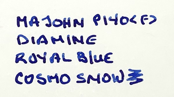
This is a sample of my handwriting to illustrate my point about varying script to suit the nib. I hope the quality of the picture, attached, is clear. To be frank, I was quite amazed at what a gusher the broad was as I haven't used it for a while - great fun, though!  

IMG_20220908_130018.jpg

Link to comment
Share on other sites

With writing as small as yours, I would expect that you could get away with the smaller sizes, but you might need to "upsize" when you are writing with Broads and above. Certainly writing with large stubs that are very wet might cause you some trouble with the medium sized script that you give. 

Link to comment
Share on other sites

I did increase the script size quite a lot when I used yhe TWSBI broad nib. Maybe it didn't show too well on the picture.

Link to comment
Share on other sites

On second thought maybe you're right. I've just checked and the increase isn't all that great! When using a broad and large stub and CI I'll just have to write larger. Amberleadavies, I think, posted a comment in which she said that muscle memory might be responsible - interesting. 

Edited by Darryl Foster
Addition.
Link to comment
Share on other sites

3 hours ago, Darryl Foster said:

On second thought maybe you're right. I've just checked and the increase isn't all that great! When using a broad and large stub and CI I'll just have to write larger. Amberleadavies, I think, posted a comment in which she said that muscle memory might be responsible - interesting. 


Don't forget that you can enlarge handwriting both in the x-height but also the character widths. I did notice your increased size for your Broad handwriting, but I was merely pointing out that you had considered using the same size for all nib widths, which, if you stuck with the medium script size, would probably have been too small for the broad nib had you not increased the size. However, even then, you have some places where the writing loses integrity here and there with the broad nib. I think in your case, simply making some of those elements wider would solve the issue. I'm specifically looking at your ascending loops, in "e", "k", and "h". Just widening out those loops a little bit would probably leave that size of script just fine in terms of x-height. Of course, that, to me, doesn't look like a particularly broad broad (I'm used to *much* wider nibs 🙂 ) . Otherwise, I don't think your instinct for sizing seems that off to my eyes, and it looks like a fine script. A little tweaking is I think all you would need to greatly enhance the overall aesthetic. It's not like some people I know whose writing is...well, in need of extreme surgery no matter what the tipping size. 

Link to comment
Share on other sites

Thank you for your suggestion. Yes, I did announce that I intended to maintain one script size for all nibs, but I went back to my usual method of adjusting my size and pace to suit the nib. That said, I think the size increase from EF-B is incremental rather than dramatic. (By EF I mean Japanese F). 

Incidently, I base my script style on a series of videos I watched a few years ago on YouTube called Milner Cursive. I added my own variations to suit myself. 

Link to comment
Share on other sites

i have to say that I do like your writing style. Looks great to me!

If you are to be ephemeral, leave a good scent.

Link to comment
Share on other sites

Thank you. It's certainly not calligraphy, but I feel the need to use such script whenever I write with a fp. My other style (none fp) is quite a scruffy form of print, but it is useful when I have ideas I need to write out quickly.

Link to comment
Share on other sites

@Darryl Foster for what it is worth, I really loved your penmanship with the F-C Cursive Italic nib.  Spectacular!

Fountain pens are my preferred COLOR DELIVERY SYSTEM (in part because crayons melt in Las Vegas).

Create a Ghostly Avatar and I'll send you a letter. Check out some Ink comparisons: The Great PPS Comparison 

Don't know where to start?  Look at the Inky Topics O'day.  Then, see inks sorted by color: Blue Purple Brown Red Green Dark Green Orange Black Pinks Yellows Blue-Blacks Grey/Gray UVInks Turquoise/Teal MURKY


Link to comment
Share on other sites

Create an account or sign in to comment

You need to be a member in order to leave a comment

Create an account

Sign up for a new account in our community. It's easy!

Register a new account

Sign in

Already have an account? Sign in here.

Sign In Now


×
×
  • Create New...