
-
Forum Statistics
357.5k
Total Topics4.7m
Total Posts -
Member Statistics
130,088
Total Members18,857
Most Online Newest Member
Spravkivzs
Joined -
Images
-
Albums
-
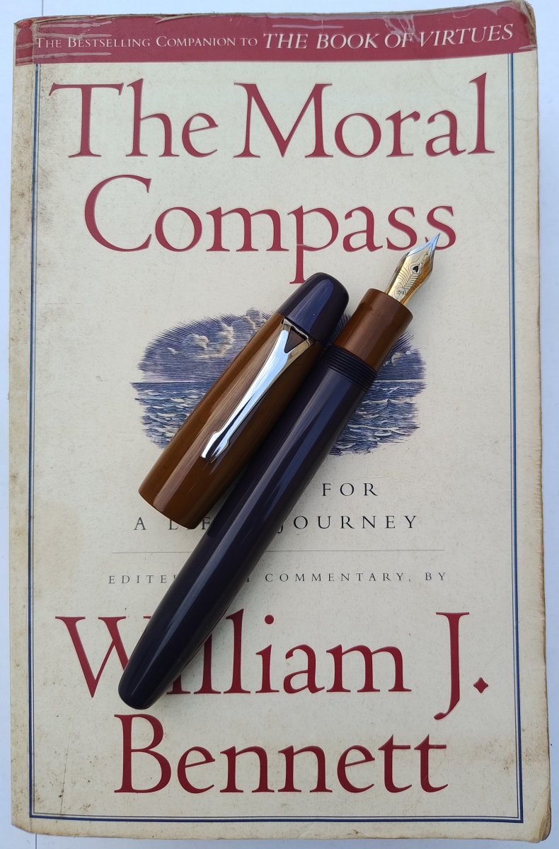
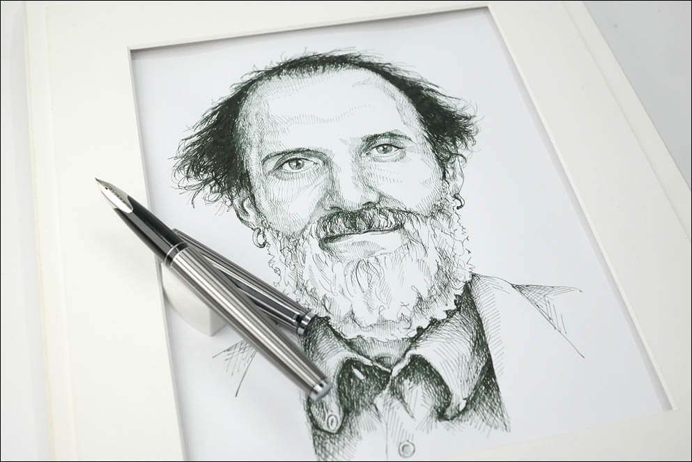
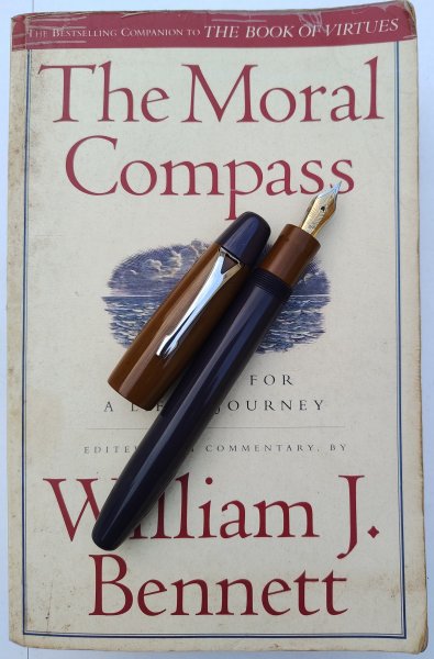
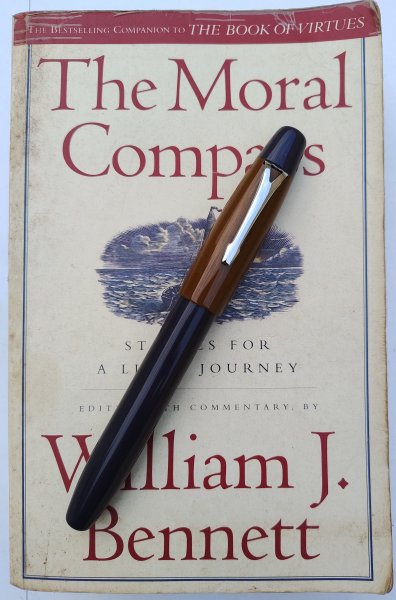
Pen Pics 4
- By K Singh,
- 0
- 0
- 10
-

Tintenlabor
- By yazeh,
- 0
- 0
- 57
-

USG 23
- By USG,
- 0
- 0
- 27
-
Andrew Lensky Arts II
- By Andrew_L,
- 0
- 0
- 4
-

Targa
- By Targa,
- 0
- 4
- 52
-


-
-
Most Contributions
-
 amberleadavis
43972 -
.thumb.jpg.f07fa8de82f3c2bce9737ae64fbca314.jpg) PAKMAN
PAKMAN
35396 -
 inkstainedruth
30669 -
 Ghost Plane
28220 -
 Bo Bo Olson
27744
-
-
Upcoming Events
-
Blog Comments
-

By Ceilidh · Posted
Ah, but how to get it processed - that is the question. I believe that the last machine able to run K-14 (Kodachrome processing) ceased to operate some 15 or so years ago. Perhaps the film will be worth something as a curiosity in my estate sale when I die. 😺 -

By Mercian · Posted
Take a lot of photos! If the film has deteriorated or 'gone off' in any way, you can use that as a 'feature' to take 'arty' pictures - whether of landmarks, or people, or whatever. -
By Ceilidh · Posted
My long lost twin! I thought I was the only one still hoarding so much film in the freezer (since the early 2000s). But digital gear has come a long way since then, and I finally converted a while ago. I'm planning to reclaim the freezer space, but I have no idea what to do with the film. -

By asota · Posted
...random aside - I still have some 30 rolls of unused, long-expired Kodachrome 64 film (35mm). They have been frozen since 2009. No idea why I have held on to them for this long, but I guess I'm hoping for a miracle. I too have never developed colour film but I still d&p my B&W to this day. As a passion, of course. -
By inkstainedruth · Posted
Thanks for the info (I only used B&W film and learned to process that). Boy -- the stuff I learn here! Just continually astounded at the depth and breadth of knowledge in this community! Ruth Morrisson aka inkstainedruth
-
-
-
Files
-


Recommended Posts
Create an account or sign in to comment
You need to be a member in order to leave a comment
Create an account
Sign up for a new account in our community. It's easy!
Register a new accountSign in
Already have an account? Sign in here.
Sign In Now