Jump to content

My Lettering


camoandconcrete

Recommended Posts

Hi all,


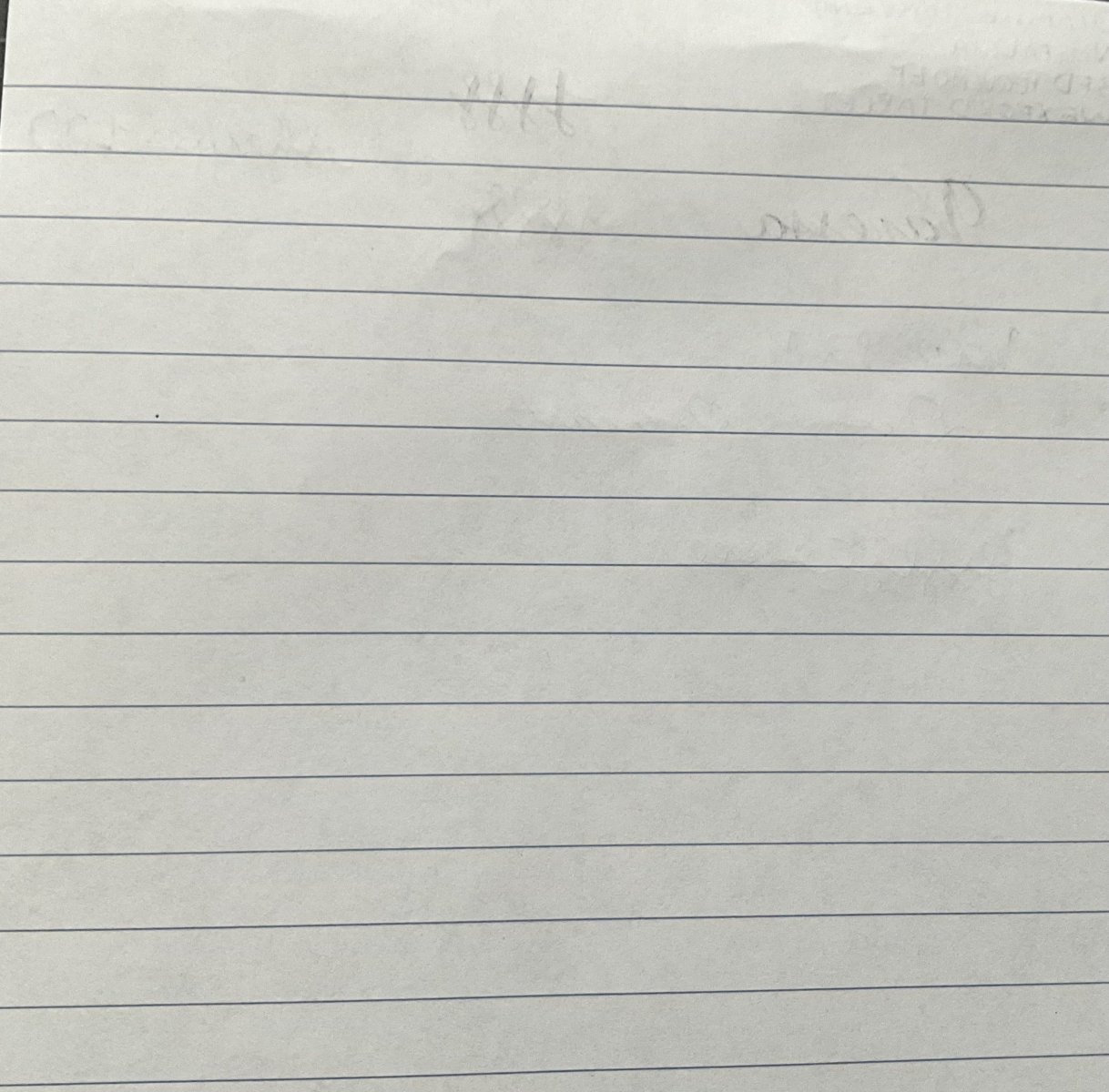
I just thought I'd post a sample of my lettering. I get compliments on it and I like it but I feel it can be a lot better. Normally I use oblique nibs to get the line variation but am thinking of having a triple B nib reground into an architect's point so I can get these results quicker and easier. I want to give my handwriting an even more stylized yet legible appearance. Anyway, if anyone has any tips on how to improve my lettering I'd appreciate it.


http://i794.photobucket.com/albums/yy224/jckrr24/scan0003.jpg?t=1264312965

Edited by MiamiArcStudent
Link to comment
Share on other sites

  • Replies 5
  • Created
  • Last Reply

Top Posters In This Topic

  • camoandconcrete

    2

  • Randal6393

    1

  • thomasdav

    1

  • NickKH

    1

Popular Days

Top Posters In This Topic

The hand looks organised but i'd like to see how the small letters would be. After all we use small letters more common than capitals.

Link to comment
Share on other sites

If you're happy with the way you write and enjoy it, then that's the most important thing - no need to improve just because others can write fancier. The only suggestions I have for your writing as it is is that some of the A's look a bit like angled F's or P's (compare the two in 'architrave'), I'd personally work on keeping the same angles there but making sure the second 'leg' of the letter comes down farther than the horizontal 'crossbar'. The thing that I try to work on the most with my capitals isn't to do with their appearance at all, but the speed at which I can write with them.


Another thing that occurred to me that you might want to try would be to add just a tiny right-hand line at the top of your letter I's (think of a capital T without the bit to the left of the vertical line).


(I deliberately tried to avoid using typographic jargon here, to make it as accessible as possible)

More of a lurker than a poster.


Daily Writers:

- Charcoal Lamy Safari (EF) - Filled with Aurora Blue

- Waterman Phileas (EF) - Filled with Noodler's HOD


Link to comment
Share on other sites

Not a bad set of capital letters. If you want to spice up the look, check into Father Catich's book on Roman letters. (Hope I got that one right -- not in my library at the current time.)


Also look at Ann Finley's pinned messages at the top of this (Penmanship) thread. She shows the Italic forms for capitals as well as small letters. The flourishing can be dropped, her capitals are clear and follow the traditional style. Think you might benefit from learning the whole Italic script.


Enjoy,

Yours,
Randal

From a person's actions, we may infer attitudes, beliefs, --- and values. We do not know these characteristics outright. The human dichotomies of trust and distrust, honor and duplicity, love and hate --- all depend on internal states we cannot directly experience. Isn't this what adds zest to our life?

Link to comment
Share on other sites

As a stylized form of writing, I like it. It has a sort of 1920s deco look. What is an architect's point?


Karen

http://farm1.static.flickr.com/51/166782921_39063dcf65_t.jpg

Link to comment
Share on other sites

As a stylized form of writing, I like it. It has a sort of 1920s deco look. What is an architect's point?


Karen


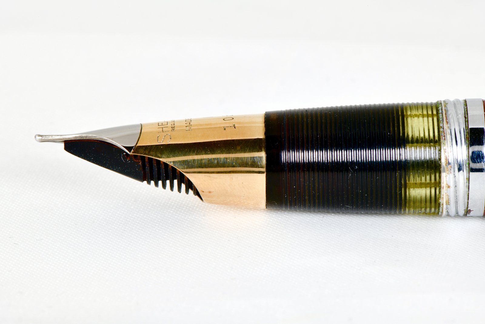
An architect's point is basically a nib that is shaped like the tip of a sword. The vertical strokes will be super-thin, almost as much as .05mm. And the cross strokes will be super-thick, as much as 1mm or more depending how broad the originally nib was.

Link to comment
Share on other sites

Create an account or sign in to comment

You need to be a member in order to leave a comment

Create an account

Sign up for a new account in our community. It's easy!

Register a new account

Sign in

Already have an account? Sign in here.

Sign In Now


  • Most Contributions

    1. amberleadavis
      amberleadavis
      43972
    2. PAKMAN
      PAKMAN
      35520
    3. inkstainedruth
      inkstainedruth
      31116
    4. Ghost Plane
      Ghost Plane
      28220
    5. Bo Bo Olson
      Bo Bo Olson
      27746
  • Upcoming Events

    No upcoming events found
  • Blog Comments

    • stylographile
      Awesome! I'm in the process of preparing my bag for our pen meet this weekend and I literally have none of the items you mention!! I'll see if I can find one or two!
    • inkstainedruth
      @asota -- Yeah, I think I have a few rolls in my fridge that are probably 20-30 years old at this point (don't remember now if they are B&W or color film) and don't even really know where to get the film processed, once the drive through kiosks went away....  I just did a quick Google search and (in theory) there was a place the next town over from me -- but got a 404 error message when I tried to click on the link....  Ruth Morrisson aka inkstainedruth 
    • alkman
      There is still chemistry for processing regular chrome (positive) films like Kodak Ektachrome and Fuji Velvia, but Kodachrome was a completely different and multistep beast. 
    • Ceilidh
      Ah, but how to get it processed - that is the question. I believe that the last machine able to run K-14 (Kodachrome processing) ceased to operate some 15 or so years ago. Perhaps the film will be worth something as a curiosity in my estate sale when I die. 😺
    • Mercian
      Take a lot of photos!   If the film has deteriorated or 'gone off' in any way, you can use that as a 'feature' to take 'arty' pictures - whether of landmarks, or people, or whatever.
  • Chatbox

    You don't have permission to chat.
    Load More
  • Files


×
×
  • Create New...