Search the Community
Showing results for tags 'ratnamson vs ratnam'.
Found 1 result
-

The Indian FP Series — Part 2: Ratnam Supreme × Ratnamson Supreme
Spkpraneeth posted a topic in India & Subcontinent (Asia)
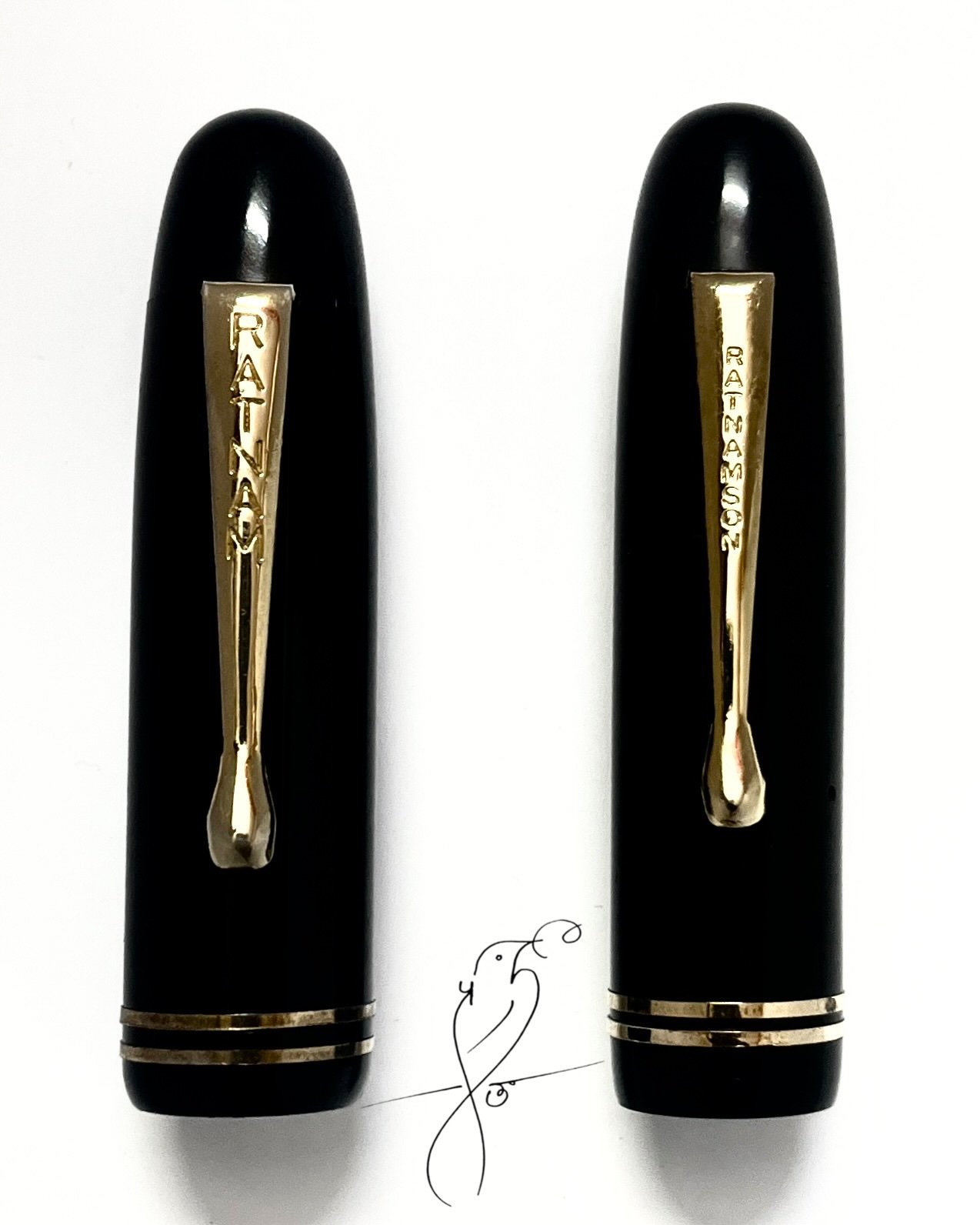
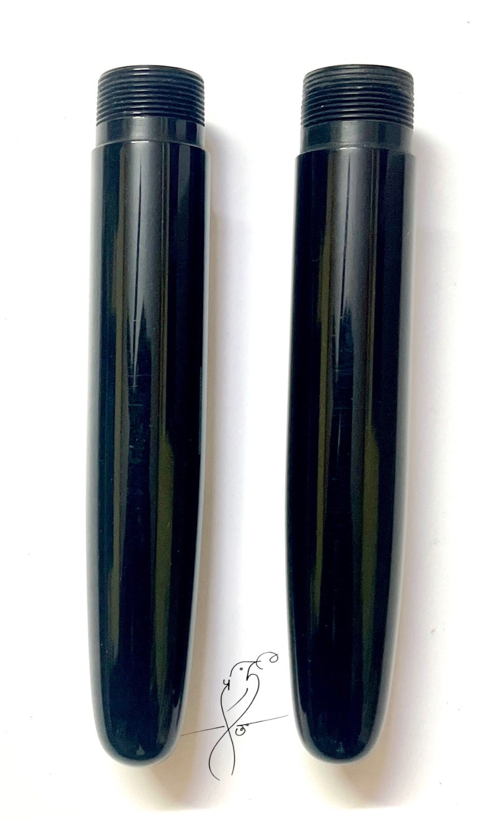
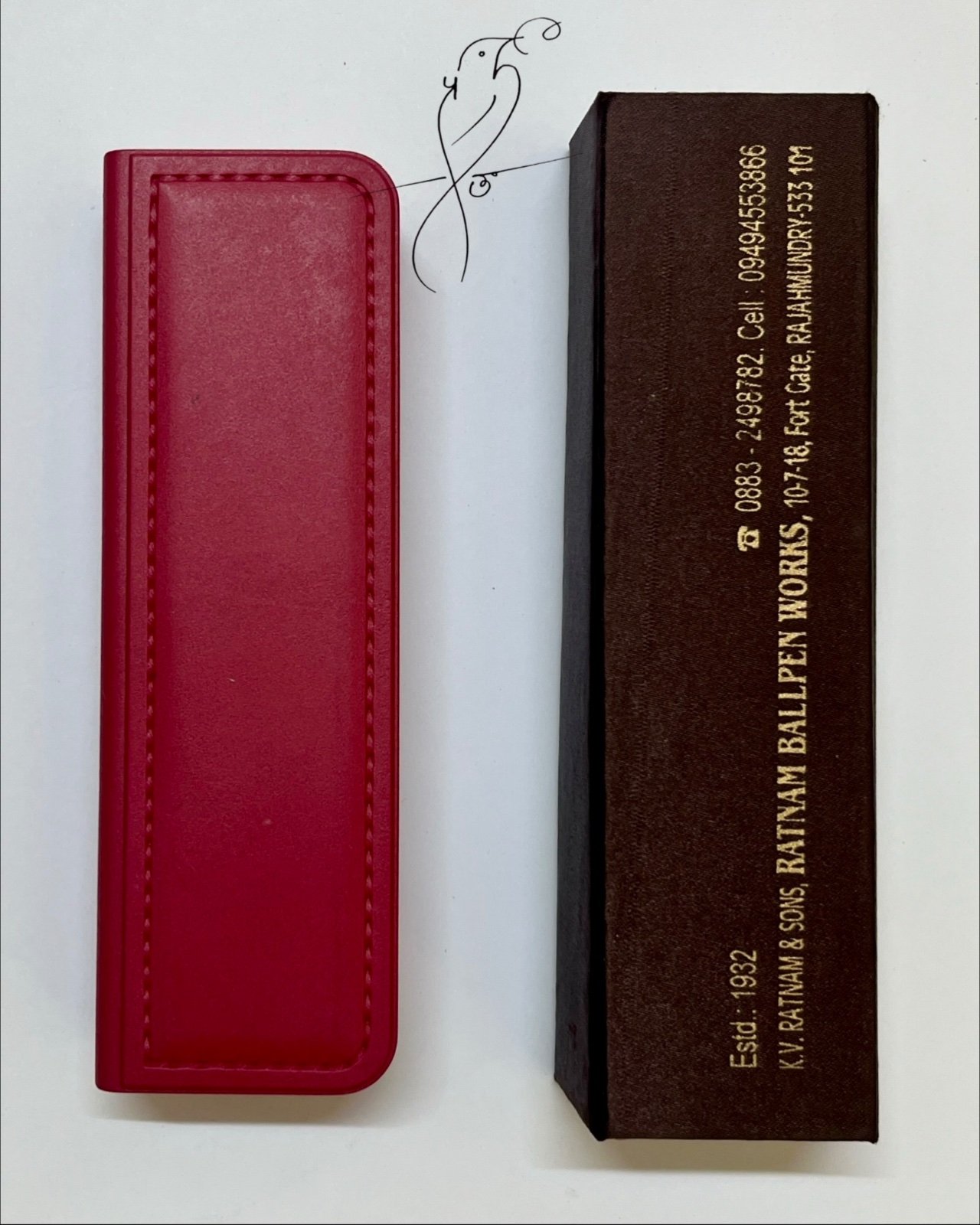
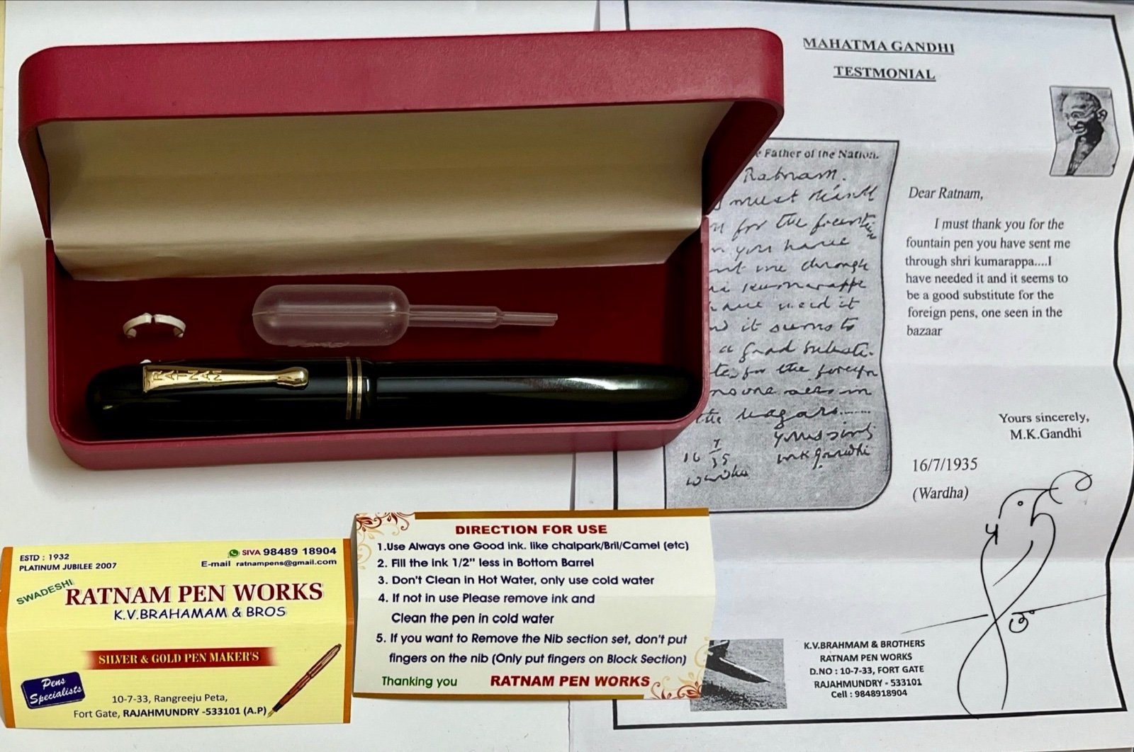
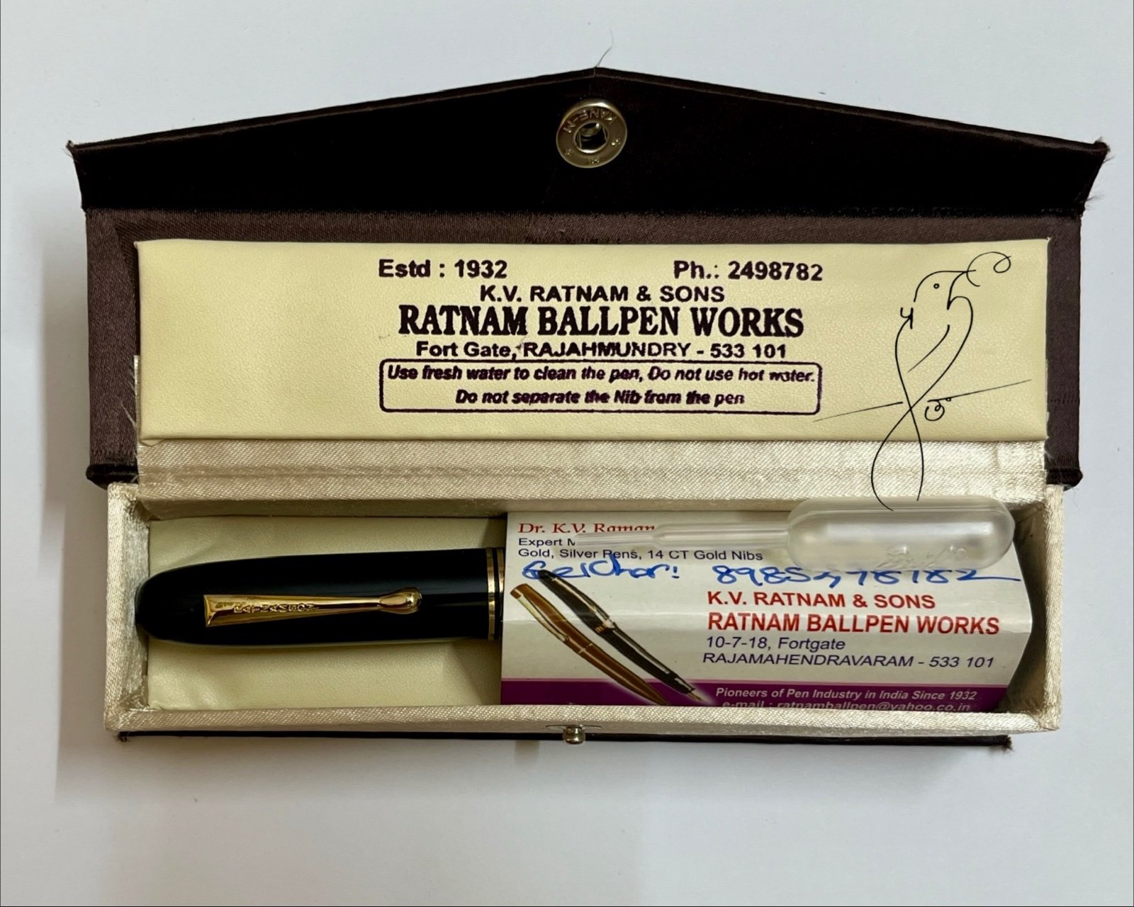
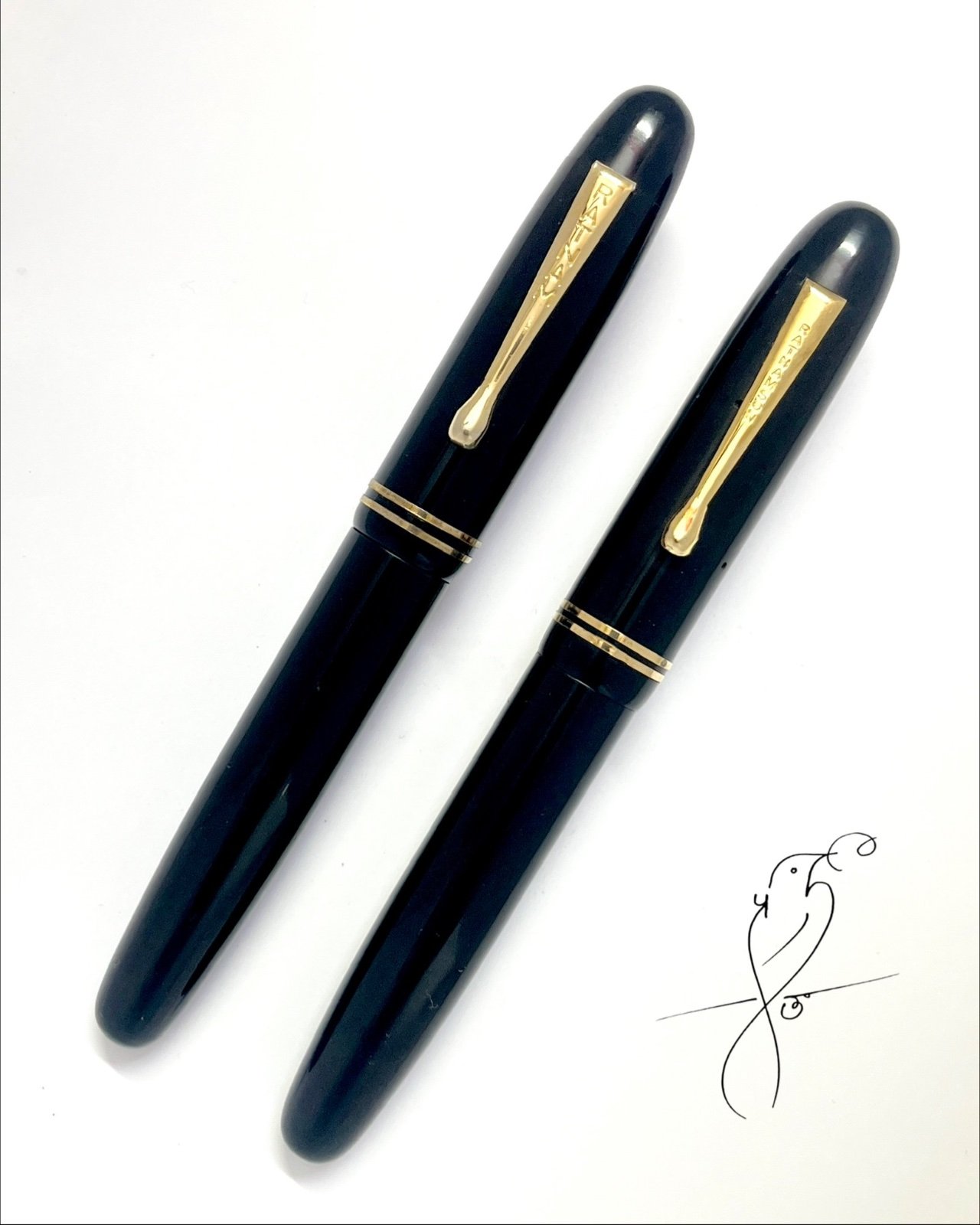
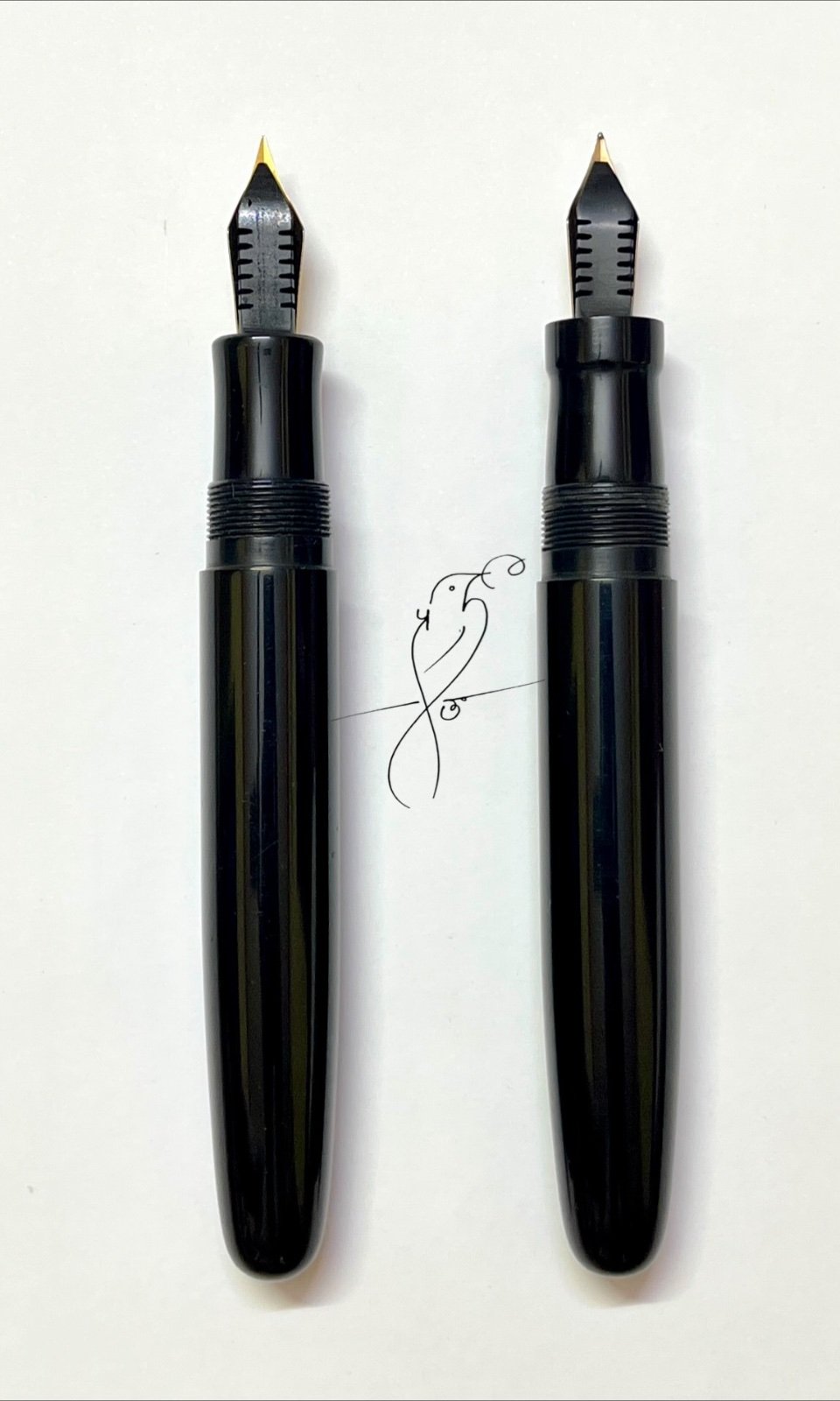
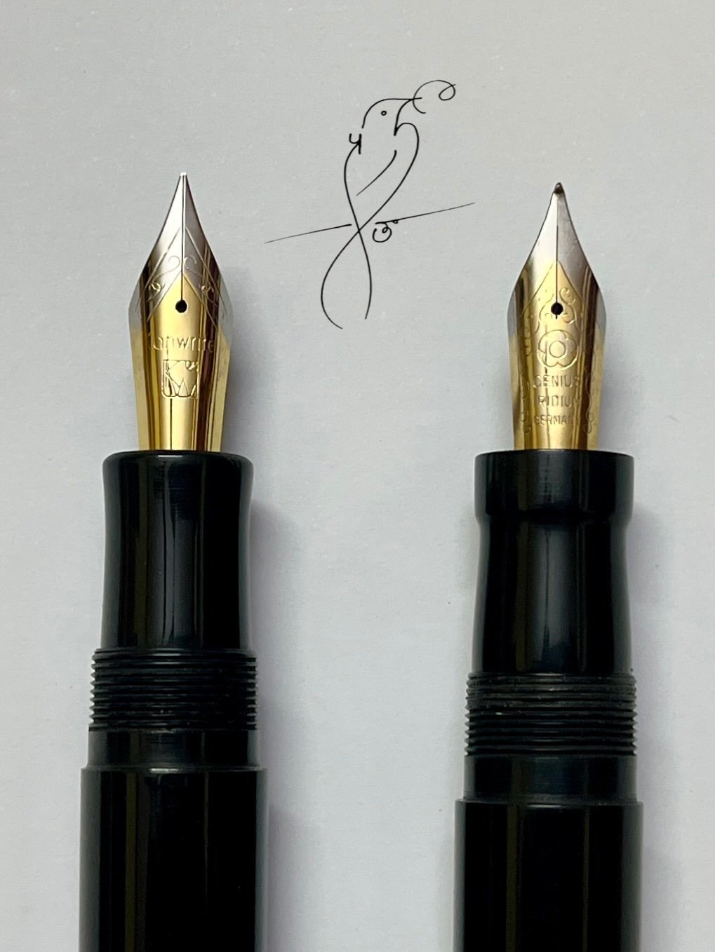
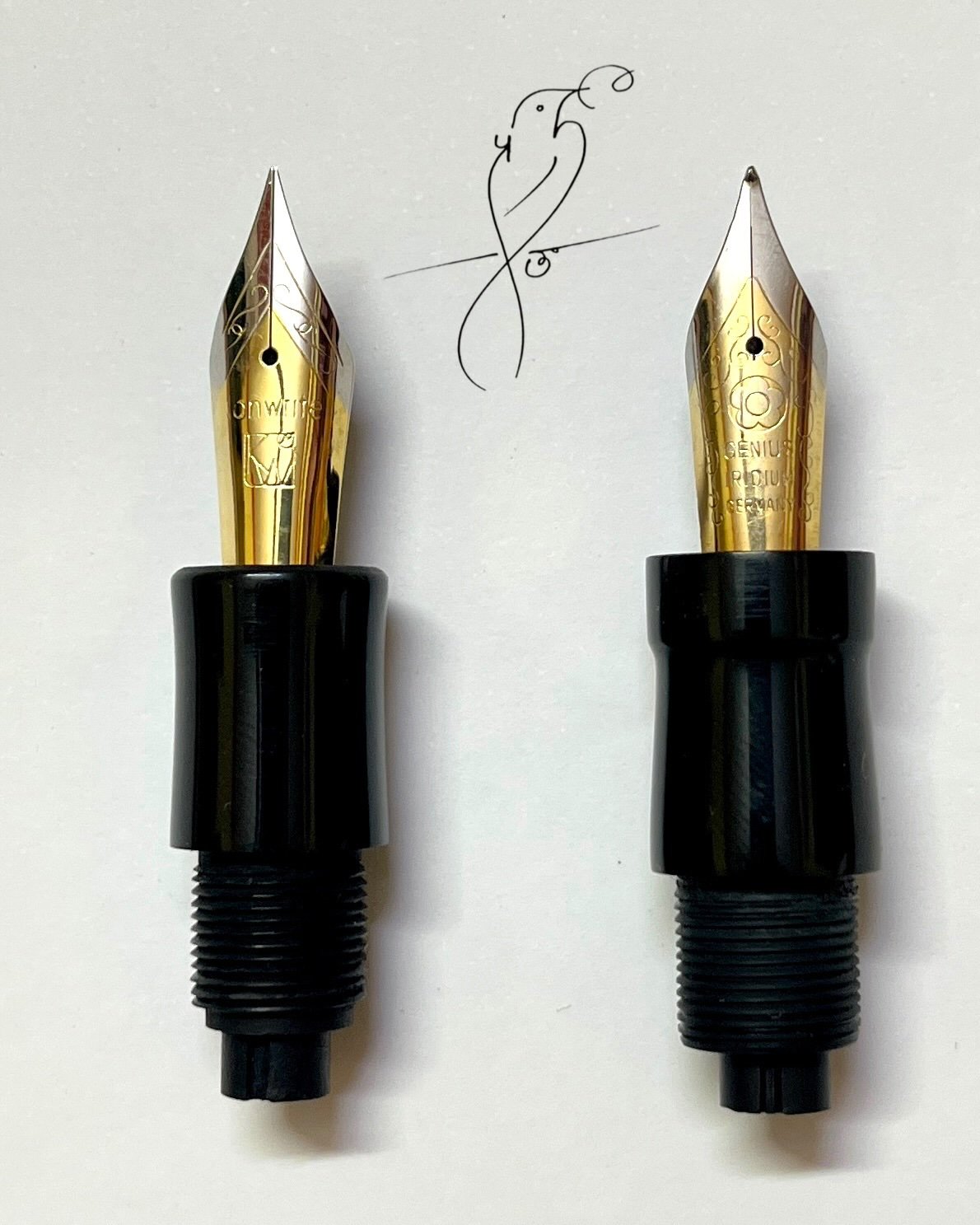
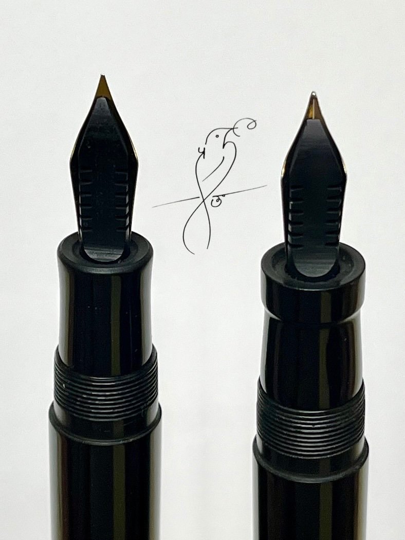
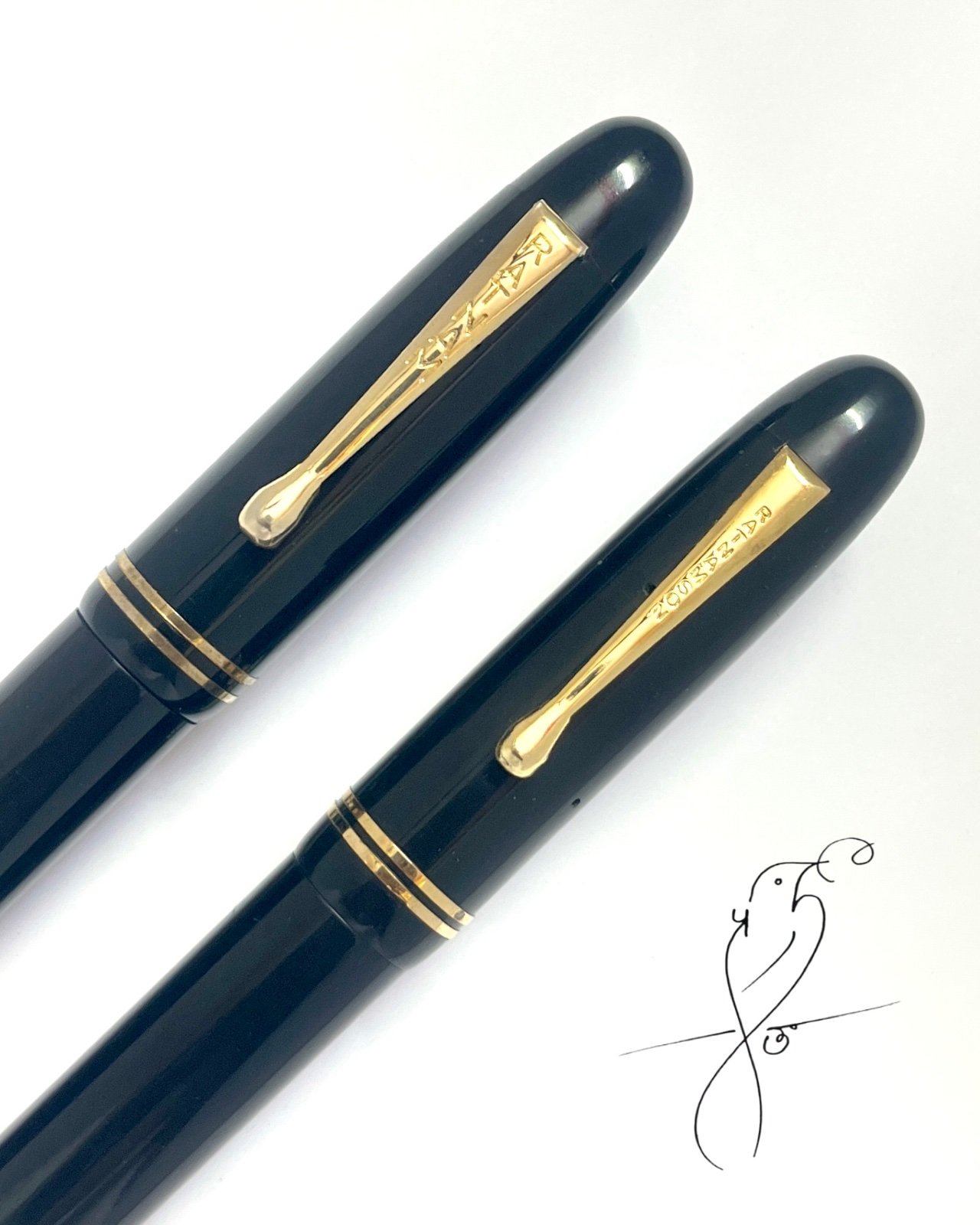
In this part of The Indian FP Series, I wanted to compare two pens that are, in many ways, reflections of the same legacy — the Ratnam Supreme and the Ratnamson Supreme. At first glance, both appear almost identical. Same torpedo silhouette, same heritage, same vintage inspired design language. Yet, once uncapped and held in hand, the subtle differences begin to emerge. What makes this comparison interesting is not simply the aesthetics, but how two pens sharing the same lineage can still offer distinctly different writing experiences. Pen Box & Presentation The Ratnam Supreme arrived in a simple red plastic jewellery-style presentation box. Inside the box were: The Ratnam Supreme fountain pen A Ratnam Pen Works card Ink filling instructions A copy of the famous letter from Gandhi ji Bril Ink piller The inclusion of the Gandhi letter adds historical and emotional context to the pen, reminding us of the Swadeshi roots associated with the Ratnam name. The Ratnamson Supreme came in a custom cloth-covered cardboard box with the company name printed on it, giving it a slightly more curated presentation. Inside the box were: The Ratnamson Supreme fountain pen A K.V. Ratnam & Sons / Ratnam Ball Pen Works card Bril ink piller The presentation felt more contemporary, while still retaining the traditional handmade charm associated with these pens. Capped — A Closer Look at Two Torpedo Classics Placed side by side, the similarities between the two pens are immediately evident. Both pens share a classic torpedo silhouette and a vintage Indian ebonite aesthetic, making them feel visually connected despite originating from different workshops. Identical cap and barrel — This is precisely why the two “Supreme” models often feel like twins at first glance. However, uncapping them is where the story begins to change. Uncapped — Where It Gets Interesting With the caps removed, subtle distinctions begin to quietly reveal themselves. Although both pens originate from the same broader lineage, they are products of different workshops and different approaches to hand-finishing. The differences are not dramatic, but they are enough to noticeably influence the feel in hand. Section Close-Up — Where the Real Difference Lies This, to me, is the defining distinction between the two pens. The Ratnam Supreme features a smoother, hourglass-shaped section that gently melts into the grip. The Ratnamson Supreme, in contrast, has a straighter section with a sharper step before the nib, resulting in a more defined and tactile grip feel. It is a subtle visual difference, but ergonomically the contrast becomes immediately noticeable in hand. This is where the comparison shifts from “looks” to “feel”. Nib & Feed The Ratnam Supreme originally came fitted with a Jinhao #6 nib, which I later replaced with a #6 Kanwrite dual-tone nib. The Ratnamson Supreme was fitted with a #6 Genius Iridium Germany dual-tone nib from the factory. Despite the difference in nibs, both pens perform well and complement the overall character of the pens nicely. Both pens use a standard Indian-style ebonite feed. Recessed Ink Relief Groove One small but interesting design element is the recessed circular groove around the nib and feed area. This groove appears to act as a buffer zone, helping prevent excess ink from migrating from the nib and feed area toward the section during filling or extended writing sessions. It is a subtle but thoughtful functional detail that adds to the practicality of the design. So What’s the Difference? Despite sharing nearly the same design language, both pens communicate differently in hand. Ratnam Supreme Smooth hourglass-shaped section Softer transition into the grip Feels rounded and flowing Suitable for people who prefer to hold the pen closer to nib. Ratnamson Supreme Straighter section profile Sharper step near the nib More tactile and defined grip sensation Suitable for people who prefer hold the pen slightly higher. Neither approach is objectively better — it simply depends on what one prefers during long writing sessions. The Ratnam Supreme and Ratnamson Supreme are not merely similar pens from related makers. They feel like two interpretations of the same legacy. Same soul. Same torpedo silhouette. Different conversation in hand. Ratnam & Ratnamson — divided by lineage, united by craft. And that, perhaps, is what makes comparing them so fascinating. Which one would you choose?