Search the Community
Showing results for tags 'blue-grey ink'.
Found 3 results
-
Wearingeul – Moby Dick I’m sure I have more than enough inks already, but sometimes an opportunity rises to explore a new brand that wasn’t on my radar before. Some time ago Scrittura Elegante – a stationery shop from the Netherlands – announced that they would stop their business. Definitely a sad thing: this lovely little webshop carried some interesting and lesser-known brands, with Wearingeul being one of them. They started a sale to empty the warehouse, and I took this opportunity to place a last order, loading up on couple of Wearingeul inks. Wearingeul is a stationery brand from South Korea, that gets its inspiration from arts & literature. In their own words: “We re-interpret novels and poetry with colors. You can find characteristic inks with stories and also notes/papers which are suitable for ink users.” Moby Dick is inspired by Herman Melville’s iconic sea story of captain Ahab’s maniacal quest for vengeance against the great white sperm whale that bit off his leg. I must admit I never got around to reading the novel, but the 1956 black&white movie with the legendary Gregory Peck made an indelible impression on my mind. This Wearingeul ink perfectly captures the atmosphere of a storm-swept Pacific Ocean with its pale blue-grey colour. This is the third Wearingeul ink I tried, and I begin to see a pattern. This brand produces inks that seem to be personalized for my taste – pale, muted, toned-down and with sublime looks. But at the same time these are difficult inks, stubborn and unwilling to comply with just any random fountain pen or paper. Moby Dick is no exception: the ink looks absolutely gorgeous in a wet pen on pure white paper. Much too pale and under-saturated though for use with dry writers (like the Lamy Safari), where it is sure to disappoint. But spend some time with the ink, and you’ll stumble across just that right combination of pen and paper, with the ink fully capturing that stormy sea atmosphere. I totally love it! Wearingeul Moby Dick writes extremely light and unsaturated, being quasi useless with dry-writing pens – especially in finer nibs. When paired with wet pens, the saturation increases, and the ink’s colour comes to its full glory. Pale blues and yellow/creamy paper don’t go together well, and this ink is no exception: on such paper the ink looks underwhelming, suffering from the yellow shining through. But on pure white paper… absolutely beautiful! To illustrate the colour span of this Wearingeul ink, I did a swab on 52 gsm Tomoe River paper, where I really saturated portions of the paper with ink. Moby Dick shows a very wide saturation range, from a really faint light-blue up to a much more saturated stormy sea-blue-grey with a bit of a purple undertone. This wide contrast range makes it a strong shader. If you like heavy shading, use a wet pen with a stub nib. Myself I prefer the F-nib on a wet pen to bring the shading into my personal tolerance zone. On the smudge test – rubbing text with a moist Q-tip cotton swab – the ink behaved perfectly. There is no visible smearing at all. If you look very closely, you’ll see that smearing does occur, but due to its wispy-light-blue nature it’s almost invisible to the eye. Water resistance is mostly absent: a faint grey residue remains, but not enough to easily reconstruct your writing. The chroma clearly shows the grey, blue and purple dyes used in the ink’s composition, which together combine to form Moby Dick’s unique colour. A splendid job by Wearingeul’s ink masters! I’ve tested the ink on a wide variety of paper – from crappy Moleskine to high-end Tomoe River. On each scrap of paper I show you: An ink swab, made with a cotton Q-tip 1-2-3 pass swab, to show increasing saturation An ink scribble made with my F-nib Laban Rosa Lilac fountain pen The name of the paper used, written with an F-nib Parker Sonnet A small text sample, written with the F-nib Laban pen Source of the quote, written with an Edison Collier with 1.1 nib Drying times of the ink on the paper (with the Laban pen) Moby Dick is mostly useless with my standard Safari test pens: it writes way too under-saturated and with bad lubrication. It did write nicely with the B-nib Safari though, where it reaches the saturation level that this ink needs to shine. The ink didn’t like high-quality Japanese coated paper with its ultra-smooth surfaces: this type of paper isn’t ink-hungry enough, and capillary action is insufficient to suck enough fluid out of the pen. Also, the whiter the paper the better: the pale blue-grey needs that neutral white backdrop to really shine. All in all a quirky ink that you need to spend some time with to discover its goldy-locks zone. I used photos for the writing samples above to get the most accurate results. In scans, the contrast gets blown up, and looks totally unrealistic – see the scan below. My scanner really messed this one up! Below you’ll find some zoomed-in parts of writing samples. Unfortunately for me, Moby Dick doesn’t seem to like my Paperblanks journal, exhibiting visible feathering with the 1.1 Edision Collier. Damn! Writing with different nib sizes The photo below shows the effect of nib sizes on the writing (written on Rhodia N°16 80 gsm paper). The initial lines were written with Lamy Safaris. Wearingeul Moby Dick is definitely no good match for the dry Safari pens – only the B-nib turned out to be usable. With the other Safari nibs, the ink is almost as pale as the square grid backdrop. But the ink really shines with the wet-writing pens. It takes some time and effort to find this perfect pairing, but it’s definitely worth it: the end result looks wonderful – a soft, muted, pale sea-blue-grey that is a feast for the eye. Related inks To compare this Wearingeul Moby Dick with related inks, I use my nine-grid format with the currently reviewed ink at the center. This format shows the name of related inks, a saturation sample, a 1-2-3 swab and a water resistance test – all in a very compact format. Moby Dick is like no other blue in my ink collection. It stands on its own, making it all the more precious. Inkxperiment – LOST and found (part 1) As a personal challenge, I try to create interesting drawings using only the ink I’m reviewing. I really enjoy the couple of hours I spend on these monochrome little paintings – experimenting with the ink to see all the shades that can be extracted from it. Inspiration for this drawing comes from the Witcher 3 game I’m currently playing, with a Mountain Troll chasing after a damsel in distress. In this first drawing, the troll emerges from its cave, angry and confused … where is that delightful morsel of tender meat that disturbed my rest? For the moment that fair maiden appears to be LOST… I started with an A4 piece of HP photo paper. I first used some washi tape and a paper mask to cover parts of the drawing. Next, I drew in the central background with water-diluted ink applied through a kitchen towel. Top and bottom parts were coloured in with cotton swabs. Finally I drew in the troll figure with a glass dip pen, and added some finishing touches with pure Moby Dick. The resulting picture shows what can be achieved with this Wearingeul ink in a more artistic context. Oh… and I made a beginner’s mistake: I should have left the cave mouth white to provide more contrast in the drawing (instead of also colouring it blue). And photo-paper is really unforgiving – there’s no way to correct your mistakes 😉 Inkxpired – computational art I love experimenting with pen/ink/paper and have added another layer as part of the hobby. I’m exploring computational art, inspired by the ink drawings I do during ink reviews. Another fun offshoot of the hobby… and all that starting with a few drops of dye-coloured water on paper. I started by using a “focal zoom” filter centered on the troll, that softened up the picture a bit. Next I used an extreme over-exposure filter, and shifted the colour to a greener hue. The added contrast definitely makes the painting look more lively. Conclusion Wearingeul Moby Dick totally delivers on the colour front – a soft pale-blue-grey that simply looks wonderful on not-too-smooth good-quality white paper. But it’s also a difficult ink with a narrow goldilocks zone: you need exactly the right combination of pen, nib and paper to extract that beautiful pale blue-grey stormy sea-feel in all its glory. It makes you totally forget the dark side of this ink – sub-par lubrication, too unsaturated, a bit sick-looking on yellow paper. I personally love this ink, but can absolutely imagine that it’s not for everyone. Technical test results on Rhodia N° 16 notepad paper, written with Laban Rosa Lilac, F-nib Backside of writing samples on different paper types
-
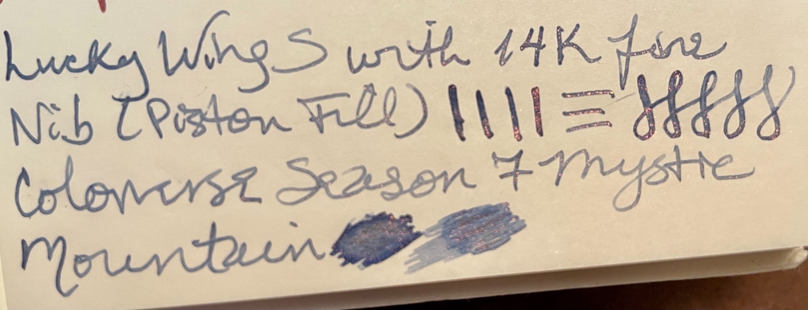
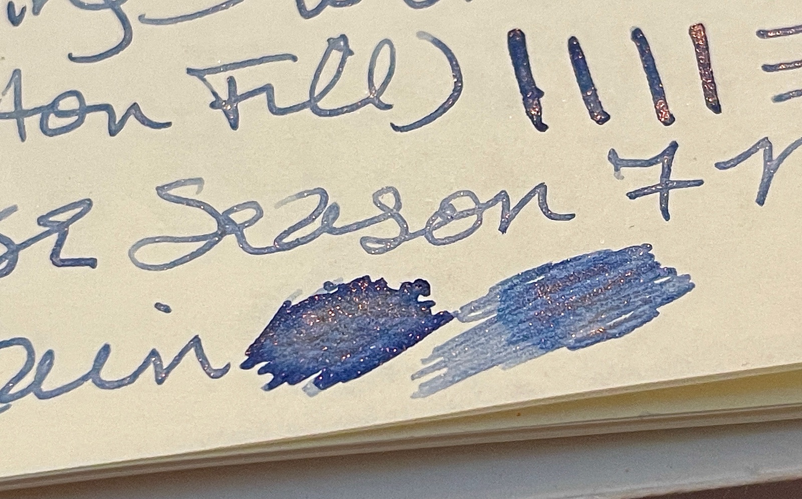
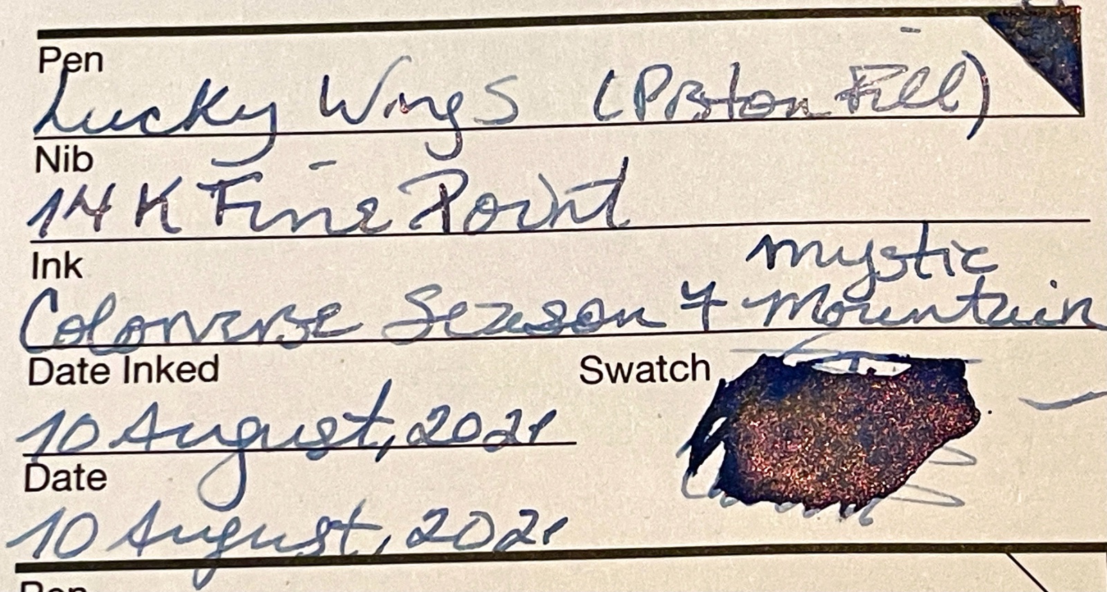
I just cracked open my new bottle of Colorverse Season 7 Mystic Mountain and I am loving the blue-grey ink with mauve shimmer. It comes, of course, in the smaller bottle along with the larger bottle of Pillars of Creation. Does anyone know if this ink will be offered in a stand-alone or mini-bottle? Ruth

-
Today I'm reviewing Diamine Prussian Blue A blue-grey or blue-black ink from the standard range, Diamine Prussian Blue is a nicely saturated colour with a vintage look to it. It’s darker, less green leaning and more saturated than Indigo, and it flows better and feels more lubricated when writing across the page. Prussian Blue was the first modern synthetic pigment. It’s a dark blue pigment also known as Berlin Blue or, in painting, Parisian or Paris Blue. It’s prepared as a very fine colloidal dispersion because the compound is not soluble in water. Prussian Blue is also the traditional “blue” in “blueprints” and as the basis for “laundry blueing.” (Source - Wikipedia) I filled my Lamy Safari and my Lamy NexxM converters with it. Then left them on my table for a few days. When I went back to the pens, they both started writing straight away. No hard starts. They didn't skip once. It exhibited excellent shading and it didn’t feather or spread on any of the papers I used it with. It didn’t show through on the HP paper either. Although it showed through slightly on some the papers listed, it didn’t show through as much as the scans suggest, and you can easily write on the reverse of all of the papers I used it with. It's not sold as a waterproof ink but showed some water resistance. Flow Rate: Good - neither particularly wet nor dryLubrication: Good - felt smooth across the pageNib Dry-out: Not noticed.Start-up: Immediate.Saturation: SaturatedShading Potential: Shading seen especially with F nib.Sheen: None noticed, though I’ve seen sheen in some pictures.Show-Through:Clairefontaine CrokbookField NotesHobonichi Techo paper.Tomoe River 52gsm paper (not very much)Spread / Feathering / Woolly Line: Not seen on any paper even Field NotesNib Creep / “Crud”: Not seen, even after over 1 week in the penStaining (pen): Not seen after several days - very easy clean-upStaining (hands): Very easy clean-up off of skin.Clogging: Not seen.Water resistance: Not sold as waterproof, but shows good water resistance.Availability: Available in 80ml and 30ml bottles plus cartridges from Diamine Inks web-site and many other outlets.