Jump to content

Parker Challenger


superfreeka

Recommended Posts

Up for review: 1939 Parker Challenger in Black and Grey Celluloid (4th Pen, at the bottom)


post-15925-1231307927_thumb.jpg


Background: I've been using this pen for a solid seven months now for classroom notes, signatures and general writing under just about every condition I think a pen may reasonably be made subject to. I'd like to note now that the construction of the pen is solid - really solid. Not weight-wise or anything to that effect; I mean the pen just oozes quality manufacturing.


First Impressions: I purchased the pen for $40 shipping included from a fellow member of the FPN. Its looks enthralled me, and when I found out that it was within the upper limits of my student budget, I simply had to have it. The pen initially arrived well-packaged and ready to write. I was impressed with the pen's appearance right from the get-go.


Score: 6/7


Disclaimer: I am not the kind of guy who likes thought and $ put into the packaging of a pen, so the lack of a true presentation experience did not hurt the score. This is just a personal preference.


post-15925-1231308994_thumb.jpg


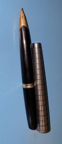
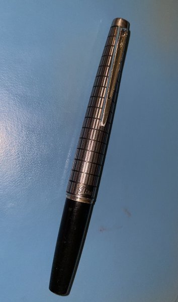
Appearance and Design: Mottled white, gray and black celluloid comprise the body and cap of the pen. Silver accents adorn the clip and cap band. On my particular example, the plating has begun to show some moderate brassing, but this is to be expected on a 70 year old pen. The clip is very well done, with a fair sized metal ball on the end of the arm. The clip performs flawlessly - not too loose, not too tight, and most importantly, not at all wobbly. The word "PARKER" is stamped prominently on the face of the clip. The gripping section is plastic, and I'd imagine it would get slippery if it wasn't for the upward slant of the end of the section. This slant retards your hand from coming off the section and onto the nib.


The nib itself is fairly pedestrian and unadorned, sans an inscription proclaiming "PARKER PEN - Made in U.S.A." with a production code underneath that I'm not able to make out clearly at the moment. The nib is copper in color.


Very classy design. Excellent overall feel and ergonomics.


Score: 7/7


post-15925-1231309099_thumb.jpg

(Slightly different Red version)


Size and Weight: I would say that the pen is a true medium weight and of average section girth. It is easily usable both posted and unposted. I prefer posted, but that's a personal choice. A very nice pen to hold in my medium sized paws. It feels very natural, and the tapering of the section is very functional as well as asthetically pleasing.


post-15925-1231309145_thumb.jpg

(Green version with gold trimmings)


Nib: What's a car without its tires? This particular nib is a mixed bag, but I see it in a positive light. When I received the pen, it felt scratchy and awkward whenever I would use it. It wrote like someone tweaked it to write like a left-foot oblique (it was not grinded this way). I have since realligned the tines and let me tell ya -- WOW!! This is now my most sensuous and reliable writer. It writes first time - every time. It lays down a pretty wet (7/10) medium-fine line with the most subtle and enjoyable feedback I've ever had the pleasure of experiencing in either a vintage or a modern fountain pen.


Again, the first impression I had with the pen during actual writing was a bit sour. This mars an otherwise perfect score. Marvellous nib otherwise.


Score: 6/7


Filling System: Classic button-filler covered by a black blind cap which screws seamlessly onto the end of the Challenger. Reliable fill. Sizable ink capacity.


Cost/Value: For $40 I got a beautiful piece of history, well built and ready to keep on writing for another 70 years. The value of this pen was outstanding.


Score: 7/7


Conclusion: One of my top 3 favorite pens. Its twist off cap, while classy, is too much of a hassle during erratic note taking sessions, preventing it from being the perfect pen for me. Otherwise, this pen model has got to be one of the best kept secrets in vintage pens. Or fountain pens. Period.


Overall Score: 6.5/7


-- superfreeka

Edited by superfreeka

Deodorant can't fix ugly.

Link to comment
Share on other sites

  • Replies 5
  • Created
  • Last Reply

Top Posters In This Topic

  • superfreeka

    2

  • david i

    1

  • FrankB

    1

  • Breck

    1

Popular Days

Top Posters In This Topic

Posted Images

Great review, thanks! This pen has interested me for some time, and my next Parker will most likely be a Challenger.

Link to comment
Share on other sites

Nice work, superfreeka! Having just sold one of those this morning, I can relate quite well to your first impressions - and you're right...they ARE nice writers. Even mine with an "unintentionally obliqued" nib, was pretty darn spectacular!

http://farm2.static.flickr.com/1118/726404937_328386ddc6_o.jpg

Brassing Adds Character: Available by clicking on my signature.

Link to comment
Share on other sites

I am fond of the mid level Parkers from the 1930's. Happy to see others like them too. i have a few long articles/chapters brewing on these pens, but thought I'd requote an earlier thread on these, for those who'd like to supplement the eye candy above with some info about the evolution of the Parker Challenger Family, comprising Challenger, Deluxe Challenger, and Royal Challenger.


The following is but tip of the iceberg, but should put some of this in period context.


regards


david


----------


(From an old FPN Thread)


A nice review of a pretty pen. As I've had chance to own and handle more than a few of these and have a rather long chapter/section in process about the Challenger Family, I thought i'd add a bit of background here :)


Parker's Challenger Family appeared in 1934 and ran through 1940.


Three core series within the family include :


Challenger, proper 1934-1940

Deluxe Challenger 1934-1940

Royal Challenger 1937-1940


Regular


http://removed.xyz/websitesalespics/pen1538sm.jpg


Deluxe


http://removed.xyz/websitesalespics/pen2036sm.jpg


Royal


http://removed.xyz/websitesalespics/pen2017sm.jpg


Each of these series featured two models:


Standard (about 5 1/8")

Slender (about 4 5/8")


The Challenger appeared in five "mottled" colors:

Black

Gray

Green

Red

and- for just one year- Blue


Deluxe Challenger had four "plaque" colors

Black

Gray

Green

Red


Royal Challenger had three Chevron colors


Gray

Brown

Red


Regular Challenger saw two core types/generations, marked mainly by the switch from Ball Clip to Blade Clip. Deluxe Challenger saw similar evolution.


First Generation Deluxe pen with ball-clip. Note the plaque-on-black color


http://removed.xyz/websitesalespics/pen1775sm.jpg


Second Gen regular Challenger with blade clip in fairly uncommon Blue. Note the mottled pattern


http://removed.xyz/websitesalespics/pen1536sm.jpg


Royal Challenger had three types squeezed into a three-four year period.

-------


Condition is important for value, as is preservation of color.


Often these make nice quite writers.


regards

David

Link to comment
Share on other sites

Thanks for a good review.


I have acquired a lot of Parkers over the decades, but somehow I missed the Challenger. I am going to have to consider one after this thread. Thanks for the reminder. :headsmack:

Link to comment
Share on other sites

Create an account or sign in to comment

You need to be a member in order to leave a comment

Create an account

Sign up for a new account in our community. It's easy!

Register a new account

Sign in

Already have an account? Sign in here.

Sign In Now


  • Most Contributions

    1. amberleadavis
      amberleadavis
      43844
    2. PAKMAN
      PAKMAN
      33559
    3. Ghost Plane
      Ghost Plane
      28220
    4. inkstainedruth
      inkstainedruth
      26744
    5. jar
      jar
      26101
  • Upcoming Events

  • Blog Comments

    • Shanghai Knife Dude
      I have the Sailor Naginata and some fancy blade nibs coming after 2022 by a number of new workshop from China.  With all my respect, IMHO, they are all (bleep) in doing chinese characters.  Go use a bush, or at least a bush pen. 
    • A Smug Dill
      It is the reason why I'm so keen on the idea of a personal library — of pens, nibs, inks, paper products, etc. — and spent so much money, as well as time and effort, to “build” it for myself (because I can't simply remember everything, especially as I'm getting older fast) and my wife, so that we can “know”; and, instead of just disposing of what displeased us, or even just not good enough to be “given the time of day” against competition from >500 other pens and >500 other inks for our at
    • adamselene
      Agreed.  And I think it’s good to be aware of this early on and think about at the point of buying rather than rationalizing a purchase..
    • A Smug Dill
      Alas, one cannot know “good” without some idea of “bad” against which to contrast; and, as one of my former bosses (back when I was in my twenties) used to say, “on the scale of good to bad…”, it's a spectrum, not a dichotomy. Whereas subjectively acceptable (or tolerable) and unacceptable may well be a dichotomy to someone, and finding whether the threshold or cusp between them lies takes experiencing many degrees of less-than-ideal, especially if the decision is somehow influenced by factors o
    • adamselene
      I got my first real fountain pen on my 60th birthday and many hundreds of pens later I’ve often thought of what I should’ve known in the beginning. I have many pens, the majority of which have some objectionable feature. If they are too delicate, or can’t be posted, or they are too precious to face losing , still they are users, but only in very limited environments..  I have a big disliking for pens that have the cap jump into the air and fly off. I object to Pens that dry out, or leave blobs o
  • Chatbox

    You don't have permission to chat.
    Load More
  • Files


×
×
  • Create New...