Jump to content

Namiki Falcon With Mottishaw Spencerian Adjustment


anaximander

Recommended Posts

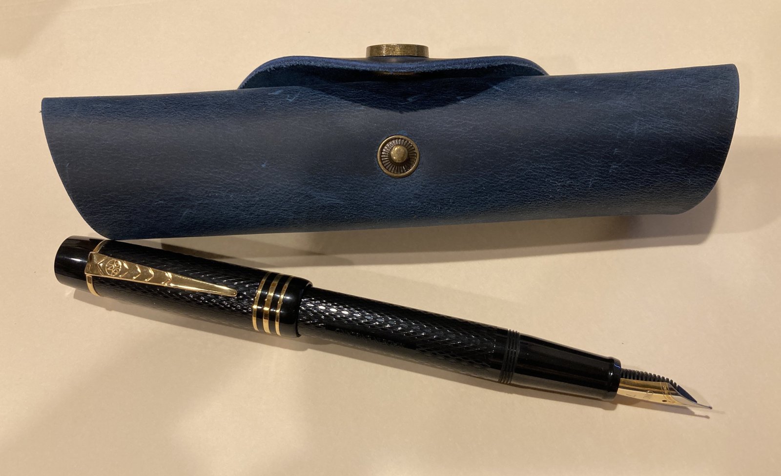
I recently purchased a Namiki Falcon from Classic Fountain Pens, with John Mottishaw's Spencerian modification. The Falcon in its unmodified form is a common enough pen and has many reviews, so I'll focus this one on the nib modification and the writing qualities of the pen as they relate to its intended purpose of Spencerian lettering. I'll also discuss how these qualities compare to writing Spencerian with the traditional dip pen with oblique holder. (Note that the term "oblique" is not being used here in the fountain pen sense, but to describe a type of nib holder with a metal flange that holds the nib at an angle.)


http://rongilmour.info/images/falcon/threePens.jpg


http://rongilmour.info/images/falcon/falconNibComp.jpg


Boring stuff: It's black. It's plastic. It comes in a box. Cartridge/converter filling system, converter included.


I am not an expert in Spencerian penmanship, so please forgive whatever is unsightly in my examples. I am taking a class and am trying very hard to improve, so constructive criticism is welcome.


A little background: I've tried to write Spencerian with a fountain pen before and have been disappointed. I have a beautiful Waterman 52 with a very flexible nib that I have tried to use for this purpose. While a great pen in general, it has some characteristics that make Spencerian lettering challenging. Spencerian depends on very fine hairlines. The Waterman can produce adequate, not spectacular, hairlines, but once the nib had been flexed for a "swell," it is difficult to return to a hairline. At first I thought that this reflected a lack of "snapback" in the nib, but I suspect now that it has more to do with the feed. At any rate, the ability to return to a true hairline after applying pressure is a requirement for a Spencerian writing instrument.


After my experience with the Waterman, I was a bit skeptical of the idea that a fountain pen could really be used for Spencerian, but figured that Mr. Mottishaw would be unlikely to call something a Spencerian modification unless he meant it. Like Agent Mulder, I wanted to believe.


I took the plunge and ordered the pen and am amazed at its performance.


In the following comparison, the top sample is the Falcon (with J. Herbin Pearle Noir), the middle one is a Nikko G nib in an oblique holder with McCafferty's ink, and the bottom is the Waterman 52 (also with Pearle Noir). The paper is a Rhodia dot pad.


http://rongilmour.info/images/falcon/spencComparison.jpg


The first thing you'll notice is that while neither of the fountain pens gets as fine a hairline as the Nikko G, the line quality of the Falcon is far superior to that of the Waterman. The capital "E" is interesting to examine. Notice how in the Falcon example, there is a reasonably fine line coming out of the bottom swell, while in the Waterman example, the connector between the "E" and "d" is thicker than average.


The Falcon example demonstrates a general difficulty with using a fountain pen for Spencerian in the mangled "t" of "triumph." Going into the "t," I was writing in my usual position. When I exerted pressure to get the desired wedge shape at the top of the "t," I found that the nib shot off to the left, not at all where I wanted it. This is not the pen's fault, but an inevitable issue with the non-obliquity of the fountain pen. Once aware of the problem, it can be corrected for, as shown by the more successful "t" in "at" and "d" in "Edinburgh."


A slight weakness of this nib is the fact that it will not produce really huge, spectacular swells. Personally, that doesn't bother me much.


http://rongilmour.info/images/falcon/Ecomparison2.jpg


In this example, with a fancier version of the capital "E," we see that the Falcon (middle) provides modest swells, compared to the Nikko G (left) and Waterman (right). But notice how the fineness of the hairline produced by the Falcon produces a far better sense of contrast between thick and thin than the Waterman. I think this pronounced thick/thin contrast is more important than the absolute width of swells, but I suppose that may depend on one's personal style of Spencerian.


To sum up, I am very happy with this wonderful pen. It is no substitute for the traditional tools, but it is a great luxury when you'd like to write a thank you note or do a bit of practice without hauling out your dip pen, ink bottle, &c. Highly recommended for the Spencerian enthusiast.


The decision to buy this was made after a phone conversation with Jonella at Classic Fountain Pens. I called wanting something for Spencerian and was prepared to pay for one of the specialty Sailor nibs. Jonella guided me away from these more expensive options and toward the Falcon, which is a bargain at $254. I greatly appreciate her thoughtful and knowlegable answers to my questions and her commitment to finding the right pen for my needs.

Link to comment
Share on other sites

  • Replies 38
  • Created
  • Last Reply

Top Posters In This Topic

  • anaximander

    8

  • mhphoto

    5

  • Mtrap

    2

  • schin

    2

Thank you for the informative and interesting review. i know nothing about spencerian and it was interesting to read.

In case you wish to write to me, pls use ONLY email by clicking here. I do not check PMs. Thank you.

Link to comment
Share on other sites

Very nice review and fascinating to me as well regarding the technique of Spencerian script. A fountain pen's use as a writing instrument is what's most important to me. Thank you :)

Tamara

Link to comment
Share on other sites

You might be able to attain better hairlines from the Falcon with a drier ink (e.g. Iron Gall) or Noodlers Bulletproof black.

"Anyone who lives within their means suffers from a lack of imagination."

Oscar Wilde

Link to comment
Share on other sites

Nice handwriting. What is the nature of the "Spencerian modification'? Did he add a little flex to the nib?


Dan

Edited by DanF

"Life is like an analogy" -Anon-

http://i98.photobucket.com/albums/l279/T-Caster/DSC_0334_2.jpg

Link to comment
Share on other sites

Nice handwriting. What is the nature of the "Spencerian modification'? Did he add a little flex to the nib?


From my invoice: "The Spencerian nib requires two operations: First, re-grind to a Super Extra Fine. ... The second process increases flexibility somewhat by thinning tines."

Link to comment
Share on other sites

You might be able to attain better hairlines from the Falcon with a drier ink (e.g. Iron Gall) or Noodlers Bulletproof black.


Great idea! Thanks! This could also provide an excuse to buy some of the R&K Salix that I've been curious about.

Link to comment
Share on other sites

+1 on Salix although it may not seem very dry in the Waterman 52, it's wet in mine but the pen is very wet. Great review, thanks

Link to comment
Share on other sites

  • 5 weeks later...

A very thorough analysis and quite helpful. I am now in day 2 of learning Spencerian and was wondering about which pen to try.

I have an oblique with a Nikko-G and would also like to have something to carry around for off-site practicing.


Thanks

Hex, aka George

Link to comment
Share on other sites

An update: Sadly, I managed to mis-align the tines on this pen. This is a very delicate instrument and clearly I was too rough with it. Specifically, I blame the Spencerian capital stem-stroke. This fundamental stroke, which forms the backbone of many capital letters, requires a sort of press-and-twist motion at the bottom of the stroke. (See the letter "R" in the writing samples of the first post.) Mild pressing with this nib is okay, but twisting is not.


I sheepishly sent the pen back to John, who re-aligned the nib and got it back to me quickly and at minimal expense. The pen once again writes beautifully and I now have a pretty good idea of what not to do with it.


Also, I followed Lloyd's advice about using a drier ink to get finer hairlines. I haven't picked up any R&K Salix yet, but I'm using some Pelikan Blue-Black and it works very well.


http://rongilmour.info/images/falcon/wagner.jpg

Link to comment
Share on other sites

Thanks for the update. It's always interesting to hear opinions and usages experiences after some time.

WTT: My Lamy 2000 Fine nib for your Lamy 2000 Broad nib.

Link to comment
Share on other sites

  • 3 months later...

I recently purchased a Namiki Falcon from Classic Fountain Pens, with John Mottishaw's Spencerian modification. The Falcon in its unmodified form is a common enough pen and has many reviews, so I'll focus this one on the nib modification and the writing qualities of the pen as they relate to its intended purpose of Spencerian lettering. I'll also discuss how these qualities compare to writing Spencerian with the traditional dip pen with oblique holder. (Note that the term "oblique" is not being used here in the fountain pen sense, but to describe a type of nib holder with a metal flange that holds the nib at an angle.)


http://rongilmour.info/images/falcon/threePens.jpg


http://rongilmour.info/images/falcon/falconNibComp.jpg


Boring stuff: It's black. It's plastic. It comes in a box. Cartridge/converter filling system, converter included.


I am not an expert in Spencerian penmanship, so please forgive whatever is unsightly in my examples. I am taking a class and am trying very hard to improve, so constructive criticism is welcome.


Thanks for all that great work I am buying one ASAP


A little background: I've tried to write Spencerian with a fountain pen before and have been disappointed. I have a beautiful Waterman 52 with a very flexible nib that I have tried to use for this purpose. While a great pen in general, it has some characteristics that make Spencerian lettering challenging. Spencerian depends on very fine hairlines. The Waterman can produce adequate, not spectacular, hairlines, but once the nib had been flexed for a "swell," it is difficult to return to a hairline. At first I thought that this reflected a lack of "snapback" in the nib, but I suspect now that it has more to do with the feed. At any rate, the ability to return to a true hairline after applying pressure is a requirement for a Spencerian writing instrument.


After my experience with the Waterman, I was a bit skeptical of the idea that a fountain pen could really be used for Spencerian, but figured that Mr. Mottishaw would be unlikely to call something a Spencerian modification unless he meant it. Like Agent Mulder, I wanted to believe.


I took the plunge and ordered the pen and am amazed at its performance.


In the following comparison, the top sample is the Falcon (with J. Herbin Pearle Noir), the middle one is a Nikko G nib in an oblique holder with McCafferty's ink, and the bottom is the Waterman 52 (also with Pearle Noir). The paper is a Rhodia dot pad.


http://rongilmour.info/images/falcon/spencComparison.jpg


The first thing you'll notice is that while neither of the fountain pens gets as fine a hairline as the Nikko G, the line quality of the Falcon is far superior to that of the Waterman. The capital "E" is interesting to examine. Notice how in the Falcon example, there is a reasonably fine line coming out of the bottom swell, while in the Waterman example, the connector between the "E" and "d" is thicker than average.


The Falcon example demonstrates a general difficulty with using a fountain pen for Spencerian in the mangled "t" of "triumph." Going into the "t," I was writing in my usual position. When I exerted pressure to get the desired wedge shape at the top of the "t," I found that the nib shot off to the left, not at all where I wanted it. This is not the pen's fault, but an inevitable issue with the non-obliquity of the fountain pen. Once aware of the problem, it can be corrected for, as shown by the more successful "t" in "at" and "d" in "Edinburgh."


A slight weakness of this nib is the fact that it will not produce really huge, spectacular swells. Personally, that doesn't bother me much.


http://rongilmour.info/images/falcon/Ecomparison2.jpg


In this example, with a fancier version of the capital "E," we see that the Falcon (middle) provides modest swells, compared to the Nikko G (left) and Waterman (right). But notice how the fineness of the hairline produced by the Falcon produces a far better sense of contrast between thick and thin than the Waterman. I think this pronounced thick/thin contrast is more important than the absolute width of swells, but I suppose that may depend on one's personal style of Spencerian.


To sum up, I am very happy with this wonderful pen. It is no substitute for the traditional tools, but it is a great luxury when you'd like to write a thank you note or do a bit of practice without hauling out your dip pen, ink bottle, &c. Highly recommended for the Spencerian enthusiast.


The decision to buy this was made after a phone conversation with Jonella at Classic Fountain Pens. I called wanting something for Spencerian and was prepared to pay for one of the specialty Sailor nibs. Jonella guided me away from these more expensive options and toward the Falcon, which is a bargain at $254. I greatly appreciate her thoughtful and knowlegable answers to my questions and her commitment to finding the right pen for my needs.

Link to comment
Share on other sites

very good review and outstanding pen :thumbup:

Pens are like watches , once you start a collection, you can hardly go back. And pens like all fine luxury items do improve with time


Link to comment
Share on other sites

My wife asked me what I want this year Christmas and the Spencerian Falcon was my answer. Seriously. Can't. WAIT. :puddle:

fpn_1451747045__img_1999-2.jpg

Link to comment
Share on other sites

For christmas?it's in 5 month....going to be very long to wait for such a nice pen

A people can be great withouth a great pen but a people who love great pens is surely a great people too...

Pens owned actually: MB 146 EF;Pelikan M200 SE Clear Demonstrator 2012 B;Parker 17 EF;Parker 51 EF;Waterman Expert II M,Waterman Hemisphere M;Waterman Carene F and Stub;Pilot Justus 95 F.


Nearly owned: MB 149 B(Circa 2002);Conway Stewart Belliver LE bracket Brown IB.

Link to comment
Share on other sites

  • 2 months later...

Thanks for a great review.

I also have a Namiki Falcon modified for extra flex by John Mottishaw (allthough only reground to extra fine).

As writing with an oblique pen holder gives an ideal angle on the downstrokes, i am curious to know how you hold your Namiki Falcon when writing spencerian?

Do you turn the paper? I seem to be ending up with my elbow under my chest, which tends to be a bit bothersome after a while...

Link to comment
Share on other sites

Just beautiful. I am learning Spencerian as well but with dip nibs and have always wanted a modified fountain pen so I can practice anywhere without having to pull out ink bottles and paper towels.


$250 is a little pricey but I have a regular Falcon and can attest to how beautiful it is. I do have a few questions before I take the plunge myself, if you don't mind? Do you feel the Falcon nib is as scratchy as a dip nib? How long did you have to wait for your pen?

Link to comment
Share on other sites

Create an account or sign in to comment

You need to be a member in order to leave a comment

Create an account

Sign up for a new account in our community. It's easy!

Register a new account

Sign in

Already have an account? Sign in here.

Sign In Now


  • Most Contributions

    1. amberleadavis
      amberleadavis
      43844
    2. PAKMAN
      PAKMAN
      33558
    3. Ghost Plane
      Ghost Plane
      28220
    4. inkstainedruth
      inkstainedruth
      26730
    5. jar
      jar
      26101
  • Upcoming Events

  • Blog Comments

    • Shanghai Knife Dude
      I have the Sailor Naginata and some fancy blade nibs coming after 2022 by a number of new workshop from China.  With all my respect, IMHO, they are all (bleep) in doing chinese characters.  Go use a bush, or at least a bush pen. 
    • A Smug Dill
      It is the reason why I'm so keen on the idea of a personal library — of pens, nibs, inks, paper products, etc. — and spent so much money, as well as time and effort, to “build” it for myself (because I can't simply remember everything, especially as I'm getting older fast) and my wife, so that we can “know”; and, instead of just disposing of what displeased us, or even just not good enough to be “given the time of day” against competition from >500 other pens and >500 other inks for our at
    • adamselene
      Agreed.  And I think it’s good to be aware of this early on and think about at the point of buying rather than rationalizing a purchase..
    • A Smug Dill
      Alas, one cannot know “good” without some idea of “bad” against which to contrast; and, as one of my former bosses (back when I was in my twenties) used to say, “on the scale of good to bad…”, it's a spectrum, not a dichotomy. Whereas subjectively acceptable (or tolerable) and unacceptable may well be a dichotomy to someone, and finding whether the threshold or cusp between them lies takes experiencing many degrees of less-than-ideal, especially if the decision is somehow influenced by factors o
    • adamselene
      I got my first real fountain pen on my 60th birthday and many hundreds of pens later I’ve often thought of what I should’ve known in the beginning. I have many pens, the majority of which have some objectionable feature. If they are too delicate, or can’t be posted, or they are too precious to face losing , still they are users, but only in very limited environments..  I have a big disliking for pens that have the cap jump into the air and fly off. I object to Pens that dry out, or leave blobs o
  • Chatbox

    You don't have permission to chat.
    Load More
  • Files


×
×
  • Create New...