Search the Community
Showing results for tags 'teal ink'.
Found 4 results
-
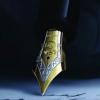
JinChen Lantau Dream Ink Review # 232 --- 🧾 Description Jinchen is a small Chinese ink manufacturer. After perusing their offerings on AliExpress, it seems that the inks are divided into chromo-shading, sheening, and shimmer inks. I bought a bottle after @LizEF's reviews and @A Smug Dill's passionate posts on Reddit and FPN. Lantau Dream, originally 屿梦 (Yu Meng), meaning Island Dream, is named after Lantau Island, the biggest island of Hong Kong. I got this ink by mistake (I was aiming for another colour, but AliExpress can be confusing). The bottles are 18 ml and come in a plastic box. There's no indication of the name in English. It’s a classic teal ink with a red sheen. The sheen is visible with the EF, F, or flex nibs only on Midori, Iroful, and Tomoe River 68gsm in my tests below. The lubrication is out of this world, especially with B & 1.1 nibs, making the nib float. Ink bled through with almost all nibs on copy paper. Ink has no water resistance, and, like most sheening inks, it is messy and will stain your fingers. I had to resort to cleaning solution and pen jacuzzi after several flushing and soaking. --- 🧪 Chroma --- ✍️ Writing Samples (scan & photos) Scans are approximate. Photos are most accurate. - Pens Used: Osmiroid Copperplate EEF flex nib, Lamy (EF/F/M/B/ Stub 1.1). Quotes: Rhodia (A4 Black DotPad) “The night gave me dark eyes; I use them to seek light.” — Gu Cheng (1956–1993), Chinese poet Iroful “The sea enters the harbor quietly, carrying the smell of distant rain.” — Yesi (Leung Ping-kwan) (1949–2013), Hong Kong poet Midori A5 (Codex) “The city floats like an island in a sea of light.” — Xi Xi (1937–2022), Hong Kong novelist and poet Tomoe River 68gsm A5 (Taroko Design) “I do not believe the sky is blue.” — Bei Dao (born 1949), Chinese poet Hammermill 20lb “After fresh rain in empty mountains, autumn air comes at dusk.” — Wang Wei (699–759), Tang dynasty poet and painter English translations are by ChatGPT and may differ from published translations. Rhodia Iroful Midori Tomoe River 68gsm Note: Tomoe River used here is 68 gsm, not the thinner 52 gsm version commonly referenced in reviews. Hammermill 20lb Closeup 🔍 Comparison Col-O-ring. Scans are approximative. --- 💧 Water Test --- 🎨 Artwork Puttin' on the Ritz Inktober52 – Prompt 8: Pretend Cat & Mouse like puttin’ on the Ritz when the world looks blue, pretending everything will be okay as long as there’s imagination. Kitty Ink Pot Unstoppable Snake, Jinchen Lantau Dream, Yellow highlighter, Signo White gel pen Talens Mixed Media Sketchbook. Inktober day 9: Horse Miniature: Cat & mouse go for a ride on horsy. Kitty Ink Pot, Unstoppable Snake, JinChen Lantau Dream, ink brush, fountain pen, Talens Sketchbook Pocket. In the Now Inspired by the majestic Buddha on Lantau Island near Hong Kong, reimagined through my cat & mouse theme. JinChen - Lantau Island ink, Brause Blue Pumpkin nib, Talens Mixed Media Sketchbook. --- - Writing Experience: Excellent. - What I Liked: Lubrication. Price. - What I Did Not Like: Not my colour. Lack of water resistance. Staining my fingers. 🧷 Ink Characteristics - Shading: With wider nibs the sheen becomes shading. - Ghosting: Faint on copy paper. - Bleed Through: Yes, on copy paper, unless used with an EEF nib and a light touch. - Flow Rate: Wet. - Lubrication: Excellent. - Nib Dry-out: No. - Start-up: No. - Saturation: Saturated teal. - Sheen: Only on Japanese Paper. - Spread / Feathering / Woolly Line: Did not notice. - Nib Creep / Crud: Did not notice. - Staining (Pen): - Clogging: No. - Cleaning: I had to resort to cleaning solution after several flashings and soakings. - Water Resistance: No. --- 🛒 Availability - Available in 18 ml bottles from AliExpress. --- 💬 Closing This is a decent sheening ink from JinChen that only works if you use Japanese paper and finer nibs or a wet pen. The price, unlike other Chinese inks, is decent and shipping takes about two weeks. However, if you understand Chinese and have the patience to navigate Taobao and can withstand the long shipping time by boat, you can get the whole series for the price of one bottle. No fountain pens were harmed in preparing this review. Please don’t hesitate to share your experience, writing samples, or any other comments — the more the merrier.
-
Hello FPNers, I’m a huge fan of shading inks but dislike sheening inks. In the blue-teal-green spectrum (and nowhere else), can you recommend high shading inks that have no sheen? My current champion blue is Colorverse Supernova and my current champion green is Diamine November Rain. But there have to be more! Again, only in the blue-teal-green spectrum. Thanks! Gary
-
-
I'd like to do some comparative reviews of a few dark turquoise/teal/green-black inks and will start with this super-long name ink: Organics Studio's "Masters of Writing" series Volume No. 14 Henry David Thoreau "Walden Pond Blue" (Handmade in Maryland) http://i.imgur.com/uZHMquL.jpg?1 The ink comes in a 55ml plastic bottle, labeled simply "Walden" and appears to be highly saturated. I've seen sample reviews of this ink showing a high amount of sheen, and I can confirm it is indeed the case, though of course the sheen level depends on how much ink your pen puts down. For high flow feed/wet nibs, and especially for dip pens, this ink is an absolute sheen monster! The sheen is of very metallic burgundy/magenta color, quite nice. Shading is low to moderate, depending on pen and paper. Lubrication is at least moderate. For my review I chose my favorite paper to show off inks: Fabriano's EcoQua dot notebook made with Bioprima 85g/m2 paper. It is a bit toothier than Rhodia or the glass-smooth Clairefontaine, and is a nice pale ivory color. It also shows off color and ink saturation well, compared to my Clairefontaine paper, which makes even saturated inks look more pale and anemic (you can probably tell I'm not a fan of that paper). Unlike some of my more watery inks, I was able to use this ink with a dip pen without having to re-dip after every few letters. It seems to be more viscous/coating in that regard. This could be a great ink for ornate writing with a dip pen, if lots of metallic sheen is desired. Here is a [slightly overexposed] scan, though also see photographs that follow, the paper is actually a cream color, not white: http://i.imgur.com/Of2QhWf.jpg?1 The water test was done with a single droplet of water from the tap (more toward the left) followed by more droplets on the right side of the grid, after the ink had about 3 minutes to dry. I think it's fairly water-resistant in that the color washes away, but the lines are still visible. Because it is so saturated, it takes a while to dry, depending on your pen. I used a Lamy Safari with 1.1 italic nib for dry time testing. In the scan above, I also wrote with Noodler's Aircorp Blue Black, which is VERY close in color to this ink but completely lacks sheen. Other differences between the two are: - Noodler's ACBB is a tad less vivid teal and a shade more subdued. It also seems to be just a bit darker. I would say that ACBB is the closest match for the Lamy Safari "Petrol" pen barrel in person, followed by this Walden Pond Blue. I have also made some test writing samples for color fastness comparisons, which I will add to this review at a later date. Eventually, beside Noodler's Aircorp Blue Black, I plan to compare this ink to Sailor's Jentle Yama-Dori, Robert Oster "Tranquility", Robert Oster "Fire & Ice", Robert Oster "Aqua", and J. Herbin's "Emerald of Chivor", samples of which are on the way to me as I type this review. Photographs that show the colors and the sheen (very difficult to show correctly, but it's a greenish teal, not quite as intense as on the photos, but more intense than ACBB): http://i.imgur.com/c09I9fJ.jpg http://i.imgur.com/3Qs2kJD.jpg?1 http://i.imgur.com/TUd99uM.jpg?1 And here's the crazy levels of metallic sheen with a dip pen, basically the teal base gets completely covered up with the metallic burgundy (on Clairefontaine french ruled Triompe notebook paper): http://i.imgur.com/0fSWdJq.jpg http://i.imgur.com/R2OjUP1.jpg http://i.imgur.com/f9QNI63.jpg