Search the Community
Showing results for tags 'lots of pictures!'.
Found 1 result
-
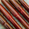
Sailor King of Pen "Tiger Lily" http://i17.photobucket.com/albums/b70/minkapics/Fountain%20pens/KOP_MF14828.jpg Having become badly addicted to all things urushi, it was probably inevitable that I’d move on to ‘Class A’ pen drugs in the end – the full maki-e. So why did I buy Tiger Lily? I already own a raw ebonite KOP, so I knew I’d like it, and given Sailor’s (and Japanese pen makers as a whole) reputations I had good reasons to assume that the fit and finish would be exemplary – which they were. From a more personal perspective, I’m drawn to images of the natural world, so the exotic subject was appealing. It also happened that the cat we owned while I was growing up was called… Tiger Lily. So when I came across this beauty, it just had to be mine. http://i17.photobucket.com/albums/b70/minkapics/Fountain%20pens/KOP_MF14832.jpg I actually used to be pretty down on Sailor’s King of Pen. Until I tried one I always wrote it off as nothing more than a MB149 clone, and this led me ignore it for way too long. How wrong I was! The KOP is a stunning pen, and while the shape and size bear a strong resemblance to the venerable German, I actually think Sailor has remedied the two things I like least about the 149; the piston – which ruins the balance and makes cleaning tiresome, and the bling – for me the 149 has associations with power and authority which don’t sit well in my hand. Actually, there’s a third difference that I really appreciate - the base material. Instead of resin (precious or otherwise), Sailor uses ebonite. I really like ebonite. It’s always warm and inviting to the touch, and I like its smell too, although that’s not relevant in this case as the whole pen is lacquered. Tiger Lily is, as far as I can tell, unique; one of a set of twelve pens commissioned from the renowned maki-e artist Daikai by Authentic Goods from Japan. Each has a different design and I understand more are planned. The pen has a pale biscuit coloured ground that is very slightly mottled. Magnified it looks like a very small version of a purple Karanuri urushi pen I own, but in this case it’s a tiny random organic pattern comprising three slightly different colours. The techniques used are Togidashi and Taka Maki-e and the main design is slightly raised. The lilies are designed and rendered so vivaciously that they appear to be dancing around the pen. It’s beautifully balanced and I particularly like that it continues unbroken across both the barrel and cap. http://i17.photobucket.com/albums/b70/minkapics/Fountain%20pens/KOP_MF14846.jpg http://i17.photobucket.com/albums/b70/minkapics/Fountain%20pens/KOP_MF14838.jpg However, this causes one of two slight issues I have with the pen – the cap threads do not always line up. It’s just an aspect of the thread design and hardly a problem because this pen was never intended as a daily writer, but it is worth a mention. Not surprisingly, given the quality of the artwork and craftsmanship, the pen is signed by the artist towards the bottom of the barrel. http://i17.photobucket.com/albums/b70/minkapics/Fountain%20pens/KOP_MF14831.jpg Tiger Lily also has a little design on the top of the cap. I think it finishes the pen off beautifully and, in my imagination, I see it as the sun that the lilies are reaching up towards. However, you could also see it as an amusing reference to the MB logo although I doubt this was intended! The top of the cap is the other feature I should mention as a slight downside. On the KOP, the outer part of the cap comprises two pieces to allow the clip to be fitted. Normally, you barely notice it but on this design you do. I spotted after I had taken the photos that it was very slightly loose, so I gently tightened it up and it’s now much less noticeable. However, I still wish that Sailor designed their caps like Danitrio and Namiki so that nothing detracts from the lines of the pen and the design – the join catches my eye too much. http://i17.photobucket.com/albums/b70/minkapics/Fountain%20pens/KOP_MF14836.jpg Aside from the design, the pen is a standard KOP, so I won’t dwell too much on its specification. The general construction is ebonite, but I wonder whether the section may be plastic. Rather like a Nakaya, some of its ‘innards’ are metal (brass?) and this gives it some heft. It is not particularly heavy – about 23g uncapped - which is about perfect for me. Interestingly, the cap on the Maki-e pen is a couple of grams heavier than the plain ebonite version. I don’t post the pen so it isn’t relevant to its performance. Although an oversize pen, I find it very comfortable to hold and uncapped its size is comparable to several popular Japanese competitors. The broad girth and perfect balance greatly contribute to what I can only describe as a near perfect writing experience. Oh, and the nib! What else is there left to say about these fantastic oversize Sailor nibs? Actually, there is something to say – I wish more companies offered something similar! The 21K medium nib is similar to a western fine, fairly firm with just a little spring, and a very nice writer. Flow is beyond reproach and with the right ink it achieves some nice shading. Being a fine nib the relatively small capacity of the converter isn’t a problem. http://i17.photobucket.com/albums/b70/minkapics/Fountain%20pens/KOP_MF14843.jpg I hope it’s apparent that I love this pen. The Sailor KOP is, IMO, one of the nicest Japanese pens already but, by adding a beautiful maki-e design to it, Daikai and Authentic Goods from Japan have created something truly special. My pictures don’t begin to do it justice. To finish here it is alongside my two other maki-e wonders, a Danitrio Takumi and the Danitrio Fellowship Pen (sorry for the finger print on the Takumi!). http://i17.photobucket.com/albums/b70/minkapics/Fountain%20pens/KOP_MF14874.jpg