Jump to content

Enjoying Montblanc Pens — Broad, Oblique, Extra Fine, Le & Bespoke


Tom Kellie

Recommended Posts

  • Replies 2.6k
  • Created
  • Last Reply

Top Posters In This Topic

  • Tom Kellie

    1114

  • Ghost Plane

    224

  • zaddick

    102

  • thygreyt

    73

Top Posters In This Topic

Posted Images

Tom--I used green ink for all my grading during my 35 years of teaching composition. Most students were used to having their papers graded in red and so were shocked that I used green. Since many of them hated papers graded in red and had negative feelings about seeing teachers' markings in red, I had the students correct their papers in red, thus giving them a chance to feel some empowerment in getting to use red to improve their work. I still use various shades of green in much of my personal writing.

Link to comment
Share on other sites

~ Feamat:


A very special thanks to you for this.

I'd never heard of it. You've provided a welcome education about a material and a pen previously unknown to me.

I've added it to the list below, as well as adding crystal, after seeing the photos of the 2007 Max Reinhardt edition with mountain crystal inlays shown by Axis.

Thank you for your kind remarks. Both new pens have been used for several days, each writing exceptionally well without any issues.

*************************************************************

• Alligator Leather

• Amber

• Anodized Aluminum

• Anthracite

• Brass

• Carbon Fiber

• Celluloid

• Ceramics

• Citrine

• Coral

• Cowhide Leather

• Crystal

• Damask Steel

• Diamond

• Ebonite

• 750 Gold

• Granite

• Grenadilla Wood

• Hematite

• Jade

• Lacquer

• Lapis Lazuli

• Malachite

• Marble

• Mother-of-pearl

• Pine

• Platinum

• Porcelain

• PVD Coating

• Red Gold

• Rose Gold

• Rosewood

• Rubber

• Ruthenium

• Sapphire

• Shark Leather

• Stainless Steel

• 925 Sterling Silver

• Tiger-eye

• Titanium

• Vermeil/Silver-gilt


*************************************************************


Tom K.

Hi Tom.


Another Limited FP, with a special material: MONTBLANC MIRACLE PINE TREE 113 FOUNTAIN PEN 113692.


Take a look.


Regards,


Feamat

Link to comment
Share on other sites

Hi Tom.


Another Limited FP, with a special material: MONTBLANC MIRACLE PINE TREE 113 FOUNTAIN PEN 113692.


~ Feamat:


Yes, you're right.

I've listed “Pine” above to reflect that edition.

In 2018 it's possible that there may be a new material to add.

Tom K.

Link to comment
Share on other sites

Tom, that shows great imagination and a thorough knowledge of Montblanc!


~ brad7k:


Your reply with a wonderful Montblanc crossword is terrific!

Thank you so much.

It's especially nice as it's made with your Beatles pen, which I enjoy seeing in use.

Tom K.

Link to comment
Share on other sites

Tom--I used green ink for all my grading during my 35 years of teaching composition. Most students were used to having their papers graded in red and so were shocked that I used green. Since many of them hated papers graded in red and had negative feelings about seeing teachers' markings in red, I had the students correct their papers in red, thus giving them a chance to feel some empowerment in getting to use red to improve their work. I still use various shades of green in much of my personal writing.


~ dannyboy:


Thank you for telling about your substantial experience in teaching composition.

Green as a correcting color is quite a departure from red, but why not?

In Japan stricter professors are called “aka-pen sensei”, meaning red ink pen professors/teachers.

Here the color red has been in long use, but there's no requirement to use it.

I'm facing quite a pile of papers this weekend, which will need substantial comments.

Thanks to your comment, I may put Montblanc Irish Green to good use.

Tom K.

Link to comment
Share on other sites

fpn_1522405956__three_pens_three_inks.jp


Three Pens, Three Inks


https://www.fountainpennetwork.com/forum/topic/187830-does-your-ink-color-match-your-pen-color/


~ Today I read a comment by U.S. Secretary of Defense Gen. James Mattis when meeting a newly appointed colleague:


I hope that there are some different worldviews. That's the normal thing you want, unless you want groupthink.”


His outlook is similar to how I feel about reading posts in Fountain Pen Network Montblanc Forum threads.


Although it's reassuring to read similar views to one's own, encountering unfamiliar outlooks is refreshing, expanding one's perspective.


Generation, Geography and Gender all have varying levels of influence, with my own being necessarily limited.


Reading Montblanc Forum threads has introduced me to concepts which had never before entered my thoughts.


For example, Ghost Plane recently explained what the ‘steps’ are on certain Montblanc models, i.e. somewhat abruptly angled shifts in diameter.


I'd failed to notice that, as none of my pens have the ‘steps’ to which she referred. Now that my awareness is raised, I look for ‘steps’ on pens.


A wholly unfamiliar concept to me prior to joining FPN is the matching of inks and fountain pens. When I initially read a reference to ‘ink matching’, I had no idea what it was about.


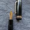
In the past few days two FPN members asked me which inks I might use in the two recently arrived pens, which are pictured above with my first Montblanc pen.


There was no satisfactory answer to give, as I have never ‘ink matched’. Whichever ink I'm interested in using goes into a pen with a nib I feel like using.


In the two older threads, found in the links above, I read dozens of comments about the full range of ‘ink matching’, from not at all to complex color harmony systems.


A friend in Japan with an extensive fountain pen collection asked me what ‘ink matching’ was all about, as he'd read references to it.


I replied that I wasn't certain, but it seemed to concern perceptions about clashing colors which might be distracting while writing.


Both my friend and I are indifferent as to which ink is in which pen at any given moment, but we respect the feelings of others with regard to ‘ink matching’.


My pens have heretofore been black. Now that there are two pens with color, inks may from time-to-time widely differ from the pen color.


As no one sees me writing, with only Zuji around my feet, it won't matter if there are occasional jarring chromatic clashes.


Reading through the above two threads was a pleasure, as such a range of perspectives was presented with cordial respect for others with very different outlooks.


Fountain Pen Network is a welcome part of my life, in that it facilitates understanding of fresh perspectives.


On a practical level, I'm undecided this evening as to which pen and which ink will be used to correct student tests this weekend.


Tom K.
Link to comment
Share on other sites

I saved hard this month and I've taken the plunge. The 149 went in to be fitted with a double broad. Oh yeah, baby!


When the time comes, I would like to see a writing sample please, been thinking of going broad, or specifically an OB, I've been noticing that I tend to rotate the pen I'm using to the side.

"Storyteller, unfold thy words untold!"

Link to comment
Share on other sites

fpn_1522432081__axel_with_nib.jpg


Montblanc Nib Expert Axel Nier Examining a Nib


https://www.fountainpennetwork.com/forum/topic/320073-my-bespoke-adventure-or-how-to-write-with-a-spade/


~ One of the topics included in this thread are the Bespoke nibs crafted by Montblanc in Hamburg to the specific requirements and preferences of clients.


The links above to FPN threads concern Montblanc Bespoke nibs of various sorts. From time-to-time I enjoy returning to them for the photos and comments.


The first listed, by gerigo one year ago, is especially fun to read. Her tale of the chance meeting with Montblanc Nib Expert Axel Nier in Shanghai is so true-to-life.


Rereading her description tonight, I was struck by how well she captured the experience of working with Axel to arrive at a satisfactory Bespoke nib design.


That she did so in a city which I know well, Shanghai, adds pleasure to the reading, as certain details are similar to my own experience.


I've included an image of Axel examining a nib at the top, to acknowledge his talent, dedication to craftsmanship and genial approach to promoting Montblanc's Bespoke nibs.


Over the past five months I've once again been involved in the Bespoke nib ordering process on several fronts, with various twists and turns.


The protracted time has had nothing whatsoever to do with Axel or Hamburg's Bespoke Nib Team, but rather is attributable to various complications in the region where I work and live.


During the past couple of months Axel has been in regular contact with me about more than one project, keeping my abreast of the progress involved with certain specialized design issues.


There was a multi-month delay involving local Montblanc staff which Axel very kindly stepped in to resolve with his customary efficiency and grace.


One of the Bespoke nib projects had an unexpected shift from one design to another, completing changing my original plans to something better suited to my needs.


He's sent images to me of progress on the nibs, and had one of Montblanc's Hamburg staff artists demonstrate the capabilities of one design, with remarkable effect.


Yet another Bespoke nib project is on the horizon, which he discussed with me in a telephone call, making clear what was possible.


What has deeply impressed me has been the attention to detail, the responsiveness, and the obvious commitment to meet my sketching and writing needs.


It reminds me of Japanese-style “omakase” (お任せ) meals, wherein the chef selects what they deem to be best that day, rather than the customer specifying particular dishes.


Given my approach to amateur sketching and writing, Montblanc's Bespoke nibs are an excellent match for my idiosyncratic requirements.


Within the coming months, if all goes well concerning the import process, I hope to share images of the nibs which Axel's Bespoke Nib Team have crafted.


This post is to acknowledge the professionalism, high standards, warmth, and outstanding customer care that I've received from Axel and those in Hamburg who work with him.


All of the Montblanc fountain pens I use are excellent writers. The recently arrived Coral Red Danish-made 212 and the 2001 PoA Marquise de Pompadour are both especially delightful writers.


With so much positive experience, I've come to enjoy writing with what Hamburg produces, looking forward to a few more well-made pens in 2018.


Tom K.

Link to comment
Share on other sites

fpn_1522513954__liz_steel.png


http://www.lizsteel.com/fountainpensketching/


~ Ms. Liz Steel is an architect and sketch artist based in Sydney, Australia. She specializes in urban sketching of buildings in context, teaching others her techniques.


Of very special interest is her advocacy of using fountain pens for outdoor field sketching, due to the flowing lines they produce, to which she later adds watercolor washes.


As I enjoy field sketching with fountain pens, her work is of great interest. She loves fountain pens with unimpeded ink flow and flexibility of line. I feel likewise.


Tom K.


Link to comment
Share on other sites

fpn_1522560167__1960s_montblanc_32_obbb.


1960s Montblanc 32 OBBB


(If OBBBs didn't grow on trees, but did sprout on Pelargonium...)


Link to comment
Share on other sites

Guest
This topic is now closed to further replies.

Announcements


  • Most Contributions

    1. amberleadavis
      amberleadavis
      43844
    2. PAKMAN
      PAKMAN
      33577
    3. Ghost Plane
      Ghost Plane
      28220
    4. inkstainedruth
      inkstainedruth
      26766
    5. jar
      jar
      26105
  • Upcoming Events

  • Blog Comments

    • Shanghai Knife Dude
      I have the Sailor Naginata and some fancy blade nibs coming after 2022 by a number of new workshop from China.  With all my respect, IMHO, they are all (bleep) in doing chinese characters.  Go use a bush, or at least a bush pen. 
    • A Smug Dill
      It is the reason why I'm so keen on the idea of a personal library — of pens, nibs, inks, paper products, etc. — and spent so much money, as well as time and effort, to “build” it for myself (because I can't simply remember everything, especially as I'm getting older fast) and my wife, so that we can “know”; and, instead of just disposing of what displeased us, or even just not good enough to be “given the time of day” against competition from >500 other pens and >500 other inks for our at
    • adamselene
      Agreed.  And I think it’s good to be aware of this early on and think about at the point of buying rather than rationalizing a purchase..
    • A Smug Dill
      Alas, one cannot know “good” without some idea of “bad” against which to contrast; and, as one of my former bosses (back when I was in my twenties) used to say, “on the scale of good to bad…”, it's a spectrum, not a dichotomy. Whereas subjectively acceptable (or tolerable) and unacceptable may well be a dichotomy to someone, and finding whether the threshold or cusp between them lies takes experiencing many degrees of less-than-ideal, especially if the decision is somehow influenced by factors o
    • adamselene
      I got my first real fountain pen on my 60th birthday and many hundreds of pens later I’ve often thought of what I should’ve known in the beginning. I have many pens, the majority of which have some objectionable feature. If they are too delicate, or can’t be posted, or they are too precious to face losing , still they are users, but only in very limited environments..  I have a big disliking for pens that have the cap jump into the air and fly off. I object to Pens that dry out, or leave blobs o
  • Chatbox

    You don't have permission to chat.
    Load More
  • Files


×
×
  • Create New...