Jump to content

... homemade journal ...


TMLee

Recommended Posts

  • Replies 1.8k
  • Created
  • Last Reply

Top Posters In This Topic

  • TMLee

    1127

  • mhguda

    32

  • pen2paper

    23

  • Earthdawn

    20

Top Posters In This Topic

Posted Images

Love Gary Larson's humor!

Larson used to have a cartoon for the Run To The Farside fun run at The California Academy of Sciences,

The shirt I have has the Lemmings running to the sea - wearing innertubes.

Haha , yes ,

He's hilarious !

... 671 crafted ... one at a time ... ☺️

instagram

Link to comment
Share on other sites

Completed ....


Journal #122D GEMATEX - Dark Purple - Spice Islands


A5 size , crafted on commission ...


Front

http://i169.photobucket.com/albums/u236/TMLee/2010%20JOURNALS/GEMATEX%20SERIES/Journal%20122%20GEMATEX%20Dark%20Purple/Journal%20122D%20GEMATEX%20-%20Dark%20Purple%20Spice%20Islands/002-3.jpg


Back

http://i169.photobucket.com/albums/u236/TMLee/2010%20JOURNALS/GEMATEX%20SERIES/Journal%20122%20GEMATEX%20Dark%20Purple/Journal%20122D%20GEMATEX%20-%20Dark%20Purple%20Spice%20Islands/005-3.jpg


Bands deployed

http://i169.photobucket.com/albums/u236/TMLee/2010%20JOURNALS/GEMATEX%20SERIES/Journal%20122%20GEMATEX%20Dark%20Purple/Journal%20122D%20GEMATEX%20-%20Dark%20Purple%20Spice%20Islands/015-2.jpg


I used yellow stitches to match the yellow flyleaves

http://i169.photobucket.com/albums/u236/TMLee/2010%20JOURNALS/GEMATEX%20SERIES/Journal%20122%20GEMATEX%20Dark%20Purple/Journal%20122D%20GEMATEX%20-%20Dark%20Purple%20Spice%20Islands/009-3.jpg


http://i169.photobucket.com/albums/u236/TMLee/2010%20JOURNALS/GEMATEX%20SERIES/Journal%20122%20GEMATEX%20Dark%20Purple/Journal%20122D%20GEMATEX%20-%20Dark%20Purple%20Spice%20Islands/007-3.jpg


This time round, I folded the signatures in one fold, instead of folding each folio like I usually do.

http://i169.photobucket.com/albums/u236/TMLee/2010%20JOURNALS/GEMATEX%20SERIES/Journal%20122%20GEMATEX%20Dark%20Purple/Journal%20122D%20GEMATEX%20-%20Dark%20Purple%20Spice%20Islands/011-3.jpg


Full Spread ...

I decided to place the map on the rear cover instead of the front.

http://i169.photobucket.com/albums/u236/TMLee/2010%20JOURNALS/GEMATEX%20SERIES/Journal%20122%20GEMATEX%20Dark%20Purple/Journal%20122D%20GEMATEX%20-%20Dark%20Purple%20Spice%20Islands/012-3.jpg


Yellow Flyleaves , yellow stitches , yellow ribbon ...

http://i169.photobucket.com/albums/u236/TMLee/2010%20JOURNALS/GEMATEX%20SERIES/Journal%20122%20GEMATEX%20Dark%20Purple/Journal%20122D%20GEMATEX%20-%20Dark%20Purple%20Spice%20Islands/014-2.jpg


There's also some yellow on the map...

and I think all these work together for the aesthetics ...

http://i169.photobucket.com/albums/u236/TMLee/2010%20JOURNALS/GEMATEX%20SERIES/Journal%20122%20GEMATEX%20Dark%20Purple/Journal%20122D%20GEMATEX%20-%20Dark%20Purple%20Spice%20Islands/013-2.jpg


I reserved the front flyleaf for the monogram , which I made it into an emboss ...

http://i169.photobucket.com/albums/u236/TMLee/2010%20JOURNALS/GEMATEX%20SERIES/Journal%20122%20GEMATEX%20Dark%20Purple/Journal%20122D%20GEMATEX%20-%20Dark%20Purple%20Spice%20Islands/017-2.jpg


http://i169.photobucket.com/albums/u236/TMLee/2010%20JOURNALS/GEMATEX%20SERIES/Journal%20122%20GEMATEX%20Dark%20Purple/Journal%20122D%20GEMATEX%20-%20Dark%20Purple%20Spice%20Islands/018-2.jpg


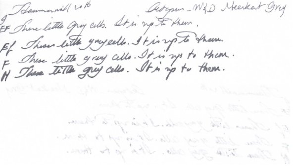
The inktestpage

http://i169.photobucket.com/albums/u236/TMLee/2010%20JOURNALS/GEMATEX%20SERIES/Journal%20122%20GEMATEX%20Dark%20Purple/Journal%20122D%20GEMATEX%20-%20Dark%20Purple%20Spice%20Islands/019-2.jpg


Colophon

http://i169.photobucket.com/albums/u236/TMLee/2010%20JOURNALS/GEMATEX%20SERIES/Journal%20122%20GEMATEX%20Dark%20Purple/Journal%20122D%20GEMATEX%20-%20Dark%20Purple%20Spice%20Islands/020-1.jpg


I used the 'wrong' side of the leather .

I figured it looked better than its rights side which was tan in colour ...

The corners are flushed ...

http://i169.photobucket.com/albums/u236/TMLee/2010%20JOURNALS/GEMATEX%20SERIES/Journal%20122%20GEMATEX%20Dark%20Purple/Journal%20122D%20GEMATEX%20-%20Dark%20Purple%20Spice%20Islands/023-1.jpg


This is a nice one ... and I like it ...

http://i169.photobucket.com/albums/u236/TMLee/2010%20JOURNALS/GEMATEX%20SERIES/Journal%20122%20GEMATEX%20Dark%20Purple/Journal%20122D%20GEMATEX%20-%20Dark%20Purple%20Spice%20Islands/005-3.jpg


... 671 crafted ... one at a time ... ☺️

instagram

Link to comment
Share on other sites

  • 2 weeks later...

I am curious,

For those of you who own my journals featuring TOMOE RIVER paper, how are the journals coming along?

I decided to use one myself, TR#05 ...

and I have to say the paper is quite something.

I used both sides , kinda distracting, but somehow after a while you get used to it.


What's your experience?

... 671 crafted ... one at a time ... ☺️

instagram

Link to comment
Share on other sites

The paper is wonderful, as is the journal itself. I'm glad you undertook the challenge!

How small of all that human hearts endure,
That part which laws or kings can cause or cure.

— Samuel Johnson


Instagram: dcpritch

Link to comment
Share on other sites

I haven't gotten to the section of the journal you made for me that has the TR paper yet. I really do like the Sugar Cane Bagasse though!

Link to comment
Share on other sites

Not sure how I will like the TR paper though -- it takes sooooo long to dry :)


Link to comment
Share on other sites

Not sure how I will like the TR paper though -- it takes sooooo long to dry :)


Agree , that was my experience too.


I recently acquired a very very wet 14K vintage stub.

and it lays down very wet lines.

Yes it takes a bit of time for the ink to dry . I was using Pelikan Brilliant Brown.


But interestingly, that large quantity of ink , whilst it took time to dry , didnt feather.

It stayed there. eventually drying out AND producing some nice shading.


When I cant wait for it to dry , like when I need to flip the page, I will insert a blotter and continue.


On a positive note, I like the smoothness. :thumbup:


Coupled with a very wet stub, I think it was just bliss.... :cloud9:


The paper does very well to receive inks that most other papers cant do as well.

For example , red inks , purples ...

I find these inks feather on most other papers.

But for the TR paper, it seems to handle them very very well.


What do others here experience?

... 671 crafted ... one at a time ... ☺️

instagram

Link to comment
Share on other sites

This is Journal 171 " Baby Boy" A5 size crafted on order...


Front

http://i169.photobucket.com/albums/u236/TMLee/2011/2013/2013%20Journals/Journal%20171%20Baby%20Boy/013.jpg


Rear

http://i169.photobucket.com/albums/u236/TMLee/2011/2013/2013%20Journals/Journal%20171%20Baby%20Boy/016.jpg


Bands deployed

http://i169.photobucket.com/albums/u236/TMLee/2011/2013/2013%20Journals/Journal%20171%20Baby%20Boy/017.jpg


Full spread

http://i169.photobucket.com/albums/u236/TMLee/2011/2013/2013%20Journals/Journal%20171%20Baby%20Boy/021.jpg


I chose a blue theme , becos it was for a baby boy ...

http://i169.photobucket.com/albums/u236/TMLee/2011/2013/2013%20Journals/Journal%20171%20Baby%20Boy/023.jpg


Blue stitches

http://i169.photobucket.com/albums/u236/TMLee/2011/2013/2013%20Journals/Journal%20171%20Baby%20Boy/020.jpg


http://i169.photobucket.com/albums/u236/TMLee/2011/2013/2013%20Journals/Journal%20171%20Baby%20Boy/018.jpg


http://i169.photobucket.com/albums/u236/TMLee/2011/2013/2013%20Journals/Journal%20171%20Baby%20Boy/019.jpg


Matching blue flyleaves

http://i169.photobucket.com/albums/u236/TMLee/2011/2013/2013%20Journals/Journal%20171%20Baby%20Boy/025.jpg


http://i169.photobucket.com/albums/u236/TMLee/2011/2013/2013%20Journals/Journal%20171%20Baby%20Boy/026.jpg


Inktestpage

http://i169.photobucket.com/albums/u236/TMLee/2011/2013/2013%20Journals/Journal%20171%20Baby%20Boy/027.jpg


Colophon

http://i169.photobucket.com/albums/u236/TMLee/2011/2013/2013%20Journals/Journal%20171%20Baby%20Boy/028.jpg


7 Signatures 4 Folios each , total 112 writing pages

Writing paper is

NATURALIS Soft White, Smooth , 135gsm


... 671 crafted ... one at a time ... ☺️

instagram

Link to comment
Share on other sites

I haven't gotten to the section of the journal you made for me that has the TR paper yet. I really do like the Sugar Cane Bagasse though!

Not sure how I will like the TR paper though -- it takes sooooo long to dry :)


You may want to check on how wet your nib is.

On my really wet nibs, the quantity of ink laid on the paper is a lot, so the ink takes a while to dry up.

Compare against a less wet nib, and you should see the ink dry up pretty quick.

I just observed this.


The reason you like the bagasse paper is cos it's uncoated, and the ink penetrates the paper without any delay , eg , the coating on TR paper.

Hence there's no 'pool' of ink waiting to dry up on the paper surface.

Edited by TMLee

... 671 crafted ... one at a time ... ☺️

instagram

Link to comment
Share on other sites

You may want to check on how wet your nib is.

On my really wet nibs, the quantity of ink laid on the paper is a lot, so the ink takes a while to dry up.

Compare against a less wet nib, and you should see the ink dry up pretty quick.

I just observed this.


The reason you like the bagasse paper is cos it's uncoated, and the ink penetrates the paper without any delay , eg , the coating on TR paper.

Hence there's no 'pool' of ink waiting to dry up on the paper surface.


I did a test using a very wet stub here ...

https://www.fountainpennetwork.com/forum/index.php/topic/238274-stub-o-the-day/page-8?do=findComment&comment=2695593

... 671 crafted ... one at a time ... ☺️

instagram

Link to comment
Share on other sites

You may want to check on how wet your nib is.

On my really wet nibs, the quantity of ink laid on the paper is a lot, so the ink takes a while to dry up.

Compare against a less wet nib, and you should see the ink dry up pretty quick.

I just observed this.


The reason you like the bagasse paper is cos it's uncoated, and the ink penetrates the paper without any delay , eg , the coating on TR paper.

Hence there's no 'pool' of ink waiting to dry up on the paper surface.


I've been writing on the TR paper in the practice journal you made for me and really do like the paper. I simply leave the page open for a minute or two before closing and don't have to worry about dry time :)


I may have to have you make me another journal with just TR paper!

Link to comment
Share on other sites

I've been writing on the TR paper in the practice journal you made for me and really do like the paper. I simply leave the page open for a minute or two before closing and don't have to worry about dry time :)


I may have to have you make me another journal with just TR paper!

Well, I just put up two journals for sale yesterday, one of which is a full TR paper journal in A6 size.

I have two more TR journals to add to the sale too.

But in A6 size.

You may be interested in the landscape format one.


Pics to follow soon.

Edited by TMLee

... 671 crafted ... one at a time ... ☺️

instagram

Link to comment
Share on other sites

Earlier on , I crafted this ...


http://i169.photobucket.com/albums/u236/TMLee/2011/2011%20JOURNALS/Journal%20152%20Maroon%20Waves/Journal%20152A%20Maroon%20Waves/098.jpg


Then i decided to undo all the stitches and replace with a thicker thread which I stubbornly want to use... 0.8mm flat thread - polyester.


This is Journal 152A "Maroon Waves " . My 10th TR journal

A6 size


Front

http://i169.photobucket.com/albums/u236/TMLee/2011/2011%20JOURNALS/Journal%20152%20Maroon%20Waves/Journal%20152A%20Maroon%20Waves/009.jpg


Band deployed

http://i169.photobucket.com/albums/u236/TMLee/2011/2011%20JOURNALS/Journal%20152%20Maroon%20Waves/Journal%20152A%20Maroon%20Waves/012.jpg


I decided on white stitches ... seemed most suitable colour ...

I have decided to always use 6 sewing stations whenever crafting journals with TR paper. Less 'wobble'...

http://i169.photobucket.com/albums/u236/TMLee/2011/2011%20JOURNALS/Journal%20152%20Maroon%20Waves/Journal%20152A%20Maroon%20Waves/014.jpg


http://i169.photobucket.com/albums/u236/TMLee/2011/2011%20JOURNALS/Journal%20152%20Maroon%20Waves/Journal%20152A%20Maroon%20Waves/015.jpg


http://i169.photobucket.com/albums/u236/TMLee/2011/2011%20JOURNALS/Journal%20152%20Maroon%20Waves/Journal%20152A%20Maroon%20Waves/013.jpg


I decided on orange flyleaves

and orange ribbon pagemarker ..

http://i169.photobucket.com/albums/u236/TMLee/2011/2011%20JOURNALS/Journal%20152%20Maroon%20Waves/Journal%20152A%20Maroon%20Waves/017.jpg


http://i169.photobucket.com/albums/u236/TMLee/2011/2011%20JOURNALS/Journal%20152%20Maroon%20Waves/Journal%20152A%20Maroon%20Waves/021.jpg


Rear pocket

http://i169.photobucket.com/albums/u236/TMLee/2011/2011%20JOURNALS/Journal%20152%20Maroon%20Waves/Journal%20152A%20Maroon%20Waves/022.jpg


Full spread

http://i169.photobucket.com/albums/u236/TMLee/2011/2011%20JOURNALS/Journal%20152%20Maroon%20Waves/Journal%20152A%20Maroon%20Waves/016.jpg


Inktestpage

http://i169.photobucket.com/albums/u236/TMLee/2011/2011%20JOURNALS/Journal%20152%20Maroon%20Waves/Journal%20152A%20Maroon%20Waves/018.jpg


Colophon

http://i169.photobucket.com/albums/u236/TMLee/2011/2011%20JOURNALS/Journal%20152%20Maroon%20Waves/Journal%20152A%20Maroon%20Waves/019.jpg


Writing paper is

TOMOE RIVER paper, 52g, Cream.

Supersmooth :thumbup:

7 Signatures , 10 Folios each

Total 280 writing pages :puddle:


http://i169.photobucket.com/albums/u236/TMLee/2011/2011%20JOURNALS/Journal%20152%20Maroon%20Waves/Journal%20152A%20Maroon%20Waves/010.jpg

Edited by TMLee

... 671 crafted ... one at a time ... ☺️

instagram

Link to comment
Share on other sites

This is the Journal 170B L "Happy Dragonflies" finally completed ... :)


A6 size in landscaped format...


My 12th TR journal ...


Stitching a full TR paper bookblock in landscaped format brings with it additional challenges.


The stitches are located on the short side.

This means that any slight offset of the folios will be exaggerated on the long side.

Will explain further later...


For piercing, I tried a different technique.


As usual, I marked (with a pencil) on the spine.

http://i169.photobucket.com/albums/u236/TMLee/2011/2013/2013%20Journals/Journal%20170%20Happy%20Dragonflies/Journal%20170B%20Happy%20Dragonflies/002-2.jpg


Then becos the paper is so transparent, I transfer this outermost sheet into the inside of the signature.

This way, I can see the shadows of the pencil markings on the inside when opening it out to a vee for piercing ...


Here you see one signature being set on the piercing cradle and pierced with a needle (not an awl) held in a handheld drill-bit vise.

http://i169.photobucket.com/albums/u236/TMLee/2011/2013/2013%20Journals/Journal%20170%20Happy%20Dragonflies/Journal%20170B%20Happy%20Dragonflies/004-1.jpg


The reason why I work this way is becos my technique demands that my sewing stations are lined up perfectly on the spine.

Hence , more time spent just on piercing the stations dead accurately on the spine.

For those of you who are stitching with TR paper, you have to be extra careful when piercing cos there is a tendency for the folios to slide out of position when handled.

Its so smooth - the paper - that when it happens, you wont even notice it.Until AFTER piercing !!!

Thats when you see the stations misaligned with your other stations :wallbash:


Here you see the stations pierced as accurately as possible ...

http://i169.photobucket.com/albums/u236/TMLee/2011/2013/2013%20Journals/Journal%20170%20Happy%20Dragonflies/Journal%20170B%20Happy%20Dragonflies/006-1.jpg


I made a decision to continue with 3 pairs of stations, having learnt from experience that the bookblock kind of stays aligned better with more stations holding it in place.

Its troublesome, them stations so close to each other , often entangling ...

http://i169.photobucket.com/albums/u236/TMLee/2011/2013/2013%20Journals/Journal%20170%20Happy%20Dragonflies/Journal%20170B%20Happy%20Dragonflies/008.jpg


Initially I decided on blue stitches ...

http://i169.photobucket.com/albums/u236/TMLee/2011/2013/2013%20Journals/Journal%20170%20Happy%20Dragonflies/Journal%20170B%20Happy%20Dragonflies/007.jpg


But after doing the first signature , i had doubts ...

I decided to remove the threads and used white thread instead ...

I wanted to have white on the spine accent bookcloth - to match the white dragonflies...


Front

http://i169.photobucket.com/albums/u236/TMLee/2011/2013/2013%20Journals/Journal%20170%20Happy%20Dragonflies/Journal%20170B%20Happy%20Dragonflies/023.jpg


Rear

http://i169.photobucket.com/albums/u236/TMLee/2011/2013/2013%20Journals/Journal%20170%20Happy%20Dragonflies/Journal%20170B%20Happy%20Dragonflies/026.jpg


Band deployed

http://i169.photobucket.com/albums/u236/TMLee/2011/2013/2013%20Journals/Journal%20170%20Happy%20Dragonflies/Journal%20170B%20Happy%20Dragonflies/037.jpg


White stitches

http://i169.photobucket.com/albums/u236/TMLee/2011/2013/2013%20Journals/Journal%20170%20Happy%20Dragonflies/Journal%20170B%20Happy%20Dragonflies/028.jpg


I am now able to stitch with 0.8mm thread with good results.

I am inclined to believe that the (undersized) size of the piercings is a contributing factor.

the tighter the fit of the thread to the station, the better the end result.

http://i169.photobucket.com/albums/u236/TMLee/2011/2013/2013%20Journals/Journal%20170%20Happy%20Dragonflies/Journal%20170B%20Happy%20Dragonflies/029.jpg


Compared to my earlier TR journals, I have overcomed the problem of signatures sliding over each other ...

The spine view of the 7 signatures now look good.

Each standing shoulder to shoulder to each other and all aligned - none are behind each other. :)

http://i169.photobucket.com/albums/u236/TMLee/2011/2013/2013%20Journals/Journal%20170%20Happy%20Dragonflies/Journal%20170B%20Happy%20Dragonflies/030.jpg


Full spread

http://i169.photobucket.com/albums/u236/TMLee/2011/2013/2013%20Journals/Journal%20170%20Happy%20Dragonflies/Journal%20170B%20Happy%20Dragonflies/032.jpg


I decided on a dash of colour - burgundy for the flyleaves

http://i169.photobucket.com/albums/u236/TMLee/2011/2013/2013%20Journals/Journal%20170%20Happy%20Dragonflies/Journal%20170B%20Happy%20Dragonflies/033.jpg


http://i169.photobucket.com/albums/u236/TMLee/2011/2013/2013%20Journals/Journal%20170%20Happy%20Dragonflies/Journal%20170B%20Happy%20Dragonflies/036.jpg


The rear pocket as usual ...

http://i169.photobucket.com/albums/u236/TMLee/2011/2013/2013%20Journals/Journal%20170%20Happy%20Dragonflies/Journal%20170B%20Happy%20Dragonflies/038.jpg


All my landscaped journals do not have ribbon pagemarkers.

Too long to incorporate - not practical.

http://i169.photobucket.com/albums/u236/TMLee/2011/2013/2013%20Journals/Journal%20170%20Happy%20Dragonflies/Journal%20170B%20Happy%20Dragonflies/035.jpg


Inktestpage

http://i169.photobucket.com/albums/u236/TMLee/2011/2013/2013%20Journals/Journal%20170%20Happy%20Dragonflies/Journal%20170B%20Happy%20Dragonflies/042.jpg


Colophon

http://i169.photobucket.com/albums/u236/TMLee/2011/2013/2013%20Journals/Journal%20170%20Happy%20Dragonflies/Journal%20170B%20Happy%20Dragonflies/039.jpg


Here is the challenge of working with TR paper in landscaped format.

I notice that the single sheet of folio which gets transferred from outside to inside, has a problem aligning with the rest of the folios in that signature.

Here you see that sheet out of alignment.

http://i169.photobucket.com/albums/u236/TMLee/2011/2013/2013%20Journals/Journal%20170%20Happy%20Dragonflies/Journal%20170B%20Happy%20Dragonflies/043.jpg

:(


I suppose this is the price for handcrafting ...


I will have to rethink how to pierce dead accurately without shifting folios around.


I used a piercing template earlier on, but still encountered inaccuracy.

Something moved during that stage ... :(


Writing paper is :

TOMOE RIVER paper , 52g , Cream, supersmooth

7 Signatures, 10 Folios each

Total 280 writing pages :puddle:


I like this journal

- for its colour scheme and aesthetics (the olive drab bookcloth spine accent matches wonderfully with the green grass on the fabric print ) ; and

- the landscaped format , which is excellent for page after page of writing ....


http://i169.photobucket.com/albums/u236/TMLee/2011/2013/2013%20Journals/Journal%20170%20Happy%20Dragonflies/Journal%20170B%20Happy%20Dragonflies/025.jpg

Edited by TMLee

... 671 crafted ... one at a time ... ☺️

instagram

Link to comment
Share on other sites

Guest
This topic is now closed to further replies.


  • Most Contributions

    1. amberleadavis
      amberleadavis
      43844
    2. PAKMAN
      PAKMAN
      33559
    3. Ghost Plane
      Ghost Plane
      28220
    4. inkstainedruth
      inkstainedruth
      26744
    5. jar
      jar
      26101
  • Upcoming Events

  • Blog Comments

    • Shanghai Knife Dude
      I have the Sailor Naginata and some fancy blade nibs coming after 2022 by a number of new workshop from China.  With all my respect, IMHO, they are all (bleep) in doing chinese characters.  Go use a bush, or at least a bush pen. 
    • A Smug Dill
      It is the reason why I'm so keen on the idea of a personal library — of pens, nibs, inks, paper products, etc. — and spent so much money, as well as time and effort, to “build” it for myself (because I can't simply remember everything, especially as I'm getting older fast) and my wife, so that we can “know”; and, instead of just disposing of what displeased us, or even just not good enough to be “given the time of day” against competition from >500 other pens and >500 other inks for our at
    • adamselene
      Agreed.  And I think it’s good to be aware of this early on and think about at the point of buying rather than rationalizing a purchase..
    • A Smug Dill
      Alas, one cannot know “good” without some idea of “bad” against which to contrast; and, as one of my former bosses (back when I was in my twenties) used to say, “on the scale of good to bad…”, it's a spectrum, not a dichotomy. Whereas subjectively acceptable (or tolerable) and unacceptable may well be a dichotomy to someone, and finding whether the threshold or cusp between them lies takes experiencing many degrees of less-than-ideal, especially if the decision is somehow influenced by factors o
    • adamselene
      I got my first real fountain pen on my 60th birthday and many hundreds of pens later I’ve often thought of what I should’ve known in the beginning. I have many pens, the majority of which have some objectionable feature. If they are too delicate, or can’t be posted, or they are too precious to face losing , still they are users, but only in very limited environments..  I have a big disliking for pens that have the cap jump into the air and fly off. I object to Pens that dry out, or leave blobs o
  • Chatbox

    You don't have permission to chat.
    Load More
  • Files


×
×
  • Create New...