-
Forum Statistics
352.2k
Total Topics4.6m
Total Posts -
Member Statistics
125,467
Total Members2,078
Most Online Newest Member
Cjtamu
Joined -
Images
-
Albums
-
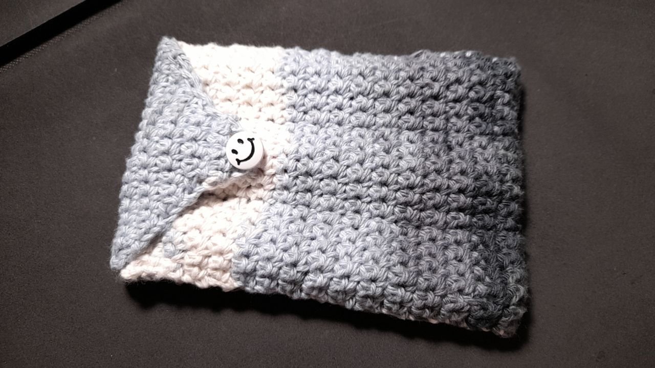
Misfit’s 4th album of Pens etc
- By Misfit,
- 97
-
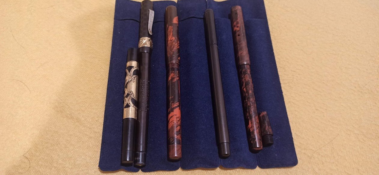
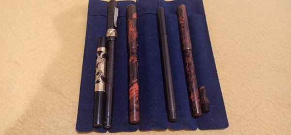
Old fountain pens
- By shalitha33,
- 0
- 0
- 20
-
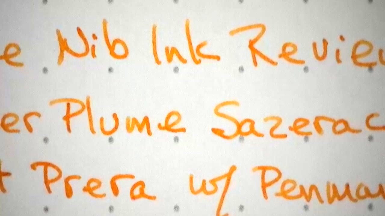
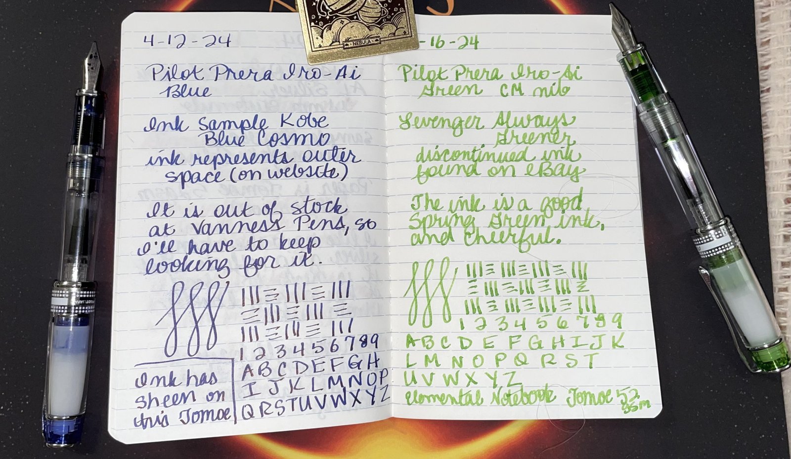
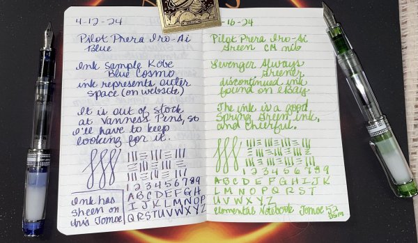
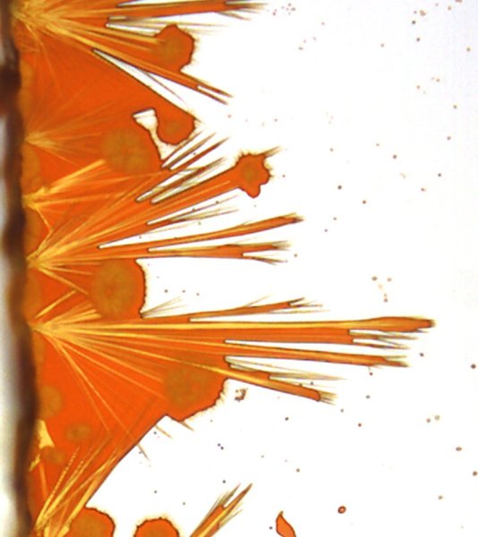
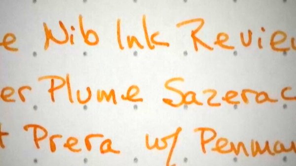
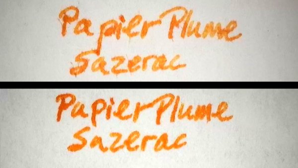
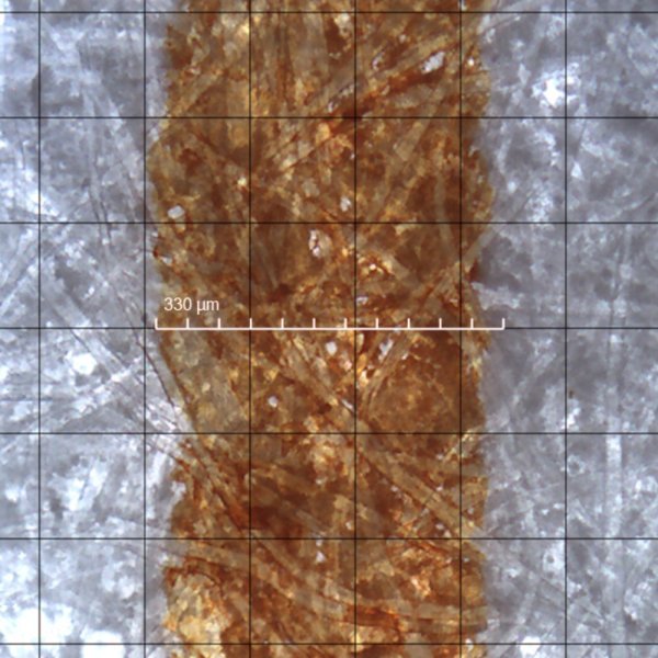
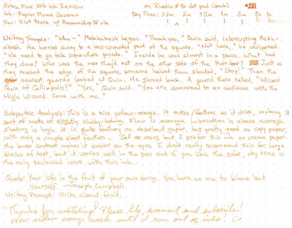
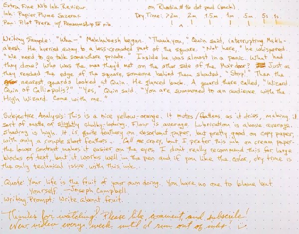
Extra Fine Nib Ink Reviews (17 of n)
- By LizEF,
- 0
- 19
- 19
-
more
- By AmandaW,
- 3
- 3
- 63
-
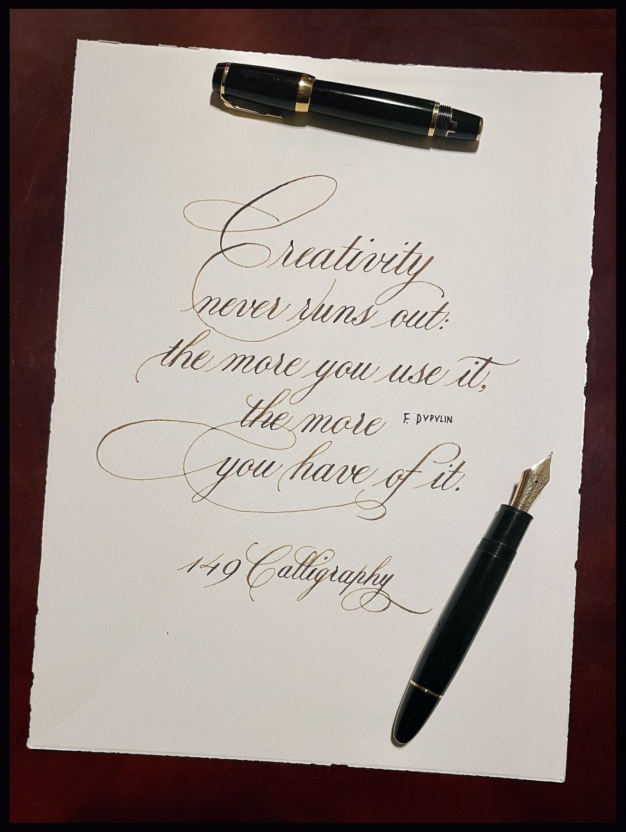
Icones Pupulinianae V
- By fpupulin,
- 0
- 1
- 31
-
-
-
Most Contributions
-
 amberleadavis
43844 -
.thumb.jpg.f07fa8de82f3c2bce9737ae64fbca314.jpg) PAKMAN
PAKMAN
33554 -
 Ghost Plane
28220 -
 inkstainedruth
26728 -
 jar
jar
26101
-
-
Upcoming Events
-
0April 20, 2024 08:00 PM
Until 10:30 PM
-
-
Blog Comments
-

By Shanghai Knife Dude · Posted
I have the Sailor Naginata and some fancy blade nibs coming after 2022 by a number of new workshop from China. With all my respect, IMHO, they are all (bleep) in doing chinese characters. Go use a bush, or at least a bush pen. -
desaturated.thumb.gif.5cb70ef1e977aa313d11eea3616aba7d.gif)
By A Smug Dill · Posted
It is the reason why I'm so keen on the idea of a personal library — of pens, nibs, inks, paper products, etc. — and spent so much money, as well as time and effort, to “build” it for myself (because I can't simply remember everything, especially as I'm getting older fast) and my wife, so that we can “know”; and, instead of just disposing of what displeased us, or even just not good enough to be “given the time of day” against competition from >500 other pens and >500 other inks for our at -

By adamselene · Posted
Agreed. And I think it’s good to be aware of this early on and think about at the point of buying rather than rationalizing a purchase.. -
By A Smug Dill · Posted
Alas, one cannot know “good” without some idea of “bad” against which to contrast; and, as one of my former bosses (back when I was in my twenties) used to say, “on the scale of good to bad…”, it's a spectrum, not a dichotomy. Whereas subjectively acceptable (or tolerable) and unacceptable may well be a dichotomy to someone, and finding whether the threshold or cusp between them lies takes experiencing many degrees of less-than-ideal, especially if the decision is somehow influenced by factors o -
By adamselene · Posted
I got my first real fountain pen on my 60th birthday and many hundreds of pens later I’ve often thought of what I should’ve known in the beginning. I have many pens, the majority of which have some objectionable feature. If they are too delicate, or can’t be posted, or they are too precious to face losing , still they are users, but only in very limited environments.. I have a big disliking for pens that have the cap jump into the air and fly off. I object to Pens that dry out, or leave blobs o
-
-
-
Files
-


Recommended Posts
Create an account or sign in to comment
You need to be a member in order to leave a comment
Create an account
Sign up for a new account in our community. It's easy!
Register a new accountSign in
Already have an account? Sign in here.
Sign In Now