Search the Community
Showing results for tags 'yellow'.
-
TACCIA Ukiyo-e Syaraku natane TACCIA is a Japanese stationery company, that - as far as I know - is now part of the Nakabayashi group. They offer high-quality fountain pens, inks, pen-rolls, notebooks, etc. More specifically, TACCIA produces a line of inks, inspired by the unique look of Ukiyo-e prints from Japan’s Edo period (1603-1868). Ukiyo-e prints are woodblock prints where the work of an artist is carved into wood by woodworkers, and pressed onto paper by printers. This allows for the production of multiple prints of an artwork with some different colours as well. In this review, the star of the show is natane, a golden-yellow ink with a hint of green undertones. The ink is inspired by the colour that appears in the kimono from “Segawa Kikunojyo III as Oshizu, Wife of Tanabe Bunzo.” This print of the actor Segawa Kikunojyo III is one of the most celebrated portraits of the onnagata (male actor in a female role) by the late eighteenth-century artist Tousyusai Syaraku. It portrays a character in the Genroku era play Hanaayame Bunroku Soga (The Iris Saga of the Bunroku Era), a drama that retells the true story of the vengeance of ten brothers for their father's assassination in 1701. The play was performed at the Miyako-za theater in the city of Edo in May 1794. For writing, this ink disappointed me. It writes really dry with a serious lack of lubrication. Also – yellow is a difficult colour to write with: not so good for dry pens / fine nibs, and definitely unsuitable for use on cream-coloured paper. Furthermore, the ink suffers from see-through / bleed-through on many paper types. And the list goes on… lines are smeared out instead of crisp with most nibs, except the fine ones. Overall, not a fantastic ink to write with. On the other hand, there is that lovely golden-yellow colour, that seems to shine of its own. When saturated, natane shows a beautiful green undertone that sets this ink apart from others I own in this tonal range. This is an ink that’s made for drawing! The ink comes in a 40 ml bottle, that is packaged in a beautiful box showing the corresponding Ukiyo-e painting. To show you the impact of saturation on the ink’s look & feel on paper, I made some scribbles where I really saturated portions of a strip of 52 gsm Tomoe River paper with ink. This gives you a good idea of what the ink is capable of in terms of colour range. Natane has a fairly wide dynamic range, while keeping a pleasant contrast between light and darker parts. This translates to soft shading, that is most evident in wet pens with wide nibs that can cover the complete expressive range of this ink. I like the writing in my Edison Collier with 1.1 stub nib, which is used in the scan below. The ink’s chromatography shows a truly diverse mix of dyes, with light-blue, rose and yellow tones appearing. This already hints at the green undertones that blossom up where the ink gets saturated. The resulting colour is really beautiful: an old gold-yellow with an antique vibe that seems to shine from within. I really like this ink’s colour. As can be seen from the bottom part of the chromatography, natane shows a bit of water resistance. The yellow dyes disappear, but a light-blue residue remains that makes it possible to reconstruct your writing. I’ve tested the ink on a wide variety of paper – from crappy Moleskine to high-end Tomoe River. On every small band of paper I show you: An ink swab, made with a cotton Q-tip 1-2-3 pass swab, to show increasing saturation An ink scribble made with an M-nib Lamy Safari The name of the paper used, written with a Pelikan M400 with gold M-nib A small text sample, written with a Parker Sonnet with F-nib Source of the quote, written with an Edison Collier with 1.1 stub Drying times of the ink on the paper (with the M-nib Safari) Natane is too unsaturated to play nice with my usual Safari test pens. That’s why I used wet pens for my writing samples. These wet pens push the colour range to the saturated part of its spectrum, where you get that golden hue with a green undertone – which I consider the goldy-locks zone for this ink. As mentioned above, the ink has lots of technical shortcomings: low lubrication, absorbs too fast into the paper, resulting in wide lines and a fair amount of see-through and even bleed-through. You also get a tiny amount of feathering on many of the more absorbent papers. Overall, natane is a poor performing writing ink (my opinion). I liked the ink best with my Parker Sonnet with F-nib – the Sonnet tends to write more saturated (it evaporates water like crazy with that breather hole in its cap), which accentuates the golden-green end of natane’s colour spectrum. And the fine nib keeps the wide-writing tendency of this ink under control. Below are photos that show the ink on the different papers in my test set. My scanner has difficulties capturing natane’s colour well. The ink shows too yellow, and that inner golden light gets lost. For the sake of completeness, you can find an example of a scan below. Writing with different nib sizes The picture below shows the effect of nib sizes on the writing. Natane is too unsatured with my Lamy Safari test pens, which results in a light yellow that is barely readable. Also, the dry-writing Safari is definitely unpleasant to use with this under-lubricated ink. But I really like the ink with wet writers, and especially with my Parker Sonnet. Related inks To compare natane with related inks, I use my nine-grid format with the currently reviewed ink at the center. This format shows the name of related inks, a saturation sample, a 1-2-3 swab and a water resistance test – all in a very compact format. The ink is different from other yellow-toned inks in my collection. The yellow dominates, but that barely-visible green undertone sets natane apart from its neighbours. Inkxperiment – hunter-seeker With every review, I try to create an interesting drawing using only the ink I am reviewing. These small one-ink pieces are an excellent way to show the colour-range nuances that are hidden within the ink. And I totally enjoy the fun couple of hours these inkxperiments provide me. Yellow-toned inks are usually great for drawing, so I had high hopes for this inkxperiment. Inspiration for the drawing comes from the novel “The Kraken Project” by Douglas Preston. A light read, where the plot centers around Dorothy, an AI program that escapes to the internet. At a certain point, virus-bots are sent out hunting for Dorothy’s signature. The drawing captures the moment where the virus-bots zoom in for the kill, with Dorothy desperately hiding behind her firewall. For this drawing, I started with a piece of A4 HP photo paper. I first drew the background, using some cotton pads and water-diluted ink, with parts of the scene taped out using washi tape. Next I drew the firewall using pure natane and a plastic card, and painted in the figure of Dorothy. I finally added the hunter-seeker virus-bots executing their attack. The final picture turned out quite well, and gives you a good impression of what can be achieved with this TACCIA ink in a more artistic setting. Inkxpired – computational art I love experimenting with pen/ink/paper, and have added another layer as part of the hobby. I’m exploring computational art, inspired by the ink drawings I do during ink reviews. Another fun offshoot of the hobby… and all that starting with a few drops of dye-coloured water on paper. For this computational derivation, I first abstracted the drawing, and then used a filter that overexposed the scene. Finally I added a lens blur filter – keeping Dorothy in focus, but seriously blurring out the image of the killer-bots. I quite like the end-result, which emphasizes Dorothy’s despair when the hunter-seekers initiate their attack. Conclusion TACCIA Ukiyo-e Syaraku natane is a difficult ink. Not really suited for writing and with lots of technical issues. You really need to hunt for the right combination of pen and paper when working with this one. But it’s also an ink with a beautiful golden-yellow colour that works great for drawing. I will continue to use it in my Parker Sonnet, but will probably use most of my bottle for doing ink paintings. Technical test results on Rhodia N° 16 notepad paper, written with Lamy Safari, M-nib Back-side of writing samples on different paper types
-
I got this one on a whim, thinking I might need a yellow. It's not suitable for writing as you cannot see what you're doing and while the scan and photos make it legible, I cannot read the page, over powered by this arguably bright yellow. It's a dry ink and wrote awful in the Soennecken. And it was awful to see the colour through the ink window, it looked like golden pee. Yuck! I believe it's only suitable for art work, or mixing to create murky greens for ex. (you know who you are) I'm not sure if you can use it as a highlighter, as it's not waterproof and loves soaking up cheap paper, meaning it'll bleed through. Oh and where sunglasses, you'll be blinded. 😎 Let's start with the Chroma: Writing samples: While it looks legible, it is not. I could not read what I was writing, hence my illegible handwriting. Hammermill 20lb back. This ink hates cheap paper Photos: Comparaison: Watertest: I was so frustrated with this ink that mixed the Lamy convertors of the pen filled with Herbin Perle Noire with this one. I also added a few drops of Perle Noire in the convertor of the Kakuna, and created a nice murky green. I did a writing sample on cheap Hammermill 20lb paper, and chromas of the different mixes: Note the blue in the first one, and fi And finally the only reason to have this ink: to draw the Minions and bananas Inks used: J Herbin Bouton d'or (yellow), Noodler's Apache Sunset A mix of Herbin Perle Noire + Bouton d'or (Murky green) Platinum Carbon Black Ink for the pants: Akkerman Delfts Blauw and water colour and pastel. · Pens used: Pilot Kakuna Ef, Lamy Safari (EF/F/M/B), Soennecken school pen semi-flex, Jinhao 450 fude · What I liked: For drawing the Minions and bananas , mixing · What I did not like: Illegible, not water resistant and ugly through the ink window. · What some might not like: Illegible It doesn’t like cheap papers. · Shading: Are you kidding me? · Ghosting: On cheap paper · Bleed through: Same as above. · Flow Rate: Wet · Lubrication: Dry · Nib Dry-out: None · Start-up: None · Saturation: Unsaturated · Shading Potential: You can’t see, so what’s the point? · Sheen: None · Spread / Feathering / Woolly Line: No · Nib Creep / “Crud”: No. · Staining (pen): No · Clogging: No · Cleaning: Ok · Water resistance: It doesn’t really make a difference does it? · Availability: 10/30 ml bottles, cartridges. I hope it's doesn't exist in 500 ml bottles Please don't hesitate to share your experience, writing samples or any other comments. The more the merrier
-
Yellow Pen Club - Show Us Your Yellow Pens!
Misfit posted a topic in Fountain & Dip Pens - First Stop
The Pen Clubs continue with a challenge, yellow pens. We will start other pen clubs, and some of those should have lots of contributions. Let’s see how many yellow pens people buy. I have five. From left: Pilot Prera yellow Nemosine Singularity Sunglow Sheaffer from a set Pilot Kakuno Lamy Safari neon yellow -
From the album: Mercian’s pens
My (currently) latest acquisition - a Lamy Safari in standard-production-run yellow, with an ‘F’ nib. #Glamorous It reminds me very much of a Lego construction set that I was given in the early 1980s 😊
- 0 B
- x
-
I'm a Parker 45 collector (among other pens). My impression is that the "Happy Colors" Yellow is quite hard to find. I have two FPs of one type of yellow, and one of another type of yellow. See the photos here from different distances and perspectives: Based mostly on the photo of the barrel ends, I believe that the two yellows (what I'd call a "goldenrod" yellow) that are alike are the authentic Parkers, and the one yellow that differs from the other two (what I'd call a "bright" yellow) probably is an Ariel Kullock creation. The bright yellow barrel end has a different shape from other authentic Parker 45 FPs and seems to match other Kullocks of the same pen model. The other reason I believe that the bright yellow 45 is a Kullock is that one cannot screw off the nib section (the pen was never used before I purchased it, but I soaked it anyhow); the nib section appears to be fixed by design. On the two goldenrod yellow 45s, I replaced the stainless steel fittings, cap, and nibs with gold-plated fittings, gold arrow and brushed steel caps, and gold nibs (because I prefer the gold as a contrast to the stainless steel). So don't be misled by my changes. My question to the group is whether my conclusion about which yellow version is an authentic Parker is correct or incorrect. Your input would be appreciated. Thanks. -- Donn

-
TAG Kyoto – kyo-no-oto – yamabukiiro TAG is a stationery shop in Kyoto (Japan) that produces some interesting soft watercolour-style inks. With the kyo-no-oto series they produce a line of inks that replicates traditional Japanese dye colours. According to available online info, the manufacturing process of the kyo-no-oto inks follows traditional dying techniques dating back to the Heian era between the years 794 and 1185. The inks come in 40 ml bottles, packaged in luxurious thick paper with a texture that feels like heavy watercolour paper. For this review, yamabukiiro takes the stage and fills it with its presence. This ink is named after the Yamabuki flower (“Mountain Breath”), that is found in abundance on Japanese mountainsides. The yellow-amber colour grabs your attention, not because it is bright and bold – au contraire – but because it is tender and soft, harmonious and elegant, and with a surprising depth of character. No ink for mundane work, but one that feels right at home for personal journaling. I guess there’s no need to tell you that I like this ink – a lot! The ink writes moderately wet in my standard Lamy Safari M-nib test pen, but with fairly low lubrication. I also found the ink to be too light and low-contrast with the dry-writing Safari. You really need a wet pen to make this ink blossom and to unlock its full potential – it works great with e.g. a Pelikan, even when using an F-nib. With the Pelikan, the ink has decent saturation, and also shows its subtle complexity with a hint of green in the undertones. The TAG Kyoto inks share a common gene-pool, which consistently delivers nicely muted, elegant, good-looking inks. They totally fit my taste, and I’m quite glad that I discovered them. To show you the impact of saturation on the ink’s look & feel on paper, I made some scribbles where I really saturated portions of a strip of 52 gsm Tomoe River paper with ink. This gives you a good idea of what the ink is capable of in terms of colour range. Yamabukiiro has a fairly broad dynamic span, ranging from a wispy light-yellow to a fairly dark amber with a touch of green. Despite this broad range, there is no harsh contrast between the light and darker parts. This translates to subtle shading, definitely present but never too strong. This aesthetic shading adds character to your writing. The ink’s chromatography shows the subtle depth and complexity of the dye-mix. The ink’s base colour derives from the yellow and orange dyes. The depth and character come from the blue component, that combines with the yellow to produce the ink's green undertone. This is without a doubt the work of a master mixer! I’ve tested the ink on a wide variety of paper – from crappy Moleskine to high-end Tomoe River. On every small band of paper I show you: An ink swab, made with a cotton Q-tip 1-2-3 pass swab, to show increasing saturation An ink scribble made with an M-nib Lamy Safari The name of the paper used, written with a B-nib Lamy Safari A small text sample, written with an F-nib Pelikan M600 Source of the quote, with a Pelikan M200 with M nib Drying times of the ink on the paper (with the M-nib Safari) Yamabukiiro looks good on all types of paper. Personally though, I like it best on pure-white paper. The ink performs well on my test papers, even on the Moleskine paper (which is quite an accomplishment). With the lower-quality paper (Moleskine, generic notepad paper) there is a certain amount of bleed-through. Drying times are mostly around the 5 to 10 second mark. Water resistance is clearly absent – this ink won’t survive watery accidents. If you are in the habit of tipping your drink over your notebook, this is no ink for you 😉 I’ve also added a few photos to give you another view on the ink. Scanned images and photos often capture different aspects of the ink’s colour & contrast. That’s why I present them both. In this case, both scanner and photo capture yamabukiiro’s golden glow fairly well. Writing with different nib sizes The picture below shows the effect of nib sizes on the writing. In my opinion, kyo-no-oto yamabukiiro really requires a wet pen. It is too light for my taste in the dry-writing Safari. With the wetter pen, the sub-par lubrication of this ink mostly disappears. Also, the ink becomes more saturated, gains more depth and brings forth its green undertones. The wet pen really shows off the ink’s golden radiance. Related inks To compare the yellow-amber yamabukiiro with related inks, I use my nine-grid format with the currently reviewed ink at the center. This format shows the name of related inks, a saturation sample, a 1-2-3 swab and a water resistance test – all in a very compact format. This kyo-no-oto ink is different from my other yellow-gold-amber inks, and as such a welcome complement to my ink collection. Inkxperiment – genesis With every review, I try to create an inkxperiment using only the ink I am presenting. Such a one-ink drawing works great to show off the colour-range nuances that are present in the ink. These inkxperiments are the favourite part of my reviews: always loads of fun and a perfect way to experiment with inks using a number of different techniques. Yellow inks are often great for drawing, and this TAG Kyoto ink is no exception! Inspiration for this drawing comes from the cycle of life – a seedling starts growing, and metamorphoses into a beautiful flower. I started with an A4 piece of HP photo paper, onto which I drew the background with water-diluted ink, spread on the paper through a kitchen towel. I also used a piece of carpet anti-slip underlay to add some background accents. I next used different-sized glass jars to stamp in the enlarging circles that represent the seed’s growth. Finally I drew in the flowers to complete the drawing. The end result is not too bad, and shows what can be achieved with this beautiful yellow-amber ink in a more artistic context. Conclusion TAG kyo-no-oto yamabukiiro is a great journaling ink – a complex yellow-amber with a unique colour that is both soft and elegant. The ink works best in wet pens, where it can express itself in full saturation, showing its golden glow with subtle green undertones. A truly beautiful ink, that makes a great impression! In my opinion, you can’t go wrong with this ink – a piece of art from the master mixer at TAG Kyoto. Technical test results on Rhodia N° 16 notepad paper, written with Pelikan M600, F-nib Back-side of writing samples on different paper types
-
Manufacturer: Robert Oster Signature Series, colour: Yellow Sunrise Pen: Waterman Hemisphere „F” Paper: Image Volume (gramatura 80 g / m2) Specifications: Flow rate: very good Lubrication: good Bleed through: unnoticeable Shading: noticeable Feathering: unnoticeable Saturation: very good A drop of ink smeared with a nib The ink smudged with a cotton pad Lines Water resistance Ink drying time Ink drops on a handkerchief Chromatography Sample text in an Image Volume (80 g / m2) Sample text in an Oxford notebook A5 (90 g / m2) Sample letters in a Rhodia notebook No 16 (90 g / m2) Sample letters in a Clairefontaine (120 g / m2) Palette of shades
-
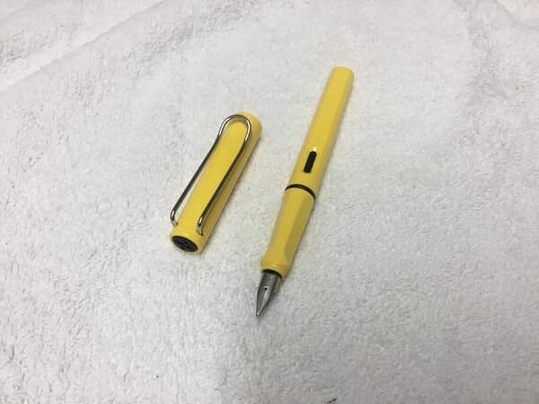
My preordered TWBI ECO in yellow arrived in the mail today. YAY!!! I was thrilled to see that it wasn't a dull orange-yellow or an eye-stabbing neon yellow, nor yet a depressing school bus yellow (which never fails to look dingy to my eye). Nope! What I have is a sunny cheerful yellow. See it below! Now I just have to ink this pretty pen up ... but though I would like to use a yellow to yellow-orange ink (but nothing mustard-like) I don't know which ink I should use. Would anyone like to offer up any suggestions as to which ink I can pair up with my new pen? Please and thank you!
-
Robert Oster 1980 - Honey Bee Robert Oster is an Australian ink maker that is well-known for its unique range of colours. With this mini-series he gives us a conglomeration of colours inspired by the anything goes world of the 1980s. These inks fit my personal preferences: muted pastel-type colours with great shading. In this review I take a closer look at Honey Bee - a yellow-orange-sepia chameleon of an ink. This ink substantially changes colour depending on the type of lighting. It's more of an orange-sepia colour in daylight, but a dark yellow under artificial light. Honey Bee is not a bad name, given that honey comes in a broad colour range, that is nicely captured by this ink. The ink feels dry - and I mean really dry - in my Lamy Safari test pens, and even in wetter pens with fine nibs. Saturation is also relatively low, meaning that you need wet pens to take full advantage of this ink. All this doesn't sound very promising, I know. But pair this ink with broad nibs in a wet pen, and the result looks really nice. And for drawing, this ink simply looks gorgeous. To show you the impact of saturation on the ink's look & feel on paper, I made some scribbles where I really saturated portions of the paper with ink. This gives you a good idea of what the ink is capable of in terms of colour range. As you can see, Honey Bee is quite faint at the lower saturation end, but reaches a much darker sepia-brown colour when fully saturated. The colour remains dusty and muted across the saturation range, which I personally like. To prove the chameleon quirks of this ink, I took a photo of the same saturation sample under artificial light. Here the ink transforms into a dusty dark yellow. Compare this to the more orange-sepia tones of the saturation sample above (my scanner uses light with a daytime colour temperature). To be honest, I personally prefer its nighttime appearance under artificial light. Like most Robert Oster inks, Honey Bee has zero water resistance. Short exposures to water completely obliterate the text, leaving next to nothing on the page. This is also apparent from the chromatography. Smudging is not a problem though - which is what I typically care about. I've tested the ink on a wide variety of paper - from crappy Moleskine to high-end Tomoe River. On every small band of paper I show you: An ink swab, made with a cotton Q-tip 1-2-3 pass swab, to show increasing saturation An ink scribble made with an M-nib Lamy Safari fountain pen The name of the paper used, written with a B-nib Lamy Safari A small text sample, written with an M-nib Lamy Safari Origin of the quote, written with a Kaweco Sport with M cursive italic nib Drying times of the ink on the paper (with the M-nib Lamy) Honey Bee is a well-behaving ink on most paper types, with no visible feathering. The ink dries quite quickly around the 5 second mark (with the M-nib Lamy Safari). The ink reacts weirdly with Moleskine paper, but works just fine with the other paper types in my test set. Due to the yellow-orange colour, the ink works best with pure white paper. Personally, I don't really like its looks on more yellowish paper. As can be seen from the quote origin texts written with an M cursive italic, Hoeny Bee works best with broader nibs or wet pens, where saturation improves, and the horrible dry-ness more or less disappears. I also show the back-side of the different paper types at the end of the review. No troubles there, except with the Moleskine paper, which shows significant bleed-through. All in all, a well-behaving ink (if you avoid the Moleskine where the chemistry gets weird). Writing with different nib sizes The picture below shows the effect of nib sizes on the writing. All samples were written with a Lamy Safari, which is typically a dry pen. I also added a couple of visiting pens. The ink's shading really starts showing up once you go to M-nibs or broader. With wet pens, the ink becomes much more saturated, while still keeping its toned-down muted appearance. Personally I think Honey Bee should only be used in wet pens with broader nibs. Below is a writing sample on Paperblanks journal paper, showcasing the difference between a Lamy Safari M-nib (dry pen) and a wetter-writing Kaweco Sport with M cursive italic nib. With the wetter pens, saturation and dryness are no longer a problem. Related inks To compare Honey Bee with related inks, I use my nine-grid format with the currently reviewed ink at the center. This format shows the name of related inks, a saturation sample, a 1-2-3 swab and a water resistance test - all in a very compact format. Inkxperiment – radiant madonna As a personal challenge, I try to create interesting drawings using only the ink I'm reviewing. Limiting myself to one ink allows me to creatively showcase all its colour-range nuances. It's often quite a challenge, but always great fun. For this drawing I started off with HP Premium photo paper. I created a background by pressing the photo paper on a water-soaked kitchen towel on which I splashed some ink. Next I used pure Honey Bee to paint in the subject. The radiant halo surrounding the madonna was added with Q-tips and different water/ink ratios. The resulting mini-picture gives you an idea of what can be achieved with this yellow-orange Honey Bee as a drawing ink. Conclusion Robert Oster 1980 Honey Bee is a pastel-toned yellow-orange-sepia chameleon, that mostly excels as a drawing ink. Personally, I didn't care much for its chameleon nature, which results in a completely different look under day- or artificial light. The ink also has technical issues, being dry and undersaturated. You really need wet pens and broader nibs to get a good-looking result. Overall, I'm not impressed by this ink - I've seen nicer ones with better behaviour. Technical test results on Rhodia N° 16 notepad paper, written with Lamy Safari, M-nib Back-side of writing samples on different paper types From idea to drawing Although Honey Bee disappoints as a writing ink, I found it to be a beautiful ink for drawing. In this appendix to the review, I'd like to give you a bit of insight into my drawing setup & process. This inkxperiment was born with some doodles, started during a lazy weekend-afternoon. I liked parts of different doodles, so I decided to combine them. I'm really bad at drawing, so I put together parts of different doodles on my computer, printed out the result, and used a light-box to transfer the resulting pic to the HP photo paper. The photo paper was already prepared with a Honey Bee background, created by pressing the paper on a water-soaked kitchen towel to which I added some splashes of ink. After finishing the Madonna picture with a fine brush and pure Honey Bee, I used Q-tips to draw in the radiant halo with multiple water-ink ratios. The end result is the inkxperiment drawing. Oh... and to protect my writing desk, I use a plastic kitchen placemat (white backside up) as a drawing surface - no accidents yet ;-)
-
Hello again to all my FPN friends, One of the interesting things for me about this hobby is how easily and suddenly my preferences for a particular design or color can change. I never use yellow for anything other than highlighting and previously would have thought something like a yellow pen to be tasteless or just plain weird. Then I saw these: WingSung 601 LE (Photo courtesy of Frankunderwater) Penbbs 308 Mango Yellow After seeing these beauties, something in my head snapped and I knew I must have an audacious and bold yellow pen! Sadly, the WS is a limited edition with an inconvenient filling system and the Penbbs 308 won't work for me for other reasons. Now the hunt is on. What's your favorite yellow pen?
-
Why is it so hard to find yellow ballpoint pen. I mean yellow ink ballpoint pen. I have yellow fountain pen ink. Yellow gel pens. Yellow pencils. you can find yellow in almost all art supplies. And when you want ballpoint pens, where is yellow? I have visited many art stores. I have purchased these https://www.amazon.in/Paper-Mate-Retractable-Ballpoint-1788863/dp/B005DEW3J4/ref=sr_1_63?keywords=colored+ballpoint+pens&qid=1565679755&s=gateway&sr=8-63 https://www.amazon.in/Staedtler-Triangular-Ball-Pen-Colours/dp/B002BDNLR8/ref=sr_1_7?keywords=colored+ballpoint+pens&qid=1565679692&s=gateway&sr=8-7 and these https://www.amazon.in/Hauser-Billi-Color-Ball-Colours/dp/B078HKW9MD/ref=pd_sbs_229_3/262-9120982-7764102?_encoding=UTF8&pd_rd_i=B078HKW9MD&pd_rd_r=62d67b55-ceed-45ab-a550-01fb0b0f6e2f&pd_rd_w=Z045E&pd_rd_wg=8VQJK&pf_rd_p=2785a4f5-4b62-4bf0-bf3d-365a6e281498&pf_rd_r=1FVT415APB4MTSCM707K&psc=1&refRID=1FVT415APB4MTSCM707K None of then contains yellow. I know its hard to get certain pigments. But is yellow that rare? Nowadays, you can find sets of gel pens like these https://www.amazon.in/Paraspapermart-Metallic-Coloring-Sketching-Painting/dp/B07F5NRD2L/ref=sr_1_11?keywords=colored+ballpoint+pens&qid=1565680045&s=gateway&sr=8-11 Why we don't find sets like these without gel inks. Plain old ballpoint ink?
-
Robert Oster Signature - Green Olive Robert Oster is an Australian ink maker that is well-known for his unique range of colours. On his website, he describes our shared love quite eloquently: "Robert Oster Signature originates from one of the most famous wine producing regions of the world, the Coonawarra district of South Australia, an idyllic setting with great influence on the senses. There is my inspiration. It's a joy to share it with you." Well, we are certainly fortunate to have inspiring ink makers like Robert Oster to satiate our thirst for glorious inks. In this review, I take a closer look at Green Olive. Catherine from Sakura provided me with a sample of this ink to play around with - much appreciated! This is in essence a yellow ink - not the type of colour I think about when hearing the name "Green Olive". As expected, saturation is low, and contrast with the paper is almost non-existent - especially in drier pens and finer nibs. As a writing ink, this one is only tolerable when using wet pens and broad nibs, in order to achieve maximum saturation. Being a typical F/M nib user, this is definitely not suitable for my pens. To show you the impact of saturation on the ink's look & feel on paper, I made some scribbles where I really saturated portions of the paper with ink. This gives you a good idea of what the ink is capable of in terms of colour range. As you can see, Green Olive is really really faint at the lower saturation end, and only achieves some kind of olive-like hue when fully saturated. Like most Robert Oster inks, Green Olive has zero water resistance. Short exposures to water completely obliterate the text, leaving next to nothing on the page. As the chromatography shows, almost no ink is left on the page. Smudge resistance is acceptable: although there is lots of smearing of the ink, the text itself remains eadable. Better said: you start off with barely readable low-saturation text, and smudging does little to make this worse. I've tested the ink on a wide variety of paper - from crappy Moleskine to high-end Tomoe River. On every small band of paper I show you: An ink swab, made with a cotton Q-tip 1-2-3 pass swab, to show increasing saturation An ink scribble made with an M-nib fountain pen The name of the paper used, written with a B-nib A small text sample, written with an M-nib Drying times of the ink on the paper (with the M-nib) Green Olive is a well-behaving ink on most paper types, with no visible feathering. The ink dries quite quickly within the 5-10 second range (with the M-nib). Because of the colour, this is not an ink to use with yellow-tinted paper. With my Lamy test pens and M/B nibs, the ink is barely readable, and totally unsuited for note-taking. I don't own BB or BBB wet pens - maybe the ink is usable for writing in these cases. Anyway, if you insist on writing with a yellow ink, you're better off using one that is more saturated to start with. I also show the back-side of the different paper types at the end of the review. No troubles there, except with the Moleskine paper, which shows significant bleed-through. All in all, a well-behaving ink. Writing with different nib sizes The picture below shows the effect of nib sizes on the writing. All samples were written with a Lamy Safari, which is typically a dry pen. I also added a visiting pen - a wet-writing Lamy Dialog 3 with gold M-nib. But even with one of my wetter pens, the ink remains almost unreadable. I therefore added a line written with a glass dip pen - here you get maximum saturation, and a readable line with acceptable contrast. With smaller nib sizes, this is an ink to avoid. Related inks To compare Green Olive with related inks, I use a nine-grid format with the currently reviewed ink at the center. This format shows the name of related inks, a saturation sample, a 1-2-3 swab and a water resistance test - all in a very compact format. I hope that you'll find this way of presenting related inks useful. It's a bit more work, but in my opinion worth the effort for the extra information you gain. Inkxperiment - petites danseuses As a personal challenge, I try to create interesting drawings using only the ink I'm reviewing. For me, this brings some extra fun to the hobby, and these single-ink drawings present a real challenge at times. With these small pictures, I try to give you an idea of what the ink is capable of in a more artistic setting. For this drawing I started off with HP Premium photo paper, and zero inspiration. So I used a variant of the random line-drawing technique (drawing random lines on paper, and then try to lift something meaningful out of the messy randomness). In this case I submerged the photo paper in water, and added drops of ink. From the random ink blobs that formed on the paper - and using my imagination - I extracted the figures of two dancing children. I then used a glass dip pen to trace "les petites danseuses" - using maximum saturation of the ink. This mini-picture gives you an idea of what can be achieved with Green Olive as a drawing ink. And I must admit - as a drawing ink, Green Olive has lots of potential. Conclusion Robert Oster Green Olive is a yellow ink that is totally unsuitable for writing. The only way to get readable results is to use broad and broader nibs in wet pens, so that the ink reaches maximum saturation. As a drawing ink though, this one shows lots of potential. I enjoyed the experience of trying it once, but this is an ink that's not for me. Technical test results on Rhodia N° 16 notepad paper, written with Lamy Safari, M-nib Back-side of writing samples on different paper types
-
Hello, I have stumbled across a vintage Lamy pen I cannot properly identify and date. Any information on production year, collectibility and value of the pen will be greatly appreciated. I am unable to post any photographs as of right now, but if necessary, they will be posted as soon as I am able to. It's a yellow Lamy Safari fountain pen, with a black clip. The nib is painted black, but there is no logo on it. I suppose there was a time when Lamy did not laser etch their nibs? When did they start etching nibs with nib size and logo? This one is completely black. As for the color, it appears a darker shade of yellow than the current yellow Lamy Safari with a chrome clip is, but as I do not have on to compare it to, I am not one hundred percent certain about this. The box it comes in is not the modern carton box with cutouts, it's much simpler, textured black box, with a Lamy logo and an elastic band on it. Thanks.
-
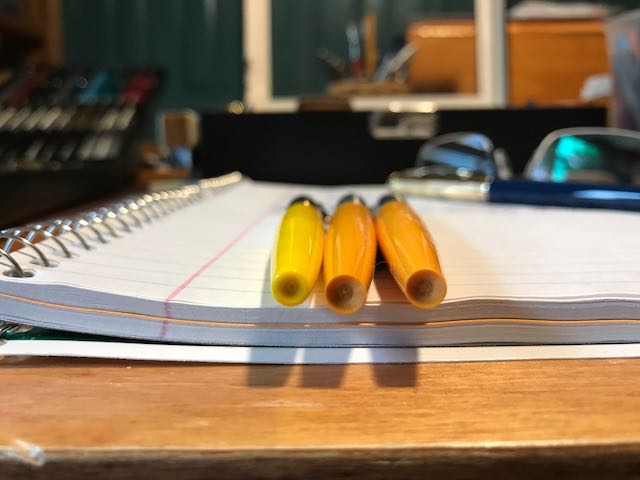
Hello there, Recently, I do a lot of pen maintenance mostly on vintage Montblancs. With this I realize the different colorations of some of the Montblanc stars on these pens which range from snow white over somewhat yellow to banana yellow. Here is a picture of a 344, a 252 and a 342 - all in different shades of yellow... These pens are otherwise in excellent condition; however, the discolorations are a bummer. A micro mesh treatment and an intensive polish have not shown any results. Does anyone of you have a suggestion on how to "revive" the original white of the stars? Best Greetings! 4810
-
Ink Review: STIPULA CALAMO SAPPHRON I have wanted to try several of the Stipula Calamo inks for some time after hearing about them. The inks are handmade in Italy and come in this great 70mL bottle. The Review above was scanned, and the color is "washed out". The ink color is closest on the writing sample on Tomoe River. I wrote the Review portion several days after receiving the ink sample. At first, I wasn't sure if I would like it. Since that time I have used this ink for a couple of weeks in several pens and it behaves wonderfully in all of them. I have been pleasantly surprised that this ink feathers very little even on cheap papers with minimal showthrough and minimal bleedthrough. The color is a warm yellow-orange that is just soft enough to be pleasant. It lays down light but darkens as it dries. Sold in 70mL light resistant glass bottle for $17.10 to $19.00 depending upon dealer. PROS: Well behaved on all papers Shading is wonderful Color is nicely saturated IMO Dries fairly quickly CONS: For some it may be undersaturated Not water resistant Not a versatile color (I doubt many would use this in a business office) May be too light in an EF/F nib Caution: While I only bought a sample of Sapphron, I did buy several bottles of other colors of Stipula ink. When first opening the ink, there is a plastic stopper in the neck of the bottle. I would recommend when loosening the stopper to place a large paper towel over the bottle and gently and slowly loosen the stopper out in order to equalize air pressure (think opening a bottle of champagne). The first bottle I opened I started to loosen the stopper and it popped out along with drops of blue ink everywhere. Thankfully I did over the bathroom sink and was able to clean all the ink up. The second bottle I opened I put a paper towel over the bottle as I gently and slowly loosened the stopper. It again popped out, but this time with less mess. Overall Score: 8+ Conclusion: This is a very nice ink. It is very well behaved in every pen I have used it in. It can be a bit light in EF/F nibs, but even in a fine nib this ink shades beautifully. The color is fairly light, much lighter than Pilot Iroshizuku Yu-Yake. Even though it is not an ink I would use everyday, I will be purchasing a full bottle.
-

Diamine Sunshine Yellow, Robert Oster Yellow Sunset, Diamine Amber, Robert Oster Peach
Jan2016 posted a topic in Ink Comparisons
Not the same, but all 4 pretty close to each other, see the chromo's -
Penbbs is chinese fountain pen forum. It seems the guys are not only talking about pens but also mixing inks and the moment they've created approximnately 200 inks. Wow. I remember I've seen Lgsoltek reviews of their inks and I had a chance to try opuntia Stricta ink that was rather nice in terms of color and quite plesant to use. Recently I've received samples of few other Penbbs inks. Ink no. 184 (can someone who knows chinese follow the link and translate it to english?) is well behaved yellow ink. It looks rather nice in broad Kaweco nib and the shading potential is strong. The ink isn't crazy wet but neither it's dry. It's pretty well behaved. I believe the sample came from Lgsoltek - thank you Drops of ink on kitchen towel Software ID Color range Tomoe River, Kaweco Classic Sport, B Leuchtturm1917, Kaweco Classic Sport, B Clairefontainte Triomphe, Kaweco Classic Sport, broad nib
-
-
-
-
-
-
-
-