Search the Community
Showing results for tags 'wine'.
Found 8 results
-
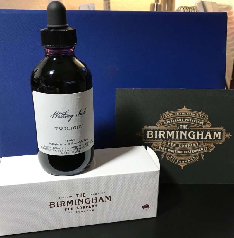
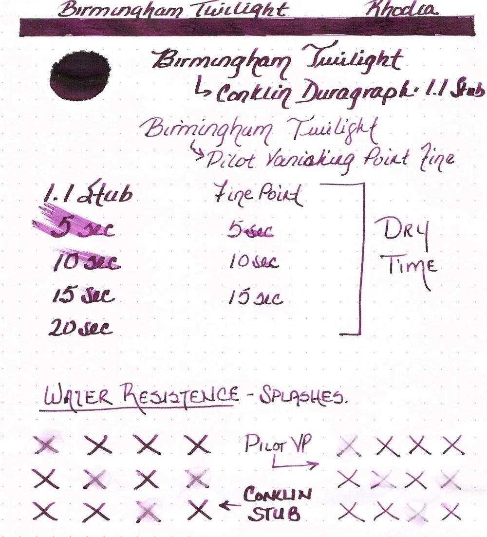
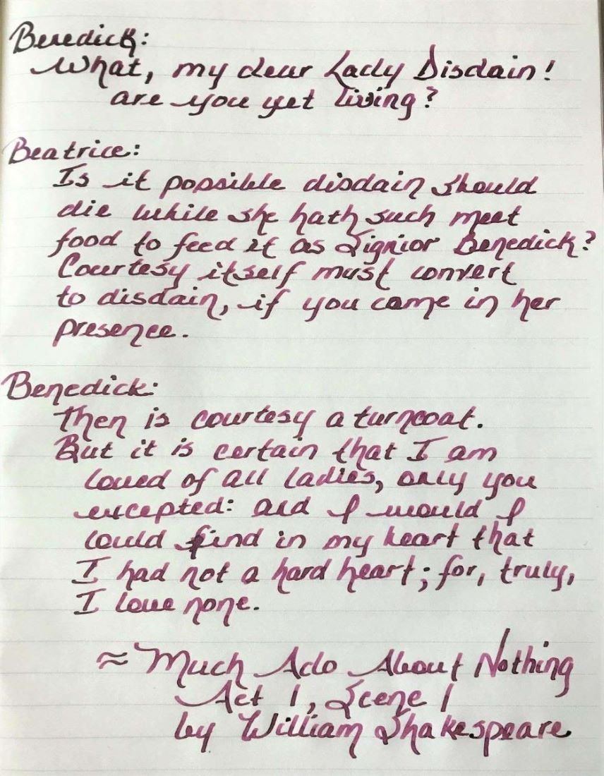
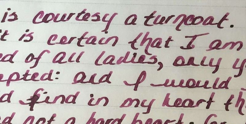
Ink Review: Birmingham Pen Company Twilight Background: Birmingham Pen Company (BPC) started as the brainchild of two brothers – Nick and Josh. Initially, Nick and Josh worked with third party ink producers in England and Germany to produce their inks. BPC started making their own inks over a year ago. While some changes have been made, their new formulations include “Crisp” inks designed for everyday use on all papers, “Swift” inks that are a bit wetter, starts up quickly and works well on premium papers, “Rich” inks which have high sheen and saturation, “Everlasting” inks that have high water resistance, “Twinkle” inks with shimmer and “Wishy-Washy” inks that are designed for performance but a washable from fabrics and surfaces. The glass bottles with tight-fitting plastic lids bottles are very nice and functional. My largest pen fits nicely into the bottle for a full fill. BPC offers three sizes: 30ml, 60ml and 120ml for all inks except the Twinkle inks which are only available in 60ml. The 120ml bottles have an eye-dropper lid instead of the regular lid. Review in Brief: Saturation: moderate saturation Sheen: some nice green sheen Shading: medium shading from fine to wider nibs Haloing: low Lubrication: medium lubrication Wetness: moderately wet Water Resistance: Moderately water resistant Feathering: minimal feathering on lower quality papers Bleedthrough: minimal only on lower quality papers and with high ink application Showthrough: medium showthrough on 52gsm TR paper, minimal on Rhodia and Apica Price: reasonable for 30mls, very good for 60ml and exceptional for 120ml which is the best value. While some inks retained the same name (or an abbreviated version), they may be slightly different. Ana at the Well Appointed Desk discussed this very well in her January 2021 blog (https://www.wellappointeddesk.com/2021/01/ink-brand-overview-the-new-birmingham-pen-company-inks/) The older version of this ink, known as Allegheny River Twilight, was review by craptacular in 2018. You will note that there is a difference between the older version and the new “Swift” formula. Pens: a Pilot Vanishing Point with a fine nib, and a Conklin Duragraph with a 1.1 stub nib. Papers shown: Rhodia, Tomoe River, Cosmo Air Light; Not shown: Apica CD Premium, Advantage 24 lb copy paper; Cambridge Premium Notebook paper. Rhodia Dot Grid Paper The ink is nicely saturated with some green sheen when pooled. The ink flows wonderfully in both pens. The Pilot VP has a very dry nib and is very particular about the ink it uses. This pen glides effortlessly with this ink. The Conklin Duragraph, on the other hand, is a very wet pen. The Twilight ink is almost too wet to use in this pen. The ink does dry fairly quickly on all papers tested but is slower on Tomoe River and Cosmo Air Light (20-25 seconds). he ink is surprisingly quite water resistant although it is not known as an “Everlasting” formulation. Feathering and bleeding are not seen on Rhodia, Tomoe River, Cosmo Air Light. There is some feathering on the 24 lb. copy paper, and minimal feathering on the Apica CD and premium notebook paper, and the three papers showed small amounts bleedthrough in heavy applications of the ink. Because this is a fairly saturated ink, there is showthrough on Tomoe River, Rhodia and Apica as well as the copy and notebook papers, especially with the 1.1 stub nib. Tomoe River Ivory Paper Tomoe River Ivory Paper Cosmo Air LIght Paper Apica CD Premium Notebook Paper The chromatography was simply done with a coffee filter. It shows how the ink color breaks down in to a complex variety of yellow, blue and red. Here are some color comparisons. Overall this is a very nice ink that behaves very well. I highly recommend giving this ink a try. Disclaimer: I purchased this ink directly from Birmingham Pen Company. Any photos, opinions and thoughts regarding the ink are my own and are not sponsored by Birmingham Pen Company and do not necessarily reflect their opinions.

-
Every now and again, whether it is from too much wine or other, we make a mistake that turns out to our advantage. Such is the tale of the 3 wine colored inks. Recently, after pen-cleaning, I loaded two of my pens with wine colored inks. I admit it was late at night and I was really tired. I already had one pen loaded with Montblanc Antoine de Saint Exupery Encre du Desert (whoever came up with that name deserves to be dipped in the ink!), which is a lovely burgundy ink. But I was loading about 12 pens full of ink, and by the time I got to the last couple of pens, I had forgotten what I loaded in the first few pens. So, I ended up with three inks very close in color. Well, my sleep deprivation provided this ink comparison. So, here they are: Taccia Ebi Pen: Lamy Scala with M nib Sailor Manyo Kuzu Pen: Monteverde Prima with 1.1mm stub nib Montblanc Antoine de Saint Exupery Encre du Desert (aka MB ASE Desert) Pen: Montblanc Unicef Legrand with OB nib Paper: Col-o-ring Ink Testing Swatch Paper: Tomoe River 65 gsm Paper: Tomoe River 65 gsm - Each line is written with the 3 inks. The color of all three inks is fairly well saturated. The two that are closest in color is Taccia Ebi and MB ASE Desert. Sailor Manyo Kuzu also has a lovely green-gold cast to it. In terms of performance, all are very well behaved inks, and are moderately wet. Of the three, Sailor Manyo Kuzu is just a bit wetter than the others. Dry times of all three were comparable at about 15-30 seconds depending on nib width.* Showthrough and bleedthrough were minimal with all three, but Taccia Ebi does have some bleedthrough on lesser quality papers.* None are water resistant, but Taccia Ebi seems just a bit more water resistant than the others. * In terms of sheen, Sailor Manyo Kuzu wins hands down. MB ASE Desert has some sheen, and Taccia Ebi has a small amount. In terms of shading, again Sailor Manyo Kuzu shades very nicely, but so does MB ASE Desert. Overall, all three inks are excellent! But, Sailor Manyo Kuzu outperforms the other two, but MB ASE Desert is close behind. * Sorry, I did not photograph these.
-
Hello! I recently purchased a Platinum 3776 Century in Borgogne with a medium nib. Gorgeous pen! I also purchased some Noodler's Black swan in Australian roses to go with it. Individually both are great, but my pen writes dry and the ink is dry and the combination is very bad! Can anyone recommend some juicy wet inks that fall in the wine/burgundy range? I know of many that are popular, but I am unsure of which of them are nice and wet. I welcome the wettest ink available! Thank you! EDIT: It breaks my heart a little that the combo isn't working out because I really love the shading and the saturation in the ink.
-

Yes, With This New Pen You Can Write With Wine!
OCArt posted a topic in Fountain & Dip Pens - First Stop
I am a new member and have't even introduced myself yet (will do soon) but i stumbled across this and found it too funnyhttp://dmoves.com/news/wp-content/uploads/2015/04/WINKImage.png You can the article and read about the kickstarter project here: http://dmoves.com/news/designer-introduces-refillable-glass-pen-built-to-write-with-wine-juice-and-tea/ Enjoy! i take a coffee! ( p.s. I apologize if this was was posted before; i did do a search -

De Atramentis - Red Wines - Merlot, Saint Laurent, Fruhburgunder (Early Burgundy)
amberleadavis posted a topic in Ink Comparisons
http://sheismylawyer.com/She_Thinks_In_Ink/2014-Inklings/slides/2014-Ink_1920.jpghttp://sheismylawyer.com/She_Thinks_In_Ink/Inked_Today/slides/20141025_005303.jpg -
K W Z I - Konrad - #81 - Iron Gall - Ig Cherry
amberleadavis posted a topic in Th-INKing Outside the Bottle
http://sheismylawyer.com/She_Thinks_In_Ink/2014-Inklings/slides/2014-Ink_2068.jpg -
Please take a moment to adjust your gear to accurately depict the Grey Scale below. As the patches are neutral grey, that is what you should see. Mac http://www.computer-darkroom.com/colorsync-display/colorsync_1.htmWintel PC http://www.calibrize.com/http://i783.photobucket.com/albums/yy116/Sandy1-1/FPN_2013/27ddb717.jpg ]:[ Fidelity The ink I used may be compared to the depiction of the Diamine site: diamineinks dot co dot ukWiki: http://en.wikipedia.org/wiki/SyrahFigure 1. Swabs & Swatch Paper: HPJ1124 24 lb. http://i783.photobucket.com/albums/yy116/Sandy1-1/FPN_2012/Ink%20Review%20-%20Diamine%20Syrah/e6710dd5.jpg Figure 2. NIB-ism ✑ Paper: HPJ1124. Depicts nibs' line-width and pens' relative wetness. http://i783.photobucket.com/albums/yy116/Sandy1-1/FPN_2012/Ink%20Review%20-%20Diamine%20Syrah/9fd045d2.jpg Pens, L → R: Estie, M400, 1745, Waterman, Slimfold, C74. WRITTEN SAMPLES - Moby Dick Ruling: 8mm. Figure 3. Paper: HPJ1124. http://i783.photobucket.com/albums/yy116/Sandy1-1/FPN_2012/Ink%20Review%20-%20Diamine%20Syrah/408ec68d.jpg Figure 4. Paper: Rhodia. http://i783.photobucket.com/albums/yy116/Sandy1-1/FPN_2012/Ink%20Review%20-%20Diamine%20Syrah/c166ced5.jpg Figure 5. Paper: G Lalo. http://i783.photobucket.com/albums/yy116/Sandy1-1/FPN_2012/Ink%20Review%20-%20Diamine%20Syrah/a84ea9e5.jpg Figure 6. Paper: Royal. http://i783.photobucket.com/albums/yy116/Sandy1-1/FPN_2012/Ink%20Review%20-%20Diamine%20Syrah/aa8f8765.jpg Figure 7. Paper: Staples. http://i783.photobucket.com/albums/yy116/Sandy1-1/FPN_2012/Ink%20Review%20-%20Diamine%20Syrah/e51c0d6f.jpg OTHER STUFF Figure 8. Smear/Dry Times & Wet Tests. Pen: Waterman. http://i783.photobucket.com/albums/yy116/Sandy1-1/FPN_2012/Ink%20Review%20-%20Diamine%20Syrah/4839836f.jpg Figure 9. Bleed- Show-Through on Staples. (Reverse of Figure 7.) http://i783.photobucket.com/albums/yy116/Sandy1-1/FPN_2012/Ink%20Review%20-%20Diamine%20Syrah/7c080314.jpg Hi-Res Scans: Originals are approximately 60x30 mm. Estie on HPJ1124: http://i783.photobucket.com/albums/yy116/Sandy1-1/FPN_2012/Ink%20Review%20-%20Diamine%20Syrah/7725b144.jpg 1745 on Rhodia: http://i783.photobucket.com/albums/yy116/Sandy1-1/FPN_2012/Ink%20Review%20-%20Diamine%20Syrah/9250425a.jpg Waterman on G Lalo: http://i783.photobucket.com/albums/yy116/Sandy1-1/FPN_2012/Ink%20Review%20-%20Diamine%20Syrah/ead739b8.jpg C74 on Royal: http://i783.photobucket.com/albums/yy116/Sandy1-1/FPN_2012/Ink%20Review%20-%20Diamine%20Syrah/36029da5.jpg GENERAL DESCRIPTION Type: Dye-based fountain pen ink.Presentation: Bottle.Availability: Available when Topic posted.Daily writer? Not so much.USE Kindly note that Red is a colour with many connotations, which vary according to the context and cultures in which it is used. These sources provide great insight into the use of Red ink: Wiki: http://en.wikipedia.org/wiki/RedInky Thoughts Forum - this Topic from 2012 seems wide ranging: https://www.fountainpennetwork.com/forum/index.php/topic/218278-the-significance-of-red-ink/?p=2299348. Business: (From the office of Ms Blue-Black.) As ever, in Western cultures the use of Red in business seems to be limited to an alt/aux ink, or colour-coded work, so I cannot envisage use for general correspondence.For personal work product, it does offer a pleasant enough writing experience, though for longer reading sessions, I would find the colour far too vibrant - even from narrow nibs when the % coverage on the page is low. (I look forward to hearing from those who use Syrah on a routine basis.)Two-sided use of common copy/printer papers may not be a reasonable expectation.Line quality might not be sufficient for tiny marginalia & annotation, but that will depend greatly on pen+paper. (The Estie + XF did well on HPJ1124.)As Red-centric inks may often be used for indicating errors / corrections and grading, and marking / underlining content of high importance, I'd not use Syrah for editing, forms work, etc.Illustrations / Graphics: A good pick for extending the Red palette, giving a respite from the brilliant Reds, especially when applied to large areas / blocks. Has just enough snap to be used for narrow lines & labels.As a watercolour, it can appear a bit 'rosy' at pale values, but avoids flashing Pink. When overworked with wet media, there is a distinct remnant which is of a similar colour, so sponging / stippling may create results of some appeal.Students: As for business, we seem to have an alt/aux ink that won't go about screaming its head off, and can survive a dunking.Personal: Another welcome addition to my small array of warm inks.As ever, I tend to approach such warm inks with a bit of reserve, so typically use my narrow nibs and smaller format sheets, and only for the shorter letter or note or sentiment enclosed with a greeting card.As these things sometimes go, I've taken to pairing Syrah with papers of low brilliance without optical brightening agents, yet there is nothing that precludes papers that glow in the dark.PHYSICAL PERFORMANCE & CHARACTERISTICS Flow Rate: Somewhat wet.Nib Dry-out: Not seen.Start-up: Immediate.With confidence.Lubricity: High.All pens ran quite smoothly on the textured papers.Greater lubricity might've caused problems on the Rhodia.Nib Creep: Not seen.Staining (pen): Not seen after three days contact.Clogging: Not seen.Seems unlikelyBleed- Show-Through: HPJ1124: Waterman, Slimfold, C74.Royal: All.Staples 20lb: Waterman.Feathering / Wooly Line: HPJ1124: C74.Royal: All.Aroma: A bit sharp on the nose.Hand oil sensitivity: Not evident.Clean Up: Quick and thorough with plain water.Mixing: No stated prohibitions.Archival: Not claimed.THE LOOK Presence: Firm.Ripe.Saturation: Middling.Shading Potential: Quite possible, even from narrow nibs.Prime driver seems to be choice of paper.Line Quality: Very dependent on paper - more so than most other Diamine inks.Variability: Pen+nib combos used:About as expected.Papers used:About as expected - other than shading.Malleability: Moderate.The wily practitioner may need to juggle pen and paper to get the desired appearance.The performance envelope isn't generous; and Syrah seems to require dry-ish writers to be used with confidence on most mid-range papers. PAPERS Lovely papers: Those that resist bleed- show-through.Trip-wire Papers: ☠ Those that cannot suppress bleed- show-through.Tinted Papers: Hmm.I really wouldn't go too far from White, though a pale Creme might be OK, as might the most pale Powder Blue.Is high-end paper 'worth it'? Yes.The smooth coated papers seem to be required to compensate for ink's wetness and propensity for bleed-show-through and sometimes wooly line; and if shading and higher line quality are desired.Others to consider are the textured G Lalo Velin de France and and MK Papier Exquisit, but only if accompanied by a rather wet pen to overcome those papers' somewhat hard textured surface, hence keep the line quality from becoming too coarse.ETC. Majik: Not so much - the performance profile is a bit snug for conjuring.Billets Doux: Oh yes.(My 30ml bottle may last quite some time.)Personal Pen & Paper Pick: M400 on G Lalo.An understated warmth comes from the wet narrow nib that keeps the line quality high, and % coverage rather low.The Natural White of the paper gently trims the simultaneous contrast, keeping the narrow line close to the surface of laid sheet.The combo gives an interesting tactile experience of the heavy somewhat stiff sheet carrying a light load of ink.Yickity Yackity: Syrah has taken its time rising to the top of my bottomless To Do list, but its time had come at last. And I'm glad I waited to get more experience with this ink before doing this IR. Ah kushbaby, can this lure you away from Binder Burgundy?===⧺=== NUTS BOLTS & BOILERPLATE Pens: Written Samples: A. Estie + 9550 EF steel nib. B. Pelikan M400 + g-p steel EF nib. C. Reform 1745 + g-p steel nib. D. Waterman + steel M nib. E. Parker Slimfold (Black) + 14K Bodacious nib. F. Pilot Custom 74 + № 5 14K MS nib. Lines & labels: Waterman Havana from a Pilot Penmanship + XF. Papers: HPJ1124: Hewlett-Packard laser copy/print, 24lb.Rhodia: satin finish vellum, 80gsm.G. Lalo Verge de France: natural white, laid, 100gsm.Royal: 25% cotton, laser/inkjet copy/print, 'letterhead', 90gsm.Staples: house brand multi-use copy/print, USD4/ream, bears FSC logo, 20lb.Imaging An Epson V600 scanner was used with the bundled Epson s/w at factory default settings to produce low-loss jpg files.No post-capture manipulation of scanner output was done, other than dumb-down by Epson, Photo*ucket, IP.Board s/w, and your viewing gear.Other Inks This Review uses the same Written Sample format, atrocious handwriting and some pen+paper combos common to most of my previous Reviews of Red-centric inks. Consequently, ad hoc comparisons through manipulation of browser windows is supported. Should that functionality not meet your requirements, I welcome your PM requesting a specific comparison. Additional scans may be produced as time & tides allow, but the likelihood of additional inky work is quite low. Fine Print The accuracy and relevance of this Review depends in great part upon consistency and reliability of matériel used. Ink does not require labelling/notice to indicate (changes in) formulation, non-hazardous ingredients, batch ID, date of manufacture, etc. As always, YMMV, not only from materials, methods, environment, etc., but also due to differences between the stuff I used, and that you may have. Also, I entrust readers to separate opinion from fact; to evaluate inferences and conclusions as to their merit; and to be amused by whatever tickles your fancy. -30- Tags: Fountain Pen Ink Review Sandy1 Diamine Syrah Bordeaux Red 2013
-
Hey folks, I'm working through the bottles of ink that Franklin-Christoph gave me to review, and this is the third. (You can see Dark Denim and Olde Emerald on FPN or on my blog.) I tried this ink out in a bunch of different nibs, and it definitely works better in a wet, broad nib. It's a great color if you're looking for a wine to add to your ink cellar. Check out the full review on Inkdependence.com.