Search the Community
Showing results for tags 'water resistant'.
Found 21 results
-
Noodler’s La Reine Mauve This ink could be the doomed sister of Kung Te-Cheng. They have the same distinct scent, viscosity, and behavior. The colour is not "mauve" in my book Ink comes in 1 oz/30 ml bottles and is thus more expensive, it's supposedly guillotine-proof, though I won't dare to test it, in the regard It isn’t as bad as I thought, but I won’t recommend to people who are not used to permanent inks. I recommend it for well-sealed pens that can be easily dismantled and cleaned, and dunked in a c leaning solution for 30 minutes. It is pen/nib/paper dependent. It bled through TR 68 gr/ Mnemosyne and copy paper with all nibs. It’s best for Midori, Rhodia and thick absorbent paper (like Peter Pauper) notebooks. I had to prime my pens a few times, but in general it was a pleasant writing experience. At one point I had to change my Kakuno’s EF nib to M. In Lamy it behaved reasonably well, I enjoyed journaling with a Stub as much as with the Ef nib. Let's start with the uninspiring chroma: Writing Samples: Note: this quote is apocryphal Photo: Comparison: Water test: and finally an artwork: La Reine Mauve inspired by a portrait of Marie-Antoinette: The background is Noodler's Socrates. · Pens used: Plilot Kakuno Ef, Lamy Safari (EF/F/M/B, 1.1), Osmiroid Copperplate nib · What I liked: Gorgeous colour, short drytimes. · What I did not like: Scent, and some flow issues and bleed through. · What some might not like: It stains and the scent can induce headaches. · Shading: None. · Ghosting: Yes, on copy/ TR 68gr/Mnemosyne papers · Bleed through: Same as above. · Flow Rate: Medium, viscous · Lubrication: Above average · Nib Dry-out: Not really. · Start-up: Did not notice. · Saturation: Very · Shading Potential: Nope. · Sheen: No. · Spread / Feathering / Woolly Line: Didn’t look for it. · Nib Creep / “Crud”: Didn’t notice. · Staining (pen): It stains be forewarned. · Clogging: No. · Cleaning: Not as bad as I thought. I rinsed and soaked with water and then let the feed/section rest in cleaning solution as a safe measure. · Water resistance: Excellent. · Availability: 1 oz, 30 ml bottle. Please don't hesitate to share your experience, writing samples or any other comments. The more the merrier
-
Noodler’s Socrates This is a gorgeous purple, very wet but alas with long dry times on coated paper. Despite that, I enjoyed using it for sketching with a Japanese Ef or journaling in my Peter Pauper notebook with its thick absorbent paper. I would recommend it only with finer nibs on coated papers and with any nib on thick absorbent paper. It is surprisingly very well behaved on copy paper. Like most purples it has the tendency to stain clear sections, and I had to resort of a cleaning solution to clean my pen. This is pricier than the normal lineup of Noodler’s ink and I believe it was originally destined for the British Market. Let's start with the chroma: Writing Samples: While the scan shows ghosting, to the naked eye, there's none. Photo: Comparison: Water test: And finally some art work: Socrates and this was part of Inktober challenge, "old" · Pens used: Pilot Kakuno Ef, Lamy (EF/F/M/B, 1.1), · What I liked: Very well behaved on copy paper. Gorgeous purple. · What I did not like: Long dry times. · What some might not like: Same as above. · Shading: I didn’t see much. Nope. · Ghosting: A bit when I used the flex nib. · Bleed through: A few dots when I pressed hard. · Flow Rate: Wet through · Lubrication: Slightly below average. · Nib Dry-out: Did not notice. · Start-up: Did not notice. · Saturation: Very saturated. · Shading Potential: Dismal · Sheen: No. · Spread / Feathering / Woolly Line: Did not notice. · Nib Creep / “Crud”: Did not notice. · Staining (pen): Yes · Clogging: No. · Cleaning: Medium to high maintenance · Water resistance: Excellent · Availability: 3 oz, 90 ml bottles Please don't hesitate to share your experience, writing samples or any other comments. The more the merrier
-
☞ Please take a moment to adjust your gear to accurately depict the Grey Scale below. As the patches are neutral Grey, that is what you should see. Mac http://www.computer-darkroom.com/colorsync-display/colorsync_1.htmWintel PC http://www.calibrize.com/http://i783.photobucket.com/albums/yy116/Sandy1-1/FPN_2013/27ddb717.jpg ☞ As Photob*cket has lost the functionality to display linked files as required and includes advertising with linked images, I've embedded the HiRes images. I apologise should that choice slow your display times. ⊣:⊢ http://i783.photobucket.com/albums/yy116/Sandy1-1/FPN_2013/Ink%20Review%20-%20Barock%20Terra%20di%20Siena/BarockTdSbottle_zps3b7abe5c.jpg Fidelity As I could not find an 'official' depiction of this ink online, it could not be determined if the ink I used is as it should be. (Hello online shoppers!) Wiki: 'Terra di Siena' http://it.wikipedia.org/wiki/Terra_di_Siena Figure 1. Swabs & Swatch Paper: HPJ1124. http://i783.photobucket.com/albums/yy116/Sandy1-1/FPN_2013/Ink%20Review%20-%20Barock%20Terra%20di%20Siena/INK144_zps5e75fb2f.jpg Figure 2. NIB-ism Paper: HPJ1124. Depicts nibs' line-width and pens' relative wetness. Distance between feint vertical pencil lines is 25mm. http://i783.photobucket.com/albums/yy116/Sandy1-1/FPN_2013/Ink%20Review%20-%20Barock%20Terra%20di%20Siena/INK160_zpsa523466c.jpg L ➠ R: Elite, P99, 502, 45, NPS, Prelude. WRITTEN SAMPLES - Moby Dick Ruling: 8mm. Figure 3. Paper: HPJ1124. http://i783.photobucket.com/albums/yy116/Sandy1-1/FPN_2013/Ink%20Review%20-%20Barock%20Terra%20di%20Siena/INK146a_zps3b3e9fe0.jpg Figure 4. Paper: Rhodia. http://i783.photobucket.com/albums/yy116/Sandy1-1/FPN_2013/Ink%20Review%20-%20Barock%20Terra%20di%20Siena/INK147_zpsb22ce010.jpg Figure 5. Paper: G Lalo. http://i783.photobucket.com/albums/yy116/Sandy1-1/FPN_2013/Ink%20Review%20-%20Barock%20Terra%20di%20Siena/INK148_zpsb2a85ebb.jpg Figure 6. Paper: Royal. http://i783.photobucket.com/albums/yy116/Sandy1-1/FPN_2013/Ink%20Review%20-%20Barock%20Terra%20di%20Siena/INK149_zps4fd14bbf.jpg Figure 7. Paper: Clairefontaine Triomphe. Pens: Estie, Sonnet. http://i783.photobucket.com/albums/yy116/Sandy1-1/FPN_2013/Ink%20Review%20-%20Barock%20Terra%20di%20Siena/INK150_zps1e26f162.jpg Figure 8. Paper: Staples White. http://i783.photobucket.com/albums/yy116/Sandy1-1/FPN_2013/Ink%20Review%20-%20Barock%20Terra%20di%20Siena/INK152_zps589a6929.jpg Figure 9. Paper: Staples Creme. http://i783.photobucket.com/albums/yy116/Sandy1-1/FPN_2013/Ink%20Review%20-%20Barock%20Terra%20di%20Siena/INK151_zps3dabb61b.jpg OTHER STUFF Figure 10. Smear/Dry Times & Wet Tests. http://i783.photobucket.com/albums/yy116/Sandy1-1/FPN_2013/Ink%20Review%20-%20Barock%20Terra%20di%20Siena/INK154_zpsc61c6748.jpg Figure 11. Bleed- Show-Through on Staples White. (Reverse of Figure 8.) http://i783.photobucket.com/albums/yy116/Sandy1-1/FPN_2013/Ink%20Review%20-%20Barock%20Terra%20di%20Siena/INK153_zps0890189c.jpg Hi-Res Samples Originals are approximately 57x45mm Elite on HPJ1124: http://i783.photobucket.com/albums/yy116/Sandy1-1/FPN_2013/Ink%20Review%20-%20Barock%20Terra%20di%20Siena/INK155_zps575ea16d.jpg 502 on Rhodia: http://i783.photobucket.com/albums/yy116/Sandy1-1/FPN_2013/Ink%20Review%20-%20Barock%20Terra%20di%20Siena/INK156_zps56cfe1c5.jpg 45 on G Lalo: http://i783.photobucket.com/albums/yy116/Sandy1-1/FPN_2013/Ink%20Review%20-%20Barock%20Terra%20di%20Siena/INK157_zps577c3f5a.jpg Prelude on Royal: http://i783.photobucket.com/albums/yy116/Sandy1-1/FPN_2013/Ink%20Review%20-%20Barock%20Terra%20di%20Siena/INK158_zps31cfd17a.jpg Sonnet on Clairefontaine Triomphe: http://i783.photobucket.com/albums/yy116/Sandy1-1/FPN_2013/Ink%20Review%20-%20Barock%20Terra%20di%20Siena/INK159_zps59a73507.jpg GENERAL DESCRIPTION Type: handgefertigte Tinte für Füllfederhalter. (Handmade fountain pen ink.)Presentation: Bottle.Availability: Available when Topic posted.Exclusive to Pen-Paradise of Germany. pen-paradise dot deDaily writer? More of an 'on purpose' ink.A go-to ink? When a high performance warm Brown ink is desired.USE Business: (From the office of Ms Blue-Black.) I have yet to be convinced that [warm] Brown ink would be OK in the workplace, but . . .When run at the darker values, BTdS has depth, but not much gravitas, so I'd shy away from this one for routine correspondence, other than brief downward / lateral notes to a known person.For personal work product, determining the value (light - dark) of what's written would be essential to achieving high readability, especially for longer sessions; and as shading may slow the reading process, a move to absorbent papers seems a good option, or reach for that wet-ish narrow nib.The writing experience is quite neutral if not slightly austere, yet I found the toothy copy/print papers comfy enough.The line quality is very high, even on the C/P papers, so tiny marginalia are well within scope.The lack of appreciable bleed- show-through on the 'lowest bidder' papers is much appreciated, and supports the option of running this ink from a slightly wet pen to achieve a darker line and increase lubricity.BTdS appears quite warm in the pale to medium values, at which it would be welcome as an alt/aux ink: mark-up & editing of material printed in Black, and drafts written in Turquoise thru Blue thru Blue-Black; and occasional forms work.Illustrations / Graphics: In the lighter values, BTdS would be a very good pick for line charts & graphs, bringing some vibrancy and its crisp clean line quality, though shading may need to be suppressed. For area formats the full range of values could be utilised; and the colour remains Brown at light values - not wandering towards Orange.Typical of inks with a warm hue, the perceived colour is sensitive to the viewing light, so that should be taken into account.As a watercolour, BTdS emulates its namesake to a great extent. There is quite a difference in behaviour of the dyes when exposed to water, which enables one to generate colour gradients by reworking with a wet sponge or brush, overworking with wet media, and/or to removing dye to leave a strong clear Burgundy-Red remnant. Students: A good pick.Much as for Business Use above, the ink would be suitable for general notes at the darker values and at lighter values will do the necessary as an alt/aux ink.The ink is reluctant to bleed- show-through 'lowest bidder' papers, and has high degree of water resistance, which makes BTdS an attractive option for all but assignments.Personal: Certainly.Even though I currently prefer Brown inks that are low chroma and/or those of a more vegetal aspect that lean Green, I find BTdS has that 'certain something' which makes it quite appealing, though it may not be a constant companion. (I'm still trying to expand my palette.)Forget using this ink for pro forma writing - there are too many default Blues on the third shelf waiting to be used-up.As ever with the Brown inks, the perceived hue is greatly influenced by the value; and this ink has a very roomy performance envelope that supports considerable manipulation to get the appearance 'just right'. Not likely to be evident on your display, the ink displays a high degree of richness and lustre on the page.While I think this ink will attract those who have an array of pens & papers who are [OCD] inclined to seek a certain appearance, BTdS is so well mannered that when used with whatever pen+paper combo is to hand the result will be rewarding. PHYSICAL PERFORMANCE & CHARACTERISTICS Flow Rate: Lean. Nib Dry-Out: Not seen.Start-Up: Immediate.With confidence.BTdS may darken in the feed of uncapped idle pens, as seen from the 502 on HPJ1124. My bad.Lubricity: Modest.Allows for good feedback.Won't jostle when dancing across a textured sheet.Nib Creep: Not seen.Staining (pen): Not seen after three days.Clogging: Not seen.Seems unlikely.Bleed- Show-Through: Inconsequential. Feathering / Wooly Line: Not seen.Aroma: Not noticed.Hand oil sensitivity: Not evident.Clean-Up (pen): Thorough with plain water, but took a bit longer than usual, so adding a few extra soak+flush cycles to one's clean-up regimen seems a good idea.The use of a 0.3% ammonia solution greatly expedited clean-up.Mixing: No stated prohibitions.Archival: Not claimed. THE LOOK Presence: The radiant Summer of Tuscany.Saturation: Typically low.A fully-inked line may be achieved with little effort.Shading Potential: High.Pleasantly fluid & low-key.Possible from narrow mono-line nibs - even on 20lb paper. Line quality: Very high for a simple dye-based ink.Variability: Pen+nib combos used:Just a bit more than expected.The flex-ish nib on the 502 showed railroading to an extent beyond that attributable solely to the inept operator and/or the pen in her hand.Papers used:Greater than expected.Papers that are coated or slick may give results that are not quite as expected, so a bit of sampling is a good idea. (See below)Malleability: Quite high.Even though there is an extended range of the pen+paper combos used for the Written Samples, the potential of BTdS is still under-represented.We see the P99 on G Lalo approach the limit at the pale end, but there is more range to be explored through the use of quite wet nibs, which the roomy performance envelope should encompass. As such, BTdS may appeal to those who have wet pens, yet still like to elicit a bit of shading.The wily practitioner would choose paper before pen, which is not often the case.My reading of the runes is that the absorbency of the paper is unusually important, but the response of BTdS isn't quite typical, so a bit of uncharted territory lay on that heading. PAPERS Lovely papers: All.BTdS ♥ paper! Trip-wire Papers: ☠ Not seen.Copy/Printer Paper: All trumps!Crisp clean lines, lack of bleed- show-through, and fair shading.One does not need a dry narrow nib to get fine results on C/P papers.Tinted Papers: As ever with the Brown inks, there is a tendency to consider the warm tints, which suit BTdS very well.Is high-end paper 'worth it'? Even though the ink performed very well on the C/P papers, I think the high-end papers should be given a fair go. That may entail a bit of sampling to find matching pens to make high-end paper 'worth it', but Figures 4 & 7 give some indication of the pleasures that await. *reaches for the Elco Opal*Another reason to choose a high-end paper is to avoid those that use optical brightening agents to achieve brilliance. ETC. Majik: Possible, but would likely be quite subtle.Billets Doux? Not quite.Personal Pen & Paper Pick: A bit of an odd pick: the P99 on Staples White.The nib is rather narrow & dry, yet generates a crisp line with attractive shading which suits the line width to a T.The paper is totally unremarkable, but just so happens to match the pen+ink combo. (These things do happen - too often when one is not looking!)Yickity Yackity: I seem to have received more than was expected when I chose this ink. Nothing too 'wow', but BTdS will keep me smiling as I pen a warm thought; and the performance of the ink should cut down on the recycling and shorten the queue of pens to be cleansed. Now that BTdS has settled in, somehow I'm reluctant to look for another warm Brown ink. (?)Ah kushbaby, surely there must be space on your shelves for a small bottle of well-mannered warm Brown, especially if you've also sent P4BBrn to the Mixing Corral.= ==== = NUTS BOLTS & BOILERPLATE Pens Written Samples: A. Pilot Elite + 18K Script nib. B. Pelikan Technixx P99 + steel F nib. C. Waterman's England 502 (Blue) + flex-ish 14CT 2A nib. D. Parker 45 + g-p steel M nib. E. The Notorious Pink Safari + steel B nib. F. Sheaffer Prelude + factory stock steel Stub nib. ◦ Esterbrook J + 1461 steel nib. ◦ Parker Sonnet + factory stock 18K Stub nib. Lines & labels: OMAS Turquoise from a Pilot Penmanship + EF. Papers: HPJ1124: Hewlett-Packard laser copy/print, 24lb.Rhodia: satin finish vellum, 80gsm.G. Lalo Verge de France: natural white, laid, 100gsm.Royal: 25% cotton, laser/inkjet copy/print, 'letterhead', 90gsm.Clairefontaine Triomphe: brushed vellum, 90gsm.Staples White: house brand multi-use copy/print, USD4/ream, bears FSC logo, 20lb.Staples Creme: 'Pastels' house brand, multi-use copy/print, USD9/ream, 20lb.Imaging An Epson V600 scanner was used with the bundled Epson s/w at factory default settings to produce low-loss jpg files.No post-capture manipulation of scanner output was done, other than dumb-down by Epson, Photobouquet, IP.Board s/w, and your viewing gear.Other Inks This Review uses the same Written Sample format, atrocious handwriting and some pen+paper combos common to most of my previous Reviews of Brown inks. Consequently, ad hoc comparisons through manipulation of browser windows is supported. Should that functionality not meet your requirements, I welcome your PM requesting a specific comparison. Additional scans may be produced, but the likelihood of additional inky work is quite low. Fine Print ◊ The accuracy and relevance of this Review depends in great part upon consistency and reliability of matériel used. ◊ Ink does not require a label/notice to indicate (changes in) formulation, non-hazardous ingredients, batch ID, date of manufacture, etc. ◊ As always YMMV due to differences in materials, manner of working, environment, gravity dimples, etc. ◊ Also, I entrust readers to separate opinion from fact; to evaluate inferences and conclusions as to their merit; and to be amused by whatever tickles your fancy. -30- Tags: Fountain Pen Ink Review Sandy1 Barock Terra di Siena Sienna Brown Ochre 2013
-
J Herbin Perle Noire (Black Pearl) My go to black inks for sketching and writing are Platinum Carbon Black and Sailor Kiwaguro. But I wanted to do some artwork and got this on a whim. I had forgotten how wonderful sometimes a shiny black ink can be (much like Japanese Sumi ink, or lamp black inks) and this one delivers. The chroma is unexciting, but there seems to be hint of yellow.... But this was the first ink that tamed the Ef Kakuna steel nib pleasurable. I also enjoyed using it with the Osmiroid with Copperplate nib but paradoxically less in Lamy Safari or the Jinhao with fude nib. Still I managed to use half of the 10 ml bottle. Writing samples: I used quotes by Josephine Baker, inspired by Perle Noire: Meditations for Joséphine, a tribute to her. Note the yellow in the smudging: It doesn't like Hammermill very much.. Ghosting and bleed through.... What was surprising was how easy it was to clean, despite being a very respectable water-resistant ink. Watertest: Comparaison And now a bit of artwork. The orange ink is Noodler's Apache Sunset. What is interesting is that it turns into gold when in contact with bleach. You can see the bleach/ gold reaction in this piece inspired by @LizEF Adventures of Quin & Makhabesh. (And a huge thanks for giving me permission to do so) The lower part of the page is all done with Herbin Perle Noir. The female Egyptian cat (Noodletitti ) , the little kitten and the lower background (diluted). The gold was created by a glass nib dipped in bleach. (other inks red: Organics Studio, Oscar's Copper, Dark Brown of the staff, and purple sphinx aka Makhabesh PIlot Yamaguri, Background dark brown (right) is Gutenberg Urkundentinte G10, and left is home made pomegranate ink) · Pens used: Pilot Kakuna Ef, Lamy Safari (EF/F/M/B), Osmiroid Copperplate, Jinhao 450 fude · What I liked: Delicious black, reminds me of sumi ink, great for art, amazing lubrication. · What I did not like: You might have Startup issues if the pen is left uncapped. · What some might not like: It doesn’t like cheap papers. · Shading: No · Ghosting: On cheap paper · Bleed through: Same as above. · Flow Rate: Wet · Lubrication: Excellent · Nib Dry-out: None · Start-up: None · Saturation: Beautiful shiny black · Shading Potential: Why would you want a black ink to shade? · Sheen: None · Spread / Feathering / Woolly Line: No · Nib Creep / “Crud”: No. · Staining (pen): No · Clogging: No · Cleaning: Very easy · Water resistance: Very good · Availability: 10/30/500 ml bottles, cartridges. Please don't hesitate to share your experience, writing samples or any other comments. The more the merrier
-
Mikhail Lermontov (1814 -1841) Russian poet, novelist. Photo: Courtesy of Wikipedia. He came to prominence after Pushkin’s death, writing a poem in his memory, which landed him in hot water with the authorities and exiled him to the Caucuses. He wrote the first Russian psychological novel, A Hero of Our time. He himself, died in duel, at age 26. He was also a painter. Photo: Courtesy of Wikipedia. His mother, from Russian nobility, died young and he was raised by his rich, doting grandmother, mostly in the Caucuses due to his fragile health. His grandmother made sure that he would have least contact with his father. It is no surprise with such an upbringing, and childhood traumas, the main character of his novel, is a narcissistic male, seduced women like Don Juan, but unlike the him was aware of his emptiness. I truly appreciated discovering this very astute and self-aware writer, and his many flaws. And the beauty of his poetry. Here is Sail, translated by Vladimir Nabakov. HP 32 - Paper - With modern flex nib Apparently, the word blue does not exist in Russian (If I'm wrong, hopefully Russian-speakers will correct me). They have words for dark/navy blue or light blue. The latter is used with much emphasis in the novel. Hence, why I assume, Mr. Tardiff, used this ice blue. It's a truly agreeable ink, very well behaved, that I used with much ease even on Hammermill 20 lb paper, with no apparent ghosting or bleed through. Chroma: Writing samples: Photo: Water resistance is quite good. In Noodler's vocabulary bulletproof means that if someone attempts forgery it'll be obvious as you can see on the left side of the image. Comparison: I was inspired by the last line of his poem Sail, to do this sketch: But you, wild rover, pray for tempests, As if in tempests there was peace! For the background I used Diamine Shimmering Seas (top), Kakimori Torori (orange yellow). The sky and sea are done with Lermontov, in diluted form. And the little sail boat, I used a dab of J Herbin's Larmes de cassis. Note how eerie it looks in under the UV light It's fluorescent ink) · Pens used: Pilot Elite (Ef/Stub) Lamy Safari (Ef/F/M/B), Kanwrite Ultraflex, · What I liked: It’s a pleasure to write with. It shines with Broad nib. · What I did not like,: it’s not an ink for all seasons. You wouldn’t want to use it in the dead of winter or on cold gloomy fall days. · What some might not like: The colour moves/changes when water touches it. · Shading: None. Unless you write on a modern shiny postal card. · Ghosting: Very well behaved. Even on copy paper. · Bleed through: None. · Flow Rate: Wet · Lubrication: Good. It’s slightly dry. · Nib Dry-out: None. · Start-up: None · Saturation: Medium. · Shading Potential: None. · Sheen: None. · Spread / Feathering / Woolly Line: None · Nib Creep / “Crud”: Nope. · Staining (pen): No. · Clogging: No. · Cleaning: Easy. · Water resistance: Very good. The excess ink came off, but the rest was stable. · Availability: 3 oz/90 ml bottles, Russian Series is more expensive than the traditional line of Noodler’s. Please don't hesitate to share your experience, writing samples or any other comments. The more the merrier
-
-
Kala inks are based in Taiwan and make mostly pigment inks, the Gemstone (variations on grey), Abstraction (variations on Khaki, Grey and Purple) and Tribute to Neon (highlighter), They have also 3 series of dye-based inks, as of now (2023). This is my first pigment ink from this brand. According to https://geology.com/minerals/scapolite.shtml "Scapolite is a name used for a group of aluminosilicate minerals that includes meionite, marialite, and silvialite" No comment Now about the ink. Chroma: Kala Scapolite belongs to the Gemstone series. It is a dark green, grey. With finer nibs it’s almost black. It needs a drier, wider nib, in order to enjoy the green. It reminds me of Noodler’s Zhivago or dark El Lawrence. Comparaison: Ink is very wet, to the point I can easily write/sketch in reverse with a European fine nib. I am not a fan of pale/ pencil greys or grey blacks. Initially I thought, I should have gone with a paler green, grey, yet I’ve been refilling my Lamy Safari, constantly with it. I really like writing and sketching with it. Writing samples: Rhodia TR 68 gr Photo of the scan above: Marumann Midori Cheap Paper (Front) Cheap paper (back) This ink is water resistant but not 100% waterproof. Rubbing or washing it will spread the green dye, which makes it perfect for washes. A simple wash on Canson Water colour paper: A sketch I did for inktober (shadows) - Note I used a wet brush to float the green dye about. (my apologies to Georges de La Tour) I had to use a pen cleaner for the Safari. Note this was after the half a day of soaking in water.... Ironically the Pilot didn't need that much cleaning... · Pens used: Lamy Safari (Fine/ Medium /Broad) /Pilot Kakuno (M), Kanwrite Ultraflex /TWSBI Go Stub, · Shading: Only wide a fude nib. · Ghosting: Yes On cheap paper · Bleed through: Yes, with absorbent papers. · Flow Rate: Very wet · Lubrication: Great. I enjoyed reverse writing with a Japanese M · Nib Dry-out: Not noticed. · Start-up: No problem. · Saturation: Dark. · Shading Potential: Only with a fude nib…needs a dry pen · Sheen: Faint · Spread / Feathering / Woolly Line: Not noticed · Nib Creep / “Crud”: No · Staining (pen): No · Clogging: No. · Cleaning: Lamy Safari needed a pen cleaner. · Water resistance: See for yourself · Availability: 30 ml bottles Comments appreciated but not obligatory
-
THREE IG INKS Waterproof, bulletproof, all kinds of inks that can withstand abuse from human malice or carelessness, the weather, time; I read about them and fail to find the fascination. First of all, I like inks that wash off easily from my hands, clothes and pens. I'm not that accident-prone but when I used to carry a Pelikan M600 in by breast pocket, many were the times when the cap unscrewed by itself and the pen decorated me with large blue blots. If those blots hadn't washed off, I might have given up on fountain pens - or carrying them around, at least. Secondly, what's the use of resistant inks when I write on paper, a carrier that can be completely destroyed so easily? Does it matter that the ink is still there when the sheet of paper has become pulp? I don't write anything that important that would be severely damaged by a droplet of fluid. So, you appreciate that I didn't get the inks I'm comparing here because they're waterproof; I just liked the colours and was curious to see how they behaved in my pens. The first is IG Blue #1 by KWZ Inks. Since I now have the delight of a local store that stocks KWZ (Fontoplumo), I decided to explore their products, including their IG range, since everybody told me that they were very well behaved. I liked it immediately, although it seemed rather dry for the Waterman Taperite I first inked with it. So, I tried it in one of my gushers, too, a Visconti Homo Sapiens with a medium nib reground into a CI by Oxonian, and the combination was a success. Interestingly, with time, ink flow in the Taperite improved, not to the level of e.g. Diamine Denim, but then that was a bit too much. The second IG ink I got was Rohrer & Klingner's Salix, just so that I would be able to make a comparison. I'm quite impressed by their inks, so I decided that yet another blue ink (I must have about twenty at the moment) was not superfluous if I were to form an opinion on IG inks through a hands-on comparison (I often use this excuse, that's why I have too many inks). It also helped that Couronne du Comte at Tilburg offered a generous discount to a visiting group of pen enthusiasts. Then I remembered that one of my favourite inks, Akkerman's Diep-duinwaterblauw, is reputedly an iron gall one, too, so I decided to include it in the comparison. THE SETUP OBSERVATIONS I love the colours of all three inks. The way the colour of IG Blue #1 and Salix changes as they dry on the page still catches my attention. Diep-duinwaterblauw remains the same but then it's the richest colour of the tree. The final greyish blue of IG Blue #1 is very much to my taste but the brighter blue of Salix seems more interesting in a finer nib. All three have enough shading. Concerning smearing, Diep-duinwaterblauw is the quickest to dry on paper, some twenty seconds ahead of the other two, which seem safe to touch after thirty seconds (or slightly longer in the case of Salix). Water resistance after a minute or so was high for Salix and IG Blue #1 (with the former performing slightly better in this respect) but less so for Diep-duinwaterblauw, which is nevertheless not marketed as water-resistant. In the smearing and water tests, the Taperite was used to represent IG Blue #1, as it was more comparable to the Marlen Aleph that was inked with Salix. In conclusion, I wholeheartedly recommend all three inks to people who know how to care for their pens. I don't know yet what the long-term effects of IG inks on the pens can be. More on that in a year or more; for the moment, I can confirm that the Parker 51 and Sheaffer Targa I keep inked with Diep-duinwaterblauw for a three years now have never given me any kind of trouble. THE PROOF The paper used must be in the area of 80g and is slightly less absorbent that common 80g copy paper. In the scan the colours seem just a smidgeon darker than in real life but their differences are well captured.

-
Given the assertion often made by others that Sailor kiwaguro pigment ink is (totally, utterly, 100%, or some other adjective meaning absolutely) waterproof, which I know is not factually true, and the assertion I've often made about Sailor souboku and seiboku being completely waterproof (which I now know is also not factually true), I decided to put the nine pigment inks I have to the test. They are: Pelikan Fount India black inkPlatinum Black Carbon InkPlatinum Brun Sepia Pigment InkSailor kiwaguro black inkSailor souboku blue-black inkSailor seiboku blue-black inkSailor STORiA Night Blue inkSailor STORiA Magic Purple inkSailor STORiA Lion Light Brown ink These inks shed colour observably while the page was being soaked in a bath of clean water: and this photo of the page after drying attests that the three blue-black and blue inks are in fact not completely waterproof, even though they fared much better Pelikan Fount India and Sailor kiwaguro: Out of the black inks, only Platinum Black Carbon Ink is completely waterproof. I cannot see any colour come off either Sailor STORiA Lion Light Brown or Platinum Brun Sepia Pigment Ink with my naked eye during or after soaking, and it may take a new test with a full page of writing with one of those inks individually for me to know for sure, but for now I'll also assume that they're completely waterproof. Of course, writing in all of the pigment inks tested remained very legible. Here's the full page after drying. (Click to bring up a larger image.)
-
This is my first real contribution to the site- please forgive any unintentional faux-pas! A friend of mine wanted to see what Pilot Blue-Black (one of my favorite inks ever!) looks like on Tomoe River paper, so I write a thing up for her to check out in person using lyrics to one of her favorite songs. Since I can't really figure out how to make file uploads here work just yet, I've linked to an imgur album of the pictures I took here: https://imgur.com/a/q4HSckJ The pics were taken with my phone camera, with no editing done on them at all. The only light used was the evening sunlight from my window. While the demonstration was intended merely to show off the appearance of the ink, I'll include my thoughts on its performance for you all: I love this ink. It's nondescript enough to be used in a professional setting, but also quite exciting (just look at the shading, and the SHEEN that it has on Tomoe River paper!). It's easy to clean out of a pen, and is pretty darn water resistant (so much so that I use it to address envelopes to penpals, but it isn't directly advertised as waterproof of archival by any means). In terms of flow, I would define it as being wet, but not gushy. I haven't used it on a particularly broad nib as of yet, but it has behaved marvellously on all of the EF through M nibs that I've used it with. I haven't experienced any bleed or feathering with it on cheaper paper; as such it's become my daily-carry ink, along with my EDC pen, the Lamy CP1 (f nib).
-
Any Safe And Water Resistant Blue Ink Or Blue Black For A Parker 51 Aerometric?
Edo98 posted a topic in Parker
Hello everyone at FPN , on Friday I just bought my first vintage fountain pen a beautiful Parker 51 teal blue lustraloy cap in near mint condition and restored, I look forward to it coming soon . I'm looking for a blue-black or blue ink that is water resistant and does not fade like other blue inks I've used before such as lamy blue that behaves quite well but my notes that I took a few months ago are about to disappear completely and also with the water goes completely. For that kind of problems I usually use noodler's black and blue black which turned out to be good inks in my 2000 lamy but the thing is that the lamy 2000 can be completely disassembled to give it a deep cleaning with water. I do this every one or two weeks . First I clean it quite well with water until the clear water comes out and then I dismantle it and I have noticed that although the water has gone clear, I find the feeder and the interior of the hood stained as if they had soot. What is presented fairly with the noodler's inks is nib creep. This does not bother me as much in my 2000 lamy as I mentioned earlier because I can completely disassemble it and clean it thoroughly. But I'm wondering if using this type of ink would be detrimental to Parker 51 when I did not know how to disassemble it and remove that soot or dye residue inside the hood and the feeder. So I ask you what ink do you recommend for Parker 51 that is water resistant and does not fade and is low maintenance and does not clog. I have seen good reviews about the pilot blue-black ink and it is low maintenance So I hope your recommendations and that you share your experiences with me since it is my first vintage fountain pen. -
Hi, I'm Suman from India. Please suggest me the cheap and moderate expensive ink. Colour may be blue or black, I don't mind.
-
INK : DIAMINE GREY PAPER : RHODIA #16 A5 white lined PEN : Onoto Magna 261 Medium nib tweaked for wet flow by John Sorowka (Oxonian). Scanner : IT8-calibrated Epson V600 flatbed Colour Space : Adobe RGB Matte : 50% grey and 100% white Post-process : Unsharp Mask Colour Balance : Neutral http://www.dcoffey.co.uk/images/fountainpennetwork/ReviewGrey.jpg WATER RESISTANCE : One thing I wish to point out immediately is that I changed my mind about the water-resistance of this ink between the quick test I did when writing this page and the proper drip and soak test I did afterwards. I found that once dry, Diamine Grey is almost fully water-resistant. Almost none of the colour lifts and what is left behind is very clearly legible. DRYING TIME : Fairly long, particularly since I use a nib and feed adjusted for very wet flow. On copy paper the dry time was between 20s and 30s. BLEED THROUGH : I saw a little bleed-through on Pukka 80gsm copy paper but it was well-behaved on Rhodia as expected. Here is a close-up of the swab. http://www.dcoffey.co.uk/images/fountainpennetwork/ReviewGreySwab.jpg The character of this ink will change on coloured paper. I tried it on Ivory paper and it allows the paper colour through nicely. And a close-up of the shading. http://www.dcoffey.co.uk/images/fountainpennetwork/ReviewGreyShade.jpg Shading was only slight. As this is a low-saturation ink so I would not expect to see heavy shading with it. Water tests were interesting... http://www.dcoffey.co.uk/images/fountainpennetwork/ReviewGreyWater.jpg The ink was robustly water-resistant and clung to the paper strongly.
-
I'm looking for a waterproof ink that is not a black nor a blue (exception: turquoise works for me). Double points if it shades well with flex (or otherwise!) I like snazzy inks and I'm getting really into flexing but I also a) like to use my inks to address envelopes so need water resistant or proof and I do color-wash and "calligraphy" greeting cards and postcards and I'd like them to be waterproof when going through the mails, but I need non, neutral colors and I'm just sick of deep and dark blues. Basically, I like pinks, purples, reds, bright blues like turquoise, kelly and other bright greens, and so on... BUT: please don't recommend anything that is Eternal or Bulletproof... basically if soap can't clean it off my hands, I'm not interested (plus I tend to spill a little). So to sum up, what's a water-proof (or resistant) ink that's a color you would NEVER use at work? Extra points for good shading! THANKS! -Miss Inky Fingers- aka Jocelyn
-
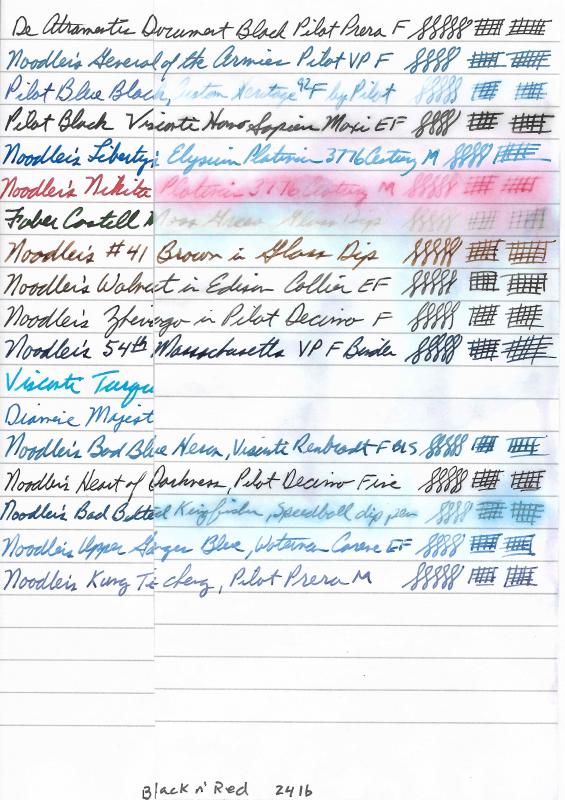
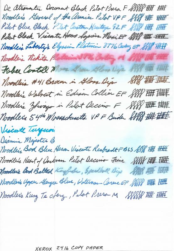
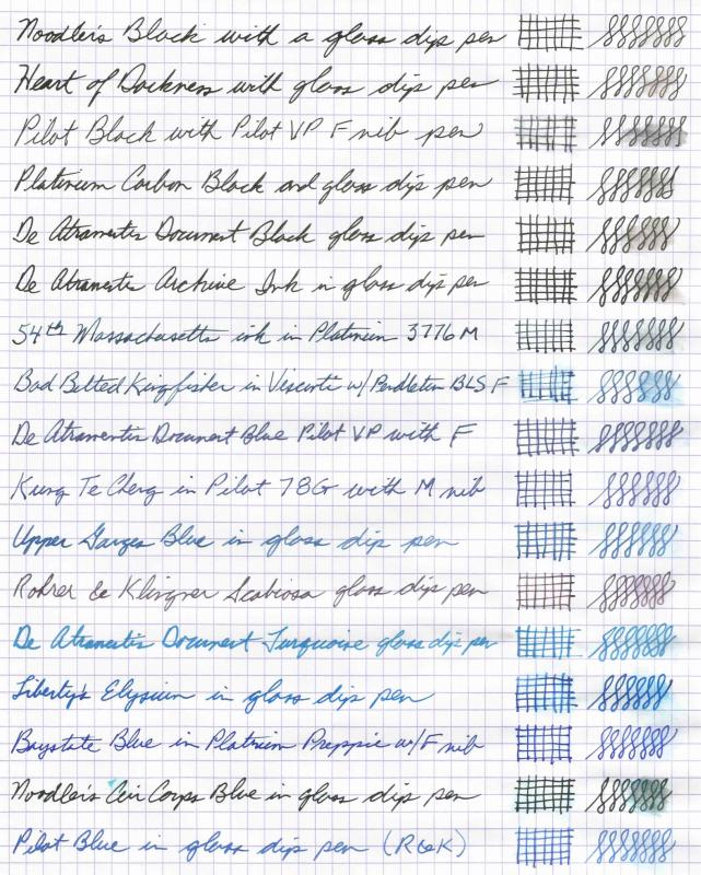
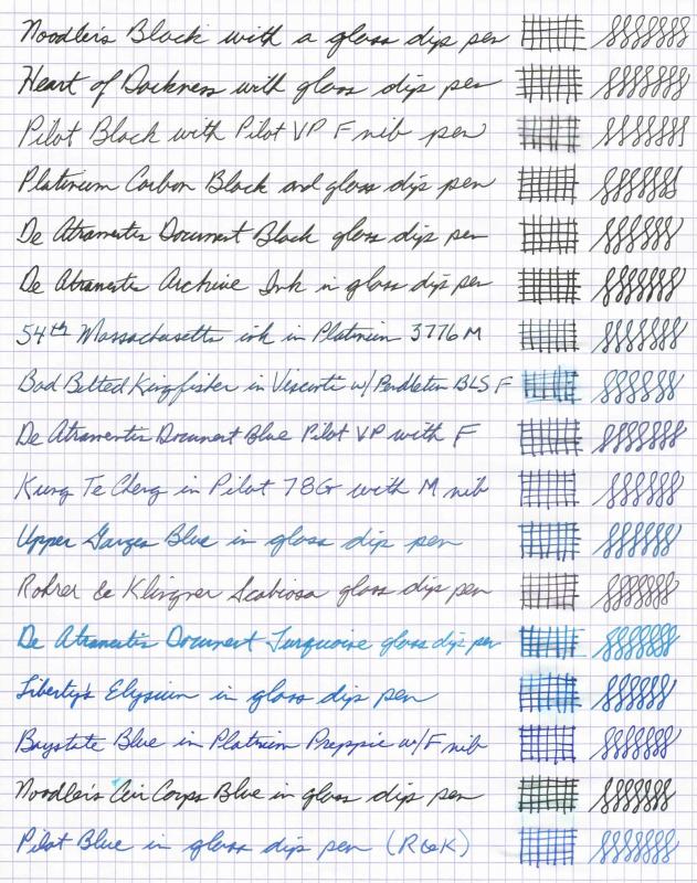
I use my fountain pens at work daily. I've had too many encounters with spills and drips on my notes to make me wary of what ink I use. One event, in particular, stands out for me when I wrote something down on a piece of paper for someone to refer to. Later, I saw the note on his desk. He had dripped some water on it, and the ink had run all over the place, not even legible! Embarrassing. It's one thing to be retro and insist on using my fountain pens at the office, but it's another when it affects the quality of the work product. So, I've been on a quest to find inks I can use reliably for work and not worry about accidents happening to destroy the writing. I have quite a lot of inks in my collection. with even more samples. I selected some inks that I've been using lately along with a couple I like, but have had bad experiences with their lack of water resistance. I use a lot of Black n' Red notebooks at the office, along with copy paper. I also wanted to compare performance with a premium paper, so I selected Rhodia. The tests consisted of generating a baseline for the three papers and 18 inks. I scanned the images at 600 dpi into jpeg files. They were later down-converted to lower quality jpeg to come in under 1 MB file size. I cut each sheet into two pieces - a control and a test side. After each test, they were scanned with the control and the test side together to provide a good comparison. The first test consisted of pouring a stream of water over the paper for a few seconds and then allowing the paper to dry without touching it. This simulated a spill at work and represents my biggest concern. The second test was for permanence. It was an 8 hour soaking in a water bath with some agitation to slough off any loose ink to see what actually remained behind on the paper. I'm posting the two test results and not the original because each test has its own control side to compare with. There are several ink brands that make water resistant inks. I've posted scans of some others previously (including Platinum). These are the inks I've been using lately as I've narrowed my preferences. One factor I've been looking for is quick drying inks so I can write and quickly turn a page without it transferring to the contacting sheet. A lot of permanent inks tend to dry slowing. The fastest drying permanent inks I've found are the DeAtramentis Document series of inks. The negative to these are that they soak in fast and feather a lot on cheaper paper. It's always a trade-off between dry time, permanence, saturation, and smearing. That's why I have so many inks. No one ink solves all problems. If I had to pick one ink to use exclusively, it would be Noodler's 54th Massachusetts. It drys relatively quickly, doesn't smear after a few minutes drying, and is really permanent with no wash off in spills. It's also a nice blue-black color. A close runner-up is Pilot Black. Dries really fast, well-behaved in all pens, and after a light wash off, leaves behind a very permanent residue. Papers tested: 24 lb Black n' Red, Rhodia 80 gsm dot pad, Xerox 24 lb copy Inks tested: DeAtramentis Document Black Diamine Majestic Blue Faber Castell Moss Green Pilot Black Pilot Blue Black Noodler's General of the Armies Noodler's Liberty's Elysium Noodler's Nikita Noodler's #41 Brown Noodler's Walnut Noodler's Zhivago Noodler's 54th Massachusetts Noodler's Bad Blue Heron Noodler's Heart of Darkness Noodler's Bad Belted Kingfisher Noodler's Upper Ganges Blue Noodler's King Te cheng Visconti Turquoise Black n Red after simulated spill: Rhodia 80 gsm after simulated spill: Xerox 24 lb copy after simulated spill: Black n Red 24 lb after 8 hour soak: Rhodia 80 gsm after 8 hour soak: Xerox 24 lb copy after 8 hour soak:
-
I love the qualities of Namiki blue: its water resistance and low maintenance. However, it would be nice to find a red which I could add to it to create a lilac purple. Do you have any suggestions for low maintenance reds which might fit the bill; if the red isn't waterproof, I'm assuming the Namiki blue will still be legible if a spillage occured. Thanks.
-
This is another water resistance test. This time, I decided to select only inks that I knew were, or were claimed to be, water resistant. I wanted to find out what that really meant. In addition, I wanted to test for simple water resistance from accidental drops and from smearing by the hand. The test I did followed these steps: Create the written samples using existing inked pens or my Rohrer & Klingner glass pen. Allow to dry for 12 hours.Do a drop test on the grid pattern using an eye dropper and two drops of water. Let stand for 30 seconds, then blot off (not rub) with a tissue.Scan.Do the smear test on the last figure 8 patterns by moistening a finger with water, rubbing firmly for a few seconds, then blotting it dry with a tissue.Scan.Cut the paper down the middle and place the right half in a tray of tap water at room temperature for 1 hour. No rubbing or other manipulation.Remove from tray and place on paper towel until dry.Tape back together and scan.Results are shown below. Baseline scan with drop test: Second scan after smear test: Final scan after 1 hour soak test: Analysis: All the inks tested are more or less water resistant. Several were weakly resistant in that some of the color was washed off, but a permanent line remained behind guaranteeing you would not lose any words you had written. The most permanent inks barely budged when rubbed with a wet finger then soaked under water. Best performers: Noodler’s Kung Te Cheng BlueNoodler’s Heart of DarknessDe Atramentis Document BluePilot BlueNoodler’s Upper Ganges BlueNoodler’s Empire RedNoodler’s Bad Green GatorDe Atramentis Document GreenWorst Performers: Noodler’s Bad Belted KingfisherPilot BlackNoodler’s Liberty’s ElysiumNoodler’s Fox RedThe remaining inks either smeared or faded more than I would want from my permanent inks. Still, there is a good variety of colors available in water resistant inks. Permanence does come with trade offs. The most permanent inks tend to be slow drying depending on the paper. Fast drying isn’t an indicator of permanence, but the faster an ink dries, the less it smudges, in general. Some of the inks are permanent (bulletproof in Noodler’s terms), but that only means some component of the ink is permanent. For example, Noodler’s Fox Red is definitely permanent, but loses some of the red and turns more of an orange if soaked in water. Baystate Blue is permanent, but the color spreads and becomes even brighter blue when wet. Liberty’s Elysium loses its bright blue and leaves behind a faded blue line. Likewise for Bad Belted Kingfisher. If I were looking for the most permanent ink, it would be Kung Te Cheng. However, it comes with warnings about frequent maintenance to prevent pens and feeds from clogging. It does perform well on cheap paper without as much bleed through, but it takes longer to dry. Runners-up would be: Heart of Darkness, Bad Green Gator, and Empire Red. HOD and BGG both bleed profusely and Empire Red will tend to dry in the pen. If permanence is not that important, then there are hundreds of beautiful shades of ink to choose from and this test is merely an academic exercise for the permanent ink purists. Hope these scans help you in selecting your next ink.
-
I wanted to extol the virtues of an ink not commercially available that I received in a 2 ml sample from a well-known and much-beloved FPN member, amberleadavis. This is one of the most well-behaved inks I have used in my time as a relative newbie, its resistance to water is moderate to high, and it is a very easy red to work with, not drying out or causing hard starts/ skipping at all. In normal writing with my fine nibbed Kaweco Sport (which is on the drier side), the hue was a vermillion color, almost a ringer for Iroshizuku Fuyu-gaki, but when writing more deliberately, I got a color almost matching Diamine Poppy Red. In my opinion, this ink deserves a wetter/ broader nib to bring out its true robustness.
-
I use my fountain pens at work a lot. Not only do I take notes, write drafts of reports and memos, and sign documents, but I also use them to mark up presentations and other reports as I review them. I like to use red and green when marking documents. I like blacks and blues for my notes and general writing. Above all, I need them to be somewhat water-resistant, because in the office environment papers come into accidental contact with beverages and such. I'd rather my writing be somewhat permanent so accidents don't make a mess of the work. I recently discovered Noodler's inks after having been a fountain pen user for many years. It wasn't until the last few months that I started to get interested in the hobby of pens and inks. That's when I discovered FPN and other forums and began reading everything I could find about pens, inks, and paper. I got interested in Noodler's inks because of the wide variety of colors and their claim to water resistance. I learned that the inks I was using were not the best for the environment in which I was using them, so I started trying out other inks. After about six months, I took a look at my ink collection and realized I had a bunch of Noodler's inks, mostly because of their claims of semi-permanence. I decided to do my own test of the inks I had to help me determine if I had selected the right ones for the job. I was confused by the different terms Noodler's used: "bulletproof" and "water resistant". Which did I need? I would like my writing to retain as much of the original color and content should it accidentally get soaked by an office spill. I'm not so concerned about forgery or intentional changes to the writing. Of the Noodler's inks I have, all but one is listed as "water resistant". All but two are listed as "bulletproof". I'm thinking I need water resistant more than bulletproof. Anyway, I decided to test what I had. Using a sheet of 28# Staples Bright White Laser paper (nice smooth finish I use for some of my writing), I wrote two lines per ink across the sheet. The ink was allowed to dry for over 48 hours. I scanned a "before" image. Then, I cut the sheet in half and placed the right half in a tray of tap water at room temperature for 1 hour. After an hour, the half sheet was removed and placed on a paper towel to dry. When dry, it was taped to its mate, and I scanned an "after" image. The results are included here. Before: Photo taken at the two minute mark: After: I was somewhat relieved to see that my inks all survived to one degree or another. Even the one ink not listed as water resistant made a respectable showing. It was interesting to note that some bulletproof inks retained their total characteristics while others faded, spread out, or lost some color components. In order of performance, here's my ranking: #1 - Noodler's Black (absolutely true to it's claims, no visible changes) #2 - Tie - Bad Green Gator and 54th Massachusetts (some faint amounts of dye lifted off in the water, but not enough to change the color or appearance #4 - Noodler's Fox Red (almost immediate loss of red hues and left behind an orange line) #5 - Liberty's Elysium (lost its deep blue dye component in the first few minutes) #6 - Baystate Blue (color remained true, but significant bleeding out into the surrounding paper) #7 - Nikita (for some reason, the red color intensified and spread out on the paper) All in all, my go-to inks, Black, 54th, and BGG held up to my expectations. My biggest disappointment was Liberty's Elysium. I love the ink and was hoping it would hold its color better than it did. My greatest surprise was Nikita Red and its reasonable showing. It's nice to have a low-cost red for general mark-up and editing that holds up to some office mishaps. Hope this helps others in selecting inks.
-

What Are Some Almost Bullet-Proof Inks, At Least Waterproof Or Water Resistant?
Centurion posted a topic in Inky Thoughts
Hi, I have a ton of Noodler's bullet-proof inks, now I am looking for a ink, especially blue ink, that's at least water resistant. An ink I could address an envelope to be mailed by snail mail, and not worry if the envelope got rained on. And also not worry if the pen somehow leaked a little ink and got on my shirt. I could simply wash out the ink stain when doing my laundry. -
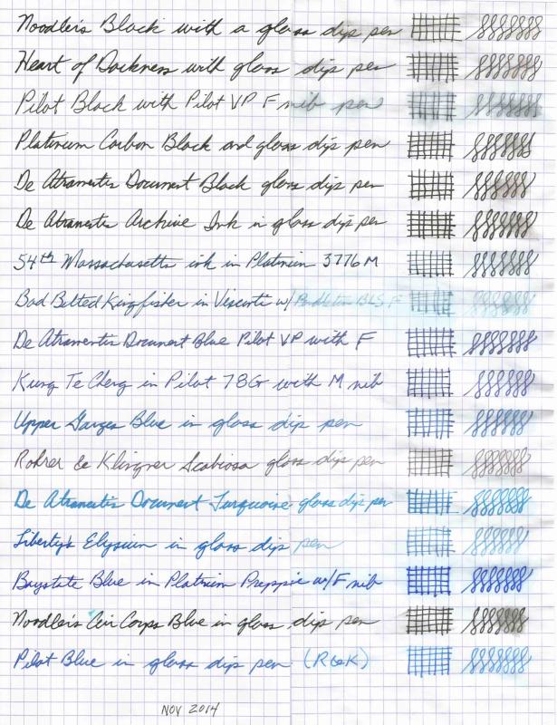
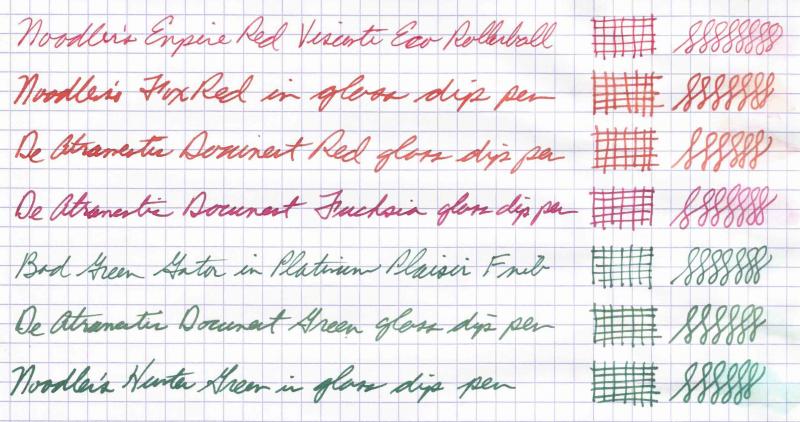
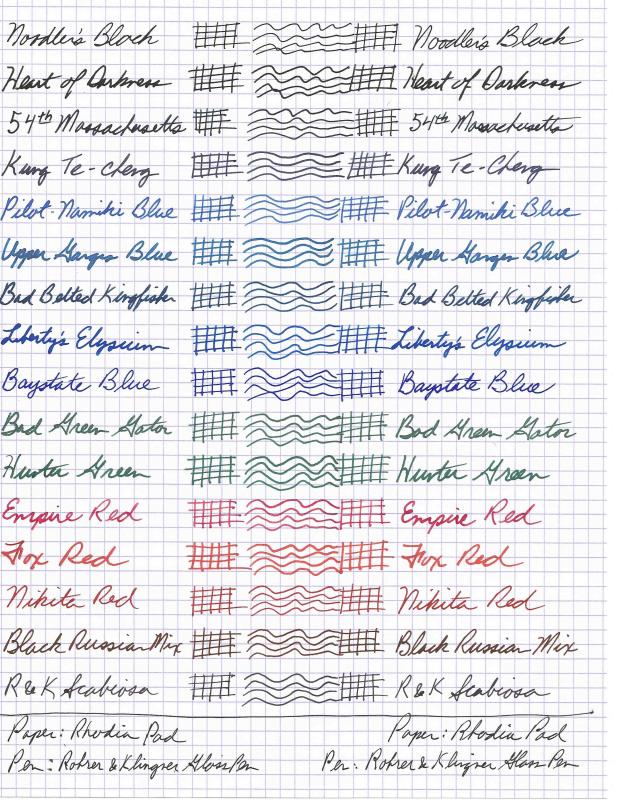
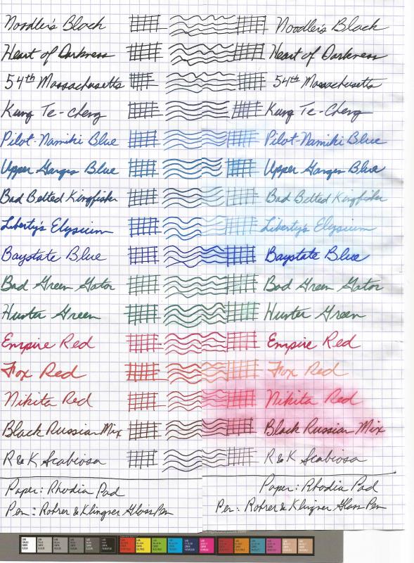
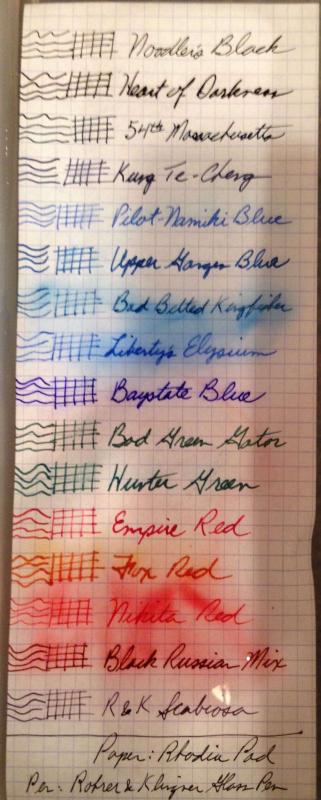
I've been searching for inks that have very solid water resistance and that can take having water dripped or spilled on them. Unfortunately, many of the colorful inks I like aren't very resistant, so I've been trying different one. I've concluded that only a few companies have truly water resistant inks. Among those are Noodlers, Pilot, and Rohrer and Klingner. I decided to collect all of my water resistant inks and test them to decide which ones I can rely on to deliver what I want. My goal is to find a set of black, blue, red, and green inks I can incorporate in my daily rotation while throwing in some of my more ephemeral colorful inks for fun. So, I selected 16 inks from my collection and conducted a water test. Using a Rhodia pad and a Rohrer & Klingner glass pen, I wrote one line for each ink. Using the glass pen ensured consistency in how each ink was represented on the paper. I let the paper dry for 24 hours. I then cut the paper in half vertically. I first did a water droplet test by dripping some water onto the grid pattern for each ink, letting it stand for about 5 seconds, and then wiping it off with a paper towel to simulate a spill at the office and quick rub off of the spill. Next, I filled a small tray with tap water at room temperature and placed the right half of the paper into the tray, making sure it was entirely submerged. I took a photo of the paper in the tray within a couple minutes to get an idea of how the ink behaved initially in water. After fifteen minutes, I removed the paper from the water and placed it on a paper towel to dry overnight. I then taped the right half back to the left half and scanned the page with a color scale included to help with color adjustments for monitors. The scans and photo are attached. BEFORE: DURING: AFTER: Results: Noodler's Black - unmoved by rubbing or soaking Noodler's Heart of Darkness - unmoved by rubbing or soaking Noodler's 54th Massachusetts - unmoved by rubbing or soaking Noodler's Kung Te-cheng - very light smear from rubbing, but unmoved by soaking Pilot-Namiki Blue - a bit more color moved when it was rubbed and slight fade from the soaking Noodler's Upper Ganges Blue - a bit more color moved when it was rubbed and unmoved from the soaking Noodler's Bad Belted Kingfisher - smearing from the drop rubbing test and also significant color fade from the soak Noodler's Liberty's Elysium - smearing from the drop rubbing test and also significant color fade from the soak Noodler's Baystate Blue - no smearing from rubbing and just a slight color lifting from the soak. In fact, BSB got darker and brighter blue after the soaking! Noodler's Bad Green Gator - very slight smear from the rubbing, but completely unaffected by soaking. Noodler's Hunter Green - same performance as BGG. Only difference is that Hunter Green does not bleed through the paper whereas BBG goes right through almost any type of paper. Noodler's Empire Red - very slight smear from the rubbing, but completely unaffected by soaking Noodler's Fox Red - no smearing from the rubbing, but loses some of its red hue from soaking. Result is a rather orange remnant. Noodler's Nikita Red - good deal of smearing when rubbed, and a lot of red color lifted off after soaking leaving behind a pinkish red line. Custom Mix "Black Russian" - same performance as Nikita, but left behind a nice, dark black/red line. This is my red/black mix of 1 part Nikita and 9 parts Noodler's Black. I get nice shading from this mix, too. It's a well-behaved blend. R&K Scabiosa - What can I say? It's an iron-gall ink. Absolutely un-phased by anything. Once dry on the paper, it doesn't go anywhere.


desaturated.thumb.gif.5cb70ef1e977aa313d11eea3616aba7d.gif)