Search the Community
Showing results for tags 'teranishi chemical industry'.
Found 5 results
-
Teranishi Guitar – Antique Black Teranishi Chemical Industries was founded during the Taisho period in 1918, and got quite some fame as one of the earlier ink producers in Japan. The Taisho period is often remembered as a romantic era. For their 105th anniversary, the company introduced some stylish retro-inks, hinting at this exciting start-up period. The inks come in stylish – almost art deco – boxes, containing a nice-looking 40ml bottle of ink. I discovered the Teranishi inks in 2022, so it’s time to do the reviews. These inks are well saturated, but at the same time manage to look muted and toned-down. This combination works quite well, and I’m becoming very fond of this brand. In this review, the center stage is taken by Antique Black. I’m not really into black inks, so I had no great expectations when trying out this colour. But boy, was I wrong. Turns out that this is not a black ink at all, but more of a very dark brown. The emphasis is clearly on “Antique” – a black faded with age that has acquired a dark brown patina. This Teranishi ink is also wonderfully complex with lots of colour hints below the surface … brown, blue, green… they are all present, and combine to give this ink a lovely depth and complexity. A big thumbs up for Teranishi’s ink masters! When scanning the ink, the brown tones seem to disappear, leaving more of a pure black image. See the line of text below, written with a B-nib. First the scan, and below that the same text captured with my camera. It’s only in the photo that the brown nature of the ink becomes apparent. Because of this, I exclusively use photos during this review. Antique Black writes wet and well saturated. When using a wet pen, a fairly black line is laid on paper, that ages to a deep dark brown while drying. On its own, it might be mistaken for a black ink, but that’s just a trick of the eye. Put a real black ink beside it, and the dark brown nature of the ink becomes obvious. Antique Black can handle all nib sizes with ease – from extra-fines up to the broadest stub – and it is at home on both white and yellow-cream paper. A great writing ink, that I enjoyed using. To illustrate the colour span of this Teranishi ink, I did a swab on 52 gsm Tomoe River paper, where I really saturated portions of the paper with ink. Antique Black has a narrow dynamic range, without too much contrast between the light and darker parts. This translates to really subtle shading. With fine nibs or wet pens, shading is barely present. But enough of it survives to give depth and character to your writing. It is still obvious that you’ve used a fountain pen instead of a ballpoint. With drier pens and broader nibs, both shading and the brown nature of the ink become obvious. Personally, I like the ink the most in the broader stub nibs. With these you really get that faded antique look! On the smudge test – rubbing text with a moist Q-tip cotton swab – a lot of the dyes get displaced, but the text itself remains quite readable. Water resistance turned out to be quite good. The darker dyes will be flushed away, but a very readable blue-grey image of your writing remains. I was fairly impressed by this. Water resistance is certainly good enough to survive most accidents, making this a good office ink. This is also evident from the chromatography that shows the grey-blue dyes clinging to the paper at the bottom part. The chroma also shows the complex mix of dyes used to create this antique brown-black. There really is a lot going on here! No wonder that this Antique Black shows such depth and character. I’ve tested the ink on a wide variety of paper – from crappy Moleskine to high-end Tomoe River. On each scrap of paper I show you: An ink swab, made with a cotton Q-tip 1-2-3 pass swab, to show increasing saturation An ink scribble made with a Lamy Safari M-nib fountain pen The name of the paper used, written with a Lamy Safari B-nib A small text sample, written with the Lamy Safari M-nib Source of the quote, written with a Pelikan M405 Stresemann with F cursive italic nib Drying times of the ink on the paper (with the M-nib Safari) The multi-paper writing test shows that Teranishi Antique Black handles all types of paper well. It even behaves very good on the low-quality Moleskine paper: no visible feathering, and only some see-through and bleed-through. With the Kobeha GRAPHILO paper, there was clearly a chemical mismatch – on this paper, the ink shows a dark murky green. Not bad at all, but certainly not black or brown. Drying times are in the 5 to 10 second range on absorbent paper, and really really long on high-quality hard surface paper. For the sake of completeness, I also add a scan of text written on a number of different papers. You get mostly black tones (as I indicated earlier), but some papers (like Midori) really emphasize the brown. Writing with different nib sizes The picture below shows the effect of nib sizes on the writing (written on Rhodia N°16 80 gsm paper). All samples were written with a Lamy Safari. I also added a couple of visiting pens: a wet-writing Pilot Capless with M-nib, and my Pelikan M405 Stresemann with F ci nib. As you can see, Antique Black can handle all nib sizes with ease, but the faded antique feel emerges mostly when using broad italic nibs. Related inks To compare Teranishi Antique Black with related inks, I use my nine-grid format with the currently reviewed ink at the center. This format shows the name of related inks, a saturation sample, a 1-2-3 swab and a water resistance test – all in a very compact format. Antique Black really stands on its own among my other black inks. The comparison grid also clearly shows the wide tonal variety among black inks: pure black inks are rare, and most have coloured undertones… blue, purple, green, brown… The dark brown nature of the Teranishi ink is really obvious when it sits next to its other black ink cousins. Inkxperiment – Wednesday With every ink review, I challenge myself to create a monochromatic drawing using only the ink I’m reviewing. I always enjoy this part of the review the most: playing with the ink, and seeing how it behaves in a more artistic context. More often than not, an ink surprises me with its expressiveness. Inspiration for this drawing comes from the Nexflix series “Wednesday”, which made quite some waves in the internet ether. I readily admit that I binge-watched this series … twice! I totally dig its sense of dark humour. And a girl with an allergy for colour seemed like a good theme for this Antique Black inkxperiment. I started with an A4 piece of HP photo paper. I taped out a square, and stamped in a background using heavily water-diluted ink. Next I used a piece of cardboard (bent into a rectangular shape) to add the film perforations. Next I painted in the spider in its web, and added the figure of Wednesday Addams to the square. To finish the painting, I darkened up the sides a bit, to put the spotlight on the girl and the spider. This little painting really succeeds in showing the faded antique brown-black of this Teranishi ink. It also surfaces the blue undertones in parts of the painting. I really like the end result, and this Antique Black definitely is a superb drawing ink. Lovely stuff! Inkxpired – computational art I love experimenting with pen/ink/paper, and have added another layer as part of the hobby. I’m exploring computational art, inspired by the ink drawings I do during ink reviews. Another fun offshoot of the hobby… and all that starting with a few drops of dye-coloured water on paper. I started by applying an “antique paper” filter to the original, while also turning up the brightness. This emphasizes the movie rail feeling. Next I used an urban art filter to add some colour to the picture. In a final step, I applied a colour shift filter to create the final inkxpired picture. Conclusion Teranishi Antique Black is a great ink. I’m not a black ink person, so I had no high hopes for this ink when I opened up the bottle for the first time. But the faded, antique dark-brown looks of this Antique Black quickly seduced me. It’s a beautiful ink with tons of character, both in writing and in drawing. In my opinion, this ink is well worth your attention. Check it out! Technical test results on Rhodia N° 16 notepad paper, written with Lamy Safari, M-nib Backside of writing samples on different paper types
-
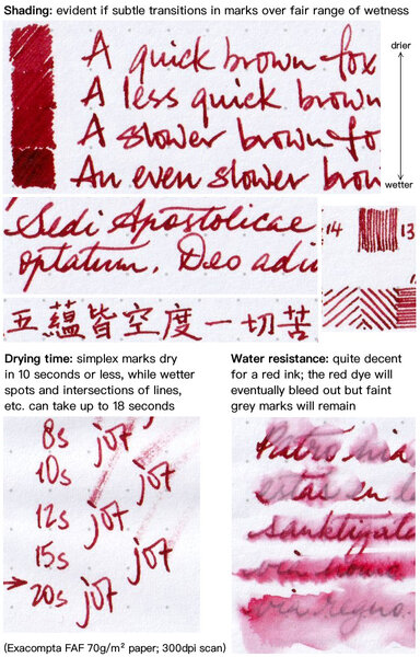
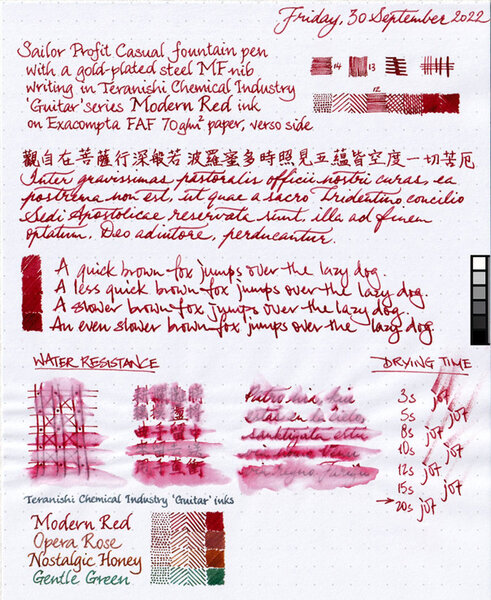
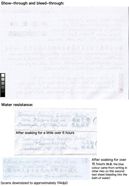
This is one of the first four colours in Teranishi Chemical Industry's ‘Guitar’ Taisho Romance High Colour Ink series. (Just to clarify, Gentle Green is another; but Opera Rose and Nostalgic Honey are not. They just happen to be the only four of the ‘Guitar’ series inks I have, and three of them are kinda close in colour range, so I decided to do quick samples of them one after another on the same sheet.) I like the colour a lot. The subtle transitions in the shading are pleasing to the eye; I certainly don't want shading in my red ink to manifest as clearly demarcated segments along a pen stroke. Little or no feathering is evident, but there is some minor show-through and spots of bleed-through. Decent water resistance for a red ink, and drying time is acceptable.
-
desaturated.thumb.gif.5cb70ef1e977aa313d11eea3616aba7d.gif)
Teranishi 'Guitar' Modern Red ink review sheet
A Smug Dill posted a gallery image in FPN Image Albums
-
-