Search the Community
Showing results for tags 'stainless'.
Found 8 results
-

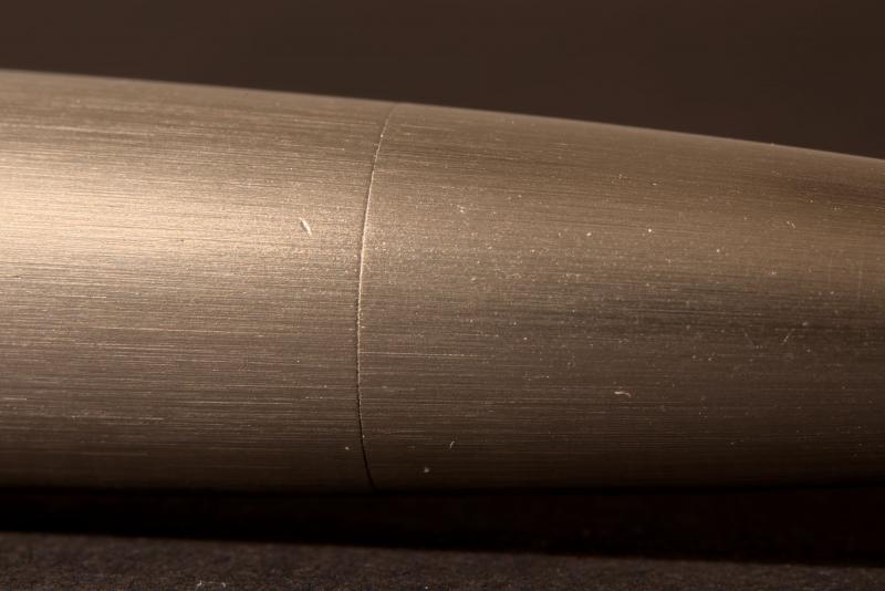
Stainless Steel Lamy 2000: How Tight The Cap Should Be? + Marks And Dents Question.
Lilla-My posted a topic in Lamy
Hi, So, recently, my brand-new stainless steel Lamy 2000 arrived… uncapped. According to the store, the cap came off during transport; hard to believe, in my opinion. I rather think that the pen was checked but not closed properly afterwards. I don’t know if it’s because the cap was totally loose in this big box or not, but I noticed some marks and even dents on the pen body. Are these kinds of things to be expected on a brand-new metal fountain pen? Personally, I find it hard to believe the loose cap has nothing to do with these; still, if they’re in the range of normal, I’m willing to accept it. But, furthermore, I have no way to know if the nib was hit or not – I noticed nothing worrying when writing, but it’s hard to compare a BB nib. Moreover, I noticed that the cap is not fixed as tightly as it is on my Makrolon Lamy 2000. The base of the cap is a bit loose on the horizontal axis, as if it wasn’t the same diameter; I can feel it just holding the pen in my hand. Also, I switched the cap between the stainless steel and Makrolon version: the Makrolon cap is always tight, while the steel cap is a bit loose on both models. Is the steel cap usually a bit looser compared the Makrolon one? Or is my cap a bit too loose, maybe even loose enough to believe the cap actually came off during transport? Thanks for your help.
-

First Attempt On Pen Turning, A Stipula Etruria Lookalike
Hardy08 posted a topic in Pen Turning and Making
I was frustrated on a pen I bought: a Stipula Etruria Gallicana in Oronero color with a stiflexnib. This pen was gorgeous at first sight, but some drawbacks refrained me from using it daily: -It could only hold a small amount of ink: it is a CC filler. -The feed was a disaster as it was not suitable for a flex nib like the stiflex nib. -The pen was made of acrylic and i love the warm feeling of ebonite. After months of drawing plans and attempting on making parts for the pen I finally succeeded! This pen is made from ebonite rods from Nikko ebonite in ripple orange. The filling system is a Vac-Fill, a copy of the Wahl-Eversharp Doric second generation filling system. The cap doesn't post. The clip is sculpted from solid 316L stainless steel. Cap jewel and end barrel jewel are made of a gem grade rhodolite garnet embedded in 316L stainless steel. The cap ring is made of a solid rod of 316L stainless steel, engraved by hand with carbide tipped burr, with an artificially rusted finish. The nib is an original 14k Stiflex nig from Globus (Stipula) and is quite a wet noodle. The feed is in hard rubber from a destroyed Omas 360. Here are the pictures, it is now my daily writer!
-
Greetings, fountain friends, I’ve been an offline observer to this wonderful community for some time now, and it has influenced me in many of my pen decisions and handwriting expansions. I'm an Irish doctor working in England, and in my spare time, I am a keen German language user, chess player, philosophy and psychology enthusiast, and now beginning to dabble in the world of writing. I’d like to begin to give back with my own opinion regarding an undoubtedly biased view on my favourite fountain pen purchase to date – the Lamy 2000M Stainless Steel (my model is a fine nib, and I like to rotate between Diamine Oxblood, Teal, and Montblanc Toffee Brown). Excellent reviews for this well-known model – most prominently the original makrolon edition – already exist in this forum, and further afield. However, I would like to write something about the SS version of this pen, which has attracted mixed-to-negative reviews regarding it’s 1) weight, 2) similarity without difference, and 3) price. I do not pretend to be impartial regarding this particular piece, and I must suggest that this is an opinion primarily for those who are closer-than-not to a purchase regarding this model with the attributes I will discuss, later, and go some way to defend the model fit enough to be considered both distinct and worthy of purchase and recognition. 1). Weight. The most notable set of specifications is the weight of this pen – both in-and-of-itself, and in contrast to the lighter, original version. For convenience, the total (54g), body (34g), and cap (20g) weights are significantly heavier than the makrolon version (typically 25g, 15g, and 10g, respectively). Particularly when the cap is posted, this can be a considerable contributor to writing fatigue, back-heavy imbalance, and an uncomfortable writing experience with poor stamina for even those with larger hands. I think this is an unfair area of criticism, and rather, should be a binary factor for those who like heavy or light pens. Consider a fountain pen reviewer who takes on a ballpoint pen – by the very nature of the pen’s mechanism, this will be reviewed much more poorly than it’s capillary counterparts by the nature of what makes the pen a writing instrument. I believe that weight – as well as dimensional size – are factors in review that should be areas of distinction, rather than comparison, when considering models of pens (even when such models are within the same branding). Therefore, I think that those who favour heavier, metal pens should take interest in the Lamy 2000M as distinct in interest even from those who use the original makrolon Lamy 2000. Whereas the first example I provide is clearly an extreme version of the issue described, here, I think that the factors of size, weight, and filling system are considerable enough to be whittled down to pens that address those precise categories rather than having (e.g.) a Kaweco Liliput scolded by a user who’s daily driver is the MB 149. 2). Similarity without difference. Apart from the material use and the weight of the pen, criticism is offered by reviewers who perhaps borrow too much influence from these paradoxically drastic differences, by finding nothing new offered by this version once the novelties are stripped away. I believe this is an easy mistake that we all can make when we overanalyse versions with heavy influences in one area or another and seeing it as a simple marketing rehash. I’d like to offer the opinion that these two factors bring about differences in performance and suitability in preference that are drastic enough to address an entirely different audience to attract those that were perhaps failed or disappointed by the Lamy 2000 in its original format. The material and weight provide a unique writing experience that is (I’d argue) much more palpable than the difference between modern steel and gold nibs. It is difficult to capture the sensory, tactile, and phenomenological experience in the differences between both versions without robbing the reader of an hour’s time, but there is something tremendously satisfying about the gravity and industrial nature of this instrument. I think it more excellently captures the Bauhaus movement than it’s makrolon parent, but aesthetics aside, even the differences in brushing material and the lack of a two-tone/material compartment provide a different experience to those deliberately sensitive enough to notice a difference. Clearly, there are differences which I think are rather miniscule (the plating on the hinged clip, or the placement of the Lamy logo, for example), whereas others are perhaps discriminatory to those who prefer other attributes (the removal of the ink window seems to be a sore point for many consumers, as is the smoother metal finish of the grip). However, when it comes to the ultimate endpoint of a writing instrument – the writing – then this pen deserves a mention distinct from the original as being paradigmal in it’s feeling, experience, and output. Everything else is style and preference. 3). Price. Finally, the Lamy 2000M is noted as being approximately 50% more expensive than the original*. This is an area of criticism, compounded further when the two areas addressed, above, are neglected in final consideration. One could talk endlessly regarding the economics of price, but I believe there are a few more objective factors to consider before discussing the differences in the intangibles: Stainless steel is a difficult material to manufacture, and clear that it is at least a significant percentage of the pen that this instrument is fashioned with (I have yet to see a demonstrator video in which the pen is sliced in half at various angles for a more accurate opinion on this, though the innards are made from essentially plastic on disassembly). The weight specifications should be enough to reassure most to a reasonable standard of this. Lamy is also a brand of (at least in my experience) good and efficient quality – perhaps the Ikea of manufacturers when it comes to template design with the odd-revolutionary product. With this comes a certain level of brand investment, especially as an edition of an item that sits on permanent display in an art museum. More subjectively, those wishing to purchase something metal, heavy, and made by a manufacturer such as Lamy, will find themselves justifying this purchase (rightly or wrongly), as it is a widely-recognised and reliable model of a pen that has already been proven to survive over long periods of time, but utilises their preferred categories of material choice and weight. Stainless steel is also tremendously robust, and provided that the user is aware of the interplay between it and the more sensitive innards, then this pen should act as its own safeguard against wear, damage, and accidents that will inevitably creep up in the coming years and decades. C). A worthy purchase for those who can discern it. The conclusion may seem as weak as point 2) that I make above – clearly, this is a pen that will satisfy those who will be satisfied by it just as much as it is the same pen without its differences. But I write this piece (which is also my first – constructive feedback would be very much appreciated from the community) in biased defence and justification to what is a wonderful writing instrument that I believe has been treated unfairly even in favourable reviews (who towards the end may conclude that the makrolon version is better simply because it is essentially the same, and more affordable). I argue here that these are two distinct pens that should not be compared any more than a small and a large pen be reviewed by an individual who is more/less suited to one or the other. That is not to argue the Lamy 2000 out of hands who love it – I merely stress that there are differences that are more significant in the review of such pens than are given credit (some which are not even available in filters for online pen retailers, e.g., weight) that will eliminate certain pens from consideration even if they are identical in other superficial aspects. Furthermore, I wish to offer the opinion that such differences then go on to contribute meaningful changes both in hand and on paper, and that these should be noted as both distinct, and as incomparable to pens with category differences such as weight that are paradigmal. Lastly, this is a pen that will suit some, and not others. For those that it will suit, however, will depend more on attributes and qualities of pens that make it knowingly or unknowingly both more appealing and satisfying in acquisition and use than variants (Lamy 2000) and competitors (when considering weight, e.g., Faber-Castell Basic Metal). Clearly, other factors also play a role (i.e., price, availability, European nib sizes, etc.), and some which I have not noted, here. But for those who can discern their ideal pen yet find themselves a little underwhelmed by the community’s reaction despite its pedigree and performance, I hope this piece can help to explain some of the feeling on both sides. Thank you for your time. Schreiber *Thank you to 1nkulus, who corrected my original gross approximation as being double.
-

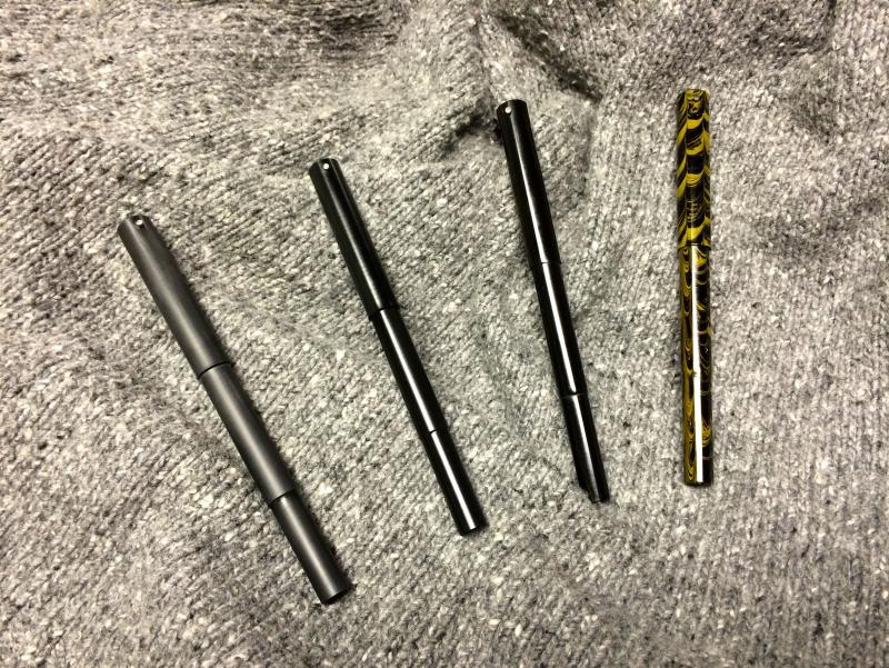
[Help] Attempting To Disassemble My Lamy 2000 Stainless Steel's Cap.
akaflare posted a topic in Repair Q&A
Hello FPN, This is my first post on this forum because I've tried through all conceivable ways and I've given up. I've owned a couple normal Lamy's in the past but this new Lamy 2000 stainless steel really baffled me. Is there a special way to disassemble the cap portion of the pen? I've tried pushing a stick up the cap to prevent the brass piece from being a piece of (bleep), I've even tried to use a pair of pliers to turn the cap while forcing the stick down (with a rubber piece in-between so no damage ), but at the end, I'm still unable to unscrew the damn thing. -
Grayson Tighe Blue Line Stainless Fiber Handmade Blue Metallic Glass Fiber and Stainless Steel infused Carbon Fiber composite over 2-toned Titanium, blued Titanium nib, there is no color or dyes added, the color is created by applying intense heat to the Titanium to create this color effect. This is also available in a rollerball for inquiries email us at orders@airlineintl.com.
-
Good Morning, Everyone (well, morning in the CST anyway)! Before I start my review, allow me to preface it by saying: My handwriting is horrible. It's bad. It's horrid. It's not good. I've been told many times that I missed my calling as a Doctor based solely on my penmanship. Please do not expect my letters to be flowing, evenly spaced, in neat parallel lines. In fact, this was my biggest barrier to posting my first review, being self-conscious about my ability to write in block letters or cursive. So, on we go to the review. I ordered this pen from Goulet Pens. My path to this pen was as follows: I had a fountain pen as a child (which I lost), and later received a MontBlanc as a gift (which the gifter lost, so I married her). At the tender age of 43 I decided to buy a new one. After extensive and detailed research lasting all of 5 minutes, I ordered a Conklin Duragraph and after using it realized that I wanted something better (and also reminded myself to slow down, smell the roses and do a little more research before making a purchase). That's when I ordered the Edison Herald in Copper Flake acrylic. My Duragraph has a fine nib, which I did not like, so I bumped up to a medium nib. The pen arrived well packaged (with a Tootsie pop!) and inside was the Edison box. Comparing the giant sloppy "trying to be really nice but failing miserably" box that the Duragraph arrived in, the Edison box was right-sized, had an attractive appearance inside and out (including this for those who care about the boxes). Inside was this beauty. What a gorgeous colored pen. I had ordered a set of ink samples in dark red, and ended up buying a bottle of Noodler's Antietam to match the color of the pen. My second choice would be Diamine Red Dragon, which also matches nicely (a bit redder, a bit darker). The cap is a nice fit and the threads match up nicely (not so tight that you worry about cracking the cap). The clip is well proportioned to the pen, and is positioned so that a small bit of the top peaks out of your pocket (if you carry one in the chest pocket). I like that, as it's a conversation starter. The pen is smooth, and is lightly engraved "Edison Pen Co." over "Herald". I'm guessing it's a laser engraving. I filled the pen using the included converter, although I could set it up as an eyedropper, too. Since I was trying different inks, I stuck with the converter. I wrote with the pen posted, and unposted. I prefer unposted, because it seems to "snuggle" into my hand a little more comfortably. The ink flowed smoothly and right at the 7/10 wetness that Edison promises. The nib is smooth, and writes with a light touch (you know when you've hit the pressure sweet spot because the pen just floats across the paper). No scratchiness, not "toothy", just a wonderful nib that wants to move faster than my hand (and brain!) can write. Summary: Appearance 10/10 - Absolutely gorgeous. For full effect, get it outside in full sunlight. WOW! Wetness: 7/10 Smoothness of nib: 9/10 - It's not a slippery nib, and it's far, far nicer than the Conklin nib that I had been using. Ergonomics: 10/10 - This pen just feels nice in the hand. Warm, light, comfortable curves, the nib section is nicely contoured and fits my short, thick fingers nicely Sealing (how well the cap seals against drying out): 9/10 - I get the occasional dry start, but I think that's more the ink than it is the pen. I think the Red Dragon ink would make this a 10/10. Weight: 10/10 - I prefer a lighter weight pen because I get hand cramps on a regular basis (always have, since a small child). Overall: 9.5/10 - Not rating it a 10/10 because someday, I may find a better pen. Possibly. I'll revisit this in 10 years and maybe change it to a 10/10 :-)
-
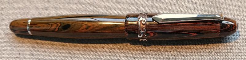
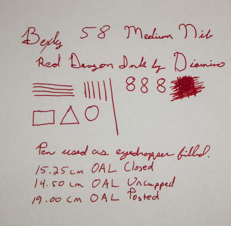
Bexley 58 Fire Engine Red, Medium Stainless Two-Tone Nib
boybacon posted a topic in Fountain Pen Reviews
This is my Bexley 58 in Fire Engine Red. This pen was purchased on eBay as an NOS Bexley from a discontinued line. This is the second pen that I purchased after my Edison, and my second "Made in the USA" pen. The pen arrived well packaged with a larger sized box in a sleeve. Good thing that the box was larger than the Edison...because this is a big pen! 15.25cm / 6 inches when closed/capped. The box was very nice, again in contrast to the box that Conklin uses. Generally speaking, I take a pen out of it's box and keep it in a cigar box with pen trays, then put the box in storage. I know that some people store their pens in boxes, so I try and leave a review of the box as well. This pen is a pretty red acrylic, described as Fire Engine Red. It came with a cartridge converter, and also an o-ring so it could be used as an eyedropper. Originally I had planned on doing the review using the converter, but due to circumstances beyond my control, you get the eyedropper review (with a different ink than intended, also!). The cap fits well, and the overall look is nice. For some reason, the gold band looks a little "meh". Not sure why, or what it is about the band, but, to me, it just looks a little chintzy (hard to explain, and probably a personal preference). Maybe it's too wide for my tastes. The clip is nice, and holds the pen in the pocket. It's a tight clip, so it is usable with a thinner dress shirt...with one caveat. There is about 1.75cm / .67 inches of pen cap that stick up above the pocket line. It's a little more than I like peaking up out of the pocket. If your pockets have flaps, then it's an awkward pen to to carry, as it props the pocket flap open. For as big as this pen is, it's not a heavyweight. It's fairly light, and if you write unposted it's nimble, as well. Posting the pen while writing makes it a little unbalanced (in my hand). The nib is nice, and lays down a wet line. This is noticeably wetter as an eyedropper with the Diamine ink than with the converter and Noodler's Purple. With the Noodler's ink, I had some dry starts and a little skipping until it settled down. Not the case with the Diamine ink. I let the pen sit capped for 5 days, and it started without even hesitating. The medium is smooth and writes well for me. I would put it on par with my Edison nib but a bit wetter. It fits well in my hand unposted and you definitely notice the pen's girth. It's not uncomfortable to write with, and it mimics the old Waterman pens of yore, according to the Bexley website. I don't have an old Waterman pen, so I cannot speak to that. The writing sample in the photo was done in a hurry, due to the dreaded disease called "lack of time". In summary: Appearance: 8/10 - The gold band isn't quite right for my tastes. Not sure why. Clip is nice, but there is a fair amount of cap above the clip. Wetness: 9/10 - It writes wet. Noticeably wetter with the Diamine ink as an eyedropper than the Noodler's with a cartridge converter. Smothness of nib: 9/10 - It's a JoWo nib, I think, like the Edison nibs. I'm guessing that it gets tuned before it leaves the Bexley factory, though. Very nice. Ergonomics: 9/10 unposted, 8/10 posted: Posted this pen is too long. Unposted, it's about right and fits my hand without any issues. Sealing: 10/10 as an eyedropper. Cap keeps the pen sealed against drying, no issues. Weight: 10/10 - For it's size, it's not a heavy pen. My Conklin Duragraph is a heavier pen. Overall: 8.75/10 - Because I wear casual clothing to the office, many of them have pocket flaps, and the cap is just too long for those. It's a nice, big pen and would probably be better in a desk drawer, or on a desk display than in the pocket. The red color is nice, and the gold clip goes good with the two-toned nib. It's in my regular pen rotation, that's for sure.
-

"modern Vintage" Flex Options…The Desiderata Pen Company
PrestoTenebroso posted a topic in Of Nibs & Tines
Hey Everyone, Many of you responded to my post "Win one of 7 new high performance flex pens" a while ago, and I was very pleased you took the time to reply to such an exhaustive survey. Well, I've been working like a dog making a lot of mistakes these past few months, and at last, here are a few ideas in the form of flex fountain pens I think you'll enjoy. You've probably already seen the writing samples I've posted in the poll posting, so I won't burden you with another one here. User testing was very positive so far. Now, we get to talk about design. Please go to the company Facebook page, and "Like" the pens you like the most on this photo: http://tinyurl.com/plo63t6 Otherwise, chime into this thread with what you'd like. I want to make these pens affordable, so if you're lusting after 14k gold flex, or lots and lots of metal in your pen, you'd probably be better off going vintage. That said, I have lots of ideas I want to make, and your comments will significantly help me refine my thoughts. The webstore is on its way, and if you like what you see, please comment!