Search the Community
Showing results for tags 'sazerac'.
Found 3 results
-

Ink Shoot-Out : Papier Plume Sazerac Vs Diamine Golden Honey
namrehsnoom posted a topic in Ink Comparisons
Ink Shoot-Out : Papier Plume Sazerac vs Diamine Golden Honey For no special reason, I have been using quite some ochre & orange inks this summer. While playing around with my inks, I noticed that Papier Plume Sazerac and Diamine Golden Honey seem to be quite similar oranges. This peaked my interest... time for a detailed comparison of both inks to find out which one I like the most. Enter... the Ink Shoot-Out. A brutal fight spanning five rounds, where two inks engage in fierce battle to determine who is the winner. Tonight we have a free-form fighting tournament... anything goes... but no biting! In the left corner - from the French Quarter in New Orleans - François "La Guillotine", the killing machine that chops down his opponents. In the right corner - from London's Soho district - "Gentleman" Joe, whose jaw-crunching uppercuts are always accompanied with a "my sincere apologies". Both champions enter the ring. The crowds are cheering for what promises to be a brutal fight. The bell rings and signals the start of the first round. May the best ink win... Round 1 – First Impressions Both inks make a great first impression on me. These are nicely muted oranges, and definitely not vibrant. I like my inks this way... a good presence on the page, but not eye-searing and in-my-face. These inks have style! Both inks also exhibit subtle yellow-leaning shading, without too much contrast between the light and darker parts. This gives your writing an aesthetically pleasing look. But even in this first round, it's definitely a dirty fight! Both champions show off their elegant moves, but they also throw some heavy punches that really hurt their opponent: Golden Honey is without any doubt the master of the finer nib. Sazerac feels really dry and undersaturated with fine and medium nibs. Golden Honey writes nicely wet with much better lubrication, and leaving a more saturated line. "My apologies"... but it's clear that in this area the New Orleans champion takes some pain. Papier Plume's Sazerac on the other hand looks richer and shows a broader tonal range in the swabs and on the saturation sample. A bit more character, more elegance. That's a rib-crunching chop from "La Guillotine". Looking at broader nibs (the squiggles drawn with a 1.5mm calligraphy nib), Sazerac becomes more saturated, but - in my opinion - also loses some of its charm. Golden Honey keeps a more yellow-orange appearance, retaining more of its muted character. Both inks make a great first impression. Sazerac looks slightly better for drawing, but Golden Honey is clearly the better ink for writing. The fact that Sazerac still feels very dry in my M-nib Safari costs it points though! A fair fight with punches in both directions, but Gentleman Joe clearly dominated this round. In my book, this round is a solid win on points for Diamine Golden Honey. Round 2 – Writing Sample The writing sample was done on Rhodia N°16 Notepad with 80 gsm paper. Both inks behaved flawlessly, with no feathering and no show-through or bleed-through. With the EF nib, both inks were equally horrible... dry, scratchy, unsaturated. Yuk! With the M-nib, Diamine recovers and writes nicely wet and with good saturation. But Sazerac still suffers, and keeps feeling dry and scratchy. With broad nibs, both inks offer a pleasant writing experience. But looking closer at the broad nib, you can see that Sazerac leaves a wider and a bit over-saturated line. It almost becomes too wet, where the line left on the pages expands a bit too much. This also seems to result in a flatter and less-pleasing look. Diamine Golden Honey on the other hand retains its crispness, and shows more character and depth. I definitely like the Diamine ink better in this respect. Colourwise, both inks look quite similar. But for writing there are big differences! Here the English champion delivers an uppercut that totally floors its opponent. "My sincere apologies" indeed! Sazerac goes to the floor, totally dazed. The crowd goes nuts, and roars its approval. What a spectacle! There is no doubt at all... round 2 is a solid win for Gentleman Joe. Round 3 – Pen on Paper This round allows the batlling inks to show how they behave on a range of fine writing papers. From top to bottom, we have : FantasticPaper, Life Noble, Tomoe River and Original Crown Mill cotton paper. All scribbling and writing was done with a Lamy Safari M-nib. Both champions did well, with no show-through nor bleed-through. But this round is not about technicalities, it is about aesthetics and beauty. Are the fighters able to make the paper shine ? One thing is immediately apparent: these inks are at their best on pure white paper. Due to the yellow undertones, their presence on more yellowish paper (like the Life Noble) is underwhelming. With the M-nib, the Diamine ink is more saturated, much wetter, and offers a superior writing experience. Looking at the swabs and saturation samples, Sazerac shows more depth and character. For this round, both inks are on par with each other, both scoring some points and taking some punches. Sazerac seems to recover, and now stands up again to the English champion. But neither ink dominates, and as such this round ends in a draw. Round 4 – Ink Properties Both inks have drying times in the 15-20 second range with the M-nib in my Lamy Safari. To test their smudge resistance, I rubbed the text with a moist Q-tip cotton swab. Here, Diamine Honey shows a little bit more smudging, but the text itself remains crisp and clear. To test water resistance, I dripped water on the grid and let it sit there for 15 minutes, after which I removed the water with a paper towel. Both champions are weak! Water resistance is totally absent, and all ink simply disappears from the paper. Not good! What a disappointing display! Both champions went on the defensive, and performed very weakly in this round. The crowd gets restless, starts boo-ing. That is not what we paid for! For this round, neither champion gets points. Round 4 thus ends with a draw. Round 5 – The Fun Factor Welcome to the final round. Here I give you a purely personal impression of both inks, where I judge which of them I like most when doing some fun stuff like doodling and drawing. And for this round, both inks are simply amazing. I did the drawing on HP Advanced Photo paper. The background uses heavily water-diluted ink, which brings out the yellow. For the flowers I used 2:1 diluted ink, while the flower accents and stems use pure Sazerac and Golden Honey. I dare you the find the difference! Both inks are equally gorgeous looking when used in a more artistic setting. I really enjoyed using them. For this round, both champions recovered completely, and gave their best. Punishing kicks, solid blocks, graceful moves, loads of energy… The crowd is loving it... this is what we came to see. Round 5 totally rocks, but in the end both champions performed equally well, and no clear winner emerges. The Verdict Both inks are great-looking muted yellow-oranges, that look fantastic on paper (provided you use broader nibs). For writing, Diamine Golden Honey is without any doubt the better ink. It's still horribly dry in fine nibs, but starting with M-sizes the ink recovers and provides a smooth & pleasant writing experience. Otherwise, both inks are really quite similar. But round 2 clearly determines the outcome of this fight, and so the Belgian judge declares Diamine Golden Honey as the winner of this shoot-out. -
Papier Plume - Sazerac (New Orleans Collection) Papier Plume is a stationary shop in New Orleans, that’s been getting some attention lately on this forum with their “New Orleans Inks”, that celebrate the rich colours and history of the city. One of their inks in this series is Sazerac, an orange delicacy with a unique personality. Fellow member Jackokun already did a great review of this ink, be sure to check it out ! Sazerac is an orange ink that really attracted me. For one – it is an intricate and beautifully complex colour, easy on the eye, with a great depth to it. For another – it is an ink that shades really well, in an aesthetically pleasing way. The shading is really noticeable, but it works great with a well-executed contrast between the light and darker parts. Personally I find this ink’s appearance really attractive. Nicely executed! I do find the ink to be rather undersaturated – this is clearly visible in swabs, which turn out to be very light on most papers. It’s also apparent in finer nibs, where I find that the contrast with the paper is not strong enough. The ink also suffers from subpar lubrication in finer nibs. Sazerac really needs broad or wet nibs, that result in a more saturated line, bringing out the best in this ink. Below you’ll find a writing sample with my drier Safari M, compared to the wet golden M-nib of my Lamy Dialog 3. It’s obvious that Sazerac looks best with wetter nibs. The ink has a wonderfully dynamic colour span. To illustrate this, I did a swab where I really saturated portions of the paper with ink, pooling it on. This beautifully illustrates the dynamics of Sazerac. A wonderful orange indeed! On the smudge test – rubbing text with a moist Q-tip cotton swab – this Papier Plume ink behaved reasonably well with only limited smearing. Water resistance however is totally non-existent. Even short exposure to water will obliterate your writing. This is also evident from the lower part of the chromatography, which shows that the ink detaches easily from the paper. If you need a water-resistant ink, Sazerac is not a good choice. I’ve tested the ink on a wide variety of paper – from crappy Moleskine to high-end Tomoe River. On each scrap of paper I show you:An ink swab, made with a cotton Q-tip1-2-3 pass swab, to show increasing saturationAn ink scribble made with a Lamy Safari M-nib fountain penThe name of the paper used, written with a Lamy Safari B-nibA small text sample, written with an M-nibDrying times of the ink on the paper (with the M-nib)Sazerac behaved perfectly on most of the paper I used, only with Moleskine there was a tiny amount of feathering. Be aware that the ink does look quite unsaturated when used with dry nibs (like the Lamy Safari M used in the writing samples). Using broader and/or wetter nibs will alleviate this, and bring out the best from this ink. There are some papers where the ink looks extra nice, a.o. Fantasticpaper, Paperblanks & Leuchtturm 1917 paper. The ink also dries quickly with my M-nib – in the 5 to 10 second range. At the end of the review, I also show the back-side of the different paper types, in the same order. The ink behaved superbly on most paper types. Only with Moleskine and Graf von Faber Castell was there significant show-through and some bleed-through. Sazerac is a well-behaving ink. Inkxperiment - orange treeI’ve recently started to experiment with ink drawings, keeping things simple and more-or-less abstract. I find it to be a fun extension of the hobby, and have found single-ink drawings a nice challenge. It also gives you an idea of what the ink is capable of in a more artistic setting. For this drawing I used 90 gsm sketch paper. I first painted the tree-trunk with a fine brush, using multiple layers of Sazerac. For the foliage I used water-diluted ink – once dry, I added some texture using a sponge dipped in pure ink. The end result gives you a good idea of the colour span that Sazerac is capable of. In my opinion, this orange ink is born for drawing… totally beautiful. ConclusionSazerac from Papier Plume is a charming orange ink, that – in my book – is born for drawing. As a writing ink, it’s not well suited to my standard finer & drier writing instruments – I would have preferred a bit more saturation. But when used with wet pens and/or broad nibs, the ink is just beautiful – a lush orange with great character. This is not an ink for the office though, but one you’ll cherish for personal communication or journaling. Overall, I find it to be an excellent ink. Recommended! Technical test results on Rhodia N° 16 notepad paper, written with Lamy Safari, M-nib Backside of writing samples on different paper types
-

Ink View - Sazerac: Papier Plume's Homage To New Orleans Official (Dr)Ink!
Jackokun posted a topic in Ink Reviews
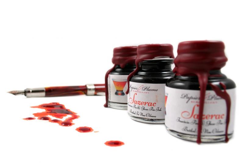
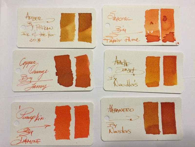
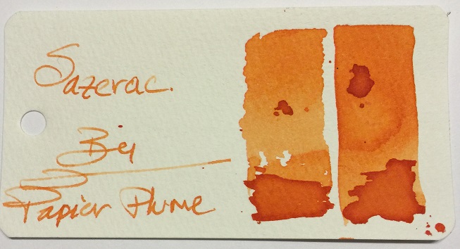
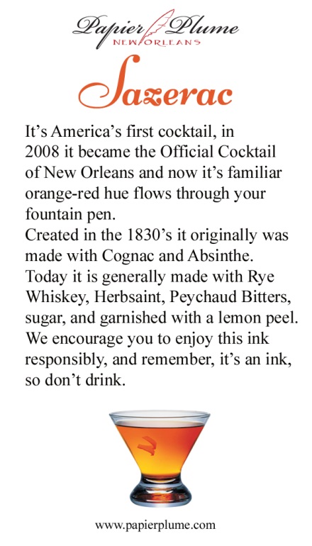
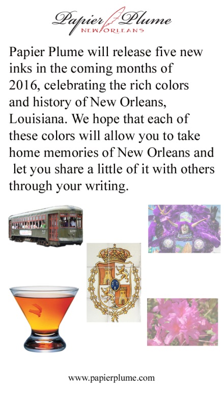
Ink View: Sazerac: Papier Plume’s homage to New Orleans official (dr)ink! Before we go any further. I wanted to apologize as my initial goal was to get this out to you before the ink was out for sale or sold out, but some unforeseen delays (mail system - mainly -) got me the sample too late to provide a meaningful view . I also want to thank Papier Plume for sending me a sample of this ink. and to Lapis for the earlier announcement. Now that that’s out of the way, I hope you enjoy this ink view as much as I enjoyed writing it. Sazerac, the drink and the (dr)ink. The Drink To start, you cannot talk about an ink about a drink, without talking about the said drink J (the rhyme was NOT on purpose). Sazerac is NOLA’s official cocktail drink. A heritage drink that dates back to the 19th century, with some arguing that it was created in the mid 1800s and others in the late 1800s. Others will consider Sazerac America’s first cocktail. What is unanimous, is that the drink was recorded (written) at the beginning of 20th century and that the name was derived from the liquor used in the original recipe: a Cognac produced by the Sazerac de Forge et Fils house (expensive, expensive), and that one of the more characteristic ingredients is peychaud’s bitters, produced by Peychaud’s apothecary (the bitters are now own by the sazerac company). Now again, some also say that it was Peychaud the one that had the recipe and shared the drink with his friends. But it wasn’t until the Sazerac bar (a bar that offered sazerac based drinks) that this drink was offered to a broader audience. Regardless , it’s a drink that had survived alterations (instead of Cognac using Rye Whiskey, addition to absinthe), changing times (different owner’s) and prohibitions(alcohol prohibitions including absinthe). It might not be in every cocktail menu in NOLA, but can surely be ordered off the menu (if asked politely ). As of 2008 The Sazerac became the official cocktail of New Orleans. So how do you prepare a Sazerac? - not the topic of this view but here is a good link for those that are curious. Now, let’s talk about the (dr)ink. The Ink Here is a shot of the bottles: (Quick trivia what is the pen on the background ? – answer at the end ) This (ink) is the third installment in Papier Plume’s (PP) homage to its native city, the first two being Street Car Green and Calle real. As with their previous inks, the hues are inspired on what they are looking to pay tribute to, in this case the drink itself. And as Papier Plume: “The drink varies from red to a golden orange depending on the hand of the bartender.” So, did the ink managed to achieve that? I think so, golden orange yes, red ? not to a deep red, but reddish tones. The shading is definitely there and it is strong. I’d say this before going any further – it does not smell or taste like the drink – shame! Let’s see the swab in the Mnemosyne card: This is definitely an orange family ink, it has yellow and redish tones depending on where and how much of the ink pools, my first impressions was how light it went on the paper. I let a few drops fall on the swab to see how it behaved and also to get a feeling about the drying time (definitely not quick). It also gave me some idea that this would be a good shading ink; however it requires a somewhat wet pen to truly bring out its properties. So on to the tools: Pens: Visconti HS Bronze – Medium, Van Graf FB – Sand – Medium, FC 02 Italian Glass - Broad Stub AND Twsbi Vac 700 Fine. Paper: Tomoe River, Rhodia, Rhodia R, Clairefountaine Thriomphe (CF), traditional copy paper and laid paper. Tests: Flow, saturation, shading, sheen, bleed-through, see-through/show-through, feathering and pooling. With other tests such as water, bleach and alcohol and dry times. Sometimes it will be a yes/no answer, sometimes 1-5 (1 being poor, 5 being excellent) CrossOver Card This is an idea I came about with my last ink view, it allows me to see all the papers and how the ink behaves across . You can see that each column is representative of the paper used. Thoughts on the ink-paper behavior Flow: Flow is good, very fluid, consistent across all papers and pens usedSaturation: Medium, sometimes it looked more saturated depending on the paper, but it was within my expectations if I was looking for good shading.Sheen: None, Zip, nada.Shade: This is where this SHINES. Yes, this ink shades. I was able to get shading across the papers used. And all nib types (thumbs up)Bleed-through: None, not even on copy paper, under normal writing circumstances. That being said I did let a fair amount of ink pool and let it dry to see the result and under those circumstances it did bleed on most papers.Show-through: There is some slight, very slight on all papers with the exception of Rhodia R and Laid . However it is not enough (IMHO) to not be able to write on both sides.Feathering: Now I did experience some tiny (and I’m being picky) feathering using a very wet nib, on all papers but tomoe. Now to be fair this was a very wet nib that I was using to see how far I could take it. Please take note that you the paper you are using is sensitive to the oils of your hand this ink will feather where the oils mix with the paper.Pooling: (This is not the shading but more on the pooling on the edges of the letters, I enjoy when the inks provide this). There was none that I could observe in any of the papersWater Resistance: The tests shown on the card were done using an eyedropper, leaving it a few seconds then using a tissue paper to retrieve the excess. But offline I did a more smear/spread test. Tests show that the ink was not waterproof, but you could potentially recover some of the writing if need to be. Big shout to Tomoe river as the ink just held on to the paper, for a paper that rejects ink by nature it is a bit odd. Alcohol Resistance: Very consistent across. You would be able to recover from this one – almost no effect.Bleach Resistance: None, Zip , nada.Dry Times: As noted this is a wet ink and the drying times were there to support it with drying times that were around the 20sec mark and on some papers longer than that. One thing I had not mentioned before it is how easy is to clean any of PP’s inks from the pens I have used them, I would attribute this to the fact that they are not meant to be waterproof, as well as that they are not viscose and not too saturated. Here are some other inks for comparison, From the top and then left to right: Ink NameMakerOverall notesAmberPelikanThis is a more yellow golden ink with great shadingSazeracPapier PlumeN/ACopper OrangeLamyLooks dark compared to Sazerac, not a lot of shading and more saturatedApache SunsetNoodlersDarker than Sazerac and renowned for its shading properties PumpkinDiamineNo shading, super bright almost no hint of brownHabaneroNoodlersApache’s darker shade or tanned brother haha! And here is a quick sketch of the Sazerac to draw Sazerac ! Here is some Cursive and Block writing for reference. Opinion Personally: I am a fan of oranges, I am. So I would say I like this ink. Objectively: this ink is not the easiest to have on a work environment, but everywhere else it would be a fun ink. This is an ink with great shading properties and it doesn’t completely washes away if by accident some water gets poured on to the paper. It is pleasant to read but it is a wet ink so you might be looking a slightly more than average dry times, again it all depends on the paper and how wet you nib is. I mentioned before that it goes lighter on the paper than any of the other inks I have, but that doesn’t mean there are others out there that could be in the same range and I don’t have or I have never tried (Caran d’ache saffron?, MB ink of Joy?, iroshizuku yu-yake?). I’m very happy to have this ink as part of my orange repertoire Availability As noted at the beginning of this view this is now sold out. For this release Papier Plume increased the production from 30 to 55 1 Oz / 30ml bottles, but sadly it was sold out within the hour of its release. I would say this, if you can get a change to try it, I strongly recommend it. For those that made it this far: what is the pen on the background of the bottle picture? The Answer : Visconti Van Gogh Room in Arles J In addition, as with all the inks in this collection Papier Plume includes nice double side card with the history of what the ink pays respect to and a list/teaser of all the inks on the collection, they don't come with samples though, but 2 more to go! Papier Plume notifies their ink availability through their newsletter first, then Instagram, then Facebook, and finally twitter (in that order). Thank you for keeping up with me up to this point !