Search the Community
Showing results for tags 'sailor ink studio'.
Found 12 results
-
Multi-Hue Inks Comparison (E.g. Sailor Ink Studio, Troublemaker Inks)
Intensity posted a topic in Ink Comparisons
Please post your comparison photographs/scans of translucent multi-hue ink that have become recently popular. The inks I can think of off the top of my head are Sailor x Sailor Nagasawa Kobe #57 Hime Ajisai; Sailor Ink Studio 150, 123, and 162; Troublemaker Inks Petrichor, Kelp Tea, Milky Ocean, and Abalone. All of these inks separate into distinctly different hues when drying on a page, and it's not because of sheen. I did not include Kobe #57 Hime Ajisai into this comparison, though I should have. It's not as complex as the rest, but still has a separation from blue-lavender to vibrant magenta-pink. For all of these inks, daylight makes them look more washed out. Artificial light--at least good quality with high CRI illumination--brings out more constituent colors. Daylight shade: (Troublemaker Kelp Tea first written with Pelikan M800 IB nib then dip pen, and Troublemaker Petrichor was first written with Lamy 1.5mm nib and then dip pen) Mixed daylight shade with some artificial light: Wet paper towel "chromatography" shows that Ink Studio 123 and 162 have a different base color dye but probably the same additional dyes. Close-ups: Troublemaker Inks "Kelp Tea" Troublemaker Inks "Petrichor" on Tomoe River 52g white, dip pen: Sailor Ink Studio #123 on Tomoe River 52g white, dip pen: Sailor Ink Studio #162 on Tomoe River 52g white, dip pen: -

Sailor Ink Studio Swatch Tests - Part 07 - The Pinky Browns
NickiStew posted a topic in Ink Comparisons
This is the seventh part of my Sailor Ink Studio swatch tests. The swatch cards shown are part of a lovely range of Pinky Browns. Incredible chromatography! Tests on Bockingford Rough 200lb watercolour paper with handwriting using a Noodler's Creeper pen. -
Sailor Ink Studio Swatch Tests - Part 11 - Blacks, Olives And Magic
NickiStew posted a topic in Inky Thoughts
This is the final part of my Sailor Ink Studio swatch tests. The swatch cards shown feature the blacks, olives and what can only be described as something magical and truly beautiful. Sailor 027 - A true black with just a hint of grey feathering at the edges when blended with water. A hint of activity in the less concentrated area when bleach is added. A great solid black when used for writing. Sailor 024 - A black with blue greys feathering at the edges when blended with water. A deep sheen in evidence. No reaction when bleach is added. Sailor 023 - A black with purple greys feathering at the edges when blended with water. A very limited reaction when bleach is added. Sailor 970 - A fabulous uneven olive green with plenty of bright yellow feathering out when water blended. A dull gold reaction to bleach. Sailor 670 - An uneven yellow ochre with plenty of bright yellow feathering out when water blended. A dull gold reaction to bleach. Sailor 370 - A khaki green with light yellow feathering out when water blended. A dull white gold reaction to bleach. Sailor 373 - A brown with hints of purple that blends with water and bleeds out greys, purples, pinks and greens. A neon gold effect when subjected to bleach. Sailor 123 - A blue purple that blends with water and bleeds out greys, purples, yellow and greens. A neon white effect when subjected to bleach. Sailor 162 - A blue green that blends with water and bleeds out greys, purples, and greens. A neon white effect when subjected to bleach. So what about that then? 100 Sailor Studio inks swatch tested and what an amazing range of chromatic behaviours to drool over. Simply stunning. I'm not not sure what else to say right now. Give me a couple of months to mull this experience over and I'll post my top 12 favourites. WOW! Please Note: From now onwards, all of my fountain pen ink swatch test reviews will be posted within Inky Thoughts. Following an insightful discussion with the moderators, it was agreed that as my investigations are experimental and tend to highlight the chromatic behaviours of fountain pen inks for potential artistic endeavours, this really is the most appropriate section for them within the FPN forum to post and discuss. Thanks. -
This is the tenth part of my Sailor Ink Studio swatch tests. The swatch cards shown are part of a lovely range of what I'm going to call Green. Sailor 160 - A light translucent green with a slight blue hue. Washes well with water with limited chromatography in evidence. Turning a neon white/blue when subjected to bleach. Sailor 767 - A rich mid grass green with yellows in evidence in the watery edge areas. A limited white/blue effect when subjected to bleach. Sailor 967 - A grubby mid grass green with yellows in evidence in the watery edge areas. A dull white/yellow effect when subjected to bleach. Sailor 960 - A deep green with a slight blue hue. Washes well with water with limited chromatography in evidence. Turning a dull white/blue when subjected to bleach. Sailor 760 - A mid green with a slight blue hue. Washes well with water with limited chromatography in evidence. Turning a neon white/blue when subjected to bleach. Sailor 460 - A translucent mid green with a slight blue hue. Washes well with water with limited chromatography in evidence. Turning a neon white/blue when subjected to bleach. Sailor 867 - A proper yellow green that blends easily with water and feathers out yellow at the edges. A sheen in evidence. A dull gold effect when subjected to bleach. Sailor 260 - A light yellow green that blends easily with water and feathers out yellow at the edges. A sheen in evidence. A white/blue effect when subjected to bleach. Sailor 167 - A translucent yellow green that blends easily with water and feathers out yellow at the edges. A neon white/blue effect when subjected to bleach. Please Note: From now onwards, all of my fountain pen ink swatch test reviews will be posted within Inky Thoughts. Following an insightful discussion with the moderators, it was agreed that as my investigations are experimental and tend to highlight the chromatic behaviours of fountain pen inks for potential artistic endeavours, this really is the most appropriate section for them within the FPN forum to post and discuss. Thanks.
-
This is the ninth part of my Sailor Ink Studio swatch tests. The swatch cards shown are part of a lovely range of what I'm going to call the Grey Greens. The first is arguably more purple in origin but hey! And just check out that chromo in 762 and 462! Sailor 723 - What appears to be a deep muddy purple with green feathering at the outer edges when blended with water. A black sheen in evidence. A neon blue purple green effect when subjected to bleach. Sailor 762 - A deep grey with light greys, greens and purples feathering at the outer edges when blended with water. A neon blue green and gold effect when subjected to bleach. Sailor 462 - A mid grey with light greys, greens and purples bleeding at the outer edges when blended with water. A neon white blue when subjected to bleach. Sailor 964 - A heavy blue green that blends easily with water bleeding out feint blues at the edges. A dark feint sheen in evidence with a hint of white gold when subjected to bleach. Sailor 664 - A mid blue green that blends easily with water bleeding out feint blues at the edges. A very dark sheen in evidence with a white gold effect when subjected to bleach. Sailor 864 - A mid blue yellow green that blends easily with water feathering out feint blues at the edges. A very dark sheen in evidence with a white blue effect when subjected to bleach. Sailor 764 - A deep mid blue green that blends easily with water feathering out feint blues at the edges. A very dark sheen in evidence with a feint blue white effect when subjected to bleach. Sailor 464 - A mid to light blue green that blends easily with water feathering out feint blues at the edges. A very dark sheen in evidence with a feint blue white effect when subjected to bleach. Sailor 564 - A mid blue green that blends easily with water feathering out feint blues at the edges. A very dark sheen in evidence with a white effect when subjected to bleach. Please Note: From now onwards, all of my fountain pen ink swatch test reviews will be posted within Inky Thoughts. Following an insightful discussion with the moderators, it was agreed that as my investigations are experimental and tend to highlight the chromatic behaviours of fountain pen inks for potential artistic endeavours, this really is the most appropriate section for them within the FPN forum to post and discuss. Thanks.
-
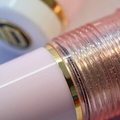
Sailor Ink Studio is a relatively new line by Sailor, composed of 100 different hues! I will not attempt to classify and categorize the line, as it is done in great detail in this excellent overview of the full line: https://macchiatoman.com/blog/2019/1/23/sailor-ink-studio-overview-100-inks I had my first exposure to these inks only briefly on-line when I had seen the interesting multi-hue inks #123 and #162, which are probably the most popular two of the whole line so far. On my recent trip to Japan, I was very happy to find that most of the large stationery store departments had the full Sailor Ink Studio line; some even with pre-filled demonstrator tester pens and paper pads to test the inks! Thus I was able to try out most of the line (it did take multiple trips to try out all 100 inks from this line, not to mention inks by other brands). With that said, the downside of having prefilled pens was that many had been sitting and gradually concentrating the inks contained in them for a week or two. And so some of the more saturated inks to begin with were super-concentrated by the time I was testing them, quickly sheening over on paper. It was not easy to imagine what some of those inks would look like in normal use back at home. Thus I focused on the less concentrated inks that showed more complexity--something different. Please note: the colored stripes across bottle labels are NOT accurate representations of the inks (unlike, for example, Pilot Iroshizuku labels). Ink Stidio #573 caught my eye right away. It was actually quite a surprise, as I was initially going to buy #273 instead. It turned out that #273, while being very nice, is just not as complex in writing as I had expected it to be. #573, on the other hand, is interesting indeed! #573 is a relatively translucent ink of lower concentration, and so it has excellent shading properties, able to produce a wide range of hues from very pale faded terracotta to a deep off-black. There is a dark outline around dried ink lines which is readily visible and gives an extra oomph to the writing. For sheen lovers--you will not see this ink sheening in normal writing. You have to practically dump a lot of ink onto a page to finally see metallic green around the edges. But in all other circumstances, even writing on Tomoe River, you won't see this sheen. Instead, you will get a complex muted terracotta with an outline effect and a somewhat matte, chalky look. I seriously love this ink--it's simultaneously understated and very exciting. Drying time is fairly quick, feathering is very well controlled, and there is even a good degree of water resistance without obscuring smearing. My regular camera is having its sensor repaired, and unfortunately I don't know when I will get it back. I wanted to wait and do a more proper review, but my current fill of this ink was running low, and I decided it was better to put something together sooner rather than later. So this is a quick mini-presentation. I am certain this ink would be great for doing watercolor-style drawings because of it separating into very different colors in chromatography tests.
-
Sailor Ink Studio Swatch Tests - Part 08 - Oranges And Pinks
NickiStew posted a topic in Ink Comparisons
This is the eighth part of my Sailor Ink Studio swatch tests. The swatch cards shown are part of a lovely range of Oranges and Pinks. These are bright! And I mean bright, with the first six colours revealing some striking chromatic behaviour I have not witnessed before. Sailor 230 - A heavy rich bright orange pink that creeps down the card when added to a wetted surface. A pronounced acid yellow is in evidence at the outer edges and in spite of the ink density, bleach works very well, turning neon white. Sailor 730 - A heavy rich bright orange pink that creeps down the card when added to a wetted surface and very similar to 230. An acid yellow is in evidence at the outer edges but due to the ink density the bleach has a negligible effect. Sailor 773 - A rich bright orange that easily blends with a wetted surface. An acid yellow with light pinks are in evidence at the outer edges and bleach works very well revealing a solid gold. Sailor 473 - A rich bright orange that easily blends with a wetted surface. An acid yellow with light oranges are in evidence at the outer edges and bleach works very well, turning neon white. Sailor 173 - This is the lighter version of the 773 and 473. It's very delicate blending easily with a wetted surface. An acid yellow with light pinks are in evidence at the outer edges and bleach works very well, turning neon white. Sailor 130 - A light dusty pink that easily blends with a wetted surface. An acid yellow is in evidence at the outer edges and bleach works very well revealing a neon white. Sailor 731 - A heavy bright pink that creeps down the card when added to a wetted surface. Light pinks in evidence at the outer edges and in spite of the ink density bleach still works turning neon gold. Sailor 431 - A medium bright pink that blends easily with a wetted surface. Light pinks in evidence at the outer edges and in spite of the ink density bleach still works turning neon gold. Sailor 131 - A light bright pink that blends easily with a wetted surface. Light pinks are in evidence at the outer edges and bleach works very well revealing a neon white. All tests on Bockingford Rough 200lb watercolour paper with handwriting using a Noodler's Creeper pen. -
Sailor Ink Studio Swatch Tests - Part 06 - The Pinks Part 01
NickiStew posted a topic in Ink Comparisons
This is the sixth part of my Sailor Ink Studio swatch tests. The swatch cards shown are part of a lovely range of reds and pinky purples. Once again, what is instantly striking is the dramatic chromatography. -
Sailor Ink Studio Swatch Tests - Part 04 - The Blues Part 02
NickiStew posted a topic in Inky Thoughts
This is the fourth part of my Sailor Ink Studio swatch tests. The swatch cards shown are the second part of an extensive range of blues. These ones are what I'd call the pretty blues. And I think you can see why? Once again, what is instantly striking is the dramatic chromatography. -
Sailor Ink Studio Swatch Tests – Part 03 – The Blues Part 01
NickiStew posted a topic in Ink Comparisons
This is the third part of my Sailor Ink Studio swatch tests. The swatch cards shown are the first part of an extensive range of blues. These ones are what I’d call the dusty marine blues. Any one of these inks or a combination of inks would be ideal to consider for marine painting? Once again, what is instantly striking is the dramatic chromatography. -
This is the second part of my Sailor Ink Studio swatch tests. The colours shown range from deep plum through to deep purple. Once again, what is instantly striking is the dramatic chromatography and heavy sheens.
-
I am delighted and excited to finally start posting my swatch tests of the Sailor Ink Studio range. This is a unique range of 100 inks custom mixed by Sailor’s very own in-house ink genius Osamu Ishimaru and they are stunning. The swatch testing process has been a genuine joy and, as you’ll see, the chromatic outcomes are nothing short of sublime. All of the colours were mixed to order at ink clinics held across Japan and I assume that the numbering system was created on a first come first served basis. However, there are theories that there is a system and a pattern to the numbering and if you’re into that I suggest you link to Yagan Kiely’s blog and read his extensive review of the range. There are already some reviews out there, but as usual these are the standard swab tests on card and Tamoe River paper and that’s okay, BUT, and this is a BIG BUT, the real wonder of these inks is the chromatography. It’s what’s going on ‘under the hood’ – this is where the real magic can be observed and appreciated. If, like me, you are seriously into your inks and their colours, what I’m up to is a creative extension of the typical swab card technique and once you have the hang of this – there’s no going back! I have decided to post my swatch cards in groups of nine and have categorised them by colour, so eleven posts will follow over the coming weeks.