Search the Community
Showing results for tags 'royale'.
Found 4 results
-
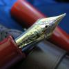
Namiki Yukari Royale versus Pilot Custom 845 http://farm8.staticflickr.com/7346/11918876405_a4b358c5a4_b.jpg Introducing the Namiki Yukari Royale in Black Urushi (top) and the Pilot Custom 845 (bottom). Both pens are resting on a Nakaya three-pen pillow in Kuro Tamenuri Urushi on top of a Midori pad. On the right is a box of Namiki Black ink. Introduction This is a long over-due comparison between two of Pilot's arguably most luxurious mainstream pens, the Namiki Yukari Royale and the Pilot Custom 845. As you all know, the Pilot Corporation uses the Namiki brand for its premium line of writing instruments, much like Toyota uses the Lexus brand and Honda uses the Acura brand for their luxury marquees. The Yukari Royale occupies the second highest rung of Namiki writing instruments, and many people have also made a case for the Pilot Custom 845 being the "flagship" of the regular line-up of fountain pens that Pilot produces, due to its comparatively high MSRP and the superior materials used in its construction. I first acquired the Yukari Royale in 2010, and found it an ideal pen to use. Over time I found myself attracted to the Pilot Custom 845 because it was similar, yet different enough so that I could justify ownership of the pen to myself. So late last year I found an 845 making its way from the sales board into my stable of pens. Some history behind these two pens, according to Fountain Pens of Japan by Andreas Lambrou and Masamichi Sunami (2012), and I paraphrase the information from this invaluable resource here. The Yukari Royale design came from a Balance model first used for the principal pen series made to commemorate Pilot's 80th anniversary in 1998. It was smaller than the #50 FFK Jumbo pen (also known as Namiki Emperor) but bigger than the standard FK Balance model (also known as Namiki Yukari). This limited edition of 1918 pens is long sold-out, but they came in black or red urushi finishes (even the clip was lacquered), and a "four animal gods" lacquer band theme around the opening of the pen cap. See this link from Namiki's website for a picture of this pen and RLD's excellent review of the Pilot 80th anniversary pen. The 845 first debuted in 2002 and its design was derived from the Pilot 75 pen (edition of 7500 pens) made to celebrate Pilot's 75th anniversary in 1993. The Pilot 75 was designed to resemble pens made in the 1930s and it sported a Kikuza clip reminiscent of 1940s-style clips. See Rokurinpapa's extensive review of the Pilot 75 pen. So how do these two pens compare, given their distinguished lineages? First up, their prices. The Yukari Royale has an MSRP of $1500 while the Pilot Custom 845 sells for around $525. Market rates of these pens brand-new hover around $1200 for the Yukari Royale and mid-to-high $400's for the 845. Fortunately, I managed to acquire both pens for much less. Are they worth their suggested retail prices? This will be up to the individual, but for me hunting for a good price is part of the fun in the pen chase. Packaging and Pen Presentation http://farm4.staticflickr.com/3716/11921486675_9a296dfab1_b.jpg The Namiki Yukari Royale pictured in its paulownia wood box. http://farm6.staticflickr.com/5473/11916545376_e7e6dbba02_b.jpg Another picture of the Namiki Yukari Royale in its box. The Yukari Royale comes in a box made of paulownia wood. Included is a bottle of Pilot Blue ink as well as some literature describing the operation of the pen. Notable is a certificate attesting to the authenticity and quality of the urushi finish (not shown). According to the Namiki website, the Yukari Royale comes with a lifetime guarantee: it is "unconditionally guaranteed against failures due to faulty materials or workmanship throughout [its] life with the original owner." http://farm4.staticflickr.com/3818/11916544816_10ee357512_b.jpg The Pilot Custom 845 in its box. The 845 comes in a faux suede-covered box with a velvety-lining inside. One ink cartridge and some literature describing operation of the pen are included. A short card emphasizing the history and excellence of the urushi finish is pictured above. http://farm6.staticflickr.com/5532/11919204383_8d23bbf501_b.jpg The two pens uncapped. Pen Construction and Urushi Finish On to the real comparison. The Yukari Royale is torpedo-shaped and has a underlying body of brass. Conforming to the Japanese aesthetic ideal, it is unadorned, save for a clip as well as a thin gold ring to protect the cap lip from impact. The 845, on the other hand, is styled in the tradition of the Montblanc Meisterstück series but with squared-off ends. There are five trim rings on this pen (including the one on the section) and the cap jewel has a golden ring around it as well. The 845 is made of hard rubber (ebonite), the material traditionally used to make fountain pens. The cap and barrel ends, as well as the section, are made of plastic, however. In his review, MYU had noted that the 845 is a cross between a Montblanc 149 and a Sailor Professional Gear (which itself debuted in 2003), and I concur. I first happened across the 845 in a Hong Kong shop called Winner Pens Collection (you can read my Hong Kong trip report here), and I was taken with its large, yet comfortable size. Both pens have triangular-shaped clips which terminate in a ball, making them highly usable. The Yukari Royale's clip is attached to the cap in a seamless fashion, while the 845's clip is clearly part of the gold trim at the cap end. The Yukari Royale's clip measures 41 mm in length/8 mm at the top while the 845's clip measures 38 mm in length/6 mm at the top. There are four numbers at the top of the Yukari Royale's clip, which might serve as the pen's serial number. More measurements for the statistically-minded here: the Yukari Royale is 46 g capped/29 g uncapped while the 845 is 29 g capped/18 g uncapped. Weights were measured with the converter completely filled. Dimensions: the Yukari Royale is 150 mm capped/134 mm uncapped/179 mm posted, with a diameter of approximately 14 mm, while the 845 is 146 mm capped/132 mm uncapped/165 mm posted, with a diameter of approximately 12.6 mm. Both pens are very well-balanced in the hand, no problems with comfort here. Both pens initially appealed to me because of their urushi finish. I was impressed as well with the history and legendary in-house expertise of Pilot/Namiki in urushi lacquering. The entirety of the Yukari Royale - including the section - is flawlessly lacquered in jet-black urushi lacquer. After four years of hard use, the finish remains impeccably shiny, a testimony to the durability of the lacquer finish. When I first received my 845 last year, I noticed two tiny specks in the lacquer finish towards the barrel end, which are only visible from certain angles and lighting. These specks are probably dust or imperfections in the underlying ebonite body. In any case, these defects did not bother me very much after I inked up the pen and discovered how good of a writer it was. Note that only the ebonite parts of the 845 are lacquered with urushi; the plastic cap and barrel ends, as well as the section, are not. The transition between the urushi and plastic bits of the 845 is seamless - with only the tiny and subtle "URUSHI" gold letters above the cap trim ring serving to remind one of the special lacquer finish. Peering inside the caps of both pens reveals a thin ring of felt that serves to protect the barrel end from marring, should one choose to post the cap on these urushi pens. The felt ring inside the Yukari Royale cap tends to wear away with time, but I haven't found this to affect the urushi finish during normal use. The Yukari Royale comes in both Black and Vermilion urushi finishes, as well as a variety of exquisite maki-e designs. The 845 normally comes in a Black urushi finish, but certain shops in Japan have managed to procure a special Vermilion edition (see here and here and also kmpn's blog for some absolutely breathtaking comparison photos of the Black and Vermilion edition 845 pens, amongst other pens). http://farm4.staticflickr.com/3677/11921489765_1be37c4ca4_b.jpg Comparison of the two sections with attached CON-70 converters. The Yukari Royale is inked with Pilot Blue-Black while the 845 is inked with Pilot Black. Both pens use the superior CON-70 piston converter, arguably the best converter on the market today. I shall not belabour the obvious, except to say that I have had no problems using this filling system. The urushi section of the Yukari Royale tends to stain with Pilot Blue-Black ink but can be cleaned off with some elbow grease. I have had no issues with ink staining the 845 plastic section. http://farm4.staticflickr.com/3774/11916555726_8945294163_b.jpg Close-up of the two nibs: the 845's #15 nib is two-tone while the Yukari Royale in plain urushi finishes come with monotone #20 nibs. The #20 nibs on maki-e Yukari Royale pens are two-tone (the stylized Mount Fuji on the nib is rhodium-plated), however. Writing Experience My Yukari Royale in Black Urushi has a medium #20 nib while the 845 is equipped with a broad #15 nib. The #20 and #15 are approximately the same in length, but have different shapes and feeds. Initially the Yukari Royale nib was a hard-starter. I persisted in using it for approximately six months without much improvement. While cleaning the pen one day, the centre channel rod in the feed came out (also see Richard Binder's page on feeds for more information). Naturally the pen went back to Pilot USA for warranty repair. After it returned, the pen wrote like a dream. I'm not sure what the service centre did but over the course of the last four years, this pen has become my absolute favourite to use. The nib on this pen is springy and extremely responsive, and will lay ink down at the slightest touch to paper. The date code on the nib reads "A809", indicating that it was made by the "A" machine in the Pilot Hiratsuka factory in August of 2009. See kmpn's blogpost for more information on dating Pilot nibs. My 845 pen's broad #15 nib came to me pre-adjusted by Yukio Nagahara of Sailor Pen Company during a pen clinic in India. It writes very well too, requiring absolutely no pressure to put ink onto paper. The date code on this nib is 1210, indicating that it was made in December of 2010 (Since 2010, Pilot has stopped using the "A" and "B" designations on their nibs). In comparison to the Yukari Royale nib, however, the 845 nib is rigid. I have another Yukari Royale with a broad #20 nib ( date code 712 - made in July of 2012), and the nib is inflexible as well. To me, it appears that Pilot broad nibs tend to be more rigid than their finer brethren, perhaps to cater for heavy-handed people? http://farm3.staticflickr.com/2831/11915941023_b990a2faeb_b.jpg Another close-up of the two nibs. http://farm4.staticflickr.com/3732/11916114524_8da4105d9e_b.jpg Side-profiles of the two nibs. The 845's nib tends to stick out more beyond the feed, giving the impression that the user is wielding a brush rather than a pen. http://farm3.staticflickr.com/2810/11915944563_405e387c83_b.jpg See how different the two feeds are! The Yukari Royale's feed is more finned than the 845's feed. Both feeds are made of injection-moulded plastic, however. From this picture, it is apparent that the two nibs are shaped differently as well. The shoulders of the 845 nib tend to flare out a bit more. Conclusions These two pens have excellent construction, an impeccable urushi lacquer finish, write well, and fly under the radar for most people. Either pen is definitely worthy of "grail" status. As might already be apparent from the following pictures, I have chosen the Yukari Royale as my favourite pen to own. Anyway, I hope that you have enjoyed reading this review! Size Comparison to other well-known pens Because more eye-candy is always welcome IMHO. Why would I take photos of all these pens and not share them? http://farm8.staticflickr.com/7369/11916119674_78a7fc57a0_b.jpg Both pens depicted with the Namiki Yukari Royale in Vermilion Urushi. http://farm6.staticflickr.com/5520/11915945783_b74755a931_b.jpgBoth pens depicted with the Namiki Emperor in Vermilion Urushi. http://farm4.staticflickr.com/3682/11915661975_5cf6eec826_b.jpg Both pens depicted with the Sailor King of Pen in Crimson Urushi, reviewed here. http://farm3.staticflickr.com/2873/11915945153_d82eccab9b_b.jpg Both pens depicted with the Sailor Professional Gear Kanreki. http://farm8.staticflickr.com/7319/11916118974_82b36dc5a6_b.jpg Both pens depicted with the Montblanc 149. http://farm8.staticflickr.com/7343/11915937543_41a3e08573_b.jpgBoth pens depicted with the Pelikan M800 in Green. http://farm4.staticflickr.com/3834/11916118674_f73a8ea1ca_b.jpgBoth pens depicted with the Pelikan M800 in Tortoiseshell Brown. http://farm6.staticflickr.com/5547/11923905185_93af11c485_b.jpg Both pens depicted with the Parker Duofold Centennial in Black. http://farm6.staticflickr.com/5477/11916119294_a1a38c6d05_b.jpgBoth pens depicted with the Nakaya Portable Writer in Shobu. A non-exhaustive listing of FPN reviews for the individual pens (Apologies in advance for any omissions) Namiki Yukari Royale: pmrogers, Archimark, enlasombra, enlasombra (again), rhk (comparison between four pens), Mkim, Painterspal, Brian. Pilot Custom 845: J-san, MYU, Hari317, Hari317 (again), seikoguy, Pen2009.
-

A Review Of Namiki Yukari Royale In Vermillion(Red) Urushi
sannidh posted a topic in Fountain Pen Reviews
A wait longer than words can define, an Emperor in Red singing a glistening rhapsody, and then a Yukari dazzling in Royale Red glory. The pens, an encompassment of elegance of words, combined with precision of maki-e artisans have been unsurpassed. The Yukari did anxiously waited in my hands to have it's first sip of ink and I had same thoughts with what if clauses! Before getting the Yukari, this is a must read-review by FPNer shuuemura, which is a rather poetic series of pictures with practical words, comparing two pilot beauties in black urushi. This pen, one can find ideal for everyday carry to write or to keep admiring the marvel it is! The doubly magnified and magnificent emperor would be more suitable for the latter though. Having said that, when both are together, it’s more fulfilling than a sumptuous meal. PS. Google says Yukari in Japanese means Affinity (上記) and is feminine by gender. In case you are looking for a review of the Yukari Royale or the Emperor (sized pen), the below links redirect to the necessarily ‘unnecessary’ eye-candies on a blogger optimized view The Yukari Royale Review The Namiki Emperor Review A BRIEF HISTORY The Namiki Yukari Royale more or less derives itself from the 80th Anniversary fountain pen (with only 1918 produced) aka the ShiSen, which was launched in 1998. The cap band was then imprinted with four mythical creatures - Dragon, Phoenix, Tiger and XuanWu (Tortoise). The band decorated with the Shijin (four gods) was finished in Togidashi maki-e. The Chinese fable of these creatures goes like this - Each mythical creature is supposed to guard one particular Earth direction and is Harbinger of a particular season. They are respectively, Shujaku - the red phoenix of the South (Summer), Byakko - the white tiger of the West (Autumn), Genbu - the black tortoise of the North (Winter) and Seiryu - the blue dragon of the East (Spring). The latter four are the Buddhist guardians of the four directions who serve Lord Taishakuten (who represents the center), and are associated with China’s Theory of Five Elements. The 80th Anniversary pen is rather excellently reviewed here by RLD. And later, in 2005, another 50 Seki Shun LE pieces (branded as Dunhill Namiki) were made by Pilot/Namiki for the Elephant & Coral Store which are still available. The clip matches the colour of the main finish in the earlier editions, something which may or may not appeal to all of us. URUSHI Urushi as you may know is the otherwise poisonous sap of the urushi or lacquer tree (Toxicodendron Vernicifluum) which grows in Japan, China, and Korea and is primarily brown in colour. The sap of this tree polymerises to form a hard, durable, plastic-like substance, when exposed to moisture/air. Liquid urushi can be applied to multiple materials like wood, metal, cloth, resin, ceramics or ebonite as opposed to the best available synthetic lacquers. When it solidifies, it turns into a very hard coating that is waterproof and protects the coated object from effects of fungus, ambient chemical reactions at surface due to heat or humidity or even from caustic acids. By mixing pigments into cured urushi, colored urushi such as black or shu (red) are made. With natural exposure to air and ultraviolet light (extended UV exposure ends up in discolouration), the urushi layers gradually increase in transparency and the material gradually unveils shades of original bright colours within. Like the Emperor, the Yukari Royale also comes in a spacious wooden box, made of traditional Paulownia wood. The box is protectively packaged inside a cardboard box. I had to let go of the box, while someone hand-delivered the pen, along with the accessories! The model number of the pen, in this case FNK-128S-<R/B>-<F/FM/M/B> contains the launch price, colour and nib width. The 128 refers to the list price of JPY 128,000 whereas the third digit R/B refers to the red/black urushi. THE TORPEDO This Lacquer No.#20 model comes in two standard finishes - Black & Vermillion (Urushi) with gold plated clips. The brass body feels comfortable in hand, from dual perspectives of dimensions and weight. The torpedo shaped pen in Vermillion/Red is adorable in both light and shadow, and when light reflects through layers of urushi, it renders itself an electric red appearance. I believe the brass substrate is partly responsible for its bright hues compared to a relatively darker scarlet hue off the Emperor’s ebonite. The expected fit & finish seem impeccable. The simplistic yet elegant design comes with two golden accents, provided deftly by the traditional triangular shaped tension fit clip with a sphere and a thin gold ring at the cap lip. Again there is a marked absence of any other decoration like a cap band or ring or anything else on the entire pen, extending infinity to modes of artistic convergence. Vermillion is considered as an auspicious colour throughout East Asia, where it’s culturally imbibed. It has four synthetic & natural shades as of today: Red-Orange[sRGB (255, 83, 73)], Orange-Red[sRGB (255, 69, 0)], Plochere[sRGB (217, 96, 59)] and Chinese Red[sRGB (170, 56, 30)]. The shades/hue of the pens in red urushi might vary. The cap finds itself after two turns, revealing a nib with the modern Mt.Fuji inscription. The seamless grip shows a pronounced taper starting from the barrel and ends up with a smoothly carved out bump, rendering continuity. The cap threads on the barrel are carved out with artistic finesse, deftly spaced and carved out of brass. The barrel at the other end leads leisurely to the smoothest tail. The brass cap again displays the most subtle art, sans any discernible extravagance. It carries the same perseverance and focus with a fluid like finish. The finish is impeccable with a parabolic finial and with colours hovering between bright and dark red, with the play of light. The clip is traditional triangular Pilot with a sphere at the end, inscribed with Namiki with the ‘Isosceles Triangle within a Pentagon’ logo. There is a thin gold ring at the cap lip, the only adornment than the golden clip. There is a alphanumeric code inscribed on the upper base of the clip, where it delves into the cap. FILLING SYSTEM - ‘CON-70 ZINDABAD’ The section unscrews from the barrel with three and half turns, with a metallic clink, given the metallic threads on both the section and the barrel. This exposes the golden metallic threads of the section, which would otherwise remain ever hidden! A special CON-70 converter, in black, is pushed inside. The inner barrel carries the opposite metallic threads. With a short black coating near the threads which contacts with the section, the rest of the brass barrel is all exposed metal on the inside. The pen can take all pilot converters CON-20/40/50 (0.4-0.5 mL) & CON-70 (1 mL) along with pilot proprietary cartridges (0.9 mL). I have used the included ‘special black’ CON-70 converter, which has a push button filling mechanism. Mind you, the ink bottle with have some froth during the otherwise fun filling exercise. Although, for Yukari I have always directly filled the converter from an eye dropper! NIB WITH THE ‘OVAL’ BREATHER HOLE The nib with the Yukari Royale is 18k, Size#20 (similar to Pilot#15) and it comes in four stock widths - F, FM, M & B, across Japan and other distribution countries. Inscribed upon it, is the symbol of Mt. Fuji and the upper part does seems symbolic of the snow caps! Comparatively the nib weighs a tad more than a usual pilot#15 nib (0.78g vs 0.70g), but at the same time it is much less wide at the shoulders. The oval breather hole rests within the snow caps. Below the snow, etched are the Namiki Logo (Isosceles triangle inside a Pentagon), Namiki, gold alloy specs (18k-75%) and Nib width <M> On the left the #20 nib carries the Namiki Logo with Ste PP-F hallmark and on the right it carries a simple date stamp. The red plastic feeder does converge with the overall color of the pen, though I would have preferred a similarly urushi coated feeder, which only the Emperor has! May be it’s a feed size limitation, may be Pilot doesn't want to spend more money, I have no idea. The moderately spaced fins ensure levelling ambient air pressure and give you a good buffer, my experience says it’s a tad better than the usual pilot feed. You can see the three different feeds, Size#50 Emperor, Size#20 Yukari Royale & the Size#15 Custom 823, side by side. PHYSICS AS RELATIVELY IT IS The lacquer somewhat helps in keeping the pen warm which is otherwise metallic, and renders it comfortable for writing. The pen is deftly balanced for writing, even for extended use. The grip, smooth & soothing, showcases both utility and elegance at the same time. I do not post the pen as the cap is not as inlaid with as much felt/velvet as the Emperor. Figures for weight and dimensions run below for the technically minded ones. Length closed ~ 14.9 cm Length open ~ 13.4 cm Grip Diameter ~ 1.1 cm Nib Leverage ~ 2.4 cm Weight (without ink) ~ 45 g Weight (without cap) ~ 27.4 g Capped, uncapped pictures with a Pilot Custom 823 run below for your reference. There is an Emperor posing, just to highlight its relative significance The uncapped Emperor without weighs around 31 grams and the Yukari with an unfilled converter weighs around 27 grams. And this is one of the most comfortable pens, I found. ECONOMIC VALUE The Yukari Royale retails at around USD 1200 in the US, and you can find it at similar prices in Japan. I was able to source the pen at a good bargain. Logically the economic value should be equal to salvage value of the pen after a few years of use and I don't think the price will vary by much even after few years of use, given that someone finally decides to sell it off. Having said that, even though the pen is one of its kind, you should give it a serious thought. It will result in a fair amount of money trapped within the urushi layers! FINAL WORDS IN WRITING The medium nib is graced with a super wet flow, which might put a few of my Pelikans to utter shame! The nib is as smooth as I want it to be, with a slight hint of control, evident in all pilot gold nibs, strictly speaking. I feel that there is some characteristic spring and softness because of the size & shape of the nib, and it does open up with a bit of pressure. The verticals grow thicker with pressure, and this nib runs a tad thicker than a usual pilot medium nib. No skips with fast or normal writing. It writes pretty similar at whether held at a high angle or a low angle. A relatively wet Sailor Nioi-Sumire ink takes around 55 seconds to dry completely on Tomoe River paper with the #20 medium nib. Thank you again for going through the review. You can find other pen and paraphernalia reviews here. REFERENCES Urushi FPN Thread on Care for Urushi lacquered pens Pilot Custom 823 Review The Namiki #50 Emperor Review -
Hello all, hope you and yours are doing well during these odd times. I am reevaluating my ‘desirables’ list of pricier fountain pens and attempting to narrow down my choices a good deal. For example, I’ve recently removed the Montblanc l’Aubrac after finally getting a chance to try one and being disappointed by the slippery metal section. (Why, Montblanc? Also, why do I trick myself into thinking I won’t mind it, every time?) The basis for my pruning of the list is that I want a pen I can use. I write a lot, usually for several hours everyday. I’d told myself that this ought to limit my quiver of pens to only the most utilitarian models. Nakaya is out, on account of their tiny ink capacity. Sailor—whose nibs are my absolute favourites—is also out, unless I put their nibs in a Conid. However, the Con-70 is a fair capacity converter, and much easier to clean than an eye dropper, so the Yukari Royale remains on the table. Why can’t I have a pen that’s gorgeous and practical? As I try to inject some majesty back into my rotation of pens (all delrin Conids and ‘precious’ plastic Montblanc) I see myself drifting further towards the Yukari Royale. It is beautifully lacquered, yet tastefully subtle, black with reserved furniture. It is unassuming, which for me is a huge plus. The last thing I want is someone to ask me about my pens. I have to work hard to hide the Montblanc snow cap if ever I leave the house with one of them. I’m counting on the uninitiated not recognizing the Namiki clip, as no one ever makes a fuss about the Conid final. The review on this forum have been wonderful, by the way. There are some effective reviewers and spectacular photographers in this community. For that, I owe you all my thanks. So, all told I am simply looking for opinions on the viability of the Namiki Yukari Royale as a moderate to heavy use daily writing pen. It’s hefty, but only seven grams more so than my Conid inked and uncapped. It’s lacquered, but urushi’s withstood more abuse over the centuries than I ever intend to throw at it. Does anyone actually use this pen to get some decent chunks of writing done? Any insight, advice, or words of caution would be greatly appreciated. Stay healthy, stay happy, folks.
-
So its finally here! Namiki Royale, Vermilion Urushi Warning: Photo Heavy - I personally love when reviews have tons of photos so just returning the favor! This pen fulfilled so many of my most desirable traits in a pen, that I found myself in need of writing a review on FPN for others to see. I will try to restrain myself from praising the pen too much, as I have only had the pen for about a week now...but as of now all I can say is: "this pen is freaking awesome!" I will divide the review into the following: 1. Appearance: The aesthetics and feel of the pen, disregarding the write-ability of the pen for this portion. 2. Performance:The nib and writing experience. 3. Construction: Durability of its materials, construction method, and details. 4. Presentation: Small portion that describes packaging. 5. Value: What/how I may value the pen and its experience. Without further ado... 1. Appearance: The appearance of the pen is of elegance and of humble gesture... At first glance from a distance the pen doesn't look too special, but as you get closer the finer details and presence of the pen slowly reveals itself to be an object of human creation approaching the pinnacle of perfection. Yes those are big words, but this is a big pen with bold attitude and confidence, I feel comfortable many who held one would agree. http://i1251.photobucket.com/albums/hh558/Pammzer/IMG_6011_zps5238ba00.jpg The shape of the pen is a classic cigar shape, but utilizes some of the lines of the french curve. A "french curve" is a classical curve measurement or standard in which the beauty of its curvature is determined through proportion. It appears pleasing to the eye much like the "golden scale" many are more familiar with. There is no compromise here, the pen became all that it wanted to be along the barrel and the cap. http://i1251.photobucket.com/albums/hh558/Pammzer/IMG_6023_zps528c8108.jpg http://i1251.photobucket.com/albums/hh558/Pammzer/IMG_6043_zps5f59366f.jpg The only details on the pen that breaks the perfectly lacquered shape are the clip and the very thin trim along the bottom of the cap. The clip very mysteriously slips into a slot, showing no evidence to how it might have been made. This is very much like Japanese Architecture, components coming together in a matter that shows no sign of bolts, rivets, seams... Therefore in appearance creating a object that is - and not that is force to be. I've seen several people complain that the Namiki clip on their higher end pens look exactly like the ones on their more "affordable" pens. I don't have any other Pilot or Namiki pens and cannot compare but from pictures the Royale Urushi and Maki-E line as well as the Emperor line seems to have greater taper along the two sides of the clip. This makes sense since they are larger pens, and therefore can have a larger clip. http://i1251.photobucket.com/albums/hh558/Pammzer/IMG_6033_zps4840078c.jpg The very thin golden ring trim at the bottom of the cap protects to urushi from impact anytime the cap is put down. It is the only urushi edge that will come into constant contact with other surfaces. This design shows impeccable excellence in the care for their pen designs, combining beauty and purpose. The Form and the Function do not compete for attention, they create synergy and one cannot be separated without the other, much like what we see in nature's design. http://i1251.photobucket.com/albums/hh558/Pammzer/IMG_6055_zps28c09fb9.jpg To give you an idea as to the size of this pen, I compared it to well known German and Italian pens well regarded as "pen standard" in measurement. The Montblanc 149 to the left appears to be similar to the Namiki in its cigar shape, but in reality it is VERY different. The ends of the 149 do not follow the "french curve" and have a bit of a squashed look to it in comparison. The Namiki I would say is slightly larger in length and very slightly thinner in girth than the 149. For die-hard Italian fans I threw in the old-style Omas Paragon to size compare... the comparatively small yet nimble Paragon is much thinner and shorter in comparison. The Paragon I feel is the perfect size for on-the-field type of writing, I feel very comfortable whipping it out in any situation to write down something quick. The 149 and the Namiki are large pens, however they somehow mastered their utility and grip comfort despite their size. I feel equally as comfortable to bring them along anywhere I go. They will feel right at home in either the field for sketching or in the meeting room. I tried to cover the colour portion in this review but it is just so difficult for words to describe, it shifts drastically depending on lighting conditions. I can say that it is a very bold and deep red that your eyes cannot look away from. I will let you readers be the judge of the colour... In my opinion, a deep bold red paired with a sensual yet humble body is a killer combination. 2. Performance: The writing experience of this pen can be explained to you in one word: Zen This is where the review might get a bit controversial... Statistics show that this pen is in the "heavier" pen category. The weight of the pen is around 45gr. This is due to the un-assuming brass construction underneath the delicous vermilion urushi (that will be covered later on). In comparison the MB149 weighs 29gr and the Omas Paragon weights 20gr. Although the Namiki more than doubles the weight of the paragon, it is so well balanced that the weight does not detract from the writing experience. Like a well made sword or weapon, the weight distribution is perfect and the user feels no strain, while at the business end there is more "oomph". I absolutely love this well balanced weight, a humble looking pen, when held has that feel to it like - "hey I am a big deal"... is what really makes it a serious pen for me. Looking at a Namiki Royale and holding one is a completely different experience. http://i1251.photobucket.com/albums/hh558/Pammzer/IMG_6028_zps80101cfe.jpg http://i1251.photobucket.com/albums/hh558/Pammzer/IMG_6041_zps05844c2c.jpg The nib is gorgeous...Large gold thing that writes with a perfect combination of smoothness and control. Unlike many Japanese cars, the smoothness of the feel does not compromise the control of the vehicle. I can feel the "road" or paper in the perfect amount so that I may react accordingly. It feels much like a BMW, I am always in control and never left dry from feeling like I am the vehicle, not riding one. The nib writes pretty wet for a Japanese pen with a bit of give to create some line variation. This pen is a m nib and writes somewhere between an Italian M and a Japanese M. I cannot compliment in control more, I ask nib for more by applying a bit more pressure - and it provides by giving me thicker lines and a juicier flow. I ask for less and loosen my pressure and it gives me thin lines with drier ink flow. What more can you ask from your pen? 3. Construction: http://i1251.photobucket.com/albums/hh558/Pammzer/IMG_6059_zpsc66017c4.jpg I don't think I can comment much on its construction other then - it is made of brass...and lacquered with the most beautiful Vermilion I've ever seen. The inside of the cap barrel is lined with some sort of felt to protect the urushi pen placing the cap on. The inner treads are all brass and align perfectly to one another, giving confidence to the user that it is robust and not a fragile instrument. The outer threads above the grip section are lacquered in urushi, and very meticulously done to show no evidence that any human has ever touched it. The pen uses a converter, yes I know what your thinking...why make a big pen and stick a converter in it? But this is the Namiki CON-70 converter, don't be fooled... it is a big converter. I am a huge advocate of large pens must = large ink reservoir, and converter in a large pen like Sailor KOP is a big turn-off for me. But Namiki's CON-70 holds 1.9ml of ink, I can hardly say that is little considering Pelikan M800 holds just about the same ink! 4. Presentation: Just a short note on the packaging of the pen: it is neat! There is no unnecessary decorative features, well protected, yet still very sophisticated. No it did not come inside that large blue metal trunk that's my coffee table! http://i1251.photobucket.com/albums/hh558/Pammzer/IMG_6061_zps9f299049.jpg 5. Value: I think I will take this portion as a conclusion to my review. How would I rate this pen? It is well worth every penny for me. No other pen has performed so well in all aspects of performance, durability, style, elegance, and presence. The object evokes a pen that strives so close to perfection that it feels almost as if it is made from a superior machine with extremely precise assembly. However the real value of this pen is knowing that in fact it is meticulously hand made. How and what it took for someone to hand lacquer this pen is beyond me... In conclusion, it has satisfied every appetite I have for a pen both subjectively and objectively. Don't just look at this pen but hold it...and if the owner allows it please take some time to meditate on the feel of its writing experience. With each tier of experience with this pen, the appreciation of it grows ever so humbly. http://i1251.photobucket.com/albums/hh558/Pammzer/IMG_6032_zps74201db8.jpg Thank you for reading this review! I hope it was fun reading it as much as it was for me to review it! Please feel free to leave a comment on how I can improve my review skills as well as any comments you may have on the pen. Many more reviews to come, my other pens are very jealous in what I had to say about the Namiki, the newest arrival...and is begging me to give them some more attention that they surely do deserve. Cheers! Michael