Search the Community
Showing results for tags 'rohrer and klingner'.
Found 11 results
-
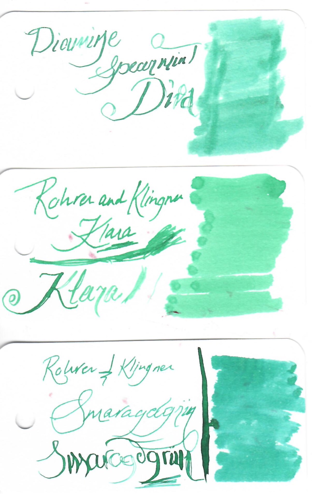
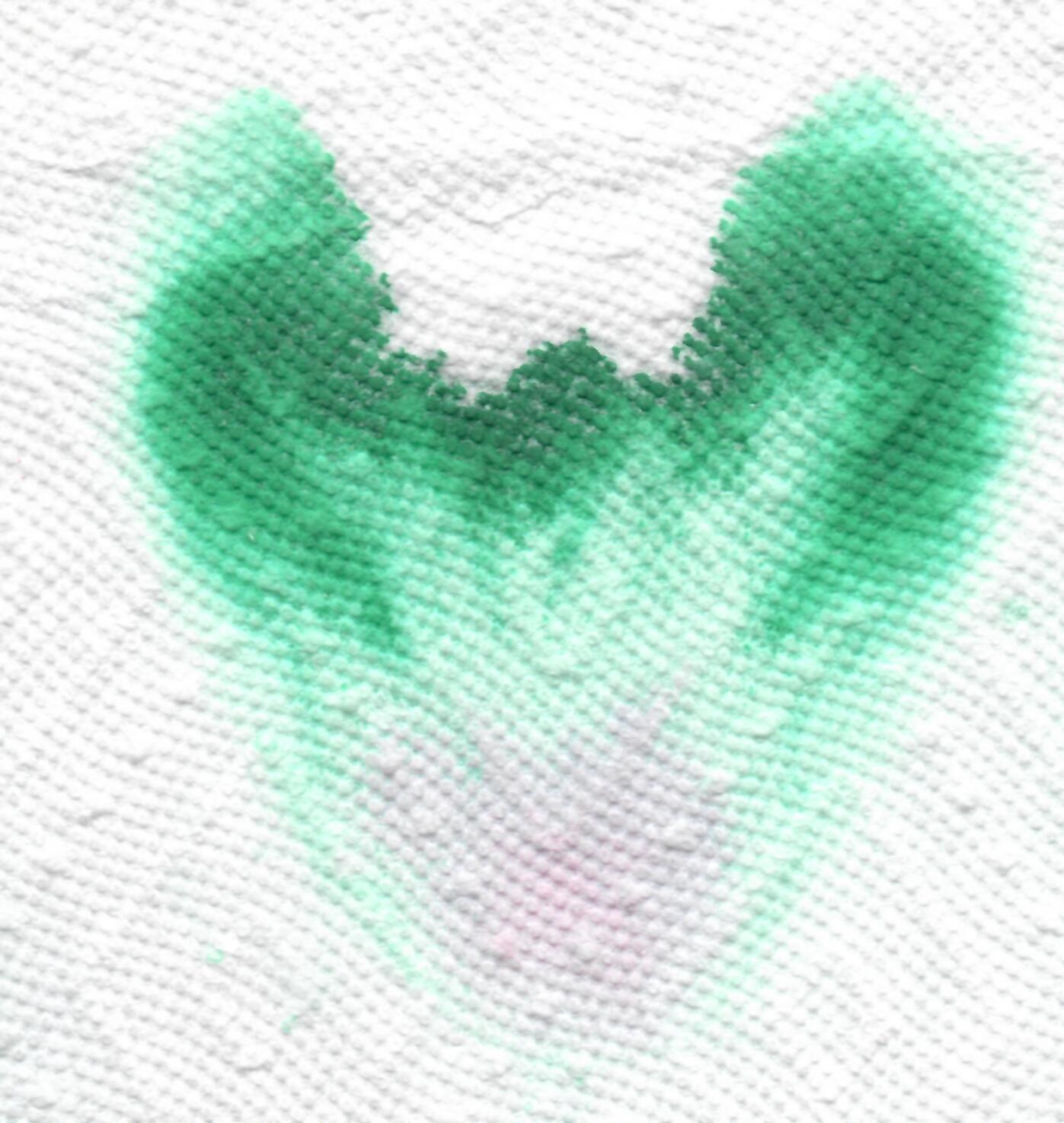
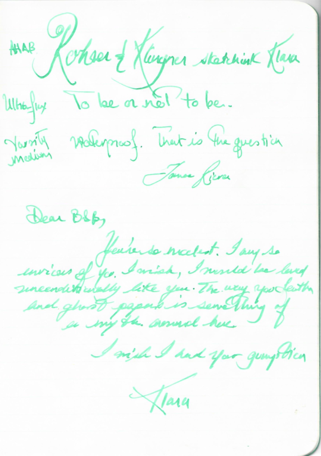
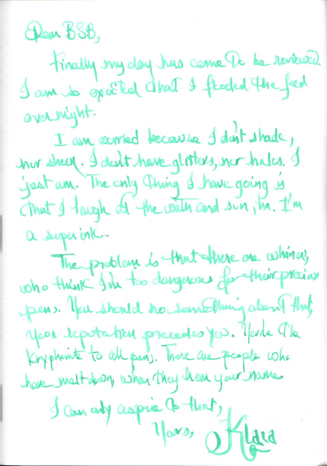
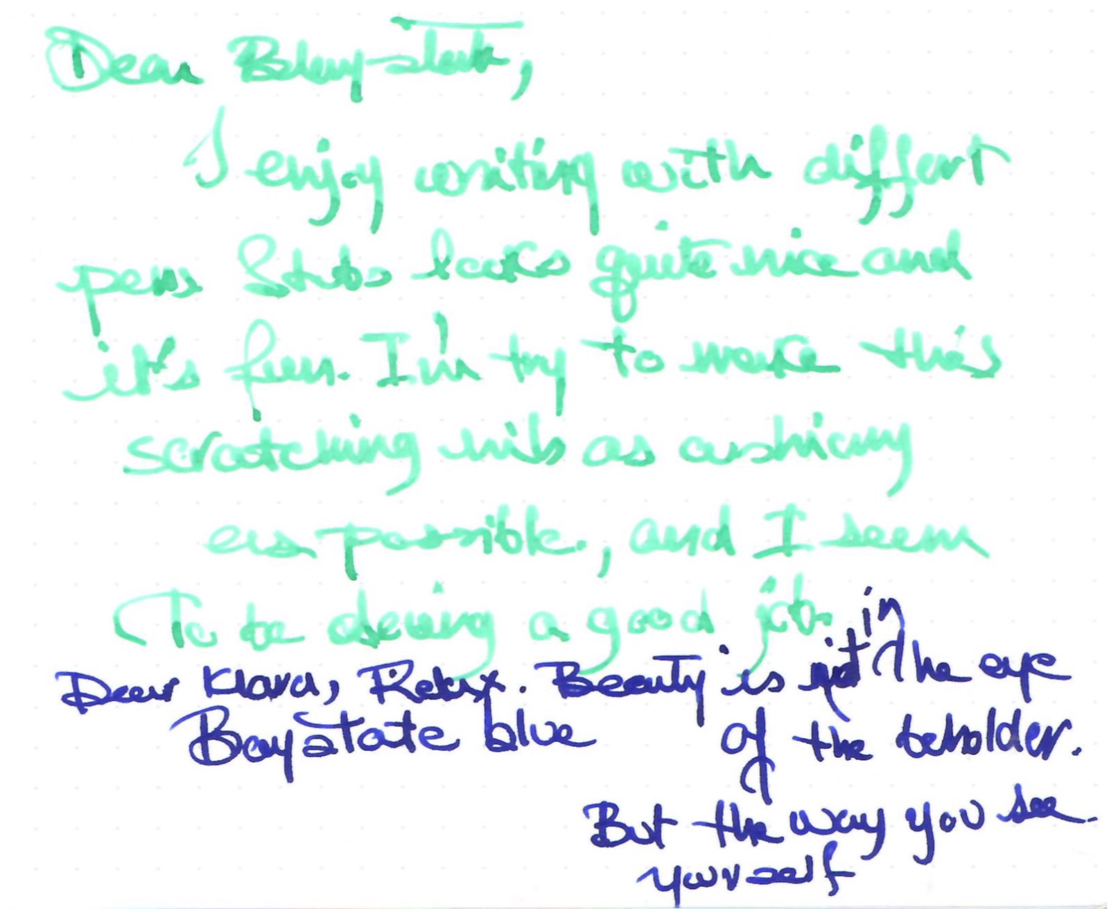
Rohrer and Klingner sketchINK® Klara Another one of the water/lightproof sketchink series. Very difficult to scan and photograph. A searing green/blue, that could be hard on the eye 🙄 I recommend using sunglasses to read this review 🕶️ I would use this ink mostly for editing and annotating. Comparaison Chroma I amused myself to a different type of the review. Letters of Klara to Baystate Blue her role model Life Classic Tomoe River Tomoe River 68 gr Midori A sketch (don't forget your sunglasses) Comparison with Baystate Blue on TR 68gr (stub) And finally a photo: Dry time is moderate.... Personally I think this ink is best with fine/ ef nibs... • Pen used: Noodler’s Ahab / Kanwrite Ultraflex, Pilot Varsity • Shading: Difficult to see • Ghosting: None • Bleed through: None. • Flow Rate: Wet • Lubrication: Nice...it took off the edge off the TWSBI stub.... • Nib Dry-out: Needs a well-sealed pen. • Start-up: If not used it can dry out, in pens with high evaporation. • Saturation: Not really • Shading: Debatable... • Sheen: No • Spread / Feathering / Woolly Line: None. • Nib Creep / “Crud”: None • Staining (pen): It doesn’t stain. But you need a pen cleaner, in my experience. • Clogging: Nope • Water resistance: Waterproof • Availability: Only in bottle 50 ml bottles. Enjoy...

-
Rohrer and Klingner sketchINK® Frieda
-
-
I've bought a lot of Noodler's inks since I've gotten into fountain pens, and since then I've found they are not to my liking with how much cleaning I have to do each time I change colors. Even thought I absolutely love Bad Blue Heron and Walnut, they tend to stain my converters and a simple flush is never enough to clean out my pens. I have Rohrer and Klingner Salix and Scabiosa, but haven't become enamored with those, even though they flush out so well. I thought Diamine might be nice but then Sargasso Sea took some effort to clean out of my pen. Hematite Rouge did the same, but I'll use it because of how beautiful it is. But I want inks that are easier to clean up. I like vibrant inks, but i don't want the hassle! Can I have my cake and eat it too? What are some good saturated inks that aren't difficult?
-
Here's one of my favorite obscure inks. It's such an odd color. I'm pretty sure my parents have a can opener from the 1970s that is this color… http://imagizer.imageshack.us/v2/xq90/538/Yocqgu.jpg
-
I found a stash of old reviews that got misplaced during a house move, so this one's a bit old. Though yellow inks aren't really on my list of usable inks, this is probably the best one I've run into. I certainly like it more than Noodler's Yellow. It's much deeper than Noodler's Yellow, shading to a darker, goldish color. Thanks to Jared for providing the ink for this review a few years back! http://imagizer.imageshack.us/v2/xq90/673/fRGcye.jpg
-
Here's another of my favorites. It is incredibly difficult to capture this incredible ink in photos. Forgive the comparison to Verdigris; I have too few green inks. Reasonable care was taken to ensure color accuracy. The Warbler was done with Alt-Goldgrün, J. Herbin Cacao du Bresil and a touch of J. Herbin Terre de Feu in a Stillman and Birn Gamma sketchbook. Any resemblance between the ink swab and le decolletage (or any other anatomical feature) was purely accidental.
-
This is an ink that I got a little while back as part of Ink Drop and I finally just had to force myself to use it. I am overall not super fond of very light colored inks like this because I don’t see much of a use for them in my daily life. Something interesting to note - the color that you see here is not the color that it had going down. When I was writing it was very light and I wasn’t exaggerating when I said that I was losing my place in the middle of a word. I wrote this review on Oct 7 and it’s now the 12th, so within the past five days the color darkened enough to make it much easier to read. In fact, it doesn’t even look that yellow anymore. Much more of an orange-yellow or “mac n cheese” color to me. As not crazy as I am about the color itself, this was not the worst ink to write with. It had good flow, even from the Lamy 1.1 which is a normally very dry nib. I didn’t notice any problems with feathering or bleeding either and it behaved on a cheap index card and under a highlighter. Water resistance was flat out not there at all, but I’m not surprised by that. It’s a bit of a bummer though, because I drew what I thought was a nice flower for that soak test… Overall, I think that this is not the worst possible yellowish ink you could buy. I never want to use it again (especially not when compared to the beauty that is Apache Sunset) but that’s a personal preference. I would say that if you need a yellow ink for artsy stuff or for CMYK color mixing, this is a good choice since R&K inks tend to be pretty cheap, at ~$12/50 mL. This ink was purchased with my own money and I am not being compensated for this review in any way. All opinions above are my own and you are free to disagree with them if you like. Full page review scan:
-
*Reposted from my blog* To follow up on my post from yesterday, I did a quick comparison of three green inks that are currently in my possession. I haven’t written up the full review of Aventurine yet (actually I have now, it's here), but my review of Verdura is here and eventually I’ll do a review of Shin-Ryoku as well (for a neat mix that uses Shin-Ryoku, you can lookhere…), but here’s the quick and dirty side-by-side: A few notes on the scan - the Aventurine looks pretty true to life, at least on my monitor. The Verdura comes out a little bit light, and the Shin-Ryoku is a touch washed out, but not drastically so. Anyway, I didn’t want to do any color adjusting because what would probably make one look the best would screw up the other two. :-P After seeing them all together, I would call Aventurine the purest green of the three. It’s like the color of the most perfect lawn that your neurotic neighbor spends waaayyyy too much time maintaining. Shin-Ryoku has a lot more blue component and is more like the color of a spruce tree. As for Verdura, I stick with my original description and would call it a vibrant shamrock green, the color of stuff that emerges around St. Patrick’s Day. All of these inks are similar in terms of behavior - no water resistance, smooth flow, not too much feathering and bleeding on good paper, and easy to clean out of your pen. If you aren’t too picky, Verdura is by far the cheapest, at ~$12, and then there’s Aventurine at ~$23 and Shin-Ryoku at ~$28 (online prices for 50 mL bottles here in the States). Given that I already have a nearly full bottle of Verdura and half a bottle of Shin-Ryoku, I probably won’t spring for Aventurine anytime soon, but perhaps it will be next on my list of greens when the time comes… Which one is your favorite?
-
Here today with another ink mix. Another pair of Rohrer & Klingner inks, this time Scabiosa and Solferino, 3:2. The resulting color dries dark enough to make it usable for taking notes and even doing homework, as long as your professors aren’t too picky. :-) It has the positive effects of the IG (water resistance, low feathering and bleeding…) while still being nice and vibrant. Speaking of water resistance, here are the results of the soak test: Like my previous partial IG mix, it remains readable after getting wet, though I certainly wouldn’t count on it being good for writing my memoirs while scuba diving. The paper used for this test is a page from my pocket sized Ecosystem journal, and all inks would bought with my own money and all opinions expressed above are entirely my own.
-
Hello! Here today with a quick overview of an ink mix I prepared yesterday morning. On the R&K website they say that their inks can be mixed without any negative consequences (except for sepia), so I decided to give it a try with some Salix that I already had and some Verdura that I ordered a sample of just for this experiment. They were mixed approximately 1:1, and the resulting color is a dark teal (ish). I did not do any color adjusting, but the scan appears pretty true to reality on my screen. Also, forgive my bad handwriting - my new VP is being a pain in the butt and skipping on a lot of my downstrokes, which makes me fear that it has a case of baby bottom… Anyway, I of course had to do a soak test as well. I only let the page “cure” for a few hours, so I don’t know if the IG component would have darkened more if I left it overnight. Still, what is left is readable, though not preferable: All in all, I really enjoy this color and I like that if it gets wet, it’s not a total loss. This is my big reason for wanting water-resistant ink - so that if it gets spilled on all my writing doesn’t disappear, not because I enjoy writing in the rain. :-P Btw, the paper used for the writing sample is Staples 24lb bright white inkjet paper and all inks were bought with my own money and all opinions expressed above are my own.