Search the Community
Showing results for tags 'rhodia'.
-

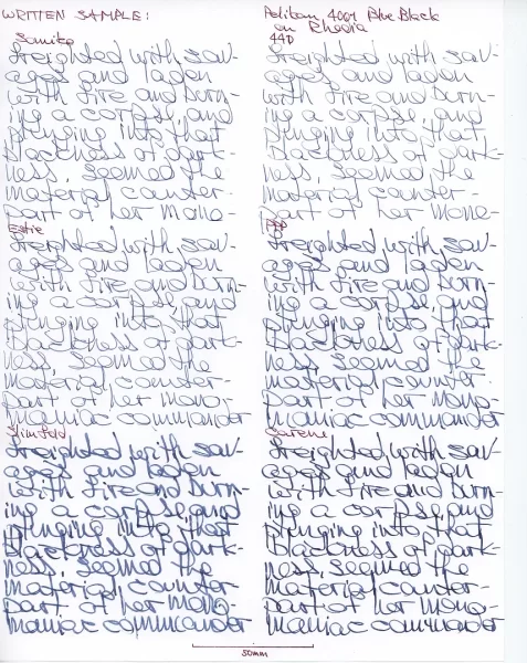
Sandy1 review Pelikan 4001 Blue-black - hi-res Estie on Rhodia.webp
Mercian posted a gallery image in FPN Image Albums
From the album: Sandy1
Samdy1’s hi-res image of Pelikan 4001 Blue-black, written on unlined Rhodia paper, with her Estie.© Sandy1
- 0 B
- x
-
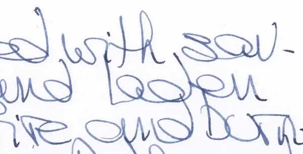
Sandy1 review Pelikan 4001 Blue-black - sample text on Rhodia paper.webp
Mercian posted a gallery image in FPN Image Albums
From the album: Sandy1
Sandy1’s sample text written in Pelikan 4001 Blue-black on unlined Rhodia paper.© Sandy1
- 0 B
- x
-
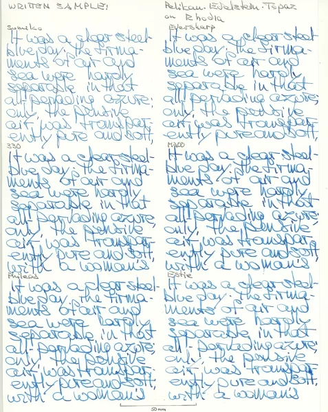
Sandy1 review Pelikan Edelstein Topaz - sample text on Rhodia.webp
Mercian posted a gallery image in FPN Image Albums
From the album: Sandy1
Sandy1’s scan of her sample text written with Pelikan Edelstein Topaz on Rhodia paper.© Sandy1
- 0 B
- x
-
-
desaturated.thumb.gif.5cb70ef1e977aa313d11eea3616aba7d.gif)
Writing samples from 24 pens on Rhodia DotPad
A Smug Dill posted a gallery image in FPN Image Albums
.jpg.40d01650e1f4eccfab7a258360886372.jpg)
-
.jpg.a06b34725dfe75bdd958d15324e7fac1.jpg)
-
Writing samples from 24 pens on Exacompta FAF
A Smug Dill posted a gallery image in FPN Image Albums
.jpg.a84a8f71a62fd42efbe530b35650e357.jpg)
-
Show-through and bleed-through on Rhodia DotPaid and Exacompta FAF compared
A Smug Dill posted a gallery image in FPN Image Albums
.jpg.7cea010f1aa1e9ae4290879b3ce60ed0.jpg)
-
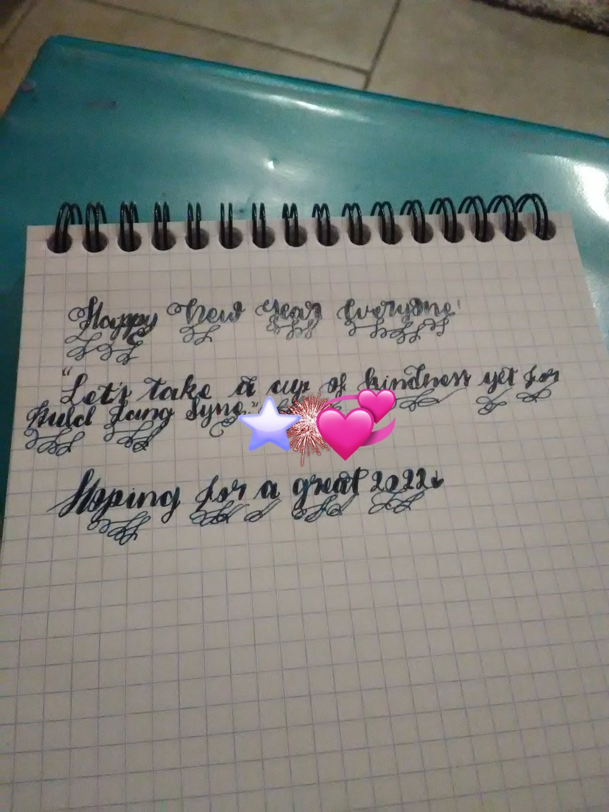
Happy New Year everyone! Let's hope that '22 will be much better than the past two years! 🖋️➡️ Pilot Kakuno 📜➡️ Rhodia Bloc N°16 🔏➡️ Diamine Enchanted Ocean 🌊 Have a great day/night!🏳️🌈

-
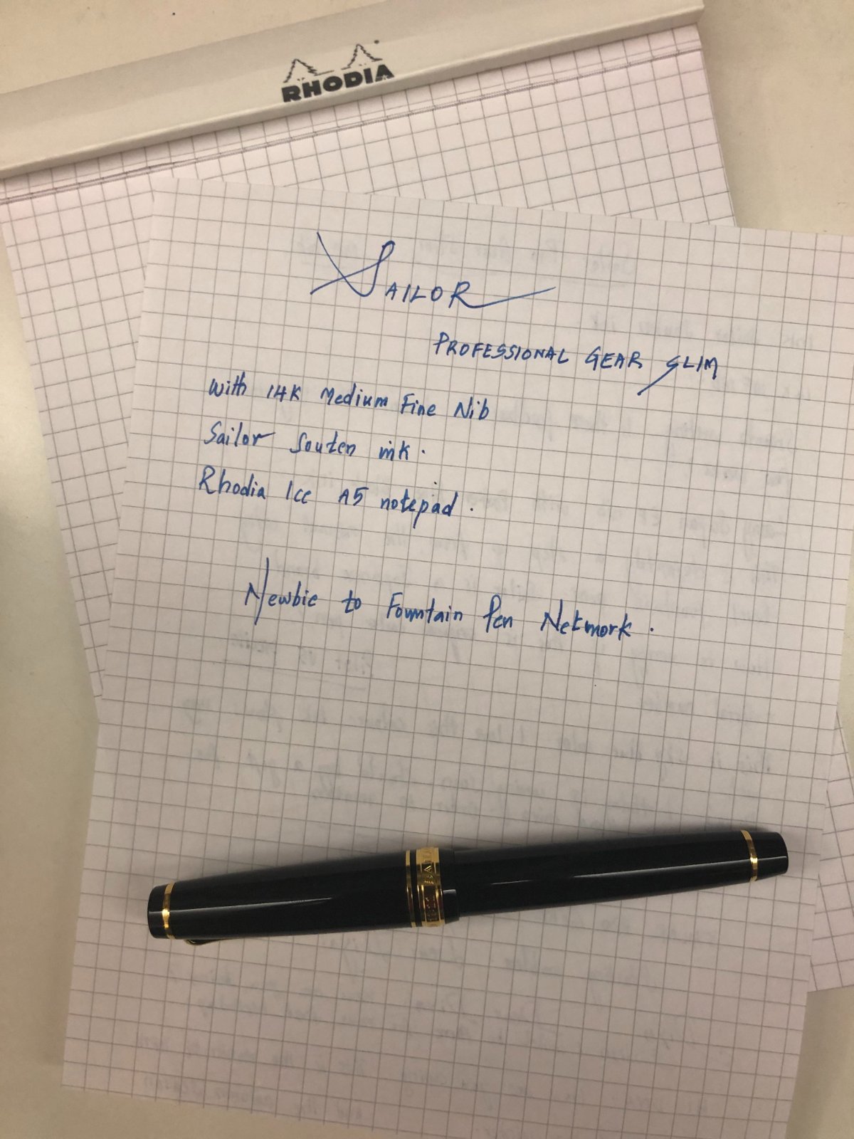
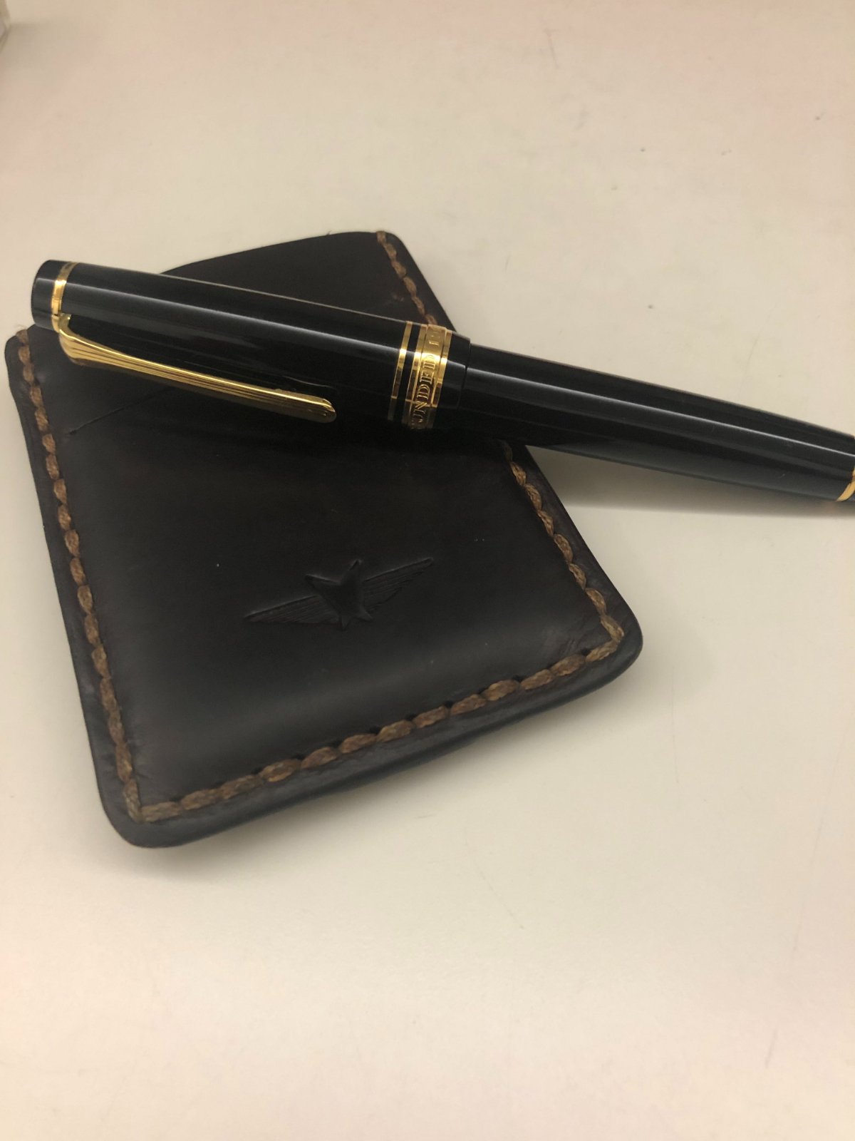
This is my first post. I have been dormant for the last 11 years since signing up to fountainpennetwork in 2010. I bought my Sailor Pro Gear Slim 14k MF yesterday which made me write this post. As soon as I got home I wrote a couple of hand written letters to my cousins in Canada, which if I mail them now will reach them in the next 40 days !! I bought this from Sailor retailer in Hong Kong for a bargain price of US $98. I went to the shop to buy Pelikan M200 which retailed around $140 but couldn't resist the deal of owning a sailor for less than $100. Most pens were at a discounted price compared to other shops I visited here. I also bought sailor Souten ink which I love. Had been contemplating between Iroshizuku Asa Gao and Kon Peki and the Souten sits just in the middle without being too rich or too light. Here are few pictures for fellow pen lovers.
-

First Time Using Rhodia Paper
MRose posted a topic in Paper & Pen Paraphernalia Reviews and Articles
Well after 2 years of enjoying the World of Fountain Pens I've finally got my hands on Rhodia Paper, yes I know took too long. There is an explanation for it. You see, the only place I could find Rhodia paper was on Blick, which is an Art Store and the Rhodia notebooks and pads that they have are a little expensive. So every time I've approach the stand where these paper is I've always back away from it. Then I went online, so the ones affordable were very small, I was not interest it, I want it a nice size pad or notebook that I could play with my fountain pens and inks. Finally one day I walk into a Michael's another big Art and Crafts store and boom! There it was, just perfect a nice Rhodia Dot Pad No. 16 - 80 sheets 80g/m2 -21.3lb -High Grade Vellum Paper, not to mentioned that I got it with a 50% Coupon. My hunt was over, went running back home filled up my pens and there...look how beautiful I like the paper, doesn't bleed is very smooth and for the inks I'm using is perfect can't be happier. Now I can write letters to my friends in a nice smooth and elegant paper. -
Hello, I was just wondering if it’s just me or do you guys have a specific pen for a specific notebook? This ink color for this pen color only? I use my pilot kakunos (M,F,EF) with colors black, gris nuage, diamine grey, respectively, for my midori notebook journal. My kawecosport (BB) in the shade earl grey for midori everyday journal. 2 Kawecosport (EF) using Vinta in the shade perya and ubi for midori and rhodia notes. Kaweco perkeo (M) using smokey grey for random scribbles and midori travel journal. Am I the only one? Lol
-

Fountain Pen Ink Is The Perfect Match For The Rhodia Touch Pen And Inkwash Book
NickiStew posted a topic in The Write Stuff
I have recently been testing some of the Rhodia Touch products. Until now, the products tested just couldn’t fully cope with fountain pen ink art with bleed through being an issue... until now! The Rhodia Ink and Wash book is just a delight. See what you think. Ink used is Robert Oster Australian Opal Mauve. Amazing chromatography, no show through, no bleed through and silky smooth for writing! Incredible! -

Italic Pens On Tomoe, Midori, Clairefontaine, Rhodia, Etc
bbbdco posted a topic in Paper and Pen Paraphernalia
First a disclaimer…I am fairly new to the forums…joining only in March. And perhaps this topic has already been written to death. But I’ve been writing cursive italic for 40 years. Everyone seems to rave about Tomoe paper for writing with fountain pens. But it’s not my favorite writing paper. I know this can vary from person to person, depending on many different things, the pen, the nib, the ink, whether you prefer some “tooth” or not. Today, I was writing a letter on Tomoe 68 gm paper. I often use an italic fountain pen for my writing….and I write in cursive italic. But I seem to find it difficult to write on Tomoe paper with my italic pens. I was wondering if others had as difficult a time writing on Tomoe as I do. The paper is super thin, which doesn’t particularly bother me. But I think it is the extreme smoothness (almost slipperiness) that gives me trouble. It is so slick that it is difficult to form proper italic letter shapes (I’m talking quickly written cursive…NOT formal italic) and I am not able to get the nice thick and thins that I get with a “toothier” paper. So I got out 6 different types of writing paper that I have on hand: 1. Strathmore Series 400 Calligraphy writing paper 75 gm 2. Rhodia High Grade Vellum Paper 90 gm 3. Tomoe 68 gm paper 4. Triomphe Clairefontaine Vellum paper 90 gm 5. Md Midori Loose leaf paper 70 gm 6. Strathmore Premium Writing Paper 25% cotton 90 g I took out several different pens with different nibs…from extra fine to medium regular nibs to italic extra fine to double broad. I wrote the same sentence on all the papers with all the various pens and nibs. I would say both Tomoe and Rhodia paper produced the most “saturated” colors with a higher sheen. Both are very smooth papers. It is difficult for me to control the uniformity of my handwriting as well on these papers. I just don’t have the control of my pens that I would like to have…especially my italic pens. They simply just don’t “feel” as nice to write on as some of the other papers. The ink lines are slightly thicker on both of these papers. The next smoothest paper was the Triomphe Clairefontaine. I felt I had more control over my pens on this paper. It is slightly “toothier” than the Tomoe and Rhodia. My pens grabbed the paper better, so I had more controll over my pens. The italic pens seemed to work much better on this paper also, providing nice thicks and thins. Next for me was the MD Midori paper. Very similar to Triomphone Clairefontaine, but just slightly toothier. Writing on this paper was perhaps the best for both regular fountain pens and my italic pens with italic cursive. The ink flowed very well, it was nice and saturated. Next was the Strathmore Premium Writing Paper 25% cotton. Actually, I really liked writing on this paper also, especially with my regular nibs. The “toothiness” made control of my regular nibs very easy. My italic nibs did not write as well on this paper, since it is rougher than the other papers. Formal italic would work fine but cursive italic handwriting is a little more difficult. My regular fountain pen nibs worked well on this paper. Nice saturated ink and dried quickly. The last paper, Strathmore Series 400 Calligraphy Writing Paper 75 gm is a bonded paper. So there are very small ridges running through it. Regular fountain pens again worked very well on this paper. But italic cursive writing was the most difficult on this paper because of the ridges in the paper. This paper would be OK for formal italic. The paper itself is the prettiest paper of all 6 that I tried. Since ALL of the paper I tried is “writing paper,” I really did not have any major problems with bleeding or feathering. Comparing the ghosting from best (least show through) to worse (most show through): Best: MD Midori Rhodia Strathmore Calligraphy Paper Triomphe Clairefontaine Strathmore Premium Writing Paper 25% Cotton Worst: Tomoe 68 gm paper My conclusions regarding these papers for the way that I write, and the pens that I use: For both regular nib fountain pens and italic nibs, I prefer both the Midori and Clairefonatine. These 2 papers work the best (FOR ME) as all around writing paper. For formal italic, I would normally use specialty papers….but the strathmore calligraphy paper, as well as the Midori and Clairefontain could also be made to work okay for formal italic. If I’m only using regular fountain pen nibs (not italic), then all of them EXCEPT Tomoe and Rhodia. The Tomoe and Rhodia paper are simply to slick for me. I don’t like how my pens feel when I write on these papers, and I am not able to control my pens well. I suppose you could say they are “too buttery” for my taste. Sorry about the pun. I like to be able to have control and “feel” my pens working on the paper. And I do NOT have a heavy hand when I write. I know most people will probably disagree with me, but that’s just my opinion based on my experience with these papers. In time and with more writing experience, this could change. I’d be curious about how others feel; especially in regard to using italic nibs for cursive handwriting. What paper do you prefer? Which nibs on which paper. And why? -
I have diamine earl grey inked up in a jinhao 51a with the unhooded nib as well as a moonman m2 knockoff "hyl" pen, both fine nibs. After some worn on the 51a nib it writes somewhat wetter than it did initially, but I still find the ink to be too light almost to the point of skipping. On hp 24 lb laser paper it is fine, but on rhodia 80gsm dotpad paper the line is dry and looks scratchy and too light. I tried changing converters and cleaning the jinhao but after the hyl had similar problems I think I've found the particular combination of nib size, paper, and possibly pen that doesn't show up well with this ink. Is this just something I have to accept, although I don't really want to because I really like this ink and those pens. Maybe something is to be learned here about light inks, less absorbent paper, and fine nibs.
-
Bloc Rhodia No.11 Notepad
A Smug Dill posted a topic in Paper & Pen Paraphernalia Reviews and Articles
Recently, I picked up a number of different Japanese-made A7 and B7 sized notepads from Daiso. I have yet to get around to using them, but they reminded me that I also bought a Bloc Rhodia No.11 notepad several months ago (at 50% off) for A$2. It's not that I can think of a good use for a notepad of that size, but in the case of the Rhodia, the purpose was primarily to trigger a special offer for a free hardcover A6 Rhodiarama notebook (with free shipping to boot, for a reason that was not a term of that offer). The Bloc Rhodia No.11 notepad is A7 in size (7.4cm x 10.5cm), and has 80 sheets of 7mm-ruled 80g/m2 white vellum paper that is made in France. The pages are bound by a single staple near the top edge in portrait orientation, and each page is finely perforated across the top about 1.35cm below the top edge of the paper for easy detachment. As with other Bloc Rhodia notepads, that means the available writing area is rather less than the nominal size of the notepad; in this case, approximately 13% of each page is lost to the binding above the perforations. The paper is quite typical of this line of Rhodia products in terms of smoothness and whiteness, and generally speaking it is quite resistant to feathering, ghosting and bleed-through when used with fountain pen inks. I can see shading even when writing on it with very fine nibbed pens. There's a bit of 'woolly' outline when writing on it with Sailor kiwaguro pigment ink using a Stub nib, but the effect is quite inconsistent from one page to the next. (See images (2a) and (2b).) I attribute that to the obviously uneven application of coating to the paper, even on the recto side. Even though I didn't feel more feedback or friction resulting from that, at some random spots on the page the coating is so lacking and/or defective that half a word may cause terrible feathering and bleed-through see images (3a) and (3b) even though the other half of the word doesn't. On the verso side the inconsistency in the coating is more evident; using the same pen and ink on the same spot, to write exactly the same thing with the same handwriting technique, on consecutive pages can give noticeably different line widths and/or levels of ink spread and feathering. (Compare images (4a) and (4b); (5a) and (5b); and (6a) and (6b).) On where the coating is not defective, ink can take relatively long to dry. The marks seen in image (7a) are not the results of bleed-through from the writing on the verso side of sheet #3, but just smearing from touching the verso side of sheet #2. Frankly, this isn't a product I can find any reason to recommend, even though I'm usually a Rhodia fan. It's expensive, the size is impractical unless you have a really small pocket that can nevertheless handle a 1cm-thick notepad, the unavailability of 13% of the already small paper surface for writing is annoying, and the paper quality is poor on account of the inconsistent coating, not that I expect anyone to put such a notepad to use with calligraphic or artistic endeavours. -

Request Ideas To Stop Ink Transfer To Adjacent Page
Grenik posted a topic in Fountain & Dip Pens - First Stop
Several years ago I was really into trying new fountain pens, ink, etc. and then settled into a routine with my favorite pens and black ink (boring). I used them at work to take notes and sign documents. Last year I started bullet journaling and enjoyed using my FP's on a nice quality notebook. My biggest problem is that the ink does not dry fast enough and it transfers to the adjacent page. It is not bleeding through, it is transferring to the page face that it is touching. There is probably a correct term for this...? Last year I was using: The ink is Noodler's Bulletproof Black in Pilot Vanishing Point and Sailor 1911 Realo pens. The nibs are EF/F and the notebook is from Rhodia. For this year, I have changed to a Dingbats* notebook which has the same problem, but not as bad. My problem is that the ink does not dry quickly and transfers to the next page: The red area is when I added items to the calendar page on the left side and closed the book. The green highlighted area is faint, but it is actually the days of the week (one column is numbers and one is the letter) that transfer over time and make the page look dirty. It is not as obvious in the picture, but in real life it is noticeable. To address this, I purchased some heavy stock "blotting paper" and put it between the most recently inked pages when I close the book. It acts as a placeholder and was not a large problem. The blotting paper gets a lot of ink on it. When I started making my bullet journal this year, I changed to a Dingbats* notebook. I like it a little better because the transfer seems to be less. Since there was a noticeable change in performance, I thought I would post here and see if there is a way to eliminate this all together by changing something. Paper and Ink seem like the most likely places to attack, but perhaps there are others, or perhaps this is just the "cost" of using FP's and I need to keep the blotting paper and move on? I would love any suggestions that you may have. I prefer black, waterproof ink, but would be open to something else if it would help. I need to use a notebook in the A5 size range. I like fine nibs and prefer the writing to not be too smooth. I like the scratch "resistance" as I write. Cheers
-
About a year ago a colleague turned me on to Oxford notebooks, having used Rhodia and Clairefontaine for a long time before that. I love Rhodia, not just the paper but also the design in that wonderful golden yellow. It took me a while to get hooked on Oxford, but once the hook sank in... Some reasons why I've come to prefer Oxford: -significantly lower price compared to Rhodia and Clairefontaine (for example: three thick, 100-page A4 spiralbound notebooks can be had for 8 euros) -huge range of products -every Oxford notebook has margins (except the ones with blank paper), whereas Rhodia and Clairefontaine often do not have vertical lines (which annoys me greatly) -Oxford usually uses 90 g/m^2 paper whereas Rhodia uses 80 g/m^2 (don't know about Clairefontaine), which translates into "more paper, less coating". This is the main selling point for me. It doesn't feel like writing on plastic at all; Oxford paper is soft, organic and smooth and all of my pens love it, whereas some of my pens really don't like Clairefontaine -in terms of feathering (none), bleedthrough (none) and showthrough (same as other good brands), Oxford is at least on the level of other brands -Rhodia can feel very different on both sides of the same page; the front side of a page is sometimes a bit rough and makes pens look dry, whereas the backside will be smooth and wet. In short, Oxford offers more for less and I honestly cannot find a single quality of Rhoda or Clairefontaine that Oxford doesn't match. I haven't tried Tomoe River yet, but that's probably too expensive for my huge daily turnover at work.
-
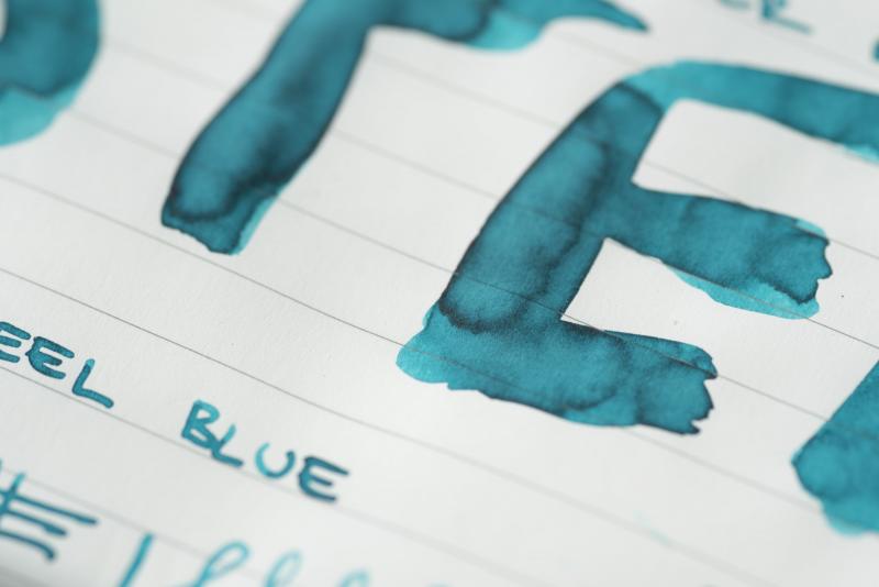
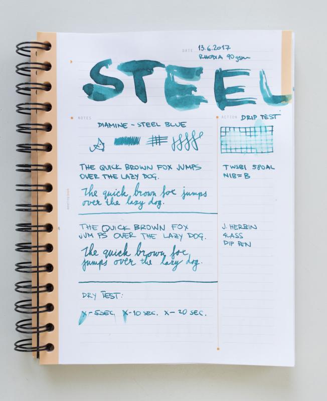
Hi folks, I have decided to finally post a review and not just spy around Diamine Steel Blue is easily one of my favourite Diamine colours, it's that happy-teal-colour family which we cannot get enough of I took couple of notebooks and written a page to demonstrate what the ink looks like on each paper. Please do let me know if there are any other papers you'd like to see...so far we have Leuchtturm, Rhodia White & Ivory and Tomoe River. Enjoy! Mishka (^_~)
-

Does Anyone Know Where To Buy Rhodia Or Cf Notebooks In Hong Kong?
energeeon posted a topic in Paper and Pen Paraphernalia
Hi, so I've recently started using fountain pens and want to take notes for school. I've decided to buy clairefontaine or Rhodia for my notes, but I can't seem to find it anywhere. Does anyone know where to buy it anymore without importing it? All the threads I've seen aren't updated and thus may be inaccurate. I've checked most stationary stores, department stores but none of them have the notebooks I'm looking for. I've found Rhodia paper in Chung Nam but not the notebooks. One place I know of is called Parentheses which is a French bookstore They stock clairefontaine and Rhodia but they aren't quite 'right' as the Rhodias are in A4 and I prefer the Webnotebooks. The Clairefontaines aren't also quite nice as I've seen the lines seem to too overpowering (as shown below) and I prefer the ones for taking notes that are either dotted grids or single lines. w Does anyone know of places that stock the notebooks of the mentioned brands that aren't wayyy too expensive? Thanks! http://reviews.shopwritersbloc.com//wp-content/uploads/2016/03/Clairefontaine-Side-Staple-French-Ruled-Notebooks.jpg -
Hi all, For those of you just tuning in, I just got back into fountain pens after a long layoff. Among other things, I am studying for IT certifications (Security+, RHCE, passed the CCNA two months ago) and it is well-documented in the scientific literature that taking handwritten notes (see, e.g., https://www.scientificamerican.com/article/a-learning-secret-don-t-take-notes-with-a-laptop) improves retention dramatically. So, I figured if I am going to be writing a lot, why not pick up some tools that make the job nicer and easier? The first "nice" notebook that I got, which I use for my RHCE studies, was a Moleskine. The hard cover and ribbon place markers are both very nice, but I quickly discovered that the paper quality left a lot to be desired. More specifically, I got awful shadowing and bleed-through even when using well-behaved inks that usually do not have those issues. Truth be told, I was very disappointed, especially given that I forked over nearly thirty bucks for the thing. Disappointed as I was with the Moleskine, and after watching numerous ink review videos that mentioned Rhodia and Leuchtturm1917, among others, I decided to take the plunge. Previously, my only experience with "fine" paper was the bond lawyer letterhead/pleading paper that my boss at my last job insisted upon continuing to purchase and use. My first foray into this new world was a Leuchtturm1917 Master A4+ notebook, which I now use for my bullet journal. From the moment I took the plastic off, I knew I had scored something extraordinary. The pages in that thing feel like what you would find in a wedding guest book or something else reserved for similarly formal occasions. It was/is magical, otherworldly, nothing like the bond paper I mentioned, and certainly nothing at all like the reams upon reams of copier paper I had grown accustomed to at my last job. I also could not believe how well the nibs of my pens glided across that paper, as opposed to the constant skipping and feathering I experience with my Moleskine. Also, I love love love dot grid paper as it allows me to keep my outline format notes straight. It's like nothing I have ever experienced before. After my Great Awakening with Leuchtturm1917, I ordered some Rhodia spiral pads, also in dot grid. Admittedly, I was loath to spend close to US$35 on notebooks that I had grown accustomed to getting for 1/10th the price. I used them in class tonight and, well... same thing. Magical. I just... I can't even. I'm hooked. I love the stuff. I can't get enough of it. It is amazing to me how much of a difference a few small luxuries like nice paper, ink, and pens make what would seem like a mundane everyday activity like writing something truly special and extraordinary. I'm not a snob and I loathe conspicuous consumption, hence a distaste for Mont Blanc. I am a practical guy and I am loath to spend big bucks on innocuous things like paper. And I constantly hear the voice of my dearly departed grandmother who lived through the Great Depression: "It costs ten times as much, is it ten times as good?" Well, in the case of this paper that is expensive as all get out, yes it is. Moleskine? Pfft. What I really feel now is best not repeated in polite company. Trouble is, I have half of my RHCE notes in it, so pitching it is not an option. Once again, experience is a cruel teacher that gives the test before the lesson. I also find that, when I hand-write study notes, daily plans, thought logs, agendas for meetings, or whatever, it is much easier for me to get into a state of "flow" than when using the computer. Why, I'm not sure, maybe it's because I spend more time putting thoughts to paper than constantly having to fight M$ Word as it does its best to botch up even the simplest of documents. One more thing: I can't help but wonder how much of the cost of these fine papers is import duties and taxes. Are they cheaper in other countries?
-
Hi, I recently decided to upgrade my paper with Rhodia, but so far I have had only terrible experience with it. I write with Waterman's Harmonious Green, but the ink seems to never fully absorb. It is safe to touch with e.g. paper towel or another page in just about 30 seconds, but even after a week or more all it takes is just to lightly touch the paper with little sweaty hand and the ink smears like it was fresh. When I write on regular Xerox paper or a normal notepad from a supermarket, it is just perfectly fine and no problems there. So, I reckon it must be either me or the ink. Since I never had any problems with my sweat being overly aggressive (watch straps or plating on them last me for years) my bet is on the ink. I think it is just not compatible with Rhodia paper. Can someone here perhaps tell me if you have encountered same problem with Waterman on better papers? Also, if anyone can recommend me some other emerald-green-ish ink that is holding well on Rhodia it will be greatly appreciated. Thanks!
-

Rhodia Vs. Leuchtturm1917 Vs. Dingbats* Notebooks
tisse98 posted a topic in Paper and Pen Paraphernalia
What are your opinions on the paper quality and writing experience between these three? I've only used Rhodia of the three, and was thinking of trying out one of the other two, but I can't quite decide which one. From what I could gather on Amazon, Dingbats* notebooks have thicker paper (100g/m²), but I'm not a big fan of micro-perforations and they don't come in the B5 format that I've come to appreciate so much. The closest size to B5 they offer is an A5+ format which, while slightly bigger than A5, I fear it may still be a bit too small to my liking. Leuchtturm1917 notebooks, on the other hand, are available in the B5 format, but they only have 60 sheets (120 pages) and thinner paper (80g/m²) than Dingbats". Neither one is cheap so, decisions, decisions... Can anyone weigh in on the difference in writing experience (with a fountain pen) between these three? Should I just stick with Rhodia? -
Hello dear friends in FPN-land. I wanted to discuss a topic related to Rhodia pads. I love the paper for everyday use. The thing I do not like about the regular top-staple bound rhoda's is that there's an awful lot of paper being wasted. The way it's constructed, it's virtually impossible to use the reverse side of each page without tearing the page off the pad entirely. And then you have to figure out where to store the loose sheets. I do understand that in this scenario, a top-spiral bound pad would be better suited, but I wanted to put to good use a staple bound regular rhoda pad which I've already been using. So I decided to pull apart a No 12 Rhodia pad ( 3.3" x 4.7" grid ruled, top staple bound ). I noticed that all pages, front flap, all the way to the cardboard backing, is bound together with one sturdy staple at the center. The orange flap in the back is not stapled but it glues over the open ends of the staple pin. So I pulled off the glued portion and used a staple removal tool to get at the staple pin, once that was removed, I extracted the staple pin from the pad. But then I realized that the pages have a second glue-backed binding so they don't all scatter once the staple is removed. This way the binding is more open and I can use the reverse of each page more easily. Anyone tried this? Do you have any other ideas for increasing the utility?
-
Last week I purchased a new large Rhodia Dotpad. I've used and loved Rhodia for many years so was utterly shocked to find that the paper does not support fountain pens well-even using dry writers I've had bleed-through and lots of shadowing/see through...although some pages are ok. The paper feels thinner also. Did I miss news about this? Is it a well-known change?