Search the Community
Showing results for tags 'r&k'.
Found 11 results
-
This time last year German ink makers Rohrer & Klingner introduced their first limited edition ink Aubergine. Right on cue the LE ink for 2019 has appeared - Kastanienbraun. This year R&K have conjured up a chestnut brown, or Maroon ink (as the company is mistranslating for the international market). No matter, since to my eyes it is neither a Chestnut nor a Maroon but rather a true brown, the colour of grandmother's cocao powder. Brown inks can be classified as Golden, Redish and the Dark Side. This one lies in the center with a slight tendency to the red. Even when the ink is showing shading the colour remains a constant mid brown. Brown all the way down. Bottle, Wing Sung and Dwell Discourager The ink comes in a sensible bottle and costs a refreshing 12 Euros for 50ml. This is 3 times what their standard-line inks costs on the German market but in this era of 70 Euro Montblanc inks it seems more than reasonable. R&K is a kind of anti-luxury brand - a serious minded East German firm, from the land of Luther - unfrivolous, quality products for decent prices. Put it this way: R&K are not about to introduce an ink line called Sheen Godzilla or Scented Twinkle any time soon. This sober attitude carries through to packaging. "How can we make the LE ink look a little more exclusive without being superficial or environmently unfriendly?”, "I have a idea", said the creative. “Let's package it in a toilet roll. Yes, the kind used for that scratchy, dwell discourager paper in the staff WC." So must the converstation have run. So what of the ink? How does it write? I inked up a wet, medium nib (Waterman Man200) and tried the ink on Moleskine textured paper and Oxford Optik paper as well as torn off pieces of envelope lying around my desk. The performance was excellent, with no excessive feathering on the cheap paper and great shading on the higher quality papers. Oxford Optik, Man200 Then I inked up my everyday brown pen - a fine nib Wing Sung 626. This nib married less well with the ink. It began to feel dry and needed some encouragement to write fluently on the Optik paper. It did fine on the Moleskine. Moleskine WS626 Doodle How does it compare to other inks? I don"t reach often for R&K Sepia; Kastanienbraun is much warmer than that. It's lighter than Diamine Chocolate yet more highly saturated than Saddle Brown. Despite the saturation, R&K dries quickly and has not tendency to smear once dry. It's a nice ink. I will use often. If you like brown inks and have a wet nib you will enjoy it too. Try it on your dry pens too and see if it works for you - but quick R&K LE inks really are limited. Aubergine was hard to obtain by mid December and this will certainly sell just as quickly.
-
Ink: Rohrer & Klingner Cassia Overall Impressions: A vibrant purple. I like the way it shades. The ink seems well-behaved; it doesn't take overly long to dry, and it flowed well in the pens I tried it in. Seems like a great everyday purple with some flair. Shading: Yes, with bigger nibs on most paper. On Tomoe River paper, I saw some shading even with an EF nib. The color ranged from a medium purple to a dark, eggplanty purple. Sheen: I didn't see any with normal writing, but there was a slight sheen in the drawing where I layered lines. Water Resistance: It is not water-resistant. Ease of Cleaning: Fairly easy. It took a few flushes for the water to run clear. It seems pretty saturated. While cleaning, I got some light ink stains on my hands, but they washed off with a little rubbing. Nib Creep: None seen after about a week in the pens. Tomoe River Paper: Dry Time: Fine nib; less than 15 sec. Water Resistance: Legible after one swipe with a damp water brush, but completely washed out by a wet brush. Writing Samples: Shading with the B nib, some with the F, and even a tiny bit with the EF. No feathering or bleedthrough, and moderate showthrough. EF: F: B: Back: Apica Paper: Shading with the B nib. Not really any shading with the F and EF nibs. No feathering or bleedthrough, not much showthrough. Notebook Paper: (This notebook is not particularly fountain pen friendly. The paper feels rougher than the previous two notebooks I had, and ink seems to feather more easily.) There was feathering and some bleedthrough with the B nib, and occasional feathering with the F nib. There was only a little showthrough. No shading.
-
Rohrer & Klingner has recently released a "2018 limited edition" ink called Aubergine. As a big fan of their inks, I think they deserve more recognition for their wonderful inks. Solferino remains my top purple/magenta/violet ink with its retina-searing brightness and vibrancy. I've bought a bottle of this new Aubergine and I like it very much. Aubergine comes in a cardboard tube packaging and their regular understated bottle. I like their bottles because they are functional. The ink itself is a low-key yet gorgeous purple that leans to the blue side but never so much as to become a blurple. It shows quite a lot of shading. A slight golden-red sheen could sometimes be observed but is really subtle. The inks writes very wet, and the lubrication is medium to good. It's not water resistant but it leaves a visible dark trace. Packaging Splash Sample (Rhodia) (Tomoe River) Comparison (Maruman loose leaf. I think it could be quite close to the non-accessible Sailor Pen & Message Sanyasou but with less sheen. However I don't have that one (sample) anymore for a comparison.) Miscellaneous (For my November "Clash of the colours" ink combo I matched up Aubergine and KWZI Menthol Green. I think a purple and a cyan-turquoise colour combo is quite ugly LOL. What do you think?)
-
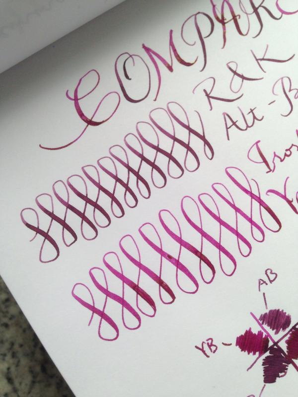
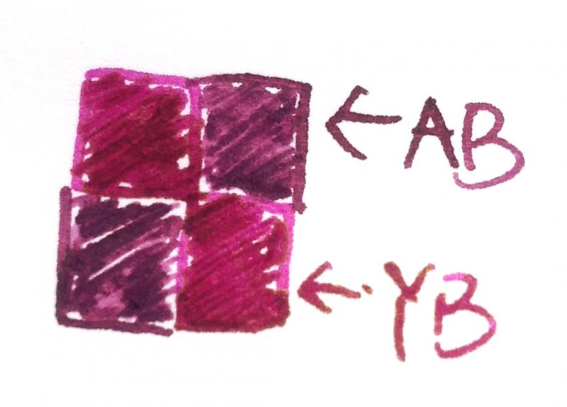
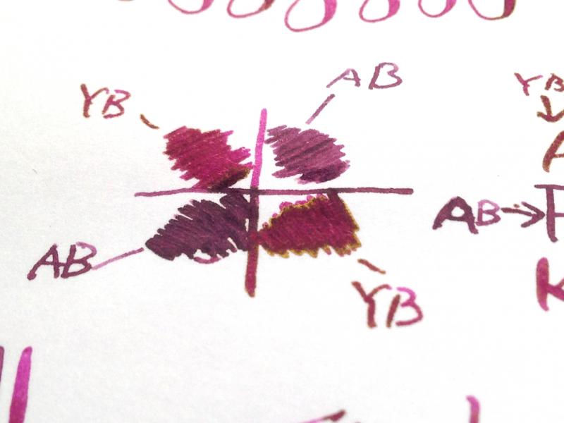
I've got a bottle of Alt-Bordeaux today and I'd like to compare it with Yama-budo, so here it is. The camera does a better job at capturing the red hue of Yama-budo than my eyes. With my bare eyes the two are somewhat similar, although the difference is still quite visible: Yama-budo is more vibrant, has more red hue; whereas Alt-Bordeaux is much more muted and has a vintage look. Yama-budo is like grapes (just like its name "Mountain Grapes") and Alt-Bordeaux is like red wine stain. And finally, let's not forget the amazing golden sheen of Yama-budo:

-
Hello all, I am currently hesitating between wide posibilities about a great ink/pen combo for crappy paper. In fact I am planning to work everyday with this set : FPR Triveni Jr / Sailor Jentle BlueLamy Safari F / PR Fiesta red (to underline)Pilot parallel / ...? (for big titles) (at home) + This for crappy paper, and I woud like also for less big titles, so like this I will be able to have a pen for two different purposes (better for me and my wallet, mostly more convenient if the ink will be with the Parallel). The inks : I am here to ask you if Scabiosa would be a great competitor, but what annoy me is that it will be very dry (I've tried Salix for comparison) among with a narrow-nibbed pen... My crappy paper → Cheap feathering-prone school copy paper, and it is more to make little notes on texts with highlighting. Otherwise I wondered about blacks before, and I have currently Perle noire but not tested in narrow-nibs (I thinked to a 78G but with con-50 I think that for the price there are better options).I can also order some samples of X-feather or Noodler's black for example. I don't know if there are more to consider, maybe more polyvalent about the flow or drying time, I am open to other colour than black/ "classic" colours, I want it to be distinguable and readable easily. Scabiosa interested me because before I was thinking about Herbin PDL, I would love to use it everyday ! You will surely recommend me basic inks like watermans, pilot.. (no judgments) I guess. About pens : I am talking about narrow-nibs (F,EF) because this is what I am used to (western F), and because I think that for this purpose it is more adapted. I have thinked about the Nemosine Singularity, not very expensive but I don't need/want to spend really much more, this might be good because of the nib choices : Does 0.6/0.8 Italic on this would work well (flow) with Scabiosa ? (also Knox K35 possible) If yes, super good, otherwise does my Safari with a 1.1 would be too wide for this purpose, I have not tested the nib yet ? If Scabiosa is that dry maybe with a western M nib the line will be not too big and the flow good ? Or do you have other pens to recommend ? Finally : Maybe I am confused, but there are a lot of options and I hope that you will be able to help me in this choice. Hoping this thread is readable, Thank you !
-
Hello, I have a few questions regarding one of my favorite inks...R&K Alt-Bordeaux. Over the past few months I've been using it and observing some weird characteristics for such a supposedly well behaved ink. For starters, it appears to slightly fade/change color over the course of a few hours, turning from a purplish burgundy to a rosy, raspberry-like color...which I also enjoy a lot, but which is lighter than the original. Secondly, and more disturbing, is the fact that this ink seems to develop nib crud after a few days, regardless of the pen being used or not. However, I found that I could clean the nib with just a dry paper towel, and had no clogging (so far). Has anyone else experienced these things with this particular ink? Thanks and have a great 2015!
-
This is an ink that I got a little while back as part of Ink Drop and I finally just had to force myself to use it. I am overall not super fond of very light colored inks like this because I don’t see much of a use for them in my daily life. Something interesting to note - the color that you see here is not the color that it had going down. When I was writing it was very light and I wasn’t exaggerating when I said that I was losing my place in the middle of a word. I wrote this review on Oct 7 and it’s now the 12th, so within the past five days the color darkened enough to make it much easier to read. In fact, it doesn’t even look that yellow anymore. Much more of an orange-yellow or “mac n cheese” color to me. As not crazy as I am about the color itself, this was not the worst ink to write with. It had good flow, even from the Lamy 1.1 which is a normally very dry nib. I didn’t notice any problems with feathering or bleeding either and it behaved on a cheap index card and under a highlighter. Water resistance was flat out not there at all, but I’m not surprised by that. It’s a bit of a bummer though, because I drew what I thought was a nice flower for that soak test… Overall, I think that this is not the worst possible yellowish ink you could buy. I never want to use it again (especially not when compared to the beauty that is Apache Sunset) but that’s a personal preference. I would say that if you need a yellow ink for artsy stuff or for CMYK color mixing, this is a good choice since R&K inks tend to be pretty cheap, at ~$12/50 mL. This ink was purchased with my own money and I am not being compensated for this review in any way. All opinions above are my own and you are free to disagree with them if you like. Full page review scan:
-
Hello, I was wondering if anyone knows any similar color to Noodler's El Lawrence. I am a big fan of murky/earthy ink colors (fervent user of Zhivago, R&K Sepia and Herbin Lie de The) and would really like to try out El Lawrence, but I can't find it in any EU store (although it's part of the UK series?!). From what I saw in writing samples, the color seems pretty similar to R&K Sepia, albeit a bit greener. What do you think? Thanks! Cheers, Dragos
-
Hello everybody, today I decided to add 2 more purples to my R&K palette (already owning Alt-Bordeaux, Scabiosa, Sepia and Alt Goldgrun). I decided to go for Cassia and one more, but I really can't make up my mind when it comes to the difference between Solferino and Magenta. From what I've seen, there are more reviews for Solferino than for Magenta, which makes me think it's generally better liked. Does anyone have both? How do they compare in terms of behavior (staining - if any- , ease of cleaning, bleed/show through on regular, uncoated paper)? Thank you!
-
Here today with another ink mix. Another pair of Rohrer & Klingner inks, this time Scabiosa and Solferino, 3:2. The resulting color dries dark enough to make it usable for taking notes and even doing homework, as long as your professors aren’t too picky. :-) It has the positive effects of the IG (water resistance, low feathering and bleeding…) while still being nice and vibrant. Speaking of water resistance, here are the results of the soak test: Like my previous partial IG mix, it remains readable after getting wet, though I certainly wouldn’t count on it being good for writing my memoirs while scuba diving. The paper used for this test is a page from my pocket sized Ecosystem journal, and all inks would bought with my own money and all opinions expressed above are entirely my own.
-
Hello! Here today with a quick overview of an ink mix I prepared yesterday morning. On the R&K website they say that their inks can be mixed without any negative consequences (except for sepia), so I decided to give it a try with some Salix that I already had and some Verdura that I ordered a sample of just for this experiment. They were mixed approximately 1:1, and the resulting color is a dark teal (ish). I did not do any color adjusting, but the scan appears pretty true to reality on my screen. Also, forgive my bad handwriting - my new VP is being a pain in the butt and skipping on a lot of my downstrokes, which makes me fear that it has a case of baby bottom… Anyway, I of course had to do a soak test as well. I only let the page “cure” for a few hours, so I don’t know if the IG component would have darkened more if I left it overnight. Still, what is left is readable, though not preferable: All in all, I really enjoy this color and I like that if it gets wet, it’s not a total loss. This is my big reason for wanting water-resistant ink - so that if it gets spilled on all my writing doesn’t disappear, not because I enjoy writing in the rain. :-P Btw, the paper used for the writing sample is Staples 24lb bright white inkjet paper and all inks were bought with my own money and all opinions expressed above are my own.