Search the Community
Showing results for tags 'purple'.
-
When I tried Diamine Eclipse the first time, I just loved the color. It was such a unique blackish purple. And it seemed to work pretty well in my pens. So I started using it in one of my daily carries. Well, I've been using it for about six months now, and, while it certainly isn't the type of ink that would ruin a pen or anything like that, I just have gotten so I don't love the way it flows. In comparison to waterman or iroshizuku, it seems relatively 'dry' to me. And, well, I'm tired of it. But I still love the color. Has anyone come across another ink with a similar color?
-
Teranishi Guitar – Innocent Mauve Teranishi Chemical Industries was founded during the Taisho period in 1918, and got quite some fame as one of the earlier ink producers in Japan. The Taisho period is often remembered as a romantic era. For their 105th anniversary, the company introduced some stylish retro-inks, hinting at this exciting start-up period. The inks come in stylish – almost art deco – boxes, containing a nice-looking 40ml bottle of ink. I discovered the Teranishi inks in 2022, so it’s time to do the reviews. These inks are well saturated, but at the same time manage to look muted and toned-down. This combination works quite well, and I’m becoming very fond of this brand. In this review, the spotlight shines on Innocent Mauve, a dusty grape-coloured purple. This is not my favourite type of colour, but I will still do my best to provide an unbiased review of the ink. I definitely see myself using this as an office ink: in a fine nibbed pen, the ink looks quite dark and businesslike, and it also shows a bit of water resistance. I usually scan my ink review text samples, but with Innocent Mauve this turned out to be impossible. In scans, the ink turns into more of a lilac – wildly diverging form the real-life grape-purple colour. So, for this review, I almost exclusively use photos to show off the ink. Innocent Mauve writes wet and well saturated, even in the finest nibs. Wet pens and fine nibs lay down a fairly dark purple line. With italic nibs and drier pens you get lighter tones, and – in my opinion – more aggressive and less appealing shading. For me, the sweet spot for this ink is a fine nibbed wet pen. You then get a nice dark grape-purple colour with some beautiful unobtrusive shading. To illustrate the colour span of this Teranishi ink, I did a swab on 52 gsm Tomoe River paper, where I really saturated portions of the paper with ink. Innocent Mauve has a fairly wide dynamic range, with quite some contrast between the light and darker parts. Finer nibs tend to concentrate the ink more, leaning towards the right side of the spectrum. You thus get the darker grape-purple colour, and less aggressive shading. Dry pens fit the left-hand side of the colour range, which – in my opinion – results in a less appealing colour. The saturation sample below also illustrates the huge colour difference between photo and scanned image: first you see the photo, followed by the scanned image that definitely shows more of a lilac colour. Don’t be fooled … the lilac is an illusion! In real life, Innocent Mauve is a grape-coloured ink. And now the lilac leaning scan: On the smudge test – rubbing text with a moist Q-tip cotton swab – the text remains perfectly readable, even if a lot of the dyes get displaced. Water resistance is mediocre: just good enough to survive an accident. Enough of the dyes remain attached to the paper to allow for a reconstruction of the written word. This is also evident from the chromatography that shows some grey dyes clinging to the paper at the bottom part. The chroma also shows the complex mix of dyes used to create this grape-purple Innocent Mauve. The grey at the bottom contributes to the dusty appearance of the ink – which is a constant theme across the Teranishi ink series. But I also see some cherry-red and sky-blue in the mix, which I hadn’t expected. Combined, these dyes create the dusty grape-purple colour of this Teranishi ink. I’ve tested the ink on a wide variety of paper – from crappy Moleskine to high-end Tomoe River. On each scrap of paper I show you: An ink swab, made with a cotton Q-tip 1-2-3 pass swab, to show increasing saturation An ink scribble made with a Lamy Safari M-nib fountain pen The name of the paper used, written with a Lamy Safari B-nib A small text sample, written with the Lamy Safari M-nib Source of the quote, written with an M-nib Laban Rosa Lilac pen Drying times of the ink on the paper (with the M-nib Safari) The multi-paper writing test shows that Teranishi Innocent Mauve handles all types of paper well. It even behaves very good on the low-quality Moleskine paper: no visible feathering, and only some see-through and bleed-through. The ink looks equally good on both white and more yellow paper. Drying times are in the 10 to 15 second range on most papers. Exceptions are the Kobeha GRAPHILO and Endless Regalia paper, which consistently showed longer drying times in the 20-25 second range. For the sake of completeness, I also add a scan of text written on a number of different papers. As you can see, this shows a lilac purple, that has zero relation to what your eyes see when looking at Innocent Mauve. Writing with different nib sizes The picture below shows the effect of nib sizes on the writing (written on Rhodia N°16 80 gsm paper). All samples were written with a Lamy Safari. I also added a couple of visiting pens: a wet-writing TWSBI VAC Mini with M-nib, and my Laban Rosa Lilac with M-nib. As you can see, Innocent Mauve handles all nib sizes well, but really shines with the finer nibs up to M-size. You get a more concentrated dusty-dark colour and more aesthetically pleasing shading. Related inks To compare Teranishi Innocent Mauve with related inks, I use my nine-grid format with the currently reviewed ink at the center. This format shows the name of related inks, a saturation sample, a 1-2-3 swab and a water resistance test – all in a very compact format. Innocent Mauve clearly relates with Diamine Grape, but after a dust-storm has swept across the vineyard. The grey components of this Teranishi ink contribute to the gritty faded look, and give more of a vintage vibe to the ink colour. Inkxperiment – Walk in the Fields With every ink review, I challenge myself to create a monochromatic drawing using only the ink I’m reviewing. I always enjoy this part of the review: playing with the ink, and seeing how it behaves in a more artistic context. Always good for a couple of quality-time hours. Inspiration for this drawing comes from some early summer walks through nearby fields. The original drawing used a 3:2 landscape size ratio. But when the drawing was almost finished, I accidentally dropped a huge blob of ink on the left side. So I added a new sun to the painting, and used a square cut-out to crop off the ink blob, thus saving the inkxperiment (and avoiding starting over 😉 I started with an A4 piece of HP photo paper. I drew in the background with heavily water-diluted ink. I then stamped in the flower field with a piece of tightly rolled-up kitchen paper, and added the house and road. I finally added the tree with my B-nibbed Lamy Safari and pure Innocent Mauve. Due to the ink blob accident, the last thing I added was the sun above the field of flowers, fitting nicely in the - now square - format. Inkxpired – computational art I love experimenting with pen/ink/paper, and have added another layer as part of the hobby. I’m exploring computational art, inspired by the ink drawings I do during ink reviews. Another fun offshoot of the hobby… and all that starting with a few drops of dye-coloured water on paper. I started by applying a colour filter that strongly enhanced the contrast in the original inkxperiment painting. Next I used a modern art tool that uses a superposition of shifted images with multiple colour filters. I like the more chaotic look of the end result, that still keeps true to the original concept of a “Walk in the Fields”. Conclusion Teranishi Innocent Mauve is a nice dusty grape-coloured ink with a vintage vibe. Not my usual type of colour, but I do like it in fine-nibbed wet pens, where it makes for a great office ink. Due to its fairly wide expressive range, this Teranishi ink also works really well as a drawing ink. If you like the colour, it’s well worth checking out. Technical test results on Rhodia N° 16 notepad paper, written with Lamy Safari, M-nib Backside of writing samples on different paper types
-
Manufacturer: Parker Series, colour: Quink Purple Pen: Waterman Hemisphere „F” Paper: Image Volume (gramatura 80 g / m2) Specifications: Flow rate: very good Lubrication: good Bleed through: noticeable Shading: noticeable Feathering: unnoticeable Saturation: good A drop of ink smeared with a nib The ink smudged with a cotton pad Lines Water resistance Ink drying time Ink drops on a handkerchief Chromatography Sample text in an Image Volume (80 g / m2) Sample text in an Oxford notebook A5 (90 g / m2) Sample letters in a Rhodia notebook No 16 (90 g / m2) Palette of shades
-
Jacques Herbin – Violet boréal La Société Herbin, Maître Cirier à Paris, was established in 1670. This makes J. Herbin probably the oldest name among European ink makers. Today, Herbin produces a range of beautiful fountain pen and calligraphy inks, writing instruments, gift sets and accessories. Herbin inks are made in France, and the finishing touches on the bottles are still done by hand in Paris. Like so many others, the company jumped on the premium product bandwagon, and started to release higher-end inks under the Jacques Herbin “Les encres essentielles” label. Nicer boxes, nicer packaging, much higher price (18,50 EUR versus the 7,50 EUR for the J. Herbin inks from the “La perle des encres” series). Nevertheless, I couldn’t resist and decided to test these new inks – are they really better than the standard J. Herbin inks? In this review, I take a closer look at Violet boréal, a violet purple with a spring-time feel to it. A wet and well-saturated ink, that works with all nib sizes. There is some nice shading, especially in drier pens. With a wet pen, the ink has a serious tendency to oversaturate, drowning out the shading. With Violet boréal, I recommend using a dry pen – it will definitely enhance the ink’s appearance on the page. The ink has quite satisfactory lubrication, even in drier pens like my Lamy Safari. With my wetter Pelikan pens the ink is actually too saturated for my taste, it loses its depth and becomes one-dimensional, diminishing its appeal. With stronger saturation, the colour also shifts from a light violet to a much darker purple. Violet boréal has a medium colour span that ranges from a light violet to a darker violet-purple. Contrast between light and dark parts is fairly low, which translates to subtle shading. To illustrate this, I did a swab on 52 gsm Tomoe River paper where I really saturated portions of the paper with ink. This clearly demonstrates the ink’s colour span. On the smudge test – rubbing text with a moist Q-tip cotton swab – there was lots of smearing. The text itself remains very readable though. Water resistance is fairly low. There remains some text on the page, and with lots of patience you might be able to reconstruct your writing. But if this aspect is important to you, simply choose a different ink. The ink’s chromatography suggests that some ink remains on the paper, but that’s only partly true: what remains on the page is a smudgy mess, not easily readable text. Drying times for this Jacques Herbin ink are around the 10 second mark with my Lamy Safari M-nib. The ink prefers the better-quality paper in my test set. With lower quality paper, I see a small amount of feathering, and quite some see-through with a bit of bleed-through. But overall, the ink behaved really well. Violet boréal looks good on both white and creamy paper. One thing to note is that this ink’s colour is crazy difficult to capture. Scans show it too blue-violet – while in reality it’s more a red-violet. And the photos show it darker than it appears in real life. To my eye, the photos are closest to its real-life appearance. I’ve tested the ink on a wide variety of paper – from crappy Moleskine to high-end Tomoe River. On each scrap of paper I show you: An ink swab, made with a cotton Q-tip 1-2-3 pass swab, to show increasing saturation An ink scribble made with a Lamy Safari M-nib fountain pen The name of the paper used, written with a Lamy Safari B-nib A small text sample, written with the M-nib Lamy Safari The source of the quote, written with my F-nib Yard-o-Led Viceroy Drying times of the ink on the paper (with the M-nib Safari) Since scans alone don’t tell the complete story, I’ve added some photos of the same writing samples to give you another view on the ink. Writing with different nib sizes The picture below shows the effect of nib sizes on the writing. All samples were written with a Lamy Safari, which is typically a dry pen. I also added a visiting pen – a wet-writing Yard-o-Led Viceroy with F-nib. With the wet pen, the ink leaves a very saturated violet-purple line, and loses much of the shading. I personally prefer this ink in combination with a dry pen – it simply looks nicer: a light-violet with subtle shading. The wetter the pen, the darker and more one-dimensional the ink becomes. Related inks To allow for a good comparison with related inks, I employ my nine-grid format, with the currently reviewed ink at the center. Each grid cell shows the name of the ink, a saturation sample, a 1-2-3 swab and a water resistance test – all in a very compact format. Callifolio Violet from L’Artisan Pastellier looks fairly close – I might do a shoot-out between these two in the near future. Inkxperiment – multiverse As a personal challenge, I try to create interesting drawings using only the ink I’m reviewing. With these monochromatic pieces, I get to explore all the colour-range nuances that are present in the ink. And I really enjoy creating these little pieces – pure quality time spent with my hobby! Inspiration for this painting comes from an astronomy book I’ve been reading lately, which also covered the concept of a multiverse. This somehow stuck in my head, and I used it as the concept for this drawing. For this drawing I used a textured Fellowes binding cover. I started by painting the different quadrants using a piece of cardboard and pure Violet boréal. The world circles were created with a small glass bottle: I dipped the bottom of the bottle in ink, and used it as a stamp to create the circles. I next painted in the scenes using water-diluted ink. For the stardust in the background, I splashed some ink on the paper with a toothbrush. I finally added some extra detail to the world circles using a glass dip pen. The resulting piece gives you an idea what can be achieved with Violet boréal in a more artistic setting. Conclusion Jacques Herbin Violet boréal is a good-looking violet that I find quite enjoyable. But… you really need a dry pen to make the best of this ink. With wet pens, the ink tends to over-saturate, shows a too dark violet-purple colour, and becomes really one-dimensional. I don’t like the ink in that incarnation (my opinion of course). Overall not a bad ink. But, for a so-called premium product, I had higher expectations. Technical test results on Rhodia N° 16 notepad paper, written with Lamy Safari, M-nib Backside of writing samples on different paper types

-

Best Yellow- And Green-Sheening Purple Inks (Vs. Diamine Winter Miracle)?
Wistful-Ink posted a topic in Inky Thoughts
Winter Miracle was by far the standout for me from the Diamine Inkvent calendar, and now that they're going to be available in 50 mL bottles, I'm sorely tempted to buy a bottle. But I don't have many large ink bottles, and before I commit, I'd like to see if there are similar inks that are worth trying out first. I don't care that much about the blue shimmer aspect of Winter Miracle, so mostly I'm looking for recommendations for your favorite deep purple inks with crazy yellow/green sheen and, if possible, how you think they compare to Diamine Inkvent's Winter Miracle. From what I've seen online, PR Tanzanite and Waterman Tender Purple seem promising. I've tried a sample of Lamy Azurite and was fairly disappointed with the sheen. Only a little bit of sheen for a heavy swatch on Tomoe River paper, with pretty much no sheen on any of the other papers I tried. I'd love to hear your suggestions (and sample pics if you have any)! -
I’ve just read a note from my wife, written using Diamine Monboddo’s Hat. It looked black to me, so we had a discussion and she is still only using Monboddo to ink that pen. Further investigation showed this: (The contrast has been heavily reduced to show the effect on-camera, but the original is merely a more intense version of this) Horizontal lines come out as purple-ish, but the vertical ones - and cursive writing - show as totally black. Is this merely an example of extreme shading? The pen is a Jinhao clone (with Arrow clip) of the Parker Sonnet Silver Fougere, with bi-tone coated steel Jinhao F nib.
-
Diamine Purple Dream (150th Anniversary II) The ink maker from Liverpool is one of the staple brands in ink-land. They consistently produce solid inks for a very reasonable price. In 2017, Diamine released their second ink series to commemorate their 150th Anniversary. I obtained my set shortly thereafter, but more or less forgot about them when my attention drifted to Japanese inks. About time to do the reviews. Fortunately, these anniversary inks are still easily obtainable, so if you like what you see you can still get them. Purple Dream is a nicely saturated purple that looks quite lovely. This is what I consider a “standard” purple – not too blue, not too red – but just bang in the middle. It’s a colour that works great for daily journaling, but is a bit too colourful for me to use at work. As we are used to from Diamine, the ink performs well and writes a saturated line in all nib sizes. Shading is present with F nibs and above, but fairly unobtrusive – there is not a lot of contrast between the light and darker parts. The ink itself is on the wet side: combine it with wet pens, and you get a deeply saturated purple line that almost – but not totally – drowns out the shading. With dry pens shading is more prominently visible, and can look quite stunning. Purple Dream works well with both white and cream paper. With low-quality paper, there is a tiny bit of feathering, and you can expect a fair amount of show-through and bleed-through. This Purple Dream is one of three purple colours in the 150 Anniversary II Series. Its siblings are Lilac Night and Burgundy Royale. Lilac Night is a beautiful muted blue-grey-purple that I really enjoy. Burgundy Royale is a reddish purple that has an old-rose quality to it – usually not my type of colour, but for some reason I find this Diamine implementation really attractive. I’m definitely going to explore this one in the near future. To illustrate the colour span of Purple Dream, I did a swab on 52 gsm Tomoe River paper, where I really saturated portions of the paper with ink. This Purple Dream has a fairly narrow colour span, with not much contrast between the light and darker parts. This translates to unobtrusive shading when writing. Shading is definitely there (starting with F nibs and above) but remains fairly low. Just enough to accentuate that you’re writing with a fountain pen. On the smudge test – rubbing text with a moist Q-tip cotton swab – the ink showed lots of smearing, but the text itself remains crips and clear. Water resistance is totally absent – most colour disappears from the page, leaving only some purple smudges. From the chroma, I expected a bit more water resistance, but that is not the case. I’ve tested the ink on a wide variety of paper – from crappy Moleskine to high-end Tomoe River. On each scrap of paper I show you: An ink swab, made with a cotton Q-tip 1-2-3 pass swab, to show increasing saturation An ink scribble made with a Lamy Safari M-nib fountain pen The name of the paper used, written with a Lamy Safari B-nib A small text sample, written with the Lamy Safari M-nib Source of the quote, written with an F-nib Pelikan M600 Drying times of the ink on the paper (with the M-nib Safari) The multi-paper writing test shows that Purple Dream can handle most papers well, looking good on both white and cream paper. There is a small amount of feathering on low-quality paper, but nothing really extreme. With cheap paper, you do get a lot of see-through and some bleed-through, making it nigh impossible to use the backside of the paper. Drying times were mostly around the 10 second mark with the Lamy Safari M-nib. Because scans don't always capture an ink's colour and contrast with good precision, I also add a few photos to give you an alternative look on this Diamine ink. To my eye, the scans show the ink a bit too light, the photos a bit too dark – reality is a bit in between. Writing with different nib sizes The picture below shows the effect of nib sizes on the writing (written on Rhodia N°16 80 gsm paper). All samples were written with a Lamy Safari. I also added a couple of visiting pens: a Pelikan M605 with F-nib, and an Edison Collier with M-nib. Purple Dream looks good in all pens, but shading is most visible with the dry-writing Lamy pen. Related inks To compare Diamine Purple Dream with related inks, I use my nine-grid format with the currently reviewed ink at the center. This format shows the name of related inks, a saturation sample, a 1-2-3 swab and a water resistance test – all in a very compact format. This Purple Dream seems to occupy the central space between more blue- and red-leaning purples. Perfectly mixed, and a pleasure to the eye! Inkxperiment – event horizon As a personal challenge, I try to create interesting drawings using only the ink I’m reviewing. I find this to be a fun extension of the hobby, and these single-ink drawings are great for exploring the colour-range nuances that are present in the ink. I love doing them! Inspiration for this drawing comes from the Sagitarius A* black-hole picture, released to the world on May 12, 2022. Astronomers, using the Event Horizon Telescope, released the first image of the accretion disk around the event horizon of Sagitarius A*, the supermassive black hole sitting at the center of our own galaxy. I used the concept of an “event horizon” as central theme in the inkxperiment drawing. I started with an A5 piece of 300 gsm watercolour paper. I wetted two circular rings surrounding the top-left and bottom-right corners of the paper, and applied some pure ink using a brush. These circular areas constitute the event horizon. I then used cotton Q-tips to draw in the houses within the horizon – these are elongated and being drawn into the singularity present in the corners of the page. Between the two singularities, a distorted starry background appears, drawn with Q-tips and different water-ink ratios. The stars were added with a B-nibbed fountain pen. I finally did a final pass over the drawing, adding some finishing touches. Purple Dream turns out to be a really nice ink to draw with. It’s easy and fun to use, and the resulting drawing gives you a good idea of what can be achieved with this Diamine ink in a more artsy context. Inkxpired – computational art I love experimenting with pen/ink/paper, and am now adding another layer as part of the hobby. I’m exploring computational art, inspired by the ink drawings I do during ink reviews. Another fun offshoot of the hobby… and all that starting with a few drops of dye-coloured water on paper. Starting from the “event horizon” drawing, I applied some filters to the drawing (using the Oilist app on iPad), and then stitched two mirrored copies of the result together. What you get is a picture of a Yoda statue, sitting in its Jedi Shrine. Cool! Conclusion Diamine Purple Dream is a lovely-looking purple, that for me embodies the concept of a “standard” purple. The ink works well with both white and cream paper, and writes fairly wet and well-saturated in all nib sizes. I enjoyed experimenting with it – both for writing and drawing - and can definitely recommend it if you enjoy purple inks. Technical test results on Rhodia N° 16 notepad paper, written with Lamy Safari, M-nib Backside of writing samples on different paper types
-
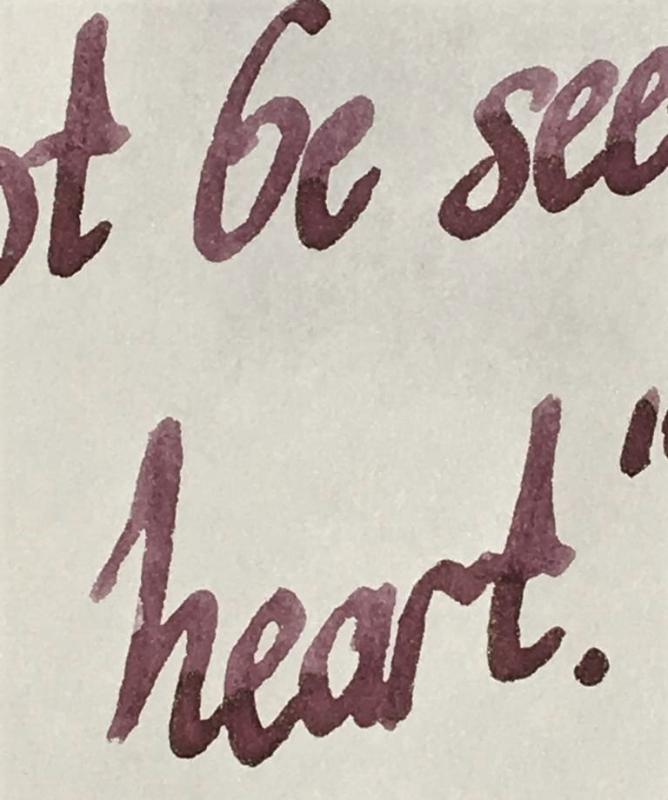
Hello FPNers - I’m searching for a burgundy ink that tends more toward purple than red. Purgundy? Burple? I like wet inks that are highly saturated, rather than milky or murky in appearance. Shading is nice, but not required. Thanks! GNL
-
This is a muted , bullet proof purple in the Polar series. Polar series consists of five inks. Black, Brown, Green, Blue and Purple. Comparison: Polar inks were developed for cold regions. In their original iteration they didn’t freeze, but had flow issues, I believe. In this updated version they turn into slush in subzero temperatures. TR 68 gr /Reverse fude #6 While I live in a relatively cold area, I have not found the need to ever use a fountain pen or pen for that matter outdoors. Frankly, I doubt if I can hold a pen in -30°C /-22°F with a gigantic mitt. And frankly I don't see the point of getting frostbite to prove a point. Midori / dry time decreases drastically on this paper, 9 seconds. Nib is medium Polar Blue and Purple are similar in behaviour: they are both very wet, and muted. So, your EF will probably turn in a fine. These i cellulose reactive inks, don’t behave well on cheap/ thin paper, that is they bleed through like there’s no tomorrow. HP 32 Polar Purple doesn’t shade, unless you use a wide nib. It’s a pastel/muted/flat colour. I like pastel. It's not distracting Shading on TR 68 gr/ #6 fude nib - There is shading on this paper. But dry times are above 20s on this paper. Dry time on Rhodia is almost immediate, with Midori is about 10 seconds. Fude nib/ Midori Polar inks have a bad rap in general. They can have some flow issues at time and need the right pen/nib combination. They stain (Green and Brown do) but a bit of Doyou/Red Rattlers and the stain disappears. Thought they are best to be married to one pen and they live happily ever after. I have Green in a Kaweco and brown in Chinese pen. They just do fine. Clairefontaine/ fude Rhodia - Water test. Note the water test was done immediately after writing. · Pens used: Jinaho 450 fude/ medium nib - Reverse · Papers used: TR 68 gr / Midori/ Rhodia/ Clairefontaine /HP32 · Shading: None. Pastel · Ghosting: On thin absorbent paper yes. With pens · Bleed through: on thin papers for sure. · Flow Rate: Wet. · Lubrication: Good · Nib Dry-out: Needs a well-sealed pen. · Start-up: No · Saturation: Muted · Shading Potential: None · Sheen: None · Spread / Feathering / Woolly Line: Not noticed. But I’m sure with thin absorbent paper it would feather and fly! · Nib Creep / “Crud”: Not noticed. · Staining (pen): I don’t know. · Clogging: None · Water resistance: Excellent · Availability: 90 ml bottles There is a strong possibility that this ink might stain plastic convertors.
-
Hello Inky Friends! It has been quite awhile since I shared my comparisons of pink and purple inks here: https://www.fountainpennetwork.com/forum/topic/274481-pink-purple-ink-comparisons/ I have updated the list with a few new inks (mostly samples, but a few are bottles as well.) Again I will say that this is not an absolute accurate depiction of every ink. Rather it is intended as more of a guide as to where certain inks fall next to each other when compared with similar ink colors. All samples were written with a glass dip pen on Clairefontaine paper. I hope that this is useful and helpful! Pink Inks Pink & Purple Inks Purple Inks Dark Purple Inks
-
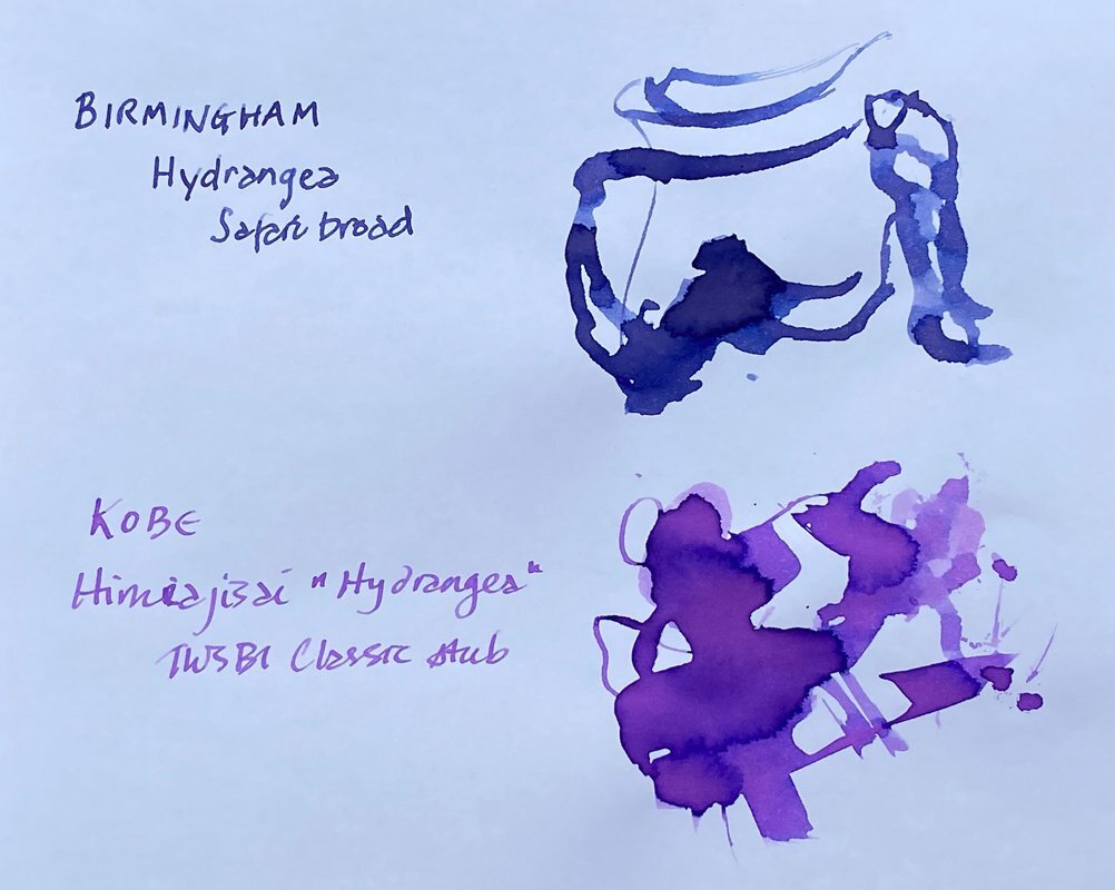
Hydrangea (Birmingham) vs Himeajisai “Hydrangea” (Kobe #57) FP inks The Birmingham version goes on a greyish blue but dries to a violet-periwinkle. Both very pretty.
-
Comparison of Pearlescent Violet-Copper (De Atramentis) & Hayabusa Glistening (Colorverse)
Audrey T posted a topic in Ink Comparisons
-
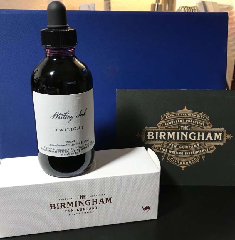
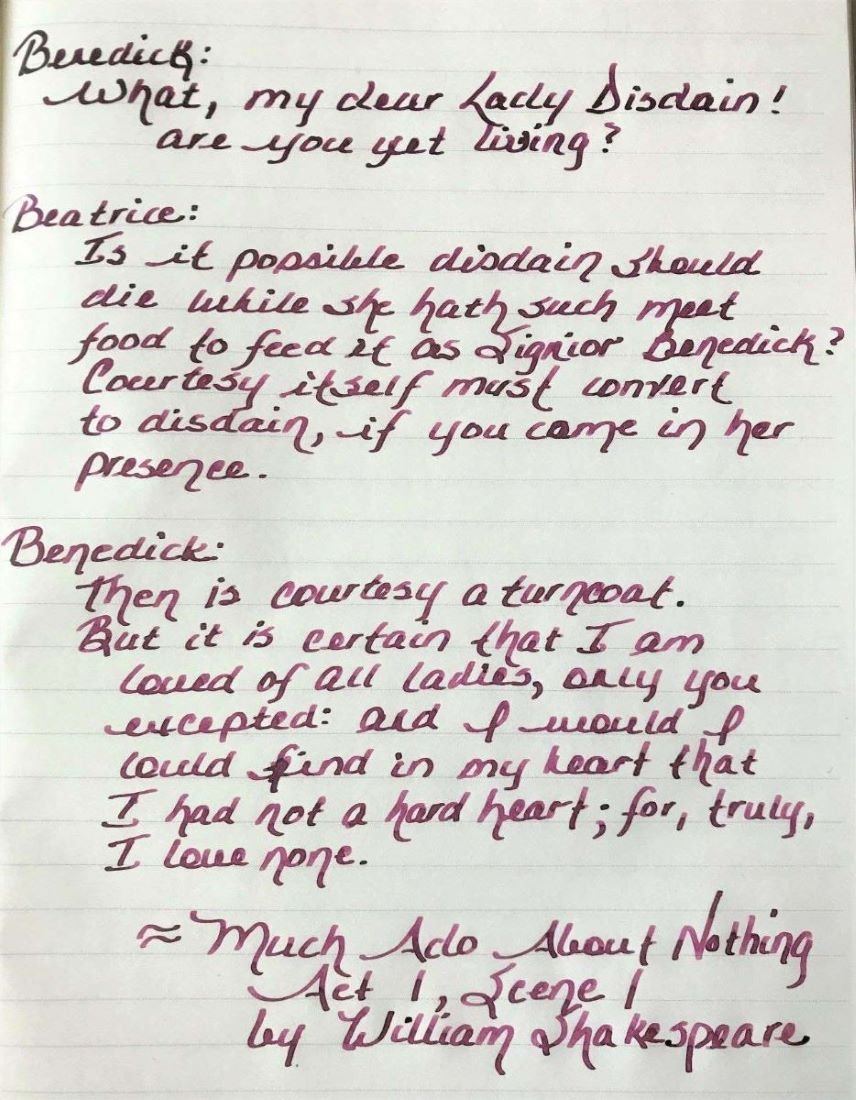
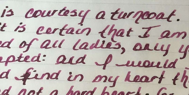
Ink Review: Birmingham Pen Company Twilight Background: Birmingham Pen Company (BPC) started as the brainchild of two brothers – Nick and Josh. Initially, Nick and Josh worked with third party ink producers in England and Germany to produce their inks. BPC started making their own inks over a year ago. While some changes have been made, their new formulations include “Crisp” inks designed for everyday use on all papers, “Swift” inks that are a bit wetter, starts up quickly and works well on premium papers, “Rich” inks which have high sheen and saturation, “Everlasting” inks that have high water resistance, “Twinkle” inks with shimmer and “Wishy-Washy” inks that are designed for performance but a washable from fabrics and surfaces. The glass bottles with tight-fitting plastic lids bottles are very nice and functional. My largest pen fits nicely into the bottle for a full fill. BPC offers three sizes: 30ml, 60ml and 120ml for all inks except the Twinkle inks which are only available in 60ml. The 120ml bottles have an eye-dropper lid instead of the regular lid. Review in Brief: Saturation: moderate saturation Sheen: some nice green sheen Shading: medium shading from fine to wider nibs Haloing: low Lubrication: medium lubrication Wetness: moderately wet Water Resistance: Moderately water resistant Feathering: minimal feathering on lower quality papers Bleedthrough: minimal only on lower quality papers and with high ink application Showthrough: medium showthrough on 52gsm TR paper, minimal on Rhodia and Apica Price: reasonable for 30mls, very good for 60ml and exceptional for 120ml which is the best value. While some inks retained the same name (or an abbreviated version), they may be slightly different. Ana at the Well Appointed Desk discussed this very well in her January 2021 blog (https://www.wellappointeddesk.com/2021/01/ink-brand-overview-the-new-birmingham-pen-company-inks/) The older version of this ink, known as Allegheny River Twilight, was review by craptacular in 2018. You will note that there is a difference between the older version and the new “Swift” formula. Pens: a Pilot Vanishing Point with a fine nib, and a Conklin Duragraph with a 1.1 stub nib. Papers shown: Rhodia, Tomoe River, Cosmo Air Light; Not shown: Apica CD Premium, Advantage 24 lb copy paper; Cambridge Premium Notebook paper. Rhodia Dot Grid Paper The ink is nicely saturated with some green sheen when pooled. The ink flows wonderfully in both pens. The Pilot VP has a very dry nib and is very particular about the ink it uses. This pen glides effortlessly with this ink. The Conklin Duragraph, on the other hand, is a very wet pen. The Twilight ink is almost too wet to use in this pen. The ink does dry fairly quickly on all papers tested but is slower on Tomoe River and Cosmo Air Light (20-25 seconds). he ink is surprisingly quite water resistant although it is not known as an “Everlasting” formulation. Feathering and bleeding are not seen on Rhodia, Tomoe River, Cosmo Air Light. There is some feathering on the 24 lb. copy paper, and minimal feathering on the Apica CD and premium notebook paper, and the three papers showed small amounts bleedthrough in heavy applications of the ink. Because this is a fairly saturated ink, there is showthrough on Tomoe River, Rhodia and Apica as well as the copy and notebook papers, especially with the 1.1 stub nib. Tomoe River Ivory Paper Tomoe River Ivory Paper Cosmo Air LIght Paper Apica CD Premium Notebook Paper The chromatography was simply done with a coffee filter. It shows how the ink color breaks down in to a complex variety of yellow, blue and red. Here are some color comparisons. Overall this is a very nice ink that behaves very well. I highly recommend giving this ink a try. Disclaimer: I purchased this ink directly from Birmingham Pen Company. Any photos, opinions and thoughts regarding the ink are my own and are not sponsored by Birmingham Pen Company and do not necessarily reflect their opinions.
-
SAILOR MANYO NEKOYANAGI Sailor created another line of inks, the Manyo line. The inspiration for this line of inks are flowers found in the Manyoshu, an ancient collection of Japanese poems. The inks are presented in lovely square glass bottles and contain 50ml of inks. While the caps appear to be plastic, they are faceted for ease of opening. The opening of the bottle is 25mm in diameter and should fit most fountain pens. Now to the fun stuff! I first saw a review of this ink at mountainofinks.com (https://www.mountainofink.com/blog/sailor-nekoyanagi), and fell in love with the color and ordered a bottle from Pen Chalet. Nekoyanagi is a lovely soft purple color. It is a soft, almost periwinkle shade. But what is truly wonderful about this ink is the way it shades into pinks, blues and turquoise. This effect is seen on more non-absorbant papers such as Tomoe River, with a lesser effect on Rhodia and HP copy paper. Scan of HP Copy Paper Nekoyanagi is similar, but more purple and lighter in color than Pilot Iroshizuku Ajisai and also lighter but more blue than Graf von Faber Castel Violet Blue. Photo Tomoe River 68gsm Cream paper Photo Tomoe River 68gsm cream paper Photo Rhodia paper The ink is very well behaved. It dries quickly but has minimal water resistance. While it is a wet ink, it is not excessively wet, and has a nice lubricated feel. It has little to no sheen, does not bleed on any paper I have used to date, and minimal showthrough even on lighter weight Tomoe River 52gsm. I have used this ink in a variety of pens and have found it best suited to wider nibs. The lovely, multi-colored shading is enhanced in a wider nib. It is very nice in fine and extra fine nibs, but appropriately paler in color with less shading. While it is a pale color, I found it perfectly suited for journal writing and note taking. It is also very pleasant to sketch and doodle with. To highlight the beauty of this ink, I did a very simple abstract with water and Nekoyanagi on Arches watercolor paper. (In case you didn't guess, I am no artist). Abstract on Arches 160lb watercolor paper Finally, it is very easy to clean from your pen and does not stain the pen or converter. I really enjoy everything about this ink. If you like the color, I highly recommend.
-
Recently, I acquired several samples of Taccia Ink. Taccia Ink is newly developed in California, but made in Japan by experienced ink makers. There are 13 colors that are vibrant and pleasurable. The inspiration for the colors comes from the "Japanese way of seeing colors in a pure, honest and innocent way". The bottles are similar to Sailor bottles, but I do not know if they have the pen filler insert since I have not purchased a bottle yet. (Photo compliments of Vanness Pens) This is a lovely ink that is a well saturated red that goes from a medium violet red to an intense dark cherry. The ink is nicely lubricated with hints of green sheen in areas where the ink pools. This ink is well behaved in this moderately wet nib, and reminds me of many Sailor inks - not just the bottle but the ink itself. Fast drying, limited bleedthrough, showthrough and feathering, and with some shading, Taccia Ebi is an excellent alternative to other well known inks in this color range. Taccia Ebi ink / Conklin Duragraph with 1.1 nib / Staples Arc paper Note: The ink name is Ebi, not Ebo; and the ink comes in 40 ml bottles Taccia Ebi ink / Conklin Duragraph with 1.1 nib / Tomoe River 68 gsm Note: The ink name is Ebi, not Ebo; and the ink comes in 40 ml bottles Pros: Fast drying Minimal bleedthrough, showthrough, feathering Excellent flow Moderate lubrication Above average shading Cons: Average dark red color Minimal sheening Price: In the US: $12 for 40 ml at Vanness Pens, Anderson Pens, PenChalet Overall, an great value both in terms of price and quality!
-
I like old ink (and pens) This is not a secret Why? Because when vintage ink was made, it had to WORK. Period. It wasn't boutique or eccentric. Fountain pens were PENS, not bling (ok, some were bling, but they still had to function as pens, without fail!)So badly behaving ink was an impediment to writing!People were FAR less likely to tolerate misbehaviour, be it bleeding, feathering, clogging of pens, etc. Think of it this way:What do you do when you are FORCED by circumstance to use a ballpoint, and then that ballpoint doesn't work within the first 5 seconds or so?That's right, you throw it in the freaking garbage, swear about how bad ballpoints are, and grab another one. (and maybe even another one after that...) Back in the day, ink was likely the same way. If you loaded your pen with ink, and more than once that ink let you down?...There's a pretty good chance you threw it out and bought a different ink! As such, Vintage ink was made when it HAD to work. And that brings us to today's ink Waterman's Patrician Purple (note the 's in the name) My bottle is NOS I purchased on eBay in Jun/Jul 2020 and was manufactured in Montreal. Bottle, box and Aqua/Pastel Blue Sentinel Snorkel used for testing Colour Swatch Rhodia Webnotebook (paper is slightly off white in real life) Chromatography done twice to verify resultsText is transcribed below for searchability and due to terrible handwriting 21 Jul 20Waterman's Patrician Purple 2oz bottle fromeBay Jun/Jul 2020. Bottleis NOS from the 1950's (i think)This ink is pale/washed out. I'm notsure how much of that is due to age.The flow is average/dryand the ink is wellbehaved as expected fromWaterman's. After itdries this ink seemsto grow on you withits understated nature.[Dry Times]Would buy again?Maybe/NA Waterman's Patrician PurpleEco 1.1 MMAqua Sentinel Shading: Low/MediumSaturation: LowFeathering: NilSpread: NilBleed: NilCleaning: P.I.T.A [water tests] Notes: Yes, it's that water resistant! It's alsoa PITA to clean. Onlya couple of hrs in theEco and it had started to stain/leave a residue. Clairefontaine paper (very white paper) Waterman Waterman'sTender Purple Patrician PurpleSheaffer SheafferAqua/Pastel Blue Aqua/Pastel BlueSnorkel Sentinel Snorkel Sentinel The quick brown The quick brownfox jumps over fox jumps overthe lazy dog the lazy dog1234567890 1234567890 Twsbi Eco 1.1 mm The quick brown fox jumps over the lazy dog 1234567890 The chromatography should have been a clue as to how much of a PITA this ink was going to be to clean out.(think Noodler's Rome Burning) Purple inks of course have a reputation for staining, and this one certainly lives up to that reputation.That said, I guess that was much less of a concern when the overwhelming majority of pens were NOT demonstrators. If you can't see the inside of the pen... how would you even know it was getting stained!? So that's it. That's Waterman's Patrician Purple It's hard to find, can be expensive, the colour is washed out and will somehow still stain your pen! But hey, at least it's well behaved on paper!
-
Ink Review : Diamine Händel (Music Collection) Pen: Lamy Safari, M-nib Paper: Rhodia N°16 notepad 80 gsm Review London, summer of 1727. “I have been commissioned to write an anthem for the coronation ceremony of my benefactor Prince George – but what to use as a theme? Now, while attending mass in Westminster Abbey, my eye is drawn to the minister’s vestments. A whirlpool of dusty red and purple shades in the muted light of the cathedral. Ah… this setting inspires my muse. I see the theme of my anthem now… Zadok the Priest anointing King Solomon. Yes… that will be it.” In 2015 Diamine released the Music Collection, a set of 10 subdued ink colours named after well-known composers. In this review, we take a look at Händel. After the above introduction, you're sure to remember that this is a dusty red-purple ink. Diamine Händel is a muted purple ink, with a heavy red undertone as is obvious from the chromatography. The ink works really well in fine nibs – well lubricated, and good contrast with the paper resulting in an easy read. This is one ink that I actually like more in EF, F and M, than in the broader nibs. With broader nibs, the shading becomes very prominent and the red undertones of the purple colour become much more visible. I personally prefer my purples without too much red, so this makes the ink less attractive to me. Below you can see what the ink looks like when heavily saturated. I really poured the ink on Tomoe River paper and let it dry up. This gives you an idea of the ink's behaviour when used in very wet & broad nibs. Händel behaved really well on all the papers I tested – with only a touch of feathering and bleed-through on the Moleskine paper. Drying times varied widely from 5 seconds on absorbent paper, to 20 seconds on more glossy papers (all with M-nib). The ink’s look & feel is fairly consistent across paper types, and the result looks good on both white and more yellow paper. The ink has no water resistance to speak of – even short exposure to water will obliterate your writing. Diamine Händel is a nice muted purple, that looks great in finer nibs. Personally I’m not a fan of the strong red undertones in this ink, but your preferences may vary. Technically, Händel behaves very well on all types of paper. Just be aware that this ink has zero water resistance, so probably not a good ink for the workplace. My overall score: B+ Technical test results on Rhodia N°16 notepad paper using a Lamy Safari
-
Very nice ink, that has been reviewed before. Colorful, yet subdued enough to be used at work. I made a mistake in not having enough ink in it to start the review, so the review is a bit two colored. The first part, seems a bit dryish, when the ink was nearly over. When I filled it, it was very wet, and you can see the sudden change to a dark color. Towards the end of the page it evens out to a more realistic shade. I'm using a 0.6 mm JoWo stub, that is not overly wet, I think. Thanks to all the other reviewers before me to make me aware of this ink, so I got a sample. Will likely buy it on my next ink shipment from Diamine!
-
Here's another amberleadavis special. http://extras.ourpatioparty.com/files/7715/9033/4330/African_Violet_001-640p.jpg Forgot to indicate this is Rhodia Dot paper... Chroma seems like a single dye component.... http://extras.ourpatioparty.com/files/5915/9033/4331/African_Violet_Chroma_001-640p.jpg Pretty color, again suitable for spring, and this is the only tested PIF ink which seems at least a bit water-resistant. I don't have many purple or violet inks, but North African Violet seems similar to J Herbin's Violette Pensee. Which stains nothing. Wonder why none of my scans are in focus...
-
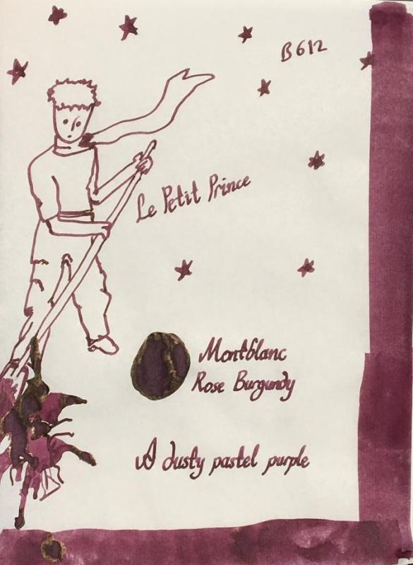
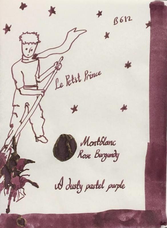
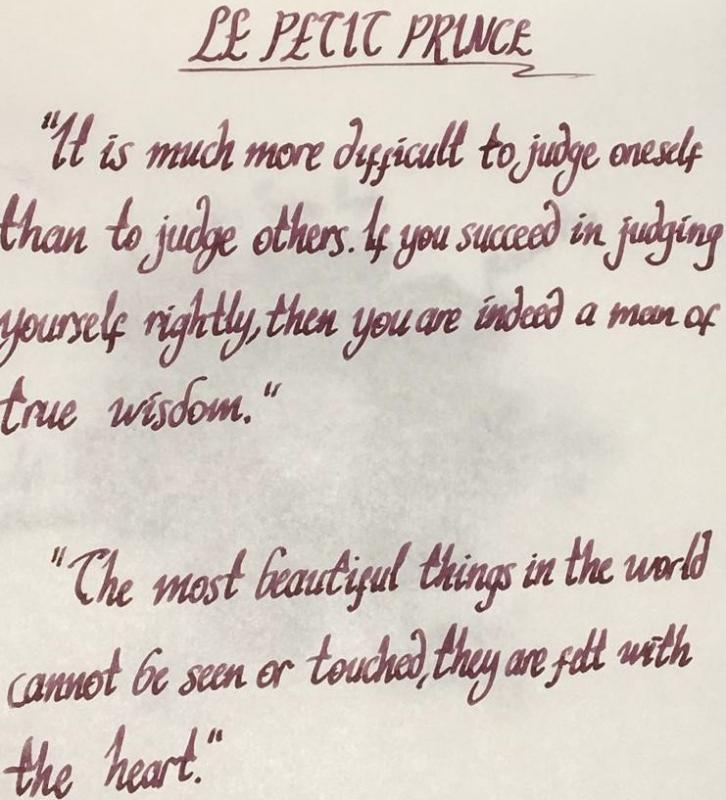
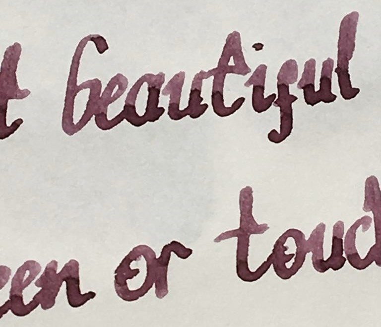
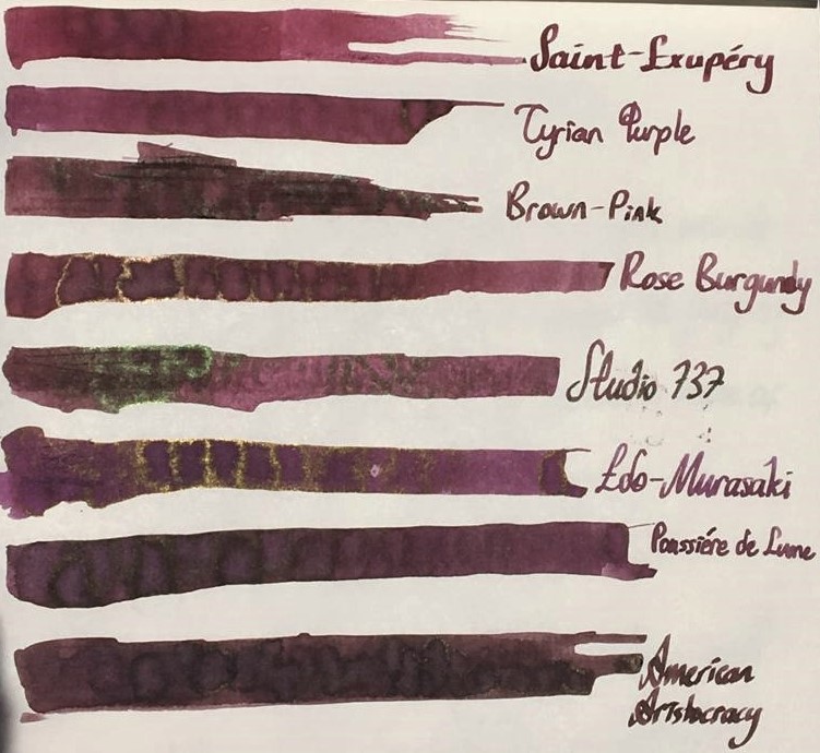
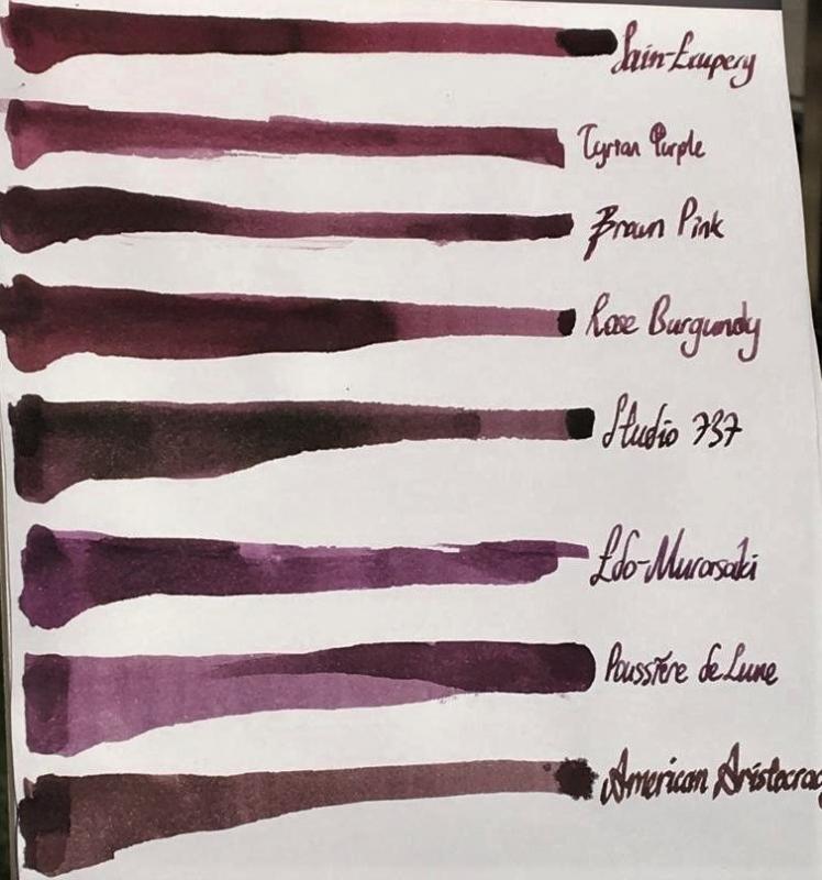
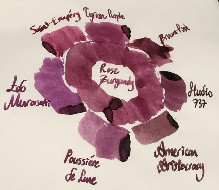
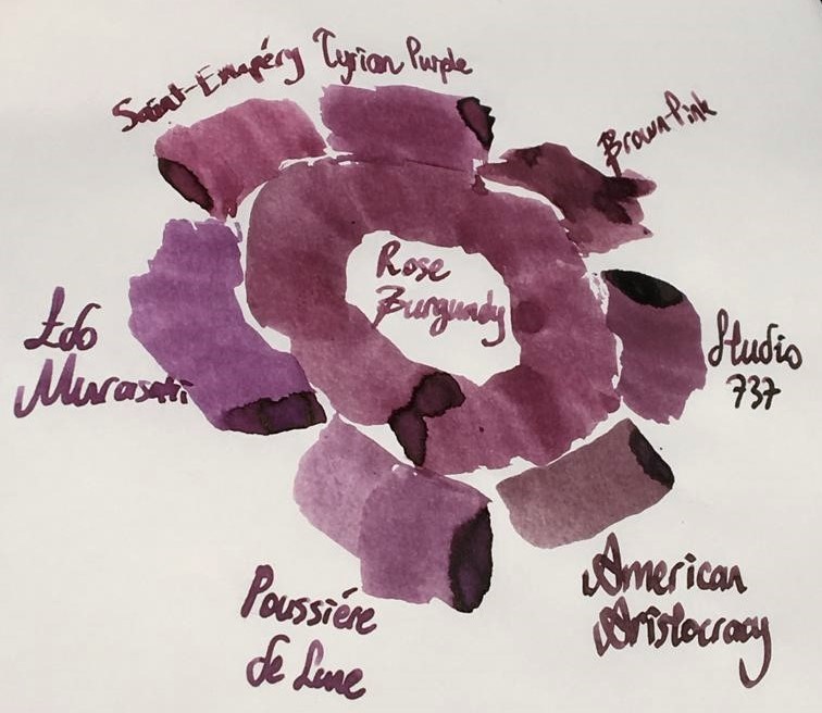
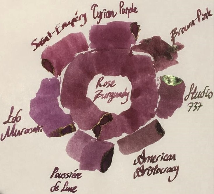
Hello dear FPNers, We have a common enemy. An enemy who is obsessive to take out what we have in our bank accounts or even what we got in our purses. A decisive, a talented, a perfectionist, a world wide known enemy who keeps releasing some magnificent items which we really don't need to but have to buy. Please welcome, Montblanc Le Petit Prince The Planet - Rose Burgundy: It is part of Le Petit Prince The Planet collection. It has the standard 50 ml cube-shaped bottle of Montblanc. It is freshly released. As far as I see, it is not claimed to be "limited edition", but it seems like. Don't know. The colour is a dusty burgundy red with hints of brown: I specifically did not filter this photo. Note that the photo is taken in a very bright time of day. The ink seems to be more vivid and more red than it really is. Actually, above version is what most people would expect to see when reading the name of the ink, I think. However, the colour seems to be more realistic in this tuned photo below: Yes, it is a bit brownish, maybe a litte bit greyish than what a burgundy red name recalls. This ink does not have an exact match of colour in ink literature as far as I know, but KWZ Brown-Pink is the closest one I suppose, which is a bit brighter, more vivid ink. Here are some writings with two lovely quotes from the book: Some close-up shots: Lovely shading, isn't it.. Note that, before moving on to ink properties, the pen I chose for this review is a Pelikan M605 in red: This pen normally comes with a 14k nib, but I found an 18k BB nib on Ebay and upgraded (!) it. Really, upgrade? It is a debate issue. Some likes 14k more since they are likely to be more springy. Of course it is also related to nib shape and the other contributors of alloy. Whatever, this nib is not a nail like my Aurora 88's 18k nib, but not amazingy soft either. It just has a small cushioning, that's all. I tuned its wetness and worked on the tip so that it is a wet stub now: Lovely. Saturation: Rose Burgundy has medium saturation. It is partially a washed out colour, but it cannot be said that it has low saturation I think. Sheen: Very little. Shows a distinct bronze sheen when you pour over huge amounts on Tomoe, but during normal writing, you will probably not see any sheen. Shading: Has a lovely shading. I loved it. Not the most shading ink, though.. But still above average. Shimmer: None. Wetness: Rose Burgundy is a dry ink, just like most Montblanc inks. I had specifically chosen a wet BB nib to compansate the potential dryness of this ink before I got the ink. But still, with very light pressure, this pen made some skippings on smooth Clairefontaine paper. Ink makes you really feel it is dry; not as dry as a Pelikan 4001, but still a dry ink. Feathering: Not detected, not likely to feather. In this term, quite a well behaved ink. The back page of Tomoe: Bleeding: Not detected, not likely to bleed. In this term, quite a well behaved ink. Showthrough: Some distinct showthrough on Tomoe but every ink has a showthrough on Tomoe, so it shouldn't be a criteria I think. So I tried it on 80 gr white Rhodia paper: And the back page is: An acceptable level of showthrough. If you zoom in at a sunny day outside, every ink will showthrough a little bit. So I can say this ink has a low amount of showthrough, like many other Montblanc inks. Water Resistance: I made a water test on Tomoe only: Let's see: Veeery little water resistance, nearly none. If you were about to find the equation of travelling in speed of light and if a cup of coffee spills over your papers, humanity would probably lost a few decades until some other person finds it. For me, it is nice. I love inks with low water resistance because they are cleaned easily. Similar Colours: As stated above, I think the closest ink in terms of colour is KWZ Brown-Pink. But there are some other powerful candidates: Diamine Tyrian PurpleMontblanc Antoine de Saint-Exupery, Encre du DesertJ. Herbin Poussiere de LuneSailor Studio 737I know it is not a very matching colour, but I wanted to compare it with Iroshizuku Edo-Murasaki also. Because Edo-Murasaki has the similar slightly washed out pastel characteristic of Rose Burgundy, except the former is a purple, not a burgundy brown. Another weak candidate is Noodler's American Aristocracy. It is not a very similar colour to Rose Burgundy, but I wanted to show the answer of question "What would happen if this ink was a bit browner?", so I added this one. Here are the swabs on Tomoe: And on Rhodia: I thought a rose of colour on Tomoe would help in exact comparison of Rose Burgundy with others. Again, I thought providing both the unfiltered and filtered versions would give some insight about the true colour. Unfiltered shot, slightly taken from side: Too bright, too warm, colours are more vivid than they used to be. Rose Burgundy is not this red normally. So here is filtered version: which suits better to reality I think. Another shot from a more perpendicular angle, which shows some sheen, again unfiltered first: And filtered version: Well, this last picture summarizes the results in terms of colour pretty well. Compared to Rose Burgundy: American Aristocracy is too brown, they seem like irrelevant. But with naked eye, American Aristocracy has some purple or burgundy red tones. If both inks are written with wet vintages, I think they will be likely to seem similar.Studio 737's base colour is much more pinkish, but it has high amount of green dye in it, making it a more complex, a darker colour with brilliant green sheen. Note that 737 is my favourite purple.Poussiere de Lune is closest in terms of being dustiness, but it is much more purpler and a bit greyish compared to Rose Burgundy. Besides, Poussiere de Lune gives green sheen whereas Rose Burgundy gives bronze sheen, which is of course valid when poured over Tomoe paper at high amounts for both inks.Edo-Murasaki is the most magenta ink out of all mentioned candidates. It does not have a vivid pinkish structure as much as 737 does, less greyish than Poussiere de Lune and it has definitely a more magenta undertone than Poussiere de Lune. It is pinker than what a medium purple should be. It has similar dusty characteristic evoking the Rose Burgundy.Saint-Exupery is the most red ink in this comparison. It is much redder than dusty Rose Burgundy, and definitely a more vivid colour.Tyrian Purple is a close colour to Rose Burgundy, but a bit pinker than it. It is a bit more "burgundy red" than Rose Burgundy, actually. Also, Tyrian Purple is more vivid, though being not a very saturated colour, it shows its colour better than Rose Burgundy.This part is a bit tricky. I said KWZ Brown-Pink is the closest colour I have in my inventory. Note that I am responsible of my own samples and pictures I provided you. I made a literature research on Brown-Pink's colour, and saw veeery different tones. Compared to those photos of KWZ on internet, Brown-Pink's colour provided by me is not that purplish, but rather a dusty pink with some chestnut hints. Actually, I think, base colour of Brown-Pink is lighter than Rose Burgundy, but Brown-Pink includes a considerable amount of green dye, making it a darker, a more vivid colour. CONCLUDING REMARKSThis is a dusty brownish burgundy red. A "unique colour" description would not be very wrong. This is a pale pastel colour with high shading.If you want saturated, vivid lines of colour, this ink doesn't seem to satisfy you.If you are on the train of sheen-craziness like me, this ink is not for you.There is no shimmer. It has a medium saturation I can tell. Doesn't deserve to be called "lowly saturated".It has nearly no water resistance. Didn't try yet but seems like it will be cleaned from pen very easily.It's kind of a dry ink. Try using it in wet nibs, even gushers or vintage pens, to get the maximum of it.Price is about 35 Euros, same as Montblanc Petrol Blue. It is definitely not a cheap ink, but not the most expensive one either. I am not sure if it deserves this price. I would buy it anyway since I am an ink nerd. There are cheaper alternatives in terms of colour, but not the exact same. Right now, I am suspicious that I will buy another bottle, because the colour seems to be a bit pale for my taste. But it is a unique colour, and it has the potential to be the ink of serious writings in moody days with a wet, unproblematic, reliable pen. If I start to enjoy the colour much more by putting it in my vintage Pelikan M400 with OBB nib, I may continue to buy this ink. Hope you enjoyed. Thank you..
-
I like writing in purple and wanted to expand my current ink collection (I have J. Herbin Poussiere de Lune and Nemosine Alpha Centauri), so I recently bought some samples to try. I thought I'd share the quick writing I did to compare the colors. I used 3 pens, dipped the nibs in the ink, then rinsed and dried the nibs a little before switching colors. So the colors may not look as they would if the pen were filled properly. Paper is Tomoe River. Photos were taken under artificial lighting. I didn't attempt to do any color correcting.
-
Ink Review: Nagasawa Kobe #18 Sannomiya Pansy Overall Impressions: The color does make me think of the dark purple in a pansy. It has very nice shading. Shading: Yes, from medium purple to very dark purple. Very dramatic looking with a big nib. Sheen: There was little bit with a wet nib, on the outlines where ink pools. Flow: Good Water Resistance: Low, leaves behind a pinkish-purple line. Ease of Cleaning: Seemed easy to clean out of the pens. Nib Creep: None seen. Tomoe River Paper: Dry Time: around 15-20 sec Water Resistance: Leaves behind a pinkish outline. Writing Samples: A little bit of shading in EF. Shading in the bigger nibs. A hint of an outline of sheen where a lot of ink pooled. No feathering. No bleedthrough except where I heavily scribbled on the page. Some showthrough. EF 0.6 1.1 Back Stalogy Paper: No bleeding or feathering. The paper is thin; there was showthrough. Shading with the stub nibs. EF 0.6 1.1 Back Apica Paper: No bleeding or feathering. Some showthrough with bigger nibs. Shading in the 1.1 stub; a little in the 0.6 stub if you try to look for it. Notebook Paper: Staples composition book, paper made in Brazil. My current notebook has inconsistent paper that can show feathering and bleedthrough. A little feathering with the 1.1 stub. Very occasional feathering with the 0.6 stub. No feathering with the EF. No bleedthrough. Light showthrough. No shading. EF 0.6 1.1 Back Comparison with some other inks: [Working my way through posting some inks I played with over the holidays. I'm still trying to figure out formatting, photos, and what's useful in an ink review]
-
Ink: Rohrer & Klingner Cassia Overall Impressions: A vibrant purple. I like the way it shades. The ink seems well-behaved; it doesn't take overly long to dry, and it flowed well in the pens I tried it in. Seems like a great everyday purple with some flair. Shading: Yes, with bigger nibs on most paper. On Tomoe River paper, I saw some shading even with an EF nib. The color ranged from a medium purple to a dark, eggplanty purple. Sheen: I didn't see any with normal writing, but there was a slight sheen in the drawing where I layered lines. Water Resistance: It is not water-resistant. Ease of Cleaning: Fairly easy. It took a few flushes for the water to run clear. It seems pretty saturated. While cleaning, I got some light ink stains on my hands, but they washed off with a little rubbing. Nib Creep: None seen after about a week in the pens. Tomoe River Paper: Dry Time: Fine nib; less than 15 sec. Water Resistance: Legible after one swipe with a damp water brush, but completely washed out by a wet brush. Writing Samples: Shading with the B nib, some with the F, and even a tiny bit with the EF. No feathering or bleedthrough, and moderate showthrough. EF: F: B: Back: Apica Paper: Shading with the B nib. Not really any shading with the F and EF nibs. No feathering or bleedthrough, not much showthrough. Notebook Paper: (This notebook is not particularly fountain pen friendly. The paper feels rougher than the previous two notebooks I had, and ink seems to feather more easily.) There was feathering and some bleedthrough with the B nib, and occasional feathering with the F nib. There was only a little showthrough. No shading.
-
TAG Kyoto - kyo-no-oto - sakuranezumi TAG is a stationary shop in Kyoto (Japan) that produces some interesting soft watercolour-style inks. With the kyo-no-oto series they produce a line of inks that replicates traditional Japanese dye colours. According to available only info, the manufacturing process of the kyo-no-oto inks follows traditional dying techniques dating back to the Heian era between the years 794 and 1185. The inks come in 40 ml bottles, packaged in luxurious thick paper with a texture that feels like heavy watercolour paper. In this review I take a closer look at sakuranezumi. The ink's name derives from a type of pigment (iron-holding Magnesium-Aluminum-Silicate) that is traditionally used in Japanese painting techniques. The name literally translates to "Cherry Blossom Mouse" and refers to the purple and grey character of the colour. Sakuranezumi is a dusty grey-purple that fits an ancient Japanese setting. Understated and elegant, with an inherent complexity that is very appealing. I immediately took a liking to this ink. It's still early in the year, but this one will probably end up in my top 3 of 2020. The ink feels a bit on the dry side in my fine Safari nibs. But not so dry as to be unusable. The line is still nicely saturated, even with fine nibs - you just get a bit of feedback when writing. With medium Safari nibs and with wetter pens, the ink just feels perfect and writes smoothly. Shading is great, without too much contrast between the light and darker parts - just as I like it. In writing, this purple ink leans heavily towards the grey, which just looks great on paper - classic, vintage, elegant, aristocratic... I love it! To show you the impact of saturation on the ink's look & feel on paper, I made some scribbles where I really saturated portions of the Tomoe River paper with ink. This gives you a good idea of what the ink is capable of in terms of colour range. As you can see, sakuranezumi has a medium colour span. This ink moves from a light to a dark grey-purple, without a sharp contrast between these extremes. In writing, this translates to subtle shading which is aesthetically very pleasing. The ink's chromatography shows a wonderfully complex mix of muted pastel-like dyes. Cherry blossom and mouse-grey/blue tones are clearly present. The resulting mix is definitely a purple, but with a strong grey undertone that clearly shows in writing. In swabs and when used as a drawing ink, the purple dominates. The bottom part of the chroma seems to indicate that there is some measure of water-resistance, but alas... in practice the ink shows zero water resistance (both with still and running water). I've tested the ink on a wide variety of paper - from crappy Moleskine to high-end Tomoe River. On every small band of paper I show you: An ink swab, made with a cotton Q-tip 1-2-3 pass swab, to show increasing saturation An ink scribble made with an M-nib Lamy Safari The name of the paper used, written with a B-nib Lamy Safari A small text sample, written with the M-nib Safari Source of the quote, with a Pelikan M400 with F cursive-italic nib Drying times of the ink on the paper (with the M-nib Safari) Sakuranezumi behaves well on all my test papers, with no visible feathering. It even worked reasonably well on the horrible Moleskine paper, without feathering and with only minimal bleed-through. Drying times were mostly just above the 5 second mark with the Lamy Safari M-nib. The ink looks great on both white and more yellow paper, and behaves well across all my test papers. Writing with different nib sizes The picture below shows the effect of nib sizes on the writing. Sakuranezumi can handle all nib sizes without problem. With the EF nib, you still get a nicely saturated line albeit without shading. Shading starts to appear with the F-nib, and is strongly present in broader nibs. Because of sakuranezumi's medium colour span, shading is never harsh and looks very eye-pleasing. And the strong grey undertones in this ink really add a layer of sophistication and elegance to this dusty purple. Related inks To compare sakuranezumi with related inks, I use my nine-grid format with the currently reviewed ink at the center. This format shows the name of related inks, a saturation sample, a 1-2-3 swab and a water resistance test - all in a very compact format. This kyo-no-oto ink is different from my other dusty purples, although Diamine Damson comes close (Damson has just a touch more purple). Inkxperiment – men's best friend With every review, I try to create an interesting drawing using only the ink I'm working on. Such a one-ink drawing is a great way to show off the colour-range nuances the ink is capable of. These inkxperiments are my favourite part of the review: often challenging, but always great fun. The elegance and complexity of sakuranezumi already implied that this would be a great drawing ink - I just had to verify this with the inkxperiment. I wanted to use watercolour paper for this drawing, but mistakenly grabbed a piece of cardboard paper (a Fellowes binding cover) - I only realized this when the drawing was finished. Inspiration comes from the apocalyptic zombie movie "I Am Legend" starring Will Smith and his dog. The city setting and dog kept lingering in my mind, and form the concept for this drawing. I painted in the background with a Q-tip and 4:1 water-diluted ink. Next I painted in the dog and the people with a fountain pen and brush using pure sakuranezumi. The city backdrop was added with a Q-tip, and building accents were penciled in with the fountain pen. I personally like the end result. It shows quite well what can be achieved with sakuranezumi as a drawing ink. Conclusion TAG kyo-no-oto sakuranezumi is a winner! A very sophisticated dusty grey-purple that is a beauty in writing: nice contrast with all nib sizes, works well with all paper types, looks great on both white and off-white paper. It is also a superb drawing ink, that I really enjoyed. In my book, this is a must-have ink. I can almost guarantee that you will enjoy it! Technical test results on Rhodia N° 16 notepad paper, written with Lamy Safari, M-nib Back-side of writing samples on different paper types
-
Robert Oster 1980s - Dusky Pink Robert Oster is an Australian ink maker that is well-known for its unique range of colours. With this mini-series he gives us a conglomeration of colours inspired by the anything goes world of the 1980s. These inks fit my personal preferences: muted pastel-type colours with great shading. In this review I take a closer look at Dusky Pink, a dim muted purple with a definite vintage feel. The ink feels sub-lubricated in dry pens like the Lamy Safari. Saturation is very low here, but there is still enough contrast with the page to make for easily legible writing. What this ink really needs is wet pens and broader nibs. It will then reward you with a beautiful well-saturated - but still toned-down - purple colour that exhibits great shading. Simply superb! To show you the impact of saturation on the ink's look & feel on paper, I made some scribbles where I really saturated portions of the paper with ink. This gives you a good idea of what the ink is capable of in terms of colour range. As you can see, Dusky Pink is quite faint at the lower saturation end, but reaches a much darker purple colour when fully saturated. The colour remains muted across the saturation range, which I personally like. The ink has a definite vintage vibe to it. Like most Robert Oster inks, Dusky Pink has zero water resistance. Short exposures to water completely obliterate the text, leaving next to nothing on the page. The chromatography seems to suggest that a faint rose-red residue remains, but don't let this fool you. What is left on the page after water damage is completely unreadable. Smudging is not a problem though - which is what I typically care about. I've tested the ink on a wide variety of paper - from crappy Moleskine to high-end Tomoe River. On every small band of paper I show you: An ink swab, made with a cotton Q-tip 1-2-3 pass swab, to show increasing saturation An ink scribble made with an M-nib Lamy Safari fountain pen The name of the paper used, written with a B-nib Lamy Safari A small text sample, written with an M-nib Lamy Safari Origin of the quote, written with a Pelikan with M cursive italic nib Drying times of the ink on the paper (with the M-nib Lamy) Dusky Pink is a well-behaving ink on most paper types, with no visible feathering. The ink dries quite quickly around the 5 second mark (with the M-nib Lamy Safari). For some reason, Dusky Pink reacts weirdly with some types of paper, a.o. the Moleskine and HP printing paper. Here the ink looks just sick ... ugh! As can be seen from these writing samples, Dusky Pink looks at its best with broad nibs or wet pens, where you get nicely saturated writing with beautiful shading. I also show the back-side of the different paper types at the end of the review. No troubles there, except with the Moleskine and Generic notepad paper, which show significant bleed-through. All in all, a well-behaving ink (if you avoid the few papers where the chemistry gets weird). Writing with different nib sizes The picture below shows the effect of nib sizes on the writing. All samples were written with a Lamy Safari, which is typically a dry pen. I also added a couple of visiting pens - a TWSBI VAC mini with M-nib, and a wet-writing Pelikan with an M cursive italic nib. The ink's shading really starts showing up once you go to M-nibs or broader. With wet pens, the ink becomes much more saturated, while still keeping its toned-down muted appearance. Personally I think Dusky Pink should be combined with wet pens and broader nibs. Below is a writing sample on Paperblanks journal paper, showcasing the diffence between a Lamy Safari M-nib (dry pen) and a wet-writing Pelikan with M cursive italic nib. For me personally, the writing with the wet Pelikan looks simply great. Related inks To compare Dusky Pink with related inks, I use my nine-grid format with the currently reviewed ink at the center. This format shows the name of related inks, a saturation sample, a 1-2-3 swab and a water resistance test - all in a very compact format. Dusky Purple fits nicely with my other muted purples, and is different enough to warrant its own place. Inkxperiment - zen at the lake As a personal challenge, I try to create interesting drawings using only the ink I'm reviewing. For me, this brings quite some extra fun to the hobby, and these single-ink drawings present a real challenge at times. With these small pictures, I try to give you an idea of what the ink is capable of in a more artistic setting. For this drawing I started off with HP Premium photo paper. I then painted in a background with heavily water-diluted ink. Next I used Q-tips and multiple ink/water ratios to draw the lake. The horizon line, and the rowing boat were painted with pure Dusky Pink. As a final touch, I added the pine trees on the mountain slope with a B-nibbed Lamy Safari filled with Dusky Pink. The resulting mini-picture gives you an idea of what can be achieved with this muted purple as a drawing ink. Conclusion Robert Oster 1980s Dusky Pink is a pastel-toned muted purple that totally fits my personal tastes - no wonder I like it ;-) Be aware that the ink looks quite unsaturated when using dry pens, and shows sub-par lubrication in fine nibs. Pair this ink with a wet pen and broader nibs, and the result is pure joy. In my opinion, Robert Oster produced a fine ink with this one. Technical test results on Rhodia N° 16 notepad paper, written with Lamy Safari, M-nib Back-side of writing samples on different paper types