Search the Community
Showing results for tags 'pro gear slim'.
Found 10 results
-
desaturated.thumb.gif.5cb70ef1e977aa313d11eea3616aba7d.gif)
Mixing-and-matching Sailor 14K gold nibs to pens
A Smug Dill posted a topic in Fountain & Dip Pens - First Stop
I've been pondering this for the past hour, now that the last of my Sailor pens on order (from before my self-imposed year-long moratorium) have arrived. Assuming that the ‘medium-sized’ 14K gold nibs are all interchangeable — and they sorta are, but not exactly in the way one may be accustomed to with Pelikan, HongDian, or Edison Pen Co. pens — between these pens, how best to reassign some of the nibs? As is, With gold trim and yellow-gold nibs (Pro Gear Slim) Shikiori Manyo — Extra Fine nib Promenade (GT) in black — Extra Fine nib Promenade ’Shining Blue’ — Fine nib Promenade ‘Shining Red’ — Fine nib Pro Gear Slim Mini in Stellar Blue — Medium-Fine nib Pro Gear Slim Mini in Taupe — Medium-Fine nib Koshu-Inden Sayagata — Medium-Fine nib Koshu-Inden Kozakura — Medium-Fine nib Kabazaiku — Medium nib Profit Standard (aka 1911 Standard) in ivory — Music nib (Profit Standard) Proske demonstrator — Zoom nib With silver trim and rhodium-plated nibs Pro Gear Slim ‘Midnight Sky’ — Zoom nib Pro Gear Slim ‘Ocean’ — Fine nib Promenade (ST) in black — Fine nib (Shockingly, I don't have any Sailor ‘medium-sized’ 21K gold nibs. I do have a few ‘large-sized’ 21K gold nibs for the full-sized Profit 21 and Professional Gear pens.) In my experience, the cap seal effectiveness of the Profit Standard and Pro Gear Slim models is excellent, but just OK for the Koshu-Inden and Kabazaiku models. The Promenade is fitted with a spring-loaded inner cap (à la Platinum's Slip&Seal mechanism), and so its cap seal effectiveness should be best of all. Out of curiosity, how would you (re)assign the nibs? -
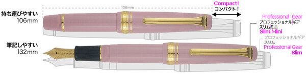
The Sailor Pro Gear Slim is one of those pens that I have wanted quite early on in the hobby. On paper ( no pun intended ), it has a lot of things going for it; it's attractive and well built, and for many, will probably be one of their first gold-nibbed pens ( my first modern one ). Was it worth the wait? Yes, it was worth the wait, but it was quite a long wait. When I got the pen, I rushed to clean it and ink it up, but there were a couple of problems. First, the nib tines were quite tight and the pen was far too dry to write properly. Obviously, you can adjust that yourself if you feel comfortable, however, the pen was also leaking ink from a gap between the section and the barrel, so right back to Anderson Pens it went. Since it came back, it's been smooth sailing (pun indeed intended). This just goes to show that probably no matter what pen you buy, something can always go wrong, so I recommend ordering from a place that will handle any issues you have. Back to the pen, what really won me over was this color combination; the reddish-orange and gold is really something that works for me. Sorry for the poor quality phone camera photos. I tried to do some color correction, so hopefully this is an accurate representation. There's also many more variants either with gold or rhodium trim, if you so desire. Design and Construction: Aesthetically, I find this a very attractive pen. The design may be conservative for some, but I think it's nice, and the color is certainly far from conservative. I think some of the smaller details such as the lettering on the cap band and the anchor on the finial help make the pen look more interesting. Holding the pen, you'll notice the quality feeling of the plastic, which has held up really well to scratches over the weeks I've been using it. The molding lines appear to have been sanded away on the barrel and cap, which helps make the pen feel like it's been turned out of a solid piece of resin. If only they sanded down the molding lines on the section, which, while mostly unobtrusive, are slightly annoying considering that's where you're intended to place your fingers. Aiding the feeling of quality however, is the exceptional balance, especially when posted. Unposted, the pen feels a little short. In general this is rather small pen, but luckily not too thin. A comparison of the capped, posted, and unposted lengths of a Kaweco Sport, Parker Duofold Junior, Sailor Pro Gear Slim, Sailor 1911s, Parker 21, Platinum Preppy, and Lamy Safari Dimensions wise, the Pro Gear Slim is identical to the 1911s except in length due to the rounded ends of the 1911 versus the flat ends of the Pro Gear. Filling System: Most Sailor pens ( except the Realo ) use Sailor's proprietary cartridge converter filling system. A converter is luckily included with the pen, but it isn't the best converter. It doesn't hold much ink, partially due to the air bubble that is always present (I've tried to expel the air out). It's enough ink to last through the day (for me), but it may be an issue. I've also heard that they sometimes leak. They do disassemble for cleaning and greasing, which is nice, but I think Sailor should really update their converter design. One oddity about filling is that it fills through the breather hole, and it's recommended by Sailor to do so. For this reason, although you can remove the nib and feed, you will break the seal and probably cause some problems ( It may also void the warranty). The Nib: The nib of any Sailor seems to be the most highly regarded part of the pen, it's practically the reason you buy one. While not perfect out the box, it's an absolutely spectacular nib. There's some feedback, but it's really smooth, definitely one of my favorite nibs. This single-tone 14k nib is also quite attractive as well ( the little things ). Sailor extra-fine versus medium I did the writing sample not long after receiving the pen, but after using it for a while with different inks, the feedback isn't as pronounced as I made it out to be. Conclusion: I think this is a wonderful pen for the $156 price. Honestly, while the gold nib is selling point for this pen, it's not the only one as this is, overall, a quality well-made pen. Do you need the gold nib? Not really since this nib produces no line variation, and a steel nib and a gold nib with the same tipping material can be almost indistinguishable. However, there is something wonderful about this nib ( which just so happens to be gold ). Not to mention that gold is an inert metal, and the alloy will resist ink staining. Some plain steel nibs can get stained rather easily from iron gall inks ( or just be harder to clean ), and some plated steel nibs I've used have had the plating come off really easily. For longevity, as far as I'm concerned, gold is a safe bet. It's also worth mentioning some of the other pens that you can get for around the same price such as the Lamy 2000, Platinum 3776, and Pilot 74, which are highly regarded by others although I have no experience with them ( yet ). If this pen appeals to you, also look at the Sailor 1911s which essentially the same pen except for the ends, which add some length. As always, your feedback is greatly appreciated.

-
From the album: Translated third-party content
Source: https://sailorshop.jp/pic-labo/11-1300_top.jpg© Sailor Pen
- 0 B
- x
-
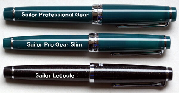
Sailor Lecoule vs Pro Gear Slim vs Pro Gear.jpg
A Smug Dill posted a gallery image in FPN Image Albums
-
Haul from EndlessPens Black Friday 2020 sales.jpg
A Smug Dill posted a gallery image in FPN Image Albums

From the album: First look
Contents: 1 Sailor Professional Gear Slim Midnight Ocean with a Zoom nib 2 Sailor Professional Gear Slim Mini, in taupe and slate green 3 Sailor converters to suit the Professional Gear Slim Mini I'm delighted by how quickly my order from EndlessPens in Florida on Black Friday 2020 was delivered to me in Australia, in spite of: the Sailor mini converters were a pre-order item at the time, with a notice to say “will ship on December 3” on the product page, which will hold up the other in-stock items on the same order; I received a communiqué from EndlessPens on 3 December (Sydney time, so 2 December in the US) to advise there would be shipping delays while they dealt with 7 days of backlog after the Black Friday sales; and these were sent by USPS First Class International post — and, given the temporarily halved free international shipping threshold at the time of ordering, I wasn't expecting different — and I've seen major (six-week) delays with parcels sent that way to me earlier in second half of 2020. I'm also pleasantly surprised that the Sailor Pro Gear Slim pens are still factory-sealed in their plastic sleeves, while the Sailor Pro Gear came with a regular converter that wasn't mentioned in the product listing as an inclusion in the price.© A Smug Dill
- 0 B
- x
-
Clash Of The Titans: M800, Homo Sapiens, 146, Justus95
TheDutchGuy posted a topic in Fountain Pen Reviews
Following the discussion if someone's best pens are also their favourite pens I decided to compare my highest-pricepoint* pens: -Montblanc 146 EF ('90s pen and feed with a much earlier 14C EF nib); retails for appr. 550 euros -Pelikan M800 F ('80s pen with 18C nib); retails for appr. 500 euros -Visconti Homo Sapiens Lava Steel Midi F (23k Pd dreamtouch nib); retails for appr. 450 euros -Pilot Justus 95 M (14k nib); retails for appr. 300 euros I bought the MB146 from a local collector at a very attractive price. The M800 was a gracious gift from a friend who bought it new in the '80s and who stopped using the pen some years ago. The Homo Sapiens and the Justus were bought new in local brick and mortar stores, but with appreciable discounts. As a "challenger pen" that retails for 1/3rd to 1/2 of these pens, I added the Sailor Pro Gear Slim 'Ocean' 14k H-MF to the comparison. ^--From large to small: Justus, 146, M800, Homo Sapiens, Pro Gear Slim. Totally different design philosophies. The 146, the M800 and the Homo Sapiens are staples of pen design, the 146 and the M800 being established classics, each with its own legacy, and the Homo Sapiens already being a modern classic. The Justus and the Pro Gear Slim are more utilitarian pens where the focus is on the nib, feed and quality of writing and not so much on eye-catching design or high-end materials. ^--Uncapped size comparison. ^--Posted size comparison. The different philosophies behind these pens are also reflected in their business ends: the nibs and feeds. The 146 and the Pro Gear Slim are relatively rigid (but certainly not nails), the Homo Sapiens and the Justus are soft (but certainly not flex) and the M800 is somewhere in between. ^--Writing sample (apologies for darkness of image). A 1cm scale is included for reference. The 146 downstrokes are 0.25mm wide. Distinguishing factors As writing instruments, obviously these five pens are objectively of very high quality. All five are top-notch pens and I'd be lucky to own just one of them. Each pen does have certain positive aspects that make it unique compared to the others: -the Justus has a soft nib with variable softness control which also controls its wetness; the Justus is the largest pen in this group and it houses the much-liked CON70 converter. -the 146 EF is an architect, which was common for MB 146 EF nibs during a certain period of time. -like most Pelikan pens, the M800 has a removable nib/feed unit making it super easy to change nibs or to clean the pen. -the Homo Sapiens is made of the unique basaltic lava material from Mount Etna, which feels fantastic, and the soft 23k Palladium nib is also a distinctive element of this pen. I deliberately chose the Midi version which is still a fair-sized pen which can be used posted or unposted and fits in shirt pockets. -the Pro Gear Slim offers the unique Sailor feedback and outstanding nib/feed quality. If I were to look for objective negatives, then the following comes to mind: -my Justus had a nib that needed serious after-care, but to be fair I knew that beforehand, it explains the discount and it allowed me to tune the nib exactly to my liking; -the architect nib of the 146 isn't for everyone, nor for every style of writing: with cursive italic, the result is far, far removed from an EF line and is actually on the B-side of M. -my M800 suffers from slight baby's bottom which sometimes leads to skipping, especially on the lower half of the page (due to hand oils); -my Homo Sapiens Midi is quite sensitive to which inks it likes (and it dislikes some very common and well-behaved inks); you cannot unscrew the nib unit, nor the piston unit (at least not easily) so cleaning the pen can be cumbersome. Last but not least the ridges of the cap lock mechanism rub against my fingers sometimes. -the smallish Pro Gear Slim needs to be posted. Personal (subjective) pros and cons The M800 is my least-favourite pen in this group. There is no objective reason for this; I simply do not feel any emotion with this pen (apart that it was graciously given to me by a friend). The striped Pelikan design is not something that revs my engine, it's not my cup of tea. The nib is very smooth but devoid of character and the writing experience strikes me as somewhat clinical and sterile. Next-up is the 146 EF, which is delightful under controlled circumstances (such as journaling or correspondence) but unsuited to circumstances where you might change the writing angle (such as quick notes at work). That's how it is with architects. I like the 146 much more than the M800, I admire it as a quality pen with a timeless design and I adore the old 14C nib. But I do not grab it all that often. Next-up is the Pro Gear Slim. It was perfect out of the box and it is still perfect to this day. Spot-on, constant flow. Consistent, spot-on performance. No fuss, no maintenance. I don't care much for how it looks and the MF writes a very fine line by western standards, which makes it less suitable for quick jots at work - I need to concentrate a bit, slow down a bit, to prevent wavering and sloppiness. Fantastic pen that puts a smile on my face every time I use it. The Visconti and the Justus are so close that it's hard to pick a favourite. If you put a gun to my head then I'd pick the Visconti because its design and materials are totally unique, it writes like a dream and offers almost the same softness and line variation as the Justus. If the house burned down, the Visconti is the one I'd save. Having said that, the Justus is much lighter and fits into the hand much better. Best vs favourite The M800 is top-tier pen that I just don't care for as a writing instrument (apart from how it came to me; I'll always cherish it for that). The Visconti has some drawbacks, as mentioned, but I'm extremely attached to it. And given its price point, it's hard not to declare the Sailor as the "winner". *I have about 20 pens, the remaining 15 being in lower price brackets. Some of those I love as well, such as my Leonardos or trusty Kaweco AL Sport. I restricted myself to the five most high-end pens that I own, realizing full well that I do not own "real" high-end pens like Scribo, Nakaya, Namiki, etc.) -
I was thinking of getting a Sailor Pro Gear Slim in Broad nib. Whats keeping me from adding it to the cart is the sweet spot issue about Sailor nibs. In numerous posts I have heard Sailor Medium and broader nibs have a definite "step" to the nib tipping which gives the typical Sailor smoothness-feedback balance. Provided I won't be rotating the pen, the thing is the writing angle. I hold my pen with a standard tripod grip at an angle of 45 degrees. I heard Sailor nibs have to be held at lower angles. Is 45 degrees low enough or is it going to scratch instead of giving its signature feedback? P.S- I don't want to buy and send it a nibmeister to smoothen the "step" out. I would I go with the default "step" to the Sailor pen or won't go for it.
-
When visiting Amsterdam today to buy a wooden pen case, I tried to ignore the wonderful Sailor display in the store - and failed. My three Sailor-nibbed pens (a Pro Gear Slim, a 1911 Standard and a Cross Peerless 125) all have M nibs. Not that they're even remotely the same in terms of feel and line width - they're quite different from each other. A Japanese F is too fine/narrow for me; my handwriting is not compatible with such a needle-thin line. I tried a MF and was hooked. Contrary to Sailor's M and B nibs, which tend to have a built-in "rotation police" thanks to their intricate, multi-faceted geometry, the MF is more forgiving. But it has the typical pencil-like feedback that sets Sailor apart. It's a Japanese MF, which is a lot narrower than a Western MF. It's line width is even less than that of my old Sheaffer Targa Slim XF. Still, the nib is smooth. It's feedback, not scratchiness, big difference. I've never used a nib this fine yet this pleasant. It's a joy to write with, if I take my time - which (for me) is the whole point of Sailor: take your time and concentrate on your writing. Given that it's an Ocean, naturally I'l use it with Blackstone Sydney Harbour Blue. This is a very saturated ink and I often dilute it when I use it in other pens, but in this MF Sailor, Sydney Harbour Blue shines in its pure form. There are many Sailor Pro Gear reviews here on FPN, so I won't go too deeply into this pen. Suffice it to say that if you love Sailor M nibs, give the MF a try as well. Apologies for the poor pictures.
-
Very recently I have developed a keen interest in the "ink" side of the fountain pen hobby versus the pen side. The Japan store exclusive inks in particular such as the wonderful Kobe Nagasawa ink line. Up until now my ink choices have tended toward the safe European brands such as Montblanc, which sadly don't offer much in the way of sheen, though do often produce nice shading. My new interest in Sailor inks has seen me build up a small collection of Sailor Pro Gear fountain pens. The Sailor Pro Gear Slim in particular. When you have a million new inks to try, the cartridge converter filling system of the Pro Gear is very welcome. Although I have had a Sailor King of Pen Demo for a few years now I have never considered the other models such as the Pro Gear Standard, Slim, Mini, or even other Sailor lines such as the Realo, 1911 or Profit. The flat ends of the Pro Gear with its anchor finial is much more preferable to me than the torpedo 1911 or Profit models. Sailor Pro Gear's fall into 3 distinct categories, with pricing given accordingly. The pricing usually holds irrespective of whether it is a shop-exclusive or part of their standard production line. The Pro Gear King of Pen is normally around $800-$900, the Pro Gear Standard around $300 and the Pro Gear Slims around $150-$250. Thankfully (for my wallet) the size of the Pro Gear slim isn't too small...so I can potentially collect them all (uh oh!). The Nagasawa Kobe line of inks utilise the flat mason jar, which thankfully isn't a problem if your filling them using Sailor Fountain Pens as they fill from the breather hole (unlike Western fountain pens where you have to dunk the whole nib and part of the section in!). I'll be honest, these flat jars are a pain when using my Omas, Danitrio even Pilot 823....but to be fair they are designed to be used with Sailor fountain pens. So I decided to go all in with their proprietary system and buy some Sailor fountain pens. I'm starting to build quite a collection. Luckily their nibs are awesome, with just a hint of feedback which is EXACTLY how I like my nibs. I HATE overly smooth nibs, they make my handwriting look out of control. I originally bought the Sailor Pro Gear Slim (properly called the Nagasawa "beside") Tarumi Apricot with H-F (Hard-Fine) nib. I had been eyeing this one for quite some time. You can see the Kobe Tarumi Apricot ink in the crappy picture of the ink pot and pen under the nib. As you can probably tell the inspiration for the Nagasawa Kobe Pro Gear slim is taken from their ink line. I believe they also do this with their Pro Colour 500 line, some featuring the latest 60+ colours. I then caved and bought the Gokuen Toshi Fresh Green also with H-F nib, pictured here with a writing sample using ink of the same name; ...and then I couldn't resist getting the other two Suma Rikkyu-Rose H-M nib and Rokko Island Sky H-EF nib. I think I might like Suma Rikyu-Rose and Rokko Island Sky the best, for the nibs as much as the colours. The EF nib is wickedly smooth with a generous flow- much nicer than the H-F and H-MF. The H-M nib is just glorious, gliding smoothly across my Hobonichi planner. I have it inked up with a sample of the Suma Rikyu Rose which has some lovely shading and complexity to it. On Hobonichi TR paper it glides across juicily with just a touch of Sailor feedback to keep your writing under control. I don't normally like pink inks or pink things but both ink and pen are winners. Here they are; I should also mention all the Kobe Nagasawa Pro Gear Slim fountain pens have a shimmer to them. Which make them even more special. I believe Kobe Nagasawa do this with a number of their store- exclusive pens, including the aforementioned ProColour 500. I guess I'll have to check those out too. Here are the writing samples on Rhodia grid pad; All in all very neat little pens at a neat little price- especially given your getting a 14ct gold nib tuned to perfection with a generous flow. Although I can use the pen un-posted I find its much more comfortable posted, and probably a must for most. The only other slight negative is the minuscule ink capacity in the converter. Luckily I bought about 50 Kobe ink samples so I'm glad of the opportunity to switch out the inks regularly. I really like the colours of these Nagasawa "beside" fountain pens, though I know they will be too bright bordering on the intolerable for some. I much prefer them to the demonstrator PG Slim's that can be found in the standard Sailor line. They really are bright happy addition to my otherwise quite serious fountain pen collection. Here are some bonus shots- Enjoy! And... Just one more... I didn't think it worth doing a separate review for essentially the same pen. So here is the Kingdom Note store exclusive Kintoki Carrot which can you believe it has a carrot etched onto the 14ct gold nib! Unfortunately there is no matching carrot finial. Or any shimmer. However it does sport an elegantly mis-matched cap and barrel, and the Sailor anchor looks very distinguished as always. It sports a H-MF nib. Here it is; Check out that nib! One last group shot;
-

Sailor Sapporo/pro Gear Slim Nibs Are Interchangeable With...?
ella343 posted a topic in Of Nibs & Tines
According to some other threads, the Sailor small 14k nibs are mostly interchangeable, thus includes this list of models? 1. Sapporo aka Pro Gear Slim 2. Pro Gear Mini 3. 1911M aka Profit Standard 4. Promenade? I ask because I broke a nib—a very small part of the tip snapped off—but the nib is threaded so I can simply swap in another one, so I would like to make sure I buy the right one.