Search the Community
Showing results for tags 'pink'.
-
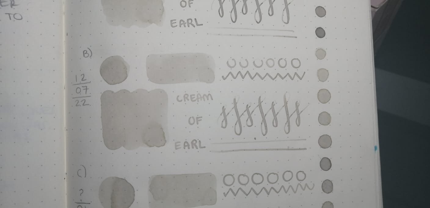
Hello! I felt the need to create this post since I can't find anyone else talking about it and maybe it's just me that I happened to contaminate two (maybe three?) different ink bottles of the same color. I hope the pictures I took serves as good reference to demonstrate what happened over the course of a year. I've been using Cream Of Earl for the past year until recently, because I thought I had contaminated my bottle of ink (fig. 3) since I sometimes use it to paint with brushes. Lucky me I had a second opened bottle at work (fig. 5), I cleaned every single piece of my pen before refilling it, to my surprise the color on that bottle also had lost its pinkish appearance. I thought maybe I had convinced myself the ink had some pink hues, so I went through my notebook to find the very first time I used the ink and it looked just as I remembered it, also found the swatch I made that year on Tomoe River's white paper (fig. 2) and compared them. As I put the ink on paper, it looks kind of green until it fully dries looks like a grey-beige-sand color, i'm not mad about it but I'm very intrigued, also Ferris Wheel Press has no info about the ink changing its color over time and people haven't talked about it, maybe everyone owning this ink think they messed it up and are too embarassed to speak about it? I also checked my other pinkish inks from Ferris Wheel Press to see if they lost their true color (Strawberry Macaron, Lady Rose & Definetely Peachy) and they look just as the first time I opened them. Anyone else has had this happened to them before with this or any other low saturated ink? fig 1. First swatch from when I first filled my pen with CoE back in 2021 fig 2. Left one is on Tomoe River's white paper, swatched back in 2021. Right ones on Leuchtturm1917 paper. fig 3. Bottle opened January 21st on 2021. fig 4. I received this ink bottle the same day as the other two, except this one I'm sure it has never been opened before nor seen daylight until past week that I opened it to compare the rest. It appears to be slightly lighter than the other two. fig 5. Can't remember the day I opened this bottle but it was around the same week I first opened A) fig 6. Swatch from FWP's page. Thanks for reading! Have a great week xx

-
*comes in a 3 oz glass bottle * it's definitely pink *more of a blue-pink than an orange-pink (the third photo looks the most accurate to me, but your monitor may show it differently) *dries pretty fast, under 5 seconds *highlights over a variety of inks without smearing *not water resistant (that's not a surprise!) The first sheet is the 32 lb HP laser paper - the only part that really shows (obviously) is where I shot the paper with a syringe full of ink! The second sheet is cheap 20 lb copy paper, and I (personally) wouldn't have any trouble highlighting on both sides of the paper. You can see it a bit, but it's really not bad at all.
-
TAG Kyoto – kyo-no-oto – imayouiro TAG is a stationary shop in Kyoto (Japan) that produces some interesting soft watercolour-style inks. With the kyo-no-oto series, they produce a line of inks that replicates traditional Japanese dye colours. According to available online info, the manufacturing process of these kyo-no-oto inks follows traditional dying techniques dating back to the Heian era between the years 794 and 1185. The inks come in 40 ml bottles, packaged in luxurious thick paper with a texture that feels like heavy watercolour paper. In this review the spotlight is on imayouiro, a bright and vibrant pink-coloured ink. Not an ink that fits my personal taste – I got it anyway because I want to try everything that TAG Kyoto has to offer. Although the ink’s colour is not my thing, I will still do my best to give you an objective review. Imayouiro is definitely not well-lubricated: in my usual Safari test pens, it writes dry and with serious feedback. With wetter pens, the lubrication issue is easily fixed, and you also get a much more saturated line. With dry pens, the ink looks quite nice and shows decent and elegant shading. Unfortunately, once you move to wetter pens, the ink’s saturation quickly drowns out that shading, and you get a very one-dimensional look, that I personally find unpleasing… the geisha is applying too much make-up, all beauty hidden beneath flat-looking paint. To show you the impact of saturation on the ink’s look & feel on paper, I made some scribbles where I really saturated portions of a strip of 52 gsm Tomoe River paper with ink. This gives you a good idea of what the ink is capable of in terms of colour range. Imayouiro has a medium colour span, without too much contrast between light and darker parts. With dry writers, this translates to elegant shading. Wet pens tend to show only the upper part of the colour span: with imayouiro, shading is lost and your writing turns fairly flat and uninteresting. The ink’s chromatography shows a single-dye composition, with most of the colour moving away with water. This is confirmed in the water test at the end of the review: most of the ink disappears when you have a watery accident, leaving only some pink smudges on the paper. Imayouiro is not a water-resistant ink. I’ve tested the ink on a wide variety of paper – from crappy Moleskine to high-end Tomoe River. On every small band of paper I show you: An ink swab, made with a cotton Q-tip 1-2-3 pass swab, to show increasing saturation An ink scribble made with an M-nib Lamy Safari The name of the paper used, written with a B-nib Safari A small text sample, written with the M-nib Safari Source of the quote, written with a Pilot Capless with M-nib Drying times of the ink on the paper (with the M-nib Safari) There is no visible feathering with this ink – it behaves well in this respect even on crappy paper. With low-quality paper there is a small amount of bleed-through. Not much, but enough to make the back-side of the paper unusable for writing. Drying times are mostly around the 5 second mark on absorbent paper, and 10 seconds on more hard-surfaced paper (with the Lamy Safari M-nib). Be aware that I mainly use the dry-writing Lamy Safari for the writing samples. As stated before, imayouiro looks real nice with these dry pens. When writing a full page with a wet pen, you get a much flatter look, that I personally find unappealing… too much make-up! I’ve also added a few photos to give you another view on the ink. Scanned images and photos often capture different aspects of the ink’s colour & contrast. That’s why I present them both. In this case, both scanner and photo capture quite well the real-world colour. Writing with different nib sizes The picture below shows the effect of nib sizes on the writing. Kyo-no-oto iamyouiro is a vibrant and saturated ink, that works well with all nib sizes, even the finest ones. With dry pens, you get some beautiful shading. Use wetter pens though, and most of that shading is drown out – the ink then loses a lot of its appeal. For me, this TAG Kyoto ink is best used with pens that are on the dry side. Related inks To compare imayouiro with related inks, I use my nine-grid format with the currently reviewed ink at the center. This format shows the name of related inks, a saturation sample, a 1-2-3 swab and a water resistance test – all in a very compact format. The two inks that – in my opinion – come closest are Pelikan Edelstein Turmaline (the 2012 ink-of-the-year, that is now unobtanium) and Callifolio Andrinople. Turmaline is quite alike, but is a more complex ink that looks more interesting on the page. Callifolio Andrinople has a bit less red in the mix, and looks softer and more fragile (also a geisha, but one that uses moderation with her make-up). Personally, I find both Turmaline and Andrinople superior pinks. Inkxperiment – Tenerife Sunset For my ink reviews, I always add a drawing using only the ink I’m working on. This inkxperiment is a great way to illustrate all the colour-range nuances that are present in the ink. I really enjoy this part of my reviews – experimenting with the ink in a more artsy context. For this inkxperiment, inspiration comes from a recent family vacation on the Canary Islands – a real treat, and the first real holiday in two years. We visited the Teide Volcano National Park in Tenerife at late afternoon – an eerily beautiful place! At sunset, my niece made a photo of our shadows. I used this photo as the subject of this inkxperiment – with a bit of artistic freedom: I added the setting sun (which obviously is nonsense, because you can’t get the shadows I painted with the sun in front). I started with a piece of A4-sized HP photo paper, on which I placed a paper cut-out of our shadows. I then covered the lot with a piece of kitchen towel, that I thoroughly wetted with water-diluted ink, thus creating the background. I drew in the sun using a plastic cup, and darkened the ground below with a piece of dish-washing sponge dipped in pure ink. Finally, I removed the paper cut-out, and filled in the shadows with a paintbrush and pure imayouiro. The resulting drawing shows what can be achieved with this kyo-no-oto ink in an artsy context. Inkxpired – computational art I love experimenting with pen/ink/paper, and am now adding another layer as part of the hobby. I’m exploring computational art, inspired by the ink drawings I do during ink reviews. Another fun offshoot of the hobby… and all that starting with a few drops of dye-coloured water on paper. Conclusion TAG Kyoto kyo-no-oto imayouiro is a very pink ink – vibrant and saturated. It looks best when paired with dry-writing pens where it shows some really nice shading, but – alas – also sub-par lubrication. With wet pens the writing experience improves substantially, but the ink also tends to over-saturate, resulting in a fairly flat look (my opinion). A nice ink to try out for the purpose of this review, but not one that convinced me. Technical test results on Rhodia N° 16 notepad paper, written with Pelikan M405 F-nib Back-side of writing samples on different paper types
-
Hello Inky Friends! It has been quite awhile since I shared my comparisons of pink and purple inks here: https://www.fountainpennetwork.com/forum/topic/274481-pink-purple-ink-comparisons/ I have updated the list with a few new inks (mostly samples, but a few are bottles as well.) Again I will say that this is not an absolute accurate depiction of every ink. Rather it is intended as more of a guide as to where certain inks fall next to each other when compared with similar ink colors. All samples were written with a glass dip pen on Clairefontaine paper. I hope that this is useful and helpful! Pink Inks Pink & Purple Inks Purple Inks Dark Purple Inks
-
desaturated.thumb.gif.5cb70ef1e977aa313d11eea3616aba7d.gif)
PenBBS Fountain Pen Ink No.178 Rose Quartz – a lazy review
A Smug Dill posted a topic in Ink Reviews
Here's a weird ink, probably closely comparable to Jacques Herbin Nude By Marc-Antoine Coulon (which I don't have), that I expected and really wanted to like, but in which I'm sadly disappointed by its performance characteristics that make it nigh unusable and useless. Colour: It really does look like rose quartz, at least the globes and other-shaped pieces that I recently saw in an antiques and secondhand knick-knacks store. The colour on the page defies proper capture with my Canon LiDE 300 scanner, in any mode and with a colour calibration reference card by the side of the review sheet. No amount of algorithmic colour correction or other post-processing — within my limited skill as a user of the software — in GIMP could make it look right in the scanned image; it should look far more pink, a bit like the Rose Taupe in the relatively recent ‘first release’ colours of the Sailor Professional Gear Slim Mini pens. The colour shown in the photo of the review sheet is much closer, even before colour correction was applied. However… with each pen stroke, the ink initially goes down looking close to the ‘quick’ broad stroke colour shown in the scan, making it difficult for me to see the exact shape of the mark I just made. Within less than a second, it gets darker, akin to the colour of the ‘3-pass’ patch in the scan, but still more taupe and dull than rose and pink. Then the mark becomes lighter, and finally more pink and (slightly) more vivid over the next several minutes, until it looks like the ink colour shown in the photo. Flow: I'm not sure how best to describe this. What I see is the behaviour of a somewhat wet-flowing ink, that somehow produces a very dry writing experience. The ink seems to be very watery, for lack of a better description, and not even remotely lubricating. When I'm ‘drawing’ a minuscule / lowercase 'l’ (or the stem in ‘t’), the vertical stroke looks faint until I lift the pen / nib off the page, and then suddenly a darker taupe colour rushes up to fill the length of the stem, so I must conclude that a fair amount of ink was laid down all along the trajectory of the stroke, but the liquid was easily pushed along the surface of the paper by the nib's tip, and only when the pen is lifted that the glob of ink is allowed to flow in reverse direction up the track of the mark that was made. That makes for a rather unpleasant writing experience. Feathering: Not observed per se on Rhodia Dotpad 80g/m² paper, but lines do ‘spread’ and become slightly thicker than they originally seemed as the ink dries Show-through: Low to nil, on account of the pale colour Bleed-through: There is a tiny bit, where two or three passes of the nib was made over a particular spot; probably on account of the ink not providing any lubrication, thus making it likely for a very fine / sharp nib to lightly damage the paper surface on the first pass, and the watery ink then seeps on the second or third pass Drying time: 9–10 seconds Smudging after fully dry: Didn't happen when I rubbed my thumb over the hatching/stippling panel and the largest Chinese hanzi chharacters Water resistance: Very poor Shading: Heaps, but not in any manner that I'd deem useful or pleasing Sheen: None observed (and I checked the ink marks under a loupe) Shimmer: None My thoughts: I don't mind the light rose taupe colour of the ink once it's dry, but the writing experience is extraordinarily horrible. (I also had the ink in a Kaigelu 316 with a steel F nib that isn't really that fine, and the writing experience with that was very marginally better; but then I had to contend with the lines spreading while the ink is drying on the page.) Maybe there is some use for such an ink in drawing portraits, or muted and faint monochrome images… but not for me. -
PenBBS no.178 Rose Quartz ink review sheet — scan
A Smug Dill posted a gallery image in FPN Image Albums
.jpg.5dc5290739dc541e5d7517a060ad1b0e.jpg)
From the album: Ink review
The colour of this ink simply defies capture with my Canon scanner, even with a colour reference card next to it; and no amount of colour correction post-processing in GIMP can make it look anything close to what I see. The photo here presents the ink colour relatively more accurately: https://www.fountainpennetwork.com/forum/gallery/image/1941-penbbs-no178-rose-quartz-ink-review-sheet-—-photo/© A Smug Dill
- 0 B
- x
-
PenBBS no.178 Rose Quartz ink review sheet — photo
A Smug Dill posted a gallery image in FPN Image Albums
.jpg.9d38aec348399867cd99f363f9627186.jpg)
From the album: Ink review
The photo has been scaled down to approximately 114dpi, so that it is rendered true to size on the screen of my 13-inch MacBook Pro. The colour shown in the image, when displayed on my screen, is fairly close to what I see on the page — when the incident light makes the colour of the paper a cool, slightly bluish white. Right now, in the indirect evening sunlight, the colour of the paper looks much warmer, and that significantly changes how I perceive the ink colour.© A Smug Dill
- 0 B
- x
-
Here is another sort-of pink ink that was generously donated by amberleadavis, famed Inky! En-Abe-Lawyer. Wancher is a Japanese concern dealing in pens and inks since 1987. This particular ink comes in a rectangular plastic bottle and is my first experience with the brand. With a heavier swab application, Evine can appear more burgundy. In the Kaweco lookalike Wing's 3007 it's more a soft, dusty pink. In contrast with De Atramentis Goat, Ebine seems a bit more dry going onto the paper, but not to the point of an unpleasant writing experience. Not at all water-resistant ... dries quickly enough for southpaw use. http://extras.ourpatioparty.com/files/2415/8933/0899/Wancher-640p.jpg The chroma seems to show a single component, but...is that a teeny turquoise halo at the very edge? http://extras.ourpatioparty.com/files/4415/8933/0899/Wancher_Chroma-640p.jpg It's perfect for spring.
-
Hip stationers "Berlin Notebook" released the excellent Blue No.1 ink a few months back. What colour would you guess, their second ink would be? Well obviously ... blinding neon pink! Like Blue No.1 it's an artist created ink, in this case Caroline Corleone, who has an interesting tale to tell about its inspiration in pink water cannon (linked from the BN web site). It's a medium priced ink 13.50Euros for 30ml (between Pelikan 4001 and Edelstein). Although it's called New Red, the colour is actually more of a pink. (higher res scan here) Pink is not a colour I would use much for writing and this is more of a creative/art or statement ink but even for every day writing it has some interesting properties. First it's well behaved. No significant feathering or ghosting even on the swabs. There were no issues writing with it in a broad or fine nib, it dried quickly, flow was fine and it was moderately water resistant. Secondly it has interesting shading. For the broad nib writing I used a Delta Veneto pen and you can just see the pink colour shades to orange-red with a pleasing gold sheen on the stronger strokes. Finally it's legible. But, one aspect to be aware of is, it's not easy to clean and can stain convertors and demonstrators. I suspect it's a pigment ink but couldn't confirm it. I tried using it as a highlighter and it is transparent enough to reveal the ink below but there are cheeper inks for this purpose. Would I buy it? Probably not unless I had an art project in mind. Berlin Notebook sell 5ml EDC tubes of their blue ink but only stock this in 30ml bottles. If they brought out a EDC version of this New Red I might be tempted. It's bright and fun and something different.
-
Colour: More of a dark pink than a red Flow: Moderate Feathering: Not observed on Rhodia Dotpad 80g/m² paper, looking closely at the thinnest hatching lines, and words/glyphs ‘reverse-written’ with the nib upside-down (i.e. the bottom of the feed facing up) Show-through: Low to nil Bleed-through: Not observed Drying time: 9–10 seconds Smudging after fully dry: Didn't happen when I rubbed my thumb over the hatching/stippling panel and the largest Chinese hanzi characters Water resistance: So apparently poor that I don't think I need to soak some part of the sheet for an hour or so Shading: Very subtle, when the range of colours that can come from this ink is so narrow Sheen: None observed — and I checked with a loupe and a bright LED light Shimmer: None My thoughts: My initial impression is that this is an uninspiring colour; and, looking at some old writing samples, I thought it is similar to Pilot Iroshizuku Tsutsuji. However, I've since done a side-by-side comparison of those two, and the apparent differences actually made this ink seem slightly more appealing now. If I wanted to use a red ink that dries quickly and exhibit a reasonably consistent colour, such as when I'm marking up draft documents that I'm not keeping for future reference, this could actually be quite suitable.
-
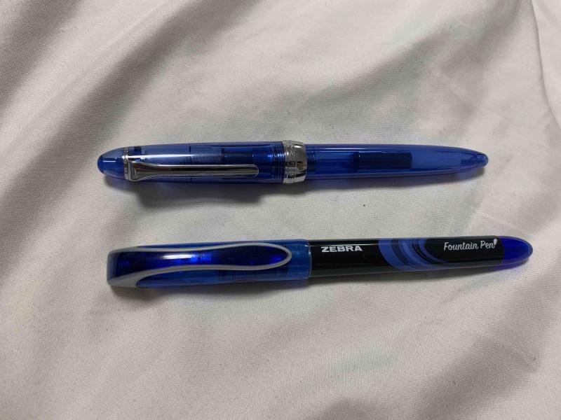
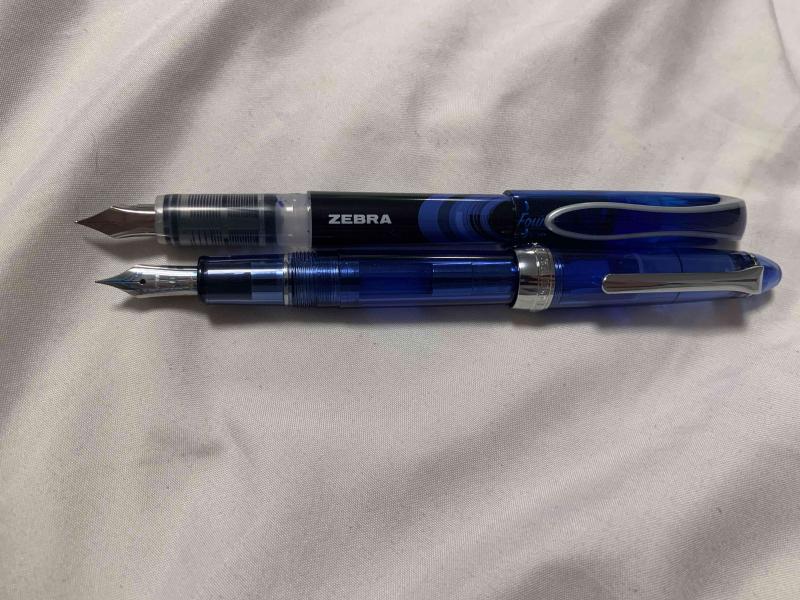
Hello people of FPN! It’s been over a year since I’ve last posted here, I’ve been busy with my first year and a half of college. In the last month or so, though, I’ve started lurking around reading the forums again, and I’ve been wanting to write another review. I just needed to find a pen that was the right balance of inexpensive and interesting, and luckily I found just the thing. As I was browsing the shelves of my college’s bookstore, procrastinating studying for my final exams, the blister pack these pens came in caught my eye. Zebra fountain pens. “An easier fountain pen” the box proudly states. I wasn’t aware that writing with pens was difficult, but that’s neither here nor there. I bought them (obviously, who wouldn’t buy a pack of 4 fountain pens you’ve never seen before for $8), and rushed them home to see what was in store. The single most important and obvious thing about these pens is that they were clearly designed to be a direct competitor to the pilot varsity. They’re made of the same materials with even the same shaped nib. They come in the same colors, and they’re sold on adjacent shelves. Zebra wanted to have a product in the disposable fountain pen market, so they emulated the most popular example of that market. Personally, I’m a huge fan of the varsity, so I’ll always be happy to see more Varsity-style pens enter the market as simple starter pens to help people make the switch and understand what fountain pens are all about. Because these pens were clearly designed to emulate the varsity, and most people have used a Varsity at some point, I’ll be comparing the pens to Varsities for the majority of this review. First off, in terms of appearance these pens aren’t terrible, but they fall short of the Varsity’s design in my opinion. There’s certainly nothing hideously ugly about them, and beauty is subjective so you’ll be able to see the pictures and make your own conclusions about the appearance, but for me the design on the Zebra’s just seems cheap. They are cheap, so that’s fine, but it would have been nice to have a design that’s a bit more clean and polished. The pen compared to a sailor procolor as a reference for size. The pens come in at least four colors (they were only offered in a four pack of purple, pink, blue, and black where I bought them, I’m not sure if more colors exist). The black is a fairly standard black, reminiscent of Parker Quink in shade. It’s not particularly dark, but it is definitely a black. The blue ink is very reminiscent of the typical blue ink you’d find in the average blue ballpoint pen. At first glance of writing with the blue pen, you might expect that it came from a ballpoint. I’m not familiar enough with pink inks to make a good comparison, but it’s what I would call a fairly standard, not too bright but not too pastel pink. As someone who doesn’t usually like pink things, I actually really like this ink color, and I plan on using it in the future. The fourth color, purple, is a pretty dark purple. It’s not so dark that it could be considered a purple-black, but it is definitely a very deep color, and in poor light conditions it can even look black. By now, you may have noticed that I’ve used a lot of words and still haven’t mentioned the most important part of any pen: how it writes. It’s complicated. Pilot Varsities are, in my experience, remarkably consistent. Especially within a particular color, every pen is exactly the same in how it writes and feels. Throughout my freshman year of college, I worked through a box of 12 Varsities, and all 12 felt exactly identical. These pens are not that. Don’t get me wrong, they all write well, and none of them are bad pens by any means, but the nibs on the four pens from the same blister pack offer vastly different writing experiences. Here is a writing sample with the four pens. Please excuse my horrific handwriting and cursive. The black and pink pens are the most similar to each other, and I have the least to say about them. They are pretty much a drier version of a Varsity. Slightly less smooth (probably because they’re more dry) but around the same width and writing behavior. The width is marked on the box as 0.6mm, and I’d call it around a Western Fine / Japanese Medium. The purple pen is wildly different from the black and pink pens. It is a very wet nib, more than a pilot varsity, and the thickness is equivalent to a western medium. Additionally, the purple pen came out of the box with ink on the inside of the cap and some ink on the grip, which may be due to a mix of the pens wetness and being moved around during shipping, but none of the other pens had that happen. There is some texture to the way it writes, it is not perfectly smooth, but the wetness makes up for any scratchiness in the nib itself and offers an enjoyable writing experience. The purple pen arrived with ink on the inside of the cap, the nib, and the grip. The blue pen is again, wildly different. This time, though, it is absolutely exceptional. The width of the pen is what pretty much every manufacturer would call an Extra Fine, and it’s incredibly smooth. I own a number of pilots with 14k fine nibs, and a number of western pens with extra fines of around the same width. This is unequivocally the best writing pen I’ve ever seen at this width. The problem is, these pens are so inconsistent that I don’t think I’d ever find another pen like it from them, no matter how many packs I opened. Still, I plan on using this pen for as long as I can (which I think will be a while with how thin the nib is and how large the ink reservoir is), and then hoping I can find another nib like it sometime in the years to come. All in all, I would recommend these pens. I would have paid the full $8 (and then some) for just the blue pen, but even without that likely fluke, these pens are a solid disposable pen. I plan on buying another pack at some point, and if the blue is like the blue in this pack then I would recommend these pens 100 times out of ten over the Varsity. That being said, if the blue I got really was a fluke, and you have a choice between these and some Varsities for around the same price, I’d probably take the Pilots.
-
These inks will be part of the fade test. Here are the current inks compared. http://www.sheismylawyer.com/2018-Ink/2018-05/slides/2018-05-03_Ink_1.jpg Much to my surprise, you can see some bleed through. http://www.sheismylawyer.com/2018-Ink/2018-05/slides/2018-05-03_Ink_2.jpg
-
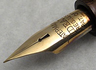
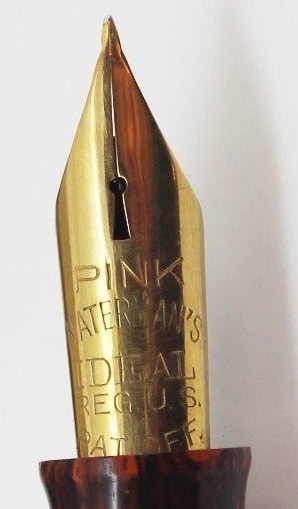
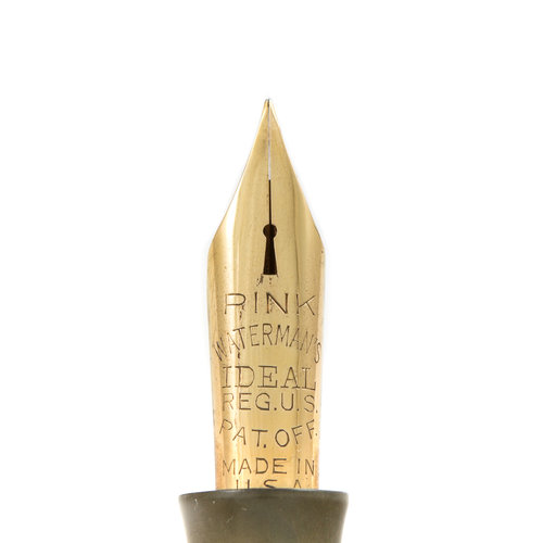
Hello everyone, I am tempted by one Waterman's #7 pen with PINK nib. I mean - I'm tempted to shell out $$$$ and finally get one. I own #7 with YELLOW nib, #5 with RED nib, and several other vintage Waterman's with different nibs. While I was looking at the pen with PINK nib, one thing occurred to me - the tines seemed shorter than what I've seen on a typical PINK nib. Then I've googled images and some previous examples of pens I haven't bought, and I've noticed that some have shorter and some have longer tines. In fact, I thought some nibs (current on sale included) may have their nibs cut (???). Does anyone has any information regarding this? Did Waterman's have different designs of pink nibs i.e. were there any evolution? What I'm worried about is that a nib with PINK inscription may be "corrected" by cutting down the tines - if they've got damaged. So there may be many pink nibs out there with correct metallurgy but incorrect dimensions, being sold for a hefty price as if they were in the original shape and form. Below is some clarification of my question, based on the photos I've found on the internet - one of them is currently on sale... Picture 1 (bellow) - what I consider a proper PINK nib, with tines length and tip shape as designed (I'll call this a benchmark example) Picture 2 (bellow) - another example of a pink nib which is arguably (?) benchmark design Picture 3 (bellow) - "yard find" a bit dirty nib, but it seems accurate Pictures 4 and 5 (bellow) - following are two examples of nibs marked "pink" but... the shape is different. Shoulders are wider, tines are shorter... first one I was contemplating to buy but I am not sure... very pricey for something that may have been altered. Another concern of mine is - if we assume that someone has "fixed" damaged pink nib, thus grinding down easily damaged tines, then re-tipped ... the metal alloy may still allow for extra-flexibility but if the design has changed, using this nib as intended may be pushing it too far - to the damage. It may became similar to RED nib and... well, hence the question and topic for a debate, before I decide to spend money. Thanks!
-
-
-
Here are a couple scans of some pink and purple ink comparisons. All these were written with a glass dip pen on a Rhodia dot pad. I did my best to represent the colors of the inks but as always please remember that what I see on my screen is probably a little different than what you see. I hope that this will at least give an idea of where each of these inks stand next to similar ones I have listed here. I will list the inks in the text also so it will be searchable. Enjoy and I hope these are helpful! http://media-cache-ec0.pinimg.com/originals/f0/d9/29/f0d92944248bba04d46040abc53d79fa.jpg Pink Inks De Atramentis Heather Violet Monteverde Pink J Herbin Rose Tendresse J Herbin Bouquet D'Antan Sailor Jentle Peche Pilot Iroshizuku Kosumosu Pilot Iroshizuku Tsutsuji J Herbin Rose Cyclamen Organics Studio Emily Dickinson Private Reserve Plum Diamine Deep Magenta Noodler's Cactus Fruit Eel Pilot Iroshizuku Yama Budo Organics Studio Lithium Organics Studio Lewis Carroll Levenger Shiraz Noodler's Ottoman Rose Noodler's Black Swan in Australian Roses (Old) Montegrappa Bordeaux http://media-cache-ec0.pinimg.com/originals/dd/f4/6e/ddf46ef824d6c1de85f67e946d81c5d2.jpg Purple Inks J Herbin Larmes de Cassis Private Reserve Arabian Rose Organics Studio Jane Austen Pelikan Violet De Atramentis Pearl Violet Rohrer and Klingner Scabiosa J Herbin Poussiere de Lune Noodler's Black Swan in Australian Roses (New) De Atramentis Aubergine De Atramentis Alexander Hamilton De Atramentis Lilac De Atramentis Magenta Violet Diamine Majestic Purple Diamine Lavender J Herbin Violet Pensee Pilot Iroshizuku Muraski Shikibu Organics Studio Vanadium Nostalgic Impressions Purple Monteverde Purple
-
This past March when I was ordering Style Dee inks, I make the shipping more reasonable I needed another ink. I decided to give this pink a try. I don't have many pink inks. So it got added to the collection. It's probably one of the few that won't remain. There's nothing wrong with the ink. It's a bit drier than other Sailor inks, but probably a somewhat normal dryness compared to other brands. I don't even mind the color, it's a pleasant bubble gum pink. What offends my senses is the neon quality this ink has, so though Sailor used a fluorescent dye in the mix. It turns a perfectly nice ink into something odious in my estimation, which after all may not count for anything at all. If you have a big broad nib, or one of those highlighter nibs, this could be just the ink for your markup endeavors. This ink is pink highlighter marker bright. The color in this ink represents a pink path near one of the watercourses in Osaka. I suspect the brightness is there to capture or represent the sunlight striking that path, making it quite bright and brilliant. The ink is perfectly legible, not light at all. There's no sheen that I can tell. I didn't test water resistance. It is shady on the right paper. This ink can be obtained through any of a number of forwarders in Japan, where basically they buy the ink for you, have it shipped to them, and they ship it to you. Most of these Japanese shops only ship within Japan. So there are extra costs in trying to obtain these kinds of inks. But at least you don't have to travel to Japan and walk personally into the shop to buy an ink.
-
Robert Oster Signature - Plumb Nut Robert Oster is an Australian ink maker that is well-known for its unique range of colours. On his website he describes our shared love quite eloquently: "Robert Oster Signature originates from one of the most famous wine producing regions of the world, the Coonawarra district of South Australia, an idyllic setting with great influence on the senses. There is my inspiration. It's a joy to share it with you." Well, we are certainly fortunate to have inspiring ink makers like Robert Oster to satiate our thirst for glorious inks. This review focuses on Plumb Nut. A big thank you to Catherine from Sakura for providing me with a sample of this ink to play around with - much appreciated ! Plumb Nut is of the pink variety - an ink that is outside my usual comfort zone. This is not an eye-searing pink however, it leans more to the salmon pink variety with some red-brown undertones. As such it's a more muted wall-flowery type of colour that doesn't try to dominate the stage. Plumb Nut works well in all nib sizes. The ink is easy on the eye, with a good contrast on all paper types, even when using fine nibs. The ink shows some nice shading in broad nibs that really enhances the character of your writing. Such shading is mostly absent with finer nibs though, resulting in a flat and - in my opinion - uninteresting look. This ink is definitely at its best with wet and/or broad nibs. Unfortunately, Plumb Nut really hates water. You typically don't buy Robert Oster inks for their water resistance, but this one is rather extreme. The ink has absolutely zero water resistance. Short exposures to water completely obliterate your writing. This is evident from the chromatography - the ink detaches easily from the paper, as can be seen in the bottom part of the chroma. Surprisingly, the ink performed really well on the smudge test, where I rub a line of ink with a moist Q-tip cotton swab. Here, there was only some mild smudging of the line, leaving the text mostly undisturbed. I’ve tested the ink on a wide variety of paper – from crappy Moleskine to high-end Tomoe River. On every small band of paper I show you:An ink swab, made with a cotton Q-tip1-2-3 pass swab, to show increasing saturationAn ink scribble made with an M-nib fountain penThe name of the paper used, written with a B-nibA small text sample, written with an M-nibDrying times of the ink on the paper (with the M-nib)Plumb Nut behaved perfectly on all paper types, without any feathering. The ink's chemistry clashes with Moleskine paper with a sickly colour as a result. Really strange - and I previously observed a similar effect with Robert's Purple Rock. There must be some chemical component he uses that just doesn't work with Moleskine paper. This is a relatively fast drying ink on most papers, with drying times in the 10 second range. In my opinion, Plumb Nut looks best on white paper, and is less good-looking on more yellow paper. I also show the back-side of the different paper types at the end of the review. No troubles there, except with the Moleskine paper, which shows significant bleed-through. Since only masochistic fountain-pen lovers adore Moleskine paper, this is not much of a problem ;-) Conclusion Robert Oster Plumb Nut is a classy salmon-pink ink with a vintage vibe. The ink looks its best in wet/broad nibs on white and creamy paper. It's not so good-looking in fine nibs and on more yellow paper. Unfortunately, the ink has zero water resistance - the briefest touch of water completely obliterates your writing. I did like the way Plumb Nut looks in drawings, but as a writing ink it is not a good match for me : it's not really my type of colour, and I typically use F/M nibs, which are too fine to bring out this ink's character. But I'm sure there are others out there that this ink will speak to. Technical test results on Rhodia N° 16 notepad paper, written with Lamy Safari, M-nib Back-side of writing samples on different paper types
-
It's a PINK. My first pink. I bought this because I wanted to complete my R&K set, and also wanted to try something that is out of my comfort zone. I don't know what to think of this one. It's not bad. It's not ugly. Quite pretty actually. But it's pink. It reminds me of some pink backpacks for little girls. It's just too girlish. I think this one will be my last and only pink. Splash: photo and scan Due to the extreme wetness here, the splash is very red, rather than pink. http://s3.homezz.com/201503/5915/50185_o.jpg Samples (Nonsensical words, featuring a pinky ghost in love. But I forgot the mouth...) http://s2.homezz.com/201503/5915/50190_o.jpg Somehow my scanner makes it much more saturated and much redder. I had to adjust the colour. So this is as far as my Photoshop technique goes. The ink is easily obliterated by water. But it's super easy to clean out of a pen too.
-
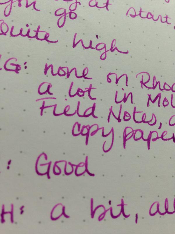
I have a slight pink problem. I have little girls, let's blame it on them. This ink performed really well. It dries really fast, is super saturated, and is surprisingly water resistant for a red. Also, it is seriously solid - really no feathering to speak of even on really poor copy paper. It's in my oldest's Pilot Kaküno so I snagged it for my second ever review - be gentle. First image is a scan, second two are iPhone photos of samples on Rhodia and (bleep) copy paper. http://images4-b.ravelrycache.com/uploads/MrsDrG/440308846/_medium2.jpeg
-
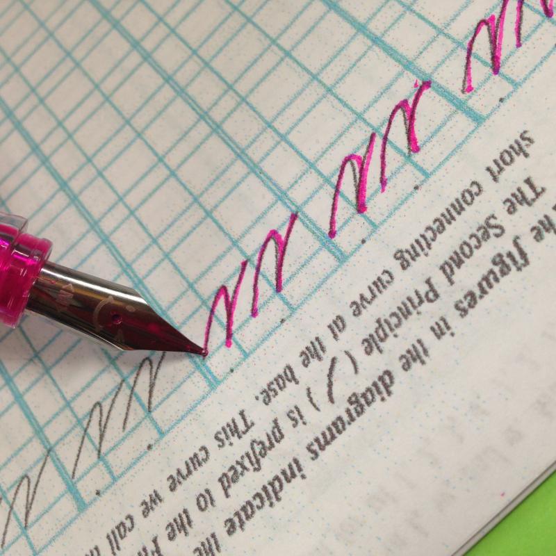
I've been lurking here for a long time but joined today as I saw Noodler's Tchaikovsky and Rachmaninov did not have ink reviews but are both in my possession. I love looking at ink reviews, even the rubbish ones, so I was inspired to make my own modest contribution. This ink is probably not a good choice for lefties, as it takes a really long time to dry (still smearing at 20 seconds), it's also not a good choice for non-FP papers as it feathers like a beast. BUT - it is oh, so, so very pretty. It shades so incredibly richly - like Apache Sunset where it's one colour at the top of a stroke, a completely different one at the base - and my pen seems to really like it. Also, it is freakishly water resistant. Even after 15 seconds and rubbing, the q-tip sample stayed squarely intact. Full page is a scan, close-ups are iPhone photos in natural light on Rhodia dotpad and Field Notes. You guys, the shading. http://images4-e.ravelrycache.com/uploads/MrsDrG/440305860/_medium2.jpeg
-
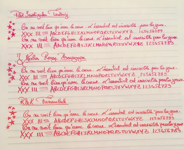
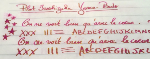
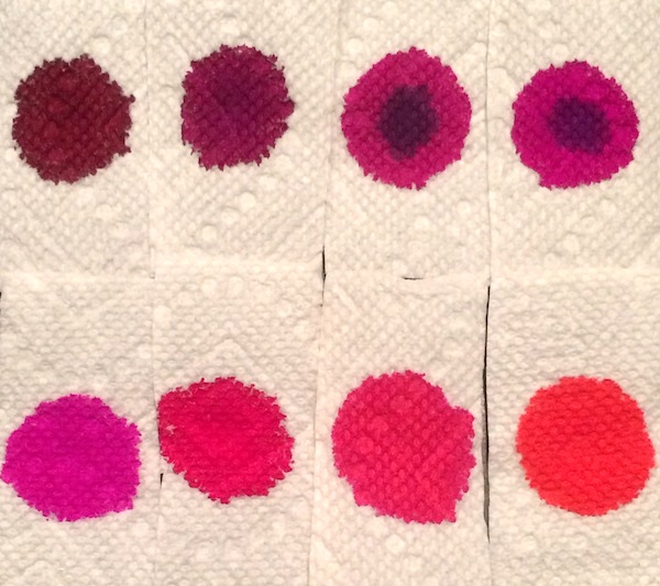
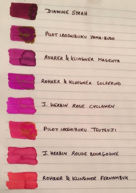
I've been wanting to try some kind of pinkish ink for a while. I didn’t want a pastel or cotton-candy pink, but other than that I was pretty open, so after going through the FPN boards and using the Goulet swatch tool, the eight finalists ranged from burgundy to magenta to purplish and reddish pinks: Diamine Syrah, Pilot Iroshizuku Yama-Budo, Rohrer & Klingner Magenta, Rohrer & Klingner Solferino, J. Herbin Rose Cyclamen, Pilot Iroshizuku Tsutsuji, J. Herbin Rouge Bourgogne, and Rohrer & Klingner Fernambuk. Although I liked some of the colors, I didn’t see myself using pink enough to warrant buying a full bottle (given that I am trying, though not very well , to stick to a stricter ink budget). I didn’t want the samples to go to waste though so I thought it might be helpful to post a comparison on here for anyone else who might also be thinking of going “pink.” The writing samples were done on Rhodia using a random steel nib pen (that I use as a dip pen) and a Pilot Custom 74 B nib ground down to a smooth stub by Mike Masuyama (also used as a dip pen to be able to test all the colors quickly). I’ve included a second set of samples on Tomoe River Paper, since some of these inks (especially given their sheen) could make for beautiful options for special letters, cards or notes on heavily "sheening" paper. PS I would need to ink a pen with it to accurately test its smoothness and flow, but if I had to pick one pink ink that I could see myself using often enough to purchase a full bottle it would be R&K Magenta. Which one of the eight would you pick? 1. On Rhodia: Closeups Ink Swabs 2. On Tomoe River Paper: Closeups Highest "Sheening" Ink Close-up Ink Swabs 3. Ink on Paper Towel: Top Row: Diamine Syrah, Pilot Iroshizuku Yama-Budo, Rohrer & Klingner Magenta, Rohrer & Klingner Solferino Bottom Row: J. Herbin Rose Cyclamen, Pilot Iroshizuku Tsutsuji, J. Herbin Rouge Bourgogne, Rohrer & Klingner Fernambuk
-
In May 2014 Kingdom Note came out with a new line of specialty inks from Sailor based on Mushrooms. At that time they were relatively easy to obtain, but only two of the inks were colors that appealed to me then, so I passed on the others. Recently several became available again as they sometimes do, and I decided to get them. I've learned that the little color circle on the box is only the most general idea of the ink color. The five inks of this series are Amanita muscaria (red) Entoloma virescens (light blue) Stropharia aeruginosa (green) Mycena pura (pink) Trametes versicolor (dark blue) I'd reviewed the two blue inks earlier and the links are above. Pink is not a color I usually buy at all. Far too many are either Barbie-pink, or hot bubble gum pink, or something that completely lacks any subtlety at all. But the color/writing sample at KN hinted that this wasn't like that. I'm glad I included it in my basket as it is a very nice complex, dusky pink, that soft kind of pink you see in sunsets, and perhaps on a certain mushroom. The ink is dark enough for writing, and I've used it a few times in making my own notes about other topics. I actually found myself reaching for it over saturated blues, murky greens, deep purples I have inked in pens. The ink is quite shady in a drier pen. In very wet pens you get less of that, but still a dusky line. The ink has some water resistance that may be a plus for some. The hue is similar to the Noodler's Suffragist Carmine, but it is not as bright as that ink by a good margin. There is no sheen that I can see. This is an interesting pink I think, one appropriate for those who appreciate the subtle. Unfortunately, this ink is sold out again now at Kingdom Note. It seems these are restocked periodically but not on any predictable schedule. I got lucky. Pen: Aurora Ipsilon Deluxe (M-14kt), vintage Drexel syringe-filler with no name nib Papers: MvL=Mohawk via Linen, TR=Tomoe River, Hij=Hammermill 28 lb inkjet, Rhodia=Rhodia 90g ivory. Camera: iPhone 7
-

(P)Ink Shoot-Out : Callifolio Andrinople Vs Edelstein Turmaline
namrehsnoom posted a topic in Ink Comparisons
(P)ink Shoot-Out : Callifolio Andrinople vs Edelstein Turmaline Given that today is Valentines Day, I thought it would be fun to pitch a fight between two inks that are definitely up to the occasion. And what a surprise ! These turn out to be pink inks ! I’m not a pink ink person myself, but these inks crossed my path and somehow stuck in my collection. The inks entering the arena today are L’Artisan Pastellier Callifolio Andrinople and the Pelikan Edelstein Ink of the Year 2012 Turmaline. Both are really vibrant super-pink inks that I would normally dislike, but these two have a certain “je ne sais quoi” that turned my eye. The date being what it is, I thought it would be a perfect time to do a detailed comparison, and find out which of these inks I like the most. Enter... the Ink Shoot-Out. A brutal fight spanning five rounds, where heavyweight inks do battle to determine who is the winner. In the left corner – la petite Française Callifolio Andrinople. In the right corner, das Deutsche Fraulein Edelstein Turmaline. Which champion will remain standing at the end of the fight ? Let's find out... Round 1 - First Impressions Both inks are an eye-searing super-pink. The inks pop from the page – pink and proud – waiting for some joyful writing or drawing. Both are lovely, but there are some differences: The Edelstein ink is more saturated, leaving a well-defined line when writing.Edelstein Turmaline is also very well lubricated, making your pen glide over the page. In contrast, Callifolio Andrinople writes much drier with noticeable feedback from the paper.Callifolio is a more reddish purple, which in my opinion looks more appealing. I like the fact that the colour is more subdued (if it’s possible to say this of a pink ink).Evaluating this round, I find that the French girl has the looks, the German girl the moves. In my opinion, this evens out. For this round, it’s the judge’s opinion that both champions are on par with each other, resulting in a draw. Round 2 - Writing Sample The writing sample was done on Rhodia N°16 Notepad with 80 gsm paper. Both inks behaved flawlessly, with no feathering and no show-through or bleed-through. Pelikan Turmaline wrote like a dream, with very good ink flow and lubrication, and leaving a well saturated line. In contrast, Callifolio Andrinople is much less lubricated, and feels much drier. It also has visibly lower saturation. The Callifolio ink needs broader nibs for a satisfying writing experience. Turmaline on the other hand writes perfectly fine even when using an EF nib. Colourwise both inks look very similar in writing, the reddish undertones of Andrinople becoming more apparent in the broader nibs. Both inks also exhibit some nice and classy shading. The shading is not very prominent – ranging from rose to pink – but it’s definitely present, and enhances the character of your writing. For this round, the focus is on writing, and here the German ink clearly has the upper hand. A solid win for Pelikan Edelstein Turmaline. Round 3 - Pen on Paper This round allows the batlling inks to show how they behave on a range of fine writing papers. From top to bottom, we have : FantasticPaper, Life Noble, Tomoe River and Original Crown Mill cotton paper. All scribbling and writing was done with a Lamy Safari M-nib. Both champions did well, with no show-through nor bleed-through. But this round is not about technicalities, it is about aesthetics and beauty. Are the fighters able to make the paper shine ? Well – the choice is difficult and highly personal (almost a blonde vs brunette thing). In my opinion, Callifiolio Andrinople is the more beautiful of the champions – I find its more reddish appearance much more appealing. The only exception is with Tomoe River paper, where I prefer the looks of Edelstein Turmaline (on this paper it’s a really striking and vibrant pink). For this round, Andrinople gets the upper hand and is granted the victory. Round 4 - Ink Properties Both inks have drying times in the 20-25 second range on the Rhodia paper, with Andrinople the quickest-drying of the two. Both inks also do fine on the smudge test, where a moist Q-tip cotton swab is drawn across the text lines. There is some smearing, but the text remains perfectly legible. The smearing is more prominent though for the Edelstein ink. For the droplet test, I dripped water onto the grid and let it sit there for 15 minutes, after which I removed the water droplets with a paper kitchen towel. Neither of the champions exhibits good water resistance – all that lovely pink writing just disappears, leaving only smudges ! The Pelikan ink leaves some traces of the original though, which might be reconstructed with a lot of patience. The chromatography shows that Turmaline leaves a greyish residue – as was apparent in the droplet test. You can also clearly see that Turmaline is a more intense pink, and one with a surprisingly complex chemical composition (notice the very water-soluble yellow and light-grey components at the top). With Andrinople, the chroma shows the more prominent existence of the red undertones. In this round, both inks show more or less the same behavior. Andrinople dries a bit quicker and is a bit more smudge-resistant. On the other hand, Turmaline is more soak-resistant (in comparison with Andrinople that is – both inks score very low for water resistance). There is no clear winner in this round. Round 5 - The Fun Factor Welcome to the final round. Here I give you a purely personal impression of both inks, where I judge which of them I like most when doing some fun stuff like doodling and drawing. Both inks do well, and the lack of water resistance allows for nice effects when using a water brush. I really enjoyed using them. Pelikan Edelstein Turmaline was easier to draw with using a fountain pen – no doubt owing to its better lubrication. When using a brush or dip pen, you won’t notice the drier feel of Callifolio Andrinople though. On the other hand, I really like the somewhat more reddish appearance of Andrinople. On the light side of these inks’ colour spectrum, they produce an almost identical light-rose colour. It’s only on more saturated parts that Turmaline shows it’s more pinkish nature. I really wanted a clear winner for this round, but in all objectivity I have to admit that both inks were on par with each other. Both inks dealt some good punches, but neither of them dominated the fight. I had a great time using them both ! So for this round, I have no other choice than to declare a draw. The Verdict Both inks are joyful, lively and vibrant pinks that are guaranteed to bring colour to your page. For writing – Pelikan Edelstein Turmaline is technically the superior ink. In the looks department, I definitely prefer Callifolio Andrinople myself. In this fight, both champions put on their best show, but in the end no clear winner emerges. So – as a first in this shoot-out series – I leave it up to you to pick your winner. If you prefer blondes, go for Pelikan Edelstein Turmaline. If you prefer brunettes, the French ink Callifolio Andrinople is an equally good choice. And in case you’re interested: my own vote goes to Callifolio Andrinople ;-) Postscriptum: in case you want to buy a bottle – be aware that Pelikan Edelstein Turmaline was a limited edition ink that is no longer produced. You can still pick up a bottle of Andrinople though, and use the occasion to explore some other Callifolio inks. I’ve done so myself, and never regretted it. -
I didn't expect to like the color of this ink as much as I did. I'm not usually a fan of pinks, but winter has me craving more lively colors. I was afraid this would have too much orange for my liking, but it is a very nice blue-pink that is moderately saturated. It performs very well & dries quickly. The flow is average, but it is a little bit drier than other KWZ inks I've used.
12_58_52.thumb.png.e1966e2f738e9054f7f9141326018311.png)
13_46_31.png.8d4da56ca7f0670ab61cf0b0bac800cb.png)
13_46_44.png.e2f3beba9bb3a83bd931d0bd2db4abb6.png)
13_47_32.png.5921629837f65e73fc8dc7b887013dd4.png)
.jpeg.3fb6cefa506627917f519adf776a7696.jpeg)
13_53_04.png.dbc459861d528a392292b1a30af637c1.png)