Search the Community
Showing results for tags 'pilot 912'.
Found 5 results
-
I very much like the austere formality of the Pilot 912 and thought that an MS nib would off-set that nicely. The pen arrived and I inked it up right away with Monteverde Copper Noir. Oh dear. The nib is a fire hose! So wet and hard to control. What to do? I recalled a recent thread extolling the virtues of Kiwa-Guro. I purchased a bottle. Analogous to putting high performance tyres on a car! I now have traction, control, the nib hugs the page and allows for precise manoeuvers. edit to add: and crisper lines Fantastic!! Now I can comfortably use this pen. Only thing is, the ink is black. I have no problem with black. I like black, but it’s only black, and I’ve become quite fond of KWZ Walk Over Vistula. So much so that I’m ashamed to admit I have three bottles. So I seek advice on inks with similar characteristics, that are more colourful, which exhibit shading. Maybe Pelikan Edelstein? Topaz in particular? Lgsoltek speaks of it’s lack of lubrication, which may be a good thing is this context. https://www.fountainpennetwork.com/forum/topic/314698-pelikan-edelstein-aquamarine/ Like the shading here! Thank you Sandy1 https://www.fountainpennetwork.com/forum/topic/174538-pelikan-edelstein-topaz/ Or making it a little darker, as shown by sansenri. https://www.fountainpennetwork.com/forum/topic/308805-aquamarine-pelikan-edelstein-ink-of-the-year-2016/?p=4155306 I thank you for your insights and advice.
-

Best Black Ink For A Pilot Custom 912 With Spencerian Customization (Mottishaw)
holgersson posted a topic in Inky Thoughts
i have just bought a pilot custom 912 customized by john mottishaw to a spencerian. does anyone have experience with this set up, and if yes, any recommendations regarding black ink in terms of ink flow, feathering, bleeding etc.? thanks. best, nils -
Best Notebook For A Pilot With Spencerian Customization
holgersson posted a topic in Paper and Pen Paraphernalia
i have just bought a pilot 912 with spencerian customization (mottishaw). any recommendations for a notebook that can handle the greater ink output (without feathering, bleeding etc.)? thanks in advance. best, nils -
Hello FPN, Here's yet another Zebra G hack. I had an extra Pilot 912 that was gifted to me and extra titanium coated Zebra G nibs I wasn't using so I figured why not. Maybe a crazy thing to do with a $150+ pen, but I sure like it a lot better now! I like dip pen calligraphy and I even like the action of going slow and dipping the pen for every word because I'm a masochist I enjoy the soothing nature of it and the purity of it all; puts me in some kind of meditative state. Sometimes you just want to write without stopping though and add some flair to boot. I was looking at various Zebra G hacks for pens; JinHao, Noodler's, Ranga etc. and seeing that poor unused Pilot gave me an idea: the Pilot 912 "G". Knowing that flow is always an issue, I modified the feed by deepening the ink channel with an x-acto knife. The Zebra G nib won't fit snugly onto the feed because the feed is too wide. So I took my x-acto knife and started shaving off material on the top and top-side areas of the feed in a way that would make the nib fit flush. Then I took fine grit sand paper to smooth it out and sanded down some other areas to make it fit well. The feed tip wasn't flush to the underside of the nib (there's space) so I put the feed in some very hot water then took it out and held it in place so as to alter the shape slightly, pushing the feed tip upwards towards the underside of the nib. Had to do it a few times (this was the trickiest part for me and I probably didn't even have to do it if I shaped the feed to the nib better by sanding it). The Zebra G nib is too long and the feed sits too far back when both are pushed in, so I took my trusty Dremel tool and in two to three minutes grinded down the back edge about a quarter of an inch keeping the same rounded shape, smoothed it out with fine grit sanding paper and cleaned the nib properly. Fit the feed and nib back into the section, inked it up with Iroshizuku just to keep it all Japanese (no it's actually fantastic ink), and there you have it. I rarely have to prime it and it almost never railroads unless I'm writing feverishly fast. I left it capped (cap fits fine) horizontally for a couple hours and came back and it started right back up again and no leaks so far.

-
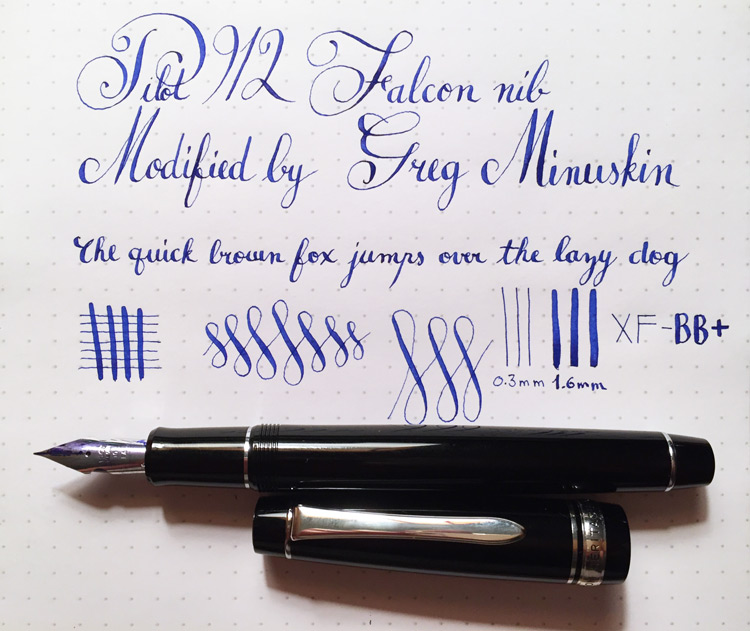
Hello, I wanted to share my impressions on the Pilot Custom Heritage 912, with a modified Falcon nib by Greg Minuskin. I'm neither a calligraphy expert nor a flex-nib expert so this review is from the perspective of a more novice user, therefore I would like to caution the reader to take my input for what it's worth. There's plenty of information out there on the Pilot 912 in general so I won't go into much detail, suffice it to say that the pen is well-constructed, solid and elegant; it's the bee's knees in my book. I don't have any experience with the original Falcon (#10 FA) nib so unfortunately I cannot compare this modified nib with it. From what I understand, Mr. Minuskin's modifications to the FA nib include re-tipping it to a "needlepoint" size, added flexibility and increased ink-flow, presumably by altering the feed. Understandably, Mr. Minuskin did not want to reveal the specifics of his modifications when asked and I can respect that. Using this particular pen can be a bit of a challenge for someone who is not used to calligraphy or flex-nibs. The needlepoint nib requires a very light touch and when not flexed it really does feel like a needle. Sometimes it feels like you have to almost hover the point over the paper to prevent it from catching, especially on the upstrokes. After practicing with this pen it becomes clear that mastering posture, speed, rhythm and pressure is paramount for good results. My experience has been that writing with the pen a certain way (the wrong way) will increase the occurrence of railroading, trembling lines when not flexed, dry starts etc. However, when concentrating on using the correct methods these issues rarely occur and the pen really begins to shine. I don't have any trouble flexing the nib while writing, meaning it does not feel too soft or too rigid and it definitely becomes more flexible the more it is used, as is to be expected from a new nib. I wish I had experience with vintage flex pens in order to compare but I don't, so please keep that in mind while considering my observations. The line variation from my rough measurements go from ~ 0.3 mm to ~ 1.6 mm. Line grading is a bit of a subjective thing but if I use a well-known vintage pen seller's system this would amount to a XF - BB/BBB. Mr. Minuskin put it best when he described this pen as a bit of a "race-car," meaning that just because I know how to use a pen (or drive a car) doesn't necessarily mean I'm going to know how to use this particular flex-nib (a race-car). Without previous experience you're going to have some "clutch-grinding" and "stalled-engines" and maybe even a "wipe-out" on the corners if you've got a heavy foot, so to speak. However, if you're more from the cautious and patient side of the fence and tend to be a quick learner you shouldn't have any major issues even without much flex-nib experience. Start slowly and cautiously and the more you practice the more you'll find your skills improving. If the prospect still seems daunting there are always very inexpensive and excellent dip pens for calligraphy to get used to flexible nibs, and honestly if your goal is strictly artistic calligraphy, dip pens would probably be a better choice anyways. If you want a new, higher end, stylish, well-constructed fountain pen with a flexible nib it's hard to overlook this one. It wasn't exactly cheap, but this doesn't mean it's not worth the price considering that it's a relatively higher-end pen to begin with and one-of-a-kind after being individually modified by hand. Whether that is worth the price or not is entirely a matter of opinion, but since this is my opinion here and since I've already purchased it I will say that it is worth it indeed (for price information check Mr. Minuskin's website). I've included a writing sample. Consider that this was made from someone who is not an experienced calligrapher or flex-nib user but I do have experience with design, drawing, decorative writing and cursive (thank you Italian primary schools.) As you can see there is room for improvement but for me the process of learning and improving is where all the fun is anyways. The hardest things for me have been obtaining smooth, non trembling lines when the nib is not flexed, avoiding railroading and correct proportions/consistency of letters. The line is *very* fine when not flexed and the point is needle sharp so it's definitely a challenge to obtain good results. Now and then my finest lines end up looking like a seismogram during an earthquake. However, I've already seen improvement from when I first started using the pen so I'm confident I will continue to improve with more practice. I hope this review will be of use to somebody and thanks for reading. Further notes: * Pen comes with a CON-20 converter instead of the CON-50 or CON-70. When asked about the converter Mr. Minuskin told me that when it comes down to ink flow the CON-20 is actually the better choice, and I have read about other people having ink-flow problems with the other converters so for now I will stick with it. Apparently there is something about those more complex mechanisms and how they function that reduces the flow of ink, which seems to be an important issue with flex-nibs. I might purchase one of the other converters or refill a cartridge with Iroshizuku ink just for experimenting in the future. * As mentioned earlier I do have some railroading issues here and there but definitely less so with what seems to be more proper posture, speed, pressure, etc. This leads me to believe that it's not so much the pen's fault as much as how it is being used. Again, this is a persnickety tool and as with most performance or precision tools good results come from precise and proper use. It won't magically write better for me just because it is designed to; that's up to me. * For practice purposes I've been using Rhodia's Dot Pad with Pilot's Iroshizuku ink. This combination seems to work very well but I will experiment with different paper in the future.