Search the Community
Showing results for tags 'peter pauper'.
Found 3 results
-

The Paper Plane - Peter Pauper Journal
namrehsnoom posted a topic in Paper & Pen Paraphernalia Reviews and Articles
The Paper Plane – Peter Pauper Jounal I’ve been enjoying this little corner of the web for some time now, mainly focusing on inks and pens. But these are more or less useless without the humble paper or notebook that will let you capture your thoughts. So here comes the “Paper Plane”, where I review some of the paper and notebooks that I’ve enjoyed using over the years. Today’s guest is the Peter Pauper notebook, and more specifically the bookbound version of this nice piece of stationary. A bit of history (from the peterpauper.com website): “in 1928, at the age of twenty-two, Peter Beilenson began printing books on a small press in the basement of his parent’s home in Larchmont, New York. Peter – and later his wife, Edna – sought to create fine books that sold at prices even a pauper could afford. Today, still family owned and operated, Peter Pauper Press continues to honour its founders’ legacy – and its customers’ expectations – of beauty, quality and value.” Peter Pauper journals look great, with truly beautiful cover designs. The question remains: are they also suited for writing with a fountain pen? With this review, I’ll try to answer that question. For the purposes of this review, I got me a copy of the Haiku Journal – with a stunningly beautiful cover design. A piece of art that encourages you to set aside some time in the evening for quality journaling with just yourself, your pen and the paper. The size of the journal, 159x216mm or 6¼ by 8½ inch, is about standard A5 size (148x210mm). Peter Pauper journals come in different sizes, and with a huge selection of beautiful cover designs, so you’re sure to find some that are to your liking. The Haiku journal looks and feels high quality, and contains 160 pages of light ivory-coloured 120 gsm paper. A single ribbon is the only extra feature, and can be used as a bookmark. As far as I know, their journal series notebooks only come with 8mm lined paper. Which is a pitty, since I prefer blank pages for my journals. I like the open nature of that blank page, which gives you more creative freedom: you can draw, write large or small, horizontally or vertically … with a blank page, possibilities are endless. For me, the lined format is a negative. Another thing to be aware of: the margins in Peter Pauper notebooks are large … really huge... enormous... gigantic. Linespacing of 8mm is ridiculously wide, so in my notebook there’s only room for 22 lines of text per page – that’s not a lot! Even worse, margins are unnecessarily wide: 10mm left and right, 14mm at the bottom of the page and a whopping 24mm at the top. That’s a lot of wasted real estate (about 28% lost space per page). And yes, I know you can write on these parts, but writing outside the lines just doesn’t feel right to me… Another reason why I prefer blank pages. For a fountain pen user, the most important part of a journal is its paper. Let’s have a closer look to see if it’s fountain pen friendly. Peter Pauper paper has a nice off-white ivory colour, that is gentle on the eyes in any lighting conditions. It’s also acid-free paper, making it very durable – your notebooks will easily survive for centuries when proper care is taken. The 120 gsm paper is very smooth but still shows a bit of friction, resulting in a nice feel when writing on its surface. But there is something to be aware of: I noticed that your nibs write about a size wider when using this paper, i.e. an F nib shows like an M, and a medium nib writes like a broad. Strange but true. And I’m not the only one who noticed this – look around a bit on the internet, and you’ll find that this is an experience shared by many users. Not a huge deal, but certainly something to be aware of. The paper itself is excellent, although colours look a bit muted (which I happen to like). Technically there are no complaints: no feathering, no see-through or bleed-through with normal use. On my test page, I tried some heavy saturation in some spots (writing multiple times over the same spot on the page) and it’s only in these circumstances that I succeeded in bleeding through the paper. This is certainly a notebook where fountain pens are at home. Conclusion Peter Pauper journals look fantastic and are certainly fountain-pen friendly. For me personally though, there’s a couple of things that bother me. First and most important: please provide us with a blank page option! For me, the lined version just doesn't cut it – so much wasted space! A version with blank pages would elevate these notebooks to new heights! Second – you need to be aware that nibs write a size larger than usual. Not a huge deal, but also not what you would expect. For now, these Peter Pauper notebooks are absolutely no competition for my Paperblanks journals. But give them blank pages, and I would certainly be tempted! As far as I’m concerned, leaving out the lines would be a true game-changer… Peter Pauper Press… are you hearing me? -
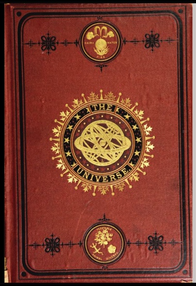
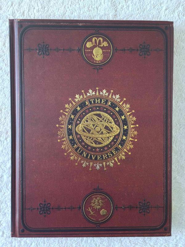
Peter Pauper Press Universal Journal
Lunoxmos posted a topic in Paper & Pen Paraphernalia Reviews and Articles
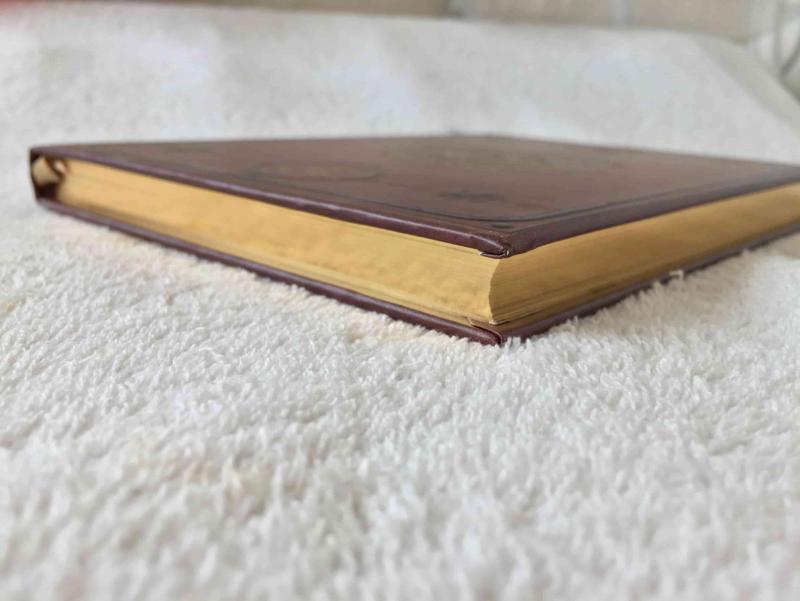
I have been looking for a suitable book do start my commonplace book in, and after some searching and thinking I decided to choose the Peter Pauper Press Universe Journal. I was attracted not only by the cover, but also the mention of "archival paper" being used in it. I received the book today, and seeing the general lack of information on Peter Pauper Press products in comparison to Rhodia, Clairfontaine, Tomoe River etc, I have decide to do a bit of an overview. The cover itself is supposed to replicate the the binding of The Universe: or The Infinitely Great and the Infinitely Little, which was a layperson's encyclopaedia of the sciences by the Frenchman Félix-Archimède Pouchet, and was published in London in 1870. Compared to the picture from archive.org, it appears that the modern cover is relatively faithful to the original: However, the size of the modern adaption is different, coming up to around 162x218mm, or 6 3/8 x 8 1/2 inches. The paper itself is relatively smooth, and is 100gsm. If you want an idea of what it feels like, think Clairefontaine 90gsm ivory brushed vellum paper, but with a little bit more texture. In addition, the paper is supposedly acid-free and archival. I say "supposedly" because these words do not technically have concrete, standard definitions. An interesting feature is the gold edges of the book: In addition the lines in the journal are relatively faint, at least compared to the lines in a Rhodia Webbie. They're not solid, but instead are dotted. I like this feature as it provides a guideline without being too distracting. The book claims to lie flat. Unless you are an extreme perfectionist, this statement is true. Yes, you will get some bulge, but that is to be expected. It lies flat enough for me. I have not gotten around to writing in it yet, as I am currently waiting on some ink (Rohrer & Klingner Zeichentusche Sepia) which I aim to use exclusively in this book, so I will post a writing sample when I have to opportunity to do some writing in it.
-
I am nearing the end of a Paperblanks notebook that was a gift. The decorative cover is quite appealing, but for my next journal, I'm hoping to get something that is better on a few functional points. Love these kinds of covers: http://images.utrechtart.com/products/optionLarge/Paperblanks/Paperblanks-Ventaglio-Rosso-64024_lg.jpg http://i.walmartimages.com/i/p/97/81/44/13/10/9781441310415_500X500.jpg http://www.lecadeauartistique.com/im/articles/carnet-paperblanks-safavide-ultra-details.jpg http://ecx.images-amazon.com/images/I/61s9N0-poCL._SY300_.jpg http://images.utrechtart.com/products/optionRegular/Paperblanks/karakusa_X.jpg The notebook I'm finishing up has a magnetic flap closure, which adds a lot of useless weight and bulk—a pain when traveling. The paper is decent, works with some inks and not others, shows no shading, but dries fast. The line spacing is also a bit wide. Some of the Peter Pauper notebooks have beautiful covers, but the lines are absurdly wide for my handwriting. 90% of my writing is with EF western nibs. On the paper, a little ghosting is fine, but bleed-through is not acceptable. If the paper is very thin, I'm good with writing on just one side, but it had better make up the difference with a good page count. Don't like add-ons in notebooks: maps, historical notes, holidays, pockets, weight and measure conversion tables. They just and weight and bulk. Ribbon bookmark are nice, but I'm not going to say "no" to a notebook that doesn't have one but is otherwise good. So, in sum: Ornate, decorative cover—but not cartoony or girlishLined, with a narrow ruling, preferably around 6mm5x7 to 7x9 inches or something in the A5, B6, A6 rangeLays flat or close to flatCream/off-white paperHardcoverNot more than 1 inch thick, preferably less than 3/4Not full of extrasAny suggestions for notebooks that fit these requirements?