Search the Community
Showing results for tags 'patron of art'.
Found 10 results
-
From the album: OldTravelingShoe's Random Pics of European Fountain Pens
© (c) 2022 OldTravelingShoe. All rights reserved.
- 0 B
- x
-
From the album: OldTravelingShoe's Random Pics of European Fountain Pens
© (c) 2022 OldTravelingShoe. All rights reserved.
- 0 B
- x
-
From the album: OldTravelingShoe's Random Pics of European Fountain Pens
© (c) 2022 OldTravelingShoe. All rights reserved.
- 0 B
- x
-
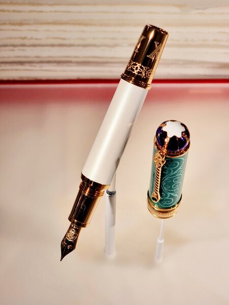
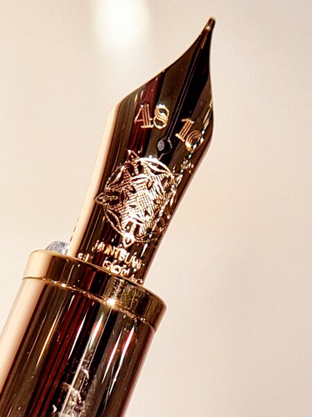
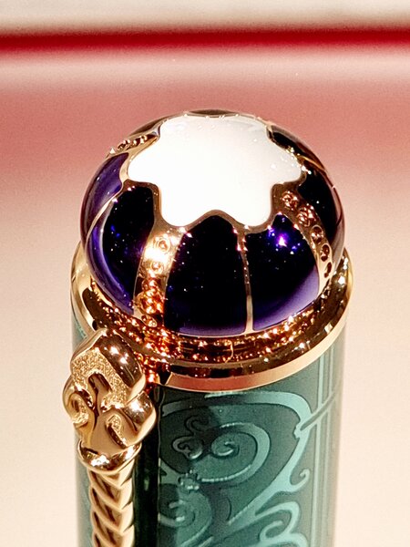
Introduction Montblanc started the release of the Patron of Art series in 1992 and each release commemorates famous individuals making great contributions to the arts and culture. Released in spring, these issues only consist of a fountain pen in a lacquered wooden box. Two versions of this series are issued: the 4810 version (limited to 4.810 pieces) and the 888 version (limited to 888 pieces), made of more precious materials. The Montblanc Semiramis is a pen from these series and dates from 1996. The pen under review here is the 4810-version. boxes and booklet This beautiful pen is a tribute to Semiramis. She is credited with the creation of numerous cities and the construction of beautiful buildings in the city of Babylon, such as the Ishtar Gate and the 2nd world wonder the Hanging Gardens of Babylon, as well as her contributions in the fields of writing and architecture. For ancient Greeks Semiramis was the legendary queen of king Ninus, succeeding him to the throne of Assyria and was queen for 42 years. Nearly every stupendous work of antiquity by the Euphrates or in Iran seems to have ultimately been ascribed to her. However, Diodorus stresses that the Hanging Gardens of Babylon were built long after Semiramis had reigned and not in her time. semiramis A real and historical Semiramis or Shammuramat (the Aramaic form of the name) was the Assyrian queen of Shamshi-Adad V (ruled 824 BC – 811 BC), king of Assyria and ruler of the Neo Assyrian Empire. She was regent of the empire for four years until her son Adad-Nirari III came of age. This part of history links Semiramis to another Montblanc Patron of Art pen: the Max van Oppenheim (I will write about that one another time). Semiramis with Oppenheim He was a German archaeologist and discovered a settlement now called Tell Halaf. This site dates to the 6th millennium BC and was later the location of the tributary (to the Assyrian empire) Aramaic city-state of Guzana. After a brief period of independency the city was plundered by Semiramis and in 808 BC the city and its surrounding area were reduced to a province of the Assyrian Empire. Well, after some legend and history back to the pen now !! Appearance & Design (9/10) For me the Semiramis is one of the more attractive pens of the Patron of Arts series. It comes in a beautiful red lacquered wooden inner box with booklet, red outer box & white cardboard box sleeve. On the wooden box there is a lion figure like the ones on the Ishtar Gate (well sort of a lion, when you pay attention you can discover more animals in it). palace of semiramis semiramis in bed The cap and barrel of this piston filled pen have delicate gold plated fretwork over resin. At the top of the cap and the bottom of the barrel / piston knob) there is no fretwork but black resin only. This is in appearance the big difference with the 888-version: in that version top and bottom are in gold too. The very detailed gold filigree has inlays of red enamel lacquer. It’s a floral decoration finished with motifs inspired by the Hanging Gardens of Babylon (although nobody really knows how that gardens looked like). The lion figure of the Ishtar Gate you find on the wooden box, comes back on the clip in gold on red enamel. The capring holds the name of the company and the number of this edition. The pen has a 18k – 750 golden nib (size F) which is decorated with an interpretation of the Ishtar Gate and engraved with the year of issue (1996). It’s not a very large nib but suites the pen well. semiramis overview 1 semiramis overview 2 Construction & Quality (9/10) The pen feels very solid. The gold plated fretwork is of high quality and very detailed. The pen opens smoothly with 1,5 turn of the cap. The piston works very smoothly as well. semiramis overview 3 semiramis cap detail Weight & Dimensions (8/10) Some pen-statistics: Length capped: app. 14,8 cmLength uncapped / unposted: app. 12,3 cmLength posted: app. 14,4 cmLength pen cap: app. 6,7 cm Diameter: app. 1,3 cmWeight capped: 52 gramsWeight uncapped: 29 grams So uncapped and unposted it is not a very large pen as well in length as in diameter. I think that is the main reason I did write with this pen just ones. Because, I write with my other limited and special edition pens very often ... Nib & Performance (.../10) The pen has an 18k – 750 golden monotone fine nib. I can’t really evaluate this part of the pen though: I only dipped this pen once to test write it. And yes, it did write! But I can’t remember how well it did this job. After test writing I put it back in its box and used the pen for eye candy only. Yes I know: It's a shame! semiramis nib Filling System & Maintenance (8/10) The pen has a piston-filling mechanism for use with bottled ink. It is what I expect with this kind of pens. The piston runs smoothly. I cannot say how it holds with regular use, because I never filled the pen. Cost & Value (9/10) Because Semiramis is one of the older Patron of Art pens, she has become a rare Queen this days. That reflects in asking prices. I bought this Queen a couple of years ago and for me considering the detailed finishing, golden nib and the wooden palace she brought with her, she was worth it. Conclusion (Final score, 4,3/5) This Queen has great looks and the finishing, golden nib and very detailed craftwork makes her special to me. She just deserves to be observed very carefully and very closely, because It is then when you really, really appreciate the thorough work of its thin shell, especially in the sensitivity of the alternation of red lacquer with gold. That said: The more time I spend with her, the more I fell in love with her. semiramis overview 4 So, it’s clear I can enjoy her looks every time I open the red lacquered wooden box and see her again, and again, and again ... But in contrary: pens are not made just for looking at, they are made for writing, aren’t they not? And that is a little of a problem here: I don’t write with this pen. So, in a sense I neglect my Queen. She just crumbles away in her beautiful wooden palace, bit by bit. Hoping for the best. For being written with. Of course with some nice royal ink. Therefore, I think, in the end I have to let her go, despite her great looks. She deserves a better life with inks of joy. But till then, I simply enjoy having her around; impeccable eye candy!!
-
Review Montblanc Patron Of Art Karl Der Grosse; Picture Heavy!
Mainecoon posted a topic in Fountain Pen Reviews
Introduction It has been a while, since I reviewed a pen. I was falling back to a patern of lurking around on this beautiful forum. So now it’s time to contribute again. I’m doing so in reviewing this “Hommage à Charlemagne”; a beautiful pen from the Montblanc Patron of Art series. With this series Montblanc honors people who have devoted their lives to the promotion of art and culture. Montblanc started the release of this series in 1992 with the Medici pen. These limited editions only consist of a fountain pen in a lacquered wooden box and are released in spring. Two versions of this series are issued: a 4810 version (limited to 4.810 pieces) and an 888 version (limited to 888 pieces), made of more precious materials. The pen under review here is the 4810-version. Issued in 2000 it is the ninth in Montblanc's Patron of Art series, paying tribute to one of the great figures of world history: Karl der Grosse. In that year it was 1200 years ago Karl der Grosse – Charlemagne / Charles the Great – was crowned Holy Roman Emperor at Old St. Peter's Basilica, Rome. Called the "Father of Europe", Charlemagne united most of Western Europe for the first time since the fall of the Roman Empire and laid the foundations for modern France and Germany. The expanded Frankish state Charlemagne founded was called the Carolingian Empire. His rule spurred the Carolingian Renaissance, a period of energetic cultural and intellectual activity within the Western Church. Charlemagne died in 814. He was laid to rest in his imperial capital of Aachen, Germany. His reign and the era it ushered in are often referred to as the Carolingian Renaissance because of the flowering of scholarship, literature, art, and architecture which characterize it. Charlemagne, brought into contact with the culture and learning of other countries due to his vast conquests (especially Moorish Spain, Anglo-Saxon England, and Lombard Italy), greatly increased the provision of monastic schools and centre’s for book-copying. He took a serious interest in scholarship, promoting the liberal arts at the court, ordering that his children and grandchildren be well-educated, and even studying himself (in a time when even leaders who promoted education did not take time to learn themselves). He also introduced reforms in the field of (organization of) church, writing (standard grammar and the famous Carolingian minuscule, a more efficient writing system) and politics. Well, history is nice, but a pen is nicer. So up to the pen now! Appearance & Design (9/10) The (sealed) Charlemagne pen comes in a lacquered wooden inner box with booklet, an outer box with a picture of a peacock mosaic (on the booklet there is another part of the same mosaic) and a white cardboard box sleeve. On the dark green wooden box there is the signum (signature) of Charlemagne (KAROLUS) and the Montblanc logo. peacock showing the box I was wondering about that peacock mosaic you find on the outer box and booklet. I didn’t find anything about it, let alone that I could relate it directly to Charlemagne. I could only find something about the peacock in medieval Europe in general: The peacock was a symbol of immortality because the ancients believed that the peacock had flesh that did not decay after death. The bird, which replaces its feathers every year, also became a symbol of renewal and resurrection in early Christian and Byzantine culture. Peacock imagery appears in early Christian tomb paintings and mosaics, especially concerning the resurrection. In the original home of the peacock, India, peacocks symbolized royalty and power. pen in the box The barrel and cap of the pen itself (Edition 4810) are crafted from faceted 925 sterling silver with a gentle spiral twist. The silver has a satin finish. The openwork gilded motifs on black resin of the mountings on cap and barrel are made to the bronze doors (from the 9th century) of the octagonal "Palace Chapel" of Charlemagne, which was built between 796 and 805. The hand-worked, rhodium-plated, two-toned nib in 18 karat gold is decorated by an engraving of an early Medieval pattern and the emperor’s monogram. Right under the monogram are the numbers 4810, the Montblanc logo with the year of issue of the pen and “montblanc”. The engravings “750” and “18k”can be found resp. at the left and right side of the nib. cap and nib cap and barrel band The number of the pen is on top of the cap, just beneath the upper gold plated ring, next to the clip. The silverstamps are placed on the cap as well, just above the lower gold plated ring. The clip is bejeweled with an onyx sphere. silverstamps clip and gold plated rings Construction & Quality (9/10) The pen feels very solid and capped / posted it is rather heavy. The pen opens / closes with a ca. 1,5 turn of the cap. The piston works very smoothly as well. So nothing to complain here for me. When closed, the cap shifts over de top barrel ring; the pen then seems smaller than he really is. the cross how far will the cap go? Weight & Dimensions (8/10) Some pen-statistics: Length capped: app. 13,9 cmLength uncapped / unposted: app. 12,4 cmLength posted: 16,3Length pen cap: app. 6,6 cmDiameter: pen: app. 1,7 cm on the barrel, on the grip: 1,0 cm, on the top of the piston knob 0,9 cmWeight capped: 58 gramsWeight uncapped: 30 gramsWhen using it unposted, it is not a very large pen. But the pen can be posted and the cap then adds some weight and length to the pen. I prefer writing it unposted: I don’t need the extra weight – although I could use the extra length – and the balance is imho better unposted. It is better for the pen as well (you could damage the lower barrel ring when posting). Nib & Performance (7,5/10) The pen on review here has a rhodium-plated, two-toned 18k – 750 golden fine nib. Montblanc gives his POA’s standard from factory a fine or medium nib. If you want a different line on your paper, the pen has to go on a holiday to Hamburg for a while for a nib exchange. This could be a disadvantage for some of us. But for me it’s ok. With this nib I manage to get a line on the paper between fine and broad, depending of the pressure. So, the nib didn’t decide yet what it should be. However, it writes it’s lines smoothly with just a little feedback. The line the pen writes is a little on the wet side. You can use the nib backwards for an extra fine line (sometimes I do that, when making notes in a text). f-nib Filling System & Maintenance (8/10) The pen has a piston-filling mechanism for use with bottled ink. It is what I expect with this kind of pens. I use this pen frequently and the piston still runs very well. It holds a middle amount of ink: I can write just over a couple of days with this pen on one fill (Yes, I don’t write very much ). Cost & Value (9/10) Always worth discussing. I like this pen very much and I enjoy writing with it. And imho: that counts a lot! I think the pen gives good value for money given the used materials and finishing as well (not only for the pen but for its box as well), even for the original retail price. Conclusion (Final score 8.4) So, we have to come to a conclusion now. In short: I like this pen. I like it a lot. Maybe I should say: I love it. It is the twist that I like the most; it makes it special and makes I want to hold it, play with it (yes, I do that sometimes with some of my pens J). Furthermore: It writes very well. peacock showing pen This is a pen that definitely will stay in my collection for a long, long time. It has made some serious writing hours already and there are more to come. Yes, it is a very nice not to heavy silver pen, well balanced and an easy writer, this pen with a twist. -
Montblanc: Alexander Von Humboldt. Patron Of Art (Poa) 2007
OngL posted a topic in Fountain Pen Reviews
About the Patron Alexander von Humboldt's travels through distant continents and research of foreign cultures made him the first German cosmopolitan. The naturalist and cultural patron was born in Prussian Berlin during the age of Enlightment and later travelled the globe to explore new horizons. Humboldt discovered a rich new world of flora on his great South American expedition (1799-1804) and researched the language and culture of the native Indians. The result was "Kosmos" a literary lifework in which Humboldt expounded on the knowledge gained through his travels and research. Information Launch: 2007 Limitation: 4810 (Another edition is 888) Characteristics: Black grenadille cap and barrel, 925 sterling silver inlays and Platinum-plated 18K Gold nib with an engraved sextant Official Link: Montblanc Review Initial Impression: 8/10 I started my limited edition pens from Great Character series hence I'm more familiar with big boxes which is twice of the size of Patron of Art 4810 packaging. Having said that, the packaging is simple and the pen display case has a beautiful turquoise colour. It is simple and also beautiful. It would be higher score if the packaging would be accompanied with an additional booklet which included in Great Character series. This is my first Patron of Art pen and I believe I'm starting with one unique pen of the series. It takes me a short moment to appreciate the pen due to its simplicity which is a contrast to Great Characters series which I own. The wood finish is the first thing that I noticed followed by the silver inlays. http://i289.photobucket.com/albums/ll206/ongl/20150120_160431.jpg http://i289.photobucket.com/albums/ll206/ongl/20150120_160448.jpg http://i289.photobucket.com/albums/ll206/ongl/20150120_160658.jpg Feel and Balance: 8/10 The pen is light yet balanced. It can't be posted securely. I believe this one of few pen made from wood by MontBlanc. There is a uniqueness in handling the pen. It is not as smooth as resin yet smooth enough with some grainy texture. It certainly good to feel differently from "precious resin" and metal for once. Twisting the cap is very smooth and with low resistance. There is no ink window which mean a careful estimation of usage would be applicable. I would fill the ink full before travelling on full day meetings or overseas. The pen has a stepped-down barrel. As some say, usually it would potentially cause an issue for long writing. I find it quite useful as It provided the place where I should put my fingers and not distracted by the silver inlays. http://i289.photobucket.com/albums/ll206/ongl/20150120_161318.jpg Design: 9/10 There are three silver inlay section: On the left, right and back side of the pen. The nib looks fabulous with dual-tone nib which offer a bit of variety instead of a single tone nibs. The silver inlays are securely placed with the wood barrel. I observed that some dust and dirt may settle in the small gaps between the inlays. Cleaning it would take more effort than a simple swipe. As said by many, the wood will change colour depending on exposure to sunlight and the contact with hands. It provides a unique personalisation to the pen. Montblanc does not provide any tips of the care for this material. I am still looking ways to best maintain the pen. Overall, the design is simple and projects back-to-nature sensation. http://i289.photobucket.com/albums/ll206/ongl/20150120_161000.jpg http://i289.photobucket.com/albums/ll206/ongl/20150120_160927.jpg http://i289.photobucket.com/albums/ll206/ongl/20150120_160947.jpg http://i289.photobucket.com/albums/ll206/ongl/0b327689-0bec-4ad4-a7a5-d72c8cd78756.jpg Nib Performance/Writing experience: 10/10 It wasn't until I start writing that I truly appreciate the pen. The nib performs very well and so smooth as if it 'glides' on the paper. Definitely the smoothest pen among that I have. The nib is Medium. http://i289.photobucket.com/albums/ll206/ongl/20150120_170649.jpg Overall: 8.5/10 The pen is a pleasant surprise for me. It was unique, simple yet great to use as daily writing. I could bring this out and it would not draw unwanted attention. Excellent for those who find PoA or GC pens too flashy. At the same time, being away from 'precious resin' provide a good break between other pens. The nib design is also visually pleasing. Cleaning would require different approach and more effort than other pens due to the material and intricate inlays. Finally, I can't agree more with one FPN member - Axis. I quote his comment in another thread: -
Dear FPN friends, I manage to find a POA 2001 and 2012 in a MB boutique but my budget only allows me to buy one of them. I am more on the Pompadour for reason of its Meissen porcelain cap and hand-painted rose. May I have your views to help my choice, please ??
-
I have acquired my first PoA pen which is the Humboldt. Although it is new, it seems not taken care well. I see a number of white patches on the wood barrel. I would like to seek an advice if this can be restored and how to do so. Preferably if It can be done (DIY) rather than sending it to MB which will send to Hamburg for a couple month. Thank you in advance. http://i289.photobucket.com/albums/ll206/ongl/E8F04A5E-6345-4F68-8DB8-99399AEC3EFC.jpg http://i289.photobucket.com/albums/ll206/ongl/5A801409-DF98-48CA-946B-62A77BC55D11.jpg
-
I recently picked up a vintage-y Montblanc Solitaire (gold plated, barley pattern, West German), and special edition Patron of the Art in unused condition (box, warranty card, and everything included). Both are medium nibs, and both are skipping, particularly when used on crappy lined notebook paper (standard legal pads and spiral-bound notebooks) or lined journals (Moleskine). The problem goes away when used on bond or printer paper, but it would be nice if they worked on legal pads too. I don't have this problem with any of my other pens, save for an older Namiki Sterling that I plan to send in for servicing. The skipping is on the downstroke. I've tried Mont Blanc Toffee Brown, Iroshizuku Asa Gao, and Iroshizuku Take Sumi in these pens. The older Mont Blanc Solitaire is skipping a lot less than the POA, which is surprsing to me. The POA is unused and far more expensive, so I expected the writing to be delectable. Turns out my Lamys, Namikis, and Porsche Design pens are far more reliable on all media I try them on. Any thoughts? How would you fix the problem? I appreciate your advice.
-
Review Montblanc Patron Of Art Max Von Oppenheim; Picture Heavy!
Mainecoon posted a topic in Fountain Pen Reviews
Introduction As announced in my review about the MB POA Semiramis, here it is finally: A review of another beautiful pen from the Patron of Art series: Max von Oppenheim. Montblanc started the release of this Patron of Art series in 1992 with the, now famous and highly wanted, Medici pen. These limited editions only consist of a fountain pen in a lacquered wooden box and are released in spring. Two versions of this series are issued: a 4810 version (limited to 4.810 pieces) and an 888 version (limited to 888 pieces), made of more precious materials. The pen under review here is the 4810-version, issued in 2009. So, this really great pen is a tribute to Max von Oppenheim. Who was he, that Montblanc dedicates a pen in the Patron of Art series to him? Max von Oppenheim (born 1860) was a German lawyer, diplomat, ancient historian, and archaeologist. He is most famous for his studies of Middle Eastern culture and the discovery of the site of Tell Halaf in 1899. After leaving the diplomatic service he started excavations there in 1911 and again in 1929. He brought many of his finds to Berlin and exhibited them in a private museum. Max von Oppenheim, who has been called "the last of the great amateur archaeological explorers of the Near East", died in 1946. The site of Tell Halaf dates to the 6th millennium BC. During the excavations Oppenheim found the ruins of the Aramaean town of Guzana, which flourished at the turn of the 2nd / 1st millennium BC. After a revolt, the Aramaean palace had been destroyed and the town plundered by the Assyrian queen Semiramis and in 808 BC Guzana became an Assyrian province. This event is the link between the MBPOA pens Semiramis and Max von Oppenheim, two pens I both like; because of the theme of the pen as well as the shown craftsmanship in making them. Let’s take a closer look to the pen now. Appearance & Design (9/10) The (sealed) Oppenheim pen comes in a black (dark green inside) lacquered wooden inner box with booklet, a brown outer box with a picture of stone carvings (on the booklet there is the same picture) and a white cardboard box sleeve. On the wooden box there is a lion (tiger?) figure and the Montblanc logo. boxes and boxes The pen itself is made of 925 sterling silver with translucent grey lacquer inlays, that gives the pen a beautiful three-dimensional effect. On the cap and barrel of this pen are gold plated rings that bear a geometric pattern which can be found not only on the greatest discovery of Von Oppenheim – the facade of the temple palace – but also on prehistoric ceramics from Tell Halaf. Pen in the box pattern of the barrel and cap The centre band of the pen is decorated with reliefs inspired by motifs on the temple façade as well. This engravings have a very good level of detail. The number of the pen is on top of the cap, just under the gold plated ring, next to the clip. The silverstamps are placed on the grip of the pen. detail center band pen detail centerband pen nib detail silverstamps The pen has a rhodium plated 18k – 750 golden nib (size M) with a fine engraving of a Bedouin caravan, the year of issue (2009) and the Montblanc logo. I’m told that the engraving stands for “Oppenheim’s major contribution to research into the history and culture of the Bedouins and his life as a Bedouin during his explorations”. Well, if they say so. I just think it’s a nicely engraved nib that suites the pen well. Construction & Quality (9/10) This truly is a heavyweight pen and it feels very solid. The pen opens quickly with just 1 full turn of the cap. The piston works very smoothly as well. So nothing to complain here for me. pen outof the box detail cap with number of the pen Weight & Dimensions (8/10) Some pen-statistics: Length capped: app. 14,5 cmLength uncapped / unposted: app. 13 cmLength posted: not possible to post this penLength pen cap: app. 6,1 cmDiameter: pen: app. 1,4 cm on the , on the grip: 1,1 cm Weight capped: 72 gramsWeight uncapped: 42 gramsSo I didn’t exaggerate: this really is a heavy pen that would ruin your breast pocket if you were planning to put it there when not in use. But: I like writing with it. It is very well balanced in my hand and I think I could write with it for hours on end easily (I never have to write that long in a row though ). Because of the weight and the perfect balance in the hand, it is not necessary to post this pen. And that is quite convenient, while posting this pen is not possible. Nib & Performance (7,5/10) The pen on review here has a rhodium-plated 18k – 750 golden medium nib. Montblanc gives his POA’s standard from factory a fine or medium nib. If you want a different line on your paper, the pen has to go on a holiday to Hamburg for a while for a nib exchange. This could be a disadvantage for some of us. But most of my pens have a f- or m-nib, so for me it’s ok. The pen writes a nice and true medium wet line on the paper. It does this smoothly with just a little feedback; the way I like it . Sometimes, when writing fast, the nib talks to me. As if it would say: “no, not to fast, enjoy our moment and relax a bit”! nib & cap detail Filling System & Maintenance (8/10) The pen has a piston-filling mechanism for use with bottled ink. It is what I expect with this kind of pens. I use this pen frequently and the piston still runs very smoothly (although my LE Pelican runs smoother). It holds a good amount of ink: I can write just over a week with this pen on one fill. You can conclude from that I don’t write that much, which is true. But I have pens that need a refill after an couple of days. Cost & Value (9/10) This pen was (or is?) not the POA most asked for. So when I bought it, prices where well under the original retail price. Good for me, because I like this pen very much and I enjoy writing with it. And imho: that counts a lot! But I think the pen gives good value for money given the used materials and detailed finishing as well (not only for the pen but for its box as well), even for the original retail price. Conclusion (Final score 8.4) So, we have to come to a final conclusion now: In short: I like this pen a lot. It has great looks and finishing. There is a nice and subtle relief on the pen that makes that I want to hold it. When using this pen, I often find myself playing with it (my colleagues are used to my sometimes somewhat strange pen habits by now, so I don’t have to worry about it ). Furthermore: It writes very well and the theme of the pen (archaeology) appeals to me. pen and its inspiration This is a pen I will enjoy for a long, long time. And to everyone who likes silver pens that are on the heavy site of the spectrum, piston-filled, with a special touch in finishing and not that common I would say: highly recommended! (but of course I’m not entirely objective in this manner )