Search the Community
Showing results for tags 'papier plume'.
-

Ink Shoot-Out : Robert Oster Muddy Swamp vs Papier Plume Bayou Nightfall
namrehsnoom posted a topic in Ink Comparisons
Ink Shoot-Out : Robert Oster Muddy Swamp vs Papier Plume Bayou Nightfall A couple of months ago, I discovered Robert Oster Muddy Swamp – a beautifully complex ink, kind of a murky grey-green-blue – and one that totally fits my taste. I also noticed that it looks amazingly similar to Papier Plume’s Bayou Nightfall. Two great-looking inks that deserve a more in-depth comparison. I wonder which one I will like the most. The sun is slowly setting over the small village of Santa Maria. Soft golden rays sweeping through the open door of the local cantina; playful bajo music drifting to the street. Then a shadow falls through the door… a tall stranger enters and settles at the bar. His steely eyes fall on the raven-haired waitress, moving seductively through the room. “Hey Sheila,” he shouts, “that tequila has my name on it. Be a nice lass and bring it to Rick Dundee.” The bajo stops playing, silence falls. The slender Don Alejandro Vegas raises from his chair, and approaches the stranger. “Ola señor, in this town we treat ladies with respect. So please apologize, or else…” Eyes lock, fists get balled, a fight is in the air… Enter... the Ink Shoot-Out. A brutal fight spanning five rounds, where two inks engage in fierce battle to determine who is the winner. Tonight’s fight is a bare-knuckles special, set in Santa Maria’s cantina. In the left corner, the tall and strong stranger from Down Under – Robert Oster Muddy Swamp. In the right corner, the slender and fast-moving caballero from Southern America: Papier Plume Bayou Nightfall. The local crowd sets aside chairs and tables, forming a ring – anticipations are high, this promises to be an interesting fight. The barman approaches: “Caballeros, no biting, no hitting beneath the belt. May the best man win.” The barman claps his hands, signaling the start of the first round. May the best ink win… Round 1 – First Impressions Both inks make a stellar first impression. The colours are simply amazing, a murky mix of greys and greens and blues, mixed with a wonderful complexity. These inks look beautiful – both in written text and in swabs. I love the toned-down nature of their colour, which feels restful and relaxed. No eye-searing vibrancy, just a soft beauty that looks great on paper. Shading is elegant and aesthetically pleasing, firmly present but never too harsh. Great looking stuff! In this first round, both champions give their best, and both throw serious punches, trying to impress their opponent (and no doubt also that seductive señorita in the corner): Muddy Swamp definitely has the stronger swing. The ink writes wet and saturated, with a strong presence on the paper. Bayou Nightfall writes less lubricated, with a lighter colour tone that looks more soothing and subtle. The saturation swab shows that Bayou Nightfall has a broader colour span, which translates to stronger shading compared to its Robert Oster counterpart. Both inks make a great first impression. The Australian Muddy Swamp definitely writes more smoothly, leaving a more saturated line with a slightly darker colour. On the other hand, the Papier Plume ink shows a bit more character in its shading. But there’s also that flicker of uncertainty in Bayou Nightfall’s eye… take a close look at the text in the intro pic with the Fallout guys. This was done on 80 gsm HP Multipurpose paper – a medium quality print paper. The Papier Plume ink shows a tiny bit of feathering, best noticeable in the word “Papier”. Not much, but there is that flicker of uncertainty… A great first round, and both inks certainly impress the crowd. The Australian ink seems a bit more confident, but it’s too early to tell whether it will dominate the fight. As such, the first round ends with a draw. Both fighter’s are really closely matched! Round 2 – Writing Sample The writing sample was done on a Rhodia N°16 Notepad with 80 gsm paper. Both inks behaved flawlessly, with no feathering and no show-through or bleed-through. With the EF nib, Bayou Nightfall showed sub-par lubrication, and struggled with the paper. This results in writing that looks a bit too light, and shading that looks a bit too harsh. In contrast, the Robert Oster ink writes wet and smooth with good contrast, even in the finest nib. Rick Dundee’s fist connects with Don Alejandro’s chin with a snapping crunch. Ouch! That’s a punch that counts. The crowd jumps up and cheers, showing its approval. The Papier Plume ink recovers when nib sizes broaden. With M-nibs and above, the feeling of sub-par lubrication disappears, and the ink again feels well-balanced. Overall, Muddy Swamp looks a bit darker and more saturated, while Bayou Nightfall looks a bit lighter, and – to my eye – shows a bit more of a green tinge. This extra layer of complexity is evident when looking at the chromatographies of both inks. But in this round we don’t score looks, but focus on the writing, and here the strength of the Australian’s fist clearly dominates. This round is a definite win for the Robert Oster ink. The crowd is loving the fight, and even the raven-haired señorita can’t hide her fascination. A great display of testosterone-filled masculinity with fighters that still look closely matched. Round 3 – Pen on Paper This round allows the battling inks to show how they behave on a range of fine writing papers. From top to bottom, we have : Midori notebook paper, Tomoe River 52 gsm, Original Crown Mill cotton paper, Clairefontaine Triomphe 90 gsm and Paperblanks 120 gsm journal paper. All scribbling and writing was done with a Lamy Safari M-nib. Both champions did well, with no show-through nor bleed-through. But this round is not about technicalities, it is about aesthetics and beauty. Are the fighters able to make the paper shine? One thing is immediately apparent: these inks work well with both white and creamy paper. They also look stunningly similar. Bayou Nightfall is just a touch lighter, and shows a bit more character in the shading – due to its wider saturation span. But the differences are really minor. Both inks truly succeed in making the paper shine! In this round both champions really throw their punches, trying to impress the wide-eyed señorita. Rick Dundee relies on his strength, focuses on the attack and puts his weight behind his punches. Don Alejandro on the other hand brings his speed and mobility into play, evades the Australian’s punches and delivers some lightning-fast hits himself. What a fight! The audience is really enjoying the show. A great round, but no winner emerges – the fighters appear evenly matched. Round 4 – Ink Properties Both inks have drying times in the 15-20 second range with the M-nib in my Lamy Safari. The American ink dries just a tad faster than Muddy Swamp. To test their smudge resistance, I rubbed the text with a moist Q-tip cotton swab. Here, the Robert Oster ink shows a bit more smudging – probably due to its higher saturation. But in either case, the written word remains crisp and clear. To test water resistance, I dripped water on the grid and let it sit there for 15 minutes, after which I removed the water with a paper towel. Both champions can survive a watery accident, but it’s clear that Bayou Nightfall handles this case the best - there’s less spreading of the dyes. Overall, there seems to be a slight advantage here for the Papier Plume ink. Not a great round. The champions seem to be tiring. They keep circling one another, without much initiative from either side. But there is that slightly better water resistance with Bayou Nightfall, so it wins this round on points (although just barely). Round 5 – The Fun Factor Welcome to the final round. Here I give you a purely personal impression of both inks, where I judge which of them I like most when doing some fun stuff like doodling and drawing. And for this round, both inks are simply amazing. I did the drawing on HP Permium Plus Photo paper. The background uses heavily water-diluted ink, applied with a cotton pad. For the ground, I poured the remaining ink on the photo paper, and let it dry completely. The trees were drawn with the side of a plastic card, dipped in pure ink. As a final touch, I added the small people to the setting with a dip pen. Both inks are a pleasure to draw with. On the photo paper, Muddy Swamp remains true to its grey-blue-green character, but shows some purple tones rising to the surface. Bayou Nightfall on the other hand really surfaces those green undertones, which add some fascinating complexity. Both inks are great looking in this more artistic setting. I really enjoyed using them both. For this round, both fighters recovered completely, and gave their best, impressing the crowd with the intensity of their moves and punches. At the end of the round, the judge hesitates. Which fighter showed most artistry? The judge’s eyes drift to the side, falling on the señorita who clearly enjoyed all this masculine display. A seductive smile lifts her lips, clearly targeted at the tall stranger. At this sign, the judge lifts the Australian’s arm, declaring him the winner of this round. The Verdict Both inks are great-looking muted inks, murky grey-blue-greens that look fantastic on all types of paper. You can’t go wrong with either of these. I must admit that I was rooting for Bayou Nightfall at the start of the fight. But hey… in the end the beautiful señorita got her way, and so I declare Robert Oster Muddy Swamp the winner of this exciting shoot-out. -
Papier Plume - Calle Real (New Orleans Collection) Papier Plume is a stationary shop in New Orleans, that's best known on this forum for their "New Orleans Inks", that celebrate the rich colours and history of the city. One of their inks in this series is Calle Real, a nice-looking member of the royal blue family. Calle Real is named after the corresponding street in New Orleans. I won't repeat the interesting history behind the name here, but refer instead to the excellent review of Jackokun (highly recommended). Personally I'm not a fan of plain blue inks, but I liked this one. It's a vivid light blue that looks great on the page, and that shows some nice non-obtrusive shading. But the ink also has its shortcomings: a tendency to feather, and drying times that can vary wildly with paper type. The ink itself writes wet and with good lubrication in my Lamy Safari test pens. Quite a contrast with some of the other New Orleans inks. Saturation is excellent, even with EF nibs. The ink itself has a medium colour span. To illustrate this, I did a swab where I really saturated portions of the Tomoe River paper with ink, pooling it on. This beautifully illustrates the dynamics of Calle Real. The range moves from a light to a darker but still vivid blue colour, without too much contrast between both extremes. This results in elegant shading that looks aesthetically very pleasing. The shading didn't show with the finer nibs, but made its appearance starting at F/M and above. On the smudge test - rubbing text with a moist Q-tip cotton swab - the ink behaved quite badly. The inks smudges easily, even after leaving it alone for a while. Water resistance is almost non-existent. The dyes disappear quickly, leaving behind a very light purplish ghost of the text. Reconstructing your writing is possible, but you will have to put some effort into it. Not what I would call an accident-proof ink. The chromatography confirms this: some light-purple dyes remain in place at the bottom part. I've tested the ink on a wide variety of paper - from crappy Moleskine to high-end Tomoe River. On each scrap of paper I show you: An ink swab, made with a cotton Q-tip 1-2-3 pass swab, to show increasing saturation An ink scribble made with a Lamy Safari M-nib fountain pen The name of the paper used, written with a Lamy Safari B-nib A small text sample, written with the M-nib The source of the quote, written with a Parker Sonnet (F-nib) Drying times of the ink on the paper (with the M-nib) Calle Real has a slight tendency to feather, most noticeable on the lesser quality papers in my test set. Not a good choice to use on cheap office copier paper. The ink manages to look equally good on white and more yellow paper. Contrast with the paper is excellent but not overdone: even a page full of text looks pleasing to the eye. Drying times are wildly unpredictable - ranging from 0 to over 30 seconds depending on the paper. Paper with a hard surface results in super-long drying times and I mean this literally... 30 seconds and above. Forget about this ink if you're a lefty. At the end of the review, I also show the back-side of the different paper types, in the same order. Some bleed-through is present on most of the lower-quality papers. You should take care when pairing paper & ink if you want a satisfying result, i.e. avoid low-quality paper, or paper with too hard a surface. Rhodia, Fantasticpaper, Semikolon and Life Noble appeared to work the best. Writing with different nib sizes The picture below shows the effect of nib sizes on the writing. Calle Real manages to look good in all nib sizes from EF up to the 1.9 calligraphy nib. With the very fine nibs shading is quasi absent, but starting at F/M and above the elegant and eye-pleasing shading is very prominently there. I am not really into blues, but I liked the vivid character of this ink that adds character without being too obtrusive and in-your-face. Related inks To compare Calle Real with related inks, I use my nine-grid format with the currently reviewed ink at the center. This format shows the name of related inks, a saturation sample, a 1-2-3 swab and a water resistance test - all in a very compact format. As you can see, Calle Real looks quite good if you compare it to the other inks in the grid. Diamine Royal Blue and Blue Velvet come close, and show some of the same vivid-ness that I like so much in this Papier Plume ink. Inkxperiment – A Saucerful of Science With every review I try to do a single-ink drawing that shows what the ink is capable of in a more artistic setting. This is the most fun part of every ink review, and I quite enjoy brainstorming and then implementing these little pieces. Inspiration for this inkxperiment comes from the Neil deGrasse Tyson book "Welcome to the Universe" that I just finished reading. A humbling book that beautifully illustrates how small we earthlings are relative to the vastness of space and time. And my respect for the scientists that extracted this knowledge from the universe has grown substantially. So this inkxperiment is an ode to science. For this inkxperiment I started with a piece of 12x18cm HP photo paper. I applied some washi tape to divide the paper into regions that I background coloured in a number of different ways, and with different water/ink ratios. I then added some topic-specific details to some of the regions (bookcases, formulas, some mysterious-looking writing). Once dry, I removed the washi-tape to create the white dividers between the regions. The end result is not too bad, and shows what can be obtained with Calle Real as a drawing ink. Conclusion Calle Real from Papier Plume is a vivid light-blue from the Royal Blue family. A great writing ink with beautiful colour and nice shading, but only if you pair it with the correct paper. Make the wrong choice, and you'll have to deal with some feathering and really really long drying times. Make the right choice, and you'll love this ink! Technical test results on Rhodia N° 16 notepad paper, written with Lamy Safari, M-nib Backside of writing samples on different paper types
-
Papier Plume is s stationery shop situated in the heart of the French Quarter in New Orleans. The company began its business in 2001 however the shop was opened in 2007. From what I see on google maps the shop looks quite nice. source Some time ago the company started to offer fountain pen inks. They're supposed to be hand poured and bottled right in the shop. The inks are water based and described as french inks (imported? anyone knows french private label maker?). At the moment the inks are available in 15 colors and are sold in three bottles: small (15 ml), medium (30 ml), big (50 ml): source I've received samples of fourteen colors and I'll review them soon. The full line consists of: Black Burgundy Denim Forest Green Forget-me-not Blue Lover's Red Ivy Green Midnight Blue Moss Green Oyster Grey Peacock Blue Pecan Red VioletOyster Grey is probably my favourite in the line. It's well behaved and nice shade of grey that is perfectly legible. Drops of ink on kitchen towel Software ID Tomoe River, Kaweco Classic Sport, B Leuchtturm 1917, Kaweco Classic Sport, B Oxford, Jinhao x750, M Comparison
-
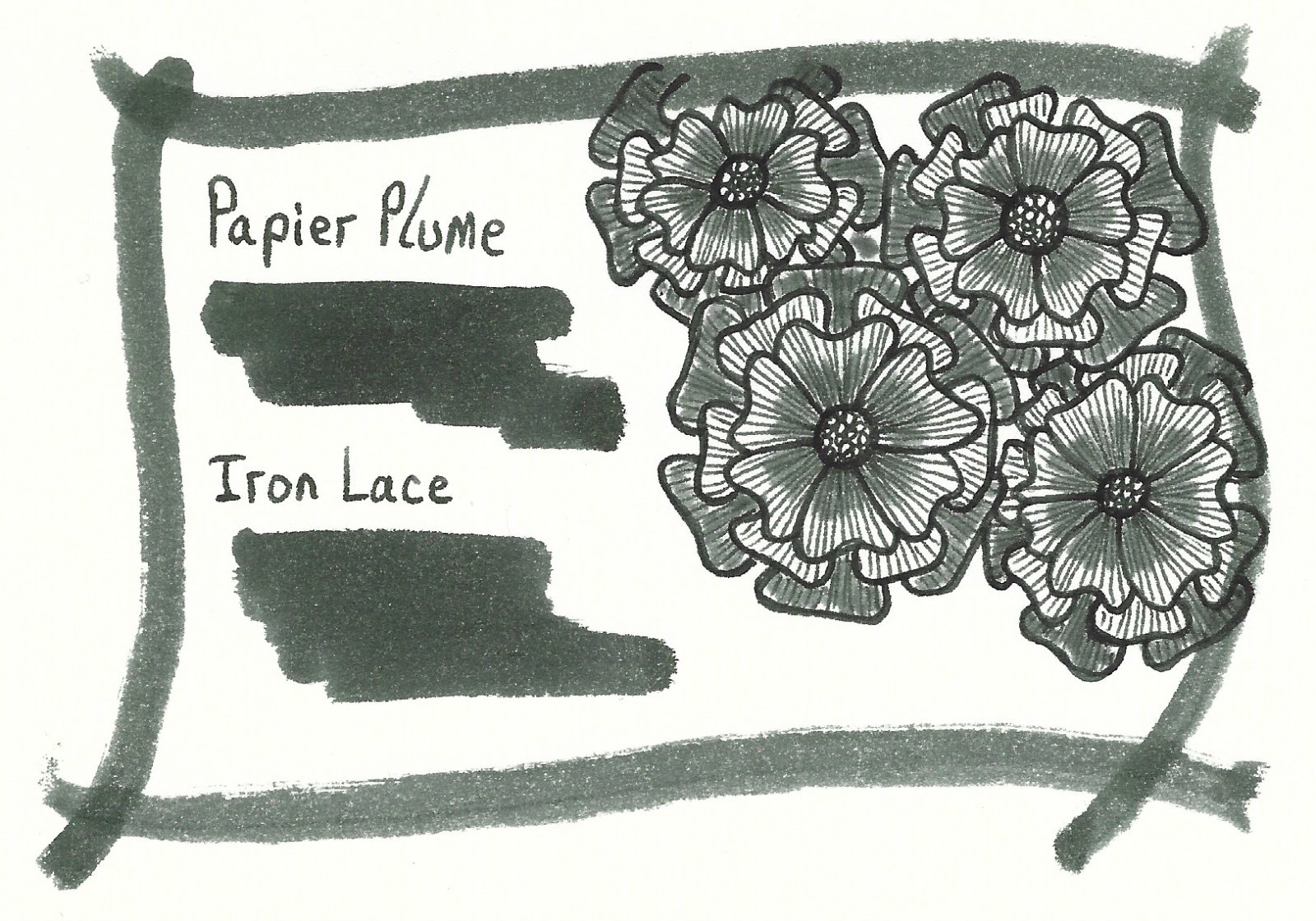
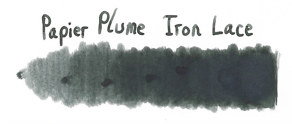
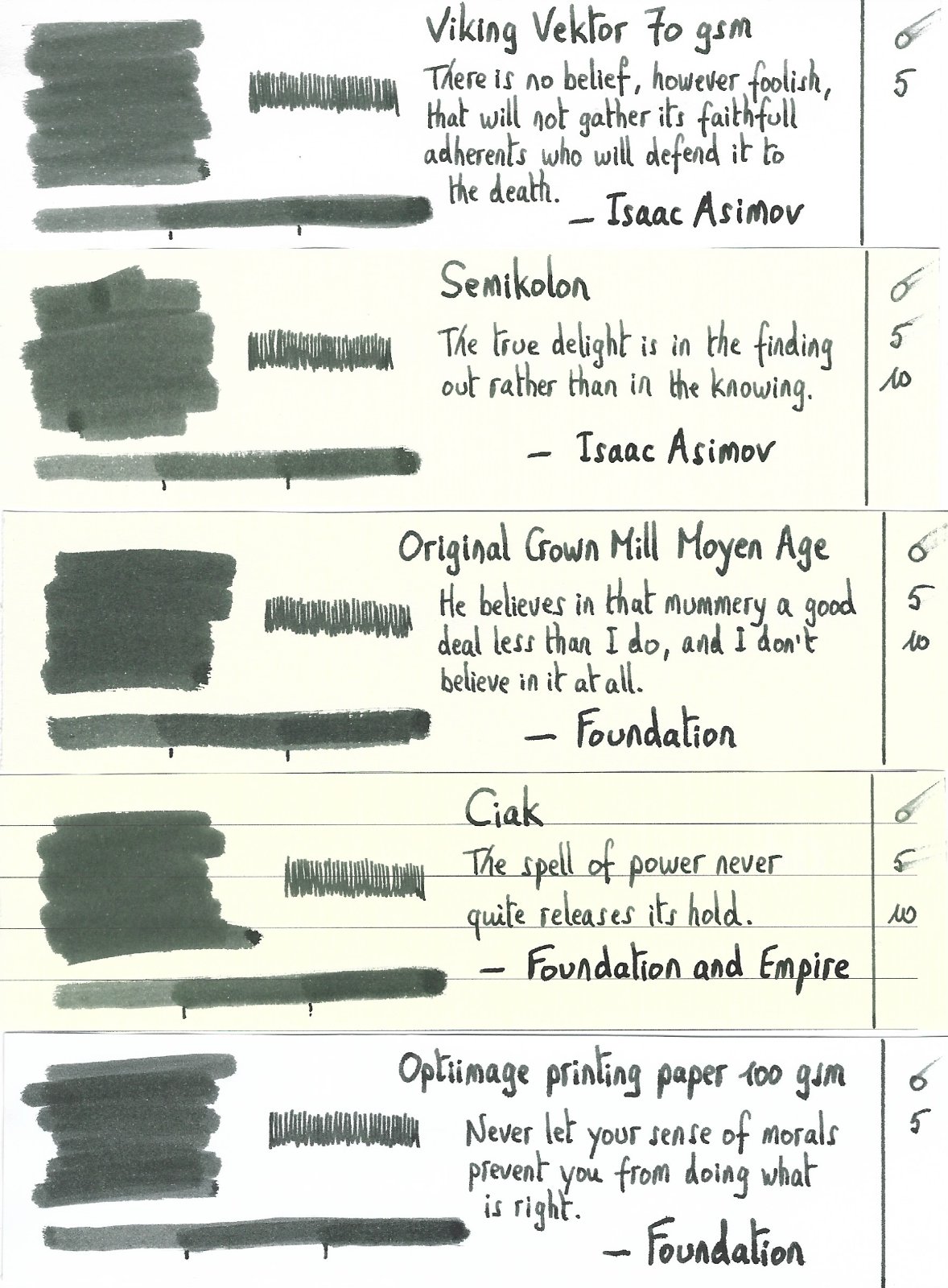
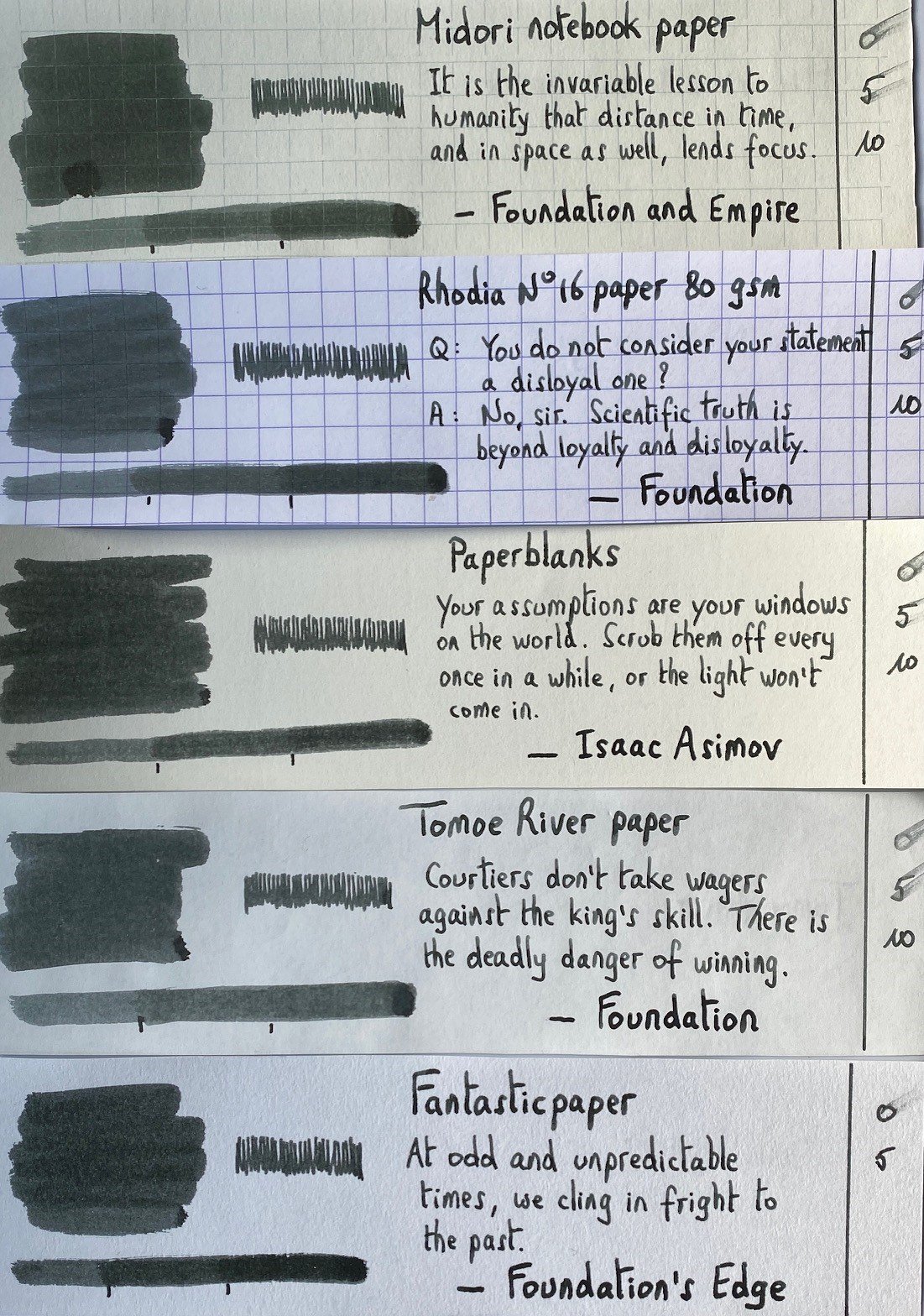
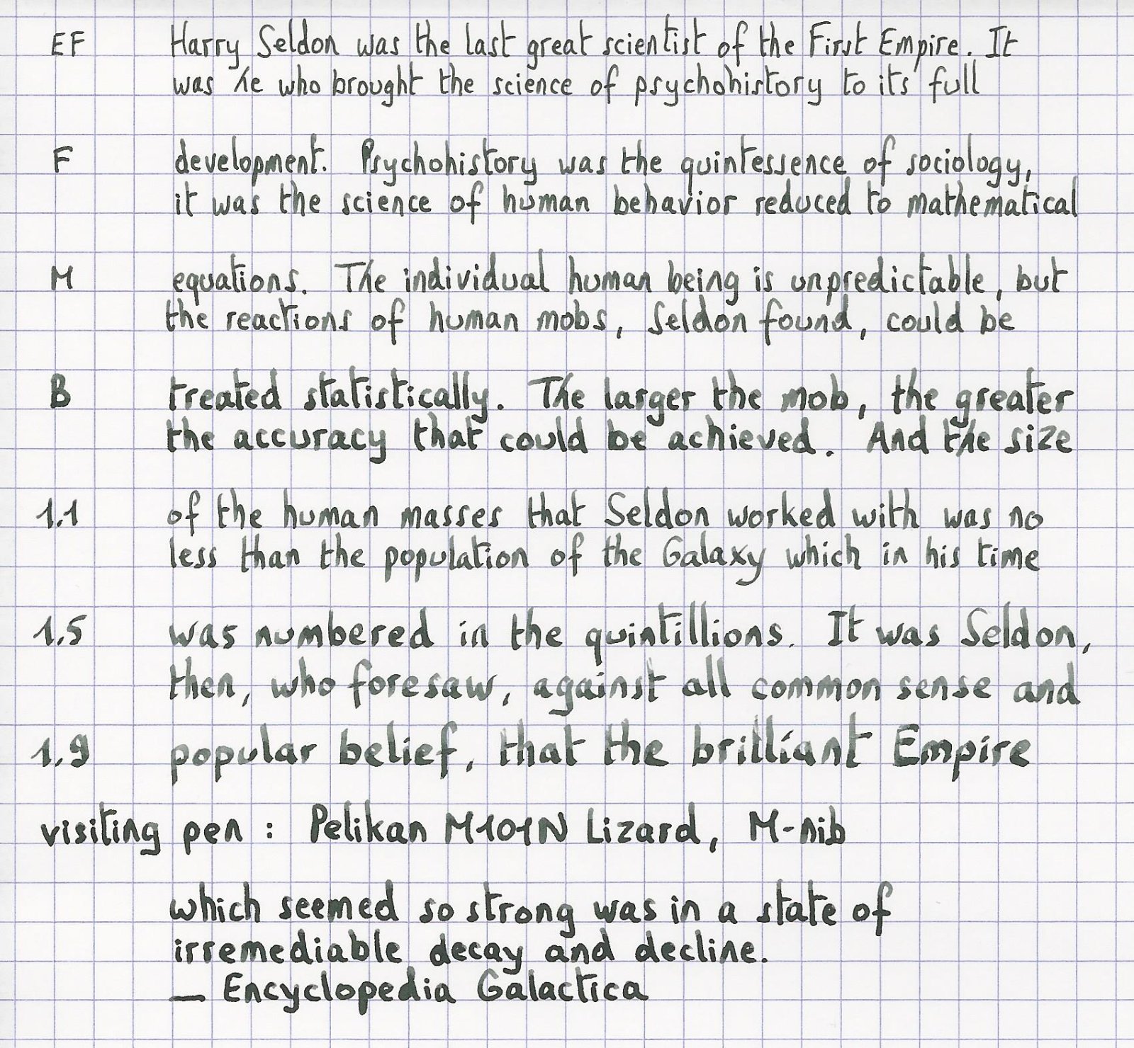
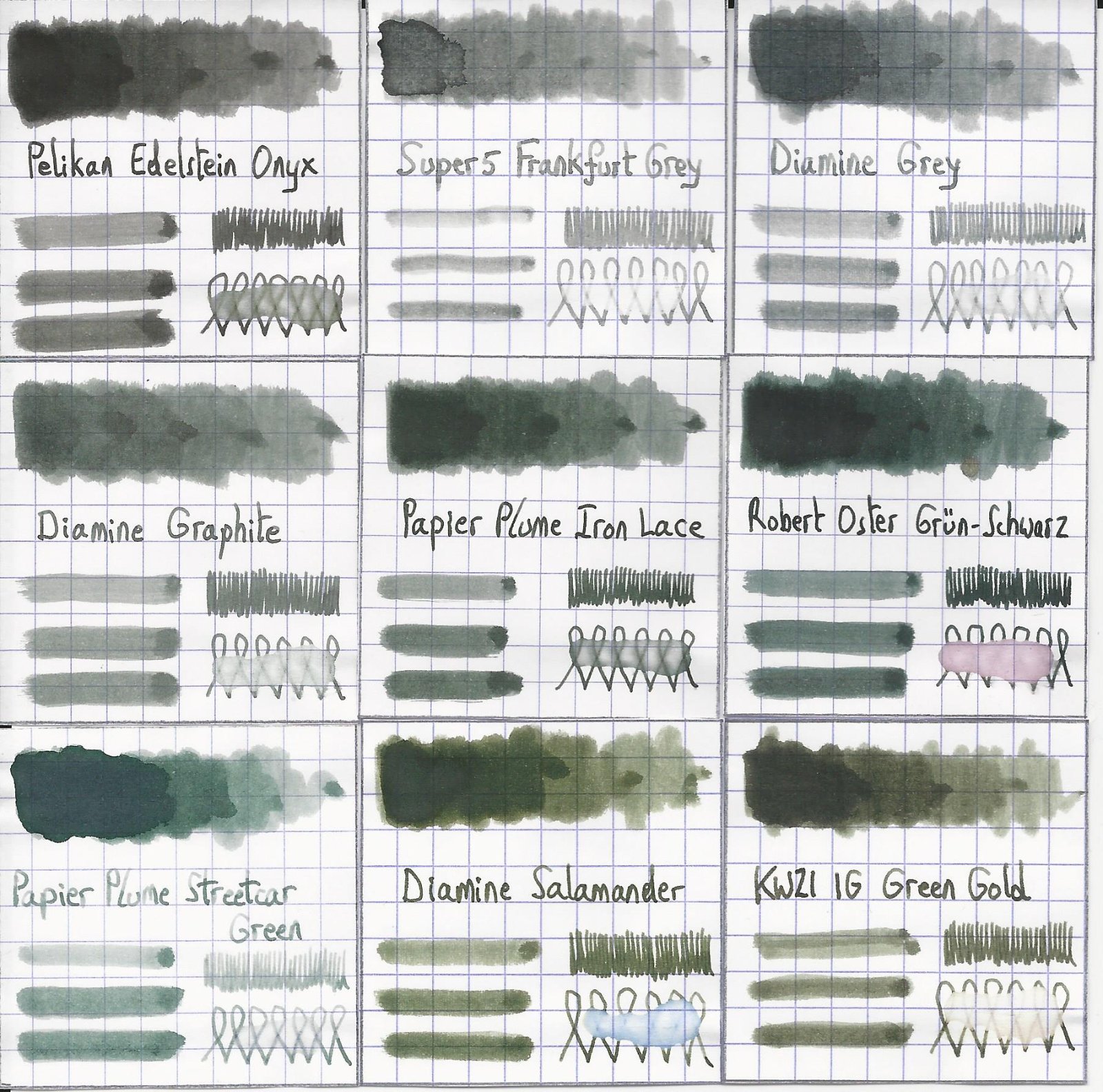
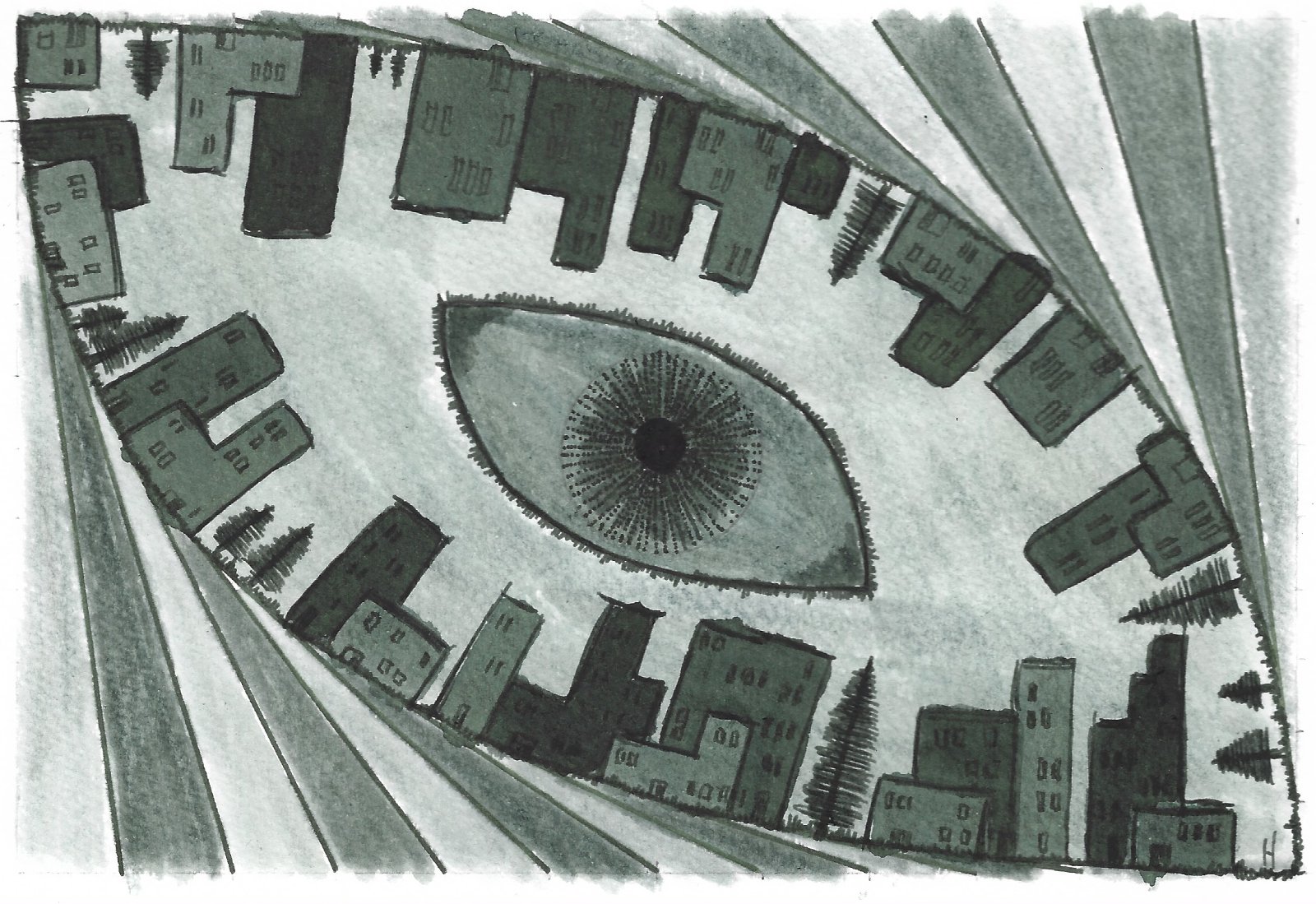
Papier Plume – Iron Lace (New Orleans Collection) Papier Plume is a stationary shop in New Orleans, that’s best known on this forum for their “New Orleans Inks”, that celebrate the rich colours and history of the city. One of their inks in this series is Iron Lace, a black ink with a strong green undertone. This ink from the New Orleans Collection is inspired by the iron lace galleries and balconies in the French Quarter. These intricate designs from wrought or cast iron can shift from black to green depending on the oxidation level of the iron. The Iron Lace ink captures this aspect just right: it’s a black ink at heart, but with a strong green component, that surfaces mostly in swatches. On the bottle it says “A Not-So Basic Black”, and they are totally right. This is not a dull and boring black, but one with layers of complexity that makes it a very interesting ink to write & draw with. The ink itself writes fairly wet with good lubrication in my Lamy Safari test pens. Quite a contrast with some of the other New Orleans inks. Saturation is excellent, even with EF nibs. The ink has a small dynamic range, without much contrast between light and dark areas. To illustrate this, I did a swab where I really saturated portions of the Tomoe River paper with ink, pooling it on. The limited contrast range translates to soft & elegant shading that looks aesthetically pleasing. Shading is just visible with the EF nib, and becomes more prominent with M-nibs and above. But it’s always subdued, giving just that extra touch of elegance to your writing. On the smudge test – rubbing text with a moist Q-tip cotton swab – there is quite some smearing, but the text itself remains crisp and clear. Water resistance is surprisingly good, both with my still water test (letting drops of water sit on the page for 15 minutes) and with a running water test. The ink easily survives watery accidents, making it an excellent ink for use at the office. The chromatography confirms this: the dyes remain firmly attached to the paper in the bottom part. I’ve tested the ink on a wide variety of paper – from crappy Moleskine to high-end Tomoe River. On each scrap of paper I show you: An ink swab, made with a cotton Q-tip 1-2-3 pass swab, to show increasing saturation An ink scribble made with a Lamy Safari M-nib fountain pen The name of the paper used, written with a Lamy Safari B-nib A small text sample, written with the M-nib The source of the quote, written with a Pelikan M101N with M-nib Drying times of the ink on the paper (with the M-nib) Iron Lace has a slight tendency to feather on the lower quality papers in my test set, most obvious when using a wet pen (see e.g. the source of the quote on the HP and Optiimage printing paper). I noticed no issues with better quality paper or when using finer nibs (M-nib or below) on paper of lesser quality. The ink writes smoothly with good lubrication, and provides excellent contrast with the page. Writing looks good on both white and more yellow paper. Drying times are fairly low – in the 5 second range with my Lamy Safari M-nib. All in all a fine ink for use in an EDC pen. At the end of the review, I also show the back-side of the different paper types, in the same order. A small amount of bleed-through is present on some of the lower-quality papers (Moleskine, generic notepad paper), but nothing too bad. Since scans alone are not always enough to give you a complete picture of the ink, I also provide you with a few photos for an alternative look at Iron Lace. Writing with different nib sizes The picture below shows the effect of nib sizes on the writing. Papier Plume Iron Lace manages to look good in all nib sizes from EF up to the 1.9mm calligraphy nib. With the very fine nibs shading is just visible, but starting at F/M and above the soft and eye-pleasing shading adds extra character to your writing without being overdone. I personally prefer Iron Lace in drier pens, where it writes a bit less saturated, and where the ink’s subdued shading is much more prominently visible. With wet pens, the more heavy saturation tends to overwhelm the ink’s shading, making your writing look more flat (my opinion). Related inks To compare Iron Lace with related inks, I use my nine-grid format with the currently reviewed ink at the center. This format shows the name of related inks, a saturation sample, a 1-2-3 swab and a water resistance test – all in a very compact format. I added Pelikan Onyx – which is a pure black – as a reference point. This clearly shows the green undertones that are present in Iron Lace. Diamine Graphite comes close in colour, but is lighter in nature (dark grey instead of black). Inkxperiment – Eye in the Sky With every review I try to do a single-ink drawing that shows what the ink is capable of in a more artistic setting. The most fun part of the ink review, and I quite enjoy brainstorming and then implementing these little pieces. Inspiration comes from the Alan Parsons song “Eye in the Sky”, with the lyrics: “I am the eye in the sky … Looking at you … I can read your mind”. I used these elements as the theme for the drawing. For this inkxperiment I used a piece of 300 gsm rough watercolour paper. I started by drawing in the outer eye surrounded by a geometric pattern. I then added the inner eye looking over the cityscape. Everything was drawn with Q-tips using different water/ink ratios. I finally added the details to the eye and the houses using a Lamy Safari pen filled with Iron Lace. In this more artistic setting, Iron Lace beautifully shows its green undertones. Conclusion Iron Lace from Papier Plume is a very well executed addition to their New Orleans line. A beautifully complex black with green undertones, that deviates enough from true black to make the ink quite interesting. Technically the ink is near perfect: good flow, well saturated, subtle shading, looks good in all nib sizes and on all paper types. I personally prefer the ink in drier pens, where the shading is more present. If you like off-black inks, this one is definitely worth your attention. Technical test results on Rhodia N° 16 notepad paper, written with Lamy Safari, M-nib Backside of writing samples on different paper types

-
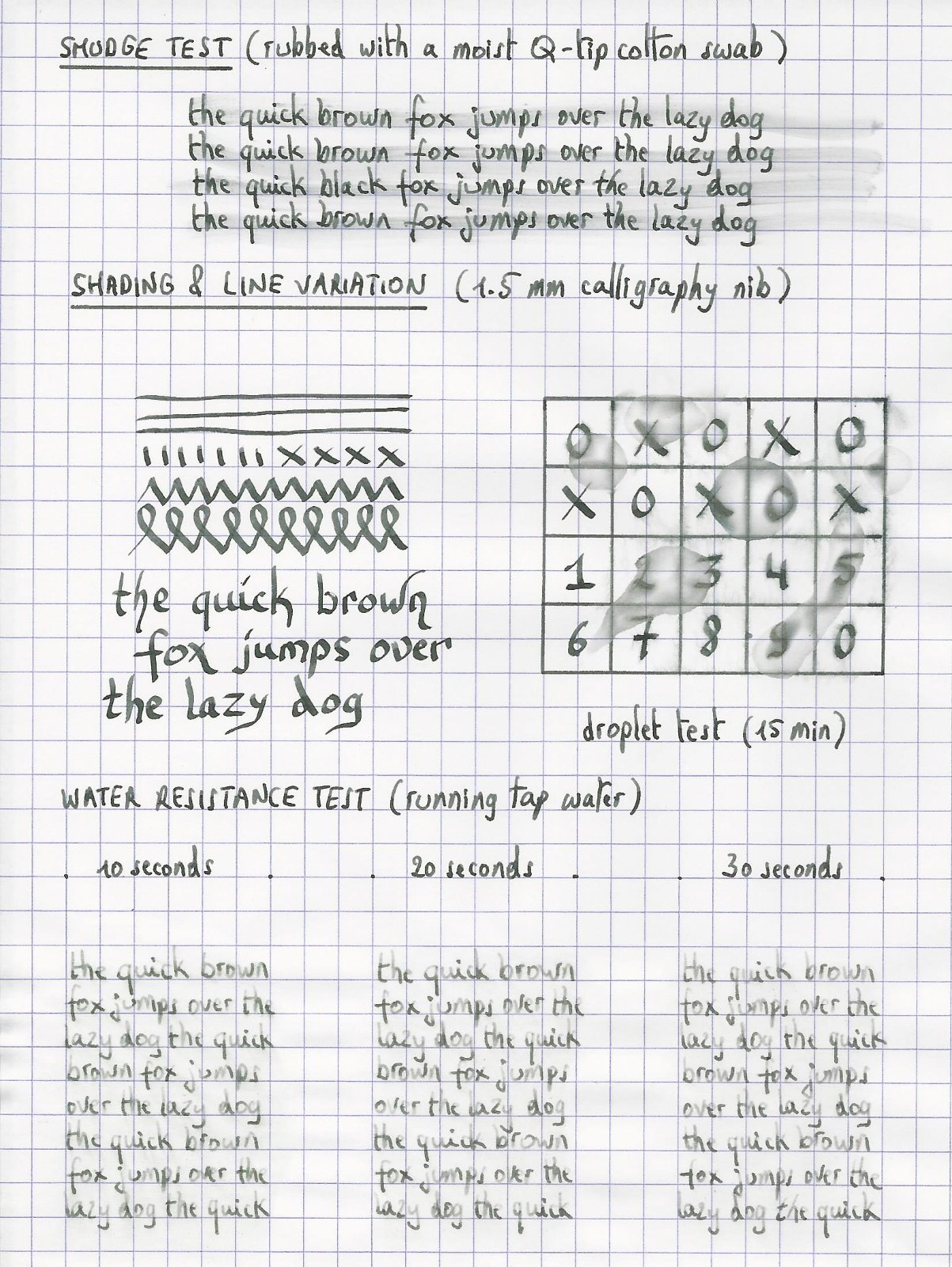
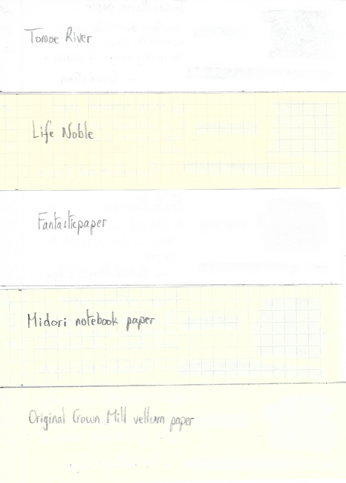
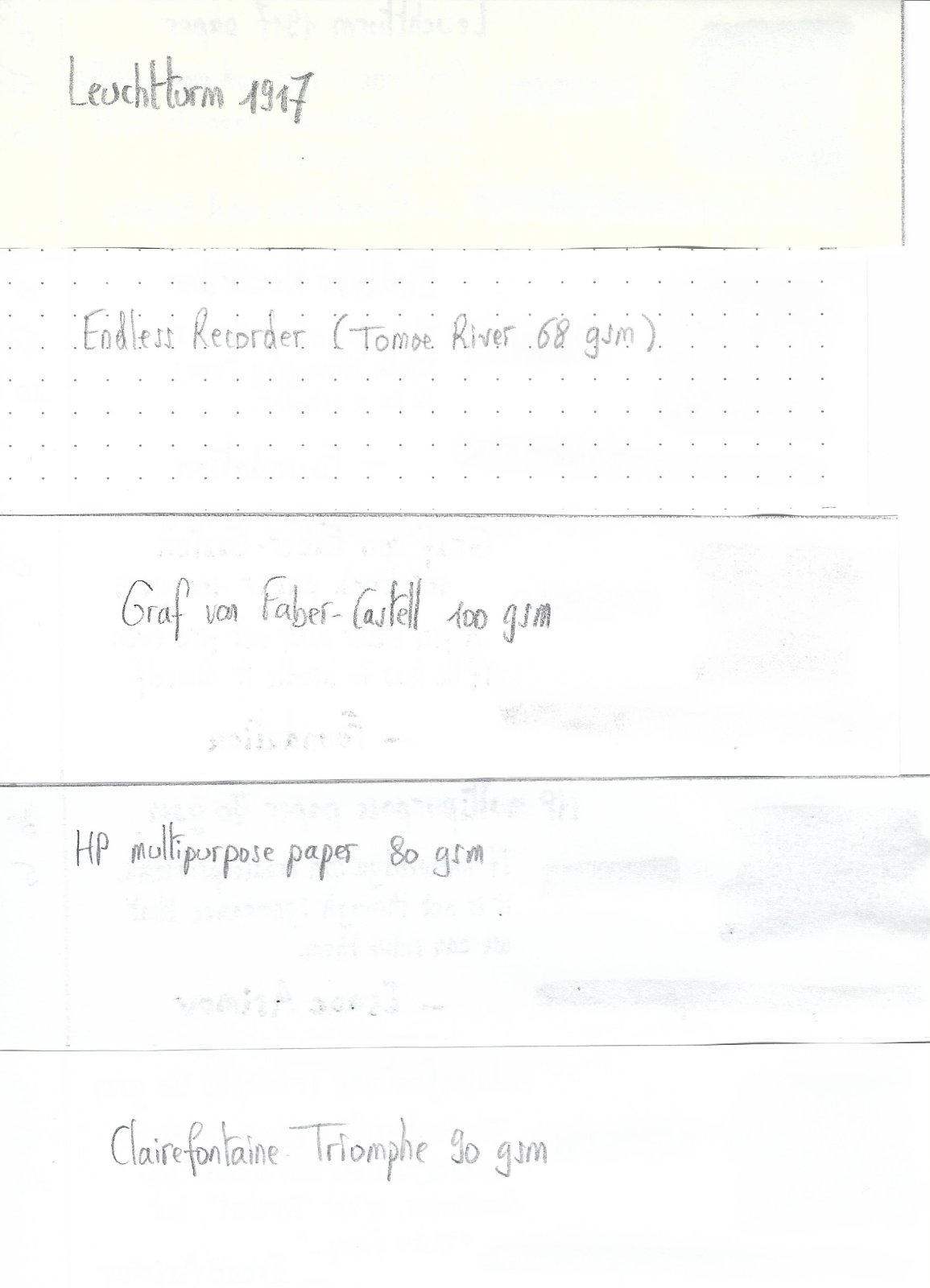
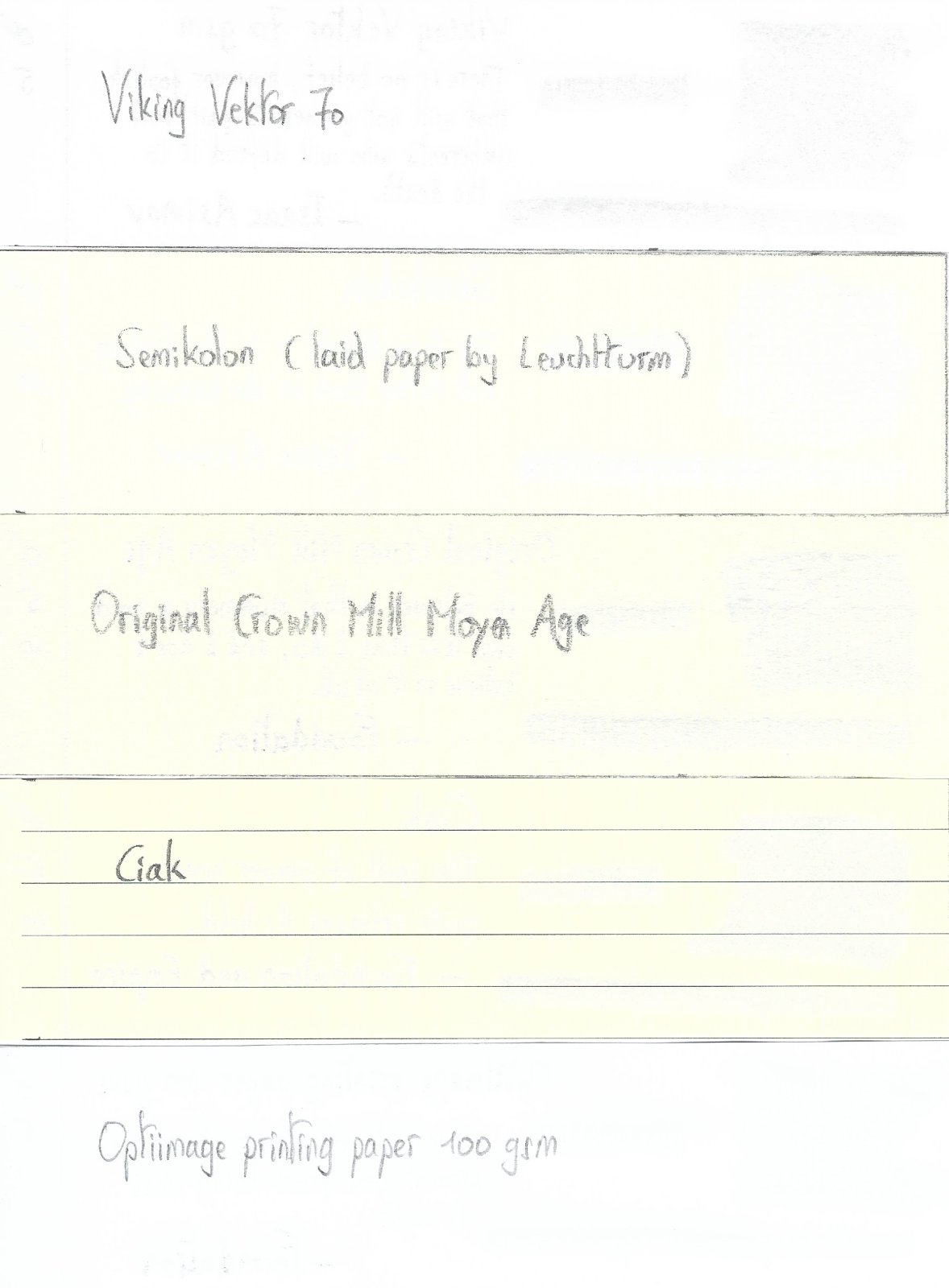
Papier Plume - Bayou Nightfall (New Orleans Collection) Papier Plume is a stationary shop in New Orleans, that’s been getting some attention lately on this forum with their “New Orleans Inks”, that celebrate the rich colours and history of the city. One of their inks in this series is Bayou Nightfall, an ink with a grey-green-blue hue, that’s unlike any colour in my collection. Definitely an ink with a unique personality. Bayou Nightfall’s colour is rather unique – it’s kind of a dark blue-leaning teal with heavy grey undertones, a mix of grey-green-blue that’s hard to describe. But the resulting mix is beautiful, and captures the ambiance of a nightfall, when the Bayou landscape’s colours fade away, and darkness descends. The shading is really noticeable, but well executed. There’s quite a bit of contrast between the light and darker parts, which tends to be exaggerated in a scan (in real-life I find the shading to be quite pleasing). The ink itself writes quite wet, but lacks a bit of lubrication (which I found to be true of other Papier Plume inks I tested). Saturation is quite good though, even in finer nibs. I did notice however that the ink behaves very differently in dry and wet pens. With drier pens, saturation depends on the speed of your writing, resulting in heavily shaded text, with a broader contrast range between light and dark parts. With wet pens, the text is more evenly saturated, and shading is more subtle. Personally, I prefer the way the ink looks in my wetter pens. The writing sample below shows the ink with my dry Lamy Safari pens, and with my wet Parker and Pelikan pens. The difference in saturation is really obvious. The ink has a wonderfully dynamic colour span. To illustrate this, I did a swab where I really saturated portions of the paper with ink, pooling it on. This beautifully illustrates the dynamics of Bayou Nightfall. The range moves from a very light blue-grey to a deep dark blue-black colour, capturing the dynamics of a nightfall. On the smudge test – rubbing text with a moist Q-tip cotton swab – the ink behaved perfectly. Water resistance is amazing – the ink effortlessly survived even longer exposures to water. Kudos! This is also apparent from the lower part of the chromatography, which shows that the grey components of the ink remain on the paper. Only the light-blue dies in the ink are very water-soluable. If you need a water-resistant ink, Bayou Nightfall certainly fits the bill. Be aware though that this is a slow-drying ink, especially in wetter pens. With my Safari M test pen, drying times were acceptable, with a decent 20-25 seconds on the slow-drying Tomoe River paper. With wet pens though, drying times on Tomoe River climb to over a minute, with some parts of the text requiring almost a full two minutes to dry completely. This is something to keep in mind. I’ve tested the ink on a wide variety of paper – from crappy Moleskine to high-end Tomoe River. On each scrap of paper I show you:An ink swab, made with a cotton Q-tip1-2-3 pass swab, to show increasing saturationAn ink scribble made with a Lamy Safari M-nib fountain penThe name of the paper used, written with a Lamy Safari B-nibA small text sample, written with an M-nibThe source of the quote, written with a wet Parker Sonnet (F-nib)Drying times of the ink on the paper (with the M-nib)Bayou Nightfall looks really nice on most papers in my test set. I don’t like the way it looks on the very yellow Life Noble notebook paper, and I find it to be too pale on Moleskine en Leuchtturm 1917. On the other papers though, the text looks stunning, with very good contrast to the paper. There’s one but though… the ink exhibits some small but noticeable feathering on the more absorbent papers. This is especially noticeable where a wet pen is used - take a look at the quote sources written with a wet Parket Sonnet (F-nib) on the Fantasticpaper, Paperblanks and Moleskine writing samples. At the end of the review, I also show the back-side of the different paper types, in the same order. The ink behaved superbly on most paper types. Only with Moleskine and Graf von Faber Castell was there significant show-through and some bleed-through. Bayou Nightfall is a well-behaving ink in this respect. Inkxperiment – Nazca spiderI’ve recently started to experiment with ink drawings, keeping things simple and more-or-less abstract. I find it to be a fun extension of the hobby, and have found single-ink drawings a nice challenge. It also gives you an idea of what the ink is capable of in a more artistic setting. For this drawing I used 300 gsm rough watercolour paper. I started off with water-diluted ink for the lighter parts in the drawing, gradually adding more ink to the mix for the darker parts. The spider square is painted with pure Bayou Nightfall. After drying, I used a small brush with a 25% bleach-solution to draw in the Nazca spider. The bleach reacts quite nicely with this ink, leaving a golden-yellow trace. The end result gives you a good idea of the colour span that Bayou Nightfall is capable of. ConclusionBayou Nightfall from Papier Plume is a grey-green-blue ink, with a unique colour that really captures the ink’s name. The ink has excellent contrast with the paper, shades nicely, and is water-resistant to boot. On the downside, the ink is rather slow-drying and can exhibit some minor feathering on more absorbent papers. Overall though, I’m quite pleased with this ink despite its minor shortcomings. I can forgive a lot for the unique colour I get in return. Well worth your attention! Technical test results on Rhodia N° 16 notepad paper, written with Lamy Safari, M-nib Backside of writing samples on different paper types
-
Ink Shoot-Out : Mont Blanc Burgundy Red Vs Papier Plume Red Beans And Rice
namrehsnoom posted a topic in Ink Comparisons
Ink Shoot-Out : Mont Blanc Burgundy Red vs Papier Plume Red Beans and Rice The other day I was playing around with Mont Blanc Burgundy Red, enjoying the ink a lot. I just love these toned down colours that move towards pastel territory, and this ink fits the bill. This definitely is NOT a bright and vibrant red! It occurred to me that Red Beans and Rice from Papier Plume is from the same colour family. Time to do a detailed comparison, and find out which of these inks I like the most. Enter... the Ink Shoot-Out. A brutal fight spanning five rounds, where truly formidable inks do battle to determine who is the winner. This time around, it's a battle between a prominent heavyweight, and a new kid on the block. In the left corner, the Mont Blanc muscle-man: Burgundy Red. In the right corner, from the French Quarter in New Orleans, Red Beans and Rice - a relatively new talent from the Papier Plume stable. Both champions enter the ring, the crowd starts cheering! Let the fight begin and may the best ink win… Round 1 – First Impressions The fighters immediately engange one another with a flurry of strikes and counterstrikes. They make a great first impression. These inks have a really nice toned-down dusty dark-red colour with a faded look, like text in an ages-old manuscript. Both inks are well-saturated, even in finer nibs, and provide excellent contrast with the page. Shading is delicate and subtle, without too much contrast between the light and darker parts - just as I like it. These inks are definitely on par with each other, but there are some differences: Burgundy Red's colour is a bit more purple-leaning, while Red Beans and Rice has more of a brown undertone. This is most obvious in swabs, less so in normal writing. The Mont Blanc ink writes really smooth. In contrast, Red Beans and Rice has sub-par lubrication, and feels a bit scratchy, especially in smaller nibs. With broader nibs - e.g. with the scribbles made with a 1.5 mm calligraphy nib - the Mont Blanc ink tends to be a bit oversaturated, drowning out most of the delicate shading. Red Beans and Rice, being a drier ink, looks better in these circumstances, and shows a bit more character. Both inks make a great first impression. Personally I like the Mont Blanc colour a little bit better, but that's not what counts. When exchanging the first punches, Burgundy Red showed much smoother and fluid play, in stark contrast with the scratchy performance of the Papier Plume ink. With broader nibs, Red Beans and Rice recovers, becoming a smooth writer that manages to keep the delicate shading, while the Mont Blanc ink blows out most of the subtle shading with its wetness. But from this round, it's mostly the scratchiness from Red Beans and Rice that you'll remember - and not in a good way. As such, the first point goes to Mont Blanc Burgundy Red. The chromatography clearly shows that both inks have lots in common. They have a really similar composition, with only a touch more blue instead of grey in Mont Blanc's mix of dyes. Round 2 – Writing Sample The writing sample was done on Rhodia N°16 Notepad with 80 gsm paper. Both inks behaved flawlessly, with no feathering and no show-through or bleed-through. With the EF nib, the wet Mont Blanc ink lays down a smooth line with excellent contrast and saturation. Red Beans and Rice struggles with the fine nib, and feels really scratchy. The low lubrication in fine nibs is a recurring theme with the Papier Plume inks. With broader nibs, the scratchy feeling of the Papier Plume ink disappears. In fact, it's more at home with broad nibs than the Mont Blanc ink. Look at the broad nib sample: Red Beans and Rice maintains the delicate shading present in the ink, while Burgundy Red loses some of the shading's appeal, flooding it away with its wetness. Colourwise both inks look similar in writing, although there is definitely more of a red-purple undertone in the Mont Blanc ink. Both inks also shade nicely, without too much contrast between light and dark parts. This aesthetically pleasing shading gives more character to your writing. For this round, the focus is on writing, and here both inks show strengths and weaknesses. Burgundy Red is definitely the better ink with fine nibs. But with broader nibs, I feel that Red Beans and Rice gets the advantage. Overall, these strengths and weaknesses cancel each other out, so this round ends in a draw. Round 3 – Pen on Paper This round allows the batlling inks to show how they behave on a range of fine writing papers. From top to bottom, we have : FantasticPaper, Life Noble, Tomoe River and Original Crown Mill cotton paper. All scribbling and writing was done with a Lamy Safari M-nib. Both champions did well, with no show-through nor bleed-through. But this round is not about technicalities, it is about aesthetics and beauty. Are the fighters able to make the paper shine ? These muted red inks look best on pure white paper. In my opinion, they lose some of their appeal on more yellowish paper like that of Life Noble. With the Tomoe River paper, Red Beans and Rice looks a bit too faded, certainly compared with the more robust presence of Burgundy Red (the latter's wetness gives it an advantage here). Overall, I personally prefer the slightly more reddish look of the Mont Blanc ink. Both inks are on par with each other, but Burgundy Red has a slight advantage in the looks department. For this round, victory is granted to the Mont Blanc ink. Not a knock-out, but definitely a win on points. Round 4 – Ink Properties These inks are not fast-drying, requiring 20-25 seconds to dry completely (with an M-nib on Rhodia paper). Red Beans and Rice takes a bit more time to dry. Both inks are reasonably smudge-resistant. Some colour rubs off when using a moist Q-tip cotton swab, but the text itself remains crisp and clear. The smudging is more pronounced with Burgundy Red. To test water resistance, I dripped water on the grid and let it sit there for 15 minutes, after which I removed the water with a paper towel. Here, the Papier Plume ink scores a real uppercut, drawing a roar from the crowd! Red Beans and Rices shows amazing water resistance! The red colour disappears, but a crisp grey line is left, that remains very readable. Really impressive. For this round, the American ink floors its opponent, in a big way. A thundering uppercut... Burgundy Red drops to the floor. The crowds get on their feet, the applause is booming through the stadium. What a spectacle! This round is a well-deserved win for Papier Plume. Round 5 – The Fun Factor Welcome to the final round. Here I give you a purely personal impression of both inks, where I judge which of them I like most when doing some fun stuff like doodling and drawing. Both inks do well, and allow for some nice effects. They both have a fairly broad colour span, making them interesting inks to draw with. I really enjoyed using them. In the picture, I used different water/ink ratios to draw in the background. The buildings were painted with pure ink, using bleach to draw in the windows. Both inks work well as drawing inks. With water added, Burgundy Red becomes a much more red ink, while Red Beans and Rice becomes more of a dirty grey-red. I personally prefer the more reddish looks of the Mont Blanc ink. For drawing, Burgundy Red looks more vibrant and alive - in my opinion of course. And since it's the Belgian judge that awards the points, this round goes to Mont Blanc Burgundy Red. The Verdict Both inks are real vintage-vibed beauties, that work on all types of paper. And being water-resistant, they make fine inks for use at work in an EDC pen. Despite the uppercut in round 4, the Mont Blanc champion showed a more consistent play, and raked up the points across rounds. Counting the points, this makes Burgundy Red the winner of this exciting fight! -
Ink Shoot-Out : Papier Plume Sazerac Vs Diamine Golden Honey
namrehsnoom posted a topic in Ink Comparisons
Ink Shoot-Out : Papier Plume Sazerac vs Diamine Golden Honey For no special reason, I have been using quite some ochre & orange inks this summer. While playing around with my inks, I noticed that Papier Plume Sazerac and Diamine Golden Honey seem to be quite similar oranges. This peaked my interest... time for a detailed comparison of both inks to find out which one I like the most. Enter... the Ink Shoot-Out. A brutal fight spanning five rounds, where two inks engage in fierce battle to determine who is the winner. Tonight we have a free-form fighting tournament... anything goes... but no biting! In the left corner - from the French Quarter in New Orleans - François "La Guillotine", the killing machine that chops down his opponents. In the right corner - from London's Soho district - "Gentleman" Joe, whose jaw-crunching uppercuts are always accompanied with a "my sincere apologies". Both champions enter the ring. The crowds are cheering for what promises to be a brutal fight. The bell rings and signals the start of the first round. May the best ink win... Round 1 – First Impressions Both inks make a great first impression on me. These are nicely muted oranges, and definitely not vibrant. I like my inks this way... a good presence on the page, but not eye-searing and in-my-face. These inks have style! Both inks also exhibit subtle yellow-leaning shading, without too much contrast between the light and darker parts. This gives your writing an aesthetically pleasing look. But even in this first round, it's definitely a dirty fight! Both champions show off their elegant moves, but they also throw some heavy punches that really hurt their opponent: Golden Honey is without any doubt the master of the finer nib. Sazerac feels really dry and undersaturated with fine and medium nibs. Golden Honey writes nicely wet with much better lubrication, and leaving a more saturated line. "My apologies"... but it's clear that in this area the New Orleans champion takes some pain. Papier Plume's Sazerac on the other hand looks richer and shows a broader tonal range in the swabs and on the saturation sample. A bit more character, more elegance. That's a rib-crunching chop from "La Guillotine". Looking at broader nibs (the squiggles drawn with a 1.5mm calligraphy nib), Sazerac becomes more saturated, but - in my opinion - also loses some of its charm. Golden Honey keeps a more yellow-orange appearance, retaining more of its muted character. Both inks make a great first impression. Sazerac looks slightly better for drawing, but Golden Honey is clearly the better ink for writing. The fact that Sazerac still feels very dry in my M-nib Safari costs it points though! A fair fight with punches in both directions, but Gentleman Joe clearly dominated this round. In my book, this round is a solid win on points for Diamine Golden Honey. Round 2 – Writing Sample The writing sample was done on Rhodia N°16 Notepad with 80 gsm paper. Both inks behaved flawlessly, with no feathering and no show-through or bleed-through. With the EF nib, both inks were equally horrible... dry, scratchy, unsaturated. Yuk! With the M-nib, Diamine recovers and writes nicely wet and with good saturation. But Sazerac still suffers, and keeps feeling dry and scratchy. With broad nibs, both inks offer a pleasant writing experience. But looking closer at the broad nib, you can see that Sazerac leaves a wider and a bit over-saturated line. It almost becomes too wet, where the line left on the pages expands a bit too much. This also seems to result in a flatter and less-pleasing look. Diamine Golden Honey on the other hand retains its crispness, and shows more character and depth. I definitely like the Diamine ink better in this respect. Colourwise, both inks look quite similar. But for writing there are big differences! Here the English champion delivers an uppercut that totally floors its opponent. "My sincere apologies" indeed! Sazerac goes to the floor, totally dazed. The crowd goes nuts, and roars its approval. What a spectacle! There is no doubt at all... round 2 is a solid win for Gentleman Joe. Round 3 – Pen on Paper This round allows the batlling inks to show how they behave on a range of fine writing papers. From top to bottom, we have : FantasticPaper, Life Noble, Tomoe River and Original Crown Mill cotton paper. All scribbling and writing was done with a Lamy Safari M-nib. Both champions did well, with no show-through nor bleed-through. But this round is not about technicalities, it is about aesthetics and beauty. Are the fighters able to make the paper shine ? One thing is immediately apparent: these inks are at their best on pure white paper. Due to the yellow undertones, their presence on more yellowish paper (like the Life Noble) is underwhelming. With the M-nib, the Diamine ink is more saturated, much wetter, and offers a superior writing experience. Looking at the swabs and saturation samples, Sazerac shows more depth and character. For this round, both inks are on par with each other, both scoring some points and taking some punches. Sazerac seems to recover, and now stands up again to the English champion. But neither ink dominates, and as such this round ends in a draw. Round 4 – Ink Properties Both inks have drying times in the 15-20 second range with the M-nib in my Lamy Safari. To test their smudge resistance, I rubbed the text with a moist Q-tip cotton swab. Here, Diamine Honey shows a little bit more smudging, but the text itself remains crisp and clear. To test water resistance, I dripped water on the grid and let it sit there for 15 minutes, after which I removed the water with a paper towel. Both champions are weak! Water resistance is totally absent, and all ink simply disappears from the paper. Not good! What a disappointing display! Both champions went on the defensive, and performed very weakly in this round. The crowd gets restless, starts boo-ing. That is not what we paid for! For this round, neither champion gets points. Round 4 thus ends with a draw. Round 5 – The Fun Factor Welcome to the final round. Here I give you a purely personal impression of both inks, where I judge which of them I like most when doing some fun stuff like doodling and drawing. And for this round, both inks are simply amazing. I did the drawing on HP Advanced Photo paper. The background uses heavily water-diluted ink, which brings out the yellow. For the flowers I used 2:1 diluted ink, while the flower accents and stems use pure Sazerac and Golden Honey. I dare you the find the difference! Both inks are equally gorgeous looking when used in a more artistic setting. I really enjoyed using them. For this round, both champions recovered completely, and gave their best. Punishing kicks, solid blocks, graceful moves, loads of energy… The crowd is loving it... this is what we came to see. Round 5 totally rocks, but in the end both champions performed equally well, and no clear winner emerges. The Verdict Both inks are great-looking muted yellow-oranges, that look fantastic on paper (provided you use broader nibs). For writing, Diamine Golden Honey is without any doubt the better ink. It's still horribly dry in fine nibs, but starting with M-sizes the ink recovers and provides a smooth & pleasant writing experience. Otherwise, both inks are really quite similar. But round 2 clearly determines the outcome of this fight, and so the Belgian judge declares Diamine Golden Honey as the winner of this shoot-out. -
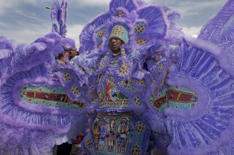
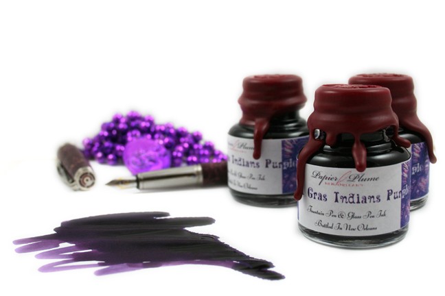
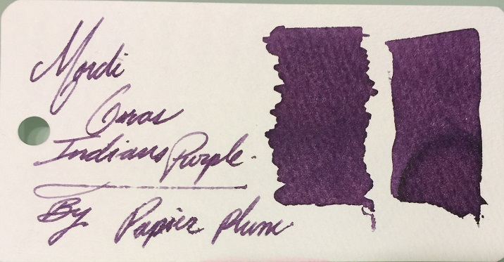
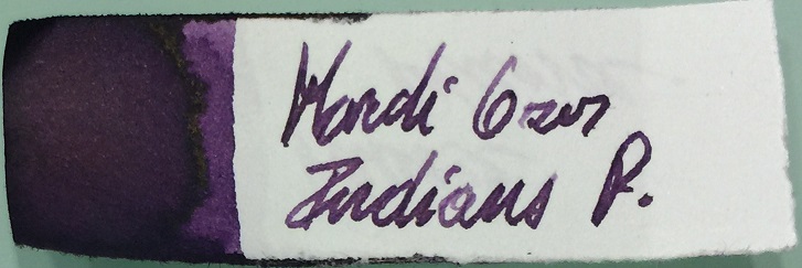
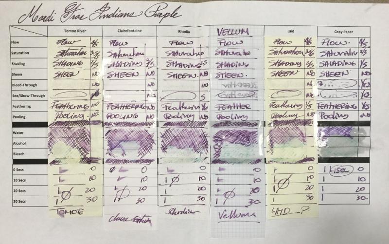
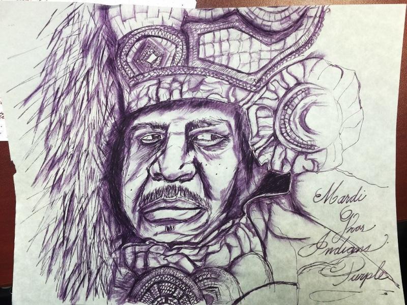
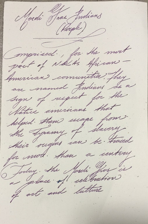
Papier Plume - Mardi Gras Indians Purple (New Orleans Collection)
namrehsnoom posted a topic in Ink Reviews
Papier Plume - Mardi Gras Indians Purple (New Orleans Collection) Papier Plume is a stationary shop in New Orleans, that's been getting some attention lately on this forum with their "New Orleans Inks", that celebrate the rich colours and history of the city. One of their inks in this series is Mardi Gras Indians Purple, a very nice grey-puple ink that I immediately took a liking to. Mardi Gras Indians Purple is a dark purple ink that looks surprisingly good on paper. Sometimes an ink instinctively appeals to you on first use ... that's what happened to me with this Papier Plume colour. I really like it. It's a purple ink, but not of the vibrant kind. Its greyish tones make for a more subdued look, that will work quite well when used as an office ink. Shading is definitely there, but without too much contrast between the light and darker parts, just as I like it. A very classy ink ! And what a cool name! This ink is modelled after the purplish colours that are often present in the elaborate costumes of Mardi Gras Indians in New Orleans. As such, the ink has links to the colourful history of the city. Be sure to read Jackokun’s excellent review that has tons of historical background - highly recommended ! The ink differs from other Papier Plume inks in this series: this one is much wetter and quite well lubricated. It's by no means a wet ink, but it still pleasantly surprised me since it is definitely the wettest ink from Papier Plume that I have used so far. Another good point in its favour! The ink has a medium dynamic colour span. To illustrate this, I did a swab where I really saturated portions of the paper with ink, pooling it on. This illustrates the dynamics of Mardi Gras Indians Purple, with moves from a light violet to a dark grey-purple colour. On the smudge test - rubbing text with a moist Q-tip cotton swab - the ink behaved very well . There is very little smearing, and the text remains perfectly readable. Water resistance is remarkably good - both with a 15 minute soak test with still water, and when running tap water over the writing. The ink smudges, but the text itself remains clearly readable - even after 30 seconds under running tap water. A welcome plus if you'll be using this as an office ink. This is also apparent from the lower part of the chromatography, which shows that that greyish components of the ink remain firmly attached to the paper. I've tested the ink on a wide variety of paper - from crappy Moleskine to high-end Tomoe River. On each scrap of paper I show you: An ink swab, made with a cotton Q-tip 1-2-3 pass swab, to show increasing saturation An ink scribble made with a Lamy Safari M-nib fountain pen The name of the paper used, written with a Lamy Safari B-nib A small text sample, written with an M-nib Drying times of the ink on the paper (with the M-nib) Mardi Gras Indians Purple behaved perfectly with most papers in my test set. Drying times are very acceptable in the 10-15 second range with the M-nib. With the low-quality papers I noticed a tiny amount of feathering, especially with the broad nib. You also get a bit of bleed-through with these papers. With better quality paper, the ink works flawlessly. The ink has a very consistent appearance across paper types, and looks good on both the white and off-white paper. My personal opinion: a sophisticated and good-looking ink. Writing with different nib sizes The picture below shows the effect of nib sizes on the writing. All samples were written with a Lamy Safari, which is typically a dry pen. I also added a visiting pen - my wet Pelikan M400 White Tortoise with an M-nib. With all these combinations, the ink writes very pleasantly and leaves a nicely saturated line. Related inks To show off related inks, I recently switched to a nine-grid format, with the currently reviewed ink at the center. The new format shows the name of related inks, a saturation sample, a 1-2-3 swab and a water resistance test - all in a very compact format. This format makes it easy to compare the ink with its eight direct neighbours, which I hope will be useful to you. Inkxperiment – Lighthouse For some time now I've been experimenting with ink drawings, keeping things simple and more-or-less abstract. I find this to be a fun extension of the hobby, and these single-ink drawings often present quite a nice challenge. It also gives you an idea of what the ink is capable of in a more artistic setting. Recently I've been using HP photo paper as a drawing medium. I'm quite fascinated by the vibrancy that inks achieve on this type of paper. For this drawing, I started by submerging the paper in water to which I added a few drops of ink. This gives a light-purple background that forms the starting point for this little 10 by 15 cm drawing. Next I painted in the horizon lines and the lighthouse, using different mixes of ink & water. I then painted in the sky and the water. Finally I added the trees, and darkened up the horizon line and lighthouse with pure Mardi Gras Indians Purple. The end result gives you a good idea of the way the ink expresses itself when used for drawing. Conclusion Mardi Gras Indians Purple from Papier Plume is a gem of an ink: a classy dark-purple colour, that leaves a saturated nicely-shaded line, and that is quite water-resistant. As such, it's an excellent ink for use at the office. This ink immediately appealed to me with its subdued grey-purple tones - it went straight to my top three for 2019 (but the year still has nine months to go, so this may change... we’ll see). I you like your purples, this is an ink that you will almost certainly appreciate. I recommend giving it a try! Technical test results on Rhodia N° 16 notepad paper, written with Lamy Safari, M-nib Backside of writing samples on different paper types -
Papier Plume - Garden District Azalea (New Orleans Collection)
namrehsnoom posted a topic in Ink Reviews
Papier Plume - Garden District Azalea (New Orleans Collection) Papier Plume is a stationary shop in New Orleans, that's been getting some attention lately on this forum with their "New Orleans Inks", that celebrate the rich colours and history of the city. One of their inks in this series is Garden District Azalea, a soft pastel-like rose-red ink with quite a unique personality. Garden District Azalea is a soft rose-red ink that looks quite good on paper. I'm not exactly a fan of pink inks, but this one leans more towards the red end of the spectrum, and is actually quite appealing. I like the pastel character of this ink, which gives it a soft and soothing apperarance. The inks shades nicely, even in finer nibs. The shading is very present, but with not too much contrast between the light and darker parts, making it aesthetically very pleasing. Nicely done! The ink itself is typical of other Papier Plume inks in this series: it lacks lubrication, especially when used with a dry pen like the Lamy Safari that I use for my reviews. Saturation is quite good though, even in finer nibs. When used with wetter pens, lubrication improves significantly, resulting in a much more pleasant writing experience. For this ink, it certainly is recommended to pair it with wet pens. The ink has an average dynamic colour span. To illustrate this, I did a swab where I really saturated portions of the paper with ink, pooling it on. This illustrates the dynamics of Garden District Azalea, with moves from a very light rose to a darker rose-red colour. On the smudge test - rubbing text with a moist Q-tip cotton swab - the ink behaved remarkably well . There is very little smearing, and the text remains perfectly readable. Water resistance is not so good though. The ink quickly loses its colour, leaving only some light-rose smudges on the paper. With short exposures to water, you will barely be able to reconstruct your writing. With longer exposure, all traces of your scribbles are forever lost. This is also apparent from the lower part of the chromatography, which shows that some of the dye remains attached to the paper, but most of the dyes wash away with the water. I've tested the ink on a wide variety of paper - from crappy Moleskine to high-end Tomoe River. On each scrap of paper I show you:An ink swab, made with a cotton Q-tip1-2-3 pass swab, to show increasing saturationAn ink scribble made with a Lamy Safari M-nib fountain penThe name of the paper used, written with a Lamy Safari B-nibA small text sample, written with an M-nibDrying times of the ink on the paper (with the M-nib)Garden District Azalea behaved perfectly with most papers in my test set. Only with the notoriously bad Moleskine paper I noticed a tiny amount of feathering. I quite like the ink's appearance on Paperblanks journal paper, which happens to be my journal of choice. The ink is quite subdued, with a very nice pastel-like appearance. I happen to like subdued colours, but if you're into vibrant inks, this one might not be for you. At the end of the review, I also show the back-side of the different paper types, in the same order. With low-quality and absorbent paper, the ink exhibited quite some show-through, and even a bit of bleed-through (e.g. Moleskine, Graf van Faber Castell). With the other papers in my test-set, the ink behaved really well with my Lamy Safari test pen with M-nib. With wet pens though, bleed-through becomes more of a problem, and you might not be able to use both sides of the paper. Writing with different nib sizesThe picture below shows the effect of nib sizes on the writing. All samples were written with a Lamy Safari, which is typically a dry pen. I also added a visiting pen – my wet Pelikan M400 Tortoise Brown with an M-nib. Here the ink leaves a very saturated line, and no longer suffers from sub-par lubrication. Related inksTo show off related inks, I recently switched to a nine-grid format, with the currently reviewed ink at the center. The new format shows the name of related inks, a saturation sample, a 1-2-3 swab and a water resistance test – all in a very compact format. I hope that you’ll find this way of presenting related inks more useful. It’s a bit more work, but in my opinion worth the effort for the extra information you gain. Inkxperiment – Red EvolutionI've recently started to experiment with ink drawings, keeping things simple and more-or-less abstract. I find this to be a fun extension of the hobby, and consider these single-ink drawings a nice challenge. It also gives you an idea of what the ink is capable of in a more artistic setting. This time I went with an abstract theme. I used 300 gsm rough watercolour paper, and started by painting in a faint rose-red background with water-diluted Garden District Azalea. I then painted in the abstract red evolution. The dark parts are pure ink, liberally applied to the paper. The lighter rose-red centers were painted in with a felt-tip brush. The end result gives you a good idea of the way Garden District Azalea can express itself when used for drawing. ConclusionGarden District Azalea from Papier Plume is a soft and pastel-like rose-red ink that is at home with both writing and drawing. Not an ink for those who like their inks vibrant, but more targeted at us folks that enjoy the more subdued kind. The ink works well with most paper types and shows subtle and pleasing shading. With dry pens lubrication is sub-par, with negative impact on the writing experience. This is an ink that begs for wet pens and/or broader nibs, which is where it shines. Technical test results on Rhodia N° 16 notepad paper, written with Lamy Safari, M-nib Backside of writing samples on different paper types -
Papier Plume is s stationery shop situated in the heart of the French Quarter in New Orleans. The company began its business in 2001 however the shop was opened in 2007. From what I see on google maps the shop looks quite nice. source Some time ago the company started to offer fountain pen inks. They're supposed to be hand poured and bottled right in the shop. The inks are water based and described as french inks (imported? anyone knows french private label maker?). At the moment the inks are available in 15 colors and are sold in three bottles: small (15 ml), medium (30 ml), big (50 ml): source Well, it's a light pink with a little bit of shading. The behavior is mostly decent but I can't say I'm in love with this one. The sample was sent to me by namrehsnoom - thanks! Drops of ink on kitchen towel Software ID Color range Field Notes, Parker Sonnet, M Tsubame, Parker Sonnet, MParker Sonnet, M Tomoe River, Parker Sonnet, M Water resistance
-
Papier Plume is s stationery shop situated in the heart of the French Quarter in New Orleans. The company began its business in 2001 however the shop was opened in 2007. From what I see on google maps the shop looks quite nice. source Some time ago the company started to offer fountain pen inks. They're supposed to be hand poured and bottled right in the shop. The inks are water based and described as french inks (imported? anyone knows french private label maker?). At the moment the inks are available in 15 colors and are sold in three bottles: small (15 ml), medium (30 ml), big (50 ml): Special edition inks are sold in 1 oz bottles with the cap covered in wax(?) Mardi Gras Indians Purple is a plesant medium dark purple with no sheen. The flow is average and the ink feels dry. It'll be pleasant to use in wet pens but in dry ones the line lacks charisma. Drops of ink on kitchen towel Software ID Color range Field Notes, Aurora 88, medium nib Field Notes, Aurora 88, medium nib Copy paper, Jinhao x750, medium nib Copy paper, Platinum Preppy, 0.3 nib Water resistance
-
Papier Plume - Red Beans And Rice (New Orleans Collection)
namrehsnoom posted a topic in Ink Reviews
Papier Plume - Red Beans and Rice (New Orleans Collection) Papier Plume is a stationary shop in New Orleans, that's been getting some attention lately on this forum with their "New Orleans Inks", that celebrate the rich colours and history of the city. One of their inks in this series is Red Beans and Rice, a soft pastel-like grey-red ink with quite a unique personality. One thing needs to be said right at the start: Red Beans and Rice has a colour that quite literally changes its appearance with the colour temperature of the light. On a scan it looks a bit too purple, while in soft yellow light it looks almost rose-red. An elusive colour indeed. For the title image, I used a daylight photo, which most approaches the hue that I see in real life. Red Beans and Rice is of the brown-red family, with strong grey undertones - as is shown clearly in the chromatography. The grey undertones soften the ink's colour, giving it a pastel-like appearance. I quite like it, but if you're into vibrant colours, this will probably not be your piece of cake. The ink shades nicely and quite strongly, even in finer nibs. Definitely an ink with character. The ink itself writes quite wet, but lacks lubrication especially when used with a dry pen like the Lamy Safari that I use for my reviews (I also noticed this lack of lubrication with other Papier Plume inks I tested). Saturation is quite good though, even in finer nibs. When used with wetter pens, lubrication improves significantly, resulting in a much more pleasant writing experience. For this ink, it certainly is recommended to pair it with wet pens. The ink has a broad dynamic colour span. To illustrate this, I did a swab where I really saturated portions of the paper with ink, pooling it on. This beautifully illustrates the dynamics of Red Beans and Rice. The range moves from a very light rose-red to a deep dark grey-red colour. On the smudge test - rubbing text with a moist Q-tip cotton swab - the ink behaved quite well . There is some smearing, but the text remains perfectly readable. Water resistance is also acceptable. The ink quickly loses all the red dyes, but a grey residue remains, resulting in a ghost image of your writing that is still easily readable. Not what I would call water-resistant, but the ink is more or less accident-proof. This is also apparent from the lower part of the chromatography, which shows that the grey components of the ink remain on the paper. I've tested the ink on a wide variety of paper - from crappy Moleskine to high-end Tomoe River. On each scrap of paper I show you:An ink swab, made with a cotton Q-tip1-2-3 pass swab, to show increasing saturationAn ink scribble made with a Lamy Safari M-nib fountain penThe name of the paper used, written with a Lamy Safari B-nibA small text sample, written with an M-nibThe source of the quote, written with a wet Parker Sonnet (F-nib)Drying times of the ink on the paper (with the M-nib)Red Beans and Rice behaved perfectly with most papers in my test set. Only with the notoriously bad Moleskine paper did I notice a tiny amount of feathering. I quite like the ink's appearance on Paperblanks journal paper, which happens to be my journal of choice. The ink is also quite subdued, leaning towards a pastel-like appearance. I happen to like subdued colours, but if you're into vibrant inks, this one might not be for you. At the end of the review, I also show the back-side of the different paper types, in the same order. The ink behaved superbly on most paper types. Only with Moleskine and Graf von Faber Castell was there significant show-through and some bleed-through. Inkxperiment – Fiery FlowersI've recently started to experiment with ink drawings, keeping things simple and more-or-less abstract. I find it to be a fun extension of the hobby, and have found single-ink drawings a nice challenge. It also gives you an idea of what the ink is capable of in a more artistic setting. This time, I was inspired by Red Beans and Rice's chromatography, which showed the water-soluble character of its red dyes. I used a very absorbent paper (Graf von Faber-Castell 100 gsm), that I totally soaked in water. I then applied drops of ink to the paper, letting them bleed out. This results in the fiery red halo surrounding the flowers. Once partly dry, I applied a bit of bleach to the heart of each flower. And after some more drying, I again added a tiny bit of Red Beans and Rice to the center of the bleached region. With the paper completely dry, I painted in the flower stems and petals. The end result gives you a good idea of the way Red Beans and Rice can express itself when used for drawing. ConclusionRed Beans and Rice from Papier Plume is a grey-red-brown ink with an almost pastel-like character, that is at home with both writing and drawing. The ink works well with most paper types, shades nicely, and shows some measure of water resistance. The colour is probably not for everybody. Myself, I like its pastel-like appearance, but if your preference goes to vibrant colours, Red Beans and Rice is not for you. For drawing however, I'm sure anybody can appreciate the expressive power hidden within this ink. Technical test results on Rhodia N° 16 notepad paper, written with Lamy Safari, M-nib Backside of writing samples on different paper types -
Papier Plume is s stationery shop situated in the heart of the French Quarter in New Orleans. The company began its business in 2001 however the shop was opened in 2007. From what I see on google maps the shop looks quite nice. source Some time ago the company started to offer fountain pen inks. They're supposed to be hand poured and bottled right in the shop. The inks are water based and described as french inks (imported? anyone knows french private label maker?). At the moment the inks are available in 15 colors and are sold in three bottles: small (15 ml), medium (30 ml), big (50 ml): source The sample was sent to me by namrehsnoom - thanks! Bean and Rice has cool name, good behavior and unappealing color. I'm not crazy about this one. Drops of ink on kitchen towel Software ID Color range Field Notes, Parker Sonnet, M Tsubame, Parker Sonnet, M
-
Papier Plume is s stationery shop situated in the heart of the French Quarter in New Orleans. The company began its business in 2001 however the shop was opened in 2007. From what I see on google maps the shop looks quite nice. source Some time ago the company started to offer fountain pen inks. They're supposed to be hand poured and bottled right in the shop. The inks are water based and described as french inks (imported? anyone knows french private label maker?). At the moment the inks are available in 15 colors and are sold in three bottles: small (15 ml), medium (30 ml), big (50 ml): source Bayou Nightfall is an interesting ink with unique hue. It's somewhere between green, blue and green. The ink is moderately saturated and offers nice and consistent flow. The shading is quite strong and differences between text parts are easily visible even from finer nibs. The sample was sent to me by namrehsnoom - thanks! Drops of ink on kitchen towel Software ID Color range Field Notes, Kaweco Classic Sport, B Tsubame, Kaweco Classic Sport, B Tomoe River, Kaweco Classic Sport, B Comparison Water resistance
-
Papier Plume is s stationery shop situated in the heart of the French Quarter in New Orleans. The company began its business in 2001 however the shop was opened in 2007. From what I see on google maps the shop looks quite nice. source Some time ago the company started to offer fountain pen inks. They're supposed to be hand poured and bottled right in the shop. The inks are water based and described as french inks (imported? anyone knows french private label maker?). At the moment the inks are available in 15 colors and are sold in three bottles: small (15 ml), medium (30 ml), big (50 ml): source Calle Real is a plesant blue ink that's easy to the eyes. It's not really interesting in terms of hue, but it behaves nicely and isn't crazily expensive. The sample was sent to me by namrehsnoom - thanks! Drops of ink on kitchen towel Software ID Color range Field Notes, Kaweco Classic Sport, B Copy paper, Hero 5028, stub 1.9 Water resistance
-
Papier Plume - Sazerac (New Orleans Collection) Papier Plume is a stationary shop in New Orleans, that’s been getting some attention lately on this forum with their “New Orleans Inks”, that celebrate the rich colours and history of the city. One of their inks in this series is Sazerac, an orange delicacy with a unique personality. Fellow member Jackokun already did a great review of this ink, be sure to check it out ! Sazerac is an orange ink that really attracted me. For one – it is an intricate and beautifully complex colour, easy on the eye, with a great depth to it. For another – it is an ink that shades really well, in an aesthetically pleasing way. The shading is really noticeable, but it works great with a well-executed contrast between the light and darker parts. Personally I find this ink’s appearance really attractive. Nicely executed! I do find the ink to be rather undersaturated – this is clearly visible in swabs, which turn out to be very light on most papers. It’s also apparent in finer nibs, where I find that the contrast with the paper is not strong enough. The ink also suffers from subpar lubrication in finer nibs. Sazerac really needs broad or wet nibs, that result in a more saturated line, bringing out the best in this ink. Below you’ll find a writing sample with my drier Safari M, compared to the wet golden M-nib of my Lamy Dialog 3. It’s obvious that Sazerac looks best with wetter nibs. The ink has a wonderfully dynamic colour span. To illustrate this, I did a swab where I really saturated portions of the paper with ink, pooling it on. This beautifully illustrates the dynamics of Sazerac. A wonderful orange indeed! On the smudge test – rubbing text with a moist Q-tip cotton swab – this Papier Plume ink behaved reasonably well with only limited smearing. Water resistance however is totally non-existent. Even short exposure to water will obliterate your writing. This is also evident from the lower part of the chromatography, which shows that the ink detaches easily from the paper. If you need a water-resistant ink, Sazerac is not a good choice. I’ve tested the ink on a wide variety of paper – from crappy Moleskine to high-end Tomoe River. On each scrap of paper I show you:An ink swab, made with a cotton Q-tip1-2-3 pass swab, to show increasing saturationAn ink scribble made with a Lamy Safari M-nib fountain penThe name of the paper used, written with a Lamy Safari B-nibA small text sample, written with an M-nibDrying times of the ink on the paper (with the M-nib)Sazerac behaved perfectly on most of the paper I used, only with Moleskine there was a tiny amount of feathering. Be aware that the ink does look quite unsaturated when used with dry nibs (like the Lamy Safari M used in the writing samples). Using broader and/or wetter nibs will alleviate this, and bring out the best from this ink. There are some papers where the ink looks extra nice, a.o. Fantasticpaper, Paperblanks & Leuchtturm 1917 paper. The ink also dries quickly with my M-nib – in the 5 to 10 second range. At the end of the review, I also show the back-side of the different paper types, in the same order. The ink behaved superbly on most paper types. Only with Moleskine and Graf von Faber Castell was there significant show-through and some bleed-through. Sazerac is a well-behaving ink. Inkxperiment - orange treeI’ve recently started to experiment with ink drawings, keeping things simple and more-or-less abstract. I find it to be a fun extension of the hobby, and have found single-ink drawings a nice challenge. It also gives you an idea of what the ink is capable of in a more artistic setting. For this drawing I used 90 gsm sketch paper. I first painted the tree-trunk with a fine brush, using multiple layers of Sazerac. For the foliage I used water-diluted ink – once dry, I added some texture using a sponge dipped in pure ink. The end result gives you a good idea of the colour span that Sazerac is capable of. In my opinion, this orange ink is born for drawing… totally beautiful. ConclusionSazerac from Papier Plume is a charming orange ink, that – in my book – is born for drawing. As a writing ink, it’s not well suited to my standard finer & drier writing instruments – I would have preferred a bit more saturation. But when used with wet pens and/or broad nibs, the ink is just beautiful – a lush orange with great character. This is not an ink for the office though, but one you’ll cherish for personal communication or journaling. Overall, I find it to be an excellent ink. Recommended! Technical test results on Rhodia N° 16 notepad paper, written with Lamy Safari, M-nib Backside of writing samples on different paper types
-
I just got an email from Papier Plume regarding a special run of the new ink Samhain. Theyre also giving some away tonight at a get together for any one who can come at Le Citron Bar/ Bistro for those lucky enough to be in NOLA tonight. https://www.papierplume.com/papier-plume-fountain-pen-day-2017-fountain-pen-ink-samhain.html
-
Not sure how many people live in the New Orleans area or will be in the New Orleans are but Friday November 3rd we're hosting a Fountain Pen Day event, "we" meaning Papier Plume. It will be a get together to meet people, share pens, and we'll also have an ink swap. You can swap bottles if you want but we'll bring some stuff for sample swaps. Speaking of ink we'll be giving away a special ink we're making for the event, it's called Samhain. We'll also have other giveaways as well, so if you can come out we would love to see you. The event will start at 7pm at: Le CitronBar/Bistro 1539 Religious St.New Orleans, Louisiana 70130 Food and drinks will be available for purchase from Le Citron Bar and Bistro. You can sign up through our Facebook, call us, or even reply here if you think you might show up. Last thing. People have asked if we are selling the ink to people that can't show up. The answer is we'll have a limited supply for sale on our website on Friday starting at around Noon CST.
-
Ink View: Ivy 108 - Papier Plume’s Chicago Pen Show Exclusive! I first came to know about this and the Lake Michigan Summer a couple of weeks ago while conversing with Papier Plume on new upcoming inks. At that point the inks weer already created and I was just at the tail end of it. I was lucky enough to receive a small sample of each. As teh main batch hadn't been done yet, I got what was left from what was sent to other reviewers. Still I was happy to tryout these inks, specially since I dont have an Ink Hookup at the Chicago Show to get me some these ink bottles. Still! Many thanks to Papier Plume for providing the sample. I meant to have this out a few days back but I was tasked with painting our Condo.... and lets say it has been time consuming to say the least. I do hope you enjoy reading this (re)view as much as I enjoyed writing it. A small evident warning: This is a limited ink to 60 Bottles only available at the Chicago Pen Show. I do not know any plans for re-releasing these inks in the future, one can hope Ivy 108 the name, the ink. As noted this (ink) is one of the two exclusive inks for the Chicago pen show , and it is customary , it is inspired in some meaningful aspect of the city or the people, in this case Chicago and what is one of Chicago Passions? The Cubs. I dont claim to be baseball fan , so please bear with me as I go a little bit more into the story of this ink's name The number 108, is number that any a Cubs fan should know, as the Cubs won the World Series in 2016 after 108 years. To quote Fountain Pen Follies from his review: “As for the ivy, the Cubs play in Wrigley Field, an old gem of a ballpark known for its tiny size and its ivy-covered outfield walls.” I later learned that the ivy is called the Wrigley Field Ivy, and was planted in 1937 to make the playing field similar to the Perry Stadium (which had it until 1996). Wrigley field is the 2nd oldest in the United States and the only field that has Ivy in the outfields walls, Every other field has padding as per regulation. Today the Wrigley Field Ivy is part of the Field’s landmark designation and, when in use, ground rules apply to how to handle a ball going in and staying stuck in the ivy. So how does the ivy look? Just like this: http://i.imgur.com/Msi27zG.jpg I couldn’t find a picture of a ball stuck on the Ivy (when is green). I did found a few videos, if you have time here is a link to a recompilation Here is a shot of the bottles for the Ivy 108 ink: http://i.imgur.com/4wFd4Pr.jpg How true is the inkcolor reflecting the actual color of the Ivy? Well .. Pretty, pretty close. This as most of PP’s inks has great shading properties, is medium saturated and with good flow. As for water resistance not the strongest suit for this ink but it looks amazing on paper Let’s see the swab in the Mnemosyne card: http://i.imgur.com/qAq5A23.jpg I found out that the shading does show on medium nibs and broader. I won’t say it can’t work on fine or finer nibs for that matter, but I would recommend a wetter nib in that case. So on to the tools: Pens: Franklin Christoph – Medium Stub and Van Graf FB – Sand – Medium. Paper: Tomoe River, Rhodia, Tomoe River 68 gr, Clairefountaine Thriomphe (CF), traditional copy paper, Velum paper and Oxford Optic 90gsm paper. Tests: Flow, saturation, shading, sheen, bleed-through, see-through/show-through, feathering and pooling. With other tests such as water, bleach and alcohol and dry times. Sometimes it will be a yes/no answer, sometimes 1-5 (1 being poor, 5 being excellent) CrossOver Card As with my other reviews here is the ink behaving across all papers . - PLease note that I poured bleach and alcohol in reverse order http://i.imgur.com/7TgfIuD.jpg http://i.imgur.com/OpwcZdc.jpg You can see that each column is representative of the paper used. Thoughts on the ink-paper behavior Flow: Flow is good, consistent in most papers, some feathering in traditional copy paper I would say this is a wet ink.Saturation: Medium, it will vary on how wet your pen is, but there is not a heavy saturation sometimes it looked more saturated depending on the paper, but it was within my expectations if I was looking for good shading.Sheen: None, Zip, Nada. Even when supersaturated there is no sheen on this ink.Shade: This is where PP’s trade mark all about the shade. with the exception of copy paper,I was able to get shading across the papers used. Bleed-through: Some bleed was observed on the copy paper, under normal writing circumstances. That being said when doing the sketch I was using a really fine nib and some did bleed at that point, but I was also scratching the paper. Extreme pooling will also make this ink bleed.Show-through: There is show through with Tomoe River 52gr and clairefountaine, copy paper and Vellum. in some you wont be able to write both sides .Feathering: The ink was fairly resistant to feathering in all papers but copy paper, and thiss to a point was expected.Pooling: (This is not the shading but more on the pooling on the edges of the letters, I enjoy when the inks provide this). There was none that I could observe in any of the papersWater Resistance: The tests shown on the card were done using an eyedropper, leaving it a few seconds then using a tissue paper to retrieve the excess. with this most of the ink on all papers with the exception of copy paper was almost gone. Alcohol Resistance: Very consistent across. You would be able to recover from this one – almost no effect. (remember that I poured this one where the bleach should have gone )Bleach Resistance: None, Zip , nada. (remember that I poured this one where the alcohol should have gone )Dry Times: As noted this is a wet ink and the drying times were between the 20 and 30 second mark. Cleaning: as with PP's inks fairly easy to clean up from the pens used. Here are some other inks for comparison http://i.imgur.com/yOWt4AG.jpg From the top and then left to right: Ink Name / MakerComparison NotesKingdom Note - Sailorgold like green great shading Jade - Robert Oster an olive ink with good saturation - medium shadingVerde de Rioa lighter green than I was expecting subtly similar to jade, some sheen and medium shadingGreen Bay - Anderson PensOne of the most similar to Ivy 108. has more yellow in it and it is more muted. A very dry ink. Ivy 108 - Papier Plumen/aEmerald - Parker Penmana known ink with shading and red sheen properties more green than Ivy IG Green #3 - KWZIdarker green when dry with good shading even for an IGIG Green #4 - KWZIMore muted than #3 and with a touch more of blackStreet Car Greenanother limited of PP an ash green to better describe it And here is a quick sketch http://i.imgur.com/p2wppXy.jpg and writing samples http://i.imgur.com/SZysHNL.jpg Opinion I Like this ink. it sits on a sweet spot between of all the inks that I have, that I don't have. I always like a big story behind it and this is a nice one, but the ink itself has good things going for it, and it is safe for office use. Availability As noted at the beginning of this view this is an exclusive ink to the Chicago Pen Show and limited to 60 bottles. If you are going to the pen show, or have a friend that can pick up a bottle for you, and you are a fan of greens I strongly recommend it. Thank you again for keeping up with me up to this point ! Papier Plume notifies their ink availability through their newsletter first, then Instagram, then Facebook, and finally twitter (in that order).
-

Ink View: Lake Michigan Summer - Papier Plume’S Chicago Pen Show Exclusive!
Jackokun posted a topic in Ink Reviews
Pictures should be ok now Ink View: Lake Michigan Summer - Papier Plumes Chicago Pen Show Exclusive! I first came to know about this and the Ivy 108 a couple of weeks ago while conversing with Papier Plume on new upcoming inks. At that point the inks were already created and I was just at the tail end of it. I was lucky enough to receive a small sample of each. As the main batch hadn't been done yet, I got what was left from what was sent for review. Still I was happy to tryout these inks, especially since I dont have an Ink Hookup at the Chicago Show to get me some these ink bottles. Still! Many thanks to Papier Plume for providing the sample. I meant to have this out a few days back but I was tasked with painting our Condo.... and lets say it has been time consuming to say the least. I do hope you enjoy reading this (re)view as much as I enjoyed writing it. A small evident warning: This is a limited ink to 60 Bottles only available at the Chicago Pen Show. I do not know any plans for re-releasing these inks in the future, one can hope and I asked! Lake Michigan Summer (LMS) The Name and the Ink When I look at an ink I want to know if there is any story behind it, this could be a simple or could be an elaborate story, but in a way it helps me signal out an ink from many others that could be close in terms of color or properties. The Lake Michigan is the third largest of the Great Lakes (when measured by water surface) and the only Great Lake located entirely in the United States. The Lake Michigan Summer ink was meant to represent the colors of Lake Michigan in the Summer! Which when looking at the pictures you can find if the lake it does look like the ink spoilers I think it does. Here is a couple picture of the Lake Michigan in the summer http://i.imgur.com/qaYhBb1.jpghttp://i.imgur.com/D38WRN7.jpg How does the Lake Michigan gets its colors? As per some research : The blue is the color given by the light hitting the water with hues varying as the light hits sediment brought to the surface when strong winds churned the lakes.In the same way the green tint is the light hitting the algae and sea weed, reflecting the green(from the plants, which are filled with clorophile) from the waterHere is where the name meets the ink, the combination of the reflecting lights gives off a blue-green color. You can see that the LMS would probably be a teal color ink and it is. Here is the picture of the bottles http://i.imgur.com/79VVl8c.jpg Lets see the swab in the Mnemosyne card: http://i.imgur.com/WEkUXu4.jpg This ink looks consistent across different nib sizes (from EF to Stub), with main differences from one side to the other on shading and for some papers pooling. So on to the tools: Pens: Sailor Realo Medium, Franklin Christoph Blade Turk (Mark Bacas), Visconti HS Bronze Stub and Nemosyne Broad Waverly (Mark Bacas) Paper Tomoe River, Rhodia, Tomoe River 68 gr, Clairefountaine Thriomphe (CF), traditional copy paper, Velum paper and Oxford Optic 90gsm paper. Tests: Flow, saturation, shading, sheen, bleed-through, see-through/show-through, feathering and pooling. With other tests such as water, bleach and alcohol and dry times. Sometimes it will be a yes/no answer, sometimes 1-5 (1 being poor, 5 being excellent) CrossOver Card As with my other reviews here is the ink behaving across all papers . http://i.imgur.com/qL2dT6v.jpg You can see that each column is representative of the paper used. Thoughts on the ink-paper behavior · Flow: Flow is good, consistent in most papers, tiny feathering in traditional copy paper. · Saturation: Medium/Heavy, which is in part responsible for the ink color to be consistent · Sheen: there is a slight hint of sheen, it is mostly sheen when the ink is laid down heavily on paper i.e Tomoe River Both and Rhodia. · Shade: Shading is between 3 and 4 not bad shading not super shading and you can see it across most papers, vellum and copy paper excluded. · Bleed-through: I saw bleed through on copy paper and Tomoe River Both. This is a wet ink and if the paper is not well coated or thick you might find some bleed through. It was tiny tiny on the Tomoe River , but worth mentioning. · Show-through: Same as Bleed Through, This is a wet ink and if the paper is not well coated or thick you might find some show through. However in TR paper it is not enough (IMHO) to not be able to write on both sides. · Feathering: fairly good on fathering, with some on copy paper and some on Clairefountaine which incidentally I do get feathering on this paper with some inks. · Pooling: woohoo hoo you can have some pooling! TR being the best and Rhodia being the worst. No pooling on Vellum or CopyP · Water Resistance: Tests (eye dropper and smear ) show that the ink is not waterproof, and what is left id very faint making difficult to recover some of the writing if need be. · Alcohol Resistance: Very consistent across. You would be able to recover from this one almost no effect. · Bleach Resistance: None, Zip , nada. Ink was here and now is gone! Magic! · Dry Times: As noted this is a wet ink and the drying times were high with all, but copy paper, ranging from 20-30 secs. Cleaning was fairly quick and straight forward. Comparison Here are some other inks for comparison, http://i.imgur.com/NX7kmtb.jpg?1 From the top and then left to right: The biggest contendent ,in my opinion, is Diamine steel blue. Steel blue is darker and a little bit more saturated. Ink ComparisonSteel Blue - Diaminevery close to Lake MIchigan Summer - with a darker tone a a little more saturatedBlue Steel - Noodlersa lot more blue than green good shadingLake Michigan Summer- Papier Plumen/aIG. Turquoise - KWZIa good ink close to Blue steel Mentol Green - KWZIpictures does not show it but it is a good teal more close to LMS and Steel Blue than anything else Fire & Ice - Rober Osterlighter blue with red sheen And here is a quick sketch using Lake Michigan Summer http://i.imgur.com/RgeEAyR.jpg Here is some Cursive and Block writing for reference. http://i.imgur.com/hAJ6aJa.jpg Opinion I like teals and I dont have many of them, Im still waiting for Zeeblau from Akkermans Dutch Masters, which is currently in the mail. But teals are in that in between place of not being green or not being blue and for those ink lovers there is no in between for these types of colors : you either like it or you dont. I know some Ink lovers that will sit on either side of this opinion J That being said , from an objective perspective, this ink is okish for using on a work environment, I like it and I can find it to have while Im making notes. Everyday use is also not a bad thing, although I dont see this being an everywhere ink. The shading on this ink is great, whats more, the ink does pool giving that nice border effect and when concentrated and with the right paper it can even give you some hints of sheen. Someone said to me that sheen has to do with oxidization, I dont know how much of that is true, but it makes sense. After all sheen happens as the inks dries up. As always Im very grateful that I got this sample, and would be happy to have this ink as part of my collection even if it just as what is left of my sample Availability As noted at the beginning of this view this is an exclusive ink to the Chicago Pen Show and limited to 60 bottles. Which is an issue for me as I really like this ink, and I got a really small sample (only have a couple of ml left!) and Im actually going to Chicago but a month later! If you are going to the pen show, or have a friend that is picking up a bottle for you, and you are a fan of greens I strongly recommend it. Papier Plume notifies their ink availability through their newsletter first, then Instagram, then Facebook, and finally twitter (in that order). Thank you again for keeping up with me up to this point ! -
Ink View: Papier Plume’S Red Beans And Rice - Now Serving For Your Fountain Pen Taste Buds.
Jackokun posted a topic in Ink Reviews
Ink View: Papier Plume’s Red Beans and Rice - "Now serving for your fountain pen taste buds". Some time back I had the chance of going to New Orleans and in my exploration of the city ( and obvious google search for stationery stores), I stumbled upon Papier Plume, and what transpired out of that moment was the chance to try out one of the then upcoming inks. I had been very fortunate that they have been kind enough to send me samples of the new releases after that and helped me try and hone this world of ink (re)view which can be as wide and large as you want to take it. NOLA is famous in a wide range of things and one is that of food. So I’m not sure if this ink will be the first on a food themed release or just one more example of what NOLA has to offer. So now let’s, as they say, spill the beans! RB&R fair warning: I have shamefully stolen this next photo, its so nice and I'm sure PP wont mind http://i.imgur.com/fyHS7wN.jpg Red Beans and Rice The Dish A traditional creole food of Louisiana, normally served on Mondays. Now to why on Mondays, that is mainly because Mondays was a traditional wash day. Back in the day, and while the women of the house where doing laundry and attending the house, they will slow cook red beans (or kidney beans as per their resemblance in shape and in color to a kidney) with leftovers from the previous day (Sunday à family day à family dinner à family leftovers), normally ham as it was customary. As with any slow cooked dish, you can go about your day and don’t pay too much attention while it is being prepared. Nowadays you can find this dish in both homes and restaurants, the later as Monday specials. Apparently, Louis Armstrong really liked red beans and rice. He would often sign his letters "Red Beans and Ricely Yours, Louis Armstrong" So when I looked at the ink, I was looking forward to a shading reddish brown ink. Lets see! Red Beans with Rice – The ink Food Here is a shot of the bottles: http://i.imgur.com/C20yMTF.jpg This (ink) is part of the First addition to the New Orleans Collection since 2016 (would there be more ? ) and comes after the Chicago Pen show LE inks (which very pretty nice). As with all their NOLA inks Papier Plume ink’s hues are inspired on what they are looking to pay tribute to, in this case one of their traditional dishes and, as you would see later, the ink will vary from a light red/brown to a more blood dark red and brown as it goes down on the paper. So, to those that would be wondering, no this is NOT a scented or flavored ink , although I have yet to see/taste a flavored ink, I have to wonder who will dare to be the first and what would that be. Let’s see the swab in the Col-o-ring card (ran out of Mnemosyne) : http://i.imgur.com/T1Ipofh.jpg?1 http://i.imgur.com/iXSXUVp.jpg This is definitely a burgundy ink, for some it would look very shiraz or a very full body wine, the red and brown tones are evident regardless of the saturation with which the ink goes on to the paper. It is as some had pointed out, “more saturated” that their normal inks. And it comes with its strengths and drawbacks, it does not shade as much as other but it still shades, and you would likely see longer drying times specially on wet nibs. So on to the tools: Pens: Visconti Joon 25th Anniversary LE 18K Medium nib (semi flex <-- I swear), Pelikan Burnt Orange IB 18k Nib, Kaweco Luxe EF semi flex nib 14K. Paper: Tomoe River, Rhodia, Rhodia R, Clairefountaine Thriomphe (CF), traditional copy paper, laid paper and Oxford paper. Tests: Flow, saturation, shading, sheen, bleed-through, see-through/show-through, feathering and pooling. With other tests such as water, bleach and alcohol and dry times. Sometimes it will be a yes/no answer, sometimes 1-5 (1 nothing of that property, 5 a lot of that property) CrossOver Card This is a way for me to see all the types of paper and how the ink behaves across . http://i.imgur.com/1YoOMwp.jpg?1 You can see that each column is representative of the paper used. Thoughts on the ink-paper behavior · Flow: Flow is good, very fluid, consistent across all papers and pens used most of their inks are good on flow · Saturation: Medium/Heavy, sometimes it looked more saturated depending on the paper, because of this doesn’t do much on but it was within my expectations if I was looking for good shading. · Sheen: None, Zip, Nada, sadly no PP ink that I have tried has Sheen · Shade: Despite the saturation this ink does shade, not as dramatic as other but I would say it has low to medium shading and the paper will play a big part. · Bleed-through: Seen only on Copy paper, all other papers tested, no bleeding was noted. · Show-through: with the exception of the oxford all other papers showed show through, with more light showthrough in Rhodia and Clairefountaine. · Feathering: Now I did experience some tiny (and I’m being picky) feathering using a very wet nib, on all papers but tomoe. Now to be fair this was a very wet nib that I was using to see how far I could take it. Please take note that you the paper you are using is sensitive to the oils of your hand this ink will feather where the oils mix with the paper. · Pooling: (This is not the shading but more on the pooling on the edges of the letters, I enjoy when the inks provide this). Only on Tomoe River, but it is expected of this paper. · Water Resistance: The tests shown on the card were done using an eyedropper, leaving it a few seconds then using a tissue paper to retrieve the excess. But offline I did a more smear/spread test. Tests show that the ink had a level of waterproofness that will wash away some of the red leaving a dark but faded residue, completely legible , and this was consistent across all papers, this will let you recover what you write . · Alcohol Resistance: Very consistent across. You would be able to recover from this one – almost no effect. · Bleach Resistance: None, Zip , nada. · Dry Times: As noted this is a saturated but also wet ink and the drying times could be long most on the 20sec mark and on some papers longer than that. Cleaning: Fairly quick and no issues, couple of flushes and my pens very ready to go. Here are some other inks for comparison,http://i.imgur.com/sA0nOnd.jpg?1 From the top and then left to right: Ink NameMakerNotes in comparison RengaMazuren Athenamild shading, lots of sheen and more red tones , hint of yellowUluru RedBlackstone inkdarkish red, more pink on the light side and small hints of the brown , very good sheen when heavy on the paperRed Beans and RicePapier Plumen/aCassis RedPlatinumThe most similar in Color to RBnR, however this one has IG properties and you do have to wait a couple of days for the color to really set inCarnivalDiaminered/dark red with layed down heavy on the paper good shading small hint of sheenWilliam ShakespeareMontblanc a more red ink , less brown tones to it and mild shading OxbloodDiaminea very dark red with more brown tones Maroon 1789Robert OsterFull body red, some purble and brown, good pooling, some sheen And here is a quick sketch and writing samples http://i.imgur.com/xWJh1vT.jpg Cursive and Block writing for reference. http://i.imgur.com/w8dHOF0.jpg http://i.imgur.com/17tklQR.jpg some flexi http://i.imgur.com/1yAvxpj.jpg Opinion This is an interesting ink, it is one that I would be happy to carry on a day to day basis and it is sober enough to use in a work environment. It surprisingly very similar to Cassis black minus the IG properties and if you are a person that is worried about IG I would recommend to try this ink instead. It is also a red similar to full body wine without being too brown to look bloodlike. The use of this on flex nibs will highlight the different shades that definitely are there and will enrich that type of writing. On top of this, the ink will not completely wash away and any writing could be easily recovered. On very cheap paper this ink will feather, so a word of caution. I’m very happy I got to try this ink, and you can bet I have already put a bottle on hold for me J. Availability This will be released at the Miami pen show and online at the same time, so it will be great for those, like me, who cannot attend the show. This ink is, as noted before, part of the NOLA collection, I would not call this LE per se but once the batch rans out, my understanding is that, it will take them a long time to bring out another batch. However they are making a fair number of bottles. The ink is sold in 1 Oz / 30ml bottles. Looking into the story behind the ink’s name, made me wonder on what dishes I used to have growing up which main component was leftovers, and there was a few, all very heavy In substance, and perfect as pick me ups after a long night or like this case to set you up for the week or for some to end your day and straight to be. I’m sure everyone had some sort of leftover dish full of good memories. as always Papier Plume will announce their ink availability and other news through their newsletter first, then Instagram, then Facebook, and finally twitter (in that order). BUT for those that made it this far, this will be the direct link https://www.papierplume.com/product-catalogue/inks/inks-bottled/papier-plume-new-orleans-collection-fountain-pen-ink-red-beans-and-rice.html Live tomorrow (july 14th,2017) after 11:00 am CST Now I'm Hungry! Hope you enjoyed this View. -
Ink View: Margi Gras Indians Purple: An Ink Homage To One Of Many Mardi Gras Secrecies!
Jackokun posted a topic in Ink Reviews
Ink View: Margi Gras Indians Purple: An Ink homage to one of MANY Mardi Gras Secrecies! So here we have the 4th installation of the limited edition inks. I would have liked this to be ready to go before the launch of the ink (gone by now) a couple of weeks ago, but the mail system here in Canada hasn’t been that kind, however it is picking up now J and as I am putting this up I will be getting the sample of the next one up Garden District Azalea, so look for my view on this one in a couple of days! PS: A quick peek is at the end ! Once again a big thanks to Papier Plume for sending me this sample, this is a really nice purple and one named after another good piece of history. And off we go! The Mardi Gras Indians (The brief – brief history) The Mardi Gras Indians is one of many New Orleans secrecies, and one of that surrounds the Mardi Gras festival. The Indians are made of African-American communities that had taken the name Indians in honor of the native Americans who during the time of oppression and slavery assisted in their freedom. Sounds nice and all, but at the beginning (and it seems that it was around a century ago, the different Indian organizations (tribes) had their disputes, and these were often violent and used the Mardi Gras to “settle” those scores as the police would have had a difficult time to do their enforcement as a result of the overly crowed city and busy streets that the Mardi Gras festival would bring. Now all is in the past. Today seeing Mardi Gras Indians are one of those things that if you go attend the Mardi Gras, and you are not attentive, you’ll miss. Their parades are not scheduled, happen at odd times and at random locations. The tribes will form a krewe – a group task with the parade – who will then give themselves a name for that moment. There will be a leader – The Big Chief who will guide and decide where the parade will go, and if the tribe meets another tribe there is an exchange between the tribes, this is reflected in dance (based on traditional African dance movement), singing and a little taunting of their suits. Their suits (not costumes) , and this is where our purple will be coming from, are full of vibrant colors resembling Native American ceremonial apparel. This apparel is made out of elaborate intrinsic designs, using a variety of materials, including feathers, beads and sequins. Some of the suits will take months and months to prepare, and will include a hefty amount of symbolism embedded within. So what does Indians’ suits look like? Something like this: This is just one of the many and unique expressions of a Mardi Gras Indian’s suit, as each suit is particular to that Indian. Would this then mean that there are many expressions of colors including the purple? and that may vary from suit to suit, correct? Correct. So what about PP’s ink? Well let’s just say that it falls (in my opinion) in that middle part of the spectrum of purple. But let’s see more in detail! The Mardi Gras Indians (The ink view) – Purple The 4th installment, out of five, that were intended to commemorate the city of New Orleans. Mardi G-P (for short ) follows the previous inks of this line: Street Car Green , Calle Real and Sazerac. A purple ink that reflects the color found on that of Mardi Gras Indians’ suits (see pic above). Here is how the production bottles looked like And here is the Swab From a first glance you will notice a couple of things: some degree in shading , looks like this is a little more saturated that it’s previous counterparts, and some feathering! Let’s look at this more in depth So how I looked at this view? Pens: I used three pens this time One fine/EF (Platinum President – Fine Nib ) , One Medium ( Faber Castell Emotion – Medium) and one BROAD – modified Mnemosyne, with a custom Broad Waverly Nib ! Paper: Tomoe River, Rhodia, Clairefountaine Thriomphe (CF), traditional copy paper , laid paper and Vellum ß this one courtesy of Barkingpig , thank you Sir! . Tests: Flow, saturation, shading, sheen, bleed-through, see-through/show-through, feathering and pooling. With other tests such as water, bleach and alcohol and dry times. Sometimes it will be a yes/no answer, sometimes 1-5 (1 being poor, 5 being excellent) Crossover Card My way to see all the papers and how the ink behaves across. You can see that each column is representative of the paper used. Thoughts on the ink-paper behavior Flow: Flow is good, very fluid, consistent across all papers and pens usedSaturation: Medium/High, sometimes it looked more saturated depending on the paper, there is definitely less shading on this ink than in the other releases..Sheen: None, Zip, Nada.Shade: There I shading on this ink, again no as drastic as with the other inks in this collection, but there is shading, the shading on this ink is more gradual. Bleed-through: On copy paper , now I was using a very wet nib, but it went through quickly.Show-through: There is some slight, very slight on most papers, I’ve circled the ones where this happened, more intense on the vellum, but that is expected. You would be able to write on both sides on most quality papers .Feathering: Now, I was using a wet nib and that might have contributed to some of the feathering, but I’ll say that this ink in wet-heavy pens will leave a lot of ink on the paper and will feather – not much but it will. Please take note that you the paper you are using is sensitive to the oils of your hand this ink will feather where the oils mix with the paper.Pooling: (This is not the shading but more on the pooling on the edges of the letters, I enjoy when the inks provide this). There was none that I could observe in any of the papersWater Resistance: The tests shown on the card were done using an eyedropper, leaving it a few seconds then using a tissue paper to retrieve the excess. But offline I did a more smear/spread test. Tests show that the ink has some waterproofness, however it is not a WP ink. You would be able recover the writing if need you need to. Big shout to Tomoe river as the ink just held on to the paper, for a paper that rejects ink by nature it is a bit odd. Alcohol Resistance: Very consistent across. You would be able to recover from this one – almost no effect. Where it shows that the ink has gone from the comparison is where the bleach spread to.Bleach Resistance: None, Zip , nada. Dry Times: As noted this is a wet ink and the drying times were there to support it with drying times that were around the 20sec mark and on some papers longer than that. On copy paper it is almost immediate, I’ll say this is because the ink is so watery that goes through quickly between the fibers One thing I had mentioned before, it is how easy is to clean any of PP’s inks from the pens. I would attribute this to the fact that they are not meant to be waterproof, as well as that they are not viscose and not too saturated. Ink Comparison Ink NameMakerOverall notesSolferinoR&KVery bright – lots of sheen (gold) – on the high of being the most violet of them allViolet BlueGvFCNew of GvFC a light Violet blue ink with good shading on moderate to heavy wet pens – see the middle sample on the two big shades this ink gives.Gummy berryKWZBig shout to Barkingpig for this one as well, more purple than blue ,very fruit like – good shadingWood VioletAnderson PensVery dry ink – good shading – the spectrum for this on is middle to darkMardi Gras Indians PurplePapier PlumeThe featured InkTenebris PurpiratumFCSomehow dry ink with good shading – however starts on the darker portion of the spectrumGrapeDiamineOn the Mnemosyne looked VERY similar to Mardi G-P, but on the sketch paper (the one in the middle) you can see that the grape is darker in all senses.Dark LilacLamySuper saturated, golden sheen, shading ink from dark to darker!Purple PazzazzDiamineInk with sparkles, good shading, and nice sparkles Grey PlumKWZDark, dark – however still manages to shade I realized now, that I had more purples that I imagined and I didn’t even show them all. But hopefully you can see that the Mardi G-P is indeed a medium hue purple, which is good in terms of shading since it can go from light to dark on that range. And here is a (quick) sketch of a Mardi Gars Indian using Mardi G-P - wasn’t as quick this time Here is some Cursive and Block writing for reference. Opinion This is a good purple, is subtle and has some fun to it, it is a wet ink, but this is very characteristic of the PP inks, so you should handle it with care on wet nibs. This is an ink that shows waterproof-ness. On finer nibs It is pleasant to read but as it is a wet ink will also be looking a slightly more than average dry times, again it all depends on the paper and how wet you nib is. To my later point be careful with possible feathering. This is not the more friendly ink you might want to use on copy paper. I’m very grateful that I got this sample, and happy to have this ink as part of the – now that I see – seemingly long list of purples. Availability As noted at the beginning of this view this is now sold out. For this release Papier Plume did 60 1 Oz / 30ml bottles. There is one more ink of this series and this one will have the same number of bottles. The name of the ink is Garden District Azalea – On sale September 16, 2016 (sample at the end of the View). Papier Plume notifies their ink availability through their newsletter first (link), then Instagram, then Facebook, and finally twitter (in that order). AND Here is a not so known story about this ink and why was purple and not another of the equally deserved colors of the Indians’ suits : “After the first one was released someone called about the green. While talking he asked if we were going to make a purple. At the time we only had 4 of the 5 colors. But I told him that it wasn't likely. He gave me his email address anyway to get on the mailing list. His email address had the word Tribe in it and he told me that he was a Cleveland Indians fan. So after I hung up I decided that the next color would be named after the Mardi Gras Indians and would be purple.” This is in my opinion a great story and another example of the influence we each carry (if you are not a fan of the Cleveland Indians, please don’t get mad). Now, how do I get to influence someone to do a likeness of me on an ink…. Still thinking And Now Garden District AZALEA!!! The (re)View on this will be up Monday/Tuesday! Remember the release is Friday the 16thJ Thanks for reading until the end!
-
Ink View: Garden District Azalea – A Homage To The Historic Neighborhood Of New Orleans
Jackokun posted a topic in Ink Reviews
Ink View: Garden District Azalea – A homage to the historic neighborhood of New Orleans Garden District Azalea (GDA) is the last installation of PP’s NOLA inspired limited edition inks. An ink evoking the colors of Azalea, commonly found on the Garden District, a Victorian style neighborhood in New Orleans and the subject of this view. Once again a big thanks to Papier Plume for sending me this sample, this is a nice pink, and despite not being a pink fan, it has enough of the red (and I like reds), that is legible and pleasant to use in my personal view. But I’m getting ahead, lets look at this ink and its name more in detail So what is this ink about? ----- The Garden District and the Azalea The Garden District(GD) is one of those neighborhoods in New Orleans that you would want to walk around, the old style Victorian homes, the well-kept garden and house are an appeal to both tourists and locals, and I know I sound like a travel agent now, but look at this picture!. Taken from : https://www.google.com/url?sa=i&rct=j&q=&esrc=s&source=images&cd=&cad=rja&uact=8&ved=0ahUKEwjnyOLg55HPAhUM0GMKHb_XB_EQjB0IBg&url=https%3A%2F%2Frdvernon.wordpress.com%2Fcategory%2Fnew-orleans-garden-district%2F&psig=AFQjCNFhjgBIOoO7oGQn-RMVpxeF3ek54A&ust=1474043941157159 And if the houses don’t attract you there is also the lower garden district where you can get original art, antiques, vintage clothing, and jewelry But GD was not originally part of New Orleans; in fact, it was part of the city of Lafayette until 1852 when it was incorporated to New Orleans. A neighborhood meant for wealthy Americans who didn’t want to mingle with the creole population that lived in the French quarter… ah history. Regardless the homes were built using Victorian and Greek revival style architecture, where the large houses in constant renovations and upgrades allowed the owners to host large parties and celebrations, especially during local festivities. The houses’ generous lots allowed the cultivation of the gardens, for which the area is named after, and both the gardens could compete to see which one stands out the most, but the fact is that both are now staples of the area. Its residents are known for being proud of their homes and maintaining them in pristine shape (they are also 4th/5th generation New Orleanians ) The Azalea - a spring showoff! . I’m way over my head when it comes to gardening, there has not been a single plant that has survived under my care, and the ones I have alive are all because of my SO, so I’ll probably trample on this part and deepest apologies to those knowledgeable with the art of gardening. Azaleas are a flower shrub, blooms on the spring and the flowers last several weeks, they are tolerant to shade and they prefer living near trees (Wikipedia). And that is all good, but what I found interesting (and NOT in wikipedia) is that the azaleas came to america from Orient two centuries ago, they can be found in seasons other than spring, they are known to bloom around March, that there are at least 5 types of azaleas in new Orleans and that there was a tour for the flower aficionado named after the city of Lafayette called Lafayette Azalea Trail (once lost, but it has now been resuscitated and modernized- see pic) And did you knew they were toxic? In large amounts they can be dangerous, I may add, but in essence they are! Now, I could not get the names of all the types of azaleas found in the New Orleans area, but I’m pretty sure that if you walk around the gardens, and you are knowledgeable enough, you would be able to spot them. I'm also positive that they will have multiples shades, but trying to be as fair as possible my take on the azalea pink will be: "middle of the road" i.e ‘George Lindley taber’ southern indica hybrid. - see bellow ‘George Lindley taber’ southern indica hybrid. ------- The Garden District Azalea (The ink view) As noted this is the last of release in the city of New Orleans line, following the previous inks of this line: Street Car Green , Calle Real, Sazerac and Mardi Gras Indians Purple. A pink ink that is pleasant to read, and an ink that in wet nibs shows reddish tones and a good amount of shading Here is how the production bottles looks like And here is the Swab From a first glance, this ink has high shading properties, not too saturated and as all PP’s inks some wet/watery nature. Let’s look at this more in depth So how I looked at this view? Pens: I used three pens this time One EF (Twsbi ECO), One Medium ( MB 146) and One Broad (FC model 1901 BS) Paper: Tomoe River, Rhodia, Clairefountaine Thriomphe (CF), traditional copy paper , laid paper and Vellum Tests: Flow, saturation, shading, sheen, bleed-through, see-through/show-through, feathering and pooling. With other tests such as water, bleach and alcohol and dry times. Sometimes it will be a yes/no answer, sometimes 1-5 (1 being poor, 5 being excellent) Crossover Card My way to see all the papers and how the ink behaves across. You can see that each column is representative of the paper used. Thoughts on the ink-paper behavior Flow: Flow is good, very fluid, consistent across all papers and pens usedSaturation: Medium, it does allow more shading having a mid-range saturation IMOSheen: None, Zip, Nada. – In general I have not found one PP ink with sheen propertiesShade: There is lots of shading on this one . Again you would need a wet nib regardless of the width to really experience it. On dryer nibs it will just be a pale pink – not too pale but pale ink. Bleed-through: Only bleed I saw was on copy paper , using a medium wet nib.Show-through: There is some slight, very slight on most papers, I’ve circled the ones where this happened, more intense on the vellum, but that is expected. You would be able to write on both sides on most quality papers .Feathering: No visible feathering on the papers I tried it withPooling: (This is not the shading but more on the pooling on the edges of the letters, I enjoy when the inks provide this). Only on the tomoe river paperWater Resistance: The tests shown on the card were done using an eyedropper, leaving it a few seconds then using a tissue paper to retrieve the excess. But offline I did a more smear/spread test. Tests show that the ink has no water proofAlcohol Resistance: Very consistent across. You would be able to recover from this one – almost no effect. Where it shows that the ink has gone from the comparison is where the bleach spread to.Bleach Resistance: None, Zip , nada. Dry Times: This is a somehow wet ink when it goes on paper, and takes time to dry between 10-20 seconds. On copy paper it is almost immediate, same as my previous view I believe is because the ink is watery that goes through quickly between the fibers One thing I had mentioned before it is how easy is to clean any of PP’s inks from the pens. I would attribute this to the fact that they are not meant to be waterproof, as well as that they are not viscose and not too saturated. Ink Comparison From the top and then left to right: Ink NameMakerOverall NotesMashmallow InkDe AtramentisLight-neon pink, good if you want to consider highlighting - has sheen behaves wellGarden District AzaleaPapier PlumeInk of this view Tourmaline - Ink of the YearPelikanPart of the Edelstein line - limited ink of the year 2012- more darker reddish tones hint of orange good shadingBordeauxViscontiThe darker of the bunch, after that you are entering the bordeaux range and moving away from the pink, good shading, good ink overall And here is a (quick) sketch, I went first for the flower then for the houses I'm not as happy with this sketch as I was with the other, I may have to work on it later on Here is some Cursive and Block writing for reference. Opinion This is a pink that at first sight might look light and on fine/EF nibs it could be, but dries a little darker and on wet nibs will show great amounts of shading and more reddish tones. It is pleasant to read, and the flow is not too bad. You may find that there is more feeling of your nib hitting the paper and that is because of how watery the inks generally are - this is not bad - but is something that you should be aware of if you are looking on an ink is that super lubricated feeling. There is no waterproof and in such place where there might be some you will note that after you clear out the water you will have a hard time to read due to the ink turning very pale, again the best attributes of this ink will be the shading. As I say before I don't have that many pinks and this is one I can work with. While I wont say I'll use it on a daily basis, I'm sure there will be times where pink will be needed and this one will do the trick. I’m very grateful that I got this sample, and happy to have this ink as part of the 2 other pinks I have . It is over all a great way to close off the Homage of New Orleans line. There are many many stories and places from the city where inspiration could be drawn from, but maybe we will see that if they (Papier Plume) decides to do Volume 2! - Lore stories anyone? Availability This ink will be up for sale today Friday the 16th This will be the link when the ink goes live: https://www.papierpl...ict-azalea.htmlExpect release at 11am CST - They will have a limited run 60 bottles to sell online and it is a limited production Papier Plume notifies their ink availability through their newsletter first (link), then Instagram, then Facebook, and finally twitter (in that order). Thanks for reading until the end! -
Ink View: Upcoming Ink - Street Car Green By Papier Plume Nola
Jackokun posted a topic in Ink Reviews
Last week I was fortunate enough to be down in New Orleans or a conference, during the times that we were not in the conference we wondered around the city and I decided to look for any local stationery stores - Of course , what else would you do on your free time - I stumbled upon Papier Plume. I have read about the store before, mostly on having a great selection on Rebecca moss pens , but as many things, it got stored in the back of my mind , way back. So by the time I got to the store, I had no expectations. As always when I go to a store, i like to buy something to remember the trip by, and I was pleasantly surprised to see that they had their own make of inks. Frankly by the time I got to the store it was almost closing time and I wanted to get some of their inks and I feel I as rushing it. So I decided to wait until the next day (and also bring some cash with me ) and I left not without looking at some incredible Wahl- Eversharp.... :focus: that night some serious web search went on inks reviews - found some , not many, but found some - and made my list Next day, with enough time and cash in my hands, I went back to the store, I had met the owner the day before, Patrick, who recognized me when I came back and helped me getting a good selection of their inks based on my list. The surprise came towards the end when he offered me to try one of the 4 new inks that they will be bringing up - Street Car Green. So of course I jumped to the opportunity. I also had the pleasure to meet Renso too, who takes care of all the online activities, both great people. Overall I had an incredible experience and I highly recommend if you are down in NOLA to visit the store or try out some of their inks, the owners and everyone of their staff is welcoming and very knowledgeable of the products they offer in the store. I'm very happy to have some of their inks in my collection. So, here is a humble review, I wanted to do one for a while and I thought this would be the perfect one to start with. Street Car Green (or as I call it SCG) - is a green/black that goes on the lighter side , I would even say a green/grey. It goes down light on paper and darkens a little when it dries. It also provides a great amount of shading. When talking about the ink with Patrick and Renso, the idea behind the new ink names and colors derives from the actual city of New Orleans. The colors are meant to represent unique parts of city, in the hopes that the color helps you take home a memory from New Orleans with you. Great Idea! One thing I didn't had, from my dozens of random pictures from the trip, was a picture of a Street Car... well, I had one but, it wasn't green. After a quick search, this is what a GREEN street car looks like. The ink comes in three presentations .5, 1, 2 Oz. Each will come on its own bottle and the bottles are different depending on the capacity. I have the 1 Oz and it looks like this: A swab of the ink would look like this on the nemosyne cards: Here is the overview card on SCG: Flow: Flow is really good, feels like you are using water, which is something to say since the ink has some waterproof properties. Dry Times: In terms of dry times 15-20 seconds on clairefountaine and even faster on tomoe river. Ink-comparison: Inks that I found to be in the similar hue were Franklin Christoph - Loden and Noodlers Zhivago, Zhivago being the darkest and SCG the lighter one. Saturation: Saturation I found it to be on the medium side, and that is reflected on how he shading shows. On a wet nib it shows really well, but if you have a EF eastern type nib or a dry nib, you might find the ink to be on the lighter side. Sheen; Not on this one, even when using a full drop of ink on paper. Feathering: None that I saw Bleed-through: None seen Show-through: There is some slight, very slight show through,you could probably say there is none, unless you are really really looking for it. Pooling: This is not the shading but more on the pooling on the edges of the letters, I enjoy when the inks provide this, but this one doesn't have that. Here is a quick sketch of a Street car using the SCG ink Here is some cursive and block writing - work in progress - Scans are also a work in progress ha! Opinion: SCG is unique on its own accord, while it is not as dark as Zhivago or even Loden (didn't had Diamine salamander to compare), it provides a fair amount of shading with good dry times and no smearing including some waterproof properties. It is a muted green that can be used at the workplace and it is pleasant to read. I currently have it on a wet medium nib and I intend using it as part of my rotation. And Finally Patrick and Renso, Patrick is the one the left. You can see what other goodies they have at http://www.papierplume.com I look forward to see what other inks they come up with, from my conversation they have the red and blue covered, so that leaves one TBD, maybe a yellow? Orange? who knows! And in case anyone is wondering, I also got Caramel, Oyster Grey, Midnight Blue, Moss Green and Peacock Blue
-
Hi, I got the ok to note that Papier Plume will be releasing a new ink for the the Miami Pen Show on July 14th. the new Ink is called "Red Beans and Rice" here is a picture of the bottles This would not be a limited ink as they plan to make a large batch of it, BUT they did said that when it's gone, it'll be gone for a while. I'll post a splash of the ink later tonight and do plan to post a review of this ink later this week!. Hope this will be of interest Here are some samples, first glance , good saturation, good texture, mild shading Col-o-ring http://i.imgur.com/iXSXUVp.jpg Rhodia http://i.imgur.com/ItHBsZH.jpg Tomoe River http://i.imgur.com/1yAvxpj.jpg Cheers Jack