Search the Community
Showing results for tags 'orange-red'.
Found 1 result
-
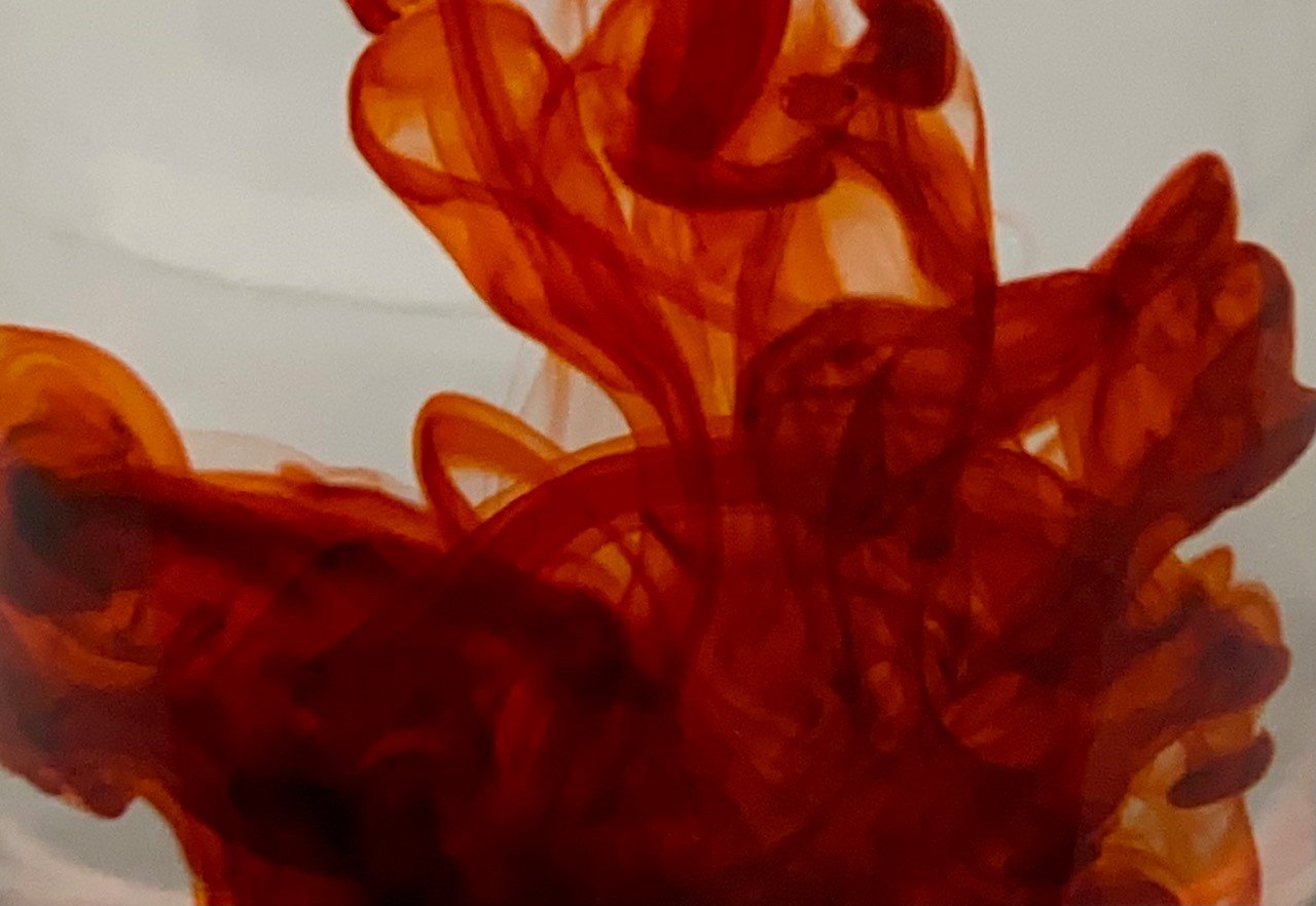
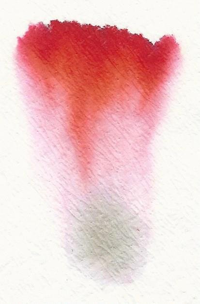
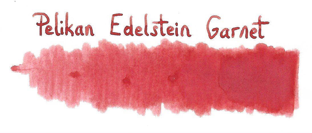
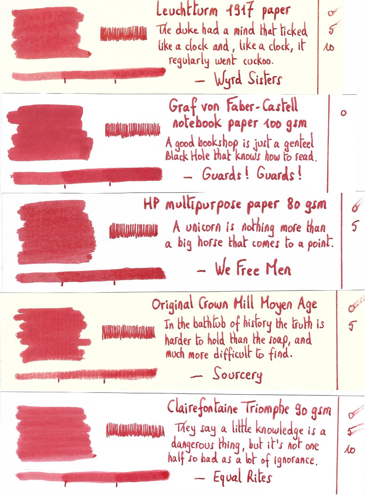
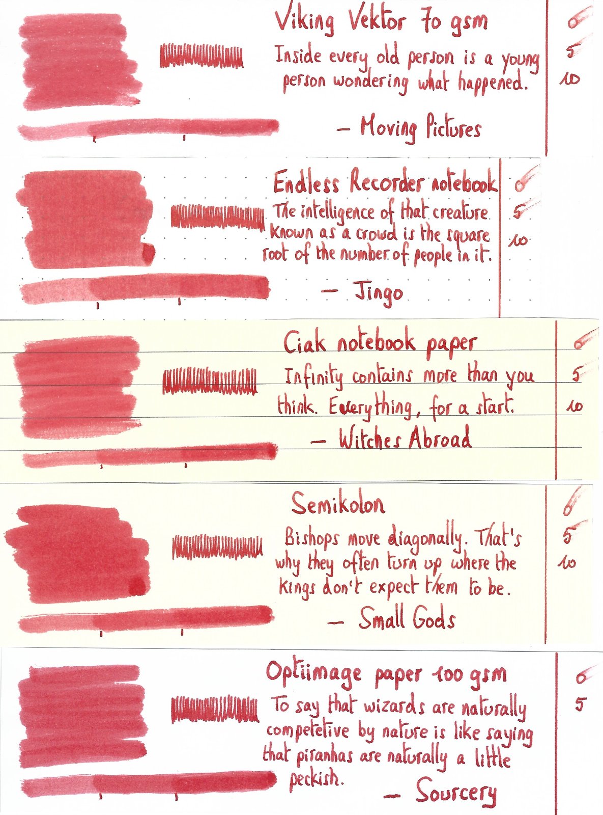
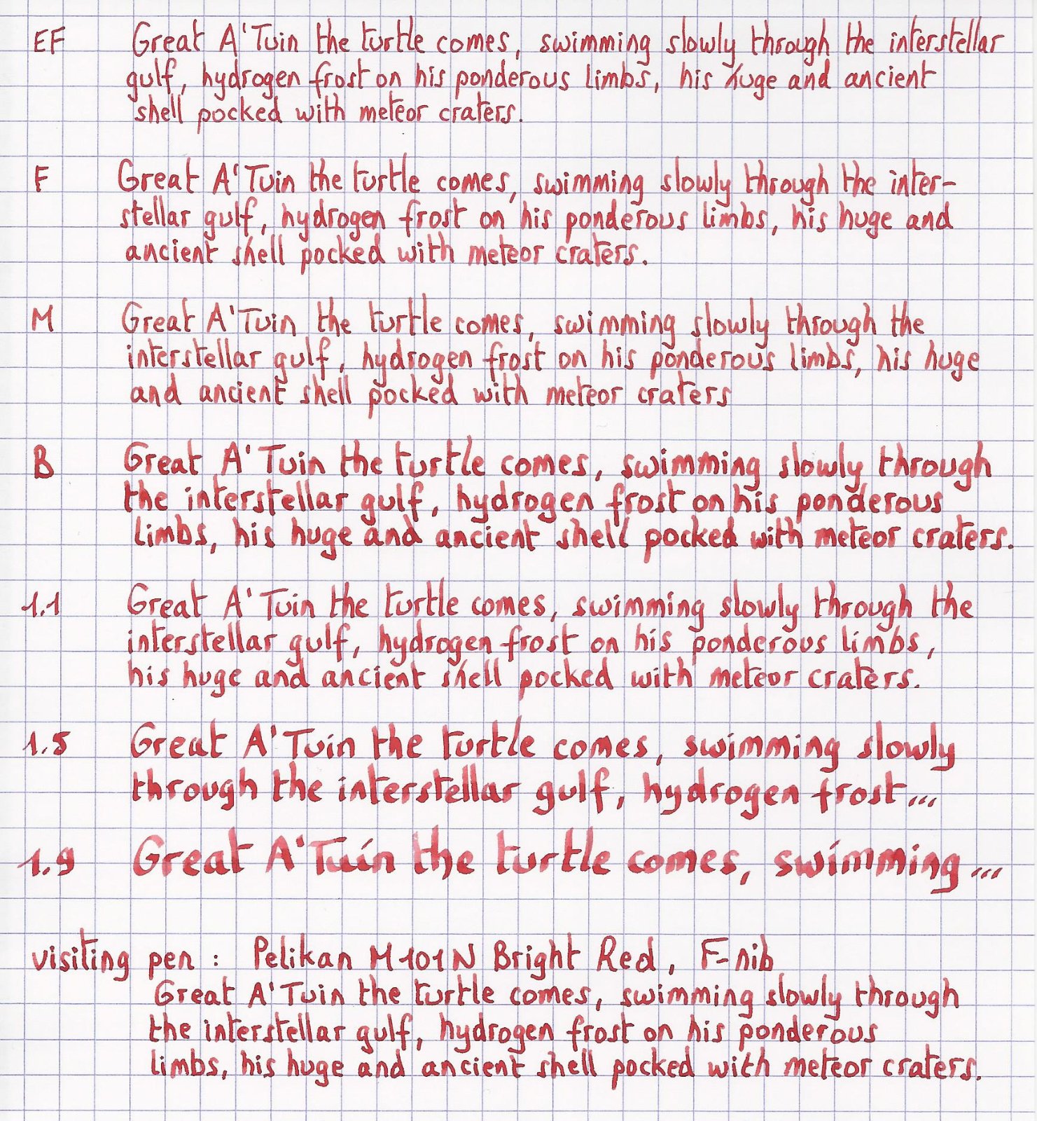
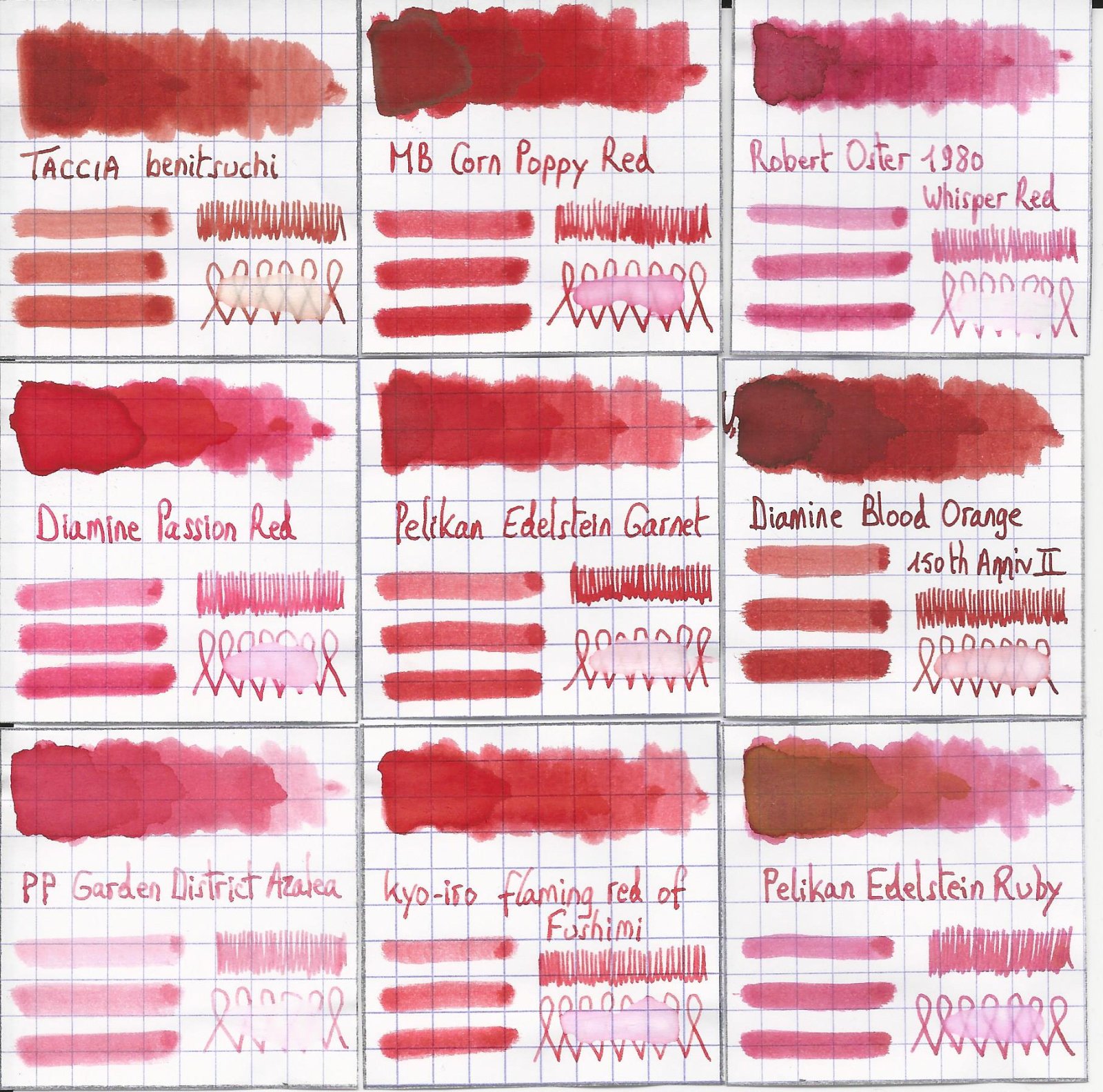
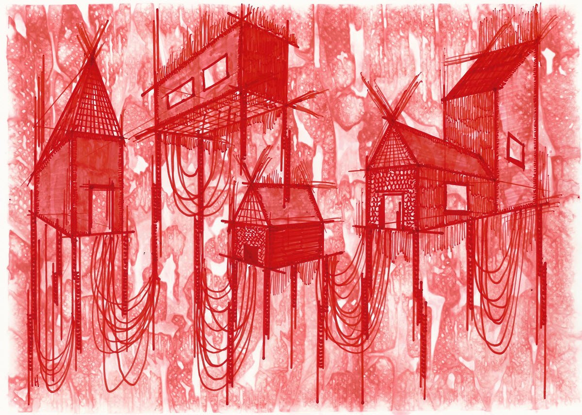
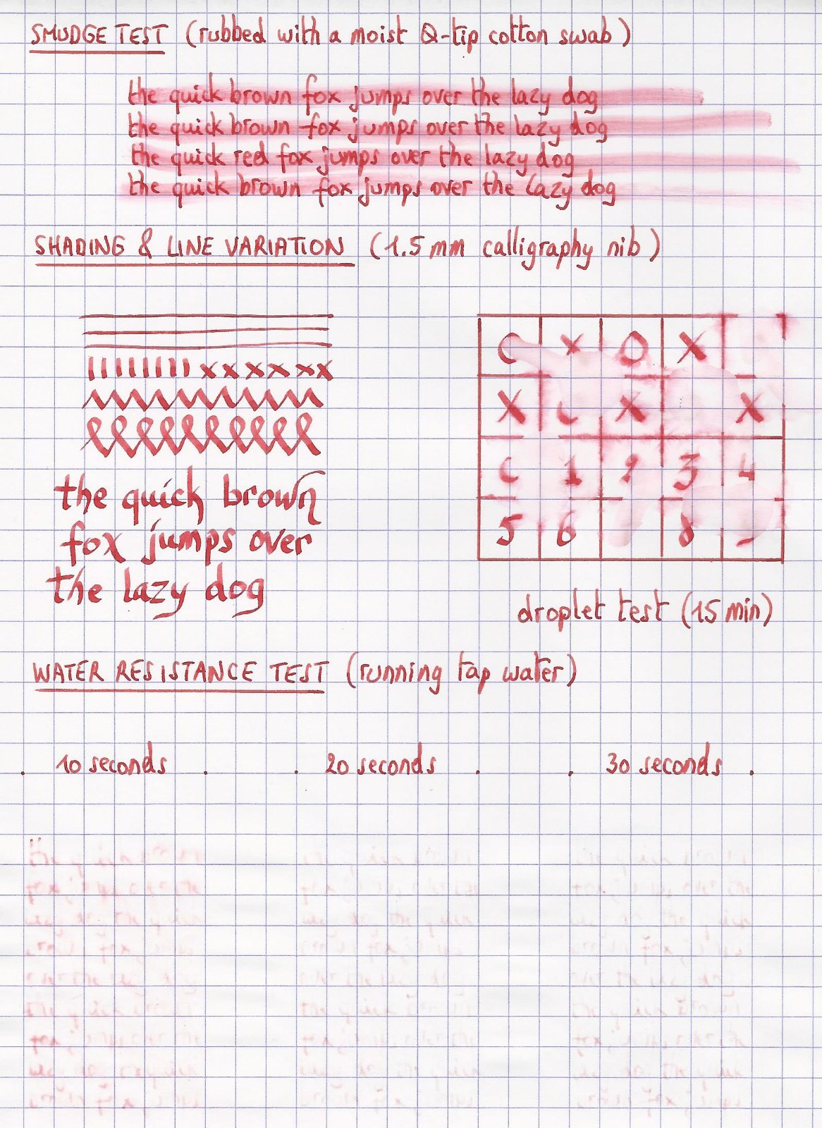
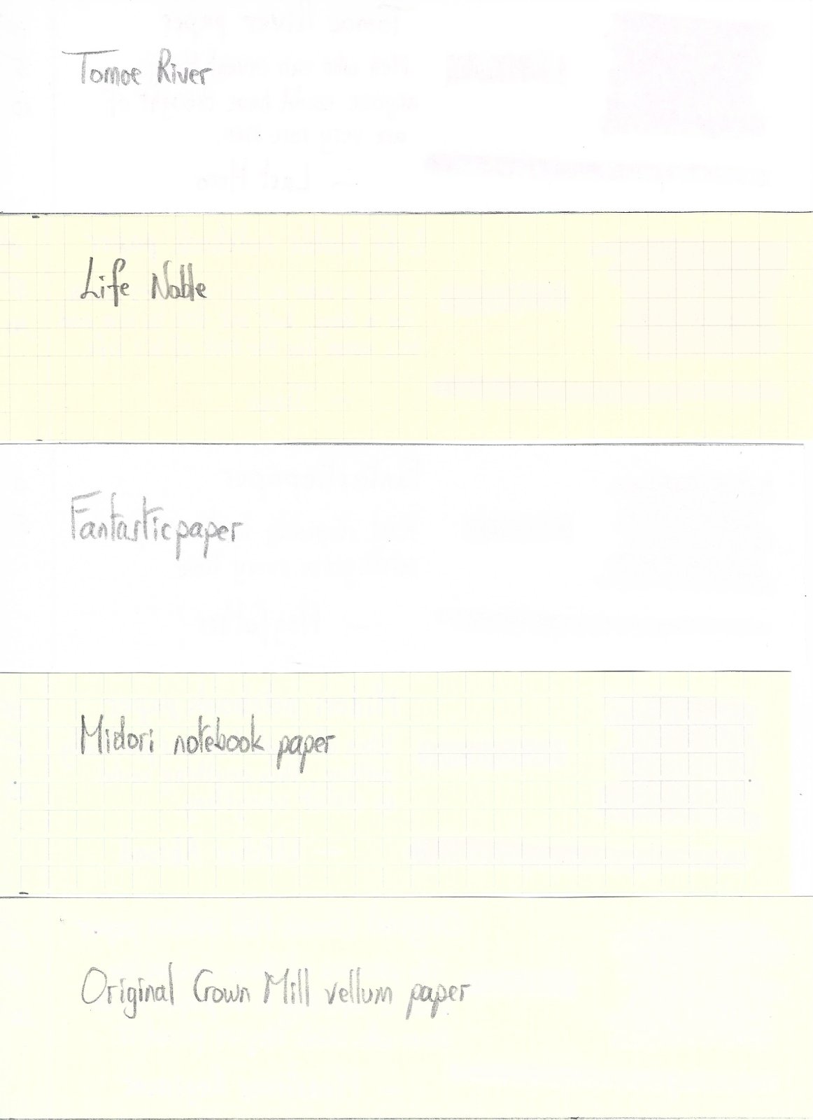
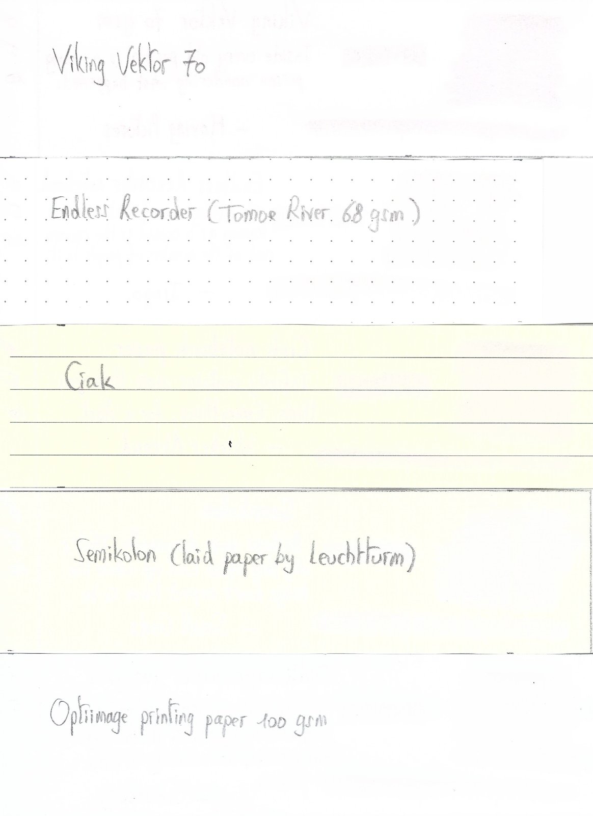
Pelikan Edelstein Garnet In 2011 Pelikan introduced the Edelstein series of high-end inks, available in a variety of colours. The theme of the Edelstein concept is the gemstone – each ink corresponds to the beautiful colour of a gem. The Edelstein line of inks is presented in 50 ml high-value bottles, that are truly beautiful, and worthy of a place on your desk. In this review I take a closer look at Garnet, the Edelstein Ink of the Year 2014, which is now part of the regular Edelstein line-up. Garnet is a fairly bright and well-saturated orange-leaning red. In daylight and in scans the ink’s red tones dominate, but under warm artificial light Garnet definitely shows its orange-leaning nature. This is a decent red ink, that works well in all nib-sizes and on all types of paper. But that’s about it… personally I think there are lots of similar reds about, and there is little to lift Garnet above the pack. Below I give you enough background information to let you make up your own mind. The chromatography shows orange-red dyes and a bit of grey in the mix. The grey tones down the ink a bit, making Garnet appear less vibrant. For red inks, this can be a good thing: a full page of vibrant red might be a bit too much for some. From the bottom part of the chroma, you can already deduce that Garnet is not a water resistant ink. This Edelstein ink can handle all nib sizes with ease, always showing a well-saturated line. I actually prefer this ink with the finer nibs (EF/F), where its presence on the paper is less overwhelming. My personal opinion is that red inks are ok for occasional notes when reviewing/correcting a document, but are too loud for regular writing/journaling. A full page of Garnet hurts the eyes. To show you the impact of saturation on the ink’s look & feel on paper, I made some scribbles where I really saturated portions of a scrap of Tomoe River paper with ink. This gives you a good idea of what the ink is capable of in terms of colour range. Garnet has a low dynamic range, with little difference between the light and darker parts. Not a lot of shading with this ink! The little shading you get is most apparent when using Garnet in dry pens with broader nibs (like the 1.5 / 1.9 calligraphy nibs for a Lamy Safari). I’ve tested the ink on a wide variety of paper – from crappy Moleskine to high-end Tomoe River. On every small band of paper I show you: An ink swab, made with a cotton Q-tip 1-2-3 pass swab, to show increasing saturation An ink scribble made with an M-nib Lamy Safari fountain pen The name of the paper used, written with a B-nib Lamy Safari A small text sample, written with an M-nib Lamy Safari Origin of the quote, written with an F-nib Pelikan M101N Bright Red Drying times of the ink on the paper (with the M-nib Lamy) The ink copes well with a wide variety of paper – it even works well with Moleskine paper: just a tiny bit of feathering, and only a bit of bleed-through. This is an ink that can tolerate even crappy copier paper at the office. I like Garnet just a touch more on the yellow papers in my test set. The yellow background accentuates the orange undertones of the ink, and reduces the contrast between ink and paper, making a page of red writing less loud and in your face. Scanned images alone are not enough to give you a good view of the ink - they tend to exaggerate contrast, and sometimes have difficulty capturing the colour of an ink. I’ve therefore added a few photos to give you another view on the ink. Writing with different nib sizes The picture below shows the effect of nib sizes on the writing. As you can see, Garnet works well in all nib sizes, even the finest ones. I actually prefer using it with the EF/F nibs – the fine line you get tames the ink a bit, and makes a full page of Garnet look a little more palatable. Related inks To show off related inks, I use my nine-grid format, with the currently reviewed ink at the center. This format shows the name of related inks, a saturation sample, a 1-2-3 swab and a water resistance test – all in a very compact form. This allows you to easily compare the ink with its eight direct neighbours, which I hope will be useful to you. Garnet sits somewhere between MB Corn Poppy Red (which is a bit more vibrant) and kyo-iro Flaming Red of Fushimi (which looks a bit softer and more delicate). Inkxperiment – stilt village I’ve put myself a challenge to try to produce interesting drawings using only the ink I’m reviewing. For me this is an incredibly fun extension of the hobby, that continuously challenges my drawing skills. Red inks often have a low dynamic range, and are a real challenge for single-ink drawings, and Garnet is no exception. I therefore decided on a simple pen drawing. I started with an A4 piece of HP photo paper, on which I painted the background using a water-soaked kitchen towel on top of which I painted with water-diluted Garnet. This always produces a nicely textured background on which to paint the subject. In retrospect, I should have diluted the ink quite a bit more… the background turned out to be a bit too prominent. I then drew in the village buildings using a 2-point perspective, and added the stilts and netting with my Lamy Safari fountain pen. Final touches to the buildings were done with a felt-tip pen and fountain pen. The resulting drawing shows what can be achieved with Garnet in an artistic context. Due to its limited colour span, Garnet is best used for line drawings. The stilt village turned out quite well. A pity about the background that should have been softer… well, lesson learned for a next time 😉 Conclusion This Edelstein ink of the year 2014 (which is now part of the regular line-up) has no real technical shortcomings: well-saturated, works with all nib-sizes and paper types. It does lack water resistance though, if you care about such things. All in all a decent red, but personally I’ve seen better ones that I liked more. Technical test results on Rhodia N° 16 notepad paper, written with Lamy Safari, M-nib Back-side of writing samples on different paper types