Search the Community
Showing results for tags 'omas paragon'.
Found 7 results
-

An Interesting Calligraphy Of Late Xv Century, And Two Italian Pens
fpupulin posted a topic in Italy - Europe
It always makes me an interesting impression see how, despite the inevitable generalizations about the form of historical handwriting, these were completely personal in everyday life, as well as in our present hand writings. With my daughter Carlotta we have recently taken up, for a couple of chapters of her thesis, some key events in the history of Spain towards the end of the fifteenth century, at the time of the so-called Catholic Kings. Among the numerous elements that in one way or another ended up largely shaping the shape of the world as we know it today, there was certainly Fernando and Isabella's decision to sponsor the discovery journey of Christopher Columbus, with whom the Italian navigator hoped to open a new route to the Indies. The agreements between the Catholic Monarchs and Columbus (the implications of which Fernando and Isabella tried to limit for years), known as the Capitulaciones of Santa Fe, were written by the secretary of the King, Juan de Coloma. The document is kept in the Archive of the Crown of Aragon, in Barcelona. The Spanish government has prepared a perfect digital copy, available at: https://enciclopediapr.org/wp-content/uploads/2016/11/Capitulaciones.pdf [the glosses on the side were written at a later date] Juan de Coloma, of humble origins, became the man of trust of the King of Aragon John II the Great and later, not without mishaps and misunderstandings, of his son Fernando II the Catholic. When he died in 1517, he had acquired the titles of Baron of Alfajarín and first Lord of Elda. The handwriting of Juan de Coloma, as can be seen in the Capitulaciones, is at first sight inexpugnable ... but at the same time fascinating and unique. The fact that I know the modern Spanish language, and that the electronic version includes a transliteration of the text, allowed me little by little to decipher most of the letters as Coloma wrote them. Now that I had a Colomesque alphabet at hand, I wanted to try it with a text written in Italian. First of all, a message of congratulations for Carlotta's birthday last week, with a writing style in use at the times of the Catholic Kings, perfect for her studies on the music of that era. Then, something literary and contemporary (or almost) to the calligraphy style. I therefore copied some lines of the Orlando furioso, a famous Italian work that writer Ludovico began writing between 1504 and 1507, when Juan de Coloma was still alive. Looking at Coloma's writing, I became convinced that a pen with a “normal” (not an italic) nib could be used for the purpose. I chose an Omas "Grand" Paragon, with a soft fine nib. The gialletta (yellowish) laid paper of Fabriano has almost the same color as the now aged paper used by Coloma to write up the Capitulaciones. The ink of choice was Montblanc's Toffee Brown, a dark and saturated brown. I used a height of two millimeters for the basic character, with a line spacing of 7 mm. Then I wrote some personal considerations on Coloma's calligraphy. They are hand written with the stub nib of my Montegrappa Extra Otto Shiny Lines and, as they are in Italian, I am translating them here for those members of the forum (most of them, I guess) who do not read Dante's language. [translation of page 1] Previously, I had never studied an ancient "real" calligraphy, or the individual and personalized execution of some model in vogue at the time of writing. Now that I have tried for a few days with the writing of Juan de Coloma, I can say that there is a great difference between the writing of a living person and the model that historians, paleographers and calligraphers then fixed in a calligraphic style. What is most striking about Coloma's way of writing is his freedom in the interpretation of letters, which can take various forms depending on their position in the context of the word and the sentence, but sometimes even without any apparent special order. The "f", for example, can take these forms:The "r" can be written alternately:The "s" shows an absolute freedom:The "l": [translation of page 2] It also amazes how the secretary of Fernando of Aragon abbreviated with freedom some words, using diacritical marks to indicate abbreviations, but also how, from time to time, he made apparently diacritical signs but in reality they were simply decorative, in order - I would say - to keep a certain 'rhythm' in the lines of the text.Original and nice, the conjunctions "and" ("y" in Spanish) and "or" ("o" in Spanish) take this form: -
Dear All: This is my first Omas. It looks like a Paragon. But the ink system is different with their website's saying. Is it Paragon? If so, what version it is? Thank you very much,

-
My three Omas Paragon pens live in Costa Rica. I have no idea of how many others Omas fountain pens are in the country, but I guess not so many. I realized that I never tried before to present my pens with a reference to the tropical environment where they work. So, here is a shot of my three faceted pens in the warm light of a tropical noon in Curridabat (the Spanish name for the indigenous Curriravá), close to the capital city, San José. They are fitted with a Extra-fine nib (New Paragon Arco celluloid), a Medium nib (black Paragon with solid gold accents and a onyx wheel), and a Bold nib (old style Paragon Arco Celluloid). The three are absolutely beautiful, extra wet nibs. The Paragons are portrayed against a background of baby bananas. The baby banana, or "Lady Finger", is still a niche production in Costa Rica, with little over 200 hectares cultivated in the Caribbean plains of the country. The Lady Finger is a cultivar resistant to the Black Sigatoka fungus, which has caused widespread damage in many of the world’s banana-growing regions. Baby bananas fruits are little more than 3” (ca. 7-8 cm) long, with a much thinner skin when compared to the typical Cavendish banana, and a very sweet and delicate flavor. Interestingly, the fruit does not become brown when cut. http://i1311.photobucket.com/albums/s677/Franco_Pupulin/Three%20tropical%20Omas%20Paragon%20FP_zpsnbatfgxc.jpg
-
http://s32.postimg.org/cpjbqsuo5/IMG_1532.jpg
-
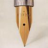
Hi, I recently bought a Omas Paragon Arco Brown from 2000, the 75 years LE with a specific 75 years nib and "Symbol of Distinction" written on cap. Afaik, there were made 750 pens to commemorate the 75 years, but I do not know if there were 750 pens in total or each model or each color had 750 pens made. Anyone can help with this? You have below 2 pictures.
-
There have been many threads here listing the “flagship” pens of various well known brands (see this, this, and this). I’m posting this simply to organize the information a little bit more attractively. To be clear, I define “flagship” as follows: A “flagship” pen is a regular production model (i.e., not a limited or special edition), which is generally the largest, most expensive, and most visibly advertised item in a brand’s inventory. Where no single pen satisfies all the criteria, a judgment call may have to be made on what (if any) product is the “flagship” for a particular brand. Obviously, a brand calling one of its own products its “flagship” trumps other considerations. Any corrections, additions, or suggestions are appreciated. Brand Flagship Entry Level Other Notable Lines Country Aurora Aurora 88 Large Ipsilon De Luxe Talentum, Alpha, Optima Italy Caran D’Ache Léman Ecridor Varius, Madison Switzerland Conway Stewart Churchill None Winston, Wellington, Series 100, Marlborough United Kingdom Cross Townsend Classic Apogee, ATX, Botanica, Sauvage United States Delta Dolce Vita Oversize Unica Many Lines Italy Graf von Faber Castell Intuition Platino Wood (seems to have displaced the Classic) Guilloche Classic, Pen of the Year Germany Franklin Christoph Model 19 “1901” Model 27 “Collegia” Many Individual Models United States Lamy Lamy 2000 Safari Studio, Dialog Germany Montblanc Meisterstück 149 “Diplomat” None Writers Edition, Great Characters Edition, Starwalker, Boheme Germany Omas Paragon None Milord, Bologna, 360, Ogiva Italy Parker Duofold (Centennial) Vector Sonnet, Premier, Ingenuity, Parker 51 (discontinued), P25 (discontinued) United States Pelikan M1000 Souverän M100, M150, M200, M205, M215, M250 Classic Many Lines German Pilot Custom 845 (Some discussion on the point ) Metropolitan Falcon, Vanishing Point, Custom 823, Justus Japan Platinum President Preppy 3776 Series Japan Sailor King of Pen Many Models 1911 Series, Professional Gear Japan Sheaffer Legacy Heritage VFM Taranis, Prelude, Sagaris, 300, 100, Intensity, Ferrari United States TWSBI Diamond Eco Classic, Vac 700, Mini, 580AL Taiwan Visconti None (Possibly the Divina. See this and this) Classic Homo Sapiens, Opera, Van Gogh, Michelangelo Italy Waterman Edson Charleston Carène, Exception France
-
Hi guys, I got my NOS Omas Paragon Saft Green today, and have a favor to ask. I found that the cap cannot fully close on the barrel, which will leave a gap between the cap and barrel when I close the pen. Did Omas leave the pen like this on purpose or there is a problem with the pen? Thanks!