Search the Community
Showing results for tags 'ochre'.
Found 7 results
-
From "Seasonal Terms", a range in the same line and octagonal bottles as "Ancient Charm" (but without the shimmer) - so is that Pen BBS? Last year at the LA Pen Show I picked up "Beginning of Spring" (like Alt-GoldGrun but browner - the bottom row in the illustration) and "Beginning of Summer", both of which are rather nice, but "Grain in the Beard" was sold out. One year later and perseverance pays off! Now why was it again that the Mesopotamians turned from hunter-gatherers to farming?
-
L'Artisan Pastellier Callifolio - Yalumba L'Artisan Pastellier is a small company in southern France that specialises in natural pigments, and offers customers authentic and reliable products in beautiful colours based on mineral or vegetable pigments. In a collaboration with Loic Rainouard from Styloplume.net, the chemist Didier Boinnard from L'Artisan Pastellier created the line of Callifolio fountain pen inks. These pastel-colored inks are traditionally crafted, and can be freely mixed and matched. Overall these inks are only moderately saturated, and have low water-resistance. The inks were specifically designed to work well with all types of paper, and all types of fountain pens. Being pastel-tinted, these inks have a watercolor-like appearance, and are not only fine inks for journaling, but are also really excellent inks for doodling & drawing. I only recently discovered them, and they are already the inks I gravitate towards for personal journaling. In this review the spotlight is on Yalumba, one of the ochre-type inks of the series. According to Wikipedia, "Yalumba" is an indigenous Australian word referring to "all the land around". And it must be said: the orangy ochre colour of this particular Callifolio ink reflects the mood of the dusty Australian outback. Yalumba has an orange-leaning ochre colour that looks quite nice. I like its looks, and find it especially suited for personal journaling. The ink is a bit unpredictable though, in that the colour you get depends heavily on the particular combination of pen and paper. Sometimes quite orangy, sometimes more ochre-brown leaning. Personally, I find this to be one of the charming characteristics of this ink. I found the ink to be a bit on the dry side in my Lamy Safari test pens, with lubrication being somewhat subpar. A wet pen solves this problem. Saturation is good though, even with finer nibs. The wetter your pen, the more the colour shifts from orange to brown ochre. Shading is subtle, and becomes more pronounced with broader nibs. The contrast between the light and darker parts of the text is just right, which makes it aesthetically pleasing. To show you the impact of saturation on the ink's look & feel on paper, I made some scribbles on Tomoe River where I really saturated portions of the paper with ink. This gives you a good idea of what the ink is capable of in terms of colour range. As you can see, this ink has a fairly wide colour span ranging from a light orange-ochre to a reasonably dark brown-ochre. On the smudge test - rubbing text with a moist Q-tip cotton swab - Yalumba behaved quite well. There is some smearing, but the text remains very sharp and readable. Water resistance is also quite good for a non-waterproof ink. An easily readable brownish residue remains even after longer exposures to water. This is also apparent from the lower part of the chromatography. I like this water resistance, since it means I can use this ink for notetaking at work (where this non-conventional colour is sure to draw some attention). I've tested the ink on a wide variety of paper - from crappy Moleskine to high-end Tomoe River. My test-bank of papers has expanded to 20 different types, so you're sure to get a good impression of the ink's behaviour. On every small band of paper I show you: An ink swab, made with a cotton Q-tip 1-2-3 pass swab, to show increasing saturation An ink scribble made with an M-nib fountain pen The name of the paper used, written with a B-nib A small text sample, written with an M-nib Drying times of the ink on the paper (with the M-nib) Yalumba behaved perfectly on all the paper types, with no apparent feathering even on the lower quality papers in my test set. Even Moleskine paper behaved quite well with this ink! Drying times are mostly around the 5 to 10 second mark. The ink looks nice on both white and more yellowish paper. With this ink, paper makes a difference... the ink's look can differ significantly depending on the type of paper you use. At the end of the review, I show you the back-side of the different paper types, in the same order. With the low-end Moleskine there is prominent show-through and a bit of bleed-through. With the other papers, Yalumba's behaviour is impeccable. The ink copes really well with a wide variety of paper types. Writing with different nib sizes The picture below shows the effect of nib sizes on the writing. All samples were written with a Lamy Safari, which is typically a dry pen. I also added a visiting pen - a wet-writing Pelikan M400 Tortoiseshell Brown with a fine nib. With this wet nib, the ink writes much more pleasantly. It also shows a substantially darker line. Related inks To compare Yalumba with related inks, I use my nine-grid format with the currently reviewed ink at the center. This format shows the name of related inks, a saturation sample, a 1-2-3 swab and a water resistance test - all in a very compact format. Inkxperiment – shadow people As a personal challenge, I try to create interesting drawings using only the ink I'm reviewing. For me, this brings extra fun to the hobby, and these little single-ink paintings are great for stretching my drawing skills. With these small pictures, I try to give you an idea of what the ink is capable of in a more artistic setting. For this drawing, I got my inspiration from some pictures I saw on Pinterest. I started off with HP Premium photo paper - which is rapidly becoming one of my favourite drawing media because it makes the ink look really vibrant. The lightly dotted background is obtained by soaking a kitchen towel in heavily water-diluted ink, and pressing the photo paper on top of it. The door frame and the shadow people were painted in using ever more saturated ink, ending with pure Yalumba for the darkest parts. The resulting picture gives you an idea of the colour range you can expect when using Yalumba as a drawing ink. Conclusion Callifolio Yalumba is an eye-pleasing orange-ochre ink, that is both at home with writing and drawing. The ink is at its best in wetter pens, where it produces a dark and saturated line, and where it doesn't suffer from the subpar lubrication you notice wih dry pens like the Lamy Safari. I especially liked Yalumba as a drawing ink, where its relatively broad colour spectrum is a big advantage. In my opinion, one of the nicer inks in the L’Artisan Pastellier Callifolio series. Technical test results on Rhodia N° 16 notepad paper, written with Lamy Safari, M-nib Back-side of writing samples on different paper types
-
I have been looking to develop my "Warm Earth" tones in general and my red earths in particular. Diamine seemed to have some good options (I have my "Cold Stone" colors from De Atramentis). I couldn't really find a good comparison so I narrowed it down to the few that I was most interested in and plumped for 30ml bottles rather than samples. It's neither scientific nor thorough, but I thought I would post my initial impressions as I couldn't find anything similar. . . . . which is a scan but the colors for Ochre and Rustic Brown are not true at all. I tried taking a photo, which is a much more fiddly process, but the colors seem truer: Two more bricks that I didn't like on the first page - I thought the Copper was rather strong! The Monaco Red might be a bit too pink in that one? Anyway it seems I have added the following to my "Sub-Tertiary Color Circle": Yellow Earths: Sepia and Ochre Orange Earths: Burnt Sienna and Ancient Copper Red Earths: Oxblood & Monaco Red (both still tending to orange - which is what I was looking for!) I don't have any "True Reds"! Rustic Brown I would count as a Rose - it's really on the purple end (where my sample of Morinda seemed to fit too). On the Orange front I also have Autumn Oak, a decent Coral (house blend!) and an Orange with a cute elephant on the label, but as these aren't anywhere near "brick" they did not seem relevant here. Hmmm, the only thing I might add is that this is my "cheap scribbling" paper (Daiso - great cheap paper for ink work!) rather than anything fancy, so the colors are a bit flatter than they might be elsewhere.
-
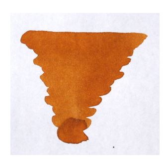
L'Artisan Pastellier Callifolio - Inti L’Artisan Pastellier is a small company in southern France that specialises in natural pigments, and offers customers authentic and reliable products in beautiful colours based on mineral or vegetable pigments. In a collaboration with Loic Rainouard from Styloplume.net, the chemist Didier Boinnard from L’Artisan Pastellier created the line of Callifolio fountain pen inks. These pastel-colored inks are traditionally crafted, and can be freely mixed and matched. Overall these inks are only moderately saturated, and have low water-resistance. The inks were specifically designed to work well with all types of paper, and all types of fountain pens. Being pastel-tinted, these inks have a watercolor-like appearance, and are not only fine inks for journaling, but are also really excellent inks for doodling & drawing. I only recently discovered them, and they are already the inks I gravitate towards for personal journaling. In this review I take a closer look at Inti, one of several ochre-coloured inks in the Callifolio series. Inti is named after an ancient Incan sun god, often represented as a golden disk with rays and a human face. An interesting name for a fountain pen ink – let’s see whether the ink is as cool as its name suggests. I’ve used the ink for more than a week in my daily journal (Paperblanks), with a TWSBI VAC Mini with an M-nib, which is a fairly wet writer. I immediately took a liking to the ink – the colour is superb, and fixes the main problem I had with Heure Dorée. That ink was just too light and too low-contrast for writing. Inti solves that : the ink is a more orangy ochre, with much better contrast on the paper. Definitely a splendid ink for journaling. And my personal impression is that Inti is rather well lubricated for a Callifolio ink, which is also a plus. Inti exhibits some very pleasant shading, especially in the broader nibs. I like that the shading is subdued, with not too much contrast between the lighter and darker parts. As with all Callifolio inks, Inti is a great choice for drawing, with a colour palette that ranges from light orange ochre to a much darker red-orange hue. On the smudge test – rubbing text with a moist Q-tip cotton swab – Inti behaved perfectly. There is hardly any smudging visible. Water resistance shows some curious behaviour. With the droplet test, where I leave water droplets on the ink for 15 minutes, the ink remained firmly attached to the paper. Running water however is not Inti’s friend – the colour washed away very quickly, leaving only faint light-brown traces of my writing. I’ve tested the ink on a wide variety of paper – from crappy Moleskine to high-end Tomoe River. For the Callifolio reviews, I’m using a new format to show you the ink’s appearance and behaviour on many different paper types. On every small band of paper I show you: An ink swab, made with a cotton Q-tip1-2-3 pass swab, to show increasing saturationAn ink scribble made with an M-nib fountain penThe name of the paper used, written with a B-nibA small text sample, written with an M-nibDrying times of the ink on the paper (with the M-nib)Inti behaved perfectly on all the paper types, with no apparent feathering even on the lower quality papers in my test set. Drying times are mostly around the 5 to 10 second mark. I love the way the ink looks on Paperblanks paper. The ink also works surprisingly well with low-quality paper like Moleskine and generic notepad paper. I also show the back-side of the different paper types, in the same order. With the low-end Moleskine there is a certain amount of show-through and bleed-through. The Graf von Faber-Castell paper also exhibits visible showthrough (this paper is a real Jekyll & Hyde – with some inks it behaves perfectly, with other inks it shows&bleeds like hell, and that for a 100 gsm paper – really strange). With the other papers, Inti behaved just fine. The ink copes really well with a wide variety of paper types. Conclusion Inti is a very pleasant orange-ochre ink with a fantastic colour. The ink is great for drawing, and works really well for personal writing. I enjoyed it a lot ! The ink is on the light side, but retains sufficient contrast with the paper. L’Artisan Pastellier produced a very fine ink with this one. An ink I will definitely include in my ink rotation. Technical test results on Rhodia N° 16 notepad paper, written with Lamy Safari, M-nib
-
L'Artisan Pastellier Callifolio - Cannelle L’Artisan Pastellier is a small company in southern France that specialises in natural pigments, and offers customers authentic and reliable products in beautiful colours based on mineral or vegetable pigments. In a collaboration with Loic Rainouard from Styloplume.net, the chemist Didier Boinnard from L’Artisan Pastellier created the line of Callifolio fountain pen inks. These pastel-colored inks are traditionally crafted, and can be freely mixed and matched. Overall these inks are only moderately saturated, and have low water-resistance. The inks were specifically designed to work well with all types of paper, and all types of fountain pens. Being pastel-tinted, these inks have a watercolor-like appearance, and are not only fine inks for journaling, but are also really excellent inks for doodling & drawing. I only recently discovered them, and they are already the inks I gravitate towards for personal journaling. In this review I take a closer look at Cannelle – one of the ochre-brown inks of the series. Cannelle gets its name from the spice cinnamon – capturing the colour of the spicy powder really well. And this definitely is the real thing – the Ceylon variety – and not the cheap stuff. This is a beautiful yellow-brown ochre ink, which you must spend some time with to really get to appreciate it. The ink shows lots of shading, especially with the broader nibs – ranging from a light yellow-brown to a well-saturated ochre-brown where the ink pools. This is a low-saturated pastel-tinted ink, with good flow, but one that needs broader nibs and a wet pen to show its character. Lubrication is on the low side, resulting in noticeable feedback from the paper when writing, especially with the finer nibs. But with the right pen and the right paper, this really is a beautiful ink, and it kind of grows on you. The more time I spent with it, the better I liked it. Cannelle is smudge-resistant – there is almost no spreading of the ink. The ink’s water resistance shows some strange behaviour. The ink is very soak-resistant – after a 15 minute soak, the result remained very readable. But with running tap water, the result was less good – even a short exposure results in a brownish fingerprint of the text that is only barely readable. Don’t count on being able to easily reconstruct your writing. When using a water-brush when doodling & drawing, you get a nice light-yellow-brown shading effect, that contrasts well with the inky lines. I use a glass pen for this, that can lay on thick lines of ink that are very saturated – this gives you a broad color-spectrum ranging from light yellow-brown to dark ochre. Nice ! I’ve tested the ink on a wide variety of paper – from crappy Moleskine to high-end Tomoe River. For the Callifolio reviews, I’m using a new format to show you the ink’s appearance and behaviour on the different paper types. On every small band of paper I show you: An ink swab, made with a cotton Q-tip1-2-3 pass swab, to show increasing saturationAn ink scribble made with an M-nib fountain penThe name of the paper used, written with a B-nibA small text sample, written with an M-nibDrying times of the ink on the paper (with the M-nib)I’ve added two new paper types to the mix – Fantasticpaper (www.fantasticpaper.de) and Midori notebook paper. Both are high-end fountain-pen friendly papers. I was pleasantly surprised by the dark look of Cannelle on the Fantasticpaper. Cannelle behaved perfectly on all the paper types, with no apparent feathering even on the lower quality papers in my test set. Drying times are in the 5 to 10 second range, so this is a fast-drying ink. On the Fantasticpaper, the ink looks much darker than on other papers – on this paper even a fine-nibbed pen will play nice with Cannelle. For me, the ink looks better on the off-white paper, where the yellow paper tones result in less contrast-rich shading, giving a more aesthetic look to your writings (compare e.g. the samples on Rhodia and Midori paper). I also show the back-side of the different paper types, in the same order. With the low-end Moleskine and generic paper, there is significant show-through and bleed-through. With the other papers, Cannelle’s behaviour is impeccable. This ink copes really well with all paper types ! Conclusion Callifolio Cannelle is a very well-behaving ink on all types of paper, but for me this turned out to be an ink that needed some time to grow on me. I’m used to fine nibs, and this ink is definitely meant to be used in broad & wet nibs to show its full potential. I really like the broad range the ink’s colour can cover – from light yellow-brown to intensely saturated dark ochre. Really nice when doodling & drawing. Overall I find Cannelle to be a very nice ochre-coloured ink that I enjoy using. That being said – when looking at the related ink colours, I think I will appreciate Inti and Anahuac even more ;-) Technical test results on Rhodia N°16 notepad paper, written with Lamy Safari, M-nib
-
Hello FPN, I need some advice on what well-behaved golden brownish inks are out there. I have been searching and searching for a while and doing research on this, but it always results in some problem people have with the ink. 1) Noodler's Golden Brown is reported to be dry and leaves a residue on demonstrators 2) Diamine Golden Brown is also dry 3) Diamine Ochre seems to get gunky and stains demonstrators 4) PR sepia has issues with clogging Now the thing is, I want to use this ink in a demonstrator - either a Kaweco sport clear as an eyedropper or a TWSBI 580 Diamond, both with either fine or extra fine nibs. So my concern is both, staining and dry inks in fairly fine nibbed pens. Any ideas out there on what else is there to try? (Also would be great if it is not too pricey!) Thank you! EDIT: Please feel free to tell me about your favorite warm-toned brown inks as this is something I am open to as well! Thanks!
-
Hello. I need a little help please, pinning-down a particular swap from a Diamine brown(ish). I found it in a general Diamine search. I want a lighter, almost dark amber vs. my beloved darker, MB Toffee Brown...Nothing with a reddish tone. Too many of these already. This color reminds me of old 19th century documents which is what I want.This swab was def. Diam., but had no tag. I've looked at other Diam. images I have and need to identify this one. Their swab is distinctive... I'm thinking this is the one for me. My guesses: Diamine-Ochre, sepia, golden brown, raw sienna ? Any thoughts please from more seasoned eyes would be most helpful. Thanks, LeRoy