Search the Community
Showing results for tags 'mix'.
-
I mixed a tiny batch of this with about 3cc total. 5 drops of Noodler's HoD. 15 drops of K T-C 12 drops of LE 3 drops of water dipped Noodler's nib creaper flex pen. full res image http://i.imgur.com/OFLRSMk.jpg

-
here is another ink mix I've been playing with. I have tried a similar mix before and results of mixing are very stable, i.e. no unwanted side effects like precipitations, or changes to the typical characteristics of the starting inks. The starting ink is Edelstein Aquamarine. I got this ink with purchase of the Aquamarine M200, but as much as I like the pen, this ink is a bit too green for my taste. I had already tried this in a mix with Edelstein Sapphire, which is a lovely ink on its own. The fact it leans evidently on purple is a good starting point to tame the excessive green in Aquamarine. I had already made some earlier tests which suggested the ideal starting ratio would be around 6 parts Sapphire to 4 parts Aquamarine. Being a test, I did not want to exceed with quantities so using two clean syringes I put together 3 ml of Sapphire with 2 ml of Aquamarine. I regret that my syringes are slightly too big (they are 2.5 ml metered syringes) and accuracy is not at its best. I already like the resulting mix, a middle blue, with no purple tinges, however it is slightly pale, so I have made a further test adding 1 part (0,5 ml) of Edelstein Tanzanite. The result is a slightly darker blue with similar tone. After some testing it seemed to me that there was still a slightly cold tone in the mix, and decides to add one more part of Aquamarine. So the final mix is Sapphire 6 parts Aquamarine 5 parts Tanzanite 1 part (depending on preference even a 1:1 ratio - 6 parts Sapphire + 6 parts Aquamarine - could look nice, to steer towards a more sea type of blue). Here is a picture taken on a very glossy paper which shows the tones rather well, on copy paper the tones are slightly more dull. Admittedly the photo loses some of the differences in tone which are more evident on paper (I will try with a scan later) The behaviour of the mix is very similar to that of Sapphire. I do not find it dry (Aquamarine is slightly dry) and the mix including Tanzanite feels slightly more wet
-
I am really enjoying using KWZ inks (other than the vanilla scent), and I've been looking into finding my perfect olive green ink. One of my requirements is good water resistance -- it does not need to be 100%, but the writing has to withstand being touched with damp hands or a small spill and still remain easily legible. I hoped KWZ I.G. Green Gold was going to be it, but when my bottle arrived, I've found that it's really more like a somewhat olive-leaning dark green. Not a green-gold as one might imagine (or olive). In a moment of inspiration, I decided to see what will happen if I mix I.G. Green Gold with KWZ Honey. Honey is a translucent and "layerable" honey-caramel color that can shade to off black if piled on. I.G. Green Gold is a very saturated low transparency ink. Both have silver sheen outline, but I.G. Green Gold just barely a hint of it, whereas Honey sheens silver around the letters very easily on good paper. Here are my results. No precipitate or odd behavior found so far. I very much like the first mixture and will be using it from now on in an empty Iroshizuku bottle. KWZ "Olive #1" : KWZ I.G. Green Gold 3/4 : KWZ Honey 1/4 KWZ "Olive #2" : KWZ I.G. Green Gold 2/3 : KWZ Honey 1/3 Both together:
-
I would like to find a good Prussian Blue, in my view, a slightly grey-turquoise-blue. Having recently bought a bottle of Shaeffer Scrip Peacock Blue, mainly for the cool bottle, I found the ink watery. Peacock Blue, Do you have any suggestions for mixing this Peacock Blue with black or blue and black so as to get a more substantial color? So far my only mix that worked from a color standpoint has been Pilot Black from an ink cartridge with deArtemis Mint Turquoise. This is somewhat gummy after some weeks, but is a beautiful dark bliue-green.
-
Hi, some of my favorite inks are iron gall. So I took some of these to see what happens when I mix them. :-) The inks: ESSRI, blue-black IG Gutenberg G10 Urkundentinte "Schwarz" black IG Platinum Classic Forest Black, green IG Platinum Classic Sepia Black, brown IG 1. I wanted to make Forest Black darker and less yellowish: My favorite: 75% Forest / 25% ESSRI (darker but not a cold green) 2.: Forest Black mixed with G10: Favorite: 67% Forest / 33% G10 (a "Moddergrün" = murky green, like Diamine Safari but darker) 3.: Forest Black with G10 and ESSRI: Favorite: 40% Forest / 40% G10 / 20% ESSRI (subtle gray-green) 4.: G10 mixed with ESSRI to remove the aubergine tint: Favorite: 75% G10 / 25% ESSRI 5.: Sepia Black and ESSRI: Favorite: 50% Sepia Black / 50% ESSRI (nice dark gray-black) Nib used: Swan B-stub; paper: Clairefontaine 90g/m3 Photos were taken 10 days after writing. No mixture developed a sediment in these ten days. Best Jens
-
In December 2014, the Fountain Pen Network contributor "Masque" offered a recipe for a highly shading teal ink that he named "Black Swan in Icelandic Minty Bathwater." The mix is composed of three Noodler's Inks: Navajo Turquoise, Massachusetts 54th, and Old Manhattan Blackest Black (an exclusive to Fountain Pen Hospital). I enjoy Nathan Tardif's Black Swan inks, both the Australian Roses and English Roses versions, which embed a mysterious black shadow in a subtle, lovely color, as well as another mix by the FPN contributor "crunchmaster," called "Black Swan in North African Violets." It's entertaining and unexpectedly educational to watch Tardif incorporate economic and historical concepts within ink, of all things -- in this case, how economies and organizations should consider the dramatic and always unexpected impact of "unknown unknowns," described in Nassim Taleb's book, The Black Swan. Realizing recently that I owned each of these three inks, I mixed Masque's recipe. His proportions -- 15 parts Navajo Turquoise, 3 parts Massachusetts 54th and 1 part Old Manhattan Blackest Black -- produce a gorgeous, reliable, highly shading teal ink. A comparison with other inks reveals similarity with Sailor Jentle Yama Dori, though without the sheening properties. Other FPN ink mix developers in the "Icelandic Mint" thread attempted blends with other versions of black, with varying degrees of success. Masque's recipe is highly successful, as is another by the FPN contributor "Intellidepth," composed of 2.5mL Noodler's Navajo Turquoise, 2 drops Noodler's Yellow, and 2 drops Noodler's Black (bulletproof). With black swan versions of red, violet, and teal, likely next candidates include blue and brown. Black Swan in Chocolate Pansies? Black Swan in Blue Sage?
-
I thought I'd share an ink mix which I am really enjoying at the moment (I hope this is the correct sub forum). I bought a bottle of Pelikan 4001 Turquoise because I wanted something different in my blue ink collection, however I found it to be un useable for my office work; far too light and bright. In my ink draw I had a bottle of Pelikan Blue Black to hand so I used an empty cleaned out Pelikan Edelstein bottle and combined measures of the two in order to make a fantastic ink which I can use in the office. This ink is within my personal boundaries of what is "office friendly", obviously everyone is different, but this works for me and I thought I would share. I've been using this for aprox. 2 months and I've had no clogging issues, and the mixed contents of the Edelstein bottle appears to be fine. Let me know your thoughts??? http://i1287.photobucket.com/albums/a633/MattRegan/Photo%2020-07-2015%2017%2001%2002_zpsp6swcjpb.jpg http://i1287.photobucket.com/albums/a633/MattRegan/Photo%2020-07-2015%2017%2027%2034_zpsp5lttj0p.jpg http://i1287.photobucket.com/albums/a633/MattRegan/Photo%2020-07-2015%2017%2027%2053_zpsptus3o5a.jpg http://i1287.photobucket.com/albums/a633/MattRegan/Photo%2020-07-2015%2017%2002%2003_zpstupsalbk.jpg
-
Hey All, If this question should be in the Ink Recipe section, please let me know! My question is rather simple though: How do I make an ink slightly darker than it is? I figured that mixing it with some black ink would do the trick, but HOW MUCH BLACK should I add to change the color only a little? The ink that I want to make darker is a beautiful brown, Noodler's Kiowa Pecan that I recently received in a great trade. The black that I am thinking mixing with it is Noodler's Zhivago. They're both from Noodler's and have similar flow characteristics. I thought about taking a 1oz sample of the Kiowa Pecan and slowly adding some of the Zhivago, testing each time, until I get the shade I'm looking for, but I think it's really easy to over do it and go too dark! Any advice?
-
I'm mixing my own colours. I keep samples in these small airtight lab tubes. I kept this small amount overnight with the tube standing upright. Next day, the ink is still sloshing all over the tube, but it seems like some of it is "stuck" to the walls of the tube. Is this surface tension from the tube? I believe if I keep it upside down, the amount WILL eventually go down, and will not stain. I was actually worried about it staining my pens, but having tried it, it doesn't. Any inky thoughts?
-
Made a little something on a groggy English morning... Quite pleased Autumn Oak + ~1/4 Red Dragon --> Red Oak. http://i.imgur.com/zYLiio2.jpghttp://i.imgur.com/HrGhSUp.jpg?1 I haven't really mixed any inks before, so this was a happy accident more than anything else. The result is a darkened Autumn Oak that is not so harsh to read for a long time, improved shading on Red Dragon with some orange flair, and damn great shading. Mixing two well behaved inks, the result seem to be okay -- no feathering or bleeding on Rhodia 80gsm paper. (Unfortunately this isn't super calculated so I can't give you exact amounts I used... I literally went out on a whim and decided to do this). http://i.imgur.com/lh0dOS4.jpg
-
Hello All! In my quest for the perfect teal- green mix, I have been tirelessly scouting ink reviews... However, much to my dismay, not many of them are readily available in India. Options are fairly limited to Diamine, J. Herbin, some colours from Private Reserve, and some from Mont Blanc. So I played mad scientist instead. This mix uses Diamine Marine and Kelly green. Unfortunately, I added random quantities of ink till I had a colour I liked, so I don't have exact proportions. However, I will mix some more when I run out of the current batch, so I'll post ratios then if anyone's interested! On to the ink itself... I have had it mixed in an ink bottle for two weeks and in a (disposable) pen for over a week with no reactions atall so I am certain the mixture itself is stable. As I was hoping, mixing two well shading inks meant that this particular mix also has good shading properties and it looks fetching. I am very satisfied with it; it's the exact colour I was looking for, shades well, and has no flow problems. Dry time on Rhodia is a bit prolonged (around 35 seconds from a wet pen) but I don't really mind. Water resistance is zilch. Here are some shots. The colour is true to life on my monitor.
-
Hey guys, I recently tried a sample of Diamine Grape and really loved the color. However, the ink is a bit weird and gets a little cloggy if left for a couple days in a pen. I have been looking at Lamy Dark Lilac swatches online and I really love the color as well. I am considering getting the ink, then making my own mixes to achieve a darker purple when I am in the mood for it. Does anyone have any experience with making grayish purples like Diamine Damson or a dark purple like Diamine Grape? I don't want to purchase two bottles of purple ink - as I am likely never going to use them up. I think getting the lilac ink will let me play with both - bright and dark purples if things go to plan. I look forward to hearing your experiences! Thanks!
-

54Th Massachusetts Mixes (With Quink, Pilot Parallel, Sheaffer, Lamy)
nathanpaulo posted a topic in Inky Recipes
I am aware from reading around that some Noodler's inks aren't made for mixing because of some components reactive producing precipitation and what not. I am wondering if any of you has had any experience with mixing 54th with quink, pilot, sheaffer, lamy. To my experience with the 4 inks, they are all completely compatible, but I am wondering if they are harmless to mix 54th as well.. thank you! -
Any Ink Mix Recipes To Emulate Pilot Iroshizuku Tsuki-Yo Or Other Iroshizuku Inks?
spaceink posted a topic in Inky Recipes
So I caved in and bought a bottle of Pilot Iroshizuku Tsuki-yo for a really decent sum of less than $20. That said, I'm not sure if that kind of a deal will always be around. Has anyone tried to approximate it using some basic inks? I think I've come close with mixing a bit of Pelikan Blue, Green, and Turquoise, along with a hint of Lamy Black, but it's still not quite there yet. Any other simple recipes for other Iroshizuku inks? -

Aurora Inks Can Now Be Mixed Together? Reformulation? Infos?
gregamckinney posted a topic in Inky Thoughts
It is no secret I love Aurora ink. It is my go to ink for all new modern pens. (I use 1940's vintage Quink B-B for new-to-me vintage pens, but that is just an irrational new vs. vintage thing.) However, from time to time, I would like to have a nice blue-black, also a slightly darker blue might be good. I've seen posts from 2009 and 2010 that indicate fairly consistent bad results mixing Aurora's black ink with their blue ink (their only colors.) Also, I had always (as long as I've been in the hobby and been aware of Aurora ink.) Then, I saw several reports in posts from last year of posters having no problems using Aurora B-B mixes. I did not see what ratios were used. There have long been reports of Aurora ink being safe in Aurora:[non Aurora ink] mixes, but I'm specifically interested in Aurora:Aurora. Can anyone provide any information about Aurora ink (black or blue or both?) changing in any way between 2010 and 2014 that would allow it to be safely mixed? My experimental mix of 7:2 blue:black had been sitting in a glass jar for 4 days before I scrutinized it to confirm no goop, particles or weird viscosity issues. I took a deep breath and filled my Sole with it. About 2 pages of notes in, and everything seems to be working well. Color is good (darker Aurora blue) as is flow. (Some early reports when mixing did not work were that the result was a black ink with no flow properties.) So, I'm now in the "well, it works for me" camp. But, I'd still like to know if the ink changed, or if the horse learned to talk. Best Regards, greg -
In the past I've looked for a lower-maintenance ink that can approximate the appearance of Noodler's Texas Blue Bonnet (albeit without the bulletproofness). Iroshizuku Tsuki-Yo is close, but costly and a bit too dull in color. DA Steel Blue is close, but a bit too vibrant in color -- and I'm not sure it's all that low-maintenance either. So, tonight I came up with: 2 parts Diamine Asa Blue, 1 part Diamine Eclipse, 2 parts distilled water. It's a nice, dark blue (but not blue-black) without any purple tint. It's not expensive, and my experience with Diamine suggests it should be low-maintenance. It should make a good everyday writing ink. I'm gonna give it a try.
-
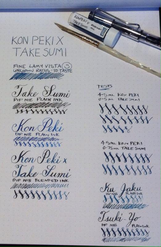
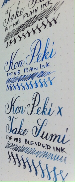
A blend I love and that has been in my go-to pen (fine Lamy Vista) for a month. As a serial ink switcher, that says a lot. I write on both white and powder blue papers, and this works on each. The blend I had in my Lamy was done by eye. I was asked what it looked like so needed to find ratios. It's 4.5mL Kon Peki to 0.75mL Take Sumi. I would personally add another drop or two of Take Sumi to match my prior version, but that's getting over the top . (My iPhone can't take true colour shots. It's also early evening on an overcast day.) I've included writing in plain Kon Peki, Take Sumi, Ku Jaku, and Tsuki Yo. The Kon Peki x Take Sumi blend in terms of colour is between Ku Jaku and Tsuki Yo. It's not as green as Ku Jaku, and not as blue-grey as Tsuki Yo.
-
Hi, after being indoctrinated by LindaMedley into Noodler's CMYK mixing, I'm going to venture into Iroshizuku as well. Obviously, Iroshizuku don't offer a pure black nor a yellow. For yellow, I can get away with orange Yu Yake down the magenta end of the spectrum, and green Chiku-Rin down the cyan. Kon Peki will be my cyan, and Tsutsuji my magenta. Along the black lines, Take Sumi will be adequate for most mixes down the cyan line, however my sample appeared to have a touch of yellow in it which gave Kon Peki a touch of green when blended. I have ordered a bottle of Take Sumi, I'll see what that's like. However, Iroshizuku have no deep blacks down the Magenta line. Are there any pure black inks or black with magenta overtones in chromatography that I may be able to safely mix with Iroshizuku inks? I do have Noodler's bulletproof black which I haven't tried yet, but I'm hoping someone's tried something else with Iroshizuku that they know works. Thanks!
-

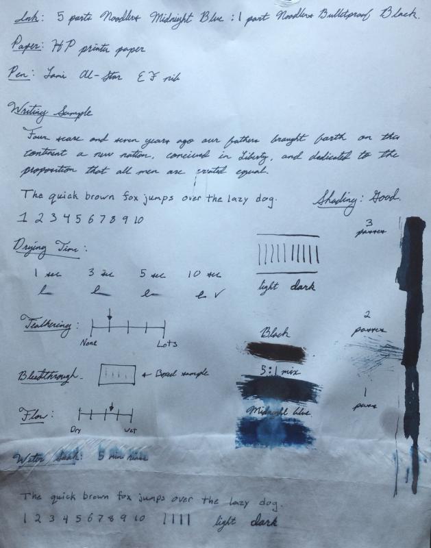
Mixed Ink Review: 5 Parts Noodler's Midnight Blue To 1 Part Noodler's Black
Gregdwilson posted a topic in Inky Recipes
I know that Noodler's Midnight Blue and Noodler's Bulletproof Black have been already reviewed but this mix has become my favorite everyday ink so I thought I would share. I mixed it in various amounts until I got what I believe is a fantastic mixing ratio. I ended up with 5 parts Noodler's Midnight Blue to 1 part Noodler's Black. The mixture ends up bringing out a little more of the green tint in the ink which is what I always associated with true midnight blue. I also felt that the original Midnight blue was a little light. I believe this mix really makes it the midnight blue that I have always loved. It also adds a some of the bulletproof qualities of Noodler's Black. As seen in the attached Image the drop tests on the ink swabs really show a difference between the original and the 5:1 mix. Like most mixes with bullet proof inks it is mostly the black that remains permanent. I use this for my journal where I want the character of my favorite color but a safety net so that water and other chemicals wouldn't make what I have written illegible. I am quite pleased with the results. This is my first review I've done on this forum so any suggestions would be appreciated. Gregory
-

Perfecting The Dark Red: Diamine Red Dragon Mixed With Oxblood?
islandink posted a topic in Inky Thoughts
I like Oxbood...but it is a bit brown especially in some pens in which it looks only brown. I have seen Red Dragon and it appears beautiful more more red than dark red. Oxblood is dried blood. Red Dragon looks like fresh blood. I am looking for the colour of clotting blood (and yes, I do know exactly what that looks like). Had anyone experimented with mixing these 2 colours, and if so, what ratio worked best? (I do not want to buy a totally different ink so not looking for a Noodler's suggestion for example) -
A few months ago I don't know what got to me and I purchased a 30ml bottle of Diamine Grey (possibly after reading some comparison of grey inks and found this one to be the true grey for me). I wrote one or two convertors of it and I wasn't very interested. It's just not exciting and I don't see me using it again. So I am thinking about mixing it with another ink to see if that'll make any fun colours. What colours (or inks) can you suggest that I mix with this grey? I have no idea at all how the colour will change when mixed with a grey ink.
-
Hello all!!! So i tried an experiment after reading aboit some people mixing inks with noodlers black. I mkxed 1:1 with diamine poppy red, and for a day or so it was great. Then i noticed the bla k disappeared. When i looked at the vial i mixed it in, the inks had separated.... :-( it was such an awesome color! Kind of like when you touch the nibs of a pilot parallel with one having black and one having red. I digress.... So how come this happened?!? Ive read about alpt of people mixing similar to these two and it working... did i do something wrong? Im worried about wasting more ink to try bpb with any other inks... Any thoughts on why this happened to me amd is there a light at the end of the tunnel?
-
http://sheismylawyer.com/She_Thinks_In_Ink/2014-Inklings/slides/2014-Ink_325.jpghttp://sheismylawyer.com/She_Thinks_In_Ink/2014-Inklings/slides/2014-Ink_325b.jpg
-
Anyone know of, or had any, long-term problems with an Aurora Blue:Aurora Black mix? There have been one or two much earlier posts about this but I believe that the ink composition of the two colours has altered in the meantime. Earlier comments are along the lines of, "...just turns to gel after a time..." I've been using such a mix for a few weeks now, by the way, and can't see any changes in the pen or the bottle it's in.
-
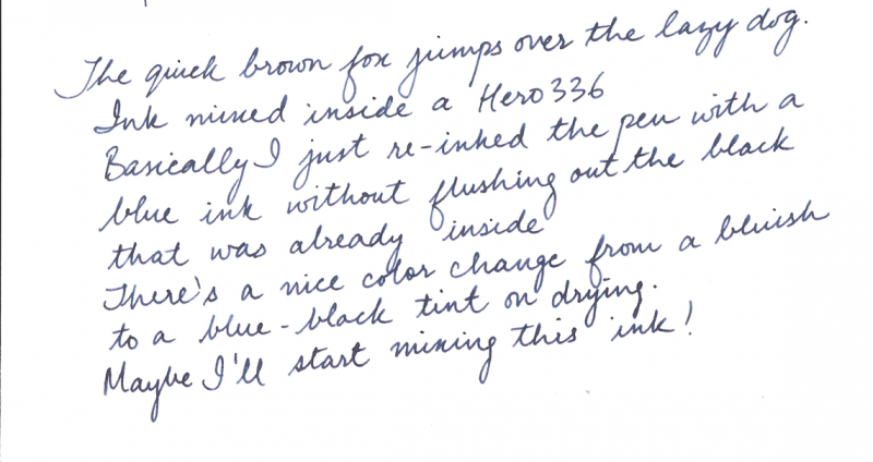
I think I've stumbled upon an ink mix. Basically I had a Hero 336 filled with Pelikan 4001 Brilliant Black recently, and once the ink ran out, I just filled it again with 'Herlitz' (It's a cheap ink I keep in office). Here's the result: And it shades! It goes from blue to black depending on the amount of ink laid down on paper. Suddenly the flow has increased tremendously compared to the dry 4001. There's a nice color change on drying, when written it's a dark blue, when dry it's a blue-black. The scan shows it 'bluer' than it looks, but that may be dependent on the lighting conditions. Now I'm not sure if the combination is safe, but I think the pen's cheap enough to be disposable (I hope I don't end up doing that however).