Search the Community
Showing results for tags 'midnight blue'.
Found 15 results
-
-
desaturated.thumb.gif.5cb70ef1e977aa313d11eea3616aba7d.gif)
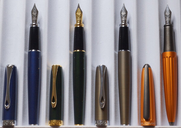
My collection of Diplomat fountain pens (as of Nov 2022)
A Smug Dill posted a gallery image in FPN Image Albums
-
How-to: Set, or change, personal info that others can see about me
A Smug Dill posted a blog entry in Sus Minervam docet
It helps to explore this yourself, revisiting once in a while if need be, and keep in mind where each of those personal info fields are entered. Don't leave it until the urge to change something specific to come upon you, and only then bother to ask the question! Invest the time surveying upfront, instead of waste it later waiting for an answer from nobody in particular. Most of the fields shown above are self-evident as to what they are. I think the only ones that could do with explanation are: Security and Privacy: There is only one setting under there, and that is a toggle for whether your online status (including ‘last active’ date or time) is visible to others Content View Behavior: That has nothing to do with what others can see about you, but only where you would like to start reading when accessing content Enable status updates: This toggle enables/disables the public feed on your profile page; if you disable it, then nobody (including you) can post publicly visible ‘status updates’ or any other message against your profile, but if you enable it, then anyone — friend, foe, or complete stranger — can post something there whenever, without waiting for you to initiate and then only reply to what you wrote Notification Settings have nothing to do with what others can see about you, and so is out of scope for this article, and I'm not going to delve into those right now. (You can look here, here, and here to wrap your head around how notifications work with respect to followed content.) N.B. There is a possibility that some of the above settings and data fields may not be available to Bronze members and/or Silver members, but I have no way of testing that or scoping it out. — • — Another way of getting to the Edit Profile dialog, and the way to change your profile photo (or ‘avatar’), is here: — • — Freeform, custom member titles that one enters for oneself are long gone, and have not been a thing since FPN came back from a long hiatus and platform upgrade late in 2020. -
Poorly written minuscule n on GvFC ink bottle labels
A Smug Dill posted a gallery image in Premium Account Albums
From the album: ~Nothing to see here, move along
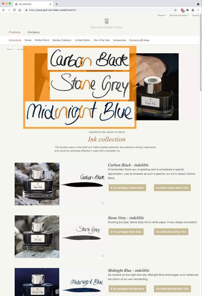
Image source: Screenshot of https://www.graf-von-faber-castell.com/ink In reply to: https://www.fountainpennetwork.com/forum/topic/266387-graf-von-faber-castell-carbon-black-ink-review/#comment-4498066
- 0 B
- x
-
Matching inks to Pelikan Classic M20x pens - shortlist
A Smug Dill posted a gallery image in FPN Image Albums
From the album: Shades of colour
Shortlist of inks with which to fill some of my Pelikan M20x pens© A Smug Dill
- 0 B
- x
-

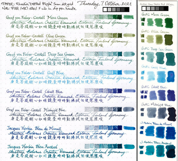
From the album: Chinese pens
The Schmidt steel F nibs on Moonman M100 and M200 pens, as well as the rebranded version on Kaco Edge pens, are just so consistent in how they put down befittingly narrow lines of ink. The cap seal effectiveness of the Moonman M200 pens aren't half bad, either. I filled these pens five weeks ago, and it seems only roughly 10% of the ink in the converters have evaporated in the meantime.© A Smug Dill
- 0 B
- x
-
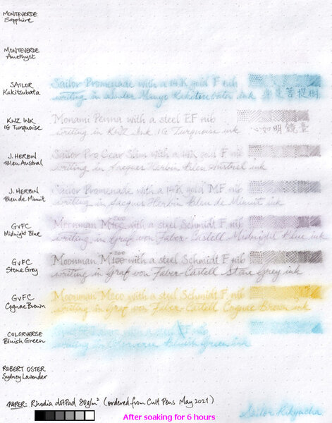
From the album: Ink performance testing
I didn't really set out to test the water resistance of these inks; I'd wanted to compare the paper in two different Rhodia dotPad No.16 notepads ordered a couple of years apart, and these inks just happen to be in pens that are on hand and ready to write. Graf von Faber-Castell claims its inks are indelible. Well, I guess the water resistance of the three I tested here aren't bad. Even though it'd be a struggle to read what was written in GvFC Cognac Brown after a long soak, I must say what's left of the marks on the page are distinct enough to make the text legible if one really tries. I am pleasantly surprised by the water resistance of the two Jacques Herbin inks, even if they aren't are good in that regard as GvFC. I'm disappointed to the same extent that the two Monteverde inks were washed away without leaving a trace.© A Smug Dill
- 0 B
- x
-
I have decided to review some of my inks. These aren't necessarily in any particular order. This one is J Herbin Bleu nuit (Midnight blue) This is what J Herbin say about it: "Bleu nuit (Midnight blue): this is the darkest color after « perle noire » ink. A color symbol of the sky at night when bursting with stars in the summertime." "From the beginning, J. Herbin distinguished itself from its competitors by offering a wide range of colors for the fountain pen inks. In 2007, 4 new colors were introduced which brought a total of 30 references of various colors. The names chosen for each color are very poetic to preserve the originality of the brand and as a French tradition." This isn't a waterproof or an archival inkBearing in mind the paper I use is very smooth, this ink took 10-12 secs to dry. Quite quick.It flows well and lubricates the nib quite well.It is currently available in sampling packs of 4 x 10ml mini glass bottles and 30ml D bottles. Each bottle of 30 ml has an integrated pen rest. They are known as “D bottle pen inks. The “D” refers to the old French unit of measure “la Demi Courtine”.It's available from many B&M shops and online retailers worldwide. I didn't find this ink to be as dark a blue as I expected. It's less dark than it looks in the bottle, and maybe less dark than you might expect a shade called Midnight blue to be. It's nowhere near as dark as Montblanc Midnight or Diamine Midnight for example.
-
I have some Montblanc Midnight Blue ink that I bought 4 and a half years ago. I actually know that because I remembered getting it on Amazon and just looked up the order. I've never taken to it that much, because I was expecting more of a blue black, and when this dries, it just looks black, so there's plenty of it left. But I was thinking of giving it another shot the next time I fill a pen. I just noticed, though, that there is a paper tag on the bottom of the bottle which says September 2017. Is that a "best by" date? I've never run into this on an ink before, generally assuming that it's good until it evaporates or develops mold. But is Montblanc suggesting that you ought to use it before it's too old? It's not that I'm really worried about it having gone bad somehow. Just curious about the logic of putting that date on there.
-

Ink Shoot-Out : Mont Blanc Midnight Blue Vs Pelikan Edelstein Tanzanite
namrehsnoom posted a topic in Ink Comparisons
Ink Shoot-Out : Mont Blanc Midnight Blue vs Pelikan Edelstein Tanzanite Pelikan Edelstein Tanzanite was my very first blue-black ink, and one that I like a lot - it's usually to be found as the perfect companion for my Lamy 2000. Then I read visvamitra's review of Mont Blanc Midnight Blue, and found another blue-black that spoke to me. Recently I managed to get my hands on a bottle of the MB ink. A great opportunity to do a detailed comparison, and find out which one of these inks I like the most. Enter... the Ink Shoot-Out. A brutal fight where heavyweight inks do battle for four rounds, to determine who is the winner. In the left corner - the challenger: Mont Blanc Midnight Blue. In the right corner - my current favorite: Pelikan Edelstein Tanzanite. Which champion will remain standing at the end of the fight ? Let's find out... Round 1 - First Impressions For the first round I made my usual swabs and scribbles on Rhodia N°16 80gsm notepad paper. Both inks are a pleasure to use, and exhibit a very professional-looking blue-black color - perfect inks for the workplace and for daily business writing. They also shade nicely, even in smaller nib sizes. But... darn... on this paper, I'm hard pressed to notice any difference. Maybe a small hint that the Tanzanite ink is a bit darker ? Time for a second first impression ;-) For this I used Midori Traveler's Notebook N°13 Refill paper - this is a lightweight paper that's supposed to be close to Tomoe River (and has the advantage of being readily available here in Belgium). Yes... on this paper the Edelstein ink is definitely darker. And a further test on Moleskine paper confirms this - Tanzanite is the darker-blue of the two inks. Both inks are on par with each other, but there are some differences: MB Midnight Blue shows a wider range of hues on different paper types, ranging from a more greyish blue to real dark blue-black. Tanzanite exhibits a more consistent blue-black across papers.I didn't notice any sheening on the Rhodia paper, but on the Midori paper... wow... Tanzanite definitely is a real sheener ! You get a very prominent red-golden sheen where the ink is laid on thickly. The Mont Blanc ink doesn't stand a chance ! Both Midnight Blue and Tanzanite are top-of-the-line inks of their respective brands. And as expected, both are very fine-looking blue-black inks. For me personally, I appreciate the fact that the Edelstein ink is a darker blue-black, with a more consistent color range across different types of paper. And there is absolutely no competition for Tanzanite's splendid red-golden sheen. Knock-out ? No. But this round definitely goes to the Pelikan ink on points. Round 2 - Writing Sample The writing sample was done on Rhodia N°16 Notepad with 80 gsm paper. Both inks behaved flawlessly, with no feathering and no show-through or bleed-through. Both inks also showed good ink-flow and smooth writing with the EF nib. Here I was pleasantly surprised by Tanzanite - usually Edelstein inks are considered to be a bit dry in fine nib sizes, but that's not the case here ! I also like that both inks show decent shading even with the finer nibs. With many inks, shading almost disappears with EF/F nib sizes, losing some of the ink's character. Not so with these inks ! On the crappy Moleskine paper, both Midnight Blue and Tanzanite exhibit some minor feathering, as well as significant show-through and bleed-through. In my opinion, both inks indubitably (hey - not often you get a chance to use a word like this ;-) measure up to each other, and no clear winner appears. As such, this round ends in a draw. Round 3 - Ink Properties Both inks have drying times in the 15-20 second range on the Rhodia paper, with Tanzanite closer to the 15 second range, drying a bit faster than Midnight Blue. Both inks also do fine on the smudge test, where a moist Q-tip cotton swab is drawn across the text lines. There is some smearing, but the text remains perfectly legible. For the droplet test, I dripped water onto the grid and let it sit there for 15 minutes, after which I removed the water droplets with a paper kitchen towel. Midnight Blue is clearly the more water-resistant of the two inks, and did really well on this test. But although Tanzanite did worse, the written word did not disappear and remained perfectly readable. I will absolutely call these inks water-resistant ! The chromatography shows that Midnight Blue leaves a darker footprint after soaking in water - as shown by the bottom part of the picture. The chroma's look really similar, which probably explains why these inks are so alike. In this round, the Mont Blanc ink had a better technique, especially on the droplet test. Again - no knock-out, but this round definitely goes to the challenger - on points. Round 4 - The Fun Factor Welcome to the final round. Here I give you a purely personal impression of both inks, where I judge which of them I like most when doing some fun stuff like doodling and drawing. For this round - I really wished for a clear winner - but that's not to be... The dark-blue color of the inks is well-suited for some gloom-and-doom doodling and drawing. And both inks put their heart into it - nice flow, easy drawing, beautiful gloomy color ... what's not to like ? But in the end, they performed equally well, and no clear winner emerges. I'm sure there will be more of a difference on other papers - where Tanzanite is guaranteed to be a bit darker. Nevertheless, for this round, I call it a draw ! The Verdict Both inks deserve their place at the top of my ink collection. They are beautiful professional-looking dark-blue inks. Both MB Midnight Blue and Pelikan's Tanzanite win a round, with the other rounds ending in a draw. Nevertheless... it's the Belgian judge that gives the points. Although Midnight Blue has some technical advantages, I find Tanzanite the more aesthetically pleasing of the two. You just can't compete with that golden-red sheen ! And Tanzanite has a more consistent behavior across paper types, which I also appreciate. Both champions came out very close. But it's the judge's opinion that round 1 was the decisive one, and that Tanzanite comes out on top and remains the reigning champion ! -
I was looking at my bottle of Montblanc Midnight Blue and it has a date on it of November 2016. I presume this is an expiration date, but what does it really mean? Should I get rid of it? Is it a suggested use by date? Is it meaningless? It won't kill me to throw it away, but I would like to know before I just do it.
-
Hi all, I picked up a bottle of the reformulated Midnight Blue yesterday, below are some photos and some first thoughts. Background: The old formula Midnight Blue has been a much loved 'iron gall' ink, an ink which contains a component that seems to result in fantastic performance, very little bleed and feathering, lots of shading and a degree of water resistance. As the ink reacts with the air it darkens to quite a deep blue black. The problem with iron gall inks is thier reactivity, which can increase corrosion of reactive metals such as steel (i.e. steel nibs), and can cause problems if they dry out in pens. Modern IG inks contain very low concentrations. As a result the cartridge versions (maybe they assume those who exclusively use cartridges are not going to wash out their pens as thoroughly?) of IG inks are often non-IG equivalents. MB is now following Lamy in replacing the bottled IG inks with a non-IG equivalent. I am not sure if this new ink is identical to the cartridge Midnight Blue, or something new entirely. First, identifying the new ink from the old is quite easy. The boxes are different on one side (the new one does not make any claims about permanency), and the ident numbers on the bottom are different. http://farm4.staticflickr.com/3751/10108355503_1d3ac229a9_z.jpgIMAGE_2.jpg by Bigeddie100, on Flickr In addition the new bottles are labled with "BLEU NUIT non perma" whereas the old bottles are labled with "BLEU NUIT". Tests:I have tested the inks on Rhodia and copy papers to see if there is a difference between the new and old formulas. My scanner is now older than some forum members, that is to say rather tired. I have taken photos in direct sunlight for comparison. Both inks were in Lamy Safari pens with medium nibs. New formula on the top, old IG formula on the bottom. http://farm3.staticflickr.com/2887/10116625453_3e8c7b565b_z.jpgMontblanc Midnight Blue (new formula) on Rhodia by Bigeddie100, on Flickrhttp://farm6.staticflickr.com/5481/10116496945_b27ff025ea_z.jpgMontblanc Midnight Blue (old formula) on Rhodia by Bigeddie100, on Flickr http://farm8.staticflickr.com/7310/10116564836_82e9f105a1_z.jpgMontblanc Midnight Blue (new formula) on copy paper by Bigeddie100, on Flickrhttp://farm8.staticflickr.com/7316/10116617633_1aea5a92cf_z.jpgMontblanc Midnight Blue (old formula) on copy paper by Bigeddie100, on Flickr Analysis:The new formula performs well on Rhodia, as well as the previous version (no bleed or feathering, and very minimal show through). It does not have the darkness that the old IG formula develops as it reacts and dries. On cheap copy paper the new formula soaks in and looses that depth completely, becoming more of a blue grey. Performance has declined with the removal of IG components, the new formula spreads out a little more on the copy paper and has more show through and bleed than the old formula. The new ink flows quite well, with the same degree of lubrication that the old formula has. Water fastness:http://farm4.staticflickr.com/3747/10116653463_80c76125ea_z.jpgWater resistance in progress by Bigeddie100, on Flickr http://farm4.staticflickr.com/3764/10116561223_bec75a871d_z.jpgWater resistance by Bigeddie100, on Flickr The new ink seems to be slightly less water resistant than the previous version, although not by much. Conclusion: The new ink is a pleasing enough colour and performance is not bad, but it's not the same as the old formula ink. Performance of the new ink seems to be on a par with some of the other MB offerings like Royal Blue. I'll miss the old formula, and when I run out I'll look for another IG replacement.
-
This is my first review on FPN. Apologies for the bad handwriting and/or missing a few points. I've been meaning to review this ink for a long time and just saw viswamitra's brilliant review for the same but I thought I'll upload it anyway even though it's not as detailed. I love blue and blue-black inks and I like this one. It's not my favourite but I won't mind using it every now and then. It behaves really well on cheaper paper too, with no feathering or bleedthrough. You'll also see some Pink/Purple undertones in the sample and because it's not so saturated, the nib would make a lot of difference. Thanks! If you want to ask any questions or want more photos I'll gladly add them in the comments.Though I'm pretty sure viswamitra's review will have it all covered.

-

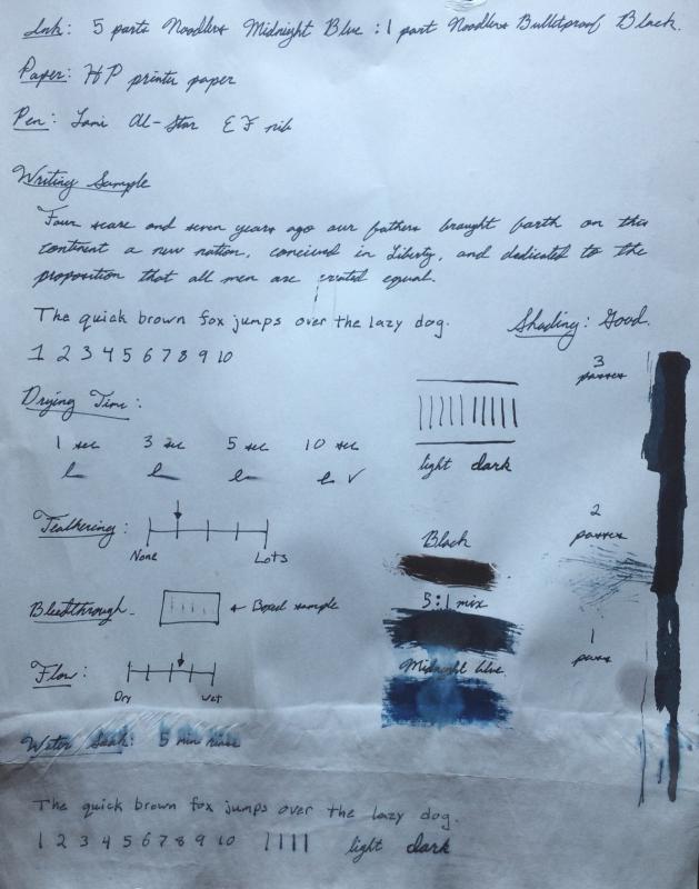
Mixed Ink Review: 5 Parts Noodler's Midnight Blue To 1 Part Noodler's Black
Gregdwilson posted a topic in Inky Recipes
I know that Noodler's Midnight Blue and Noodler's Bulletproof Black have been already reviewed but this mix has become my favorite everyday ink so I thought I would share. I mixed it in various amounts until I got what I believe is a fantastic mixing ratio. I ended up with 5 parts Noodler's Midnight Blue to 1 part Noodler's Black. The mixture ends up bringing out a little more of the green tint in the ink which is what I always associated with true midnight blue. I also felt that the original Midnight blue was a little light. I believe this mix really makes it the midnight blue that I have always loved. It also adds a some of the bulletproof qualities of Noodler's Black. As seen in the attached Image the drop tests on the ink swabs really show a difference between the original and the 5:1 mix. Like most mixes with bullet proof inks it is mostly the black that remains permanent. I use this for my journal where I want the character of my favorite color but a safety net so that water and other chemicals wouldn't make what I have written illegible. I am quite pleased with the results. This is my first review I've done on this forum so any suggestions would be appreciated. Gregory
-
Is it mean to say that something is utter (bleep)? I don't think so. Okay, okay. To be fair, the new version isn't that bad, as long as you're not looking for water resistance. But it doesn't have any ferric component, nor does it have the old ink's (surprisingly unique) deep crimson sheen. The new color leans distinctly towards periwinkle. Before the pictures let me just say, if you're wanting to try and find the old ink out on the market before supply dries up, ask the seller for the product number. The old, iron gall ink's number is 105194. The new ((bleep)) ink's number is 109204. The sticker on the bottom of the new ink's bottle also says "non perma". In the bottle, the new ink looks unmistakably purple. http://imagizer.imageshack.us/v2/xq90/802/20n7.jpg http://imagizer.imageshack.us/v2/xq90/823/luzy.jpg And let it be known that I didn't want the new version. I ordered what was listed (by its product number) as the old ink, but I ended up receiving the new ink. I would return it, but the seller is in Germany. It wasn't too expensive, so I I guess its just a big sample now. So, let's hear it. Whatcha think?