Search the Community
Showing results for tags 'm805'.
-
From the album: Mercian’s pens
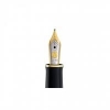
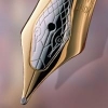
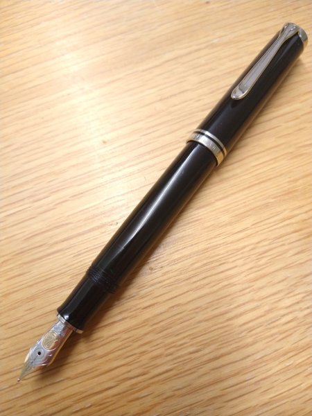
My Pelikan Souverän M805F. I bought it in March 2020, just as the Plague the pandemic of Covid19 was arriving in the UK. Those of you have a keen eye for a waspy will notice that it has a bi-colour nib on it, rather than one of the entirely-rhodium-plated ones that one would expect to find on an M805 of that vintage. This is because the lovely people at the company from whom I bought it allowed me to have mine with the bi-colour nib. Which is what would have been on an M805 when I first saw one. I wanted to buy one then, but could not justify spending that much money on one pen. In the subsequent years, the prices charged for this pen only went up. And up again. In 2020, with the pandemic arriving in my country, I realised that I would certainly be finding myself stuck in a ‘lockdown’, and also that I may even actually be dying soon. So I decided the time had definitely arrived for me to stump-up the Silly Money necessary to buy myself a Souverän 😁
- 0 B
- x
-
From the album: Mercian’s pens
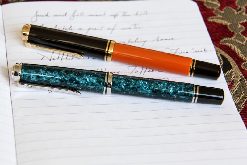
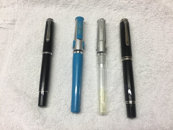
L-R: ’Classic’ M205 ‘F’; P480 Pelikano ‘F’; P480 Pelikano ‘F’; Souverän M805 ‘F’. If you look closely you will see that I have broken the clip on my blue Pelikano, and the barrel on my transparent Pelikano. They are not as robust as Lamy Safaris.
- 0 B
- x
-
From the album: Mercian’s pens
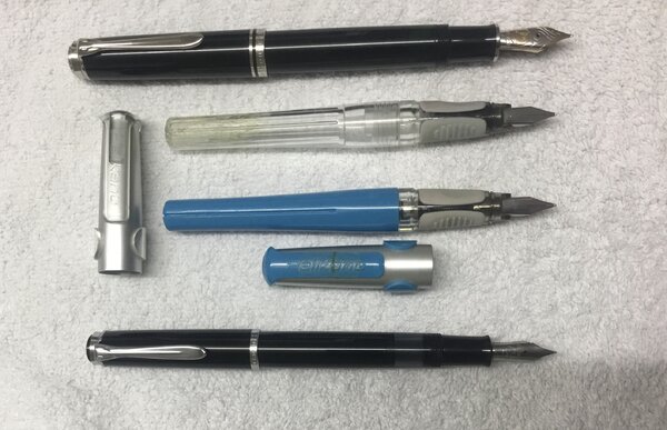
Top-bottom: Souverän M805 ‘F’ with bi-colour nib; P480 Pelikano ‘F’; P480 Pelikano ‘F’; ’Classic’ M205 ‘F’. If you look closely, you will see that I have broken the clip on the blue Pelikano, and the barrel on the transparent one. They are not as robust as Lamy Safaris.
- 0 B
- x
-
Hello Everyone, I have a brief window of opportunity to purchase a new Pelikan Souverän M805 Blue-Black fountain pen at a very favorable price. The question is, which nib to choose? I write in cursive and dabble in calligraphy strictly for pleasure. I am retired, so no writing for business or publication is required. Only letters & notes to friends. I have a few gold nib pens, most custom ground from a “B" to a smooth stub, though I also enjoy writing with a fine or extra-fine nib too. I am aware that I can purchase additional nibs later and easily swap them out on the M805. I am also prepared to send a new nib to a nibmeister for customization. And finally, I have read several reviews of this pen that the nibs tend to run to the broad/wet side of the curve. So, having said all of that, the question is, which nib to start out with since I can only afford one at this time? I realize there are probably many more factors that weigh into this decision, but the purpose of my query is not to wade deeply into the minutiae of choosing this nib, I’m just asking for some general advice and opinions from those more experienced than I with this pen. Are the Extra-Fine & Fine nibs true to their names or do they lean more to one step larger? Same question for the Medium nib. Is it suitable for grinding to a good, all-around every day stub/italic, or would I be better starting with the Broad? And finally, what is the general opinion about the all rhodium nib for the M805, or do you think borrowing the two-toned gold/rhodium nib from the M800 looks better on this pen? Additionally, recommendation for a nibmeister to grind an everyday stub/Italic nib would be appreciated. I have some ideas on this myself, but am always interested in the thoughts of others. Thanks very much for taking the time to read this. Any thoughts you may have will be appreciated.
-
~ Fritz Schimpf & Pelikan: Höchste Qualität One of the pleasures of being active in the fountain pen and handwriting community is getting to know fine persons and organizations worldwide. After a day in the classroom I returned home to find a box from Fritz Schimpf in Tübingen, Baden-Württemberg, Germany. The excellent packaging and wrapping matched the equally high quality contents, including ink, paper and a fountain pen. A quartet of bottles of my beloved L’Artisan Pastellier Callifolio ink from Albi, Tarn Department, France. Fritz Schimpf Feinpost paper with envelopes and Fritz Schimpf Fritzrot ink, all special favorites of mine. A Pelikan Souverän M805 Blue-Black Italic Broad nib with a Fritz Schimpf Italic Grind. All arrived in top condition. The pen inked in Fritzrot writes as smoothly as melted butter on Feinpost paper. A wonderful start to the 2022 writing and sketching year. Tom K. Box from Tübingen Protective Wrapping Direct from Baden-Württemberg Ink Bottle Quintet Souverän M805 Blue-Black Pelikan Artistry Italic Broad Nib FS Italic

-
From the album: Ink review
(right-sized to match the screen resolution of my MacBook Pro's built-in display panel at ~115dpi)© A Smug Dill
- 0 B
- x
-
From the album: Ink review
(right-sized to match the screen resolution of my MacBook Pro's built-in display panel at ~115dpi)© A Smug Dill
- 0 B
- x
-
To tell you the truth, I am heavily biased towards two of my pelicans - one is a M400 white tortoise, other is the blue striated M805. The M8XX usually considered to be the logical next step to M4XX/6XX, if some logic is still left. As with the model numbers, there is a general increase in nib size & specs, in addition to overall dimensions, when you move from M4XX to M1XXX. I also love the Souverän M 625 with dazzling sterling silver trims (Ag 92.5%). Although the blue-striated M805 in a way alludes to the 1929 classical green-striped design with a differentiated version of the striped translucency. Been a while since I wrote a review. This is a review I loved to do. Also, here is the link to the same review on my blog: The M805 Review DESIGN - THE STRIPED TRANSLUCENCY (5/6) The M800 comes in three gold-trimmed standard designs, two striped translucencies - Green, Blue and the Classical Black with a Green Ink Window, across four standard different nib widths - EF, F, M and B, although a tipped italic nib is available with a special edition. Sometimes a M800 Red also chips in. The M805s now come in silver trimmed versions of Striped Blue and Black/Green Ink Window now with monotone rhodiated nibs. Personally, I prefer the earlier two-tone nibs on these. There are several special editions of M8XX starting with the m805 demo, m800 brown tortoise, the recent m800 burnt orange which is creating a lot of fire these days, after the m805 Stresemann. The M805 hints the subtle craftsmanship associated with building this writing instrument. It’s superb balance somehow ensures all the necessary weight and balance for writing. The barrels made up of highly polished pelikan famed ‘cellulose acetate’ with its diamond cut contours, partially reveal the necessities like the piston end or ink level, while concealing the irrelevant ones. I feel that this blue stripes reveal quite conservatively compared to the green. http://1.bp.blogspot.com/-vN_i0x_9Vkw/VgqAwB1h83I/AAAAAAAAFiI/oWHJnXSEuFo/s1600/DSC_6389.jpg The blue stripes innately reflect both light and dark while preserving a formal appearance of the souverän as the silver palladium plated trims continue to stand out. The translucency is subtle but useful at the same time to note ink levels. http://4.bp.blogspot.com/-4GkInYxF2xw/VgqAwobD_sI/AAAAAAAAFiM/oUuuN5Felyc/s1600/DSC_6393.jpg The sleeve has deeply shining blue stripes and reveals itself with ambient light. It’s sleek and smooth to touch. http://2.bp.blogspot.com/-M-PSLhWSWgU/VgqArRRleTI/AAAAAAAAFh8/kHZsKijV0KM/s1600/DSC_6395.jpg The white dazzle is matched throughout the pen starting from the famed finial and the clip, through those concentric bands in the cap, before finally converging with the dual piston rings. While the white tortoise plays with light with phenomenal efficiency, the blue stripes have their conservative thoughts about exposure! (Pradeep aka pgd84 should like this pic ) http://3.bp.blogspot.com/-HKt-S86L0Pw/VgqA1EpXffI/AAAAAAAAFiU/LrCXGIde1xA/s1600/DSC_6397.jpg The cap feels substantial and unscrews with a single turn, revealing a dazzling two-tone nib. The grip reveals another knot of white glitter, towards the nib end. http://4.bp.blogspot.com/-Ke6RMLlQ6QU/VgqA--u8BDI/AAAAAAAAFi8/FTdPYRoTbss/s1600/DSC_6402.jpg Two concentric white bands with a palladium plated crown embossed with the pelikan logo, adorn the cap with a signature pelican beak-shaped clip. The thicker bottom band carries the brand imprint of PELIKAN SOUVERÄN GERMANY. A high degree of polish gives it a gleam which can coax the lustre of the bands. The logo on the finial is the one embraced by Pelikan post 2003, that of a mother pelican and its chick, gleaming in brushed palladium. You can observe the staged pillar caps of M400, 625 and 805 glittering with light. http://4.bp.blogspot.com/-4sXhoscpxSQ/VgqBEwa61eI/AAAAAAAAFjY/tdfBFmtkuwg/s1600/collagecap.jpg FILLING SYSTEM (6/6) A piston filler with a sturdy knob is embellished with two concentric loops. Like any other pelikan, it’s imbibed within the system and is hassle-free. The piston end unscrews with three to four rotations and ink is drawn into the pen with remarkable efficiency without any fuss, once the piston is screwed back on. And of course, you can observe some of it live through the striped windows. A brass spindle connector in the M8XX provides weight and balance. Everything is glistening white as you can see the connector nut in the picture. M8XX fills upto 1.85 - 2 mL of ink. These brass piston mechanisms can be dismantled using a 7mm wrench (TWSBI would fit). I don’t really find a need to do that unless there is a fault which can be addressed at home. For any problems, it might be better to send the pen to Pelikan Germany/Country Authorized Service Center. http://2.bp.blogspot.com/-HqGqr1KuF_Y/VgqA9WOLd9I/AAAAAAAAFio/7vQ1ychkJGk/s1600/DSC_6419.jpg NIB - ALL THAT MATTERS (6/6) The nib/feed section is screw-fit and comes in a standard 18k two-tone design across four stock widths - EF, F, M & B. It has the standard pelikan design with the usual convenience of a screw-fit section. Like all cousins, the nib is both exquisite and efficient. With a big feed, and a spread out nib it looks like a real delight. The silver of two-tone finish does converge with the white trims in terms of both glitter and glimmer. The tail end specifies the nib-width and composition (18 C, 75% Au) of the gold-alloy used. Three arabesques diverge along the shoulders of the nib with two of them converging near the circular breather hole. The third curve runs across the tines towards the shoulders ending with the tail end of the nib, outside of which a golden decor runs along the shoulders across the outer tines, before converging onto the iridium tip. There is of-course the dazzling golden mother-baby pelikan logo, resting above the tail. This one in the picture is a Fine nib and writes smooth and wet. No complaints on out of the box smoothness. Some ink always manages to creep on the surface of this nib. http://3.bp.blogspot.com/-7VweTHjHvDk/VgqA_gz9nxI/AAAAAAAAFjA/D7mhxz9IjPc/s1600/DSC_6453.jpg A big black plastic feed with closely spaced fins ensures a good ink buffer and dearly promises wet and smooth starts. Even with a dipped nib section, it can write a page. http://2.bp.blogspot.com/-ESn9Ya-lD4c/VgqA_15LMhI/AAAAAAAAFjE/QwpZ3dRnkQA/s1600/DSC_6455.jpg PHYSICS OF IT (6/6) – RELATIVELY SPEAKING The pen has got some heft in it but it is very comfortable for me unposted. The overall capped length is around 14.1 cm. The total weight of M80X has more than a third contribution coming from the cap. The grip diameter is around 1.1 cm. The cap threads are higher up the section and are non-obtrusive even for a higher grip. Uncapped Length ~ 13 cmPosted Length ~ 16.4 cmNib Leverage ~ 2.3 cmOverall Weight ~ 29 g (Cap ~ 11 g) Capped and uncapped comparisons with some pens like Visconti Homo Sapiens Maxi, Pilot Custom 823 & a MB146 go below for your reference along with another family pic. http://1.bp.blogspot.com/-yI3D629hjko/VYZWVtWmUWI/AAAAAAAAEpQ/nBA0-yX7x-I/s1600/014.jpg http://1.bp.blogspot.com/-wGjWaqmP_tQ/VYZWYo3cT6I/AAAAAAAAEpY/Xy-kqy2fQLw/s1600/015.jpghttp://1.bp.blogspot.com/-MKRvVUnJtLo/VatxdhNisxI/AAAAAAAAE6Q/yAypHzfnwZc/s1600/DSC_4574.jpg ECONOMIC VALUE (5/6) The M805 retails now at around GBP 290, though it might be available at lower street prices. I do not feel this pen was an impulse buy for me, since I had carefully decided before getting to a M800/1000 level. I would not undervalue this rating by much, because I feel it’s one of the phenomenally efficient pens in this segment. It could be your daily workhorse or your part-time poet, does not matter! OVERALL (5.6/6) These 18k nibs have a smooth and wet flow. The nibs have a decent spring with an inherent softness in them although without any noticeable flex. Being extremely wet writers out of the box, the Fine nib puts a relatively thick line, which takes around 20 seconds! to dry a (Hail!) Iro Tsuki-Yo line on MD Paper. The pen feels extremely well balanced for my hands. (However, for Pelikan 4001 blue ink, it takes 30 seconds). These nibs do run a size wider than Japanese. Compared to this the M1000 tines will be much easier to flex, however I find the M1000 too unwieldy for my hands. http://1.bp.blogspot.com/-xGEF4monnrw/VgqBFcss81I/AAAAAAAAFjc/LQUVBDboVqo/s1600/DSC_6458.jpg Thank you for going through the review. You can find some more pen and paraphernalia reviews here. OTHER REVIEWS & LINKS Pelikan M605 Marine Pelikan M625 Pelikan M4XX Pelikan M200 Cognac Patent Ink Capacities MB 146
-
Pelikan M805 Overview: The Pelikan M805 has been regarded by many people as their favorite pen. Due to the pen’s great nib and convenient filling system I’d say it’s right up there on my list favorites. The pen is pretty attractive as things go. The pen feels great in hand for me except for one thing. I have fairly small hands and I prefer a smaller pen just for the writing comfort. My one issue with this pen is that it is slightly back weighted because of the all metal piston filler mechanism under the blind cap. This wouldn’t be an issue if I had larger hands, but if you are like me with little hands you should be aware what I call the Visconti Opera Master factor because of the Opera Master’s heavy metal blind cap. I don't have any complaints beyond that one. The section is just long enough with the right amount of girth. At the end, the section flairs out to a metal ring that I enjoy. The writing experience with this pen is just something else. The broad nib lays down a nice, wet line and it never skips or hard starts which is my idea of a perfection. As always, thanks for reading and I hope you enjoy the rest of the review. Writing Experience: As you will see in the writing sample the pen lays down a very wet line that takes 40-60 seconds to dry depending on the ink. I have Diamine Oxford Blue in the pen which overall is a pretty wet ink and this pen is a gusher without a wet ink, so naturally wit this Diamine, the pen still lays down a crazy wet line. The pen is also a very good reverse writer. I don’t tend to use my pens that way, but in a pinch the pen could still preform well. The pen does offer a tiny bit of flex, but the feeling of the nib is very different compared to the close in size M1000 that is a very bouncy writer. This is partly due to the wider shoulders on the M800 as opposed to the skinnier ones on the M1000. The nib has that big hunk of Pelikan tipping which I like because when Pelikan discontinued their specialty nibs they sadly took away their double and triple broads. So, what I’ve learned is every Pelikan nib size is a size broader than any other standard western nib you might run into like a Jowo or a Bock. My broad acts like a double broad which is not a problem for me the broader the better, but if you ordered a broad, you probably wanted a broad, not anything finer or wider and if you get a size other than a broad that could be annoying. Other than my small gripe about the nib size inconsistency I love the way this pen writes. Measurements: Length (capped): 141.3 mm/5.56″ Length (uncapped): 127.6 mm/5.03″ Length (posted): 164.0 mm/6.46″ Diameter (section): 10.7 – 12.0 mm/0.42″ – 0.47″ Diameter (barrel): 12.8 – 13.4 mm/0.50″ – 0.53″ Weight (all): 30 g Weight (cap): 9 g Weight (body): 21 g Design: The design of this pen is basic, yet elegant. If you want a big flashy pen with lots of bright colors and interesting materials a Visconti is the way one should go. My particular pen is the back barrel with silver trim model. Looking back on it now, I would have gone with a slightly more exciting color on this pen, but the black works fine. This pen was bought in 2017, so it has a single chick finial and nib. The cap screws off in about 7/8 of a turn. On pens like the Visconti Torpedo it takes 4 full turns to uncap, so if you need to quickly jot something down, you’re in big trouble. The pen is a piston filler that holds just over a milliliter of ink, so you write for a pretty long time. This pen has a green link window just below the section because of the solid black barrel. The most eye catching feature of the pen is the pelican bill shaped clip. In all, I like the design of this pen. Presentation: Pelikan boxes are pretty odd. With most manufacturers packaging is provided with the pen, however with Pelikan pens are included with a tiny cardboard box that can barley fit the pen and retailers buy additional packaging. The Pelikan box most of us are familiar with are the coffin boxes with the gray top. There are also the slide out Pelikan boxes commonly used for less expensive pens. Then there are the boxes for the special editions like the white M600s and the M101Ns and then there are large round gift boxes that include a bottle of Edelstein ink and a nice pen case. My pen came in the very basic cardboard box, but I bought the pen at a very good price. While a normal M805 retails for just around $500 I purchased mine for about $300. Granted, I didn’t get it from an authorized retailer, but the pen writes really well and it’s still the same product I would get for the extra $200. As always, thanks for reading! Feel free to comment and share your thoughts.
-
The Custom 823 pens have always been highly captivating demonstrators from Pilot Corporation (Japan), sporting the second largest nib (Pilot#15, Namiki#20 nibsize), with a vacuum plunger filling mechanism. The model number 823 refers to the price and year, of launch, although in a slightly intricate manner. Since this pen was released in the year of 2000, 82 years after the company’s inception (i.e. 1918), it carries the first two digits of the model number as ‘82’ and the last digit which is ‘3’ refers to it launch price of JPY 30,000 (3 X 10,000). Also replicated the content with additional pictures in my blog, as the images are/will be reduced to a small thumbnail after a short-while by the image hosting service. Happy reading ! Below is a link to the same: The Pilot Custom 823 Amber Demonstrator Review The Custom 823 (for the Asian market) comes packaged in a standard pilot gift box (Z-CR-GN) which might not draw much attention, quite unlike the pen. The US merchandise comes with a silver sateen lined gift box with a complementary (hey! not really folks) bottle of Pilot/Namiki Ink-70 (Blue). The pen of course is a hot star. A golden label with a model number and nib specs is tagged to the clip. The box carries a user manual for a Type P fountain pen, which does mention keeping the knob slightly unscrewed (at a 2 mm distance) relative to the metal ring, while writing. http://i1302.photobucket.com/albums/ag127/soniknitr/C823/DSC_4033_zpsn5yia4uf.jpg DESIGN - THE AMBER DEMONSTRATOR (6/6) The Custom 823 comes in three standard designs of translucency transparency - Amber, Smoke and Clear resin, all with gold plated trims. The resin material seems substantial and feels heavy. A silver trimmed version may be a nice thing for many fountain pen nerds including myself. I went for an Amber one with a medium nib and find it quite challenging to resist getting another Smoke version, with recently slashed prices in Rakuten/Ebay. The Amber demonstrator given its lightness, is capable of bedazzling you even with a tiny bit of moonlight. A golden dazzle along the three bands and the clip, subtly delivers the rest. The finials at the cap along with the piston knob conclude the design with a brownish opacity. http://i1302.photobucket.com/albums/ag127/soniknitr/C823/DSC_4038_zps59uqxwrt.jpg The cap feels substantial and unscrews with one and a half turn, revealing the elegant yet simply designed pen. The grip section is moulded from the same brown resin as the cap-final and the piston-knob, and another golden ring segregates the grip from rest of the body. The amber demonstrator translucency does reveal the steel rod with a plunger seal mechanism. http://i1302.photobucket.com/albums/ag127/soniknitr/C823/DSC_4058_zpsdj6urt8a.jpg The cap does mention a few things etched across the broader of the concentric golden bands, including the model name CUSTOM 823 and PILOT MADE IN JAPAN with six stars of separations. A thinner band above renders some more aesthetics to the overall design. The clip is tension fit and it encompasses a vertically embossed PILOT within its golden sheen. http://i1302.photobucket.com/albums/ag127/soniknitr/C823/Cap_zpsp81nns3m.jpg FILLING SYSTEM (6/6) The brown piston knob unscrews from the golden ring till an end stop, post which the plunger unit can be pulled out. The rod is made of stainless steel and is resistant to most of the commonly used inks. For IG (Iron Gall) and Pigment Inks, care must be taken to clean the pen several times, to prevent clogging or deposit accumulation inside the ink passages. The pen fills to more than two-thirds its capacity, once the nib is dipped in ink and the plunger is pushed back in. This can give a quick gush of ink inside with a comfortable volume of 1.4 - 1.5 mL, which again could last for several days. Although getting some more ink into your pen is quite possible. Cleaning the pen is a similar ritual accompanied with some shake and I suggest you do it on a regular basis, for the ink stains if left may look ugly with time, and might require a light ammonia solution to go-off. And as mentioned in the manual, while writing with the pen, you would need to keep the piston-knob slightly unscrewed (at a 2 mm distance) relative to the golden ring. This will displace a conical valve seal below the piston seal to allow passage of ink to the feed. Given the high ink capacity of these pens with plunger type filling mechanism, this has been done to prevent ink-leakage. And this is a nice thing to have, if you intend to carry the 823 in a flight. http://i1302.photobucket.com/albums/ag127/soniknitr/C823/DSC_4130_zpsjqcefo3d.jpg For a rather crazy and complete fill, you do have a workaround. With the nib pointed up, you can pull out the plunger of a partially filled 823 and then by slowly pushing the plunger inside, you would get the air-gap between the inverted ink-levels and the visible end of barrel-section minimized. Once the inverted ink-level reaches the visible end of the barrel, you can submerge the nib in the ink bottle and push the plunger in. Voila! Done. This process may result in some ink escaping to the threads of the piston knob, but again you can repeat the same process with water/cleaning solution and shake a little to wash it off. NIB - ALL THAT MATTERS (6/6) The nib is friction-fit and comes in a standard 14k monotone design across three stock widths - F, M, B (and some specially ordered custom widths of FA and WA). The nib has a standard pilot design. The tail end of the nib specifies the month and year of manufacture. An elongated hexagonal imprint separates the design from the outer shoulders and tines with an arabesque decor running inside its circumference, encompassing the circular breather hole in between. The branding and nib specifications of PILOT, 14k-585 (58.5% Au Alloy) along with the nib size and width, which are imprinted below the breather hole. http://i1302.photobucket.com/albums/ag127/soniknitr/C823/DSC_4151_zpscb3t9giu.jpg A standard bluish grey plastic feed with thin fins and a decently sized feeder hole delivers the amazing ink suction. http://i1302.photobucket.com/albums/ag127/soniknitr/C823/DSC_4152_zpswsiiokoa.jpg PHYSICS OF IT (6/6) – RELATIVELY SPEAKING With a transparent translucent resin body in form of a traditional cigar shape, it does give a comfortable feel of length. The cap itself weighs 10 grams which makes it top heavy if posted. The overall weight of the 823s have thus a significant (one-third) contribution from the cap. There is then a comfortable grip section with around 1.1 cm diameter. Uncapped Length ~ 13. 2 cm Posted Length ~ 16.4 cm Nib Leverage ~ 2.4 cm Overall Weight ~ 29 g A capped and uncapped comparison with few of the standard large pens like Visconti Homo Sapiens Maxi, Pelikan m805 and MB 146 is posted below for your reference. http://i1302.photobucket.com/albums/ag127/soniknitr/C823/DSC_4154_zpsxjd20amq.jpg http://i1302.photobucket.com/albums/ag127/soniknitr/C823/DSC_4155_zpsieq78ytb.jpg ECONOMIC VALUE(6/6) It retails at around USD 288, and as usual it’s available at lower street prices towards a band of USD 200. I had got the pen at a cost of USD 220 at that time, which I thought was a good bargain. This year Rakuten sellers made it look lamentable by selling 823s at less than USD 190, inclusive of shipping! OVERALL (6/6) This 14k nib has a wet flow, albeit a hint of softness like the custom 74. The nib is springy and lays a somewhat wider line with pressure. There is no significant variation among the horizontal and vertical strokes. These wet lines take almost 15 secs to dry a Sailor Jentle Sky High on MD paper. http://i1302.photobucket.com/albums/ag127/soniknitr/C823/DSC_4180_zpsxbepmpcf.jpg Thank you for going through the review. Sonik
-
I finally took the plunge finally and bought an Izumo (Tagayasan) after going through some lovely reviews from my fellow fpners. I could not find a review of the matte version at fpn before buying this. Here is also a link to my blog with some more pics: Platinum Izumo Tagayasan - Matte Review The Izumo series was launched in 2010 to celebrate the birthplace of Platinum’s founder Shunichi Nakata. The Nakata surname of course reflects in all Nakaya nibs. Coming to Izumo, the Izumo province is located in the eastern coast of Japan and is famous for its political history as well as making traditional Japanese paper out of vegetable fibres (a sample of which is also included in a paper roll). The two variants of Izumo pens are Urushi-on-ebonite and Wooden versions. I am reviewing one of the wooden versions here. Some of the other versions have been rather marvellously reviewed by Hari1(had got mine on his recommendation), Hari2, & atomic_doug at FPN. This Izumo is called Tagayasan which literally translates into Iron Sword Wood (鉄:Iron 刀:Sword 木: Wood). More on this later. PRESENTATION The pen comes in a wooden box (IZU4000061) made of up Paulownia wood encased inside a handmade paper box. The box will itself feel very light which is characteristic of this wood along with high resistance to deformation, and it’s also used to make chests and boxes in Japan. This box also used for Nakayas and a few other premium pens of Platinum (Urushi Maki-e) with an RRP of JPY 50000 or greater. http://3.bp.blogspot.com/-B7KYVFMlZuk/VdGlYG3u0fI/AAAAAAAAFIw/bfiUzb6WrBk/s1600/aPack.jpg Once you open the satin lined top cover, you will find a green kimono encasing your Izumo, resting along with a standard platinum converter, a cartridge (though a complementary box was included by the seller), a paper roll made of traditional Japanese paper (Kiku) and a few other cards for maintenance & use. The one important out of them warns you against posting the cap. You will see later that there is a metallic insert for threading the cap and it might chip off the barrel wood, if posted. http://3.bp.blogspot.com/-8y7BZXL4Goc/VdGlbpicYvI/AAAAAAAAFI4/ZSBvDhdR7zk/s1600/apack2.jpg DESIGN - THE WOODEN CIGAR (6/6) The Izumo Tagayasan comes in two finishes : Matte (PIZ-50000T #20) and Gloss (PIZ-50000T #21). The word Tagayasan in Japanese refers to a wood which is as hard as iron, and to my delight, I found that it was produced in India. The scientific name is Dalbergia latifolia and it’s more commonly known in India is Shisham or Bombay Black Wood. As the wood is hard, durable and resistant to termites, it’s used in India to make premium furniture. The build is remarkably sturdy and for a wooden pen it’s heavy and quite comfortably so. You will find this to be a large pen and initially I was concerned about its dimensions. The wood has a dark brown appearance with still deeper streaks running horizontally across the length of the pen. The golden gleam coming solely from the clip supplies the pen with a simply amazing contrast. Doesn’t the pen look like a marvellous piece of art? I salute the Japanese craftsmanship behind this handmade pen. http://4.bp.blogspot.com/-CbnpPdS3trg/VdGlCk3-zwI/AAAAAAAAFHQ/8qv7eCnqUPQ/s1600/DSC_5213.jpg The cap feels substantial and unscrews with one and a half turns, revealing a stunning two-tone nib. The threads of golden glitter mark start of the grip section. The tapering of the section in someway ensures that your grip remains least affected by the metallic threads. Towards the nib a golden trim ensures the aesthetics remain singularly complete from top to bottom. http://4.bp.blogspot.com/-iay_4sCJZyk/VdGlIEzHmRI/AAAAAAAAFHg/YIbcLvU1wTs/s1600/DSC_5237.jpg The finial is in the shape of an elliptical dome and quite deftly conceals the clip-joint. The dazzling tension-fit clip is plated with gold and has some resemblance with a traditional Japanese double edged sword called Tsurgi or Ken. It sports the brand name of PLATINUM within a dome of etched squares. There is a smaller sculpted impression below mirroring the sword in the green kimono. The metallic thread insert inside the cap render the pen unsuitable for posting. http://3.bp.blogspot.com/-wUo-EoodEso/VdGk-oEKD9I/AAAAAAAAFHA/AUqTHBzvq78/s1600/Cap.jpg FILLING SYSTEM (5/6) As a cartridge converter filler, the supplied convertor is limited by a volume of 0.6 mL although platinum cartridges have an advantage with capacity of 1 mL or more. The Izumo also takes in proprietary converters and like other Platinum pens and there is an adapter available for international cartridges/converters, whose production is currently stopped. The proprietary converter does look good with its golden trims, but again you can see it only when you are filling up ink. The barrel unscrews from the grip section with four turns revealing the gold accented metallic thread section. The wooden barrel carries the opposite threads with a similar metallic insert, eliminating any chance of internal chipping of wood. The feed does draw ink even when the nib is not fully immersed inside ink. http://3.bp.blogspot.com/-dcHnwGYCYs0/VdGlIK5ZYBI/AAAAAAAAFHk/h9ApMJDh1gc/s1600/DSC_5286.jpg NIB - ALL THAT MATTERS (5/6) The nib/feed section is friction-fit and comes in a 18k two-tone design across three stock widths of F, M & B. I like the design of these nibs. Above the tail lies the brand imprint of PLATINUM specified with nib type i.e PRESIDENT (or 3776) along with nib-composition (18 K) and width (B). A hearty breather hole lies above the imprint. Three bands of rhodium decor run amidst the body and shoulders as an enhancement. These bands are limited to the tines. The nib lays a moderately wet and smooth line with a characteristic stiffness. I would have personally preferred a bigger nib given the price point of this pen. http://2.bp.blogspot.com/-mgtpCTtzEdU/VdGlLj4bZcI/AAAAAAAAFHw/5vZCFh5ytsc/s1600/DSC_5297.jpg The black plastic feed for the President nib has closely spaced fins and even with the cap open for a while, it does not take any effort to lay a nice and wet line. http://1.bp.blogspot.com/-UIHq32QBusE/VdGlNmM-P8I/AAAAAAAAFIA/O461HSTuDOc/s1600/DSC_5304.jpg PHYSICS OF IT (6/6) – RELATIVELY SPEAKING A comfortable length and weight ensures that the cap doesn't need to be posted while writing. With a cosy girth of around 1 cm, it poses absolutely no problems with extended writing times. Capped Length ~ 16.5 Uncapped Length ~ 14 cm Nib Leverage ~ 2.4 cm Overall Weight ~ 38 g Capped and uncapped comparisons with a pelikan m805 run below for your reference. You might be already noticing the giant cap with an elliptical dome finial, which contributes rather lavishly to the length of the pen. http://2.bp.blogspot.com/-jAKoO_FBARE/VdGlSWvVgyI/AAAAAAAAFII/_pPe2OhEaYE/s1600/DSC_5317.jpg Uncapped the Tagayasan is about 1 cm longer than a m8xx, making it a comfortable wooden companion. The threads at the section are located necessarily at an upper region of the section, which does not interfere with my grip, given the section taper. http://3.bp.blogspot.com/-9Ig9nj0XF1M/VdGlXHtQicI/AAAAAAAAFIg/r0pKXytek58/s1600/DSC_5338.jpg ECONOMIC VALUE (3/6) The Izumo wooden versions - Tagayasan retail around US$ 600, though they are available at much lower prices around US$ 400 with known Japanese shops like Engeika or Rakuten. I expected a bigger nib at this price point and I do have a sinking feeling that the usual President nib does not do complete justice either to this pen or its price point. OVERALL (5/6) This stunning 18k nib is smooth but not buttery, with kind of a controlled glide. It’s blessed with a moderately wet ink flow. There is a subtle bit of line variation, the horizontals being a tad thinner than the verticals. The nib is as stiff as a nail. Though, there is a hint of softness with this nib. Even being a wet writer out of the box, this Broad nib puts a line which takes around 30 seconds to dry on MD Paper. Ink used was Platinum Blue Black cartridge. http://2.bp.blogspot.com/-AK8OBMu_L9E/VdGlWmqbz3I/AAAAAAAAFIc/fZWtb49MDOk/s1600/DSC_5343.jpg REFERENCES Platinum Izumos Hari’s Review of the Gloss Version Bombay Black Wood Thank you for going through the review. You can find some more pen and paraphernalia reviews here.
-
Today Pelikan announced the upcoming M805 Special Edition Blue Dunes fountain pen and ballpoint pen. They are scheduled to arrive sometime in June. We are offering them for pre-order in our shop www.fritz-schimpf.de. By choosing "Vorauskasse" or pre-payment as payment option we will not charge the amount untill the pens have arrived, have been checked and are ready for shipment. Our price for the Pelikan Souverän M805 Special Edition Blue Dunes fountain pen (nib sizes F, M and B is € 352,94 (EF nibs € 386,56) for all orders shipped to the outside of the European Union. Shipping costs depend on the country (to the USA shipping is € 30.-). In our opinion the Blue Dunes is a rather new appproach from Pelikan to their endless color variations in the Souverän line. It is the first "official" Souverän pen after the Grand Place with a swirly surface. Should the sales meet Pelikans expectations we would suspect a whole range of swirly Souverän pens to come. And yes, after many years, we now offer an English version in our shop.... Best regards Fritz Schimpf
-
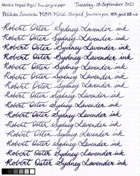
Dear Forum, glad I found you - And I am your new member and maybe contributor to others that are on the quest for nice pens. I have owned a silver/black Pelikan M805 for ages, it was "the" pen I decided to buy when I was thinking that should take care of any word I write and so my (in my terms) expensive pen should me remind me. Same as with my watch, that I bought to remind me of how precious time is. (So the watch was precious, too) And now, all of a sudden and surprisingly I went into growing a M805 family in just 1 week! By coincidence, I found a M805 Demonstrator that I immediately fell in love with on the bay. The seller lives close by, so I went there and owned this wonderful pen. I was happy, although this pen being a M805 didn't "add" something to the pen I used already. And while I was at the seller's place, she (owning thousands of pens and even writing books about) told me about the M815 Metal Stripe limited edition that would be THIS special pen arriving soon. Actually, I ended up with ordering a M815 that arrived Friday. So I made it to three M805 in one week - And the point is, I feel every single one has a right to exist next to each other. What do you think, would you buy 3x the same pen - Or do you feel it's three different pens? Please find my picture attached Well, at least I have different nibs, M and F on them.. Let me know whether this is the start of an addiction or still normal? Best greetings for next week, Stephan
-

A Tale Of The Lesser Flagship Of Montblanc : The Meisterstück 146
sannidh posted a topic in Fountain Pen Reviews
Loved the MB's flagship pen review by Betweenthelines. And then realized, I was yet to post a review on FPN for the lesser one, the 146. As for me, I came across a real Montblanc pretty much later in life, though used to love a pen called Camlin Premier during school days. It came with a 1-pen leather pouch, an additional screw-fit nib and it did have those striped ink windows. I say I loved it, but never wrote with it since it belonged to my dad and I was a small kid. Back in 1999-2000, it cost around USD 5.00 and it was a hefty price tag for any locally made fountain pen. Later I did realize that it was yet another MB 146 inspiration, when I went to a pen store in Calcutta. So here goes my review @ blogger too with some more pics: A Tale of the lesser flagship of Montblanc : The Meisterstück 146 A BRIEFER HISTORY IN TIME MONT BLANC As most of you would know, Montblanc was started in 1906 a Hamburg banker, Alfred Nehemias, and a Berlin engineer, August Eberstein as Simplizissimus-Füllhalter which means Simplistic Fountain pens, after they learnt about fountain pens with ink tanks from the US. By 1908, three other people by the name of Wilhelm Dziambor, Christian Lausen and later Claus Johannes Voss had taken over the business and the company took the name “Simplo Filler Pen Co.” which referred to a fountain pen design with a built-in ink-tank. In 1909, a safety fountain pen made up of hard rubber called “Rouge et Noir” was launched, which actually means Red and Black. The pen consisted of a red cap and a black body, perhaps inspired from a card-game. You can also find a limited edition of the same. In 1910, the company became Mont Blanc, inspired by the highest peak of the Alps (4810 m) and a pen called Montblanc was introduced with a white tip (which would later evolve into a white star in 1913). In 1926, the Meisterstück was launched. By 1929, the nibs were engraved with 4810, the official height of Mont Blanc peak, as an allusion to supreme quality and craftsmanship. The flagship Meisterstück 149 was launched in 1952, evolving from celluloid & brass mechanism to resin & plastic mechanism over the years. For the Meisterstück 146, the ink windows were modified to striped version somewhere around the 1970s from clear blue window and the the two-tone nib was introduced in 1993-94. As far as the model numbers XYZ (146) are concerned, MB did traditionally follow a naming convention, albeit in a rather loose mannerX or 1: Tier of pen, 1 - Top class or Meisterstück 2 - Medium range & 3 - EconomyY or 4: 0 - Safety filler, 2 - Button Filler, 3/4 - Piston FillerZ or 6: Nib size, 9 being the largest MB eventually stopped production of all economy pens in 1992. DESIGN (5/6) The pen is made of glossy 'precious resin' (a custom variant of Polymethyl methacrylateaka PMMA) and is adorned plated rings and bands. Glistening golden with the subtle shine of black preserve a culture while adding a modern luxurious touch. This specific cigar shape was later copied around the world by many leading pen makers, over decades till date. The cigar shape was invented by Sheaffer Balance in 1928. The 146 also comes with platinum plated trims. The resin does feel substantial to hold, but it's also prone to scratches, if due care is not exercised. http://2.bp.blogspot.com/-Bdf5EwHxYco/VaEdqGTo-GI/AAAAAAAAEw0/d-mgo1330LE/s1600/DSC_1786.jpgWith a minimalist piece of design, the clip does start with a tiny piece of elevated ramp. The cap bands and the rings follow the same equation till a ring separating the piston end concludes both dazzle and design. The clip is tension fit and carries a serial number and GERMANY along the ring. On its underside it may or may not carry the engraving of Pix, depending upon the year of manufacture. Montblanc included the trademark post 1997. There are a lot of Chinese fakes flooding both online and offline channels, which is why Montblanc has to come up with newer and innovative trademarks with every model. http://2.bp.blogspot.com/-NRQ0HCyiSbE/VaEdpgbgWkI/AAAAAAAAEww/t6HaP1PAD-I/s1600/DSC_4304.jpgThe cap unscrews with a single turn revealing a dazzling two tone nib along with a striped ink window. I like the ink-windows very much. http://2.bp.blogspot.com/-JDI6YLg1mQs/VaEeC3KPgeI/AAAAAAAAExI/PpEzAndAV40/s1600/DSC_4322.jpg The cap does mention MONTBLANC - MEISTERSTÜCK etched across the broader of the concentric golden bands, in a cross-hatched font while two thinner bands above and below render the differential aesthetics. The finial carries the white-star.http://4.bp.blogspot.com/-t_EFEBqFTIg/VaEdWzZ1XtI/AAAAAAAAEwg/tn6K260KlYI/s1600/CapC.jpg FILLING SYSTEM (6/6) The piston is distinguished by a golden band and has an easy and a hassle-free mechanism. The piston end unscrews with less than three rotations and as the white piston head moves along the ink-windows, ink gushes into the barrel. A brass connector gives the necessary weight to the barrel.http://2.bp.blogspot.com/-OOGMOsyTrIg/VaEd-CQOqHI/AAAAAAAAExA/0Y8dcje74k4/s1600/DSC_4323.jpg NIB - ALL THAT MATTERS (6/6) The dazzling two-two nib is tested by hand, and it comes in eight different widths including the common widths of EF, F, M & B. And this silvery rhodium finish provides both glitter and glamour. A golden decor runs along the shoulders of the nib and it converges across the outer tines onto an iridium tip, while the rhodium silvery finish diverges from the breather hole across the inside of the tines and over to the tail. A bounded layer of arabesques & curves segregates the rhodium and gold decors. Then, there is a dazzling white M logo resting inside the encircled star, above which rest the height of Mont Blanc peak, 4810 (m). This one is a fine nib and writes quite wet and smooth. The tail end specifies the composition (58.5% Au) of the gold-alloy used. Above it rest the specification 14K and brandname of MONTBLANC. There is no width specified on the nib itself, unlike others.http://2.bp.blogspot.com/-15f8N4cwztg/Vf0EnKnBu6I/AAAAAAAAFhM/Yve04cKG-ns/s1600/DSC_6351.jpgA standard black plastic feed with finely spaced fins (earlier ones had ebonite feeds) ensures a good ink buffer for the awesome wetness and prevents hard starts. By the way, I just love the ink windows.http://3.bp.blogspot.com/-tRJBu8G6-gw/Vf0Et4j5lZI/AAAAAAAAFhY/ffaTbAgFWvs/s1600/DSC_6360.jpg PHYSICS OF RELATIVITY (6/6) It does give a comfortable feel to write with the pen without posting the cap. The overall capped length is around 14.2 cm. The pen can be used posted without any feeling of top-heaviness as the weight of the cap is less than a third of the total weight, with a comfortable grip of 1.2 cm.Uncapped Length ~ 12.4 cmPosted Length ~ 15.6 cmNib Leverage ~ 2.4 cmOverall Weight ~ 31 g (Cap Weight ~ 9 g)Below are the pictures along with a Pelikan m805 and a Pilot Custom 823 for your reference. http://2.bp.blogspot.com/-9cEZUiQx1Ow/VaEeVgzlMiI/AAAAAAAAExQ/ebKpXBCOoak/s1600/DSC_4360.jpghttp://4.bp.blogspot.com/-b4ug3mQy5cY/VaEee7RkPyI/AAAAAAAAExg/JKVrY2iUfOc/s1600/DSC_4379.jpghttp://2.bp.blogspot.com/-IXL8Je6WvTI/VaEeZFRv8GI/AAAAAAAAExY/zsBQQ5L1UUM/s1600/DSC_4371.jpgECONOMIC VALUE (3/6) This one defies both logic & gravity and the pen retails at more than USD 750. The price puts most of the fountain pen people off, while getting a pre-owned one from your uncles (well nothing like that! or buying it at a good discount) can save some money. You can also get hold of a MB boutique sales person selling off some older generation demo pens at a good discount. When it comes to the internet, one has to be careful regarding the abundance of fakes in the online marketplaces and the best fakes are costly and are quite difficult to identify without experience. Value for money? I doubt. Heritage Value? High. You can probably pass on the pen to your next generation and they would still recognise it as a brand. Can I pass on the same emotional value with a say, Pilot Custom 845, outside of Japan? I doubt. This will probably need some internet searches, before one realizes the true value of the pen. OVERALL (5.2/6) The writing experience is amazing although I do find the pilot custom 823 and m805 being equally good when it comes to nibs of similar size and constituency. There is a hint of spring and softness in the nib and an absence of any line variation between the horizontal and vertical strokes. The lines dry relatively quickly with a MB Toffee Brown ink taking around 25 seconds on MD Paper. And you get a nice shading too!http://1.bp.blogspot.com/-dDdiKKFeJ94/Vf0ExcEcTAI/AAAAAAAAFhk/gsIvnhXgG20/s1600/DSC_6286.jpgComparatively, a custom 823 with a medium nib, draws a line, thinner than both 146 and m805 fine points and dries quickly. On a smooth MD paper with stock pelikan 4001 inks, it took more than 30 seconds to dry the dots put by the 146 (as well as the m805). Final Toffee Posehttp://2.bp.blogspot.com/-aFyTIagg_s4/Vf0EyWgzXJI/AAAAAAAAFho/-d2kcXs6_UU/s1600/DSC_6304.jpg REFERENCES Montblanc WebsiteGentleman's GazetteForbes Article Model Numbers Thank you for going through the review. You can find some more pen and paraphernalia reviews here. -
PRELUDE I was looking to gift my dad with a Montblanc pen for a long time. And it had to be a new one. Personally, I had bought a pre-owned MB 146 (the only pre-owned in my small collection), and I am more or less happy with it. It’s kind of ineffable but the right shape with the right balance, encompassed within a classical look seemed missing in some luxury pens, which I own. Personally, I feel that any pen above $ 100 is never a VFM and it’s rather a self-indulgence in fooling myself when I order one more expensive pen. May be it’s just applying theory of brand relativity when I try to convince myself that a Pilot 823 or a m800 is a VFM pen. You are invited to read the review live on my blog (linked below), where you can find reviews of my other pens: A Montblanc Meisterstück 149 in Red Gold Back to the pen and it’s acquisition, the phenomenon was popularly known as the Apshankar hand wave within our small fountain pen group on the Telegram app. Actually, Kapil & Pradeep are the two main agents for urban poverty for many people including Vaibhav and me. Jokes apart, both are really fine people who are passionate about pens & paraphernalia and real good friends. Pradeep was kind enough to place an order for me from LCC & the pen travelled across the Atlantic Ocean with Kapil to finally land in my hand. While I was a bit unsure of the Red Gold trim, aesthetic opinions from both Kapil & Dennis (of LCC) helped me finalise on my choice. HISTORICALLY SPEAKING As most of you would know, Montblanc was started as Simplizissimus-Füllhalter in 1906 by a Hamburg banker, Alfred Nehemias, and a Berlin engineer, August Eberstein. Simplizissimus-Füllhalter means Simplistic Fountain pens and the founders had learnt about fountain pens with ink tanks from the US. By 1908, three other people by the name of Wilhelm Dziambor, Christian Lausen and later Claus Johannes Voss had taken over the business and the company took the name “Simplo Filler Pen Co.” which referred to a fountain pen design with a built-in ink-tank. In 1909, a safety fountain pen made up of hard rubber called “Rouge et Noir” was launched, which actually translates into Red and Black. The pen consisted of a red cap and a black body, perhaps inspired from the card-game. You can also find a limited edition of the same. In 1910, the company became Mont Blanc, inspired by the highest peak of the Alps (4810 m) and a pen called Montblanc was introduced with a white tip (which would later evolve into the classical white star in 1913). In 1926, the Meisterstück was launched. By 1929, the nibs were engraved with 4810, the official height of Mont Blanc peak, as an allusion to superior quality and craftsmanship. The flagship Meisterstück 149 was launched in 1952, evolving from celluloid & brass mechanism to resin & plastic mechanism over the years. The 149 was reintroduced with a triple tone 18k nib (they are 2 colours really) somewhere around 1995. For the conventions of MB, as far as the model numbers XYZ (149) are concerned, it did traditionally follow a naming convention, albeit in a rather loose manner X or 1: Tier of pen, 1 - Top class or Meisterstück 2 - Medium range & 3 - EconomyY or 4: 0 - Safety filler, 2 - Button Filler, 3/4 - Piston FillerZ or 9: Nib size, 9 being the largestMB has eventually stopped production of all economy pens in 1992. PRESENTATION (6/6) The pen came inside a luxury gift box, with an user manual cum warranty card and a 60 mL bottle of Montblanc Mystery Black Ink. I hope that the pictures below will be able to do a justice, especially when you are gifting the pen to someone dear. I am someway bound to appreciate this presentation with a full rating. http://4.bp.blogspot.com/-ILer5LGc6Fk/VlbWZ_KW1MI/AAAAAAAAFm0/btdPkChRufE/s1600/DSC_6563.jpg http://4.bp.blogspot.com/-7Pfr15tN7mM/VlbWhoj_LaI/AAAAAAAAFnM/LRzbJEWeA7U/s1600/DSC_6581.jpghttp://1.bp.blogspot.com/-TLj6oKpSMgM/VlbWbNloW3I/AAAAAAAAFm4/L80AC4al4ZQ/s1600/DSC_6597.jpg DESIGN - THE CLASSIC CIGAR (6/6) Glistening with red gold with a non pretentious shine of black preserves a culture, while simultaneously adding a touch of modern luxury. While Red gold, Rose Gold & Pink Gold are often used interchangeably, 18k Red Gold is actually made of 75% gold and 25% copper, Rose & Pink gold add up 2.5% to 5% of silver which balances out the copper. The 149 is available in three delightful trims - Gold, Red-Gold and Platinum. The pen along resting against the shoe shaped ink bottle looks awesome to me. http://4.bp.blogspot.com/-OO0Flnfv644/VlbWsfFJiGI/AAAAAAAAFng/sUm98vzYaS8/s1600/DSC_6603.jpg While the pen does not look or feel hefty, it has the semblance of an oversized pen. The clip starts with a tiny piece of elevated ramp preserving tradition. The thin and thick cap bands along with the piston rings complete the minimalistic design of the pen with grace. The clip is tension fit and carries a serial number and GERMANY along the ring. On its underside carries multiple engravings this day, however the engravings could be completely dependant upon the year of manufacture. There are a lot of Chinese fakes flooding both online and offline channels, which is why Montblanc has to come up with newer and innovative hallmarks with every model. http://3.bp.blogspot.com/-aaAG0DFBxvY/VlbW0dX4hUI/AAAAAAAAFn4/52mXlVMyESA/s1600/DSC_6604.jpg A quick pose with its smaller cousin 146 in gold trims. Red Gold vs Gold. http://4.bp.blogspot.com/-HFdgO8sHgSk/VlbW0BakqmI/AAAAAAAAFn0/CW8eBma91ms/s1600/DSC_6607.jpg It is oversize but I almost never feel the heft while I hold the pen. The cap unscrews with a single turn revealing a red gold nib with a rhodium inlay. It also reveals the beautiful striped ink windows just above the section threads. The attention to details is kind of amazing. The section ends up with a little bump with a rougher loop of resin, before the mind delves into the dazzle of the rhodium inlaid red-gold nib. http://4.bp.blogspot.com/-mQpOklcxwfQ/VlbW3bo2McI/AAAAAAAAFoM/gGWGNuZOKc0/s1600/DSC_6609.jpg The cap does mention MONTBLANC - MEISTERSTÜCK No 149 etched across the broader of the parallel cap bands in cross-hatched characters, while two thinner bands subtly play along with it. The finial of course carries the white-star. There is a tiny hole in the cap meant to equalise the ambient pressure and avoid inking of the cap. I think it could be a very recent modification. Some of the earlier 149s don't have it. There are some hallmarks including metal written on the underside of the clip to preserve MB’s product authenticity. http://2.bp.blogspot.com/-thyYhUwt278/VlbWhmWSrwI/AAAAAAAAFnI/teMm2XlYIaM/s1600/cap.jpg FILLING SYSTEM (6/6) The piston is distinguished by a red gold band and is very convenient to operate. The piston end unscrews with less than three rotations and as the white piston head moves along the ink-windows. Once screwed back inside the bottle, ink gushes inside the barrel. The brass connector renders some weight to the barrel. The feeder hole assists in efficient ink intake for an oversize nib. The manual carries graphical steps for filling the pen in case your are using a piston filler for the first time. The ink windows still rule my thoughts. http://2.bp.blogspot.com/-jsnUzfWCyUs/VlbW327fG4I/AAAAAAAAFoU/JMwK28JAZGI/s1600/DSC_6613.jpg NIB - ALL THAT MATTERS (6/6) The dazzling triple-tone nib is tested by hand, and comes in eight different widths including EF, F, M, OM, OB, OBB, B & BB and a signature replacement width of O3B. And of course it looks awesome given its size and glamor content. The size and spread of the nib are just gorgeous. http://4.bp.blogspot.com/-gwKtkYQvubs/VlbW3PUqihI/AAAAAAAAFoI/mdyR1ldQdKE/s1600/DSC_6615.jpg A bounded layer of spiral galaxies rest within the rhodium inlay while red gold defines the decors in the outer tines as well as the inner body. Then, there is a dazzling red gold M logo resting inside the encircled star, above which rest the height of Mont Blanc peak, 4810 (m). This one is a fine nib and lays a smooth wet line. The tail end specifies the composition Au750 of the gold-alloy and the brandname of MONTBLANC rests above the tail. Between those there is a hallmark of StOD inside a crossed ellipse. There is no mention of width on the nib per se, while a sticker at the piston end of the barrel says it all. http://4.bp.blogspot.com/--FAGKaOnLSg/VlbW4q8VLtI/AAAAAAAAFoY/4KYxjHgQB2A/s1600/DSC_6622.jpg A black plastic feed (earlier ones had ebonite feeds) with a feeder hole improves ink suction while closely spaced horizontal fins ensure a good ink buffer and promise wet and smooth starts. Even with a dipped nib section, it can a few paragraphs. http://1.bp.blogspot.com/-VjDqzClHuT0/VlbW7JURE0I/AAAAAAAAFog/MbEnimU7NdQ/s1600/DSC_6657.jpg PHYSICS OF IT (6/6) – RELATIVELY SPEAKING The overall capped length is around 14.8 cm. I would prefer to use the pen unposted as both weight and balancing seem perfect with an awesome nib leverage. The section has a comfortable grip of around 1.3 cm. I feel it’s a very comfortable from an overall perspective balancing amazingly well for an oversized nib. Uncapped Length ~ 13.3 cmPosted Length ~ 16.8 cmExposed Nib Leverage ~ 2.8 cm Overall Weight ~ 32 g (without ink, cap weight~10 g)Below are the pictures along with a MB146, Visconti HS Maxi and a Pelikan m805 for your reference. http://3.bp.blogspot.com/-SoYa2kCUFqs/VlbW8ygEEII/AAAAAAAAFoo/KJScsu0hVXg/s1600/DSC_6661.jpghttp://1.bp.blogspot.com/-KwFTSxJvUME/VlbW_B55utI/AAAAAAAAFo4/bH3TcB2_DwE/s1600/DSC_6669.jpg ECONOMIC VALUE (3/6) An expensive retail price of above USD 900 puts off people, while getting a pre-owned does save some money, while you keep the charm of writing with a 149. When it comes to the internet, one has to be careful regarding the abundance of fakes in the online marketplaces and the best fakes are costly and are quite difficult to identify without experience. I am not going to discuss the pricing, but I had more than a reasonable discount, thanks to Kapil. And for me it’s a gift (although I could end up using it ) and the price didn’t matter. Although personally speaking, I would have preferred a pre-owned 149 in a great shape. OVERALL (5.5/6) The writing experience is as amazing as the nib looks, with just the kind of control which you would require from a superb nib. Both Kapil & Dennis had tested it before packing. There is spring and softness in the nib and an absence of any line variation between the horizontal and vertical strokes. The lines dry in 30 seconds with a MB Mystery Black ink running on MD Paper. With other inks the width is good enough to reflect some shading too. The best part perhaps is the balance that Montblanc could find with an oversize nib, so that it does not feel unwieldy. I initially had my own doubts regarding the size but I did try the 149 in a MB boutique then Pradeep’s 149, to be certain. The nib never skips and always lays a wet line, and seems to be one of the best oversized nibs in my small collection. I am sorry I couldn't gather the courage to put some pressure and try flexing some characters out from this one. http://2.bp.blogspot.com/-8jcp0ekeOKA/VlbW_Lcs50I/AAAAAAAAFo0/etpyrbHZrzo/s1600/DSC_6645.jpg REFERENCES Montblanc Website Gentleman's Gazette Model Numbers StOD Hallmark Thank you for going through the review. You can find some more pen and paraphernalia reviews here.
-

Very Disappointing Experience With A Pelikan M805 Stresemann
John545 posted a topic in Fountain & Dip Pens - First Stop
Hi Guys. I have been into fountain pens for a while now, but I hadn't bought any expensive pens until now. My collection mainly consisted of TWSBIs which I have been very happy with. I worked really hard this year for my 2nd-year exams, and I worked pretty hard over the summer in an internship so I decided I would reward myself with my first "expensive pen". I decided on the Pelikan M805 Stresemann for a couple of reasons. 1 - It looks brilliant. I really like the look of the grey stripes down the barrel. I haven't seen a pen that I like the look of so much. 2 - I had heard that Pelikan nibs are some of the best nibs around and write brilliantly out of the box. However, I opened up my new pen this morning and sadly I have never been so disappointed with a purchase. As I was opening the pen it was somewhat clear that I had been sent a pen that was previously a return. For example, the little plastic bag that the pen comes in was all screwed up. (I bought this pen from cultpens in the UK by the way). Now I'm wondering if someone else had a bad experience of this pen, sent it back, and now I've ended up with it. On the barrel, it appears that one of the grey stripes is missing. There appears to be a dark gap where it is missing. I have tried to get a picture of this but it is quite difficult to pick it up on camera! This is something that wouldn't bother me in the slightest on a much cheaper pen, but at £300 I'm not impressed by this. I decided to forget all this as the writing experience is the most important thing. So I inked up the pen with some Iroshizuku Ku-Jaku and began to write with it. The writing experience is extremely disappointing! It's almost as if I am writing with a different pen to that of the reviewers online. The nib is very dry, and not smooth at all. Also, it feels very stiff which I was surprised by as a lot of people say the Pelikan nibs have some spring to them. I grabbed my TWSBI Eco to compare the writing experience, and the eco is the clear winner. Smoother and wetter, at less than a tenth of the cost. A lot of people say that the Pelikan nibs are quite broad. For example, the medium M805 nib in the pen habits review looked more like a broad or even a double broad. So I decided I would go with a fine nib as opposed to the medium nib I usually go for. So I'm wondering, would you guys recommend returning the pen and swapping it for the same pen with a medium nib? Or do you think I would be better getting a refund and buying a different pen altogether? If you think there is a better alternative pen out there I would appreciate any recommendations - I'm looking for a pen with a really wet and smooth nib for the best writing experience possible. Around £300 or less. -
Coming from my home base in California, USA - A new discount from paperinkpen.com: Today through next Wednesday I'm offering 20% Off Regular Pricing on all Pelikan Souveran Fountain Pens in Stock Please use code: fpn20 to receive your discount. Discount is taken during checkout. As always California Residents: We Pay Your Sales Tax! Thanks for peeking in. I look forward to serving you. Dave macaddicted Paper, Ink, Pen is a California based authorized Pelikan reseller. Not responsible for typographic errors. Offer is subject to change without notice. Have a nice day!
-
Looks like Massdrop is running a drop on the M805 in the Stresemann finish. The price looks OK but is above my current budget. $400 https://www.massdrop.com/buy/pelikan-souveran-m805-stresemann-special-edition
-
Thoughts On Pelikan M805 Demonstrator
Fatalpotato posted a topic in Fountain & Dip Pens - First Stop
Hi everyone, I wanted to have a separate topic on this because I couldn't find enough information on other topics and they're quite old now. I have been searching for a m1005 demo for quite a while now but as many of you might have found out the unused ones in market have almost tripled in value since that pens release (6 years ago?) and the used ones usually ask for the new price when it was released (600$ range) and they are usually sold in less than an hour. I have a visconti opera black demo and an aurora 88 black demo and I really enjoyed using those, though I dropped and cracked the barrel of aurora some time ago. I fixed it with some cyanoacrylate glue (supeglue) to attach two parts of barrel. But now it sometimes leaks ink to the space between inner and outer chamber and its a whole lot of mess to clean it out. So I rarely use that pen now and I figured out aurora nibs are not that good for my taste. As a replacement to that pen, now I'm contemplating to buy a 805 demo probably with engravings because it looks cool . I tried to read some reviews about the pen but only could find a not so thorough review at pelikans perch (what a lovely site for pelikan aficiandos ) and as that pen was released almost three years ago I find the love it found in community a little underwhelming compared to more recent offerings from pelikan. I would like to hear from everyone that either owns the pen, seen the pen, or even has some opinion on it from stuff they saw online that I couldn't find. Positive criticism of the pen is much appreciated but I'm actually more interested in what made the 1005 edition such a big hit and this one not so much. Thanks in advance, and I'll return the favor to the community by writing a nice review on the vermillion custom urushi I recently got, which I think isn't getting the love it deserves right now -
Before purchase I read some reviews and watched some videos on the M805 blue striped. All were mentioning some degree of translucency of the black stripes that allow to see the ink level. When I got the M805 I immediately noticed the lack of translucency - one of the first things that I did was to hold the pen up to the light. Very little light passes through the barrel when placed between myself and my phone flashlight and that's only on 2/3 of it. It's not as bad as the R600 red striped which is opaque even with flashlight, but that's a rollerball so I don't care. Is this common on the blue version (the green model seems even more translucent, from pictures)? The pen writes beautifully (M nib) so I'm not inclined to replace it even though the barrel is not to my liking. Would you replace the pen for something like that?
-
Got My Pelikan M805 Ocean Swirl. Boy Am I Disappointed!
sub_bluesy posted a topic in Fountain & Dip Pens - First Stop
I had heard rumors of the cap and pen body coloring not lining up but figured I would be able to sort it out if it was an issue. At least be able to line the cap and body up to an acceptable arrangement. Ive had to re align many new Omas pens that the facets did not align so I was not afraid of the Pelikan if alignment was needed. Well I was wrong. The cap threads on the Pelikan appear to be cut into the cap itself and the sealing cup is glued into the cap separately. If I remove the liner and move it down, it will just come loose after a brief amount of capping and uncapping. I spun the cap around freely in an effort to see if it was even possible to line up the Ocean Swirl sections with the black sections and found that its impossible. On my pen, the cap is about 1/2 Ocean swirl but separated by a very small black section that isnt really black. Just a little less Swirl than the rest of the cap. The rest of the black section is much wider than the other side. The body is about 2/3 Swirl with a somewhat black section 1/3 around. Theres no way to make the cap and body even remotely match! The black to Swirl ratio is completely off and cannot be reconciled. Its like they turned the body from a rod that was cast at an angle. Then turned the cap from a completely different rod at a different angle. Im so frustrated with this! I have been looking forward to this pen since it was released and finally came up with the funds/justification to order one. As you all know, its not a cheap pen. I even had to wait an extra week to get a broad nib in stock. Its also extremely disappointing that theres no way to fix it. Im used to getting pens that need work over the years. Thats why Ive learned to correct my own nibs and disassemble brand new pens at all price points. Ive accepted that with this hobby, but theres nothing that can be done with this one to correct the alignment. I didnt even get to write with it either as its still uninked due the the alignment issue. Im sure that the retailer I ordered the pen from will take it back without issue but I really love the material. It would be great to have one in my collection. The material is really special. Its really unfair that Im going to have to ask the person I ordered the pen from to sort their stock and find an acceptable pen with correct alignment for me. I shouldnt have to do that and they shouldnt have to go through several pens to find a good one. Its also bad business that they (or me) is going to have to eat the cost of return shipping and then new shipping back. Thats about $20 being very conservative. I was expecting much more from Pelikan especially at the cost of this pen. This is my first pen from them. At least the bare minimum I could expect from a $450+ Pen is that the material even remotely lines up. I spent about an hour tonight fiddling with the pen to get it to align. I even put an o ring in the cap as a last ditch effort. Theres just no way to match the ratios here. I really hope the retailer will find a pen for me that matches. If not, I just cant place another order for this pen and Ill just have to write it off as something that could have been great but was unacceptable due to bad QC/manufacturing practices. Thats extremely disappointing to me! The pics attached are, no BS, the best alignment overall I could get. I really want to like this pen! -
Meet the new Pelikan Souverän M805 Ocean Swirl. This new Special Edition has been created using a unique material that gives each piece an spectacular appearance evoking the ocean's swirls. Exposing it to light you achieve brightness and depth. As it happens in the deep of the ocean light tones alternate with darker touches, reliving its lights and shine. Each instrument in this series is unique. Cap and rings are palladium plated and the fountain pen features a 18K gold nib rhodium plated available in EF, F, M and B. The collection will be available in fountain pen, ballpoint and roller. The fountain pen will be available in November, but we are already acepting pre-orders. Please email info@iguanasell.com to make yours! Kind regards, The Iguana Sell Team
-
The M805 Ocean Swirl is a stunning yet controversial 2017 Special Edition from Pelikan. While my initial view was ambivalent, in actual use, the pen has moved into the same vaunted category as the understated, equally variable, City Series San Francisco. I was fortunate enough to see seven copies among the local DC/MD stores and two additional copies from Pen friends; 9 in total. Particular thanks goes to Pen Boutique for helping me land mine. Pattern and Color Distribution: Some posts seem to hint that some pen copies may have "nearly" 100% blue-green and others verging on total black. Not what I saw and may be due to range in perception. All 9 copies had clear bands of fluorescent blue-green swirls alternating with darker bands of shimmering deep blue-black occurring in approximate quarters as a constant. None of them were nearly one color, and certainly not pitch black (see a true black pen comparison side-by-side below). Granted, as a matter of degree, two copies leaned toward the darker side a tad more, but most were ~50/50 distribution, or close. The fluorescent bands are striking when light hits them and depending on the warmth there is a bit of green peaking through, but to me its a blue-leaning teal or brilliant turquoise in most instances (Yama Dori calls!). Pattern Alignment: Much has been made of the alignment or the lack there of between the fluorescent and darker bands in some copies. This is true. Not all the pens had aligned-patterns, but most seemed to have at least one vibrant band that aligned upon choosing the right cap-thread. I am sure there are some cap/body combos out there that do not align at all, along any thread. If this is important, seeing pens in person, or getting pics may help, but unaligned patterns look quite nice to my eye when in actual use. My copy does align, but when misaligned purposefully, the darker cap still looks elegant to me (pic below). YMMV. Work-appropriateness: almost black, but not quite My Ocean swirl saw more use simply because it was not a pen that immediately attracted attention, but still had a subdued elegance about it. In conservative settings, pulling out even a marginally showy pen, may go without comment but not without notice. This pen is work appropriate. In comparison, the Burnt Orange frequently invites comment (lovely nonetheless). Dr Jekyll and Mr Hyde Two's Company: Here's the Ocean Swirl next to the somewhat showy Burnt Orange Nib: I chose a Fine nib. Luckily, it turned out to be a true fine, not "Pelikan- Fine". My take on it: The color pattern is truly beautiful and unique. The pattern alignment issue can't be helped unless there is a way to nail down each body to a specific cap all the way through the supply chain and retail counters: fairly a tall order once it leaves the Pelikan factory given the number of hands that may handle them. Also when misaligned, the black cap contrast actually looks ok to me in actual use, YMMV. There are scores of pens out there that cover the whole pen with a single mosaic pattern from countless manufacturers including Pelikan (M620 Chicago anyone?). What's novel in that? This is more of a brave choice from Pelikan that is fairly subtle and renders a different look from one lighted room to another. Yet I doubt they will ever try this again. Cheers!
-
Posting yet another Pelikan M400 review Have replicated the content with some more pictures in the blog. Happy reading ! Below is a link to the same: Pelikan Souverän M400 Review BACK IN TIME An 180 year old maker of fountain pens and their paraphernalia, coupled with the fact that your collection is rather incomplete without a Pelikan, was enough to provide momentum for my first purchase. Pelikan had launched its first fountain pen back in 1929. As for me, having already witnessed the writing finesse of a steel nibbed M 205, which I had to trade off, it was time to witness the real 14K Gold nib. And of course, these Swiss-incorporated German pen makers are credited with the genesis of piston filling mechanism with a differential spindle gear. It means that the piston knob is also threaded so that it unscrews a bit when the piston moves outward, thus delivering a greater ink-suction. Hungarian engineer Theodor Kovacs is credited with the invention of the original filling mechanism before selling off the patent to Günther Wagner (the man who established Pelikan) in 1927. The M4XX is usually considered to be a logical next step to M2XX. As with the model numbers, there is a general increase in nib size & specs, in addition to overall dimensions, when you move from M4XX to M1XXX. Brass piston fittings in 8XX/1XXX series, render additional weight. The designs of the striped 400/600/800/1000 are pretty linearly recurring over the entire writing range except for several special editions. 405/605/805/1005s refer to the similar pens with silver accents, plated with noble metals (like Palladium or Rhodium), unless it’s a special or demonstrator model. The other model numbers refer to special/limited editions. One such alluring model is Souverän M 625 with sterling silver fittings (Ag 92.5%). And the green-striped M400 embarks the 1929 classical design with a translucent striped barrel. The logos have changed over the years starting from a mother pelican with four chicks to a one-to-one correspondence from 2003 onwards. http://2.bp.blogspot.com/-Vna3fc34jL0/Vatxew7iggI/AAAAAAAAE6U/M9MvUK-tuXg/s1600/Pelikan%2BLogos%2Bcopy.jpg PRESENTATION The pen comes in a standard G15 gift box, constituted of thick cardboard with dimensions in the range of 20 X 9 X 5.5 cm, in a top-bottom slider configuration. http://4.bp.blogspot.com/-nu3raQTSS6Y/VatvZMo7P3I/AAAAAAAAE4Y/EWWtcS-G_kw/s1600/DSC_0669.jpg On opening the box, you would at once notice a white synthetic-leather pouch, secured by a brown strap with a plastic emblem, which mimics a wax seal. The pouch contains your pen and there is a separator holding the warranty and catalogue beneath. http://2.bp.blogspot.com/-NcoO_QhOUAw/VatvWzNzbiI/AAAAAAAAE4Q/VaJGaHas6dQ/s1600/DSC_0850.jpg DESIGN - THE STRIPED TRANSLUCENCY (6/6) The m400 comes in five standard designs, four striped translucencies - Green, Blue, Red, Tortoiseshell White and one Classical Black with a Green Ink Window, across four different nib widths - EF, F, M and B although a custom grind is offered for a italic nib by some of the authorised sellers. The m405s now come in silver trimmed versions of Striped Blue and Black/Ink Window with monotone rhodiated nibs. Personally, I prefer the earlier two-tone nibs on them. http://4.bp.blogspot.com/-hU7WdN95RIU/VatvwS--x1I/AAAAAAAAE4w/FW91EVl9p_k/s1600/DSC_0933.jpg A touch would unveil the subtle craftsmanship associated in building the writing instrument. Through its light-weightiness, it apparently belies any effort for transforming thoughts into words. The black and green striped shaft has stood the test of time since the 1950s. The barrel made up of extremely smooth pelikan famed ‘cellulose acetate’ with its diamond cut contours, partially revealing the necessities like the piston end or ink level, while concealing the irrelevant ones. http://3.bp.blogspot.com/-H3Z3EPmmOUQ/VatwHE4R95I/AAAAAAAAE44/itQB4A9FSoo/s1600/DSC_4476.jpg Light and dark play differently with the barrels, which dazzles your eyes, rather than the lenses. http://3.bp.blogspot.com/-1zIiWrL7HGk/VatvusLRveI/AAAAAAAAE4o/NiaxZKgWrxc/s1600/DSC_0852.jpg The striped transparent sleeve gleams in gold with ambient light and these effects proliferate with sunlight. The golden radiance is matched throughout the pen starting from the famed finial and the pelican beak (clip) through the concentric bands in the cap finally converging with the piston rings. http://2.bp.blogspot.com/-EEq26h9Fqus/VatwRVg7RXI/AAAAAAAAE5I/5ASN8IgzmoQ/s1600/DSC_4478.jpg The cap feels light and unscrews with a single turn, revealing a dazzling two-tone nib. The grip reveals another knot of glitter, towards the nib end. The transparency does reveal the inside works of its piston mechanism. http://3.bp.blogspot.com/-QhXbrw5dzfk/VatwqCuW_jI/AAAAAAAAE5Y/ZItAwHF10u8/s1600/DSC_4490.jpg Two concentric golden bands with a gold plated crown embossed with the pelikan logo, adorn the cap with a signature pelican beak-shaped clip (with a face!). The thicker one carries the brand imprint of PELIKAN SOUVERÄN GERMANY. A high degree of polish gives it a gleam which can coax the lustre of the gold plated bands. The logo on the finial is the one embraced by Pelikan post 2003, that of a mother pelican and its chick, gleaming in brushed gold or brushed palladium. http://4.bp.blogspot.com/-EWRZBi0DzIQ/VatxoHkUjfI/AAAAAAAAE6o/ndvoZNfgceM/s1600/cap.jpg The significance of these bands is that somehow they seem to be intrinsically associated with the design rather than just differentiating the aesthetics. FILLING SYSTEM (6/6) A piston filler with a sturdy knob is embellished with two concentric golden loops. Apart from their enchanting looks, like any other pelikan, it's an easy and hassle-free mechanism. The piston end unscrews with three to four rotations and ink is sucked in, with quite a gush, once the piston is screwed back on. And of course, you can observe the thing in action through the striped windows. A plastic spindle connector in the m4XX/6XX limits weight. M4XX fills upto 1.5 mL of ink. However, given the wet flow of the flock, it does not get a long time to use this 1.5 mL. One thing to note here is that these piston mechanisms are not supposed to be dismantled using a wrench. In case of problems other than lubricating the piston seal, it’s better to send the pen to Pelikan Germany/Country Authorized Service Center. Pelikan does have an excellent customer service. http://3.bp.blogspot.com/-1HYLPTwAYgo/VatwtaPH9yI/AAAAAAAAE5g/DpFL3AXvjVI/s1600/DSC_4516.jpg NIB - ALL THAT MATTERS* (4/6) The nib/feed section is screw-fit and comes in a standard 14k two-tone design across four stock widths - EF, F, M & B. It has the standard pelikan design with the usual convenience of a screw-fit section. Like all its cousins, the nib is exquisite and efficient. With a standard m4xx feed, the nib-section is an ensemble of efficiency and art. And this two-tone finish does converge with the golden trims in terms of both glitter and glimmer. The tail end specifies the nib-width and composition (14 C, 58.5% Au) of the gold-alloy used. Three arabesques diverge along the shoulders of the nib with two of them converging near the circular breather hole. The third curve runs across the tines towards the shoulders ending with the tail end of the nib, outside of which a golden decor runs along the shoulders across the outer tines, before converging onto the iridium tip. There is of-course the dazzling golden mother-baby pelikan logo, resting above the tail. This one in the picture is an Extra-Fine nib and writes smooth out of the box. http://3.bp.blogspot.com/-nQtpvzkPJHY/Vatwvj0A2sI/AAAAAAAAE5o/3jkz4DSrx2s/s1600/DSC_4532.jpg A standard black plastic feed (earlier ones had ebonite feeds) with closely spaced fins delivers the amazing ink suction allows a good buffer capacity to hold ink with ambient pressure and temperature fluctuations. http://1.bp.blogspot.com/-1gNx1gskIPw/Vatw-ST1xWI/AAAAAAAAE50/Owq93Xszcx8/s1600/DSC_4540.jpg *My first green striped M400, had a wet yet scratchy nib. No doubt, it drained my entire emotional elation all of a sudden, when I started writing with it. Upon close inspection with a 20X loupe, I found tines misaligned by a considerable extent. But still due to wet flow, it laid a broader line than a pilot 14k medium nib, concealing most of the scratchiness, unless I wrote a looped ‘r’ or ‘s’. The next day, taking the loupe I did spend two hours, routinely lifting the right tine from the middle with my fingernail to align it with the left, although it kept coming back with amazing flex. An hour and a half later, the loupe showed both the tines to be more or less aligned and yes the scratchiness was almost gone. But the inertia of scratchiness still carried on the back of my head. Finally, I sent the nib back for a free replacement. The next m40Xs were gliders right out of the box and needed no such effort. But I did hope a better QC from Pelikan. PHYSICS OF IT (5/6) – RELATIVELY SPEAKING It does give a comfortable feel to write with the pen with the cap posted. The overall capped length is around 12.5 cm. The total weight of m400 has a third of contribution from the cap and it feels very light without posting the cap. The pen does get some heft from the ink inside the barrel. Uncapped Length ~ 12 cm Posted Length ~ 15 cm Nib Leverage ~ 2 cm Overall Weight ~ 16 g (Cap Weight ~ 6 g) Capped, uncapped and posted comparisons with its cousins - m605 and a m805 go below. A m20X with a steel nib shares the same measurements as a m40X. http://3.bp.blogspot.com/-Szlbwi8JT7U/VatxFBpMP8I/AAAAAAAAE6A/WI3MKqTWTYQ/s1600/DSC_4556.jpg http://1.bp.blogspot.com/-MKRvVUnJtLo/VatxdhNisxI/AAAAAAAAE6Q/yAypHzfnwZc/s1600/DSC_4574.jpg http://1.bp.blogspot.com/-YpU6_6F8m_M/Vatxb2Ic7tI/AAAAAAAAE6I/jH4ohE7Ic7s/s1600/DSC_4568.jpg ECONOMIC VALUE (5/6) The m400 retails at around USD 300 - 400, though it might be available at lower street prices. I was able to get the pens at a good discounted price in an online action at the bay, however the subsequent custom duty was high. I would not undervalue this rating by much, because in the end, I do consider the pen a workhorse. OVERALL (5.2/6) These 14k nibs have a smooth and wet flow. The nibs have a slight bit of spring and softness in them, without any noticeable line variation. Being extremely wet writers out of the box, the Fine nib puts a line which takes around 40 seconds to dry on MD Paper (for the Extra-Fine one, it takes 30 seconds to dry a line-width falling between a pilot 14K Fine and Medium nib) http://2.bp.blogspot.com/-mm5HUakG460/Vatxmjq1lwI/AAAAAAAAE6g/mae0Bmz9FvI/s1600/DSC_4582.jpg Some of the links which I can happily share : Nib Adjustment, Souverän M 625, Patent, Piston mechanisms, Gentleman's Gazette Thank you for going through the review. Hope you liked it. Edit: Modified with Hari's inputs (Comments)
-
Yesterday I got my new Pelikan M805 with M nib from Missing-pens.de it took one week to make it from Germany to Washington State. That actually was not too bad! I went with a M nib because I was reading here that M800 nibs tended to be marked one grade finer then they wrote compared to other Western nibs. In my case that is WRONG. The M nib puts down a 0.6mm line on Rhoda paper with kon-peki ink. That is the very same width as my Montblanc 146 M and my Pelikan m215 M. I guess I should have gone with the B. I do like the nib and plan on keeping it but I am getting into broader nibs and M is my new F. Maybe at some point I will have it reground to a M CI. The nib is also not as wet as I expected, but sometimes it takes a page or so of writing before a nib really decides to flow its best. Its smooth but does not skate on Rhodia paper which is just right for me. I really like the feel of the M805 in hand. It has a nice solid feel that I enjoy. I like the feel of the section even though it is short. It has a nice curve to it and its right where I would hold the pen. The color is darker then many pictures I have seen of the pen and a little purple in the blue. In any case my favorite color is blue so I like it. The blue stripes don't make the best ink window but not much worse then the dark window on my M215 rings model. http://driften.dragonsightsoftware.com/images/PelikanM805-1.png http://driften.dragonsightsoftware.com/images/PelikanM805-2.png


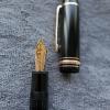


desaturated.thumb.gif.5cb70ef1e977aa313d11eea3616aba7d.gif)