Search the Community
Showing results for tags 'kwzi'.
-
So, at one point of another... we have all said.. "Wow, I wish I could get THAT ink".. but is discontinue/expensive/unobtanium .. etc So, here is the place where you should come and check if "THAT" ink has a Doppelgänger (look-alike, double, one who nearly or completely resembles another).. I will start... I will remind you, that even the same ink looks different depending on nib/flow/paper .. so these are examples inks with the same/similar hue.. that depending on your nib/flow/paper it might look identical.. Have you heard of Sailor Tanna Japonensis (Evening Cicada).. what about Sailor Shin Zan (Deep in the Forest).. well if you can't get those, you can grab a bottle of Safari.. is cheaper, not exclusive, and easy to find. photo below... (in real person they look almost identical) Knowing how famous scanners and pictures are for not completely represent what your eyes perceived, you get both... and take my word for it.. With the right pen you can get the exact look. C.
-
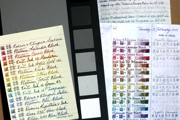
(All the writing was done using a dip pen, not the Aurora 888 Saturno that was merely acting as a paperweight while I took the photo above.) The degree to which iron-gall inks are water resistant vary greatly from ink to ink, even when they are in the same product line of the same brand. Sadly, KWZ Ink IG Mandarin does not perform very well at all, and barely surpasses Aztec Gold IGL (which stands for Iron-Gall Light) in that respect. Aside: I was a bit surprised to see Platinum Blue-Black sheen purple some prominently and evenly.
-
desaturated.thumb.gif.5cb70ef1e977aa313d11eea3616aba7d.gif)
Colour of KWZ Ink IG Turquoise after some time has passed
A Smug Dill posted a gallery image in FPN Image Albums
-
As some of you may know Poland is one of biggest exporter of cosmetics, furniture and fruits. But we also have inks Hopefully more and more inkthusiasts know what the four letters - KWZI - mean. They mean good ink, saturated color. The fruit of the passion. You can check Konrad's site here. IG Violet no 3 is stunning colors - it starts as pink and than turns into strongly saturated and deep purple that I enjoy a lot. Good stuff. Ink Splash http://imageshack.com/a/img540/8452/mrFJkx.jpg Software ID http://imageshack.com/a/img538/2262/dgqTFr.jpg http://imageshack.com/a/img537/6718/kH5YiV.jpg Waterproofness http://imageshack.com/a/img673/9460/gtR2H6.jpg Oxford recycled, Platinum 3776, BB http://imageshack.com/a/img661/9454/XAahX7.jpg http://imageshack.com/a/img673/1270/qzU1zp.jpg http://imageshack.com/a/img673/6383/10a7sI.jpg CIAK, Platinum 3776, BB http://imageshack.com/a/img537/7678/LjK5Am.jpg http://imageshack.com/a/img538/1374/aQvkYG.jpg http://imageshack.com/a/img911/4636/JpTfB2.jpg
-
Giveaway: Iron-Gall Ink Sample Set
A Smug Dill posted a topic in Pay It Forward, Loaner Programs & Group Buys
It's time for me to make good on what I've been talking about for a while, now that my order of plastic blunt tip needle attachments of syringes have finally arrived, and all the bits are in place. I'm giving away a set of (~0.75ml) samples of seven iron-gall inks: Platinum Classic Ink Cassis BlackPlatinum Classic Ink Forest BlackPlatinum Classic Ink Khaki BlackPlatinum Classic Ink Lavender BlackKWZ Ink Aztec Gold IGLKWZ Ink IG Green #3KWZ Ink IG TurquoiseThe volume is chosen to match what one would get from an international short ink cartridge, without being strictly being limited by the diameter of the 'nipple' on the feed or post inside the grip section, in case someone has a pen that uses a proprietary format (such as Sailor, Platinum, Pilot and Parker) converter. I will include a 1ml syringe with a 14-gauge blunt tip needle attachment, so the ink can be transferred into the cavity of any converter, empty ink cartridge, the barrels of 'eyedropper' pens, and even some piston-fillers from which the nib and feed can be easily removed by the user to access the pen's ink reservoir. I intend to send the ink sample set as a large letter (in a corrugated cardboard mailer 'envelope') and not a parcel. Australia Post is perfectly happy to accept the article as just that, when I showed the staff at my local post office. That makes international postage charges for the article not that much (at about 60%) more than domestic postage charges. The only question is whether the recipient's country postal regulations will deem the contents acceptable; I have to fill out a CN22 customs declaration if I send it outside of Australia. In view of this, the way I'm conducting this giveaway is: Please express your interest in being the recipient by making a post in this thread before 11 November 2019.There is no restriction based on country or geography on expressions of interest. Anyone from Australia, Brazil, Canada, Mexico, New Zealand and the UK (for example, but not exhaustively) who puts his/her hand up for it will be treated equally.The letter mail postage charges will be paid for on my end, thanks to @mariom.If you're outside of Australia and you're interested, then you have to include in your expression-of-interest post a link to the part/section of your country's postal regulations regarding dangerous, prohibited and 'non-mailable' items so that I can verify it's OK, since I'm the responsible party for filling out a CN22 customs declaration form for the article. I will use a random number generator to select the recipient from all eligible entries on 12 November 2019.This is the general format of how I intend to do future ink sample giveaways, after a lot of thought and non-trivial investment of effort and funds in getting suitable mailer envelopes, ink containers, syringe needle attachments, etc. together. Right now I've got other ink sample sets in plan for pigment inks, inks of a particular colour family, etc. and I would be open to feedback on what to include in future sets. What will not change is the approximate volume of each ink in a sample set, and the type of ink container to use. However, if anyone has better ideas of how to more time- and cost-efficiently offer others just enough of 'a taste' to decide whether they want to spend money on buying retail bottles of particular inks for themselves, I'm all ears. -
I am really enjoying using KWZ inks (other than the vanilla scent), and I've been looking into finding my perfect olive green ink. One of my requirements is good water resistance -- it does not need to be 100%, but the writing has to withstand being touched with damp hands or a small spill and still remain easily legible. I hoped KWZ I.G. Green Gold was going to be it, but when my bottle arrived, I've found that it's really more like a somewhat olive-leaning dark green. Not a green-gold as one might imagine (or olive). In a moment of inspiration, I decided to see what will happen if I mix I.G. Green Gold with KWZ Honey. Honey is a translucent and "layerable" honey-caramel color that can shade to off black if piled on. I.G. Green Gold is a very saturated low transparency ink. Both have silver sheen outline, but I.G. Green Gold just barely a hint of it, whereas Honey sheens silver around the letters very easily on good paper. Here are my results. No precipitate or odd behavior found so far. I very much like the first mixture and will be using it from now on in an empty Iroshizuku bottle. KWZ "Olive #1" : KWZ I.G. Green Gold 3/4 : KWZ Honey 1/4 KWZ "Olive #2" : KWZ I.G. Green Gold 2/3 : KWZ Honey 1/3 Both together:
-
As some of you may know Poland is one of biggest exporter of cosmetics, furniture and fruits. But we also have inks Hopefully more and more inkthusiasts know what the four letters - KWZI - mean. They mean good ink, saturated color. The fruit of the passion. You can check Konrad's site here. Brown Pink is complex color I'm not really keen on but I'm pretty sure some will like it. Chromatography http://imageshack.com/a/img538/5023/T0Wj7D.jpg Waterproofness http://imageshack.com/a/img661/6731/aHOYqf.jpg Ink splash http://imageshack.com/a/img905/1892/qk8cp1.jpg Drops of ink on kitchen towel http://imageshack.com/a/img908/4923/lE6E96.jpg Software ID http://imageshack.com/a/img910/5210/vbG7ut.jpg Oxford recycled, 90g, Kaweco Sport Claassic, stalówka B http://imageshack.com/a/img912/8892/5G9B5x.jpg http://imageshack.com/a/img912/1162/xxDjGf.jpg Kalendarz LEB MODEL, 90g, Kaweco Sport Claassic, stalówka B http://imageshack.com/a/img540/6062/baDGUF.jpg http://imageshack.com/a/img661/1210/W5lcnv.jpg Papier Lyreco Budget, Kaweco Sport Classic, stalówka B http://imageshack.com/a/img540/8555/iii5Yn.jpg Comparison http://imageshack.com/a/img540/860/vDu8o6.jpg http://imageshack.com/a/img908/8278/qh4FIb.jpg
-
I haven't done a 'quickie' ink review in a while, and some of my thoughts on the approach have changed in the meantime. Drying time: Long. Exceeds 30 seconds on Bloc Rhodia 80g/m² notepad paper. At 45 seconds (not shown), where the horizontal and vertical strokes in the digit '4' intersect, colour still came off and smudged readily. Water resistance: Mild. There's a fair chance you'll be able to read what was there before, after a minute or so under the tap or in a bath, but the colour that come off already dried writing into a water droplet or onto a wet cotton swab could well render that faint shadow illegible. Flow: I'd say more wet than moderate, when you compare the colours seen in the writing and the long straight lines against the multi-pass bar done with a Pilot Parallel pen; the 'single-pass' colour is not often seen. Feathering: Not on Rhodia paper, but because of the ink's 'wetness', I've seen it leave 'woolly' lines on other types of paper. Shading: Some, and the potential is definitely there, but because of the ink's 'wetness', it's more of a case of the 'two-pass' colour transitioning straight into sheen territory, overwhelming the shading effect unless one is using a very 'dry' pen. Sheen: Evident even in narrow lines coming out of a 'Japanese fine' nib, on various types of paper I tried. Show-through: Not enough to warrant mention. Bleed-through: Evident with three or more passes of the ink. Interestingly, it's not just the amount of ink left wet on the surface of the page to dry over time; there is no bleed-through where ink pooled at the end of a stroke with a Pilot Parallel 6mm pen ever with two passes. Contact with moisture/water for 60+ seconds did not cause any (more) bleed-through. See also: https://www.fountainpennetwork.com/forum/topic/346552-kwz-walk-over-vistula/?p=4210293
-
As some of you may know Poland is one of biggest exporter of cosmetics, furniture and fruits. But we also have inks Hopefully more and more inkthusiasts know what the four letters - KWZI - mean. They mean good ink, saturated color. The fruit of the passion. You can check Konrad's site here. Brown 4 is one of relatively new colors. To be honest I don't really like it - it has too much red - for a brown - to my taste. I also have a question to admins - given that KWZI Inks are in stock in two shops (Sakura Pen Gallery and Vanness) can I put reviews of the line in main ink review forum, where we can find reviews of Sailor inks sold in just one shop on planet earth? Ink Splash http://imageshack.com/a/img540/5130/Opn0M7.jpg Drops of ink on kitchen towel http://imageshack.com/a/img538/7770/PDQL0W.jpg Software ID http://imageshack.com/a/img673/6163/Ak0auA.jpg Waterproofness http://imageshack.com/a/img661/3834/i5EHB3.jpg Clairefontaine Triomphe Lined, Kaweco Sport Classic, B http://imageshack.com/a/img538/3291/yHRylk.jpg http://imageshack.com/a/img537/2876/bWDdak.jpg Cheap Calendar, Kaweco Sport Classic, B http://imageshack.com/a/img673/2192/cpclZD.jpg Oxford, Kaweco Sport Classic, B http://imageshack.com/a/img909/7927/hjctRy.jpg http://imageshack.com/a/img661/3749/7KJVgc.jpg http://imageshack.com/a/img912/6394/sw0W89.jpg
-
It took me some time to finish this comparison but here it is. Not flawless, not pefect, but it has plenty of colors to see. To be honest I've never been violet fan. I always liked dark purples but disliked most of violets. It's hanged with time. At the moment I'm quite keen on these hues. I've included 60-63 inks here (the number differs on different papers, I didn't have enough samples of some inks, I've forgotten about one or two inks and haven't included them everywhere). There are some odd-looking inks here that aren't violet/purple like KWZI Blue L51 (I just had a small sample so I included it here). Kung Te-Cheng, Potassium, Purpillusion are more blue than purple. Alt-Bordeaux and Deepwater Obsession can be regarded as burgundy but as I'm not planning (yet) to compare burgunds / bordeaux I've included them here as well. I need to thank Cyber6 here for A LOT of samples. You trully are Ink Smuggler Extraordinaire Ink Splashes http://imagizer.imageshack.us/v2/1024x768q90/674/D57Iib.jpg http://imageshack.com/a/img911/9309/XMowa7.jpg http://imageshack.com/a/img905/9462/Dzf3fY.jpg http://imageshack.com/a/img537/121/srURhs.jpg http://imageshack.com/a/img901/3985/xcEDod.jpg http://imageshack.com/a/img537/4492/NtfODA.jpg http://imageshack.com/a/img538/2685/q8cIq7.jpg http://imageshack.com/a/img673/1967/EnAfQy.jpg http://imageshack.com/a/img674/4319/WdEf3j.jpg http://imageshack.com/a/img631/7922/1S4blW.jpg http://imageshack.com/a/img673/9114/raVPLz.jpg http://imageshack.com/a/img674/3466/vK8xaM.jpg http://imageshack.com/a/img538/7629/ivb3lB.jpg http://imageshack.com/a/img538/2456/dhwe19.jpg http://imageshack.com/a/img745/7901/pw9g05.jpg http://imageshack.com/a/img674/6609/m4k036.jpg GEMS (they were cut from photos taken on a sunny day, you may find the colors bizarre but I like to show them this way even though most of the times we're not writing in a direct sunlight) http://imageshack.com/a/img910/3417/UZX0cP.jpg http://imageshack.com/a/img674/7610/4sDPbR.jpg http://imageshack.com/a/img538/8730/osVcHA.jpg http://imageshack.com/a/img912/9997/NAgsqc.jpg
-
As some of you may know Poland is one of biggest exporter of cosmetics, furniture and fruits. But we also have inks Hopefully more and more inkthusiasts know what the four letters - KWZI - mean. They mean good ink, saturated color. The fruit of the passion. You can check Konrad's site here. KWZI Blue /Black is dark and deep blue black. On some papers (absorbent ones_) it may look greyish. I'm not that much into the genre but it's well lubricated and writes well. As it's standard ink it has no water resistance. Ink Splash http://imageshack.com/a/img540/9818/GeK1JP.jpg Software ID http://imageshack.com/a/img661/8108/rsgmVZ.jpg Oxford recycled, Kaweco Sport Classic, B http://imageshack.com/a/img540/1237/3YzhdY.jpg http://imageshack.com/a/img538/2985/Tmae1K.jpg CIAK, Visconti Van Gogh. M http://imageshack.com/a/img538/6713/nw6C1Z.jpg http://imageshack.com/a/img537/3005/go7qXs.jpg http://imageshack.com/a/img538/2023/Kheuis.jpg http://imageshack.com/a/img537/7007/ra7nWF.jpg
-
As some of you may know Poland is one of biggest exporters of cosmetics, furniture and fruits. But we also have inks. Or, to be more precise, one ink maker – KWZI. Konrad offers handmade inks in more than sixty colors. You can check his website here. Liquid Words is LE ink brewed for participants of polish Pen Show 2017. The ink is heavily saturated and was available for short time and in limited quantity. Flow: This ink is wet and dense. It flows well, I haven't experienced any hard starts or skipping.. Saturation: well saturated ink. There are stronger purples on the market, but for me, this level of saturation works fine. Lubrication: good and pleasant. Drying time: It can take a while, depending on the nib you use. 15-20 seconds on Rhodia, 5 – 8 seconds on absorbent paper. Feathering: present on bad quality papers. Bleedthrough: experienced only on Moleskine (crappiest paper ever) Water resistance: nope. Drops of ink on kitchen towel Color ID Color range Fabriano, Kaweco Classic Sport, medium nib Field Notes, Lamy Al-Star, medium nib Velin Paper, Lamy Al-Star, medium nib Water resistance
-
KWZI is polish ink manufacture that gained popularity by reintroducing safe iron gall inks on the market. At the moment KWZ Ink offers wide variety of standard and iron-gall inks. Bottle Ink Splash (on Tomoe River to show sheen) Red 1 is nice and saturated ink. It behaves fairly well on most papers, even those of debatable quality. The flow is good, there's no water resistance. Drops of ink on kitchen towel Color ID Color range Fabriano, Munken Pure Rough 100 g. Omas Ogiva Alba, M Maruman, Munken Pure Rough 100 g. Omas Ogiva Alba, M Fabriano, Munken Pure Rough 100 g. Omas Ogiva Alba, M
-
Just ordered these three inks from Massdrop - KWZI Brown #4, El Dorado, and Pine Green. Does anyone have experience with them. I have a couple of milliliters left of Levenger Pomegranate. Was curious if Brown #4 is similar (if anyone has experience with both). I saw in a review of Brown #4 that it is kind of a red/brown, which triggered the question. For those that have the others, what other inks would you compare them to?
-
There are four KWZ inks having "brown" in their name: Brown #2, Brown #3, Brown #4 (this ink), and Dark Brown. These are the warm browns, the red-leaning ones, that some people don't like. That's not an issue for me so long as it's a nice color, and the handling is how I like it in my pens. Each has their own qualities in handling and appearance, however, only one of them, #3, is actually a brown to my eyes. With this preview out of the way, let's look at the individual inks. While the color of this ink is not quite brown, it's a very good color. I think visvamitra likened it to "baked cherry" in his 2015 review. It definitely has a "yummy-ness" to it, in color richness and in wetness. You might want to check out that review for the color accuracy as my images came out too dark and his look very good, as well as Cyber6's listing of all the KWZ inks (link below). visvamitra's review.https://www.fountainpennetwork.com/forum/topic/295605-brown-no-4-baked-cherry-kwzi/?p=3434898 Cyber6's full KWZI list:https://www.fountainpennetwork.com/forum/topic/280869-kwzi-full-list-may-2015/?p=3215166 The usual papers: MvL=Mohawk via Linen, Hij=Hammermill 28 lb inkjet, TR=Tomoe River. The photo definitely shows this as too dark. Much more moderate and deep red. Still to dark... Imagine this being deep dark red and you've got it. Yes, red. Not terribly water resistant, but the standard inks aren't meant to be so.
-
As some of you may know Poland is one of biggest exporters of cosmetics, furniture and fruits. But we also have inks. Or, to be more precise, one ink maker - KWZI. Konrad offers handmade inks in more than sixty colors. I believe it's fair to say iron - gall inks were refreshed by him. You can check KWZ website here. El Dorado is one of two new KWZI inks (the other one being Aztec Gold) First let's look at the bottle. The ink is wet and lubricates the nib in a satisfying way. I haven't observed any feathering or bleedthrough. Drying time is reasonable. The main issues some people may have with this ink is the color. It's not practical one, you'll use often. Rather it's one of those fun colors used to doodle or write to a friend. The text written with broader nibs is legible but I can imagine that on some papers and in direct sun the text written with El Dorado won't be perfectly visible. All in all it's nice ink. It has better price than Montblanc Golden Yellow and if you can't find Golden Yellow and consider buying fun ink, El DOrado might be for you. Ink on kitchen towel Software ID Color range Tomoe River, Kaweco Classic Sport, double broad nib Leuchtturm 1917, Kaweco Classic Sport, medium nib Lyreco Budget 60 mgsm, Jinhao X750, M
-
As some of you may know Poland is one of biggest exporter of cosmetics, furniture and fruits. Chances are we'll get to be known as KWZ Ink country of origin Hopefully more and more inkthusiasts know what the four letters - KWZI - mean. They mean good ink, saturated color. The fruit of the passion. You can check Konrad's site here. Foggy Green is strange color, quite close to so called slate grey. I must admit I enjoy this color. It's saturated and has great flow. Ink splash http://imageshack.com/a/img540/5093/RsvnLh.jpg Drops of ink on kitchen towel http://imageshack.com/a/img538/7957/4SVFJw.jpg Software ID http://imageshack.com/a/img673/7549/LvraNj.jpg Oxford recycled, 90g, Kaweco Sport Claassic, stalówka B http://imageshack.com/a/img910/7015/tjToqh.jpg http://imageshack.com/a/img537/43/qnc2sG.jpg http://imageshack.com/a/img908/7055/h6sb3K.jpg http://imageshack.com/a/img537/5866/UI5oCe.jpg TeNeues, Kaweco Sport Classic, B http://imageshack.com/a/img633/3765/clAVyQ.jpg http://imageshack.com/a/img537/2738/0e3gFZ.jpg Copy paper. Kaweco Sport Classic, B http://imageshack.com/a/img908/675/a6flAM.jpg http://imageshack.com/a/img537/5445/KVJtyo.jpg
-
KWZI is polish ink manufacture that gained popularity by reintroducing safe iron gall inks on the market. At the moment KWZ Ink offers wide variety of standard and iron-gall inks. Recently Konrad and Agnieszka crafted three new inks named after places in Poland: 1. Sen o Warszawie (A Dream of Warsaw) 2. Spacer nad Wisłą (Walk along Vistula) 3. Wspomnienie znad Bałtyku (I'm not sure how to translate it well - Memory of/from the Baltic Sea sounds awkward) I think it's cool idea to have inks named after places (like Super 5 series of pigmented inks named after European cities). The inks come in usual KWZI glass bottles, but the etiquettes were painted with an ink by one of Polish fountain pen boards user. Additionally, KWZI printed postcards with the etiquettes. If someone wants to receive one, drop me PM with you adress and I'll send you a postcard - I have only three of them, though. I'll start with the Walk Along Vistula. Bottle Postcard Ink Splash (on Tomoe River to show sheen) Spacer nad Wisłą is a heavily saturated ink that leans toward turquoise a bit. It has quite strong sheen on Tomoe River paper, so if it's up your alley, you'll enjoy this one. Personally, I don't care much about the sheen. The flow and level of lubrication are good. Due to high level of saturation it takes a while to clean the ink from the pen. I haven't noticed any stains but it's definitely not Waterman that flushes easily with water. Drops of ink on kitchen towel Color ID Color range Fabriano, Visconti van Gogh, fine nib Rhodia, Visconti van Gogh, fine nib Tomoe River, Visconti van Gogh, fine nib Midori,Hero 5028, stub 1.9 Water resistance Fabriano, Visconti van Gogh, fine nib
-
Ink Review - KWZI IG Blue #4 KWZI inks are developed by Konrad Zurawski, a Polish chemist and fountain pen enthousiast, who started in 2012 with his own line of inks produced in an artisanal manner – i.e. handmade in small batches with lots of care & craftsmanship. The KWZI IG line consists of Iron Gall inks, that darken over time and are waterproof. Since I was looking at waterproof inks for use at work, I decided to give Konrad’s IG inks a closer look. Be advised that Iron Gall inks require more care from the fountain pen user in comparison to standard inks. Practice good pen hygiene! Update: Thanks to feedback, I learned that this was a very early KWZI ink, that has been discontinued a few years ago, because it didn't live up to its maker's expectations. This review thus refers to my specific bottle of "unobtanium", that contains an ink that oxidizes to a nice waterproof dark grey. In this review, I take a closer look at KWZI IG Blue #4 – my very first Iron Gall ink … although in reality, I would consider this a grey ink, with maybe a hint of blue in the undertones (at least in the bottle I got). But that’s exactly the reason I chose this IG Blue variant, because it is the most grey-leaning ink of his blue range of colours. I was really fascinated by the writing experience offered by these Iron Gall inks. This particular one really shows the writing chemistry. The pen lays down a pale orange-brown line, that quickly oxidizes to a nice grey-black. Fascinating ! This is top-rate chemistry at work. The chromatography of this ink is equally strange. What you see are the orange-brown components, which are most likely the IG chemicals involved in the oxidation process. And then there are the grey-blue parts that are indicative of the ink’s colour palette. Thanks to the Iron Gall chemistry miracle, IG Blue #4 ultimately produces a nice dark-grey text line, with good contrast on all types of paper. This ink works well in all nib sizes – even with EF nibs the resulting line is nicely saturated and contrast-rich. With broader nibs, the ink’s shading emerges with a fine balance between the lighter and darker parts, resulting in pleasing aesthetics. This definitely is an ink with character. To show you the impact of saturation on the ink’s look & feel on paper, I made some scribbles where I really saturated portions of the paper with ink. This gives you a good idea of what the ink is capable of in terms of colour range. With IG Blue #4 the colour ranges from a pale light-grey to almost black. The strong point of IG inks is their waterproofness. And in this area, Blue #4 definitely does not disappoint. This ink is rock solid when confronted with water – see my “water test” at the end of this review. Once dried, the ink is impervious to smudging and easily survives longer exposure to both running and still water. Even a 15 minute soak was easily survived – there is only some minor degradation of the text, which itself remains completely readable. Respect ! I’ve tested the ink on a wide variety of paper – from crappy Moleskine to high-end Tomoe River. On every small band of paper I show you:An ink swab, made with a cotton Q-tip1-2-3 pass swab, to show increasing saturationAn ink scribble made with an M-nib fountain penThe name of the paper used, written with a B-nibA small text sample, written with an M-nibDrying times of the ink on the paper (with the M-nib)Konrad’s IG Blue #4 behaved perfectly on all paper types, and even wrote surprisingly well on Moleskine paper (although with noticeable show-through and bleed-through). The ink is equally at home on both white and more yellowish paper. While writing, the ink lays down a pale wet line, that dries within the 10 to 20 second range (with an M-nib). Soon after writing, the IG oxidation process will start to visibly darken the line, reaching its almost final state after a couple of minutes. After that, the text may still get marginally darker over the next couple of days as the oxidation process tapers off. Conclusion KWZI IG Blue #4 is a good-looking grey ink with beautiful shading. And being totally waterproof, this ink is made for use at the office. If you expected a more blue ink, you’ll have to look elsewhere – to my eye this evidently is a grey ink, with a hint of blue undertones. That of course is exactly what FPN reviews are for : to give you the opportunity to find out what an ink is about before committing to a bottle. If you’re into greys, you can’t go wrong with this one. Technical test results on Rhodia N° 16 notepad paper, written with Lamy Safari, M-nib Back-side of writing samples on different paper types
-
KWZI is polish ink manufacture that gained popularity by reintroducing safe iron gall inks on the market. At the moment KWZ Ink offers wide variety of standard and iron-gall inks. Recently Konrad and Agnieszka crafted three new inks named after places in Poland: 1. Sen o Warszawie (A Dream of Warsaw) 2. Spacer nad Wisłą (Walk along Vistula) 3. Wspomnienie znad Bałtyku (Baltic memories) I think it's cool idea to have inks named after places (like Super 5 series of pigmented inks named after European cities). The inks come in usual KWZI glass bottles, but the etiquettes were painted with an ink by one of Polish fountain pen boards user. Additionally, KWZI printed postcards with the etiquettes. Bottle Postcard Ink Splash (on Tomoe River to show sheen) Sen o Warszawie is a heavily saturated ink that's almost black. As you see on the postcard and some of the scans it's actually very dark blue/black but in some pens it'll look almost black. The ink has some sheen sheen on Tomoe River paper, so if it's up your alley, you'll enjoy this one. The flow and level of lubrication are good, although it has to be mentioned that this ink tends to dry fast if you leave the pen uncapped. It caused some hard starts in Baoer after not using it for a day, however, no such thing was observed in Kaweco. Drops of ink on kitchen towel Chromatography Color ID Color range Fabriano, Baoer 388, fine nib Rhodia, Baoer 388, fine nib Tomoe River, Visconti van Gogh, fine nib Midori,Hero 5028, stub 1.9 Water resistance
-
KWZI is polish ink manufacture that gained popularity by reintroducing safe iron gall inks on the market. At the moment KWZ Ink offers wide variety of standard and iron-gall inks. Recently Konrad and Agnieszka crafted three new inks named after places in Poland: 1. Sen o Warszawie (A Dream of Warsaw) 2. Spacer nad Wisłą (Walk along Vistula) 3. Wspomnienie znad Bałtyku (Baltic memories) I think it's cool idea to have inks named after places (like Super 5 series of pigmented inks named after European cities). The inks come in usual KWZI glass bottles, but the etiquettes were painted with an ink by one of Polish fountain pen boards user. Additionally, KWZI printed postcards with the etiquettes. Bottle Postcard Ink Splash (on Tomoe River to show sheen) Wspomnienie znad Baltyku is a heavily saturated ink. Color range van be quite big depending on the pen and paper you use. The ink is heavily saturated and as such is prone to drying if you leave the pen uncapped for more than one minute. I love naming inks after real places and I think newlabels are excellent. I just want to see warmer colors. Drops of ink on kitchen towel Color ID Color range Fabriano, Baoer 388, fine nib Rhodia, Baoer 388, fine nib Tomoe River, Visconti van Gogh, fine nib Midori,Hero 5028, stub 1.9 Water resistance
-
Blue-black inks were one of the most common inks in my original collection. To me there wasn't much else to get other than a black ink and a couple blue-blacks. Done. Right? That was a long time ago, and blue-black inks came into the collection, but they were quite dark. The KWZ Blue-black seems kind of ho-hum in comparison. It's not really dark at all. It's middle-of-the-road dark. But it does have a very vintage look to it, it shades very well. Usual KWZ flow and lubrication. This ink dries quite fast on absorbent papers, and was quite decent on Rhodia where more saturated inks can take 20 seconds or more to dry. Again the iPhone images are making the ink look much darker than it actually is. Samples are readily available in the US and EU from various retailers, so it's very easy to try before you buy a bottle. A lot will depend on what you expect and want from a blue-black ink.
-
Scriptus is the name of the Toronto’s Pen Show and Writing Show. Since 2017 Scriptus organizers together with KWZI create a LE ink for the show. For Scriptus 2017, show participants will be able to get “150 Confederation Brown”,crafted to celebrate the 150 years of Canada becoming a Confederation (proclaimed on July 1, 1867). I received a sample of the ink and since Claudia revealed the name of the ink and it's no longer top secret I'll share my scans and thoughts. The ink is saturated and it has interesting hue that's highly paper dependent. On some papers it's more brownish while on others greener. Nib width and the pen influence color as well. I would say that the flow is nice. Lubrication is satisfying. Drying time, especially on absorbent papers is very good (less than 5 seconds). Of course on Rhodia it'll take longer to dry. It's not water resistant. Drops of ink on kitchen towel Software ID Color range Tomoe River, Faber-Castell Ambition, broad nib Tomoe River, Hero 5028, stub 1.9 Maruman, Hero 5028, stub 1.9 Midori, Hero 5028, tub 1.9 Midori, Faber-Castell Ambition, broad nib Discovery copy paper, Faber-Castell Ambition, broad nib Water resistance
-
As some of you may know Poland is one of biggest exporters of cosmetics, furniture and fruits. But we also have inks. Or, to be more precise, one ink maker - KWZI. Konrad offers handmade inks in more than sixty colors. You can check his website here. Monarch was made for Fontoplumo shop in Netherlands. The idea was to create an ink that could accompany this stunning SE Conid Bulkfiller Monarch fountain pen. Source First let's look at the bottle. And now the color, well, this color simply rocks. It's rich, shades nicely, is strongly saturated and lubricates nib in a pleasant way. It may be one of three best oranges I've ever tried. Simply stunning. If water resistance is important for you, you'll have to look somewhere else - Monarch offers no water resistance. The ink can be bought only directly from Fontoplomu. Good news is you don't have to buy the pen in order to get the ink;) On the other hand this pen is simply stunning. If only it wouldn't cost that much, I would get it and wait impatiently for it to come. Ink on kitchen towel Color range Tomoe River, Kaweco Classic, broad nib Leuchtturm 1917, Kaweco Classic Sport, broad nib Rhodia, Kaweco Classic, broad nib Water resistance (not really)
-
I must say I'm not certain if I should thank an FPN friend, or curse them for having sent me the KWZ Northern Twilight ink from the 2016 Scriptus pen show. Totally limited edition. All gone within the first 45 minutes they went on sale. If you are still looking for your grail ink, I'm so sorry, but it came and went and you didn't get any. Unless you have a bottle of this. And when it's gone, your grail will be gone too, and you really won't have an inky life worth living. This is the best KWZ ink evah. EVAH I tell you! I'm trying not to exaggerate. Really I am. This ink is a blue-black/blue-green that is all its own. So rich, So deep, So complex. So much sheen on the right papers. Shading too on the right papers. Pen: Pelikan M400 (M-14kt) Papers: Mohawk via Linen=MvL, Tomoe River=TR, Hammermill 28 lb inkjet=Hij. I know on this image it looks just black but it's not. Deep blue-green. And normally that is not a color I gravitate towards. You'll probably have difficulty recovering your writing due to the richness of the ink itself and the flow enhancers that cause the ink to migrate into wet areas and penetrate the back of the paper. But with this ink you won't care. There are colors that don't show up in this image on my paper towel.