Search the Community
Showing results for tags 'kwz'.
-
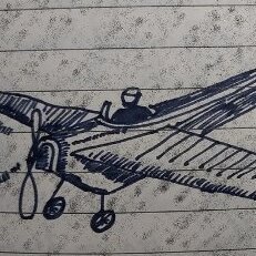
Scriptus Ink 2017 – Picture Review!! For anyone who doesn’t know what Scriptus is.. Scriptus is the name of the Toronto’s Pen Show and Writing Show. Every year (since 2015) Scriptus has release a Show ink which becomes one of the highlights of the Show. The Scriptus show ink is done in collaboration with KWZ. For Scriptus 2017, we have “150 Confederation Brown”, to celebrate the 150 years of Canada becoming a Confederation (proclaimed on July 1, 1867) Since I am totally biased… I will just let the pictures do the talking. LABEL: Sketch of the "Peace Tower", a Canadian Landmark. Is the focal clock Tower standing at the centre of the Canadian Parliament Building. 150 Confederation Brown, is an olive-brown that is extremely paper dependent. It seems to react to the different chemistry of every paper. On coated paper it looks more green, on more absorbent paper, more brown. On cardstock it shows almost black brown. Below is 100% cotton paper... Tester Pens: Three of my favorites EDC were used. In order (top to bottom), My extremely wet Sheaffer Legacy II with a stubbish Broad, my equally wet MB 149 with a luscious OBB and a lovely mid-wet Bexley (cant remember model). Ink was taken from the same bottle. Tomoe River below... and Rhodia.. Art from Alannah (@iamjoopiter) Credits: As with previous years (Maple Red 2015 and Northern Twilight 2016) the creative process is heavily manipulated by me. The decision is all Scriptus, if the Scriptus lords want me to start from scratch, I will oblige. The artistry in manufacturing is all KWZ, so you know you will get a great performing ink with lush colour and saturation. The creative label is original artwork from Alannah (instagram @iamjoopiter) and this year we had the honour to get Salman Khattak (our own FPN Calligraphy expert, goes by SMK) to do the fabulous writing.
-
Introduction and Elephant in the Room KWZ inks at this point don’t really need an introduction of themselves so all I can say is about page on KWZ website is the best friend here. Bottle is dark glass bottle, good for inks. Now to elephant and well there are 2 different things that I noticed here, First the ink comes in a plastic wrap around the bottle, nice touch really as this prevent many issues that can arise. Second, is entire ink smells like vanilla and that was nice (typical of KWZ)....it made me want to eat ice-cream though so that’s bad. Jokes aside I can see some real practical benefit of inks condition and easy to spot any issue in ink if it arises (by smell) and that is a big plus for many. Each ink is handmade as mentioned by KWZ and might have some variations in them, take it as may that is a what it is. Variation are understandable if on asks me and I don’t think there will be any change in base formula or nature of ink, as comparison lets take processors, there is difference in each processors wafers when made and this has no real impact on processor itself but if you are overclocking the processor then it matters not for normal case. In short for most part, there should not be enough difference in actual ink nature of ink itself and that is the goal of this analysis. Ink review section Test papers include 75gsm sectra copy paper 70gsm and 85gsm nightingale paper 52gsm classmate copy paper (dot bleeds at end seen) 100gsm JK Cedar bond papers. Random books back sides and some unknown real cheap papers (slight bleed on cheap ones). Ink properties Bleeding/Ghosting – very slight on cheap papers. Feathering – None observed. Saturation – Good. Flow – Wet ink. Dry time – 5 sec to 20 sec approx. This above is when ink has been given 1 hrs to dry before pics were taken 10 day dry time has been given to ink. The color came out to be remarkably what it really is, very dark blue-black almost black in color. As with all the pea shooter phone camera at full works. This will serve as 1st case of testing, more below on that. Water Resistance – Very High. Although the dye tends to bleed out of page, content survive just fine and colour mostly. this is 10 day dry time given paper 1 min tap run, page has not been given time to dry but cloth was used to try removing ink using as soak for water and not rubbed. Pressed with cloth. The square lines have been soaked for 2 hrs in water and then crushed with dry cloth in attempt to remove ink. Color in these 3rd images is way off the mark, its little darker and paper is white, but dye loss is visible and that was intent, sadly due to nature of test its not possible to recreate the colors if one wants to I will perform another one but results will take 10 days at min...cos well 10 day time The ink is wet writer but very well behaved, I did not find any running issue even on wet pens of mine but all nibs I use are Fine ones so there is that, but I don’t think it will give trouble on this front. It does show very small bleed on cheap papers (in my experiment, the paper with bleed were some random 40 ish GSM pages which are very absorbent in nature and on 52 GSM classmate copy paper which showed dot bleeds) All in all a normal paper will not have any issue including copy pages. Cleaning well........will require hard work and regular interval is suggested as with all permanent inks. Ink is very dark blue-black and is on edge of black over blue. The beauty lies in it being blue at start and then quickly darkening to blue-black with inclination to blue for first 2 hrs or so while the real dark blue-black color takes another 2 days to fully show. No significant change after this.....yet. Personal take This ink has been on many people hit list and for obvious reasons of being liked in color and being an IG ink which also raises many questions on maintenance of ink and its general oxidization over time and this comes especially true for people like me who are burned by Sallix if I may be so bold as to say. While sallix tends to show signs of losing color this one it too early to say what changes will be. The main highlight for me was that it will darken as age, now I don’t think it will become black from already very dark, almost black color, but I hope to see it darker then sallix as it ages, The ink on box shows blue black and I suspect that is the final color of the ink (after properly oxidized). Lubrication is good, the last part of multiple pen test was left here and oliver used has some issues during testing. Dried ink for 1 hrs. 7 day dry for same page. below part of page came a bit wrong.....thanks pea camera lol.... This page will serve as second case. (more below about case). Reasoning behind other post of same ink Now begins the game of waiting and real reason to separate this post from other Blue black IG. Over the concern for IG ageing in time in current environment and uses, plus paper and well general skepticism of IG ink fade over time faster then most What I intend to do is simple, record the way the ink changes its color over the course of entire year with the way paper would be normally handled in normal situation. The tests will have 3 categories planned for testing on how the page is kept First- this is one where the page will not be used for any reference and will be opened for bare minimum like taking pics and observing the ink, but paper will lie outside shelf and wardrobe making it exposed to all weather paper might suffer. Second- Same as above but stored in wardrobe. Third-one small page will always be exposed to light of room and daylight abid diffused one to see general nature of inks movement. Possible due to east facing room with complete open windows, attempting to recreate a well naturally lit room. Fourth-Page opened and referred often to as notes, these are my geography notes. The first page of this will be posted along with others later. Oh and this is kept outside wardrobe...cos well its in constant use and I am too lazy. this is third case test page.

-
THREE IG INKS Waterproof, bulletproof, all kinds of inks that can withstand abuse from human malice or carelessness, the weather, time; I read about them and fail to find the fascination. First of all, I like inks that wash off easily from my hands, clothes and pens. I'm not that accident-prone but when I used to carry a Pelikan M600 in by breast pocket, many were the times when the cap unscrewed by itself and the pen decorated me with large blue blots. If those blots hadn't washed off, I might have given up on fountain pens - or carrying them around, at least. Secondly, what's the use of resistant inks when I write on paper, a carrier that can be completely destroyed so easily? Does it matter that the ink is still there when the sheet of paper has become pulp? I don't write anything that important that would be severely damaged by a droplet of fluid. So, you appreciate that I didn't get the inks I'm comparing here because they're waterproof; I just liked the colours and was curious to see how they behaved in my pens. The first is IG Blue #1 by KWZ Inks. Since I now have the delight of a local store that stocks KWZ (Fontoplumo), I decided to explore their products, including their IG range, since everybody told me that they were very well behaved. I liked it immediately, although it seemed rather dry for the Waterman Taperite I first inked with it. So, I tried it in one of my gushers, too, a Visconti Homo Sapiens with a medium nib reground into a CI by Oxonian, and the combination was a success. Interestingly, with time, ink flow in the Taperite improved, not to the level of e.g. Diamine Denim, but then that was a bit too much. The second IG ink I got was Rohrer & Klingner's Salix, just so that I would be able to make a comparison. I'm quite impressed by their inks, so I decided that yet another blue ink (I must have about twenty at the moment) was not superfluous if I were to form an opinion on IG inks through a hands-on comparison (I often use this excuse, that's why I have too many inks). It also helped that Couronne du Comte at Tilburg offered a generous discount to a visiting group of pen enthusiasts. Then I remembered that one of my favourite inks, Akkerman's Diep-duinwaterblauw, is reputedly an iron gall one, too, so I decided to include it in the comparison. THE SETUP OBSERVATIONS I love the colours of all three inks. The way the colour of IG Blue #1 and Salix changes as they dry on the page still catches my attention. Diep-duinwaterblauw remains the same but then it's the richest colour of the tree. The final greyish blue of IG Blue #1 is very much to my taste but the brighter blue of Salix seems more interesting in a finer nib. All three have enough shading. Concerning smearing, Diep-duinwaterblauw is the quickest to dry on paper, some twenty seconds ahead of the other two, which seem safe to touch after thirty seconds (or slightly longer in the case of Salix). Water resistance after a minute or so was high for Salix and IG Blue #1 (with the former performing slightly better in this respect) but less so for Diep-duinwaterblauw, which is nevertheless not marketed as water-resistant. In the smearing and water tests, the Taperite was used to represent IG Blue #1, as it was more comparable to the Marlen Aleph that was inked with Salix. In conclusion, I wholeheartedly recommend all three inks to people who know how to care for their pens. I don't know yet what the long-term effects of IG inks on the pens can be. More on that in a year or more; for the moment, I can confirm that the Parker 51 and Sheaffer Targa I keep inked with Diep-duinwaterblauw for a three years now have never given me any kind of trouble. THE PROOF The paper used must be in the area of 80g and is slightly less absorbent that common 80g copy paper. In the scan the colours seem just a smidgeon darker than in real life but their differences are well captured.
-
Just a brief note on a recent comparison: a bottle of Robert Oster Signature Bronze had been lingering in my ink drawer until I decided to use it a new acquisition by Atelier Veleray (more on that in the near future). It turned out greener than I'd expected, similar to KWZ Green Gold but slightly lighter. The attached image is an unprocessed photograph hastily taken with a smartphone. Still, it comes close to what I see on paper, especially in the lower part, where Bronze and Green Gold are separated by Callifolio Olivastre. In the upper part, where the two inks are next to each other, Green Gold appears a bit too dark. The other two inks included as a kind of control in the comparison are Callifolio Olivastre (in a Diamond Point with a flexible broad nib) and Rohrer & Klingner Sepia (in a Delta Tech & Web with a stub nib). KWZ Green Gold came from a Montblanc 149 with a medium nib and the Atelier Veleray pen sported a broad nib I had from a Visconti Rembrandt. Bottom line: nice colour and a well-behaved ink. As my interest in shading increases, Bronze may replace the darker KWZ Green Gold among my favourites.
-
KWZ Baltic Memories (Wspomnienie znad Baltyku) I must say I was very excited when I saw the announcement of new KWZ inks. I am a real fan of their inks, and they are one of my favorites. This is the first of those three new inks that I'll review. There are a number of positive things about this ink, and one fairly important negative. The color for this ink is really lovely. It's a green-leaning blue but quite dark, so not at all a bright teal. The shading I got with the Gate City Belmont was fabulous. There's supposed to be lots of sheen with this ink and it's true. It's sort of shiny and not quite red, it more like darkens the places where a heavier application is found. I don't care much for sheen. It's not a requirement for the inks I use and most of the papers I use won't show sheen, ever. So unimportant to me. I don't know if this sheen is the kind folks will rave about. The ink is not water resistant and having a heavy dye load will probably leave a mess when a page interacts with water. The problem I have with this ink is the numerous hard starts and skips. I suspect it was the pen did not work well with this ink. This is a fairly wet nib, but it would constantly dry out even after a few seconds of a pause. And it would write somewhat dryly until the flow got going again. On Rhodia, the writing was painful as the paper is somewhat dry itself. These problems made me quite disappointed in the ink. The saturation/dye load for this ink is very high, much higher than the usual KWZ ink. So much so I was concerned that the ink would stain the clear barrel of the Belmont. It did not, but I only had the pen inked for a couple days with it. This ink reminded me of some of Noodler's ultra-saturated inks where it's necessary to add some water, perhaps up to 10%, to improve their flow. I haven't tried this yet here, so don't take that as a recommendation. After my disappointment I switched pens to an Edison Premiere (F). I knew this pen was very wet, with an excellent feed. So far it has performed flawlessly without the hard starts, skips, dry out I experienced with the Belmont. But much of the special character of the ink is lost: it's now just a dark blue-green with minimal shading. If I was writing on paper that would show the sheen, perhaps I'd see that aspect of the ink. I'll have to give some thought to which of my pens might work well with this ink and bring out its good qualities. I'd definitely recommend a sample so you can determine whether you'll have issues with your pens with this ink. Pen: Gate City Belmont (M-steel) Pen: Edison Premiere (F-steel) Papers: MvL=Mohawk via Linen, TR=Tomoe River, Hij=Hammermill 28 lb inkjet, Rhodia=Rhodia 90g ivory. Camera: iPhone 7 using Camera+ app The images were fairly decent, but the FPN uploader seems to modify the images making the ink appear darker and with less range than in reality. As always with ink reviews, you may want to order a sample prior to diving in on a full bottle. Sadly the FPN uploader has totally messed up these first two images. Far too dark in the ink. The original images look fine on my screen.
-
After seeing some posts about KWZ killing some of their iron gall inks, I emailed them for clarification. This was Agnieszka's response: So, if you are a fan of Blue #3, as I am, time to stock up.
-
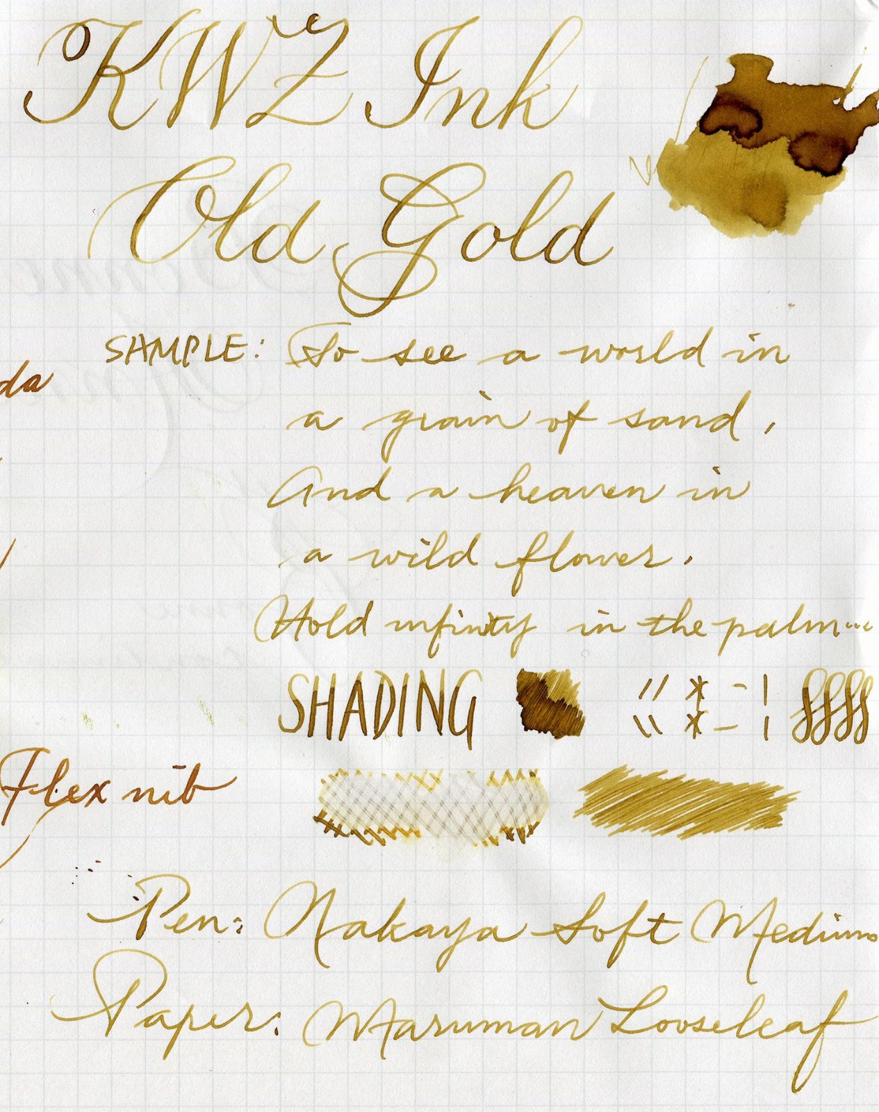
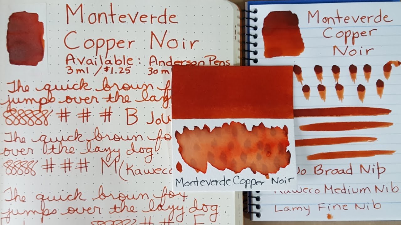
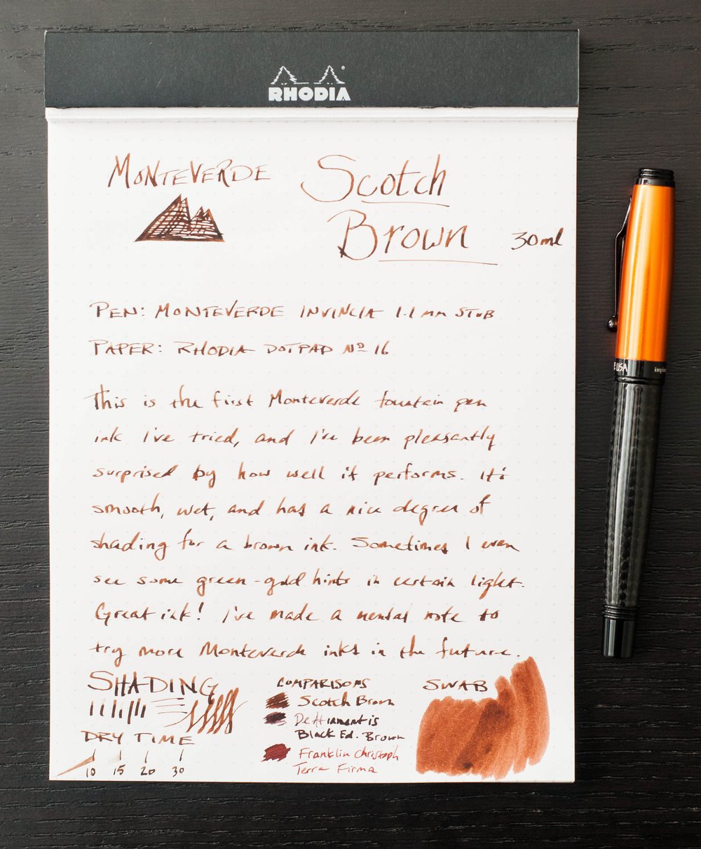
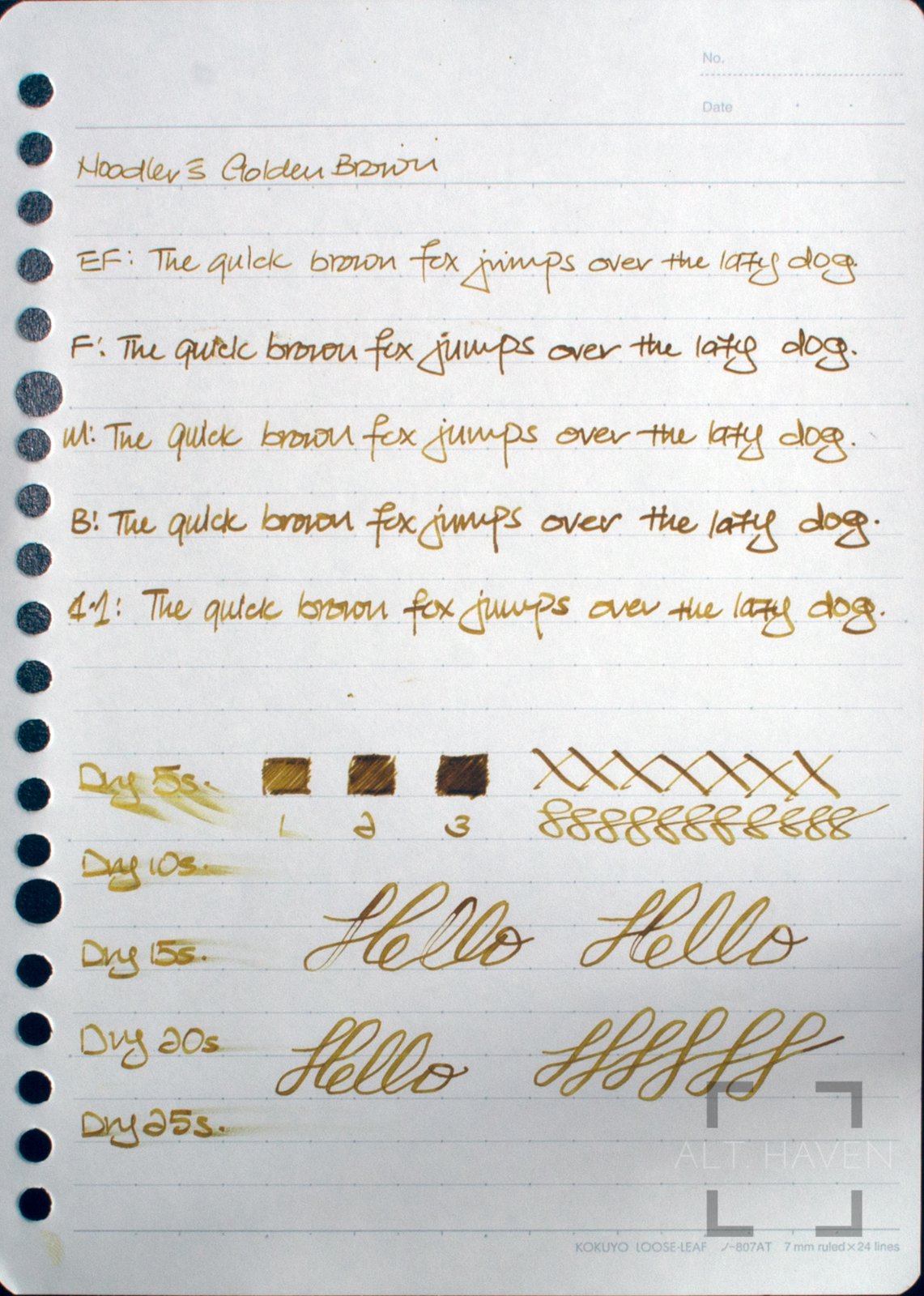
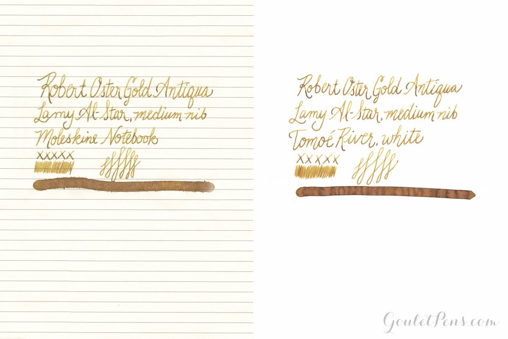
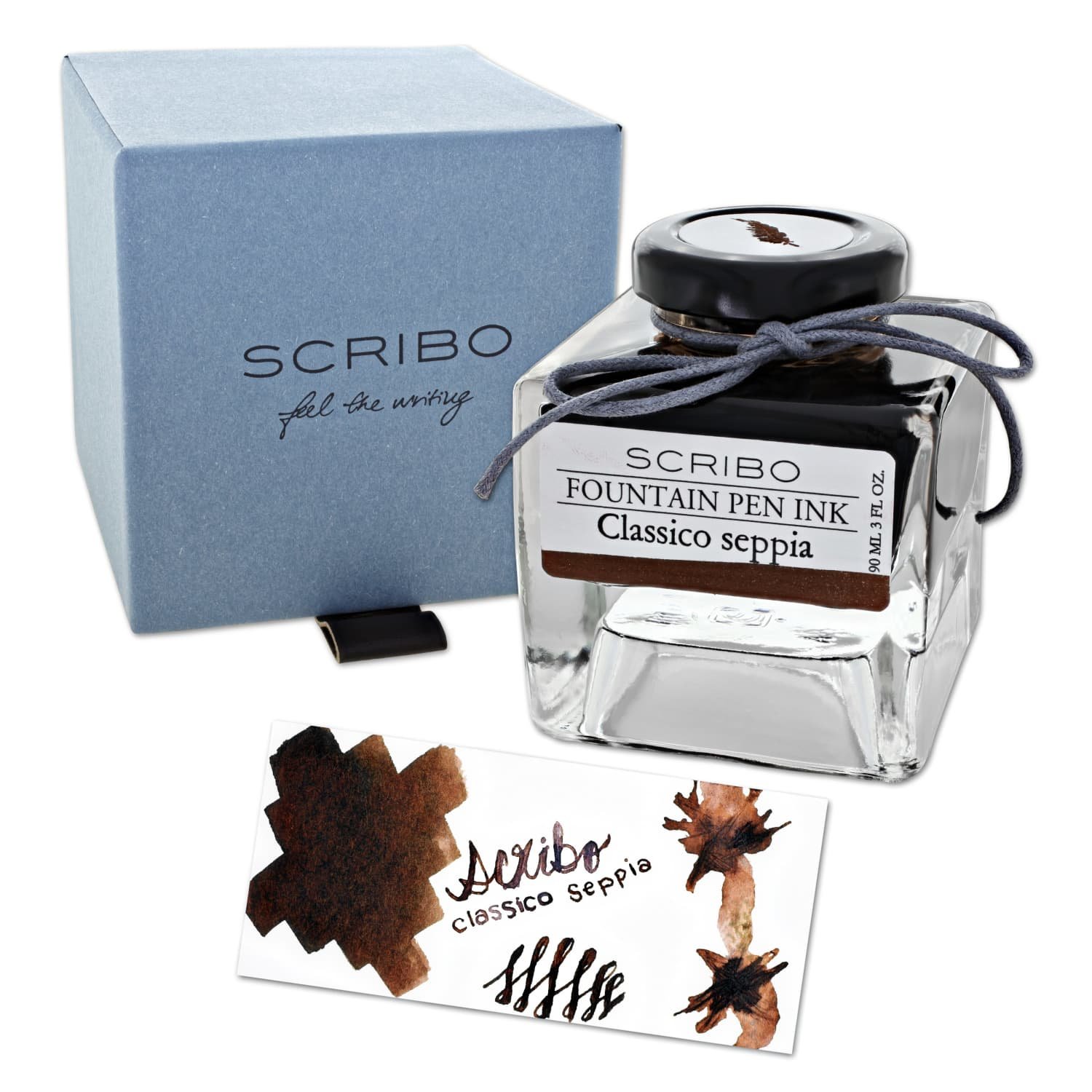
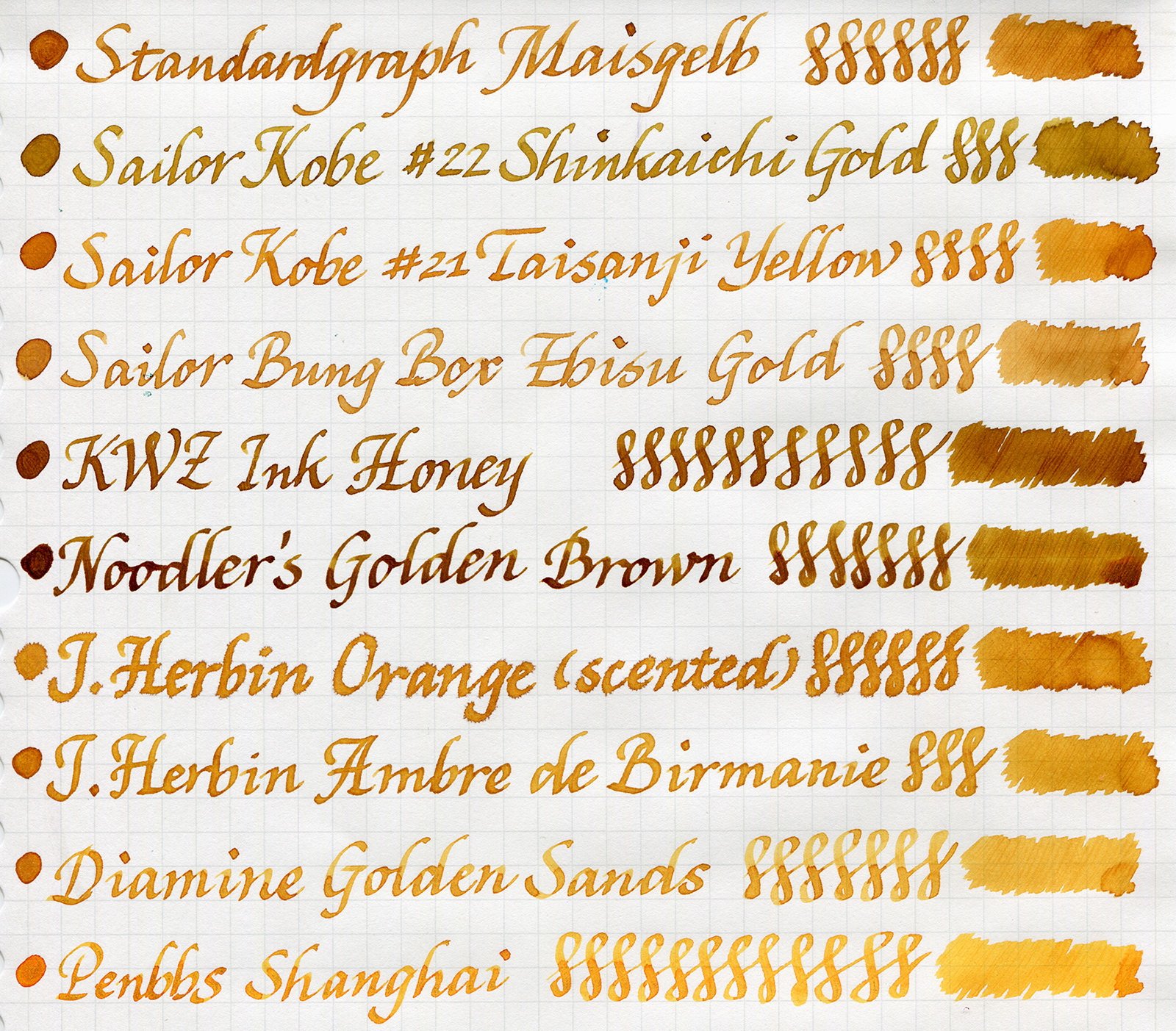
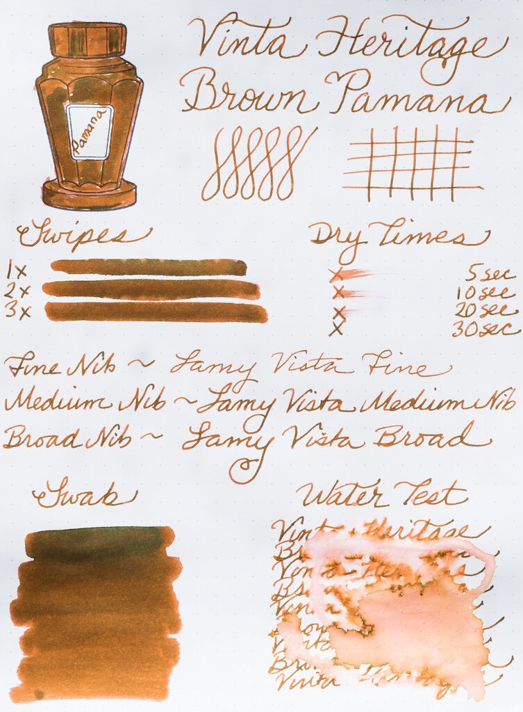
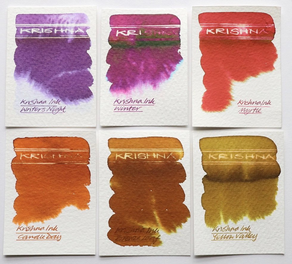
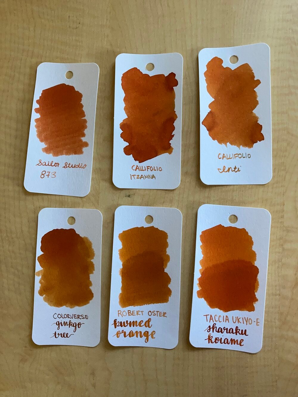
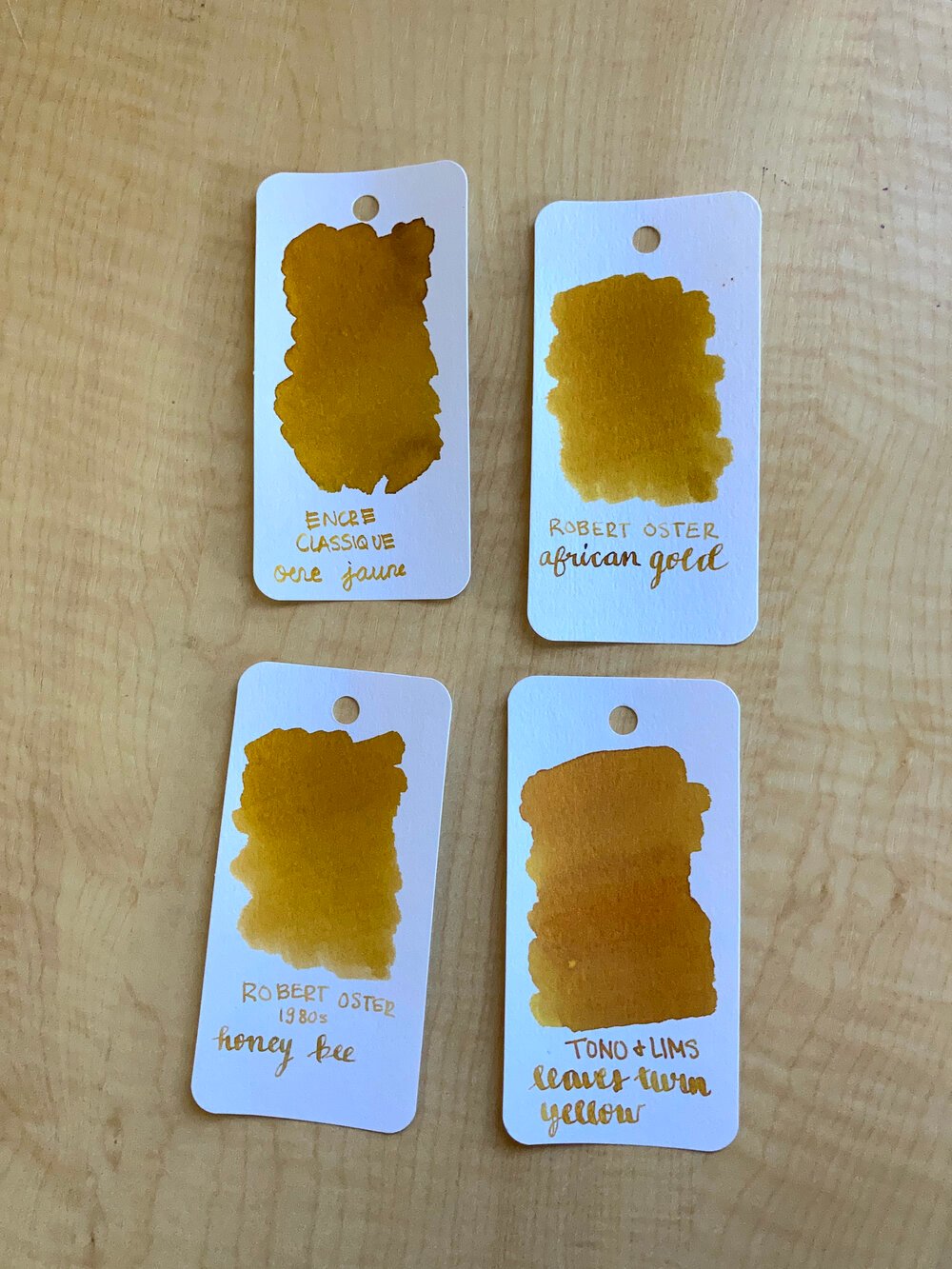
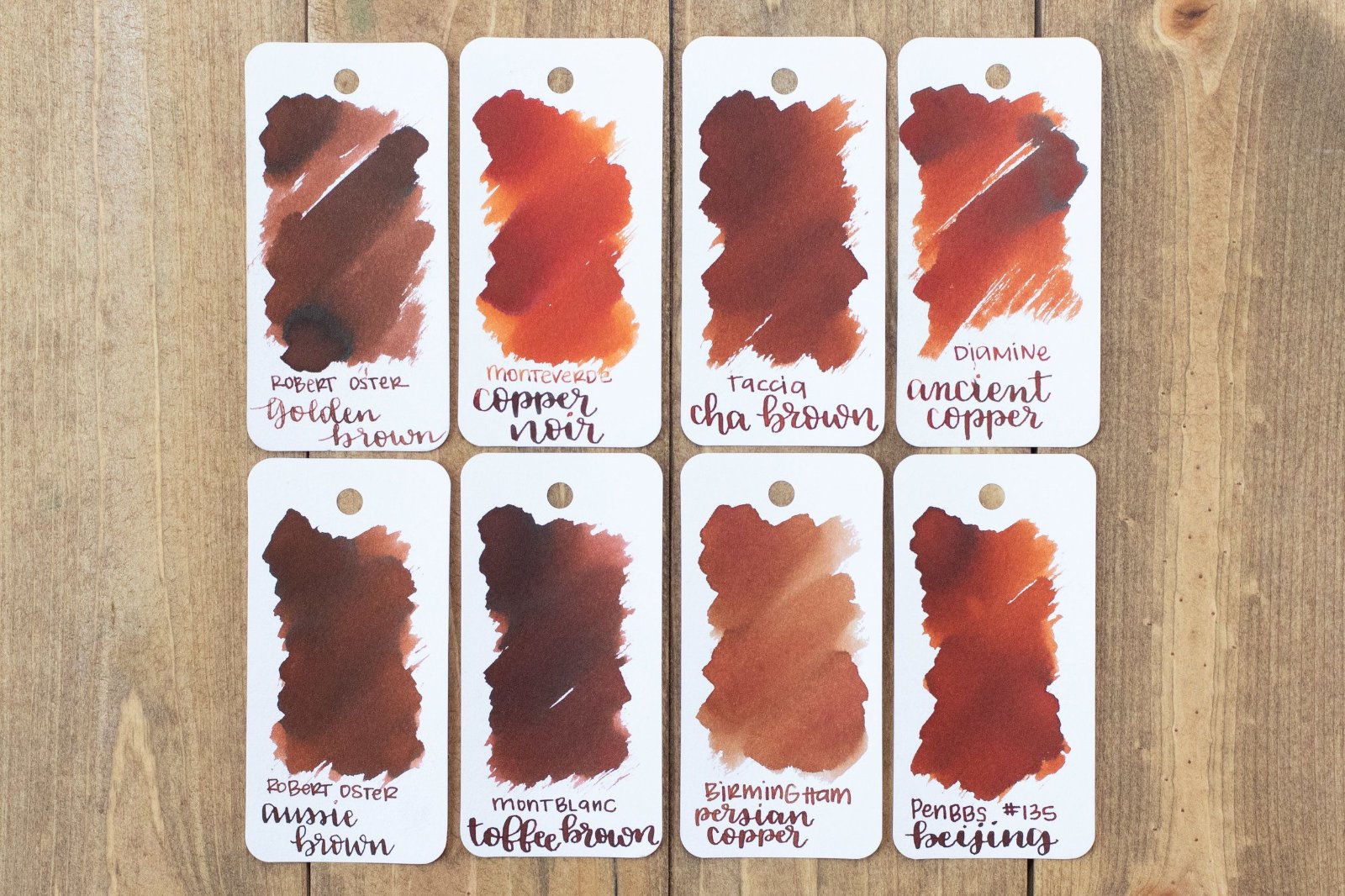
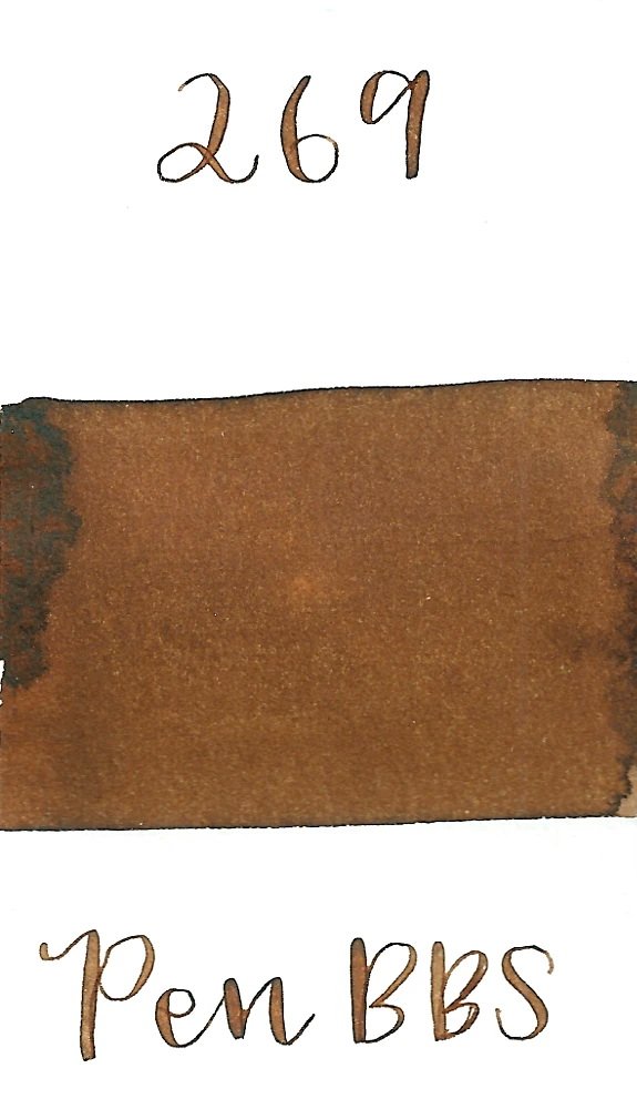
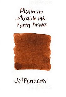
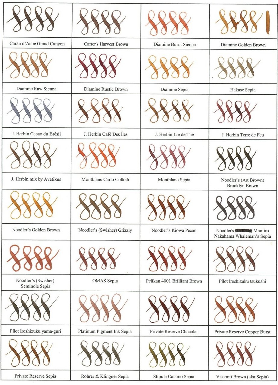
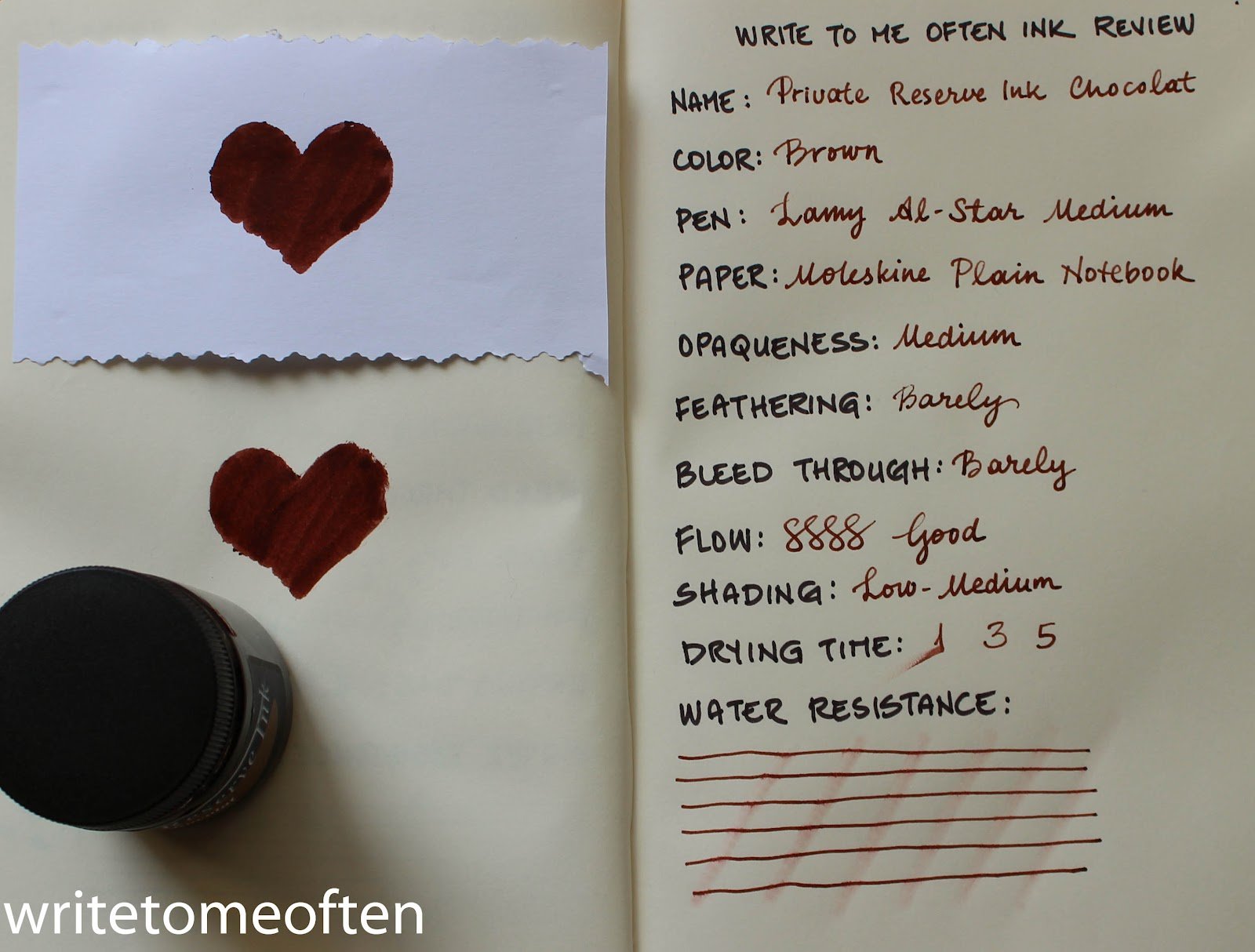
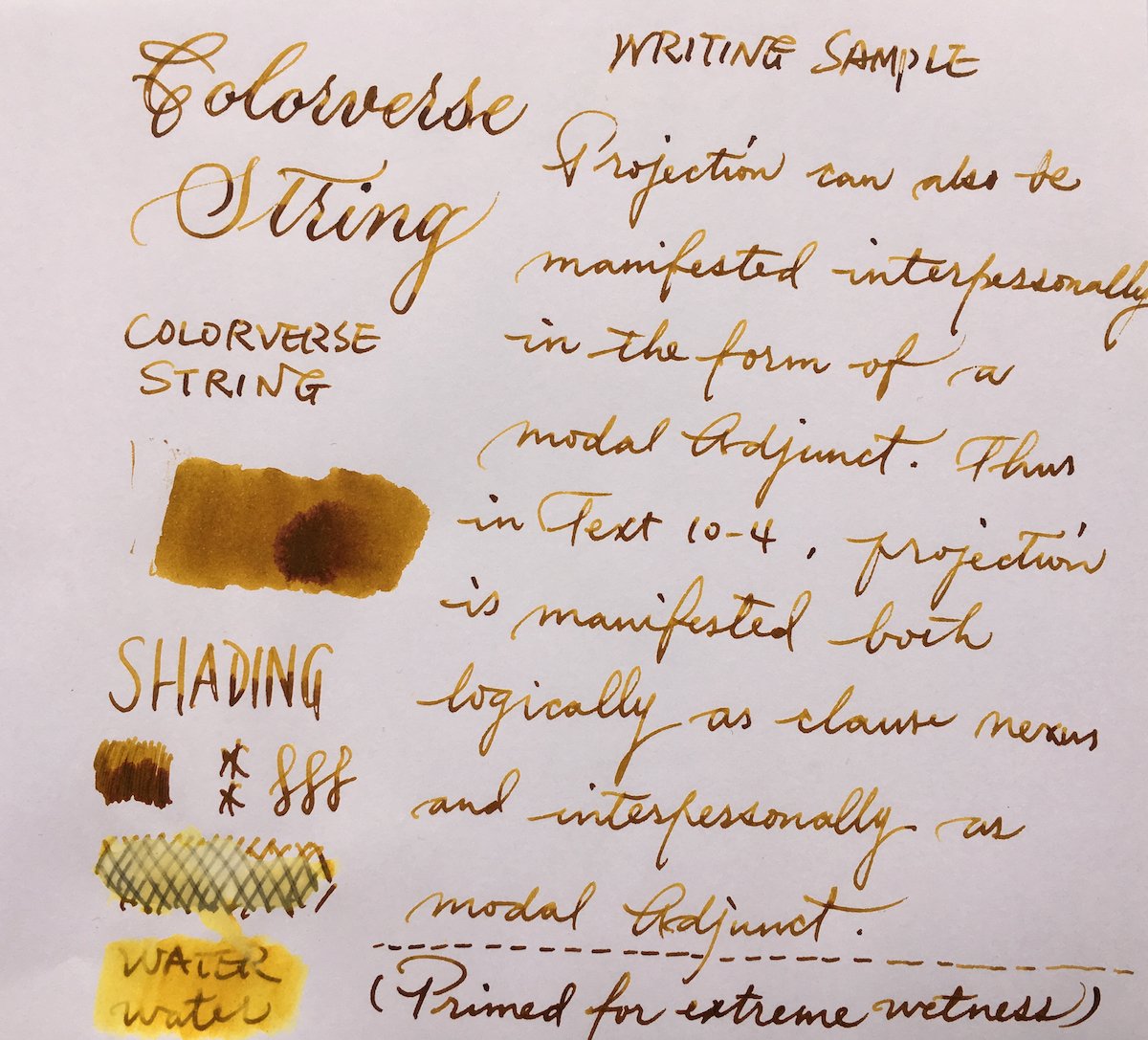
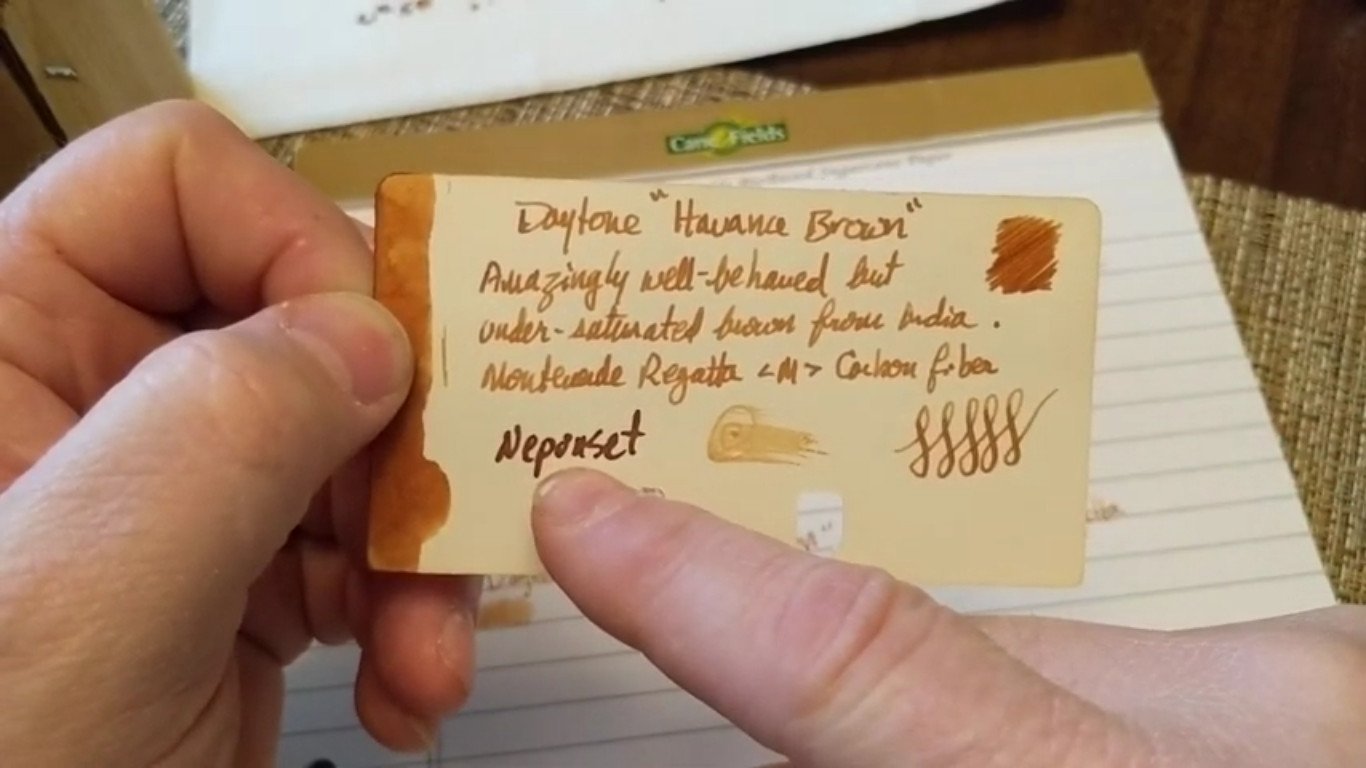
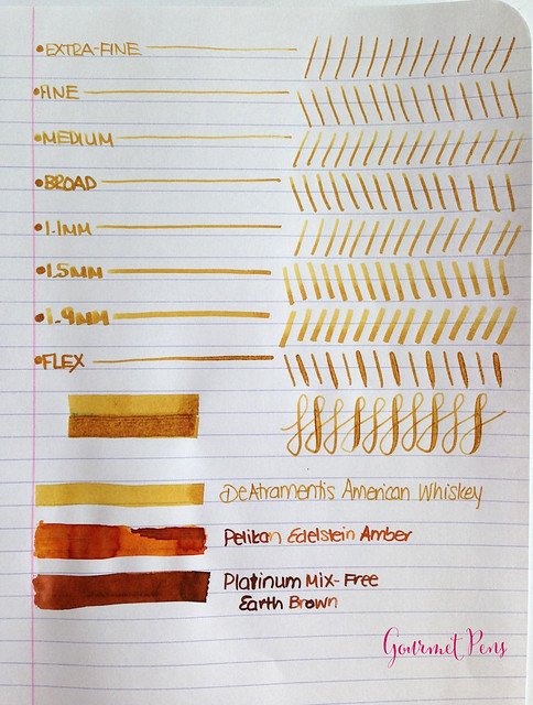
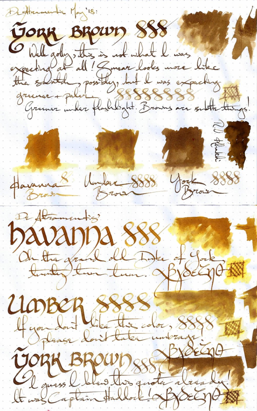
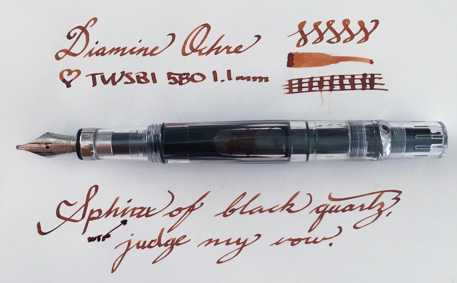
This collection has been made in an intensive attempt to find the most ideal and complete shades of brown color fountain pen inks over the internet and as long as writing with a medium size fountain pen is what I'm concerned of, the "infinity symbol" on a regular paper is the thing I've considered saving these samples. I've also benchmarked the index card samples for those which were not available in infinity sample. All the top-rated fountain pen inks – even those which are not mentioned here probably for the lack of a quality brown ink – have been taken into account. ~ Here's the list ~ Akkerman Hals Oud Bruin Akkerman SBRE Brown Chesterfield Antique Copper Colorverse #25 String Colorverse Coffee Break Daytone Havana Brown De Atramentis American Whisky Brown Gold De Atramentis Havanna De Atramentis Scottish Whiskey Diamine Ancient Copper Diamine Chocolate Brown Diamine Desert Burst Diamine Golden Brown, Carter's Harvest Brown, Diamine Raw Sienna Diamine Ochre Diamine Terracotta Diamine Tobacco Sunburst Faber Castell Hazelnut Brown J. Herbin Café Des Iles J. Herbin Caroube De Chypre J. Herbin Lie de The J. Herbin Terre d'Ombre KWZ Honey KWZ Iron-gall Aztec Gold KWZ Iron-gall Mandarin (Corrected Version) KWZ Old Gold L'Artisan Pastellier Callifolio Cannelle Leonardo Sepia Classico Monteverde Copper Noir Monteverde Joy Sepia Monteverde Scotch Brown Noodler's Golden Brown Noodler's Kiowa Pecan OMAS Sepia Private Reserve Chocolate Private Reserve Copper Burst Private Reserve Sepia Robert Oster African Gold Robert Oster Antelope Canyon Robert Oster Caffe Crema Robert Oster Gold Antique Robert Oster Toffee Sailor Kobe #22 Shinkaichi Gold Sailor Storia Lion Light Brown Scribo Classico Seppia Standardgraph Maisgelb by @lgsoltek Taccia Tsuchi Golden Wheat Vinta Heritage Brown Vinta La Paz Diplomat Caramel Krishna Bronze Leaf, Krishna Yellow Valley L'Artisan Pastellier Callifolio Anahuac L'Artisan Pastellier Callifolio Itzamna L'Artisan Pastellier Encre Classique Ocre Jaune Maruzen Athena Kinkan PenBBS #135 Beijing PenBBS #269 45th POTUS PenBBS #504 Vernal Equinox Platinum Mix-Free Earth Brown Taccia Ukiyo-e Hokusai Benitsuchi Tono & Lims Kela Nuts Vinta Terracotta Vinta Ochre Note: the absorption of the ink to the paper could vary. Before purchasing any of the inks above be aware some of them are dry while the others are wet. Plus, based on the fountain pen model and paper you use, the colors could look different. Make sure to use fountain pen inks only, otherwise your fountain pen will clog. Stay away from drawing, calligraphy, lawyer, and India inks. They are not designed for the fountain pens. Platinum and Sailor have some pigmented-based inks; avoid them. Take all these into account.
-
Since succumbing to the Hobonichi Cousin last year, I have been enjoying matching my fountain pen ink colour to that of the daily pages. The Japanese versions of this planner has lovely, slightly dusty, faded vintage colours which change for each month. The whole page is printed in that colour - grid, Japanese quote, date and day markets etc. So I thought it would be fun to write using a matching ink - a great excuse for exploring some of the glorious colours now available and a built in excuse for changing inks regularly. This idea was inspired by a blog I saw (sorry, can't remember who) where the writer had done a similar project but using gel pens. I know everyone's experiences of ink colour is different, depending on pen, nib, paper, how heavy-handed your are, phase of the moon (who knows? Maybe) but I thought someone out there may be doing something similar and we could share our thoughts. Anyway, here are my selections so far: January: burnt orange - Monteverde Fire Opal February: bronze brown - my own mix using Platinum mixable inks March: pinky purple - Herbin Larmes de Cassis April: red pink - Colorverse Sea Europa May: bright olive - KWZ green Gold Ii or Monami Olive June: grey green - another custom mix - see above July: grey turquoise - Birmingham Pen Co Fountain Turquoise August: blue grey - another custom mix - see above September: warm brown - Krishna Vaikhari October: grey purple - another custom mix - see above November: pine green - Birmingham Pen Co Fern Hollow Creek December: faded red - another custom mix - see above. As you can see, I've ended up mixing some colours myself - lots of fun, and I'm less happy with some of the other choices so will need to explore further. For example, I find the Herbin colours a bit watery but haven't yet found a similar colour to Larmes de Cassis; the Krishna Vaikhari is a nice colour but not quite yellow enough... I generally stick to relatively easily available inks and would like to expand the brands but I like this selection as a first pass. I should add that I'm using a Pilot Metro with a Plumix EF or F calligraphy nib. If anyone else is doing this, I'd love to see your choices or generally, any thoughts.
-
I'm surprised this has not been reviewed yet. This is my favourite of KWZ's iron gall inks. Still close enough to a more traditional iron gall in terms of water fastness, colour change, dry time and performance, but with enough blue remaining to make it not just another blue-black. Dry time for normal handwriting is closer to 5 seconds, but a broader, wetter pen will be longer, hence the heavy swatch test. Dry swab was after 20 minutes, wet after 2-3. Paper is Rhodia dot.
-
(All the writing was done using a dip pen, not the Aurora 888 Saturno that was merely acting as a paperweight while I took the photo above.) The degree to which iron-gall inks are water resistant vary greatly from ink to ink, even when they are in the same product line of the same brand. Sadly, KWZ Ink IG Mandarin does not perform very well at all, and barely surpasses Aztec Gold IGL (which stands for Iron-Gall Light) in that respect. Aside: I was a bit surprised to see Platinum Blue-Black sheen purple some prominently and evenly.
-
I've got a couple of Rangas and a very tightly-tined nib on a TWSBI that I like to fill with wow greens. I am searching for wet, lubricating inks that will help these pens flow. I like saturated colors, maybe some shade and sheen, and even some water resistance. Noodler's Eel Gruene has been my go to, but I'm not nuts about the color. (I prefer bright greens, nothing Army shaded with grays and blacks.) I've tried Diamine Woodland, KWZ Emerald. What else does the world offer? Unlike Veruca Salt, whose image I'm not allowed to post, I won't scream if I don't get it, but I will keep looking!
-
Hello everybody! It's my first time in this subforum, so please alert me if I'm doing something wrong. I have somehow accumulated over 20 different bottles of ink and 50 samples in the past two years. Love the variety, but some of these bottles don't get much use, and the ink in them just ages on my shelf. That's been bothering me a lot, since they're actually superb inks that just have had the bad luck of ending up in the hands of someone who doesn't appreciate them the way they deserve. So I'd like to send some of these out as big 5ml samples to anyone who's interested, in exchange for the same courtesy. I feel that that way, each of us gets to try new inks, and since everybody would pay postage, it wouldn't cost one more than the other. Full-sized bottles: De Atramentis AubergineDiamine AmaranthDiamine Ancient CopperDiamine Autumn OakDiamine Asa BlueDiamine BilberryDiamine Classic GreenDiamine Earl GreyDiamine Golden BrownDiamine Majestic BlueDiamine OxbloodDiamine SyrahJ. Herbin Bouquet d'AntanJ. Herbin Lie de ThéJ. Herbin Poussière de LuneKWZ HoneyKWZ MaroonNoodler's Heart of DarknessRohrer & Klingner Alt-GoldgrünRohrer & Klingner HelianthusRohrer & Klingner SalixRohrer & Klingner SepiaSailor Jentle/Shikiori MiruaiSailor Jentle/Shikiori Oku-YamaSailor Jentle/Shikiori Rikyu-ChaSailor Jentle/Shikiori Tokiwa-MatsuSailor Jentle/Shikiori Yama-DoriSailor Nano Sei-Boku Samples: Diamine China BlueL'Artisan Pastellier Callifolio Heure DoréeSailor Jentle/Shikiori Waka-UguisuJ. Herbin Vert OliveSuper5 Frankfurt
-
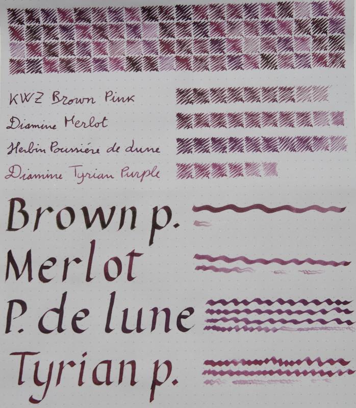
KWZ Brown Pink Diamine Merlot Herbin Poussiere del Lune Diamine Tyrian Purple The KWZ, like many others from Konrad, looks almost black when pooled, with a velvety, matt sheen. It is the most free-flowing of the bunch. The Diamines have a very slight golden sheen, more evident on Tomoe than on this Rhodia; Tyrian Purple is the least saturated of the bunch and exhibits a more pronounced halo effect when used with the flat nib. Poussiere de Lune is more blue than the others. If I had to pick a favourite, it'd be Tyrian Purple
-
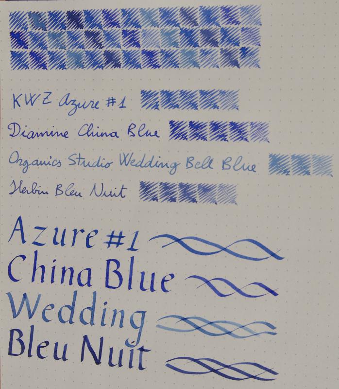
Hey guys! I was pondering whether or not to order a full bottle of KWZ Azure #1 and I made this to help me decide. It didn't look extremely ugly so I decided to share, maybe it can be useful or something
-
In the end I won't be getting the Honey, it doesn't seem to be different enough to me.
-
desaturated.thumb.gif.5cb70ef1e977aa313d11eea3616aba7d.gif)
Giveaway: Iron-Gall Ink Sample Set
A Smug Dill posted a topic in Pay It Forward, Loaner Programs & Group Buys
It's time for me to make good on what I've been talking about for a while, now that my order of plastic blunt tip needle attachments of syringes have finally arrived, and all the bits are in place. I'm giving away a set of (~0.75ml) samples of seven iron-gall inks: Platinum Classic Ink Cassis BlackPlatinum Classic Ink Forest BlackPlatinum Classic Ink Khaki BlackPlatinum Classic Ink Lavender BlackKWZ Ink Aztec Gold IGLKWZ Ink IG Green #3KWZ Ink IG TurquoiseThe volume is chosen to match what one would get from an international short ink cartridge, without being strictly being limited by the diameter of the 'nipple' on the feed or post inside the grip section, in case someone has a pen that uses a proprietary format (such as Sailor, Platinum, Pilot and Parker) converter. I will include a 1ml syringe with a 14-gauge blunt tip needle attachment, so the ink can be transferred into the cavity of any converter, empty ink cartridge, the barrels of 'eyedropper' pens, and even some piston-fillers from which the nib and feed can be easily removed by the user to access the pen's ink reservoir. I intend to send the ink sample set as a large letter (in a corrugated cardboard mailer 'envelope') and not a parcel. Australia Post is perfectly happy to accept the article as just that, when I showed the staff at my local post office. That makes international postage charges for the article not that much (at about 60%) more than domestic postage charges. The only question is whether the recipient's country postal regulations will deem the contents acceptable; I have to fill out a CN22 customs declaration if I send it outside of Australia. In view of this, the way I'm conducting this giveaway is: Please express your interest in being the recipient by making a post in this thread before 11 November 2019.There is no restriction based on country or geography on expressions of interest. Anyone from Australia, Brazil, Canada, Mexico, New Zealand and the UK (for example, but not exhaustively) who puts his/her hand up for it will be treated equally.The letter mail postage charges will be paid for on my end, thanks to @mariom.If you're outside of Australia and you're interested, then you have to include in your expression-of-interest post a link to the part/section of your country's postal regulations regarding dangerous, prohibited and 'non-mailable' items so that I can verify it's OK, since I'm the responsible party for filling out a CN22 customs declaration form for the article. I will use a random number generator to select the recipient from all eligible entries on 12 November 2019.This is the general format of how I intend to do future ink sample giveaways, after a lot of thought and non-trivial investment of effort and funds in getting suitable mailer envelopes, ink containers, syringe needle attachments, etc. together. Right now I've got other ink sample sets in plan for pigment inks, inks of a particular colour family, etc. and I would be open to feedback on what to include in future sets. What will not change is the approximate volume of each ink in a sample set, and the type of ink container to use. However, if anyone has better ideas of how to more time- and cost-efficiently offer others just enough of 'a taste' to decide whether they want to spend money on buying retail bottles of particular inks for themselves, I'm all ears. -
I love the shading and sheen of Diamine Asa Blue but by far prefer the flow and lubrication of KWZ inks, and since I've just run out of Asa Blue and Christmas is around the corner I thought this would be a good time to find a replacement. Unfortunately, there don't seem to be any comparison pictures online. Can anyone say anything to the colour differences of the inks? Dominique
-
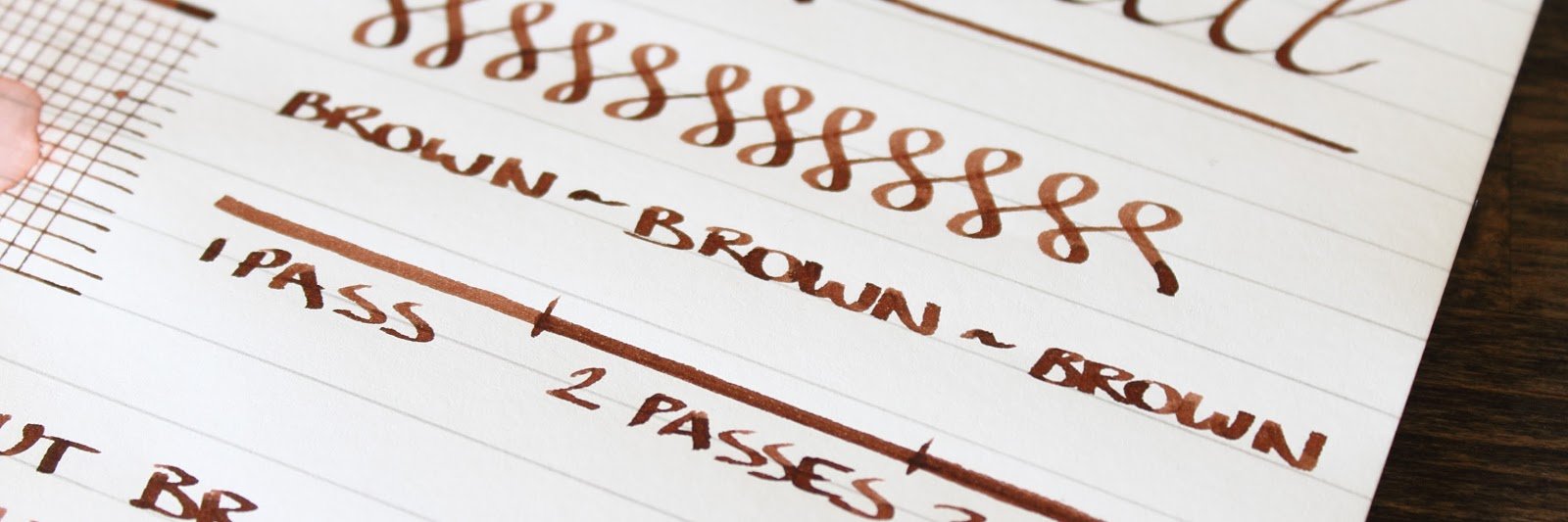
I ordered a sample of KWZ Brown Pink a while ago (cannot remember when exactly, it must have been a couple of months) and enjoyed it greatly in a PenBBS 456 for a time, until recently I noticed that the colour had shifted toward a decidedly non-pink brown, almost like J. Herbin Lie de Thé. Has anyone experienced something similar with this ink? I like the "normal" colour a lot and am thinking about buying it, but if this is regular behaviour then it is out of the question. Since it's not IG, the only other two possibilites I can think of is that either it was a faulty bad, or the bottle from which the sample was taken was subjected to some conditions that caused the colour to go off. Dominique
-
I am really enjoying using KWZ inks (other than the vanilla scent), and I've been looking into finding my perfect olive green ink. One of my requirements is good water resistance -- it does not need to be 100%, but the writing has to withstand being touched with damp hands or a small spill and still remain easily legible. I hoped KWZ I.G. Green Gold was going to be it, but when my bottle arrived, I've found that it's really more like a somewhat olive-leaning dark green. Not a green-gold as one might imagine (or olive). In a moment of inspiration, I decided to see what will happen if I mix I.G. Green Gold with KWZ Honey. Honey is a translucent and "layerable" honey-caramel color that can shade to off black if piled on. I.G. Green Gold is a very saturated low transparency ink. Both have silver sheen outline, but I.G. Green Gold just barely a hint of it, whereas Honey sheens silver around the letters very easily on good paper. Here are my results. No precipitate or odd behavior found so far. I very much like the first mixture and will be using it from now on in an empty Iroshizuku bottle. KWZ "Olive #1" : KWZ I.G. Green Gold 3/4 : KWZ Honey 1/4 KWZ "Olive #2" : KWZ I.G. Green Gold 2/3 : KWZ Honey 1/3 Both together:
-
I have just loaded a sample of this ink into a Lanbitou 3059. The Lanbitou does have a 0.38mm nib, but does that really make a colour difference? The ink looks blue in the pen but dries much more towards teal than review samples suggest. I immediately suspected the Rhodia paper, so tried white vellum and Tomoe River (the thin stuff). Has anybody else encountered this? I wondered if the Lanbitou was writing drier than previously thought. Has anybody else come across this colour difference? I can't see how it would turn back to blue if I used a wetter pen, like one of my Indian eyedroppers. I will come back to you with images.
-
Hello, I'm looking for a little help with an iron gall ink (KWZ IG Orange). It's my first IG ink, and I don't know if I am just unlucky, the ink isn't for me, or if I am doing something wrong! I've tried it in two pens now, ones I'd consider pretty wet writers. However, I'm finding that they run dry after a day or so. It's very difficult to get them going again. (TWSBI Vac 700 M and TWSBI 580 w/ Jowo ground M stub FWIW). I think there is a drying out problem in the feed channel or at the feed / nib interface. I think this because the feed is pretty primed when I look closely, it's just not then getting down to the paper. One of them actually seems to dry between the tines, but the tines gap is a little on the big side for that pen. Both write excellently with other inks, though I've had problems with really dry inks like D Autumn Oak (in all my any pens!). The cap seems to seal fine from what I can tell. I've got a Lamy Safari that I'll try next as a nice 'standard test', but I'm not feeling confident. I've been sticking to pens I can completely disassemble. Any thoughts? Is this normal for IG?
-
KWZ recently released some new inks, and Warsaw Dreaming is one. KWZ never had a black ink in their line until now. I imagine Mr. and Mrs. KWZ thought why make a black ink when every other ink maker has a black ink, and nearly all of them are pretty decent? And in a way they are right. But this set of three inks focuses on the elusive quality "sheen", so now there was a reason to have a black ink, one that has some sheen. Except there is Sailor's Kiwa-guro nano-pigment black ink that "sheens" on nearly everything, sometimes looking like pencil. Which can be very annoying if you want to see black ink. This ink has some sheen on some papers, more typically the coated papers (Tomoe River, Rhodia). More absorbent papers probably won't see much of this property. The ink is very dark, maybe even as dark as Aurora black. It appears comprised of a black in supplemented with blue, purple, and a bit of red dyes. This based on my simplistic paper towel chromatography. I'll post a photo later.) The flow is very good but I do notice an occasional hard start. It's not as bad as with KWZ Baltic Memories which was an ink I fought with. So the Warsaw Dreaming is pretty decent on that score, but not perfect. As a very dark black there is no shading on the papers I used, but that's expected. There was no show through or bleed through experienced on the good papers, (MvL, Rhodia, TR). The ink is not waterproof, and not water resistant. Because of the heavy dye load it will run, and the flow enhancers will help the ink penetrate both sides of the paper making your writing undecipherable. The label is great. As a fan of KWZ inks I wish I could recommend this ink unreservedly. I think it's a good ink, but your writing experience with it may be very pen, nib, and paper dependent. I recommend buying a sample first to see how it meets your writing needs. Edited to add the simple paper towel chromatography. Pen: Edison Collier (F-steel) Papers: MvL=Mohawk via Linen, TR=Tomoe River, Hij=Hammermill 28 lb inkjet, Rhodia=Rhodia 90g ivory. Camera: iPhone 7 using Camera+ app
-
Anyone have information as to when KWZ will be restocking? Some inks have been out of stock for a while now. Are they taking a break? Are they still in business? Should I be more judicious in the use of their inks?
-
Chromo's are different , but they come pretty close
-
I recently learned that, for this year’s birthday, I get to import some fountain pen inks! It's still a couple of months away but I just couldn't wait. The problem being that I can’t try out any samples beforehand. The price of importing them wouldn't be worth it, for me. Which means I usually read a lot of reviews before buying any inks, and that has worked for me so far! This time, however, I’m having a hard time finding enough reviews. So I’m asking for help in figuring out which ink colors I want. I’m already fairly sure of the brand I want: I’ve always liked the idea of very resistant and colorful inks, so I’d like to try and get my hands on some KWZ Iron Gall inks. But I’ve read tales of IG inks losing color after being opened. Is that a worry for KWZ? SPECIFIC COLOR QUESTIONS: All colors - I’m very fond of shading, and I’d like for the inks not to be too dark… by which I mean I’m okay with dark colors, I just don’t want anything too greyish or black-looking. BLUES - I also already have an IG blue so I won’t be looking at those. GREENS - I’m very interested, but I’m finding it hard to pinpoint all the shades. How similar are IG Green #1 and #2? What about #3 and #4, and what about IG Green Gold? I’ve also heard that #3 borders on black. BROWNS - the contenders being IG Gold and IG Mandarin. How similar is Gold to Green Gold? Is Mandarin a pure brown or does it have warmer orange undertones, and how much do they show? VIOLETS - what are the differences between the Violets and Gummiberry? It is my understanding that Violet #2 is duskier, Violet #3 is more vibrant, and Gummiberry leans more towards blue. Is that correct? Do any of the above tend to shade, and how much? Paper - I use white paper most of the time, but I also have a couple of nice ivory/cream paper notebooks (specifically pollen paper) I'd like to write on, so does anybody know if any of these looks particularly good on ivory paper? Thank you very much for all your help!


.jpg.e953d46aa30a670f20d0ff630c1e945c.jpg)