Search the Community
Showing results for tags 'jowo #6'.
-
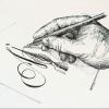
(Andrew Lensky) My first fully designed and self-made fountain pen
Andrew_L posted a topic in Fountain Pen Reviews
Hi friends! Finally, I can boast of my own fully created fountain pen. Of course, I didn’t make the nib and used a standard nib unit with Germany nib, but the rest was built by me from start to end. So, welcome to viewing and discussion. Andrew Lensky “Tribute” (working title) – ebonite medium sized fountain pen w|JoWo #6 nib unit (made in Ukraine) prototype Detailed: http://lenskiy.org/2023/11/own-my-first-fully-designed-and-self-made-fountain-pen/ Compared to Pelikan M800 and MB 146|Legrand- 108 replies
-
- handmade
- handcrafted
-
(and 4 more)
Tagged with:
-
desaturated.thumb.gif.5cb70ef1e977aa313d11eea3616aba7d.gif)
Four steel EF nibs writing in Pilot Iroshizuku Syo-ro
A Smug Dill posted a gallery image in FPN Image Albums
- 1 comment
-
- hongdian no.26
- 26mm
- (and 7 more)
-
Ranga, Model Giant 9B ebonite in Crimson Red with black specs I started out with relatively small and slim pens (e.g. Waterman Expert III). I soon found out that larger and girthier pens suit my hands better. Which is strange as I tend to have very small handwriting and prefer western extra fine and/or Japanese fine nibs. But somehow a bigger pen makes me write neater and helps me to hold the pen without tensioning my muscles that much. So, the facts: Manufacturer: Ranga & Co Model: Giant 9B Material: Ebonite Nib: Jowo #6 steel (EF) - unit Filling system: 3 in 1 (eye dropped) Capped: 175 mm Uncapped: 152 mm Posted: 207 mm Section: 12 – 13 mm ______________________________________________________________________ Appearance & Design – Oversized classic torpedo Well yeah, there is doubt about it, this is a giant pen (as the name suggests). It’s a clipless design and the seam between the cap and barrel is hardly noticeable. This gives it a classical yet sleek appearance. It is by no means an understated design, put this on your desk and people will notice. Construction & Quality - Craftmanship The pen feels lovely in the hand and is well balanced and is lightweight. The threading on the pen is unintrusive and well made. The pen uncaps in just under 1 turn! The treading on the barrel is quite long and this enhances the felling of security when eye dropping this pen. The ergonomics of the pen really fits my hand quite nicely. Weight & Dimensions - Long, girthy, yet lightweight This pen is surprisingly light! With such a big pen I expected it to be heavy but no, this weights no more than, say, a Pilot Custom 823 (by feel, as I don’t own a scale). For size comparison I show the pen with some well-known pens, hopefully this gives you an idea. Nib & Performance – It’s a Jowo #6 The extra fine steel #6 Jowo nib perform great out of the box (cleaned), no misalignment, no flow issues and smooth. The ink flow is generous enough to show the characters of the ink. I matched it with Akkerman Ink #17 (Staten-Generaal Rood), this suits the pen nicely IMHO. So, nothing to complain here. Filling System & Maintenance – Your choice With the 3 in 1 filling system, you can do whatever you want. There is a Smith standard international converter included with the pen. I chose to eye dropper it as I dislike refilling pens constantly (I write a lot) and like a big ink capacity. Cleaning is straight forward and easy as you can take the pen apart. Cost & Value – Great value For just a little over € 74,- this is a great value for your money pen. Especially if you consider it’s handmade, made of ebonite, huge number nib options and send within 2 weeks (order, produced and shipped!!). The packaging is great and customer service is impeccable Conclusion – Again thumbs up for Ranga 👍 All in all, again a lovely pen made by Ranga Pens. I have this pen inked-up and at the ready at my desk and use it mainly for longer writing session, the size and girth of the pen gives me a relaxed writing experience. It’s a pleasure to write with this pen.
- 21 replies
-
- ranga
- giant pens
-
(and 2 more)
Tagged with:
-
So I have a pen which currently has a fine nib, but I would prefer a broader, wetter, and smoother experience. This brand uses JoWo nibs, and the fine was too feedbacky and fine, and it was a touch on the dry side. So this brand sells extra branded nib units, which are JoWo #6 18k nibs, and I was wondering whether I should buy a medium or a broad. I would like a smoother and broader (but I do not want a super broad nib) writing experience. So is the jump in nibs sizes from medium to broad, or fine to medium? Is the medium noticeably smoother? Thank you for your help, W. Major
-
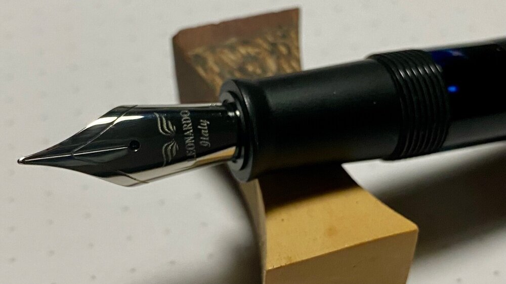
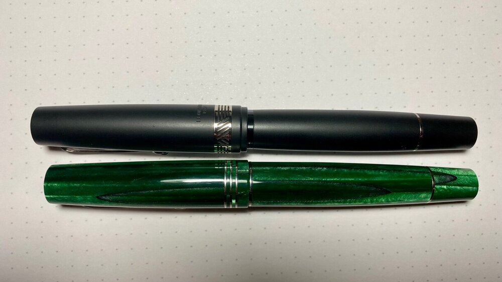
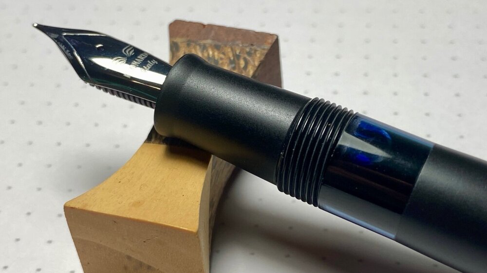
I'm not unfamiliar with this brand, as I already have a Momento Zero (green Alga), which I really like. Not only for its looks but is writes quite comfortable (after some tuning). As I dislike filling pens often, when I saw there was a piston filler that piqued my interest. The formfactor closely resembles the Momento Zero with some differences. So, the facts: Manufacturer: Leonardo Officina Italiana Model: Momento Magico - Anima Nera Material: Matte black resin Nib: Jowo #6 steel (EF) - unit Filling system: Piston filler (+/- 1,5ml) Capped: 145 mm Uncapped: 133 mm Posted: 169 mm Section: 10,8 - 11 mm ______________________________________________________________________ Appearance & Design – Lovely as always The appearance of the pen is typical for Leonardo. The matte black finish of the resin in combination with the silver trimmings gives it an understated and luxurious look. The cap band has a nice design, and you can se the underlaying material through the cut-outs. The barrel tapers a bit towards the ink window, and this gives it a bit of an unbalanced appearance to me. I was expecting that the large ink window would bother me, but actually if the pen is filled you hardly notice it, so that’s a plus. Construction & Quality – Good, as expected The construction and build quality of the pen is good, as I expect from a Leonardo and a higher priced pen. The Matte finish has a silky feel to it. The treads are unintrusive and the pen uncaps in just under 1 turn. The clip is excellent and functions great, I really came to love wheeled clips. Weight & Dimensions – Good size and lightweight As I don’t own a scale, I can’t weight the pen. But it feels a bit lighter to me that the Momento Zero. The length of the pen (uncapped) is perfect for my hands and slightly bigger than the Momento Zero. When posted it is slightly back weighted, but still very comfortable to write with. The ergonomics of the section fit’s me better than the Momento Zero although it could do with a bit more girt for my taste. As stated before, the slight tapering of the barrel towards the ink window gives it a bit of an unbalanced appearance to me. Nib & Performance – A misaligned Jowo The #6 Jowo nib the pen comes with is misaligned and out of the box (after cleaning) it has hard starts or simply refuses to write at all. This is quite a disappointment considering the price of the pen. After some tuning and aligning the tines, the pen performs great and has a nice juicy ink flow. After the tuning the extra fine nib writes more like a western fine (or a Japanese medium), I clearly must do some more work on the nib. Filling System & Maintenance - Classic piston filler The piston filling system works well and has a advertised capacity of 1,5 ml. It’s easy to fill it almost to the max. As all piston fillers cleaning can be a bit of a challenge and is time consuming. But these is a tool available to take the piston apart and that makes cleaning and maintenance easy. The Jowo nib unit can be removed easily. So, for those OCD cleaning freaks out there, you can get this pen as clean as it arrived in the box Cost & Value – No “bang for your buck” pen For a pen of € 199,- it’s very disappointing that you receive a pen that does not write out of the box and has misaligned tines. But that aside, it’s a nice pen to write with (after tuning) the lightweight pen is great for longer writing sessions especially with the larger ink capacity. Conclusion – Do it yourself nib on a lovely pen. All in all, the Leonardo Momeno Magico is a lovely pen if you are willing to do some work with the nib. For this price range of pens, I expect the nibs to perform perfect out of the box. The formfactor of the pen is great and the understated matte finish with silver trims makes it a great notetaker during meetings. The cap comes of just under 1 turn so that is ideal for quick note taking.
-
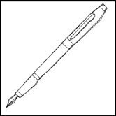
Could I put a 18k Edison nib or 14k FPR nib in a Conklin Duragraph? Is there any other gold nib I could get that would fit it for cheaper?
collectorofmanythings posted a topic in Of Nibs & Tines
Hello! I love the look of many Conklin pens, especially the Duragraph, and the steel JoWo nibs are just fine, but I would love to put a gold nib in it. I saw that both Edison and FPR make gold nibs (I especially like FPR because it is $20 cheaper) in the #6 size and was wondering if anyone thinks this is a good idea or if anyone has ever tried it. Thank you for your help! W. H. Major I posted this in the wrong section before. Oops! Reposting to the right place, which I think is this one. -
-
- broad stub
- montblanc 146
-
(and 2 more)
Tagged with:
-
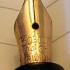
Fine Writing Bronze Age Ef (Expanding Long-Term Review)
TheDutchGuy posted a topic in Fountain Pen Reviews
Context Fine Writing is a Taiwanese company, making mostly high-end pens. Their more affordable pens tend to have striking designs and consist of a series of time-limited models. What's in stores now will not be there forever and what Fine Writing might cook up next is unknown until they release it. There are two earlier Fine Writing reviews here on FPN, as far as I could determine: one for the Bronze Age and one for the Golden Armour. When I first saw photos of the Bronze Age, I knew I had to have one, even though I'd vowed never to buy another pen with a generic Jowo or Bock nib (not that those nibs are inferior, just a matter of personal preference). In other words, this is the first pen that I've ever bought purely because of its design. Packaging, pricing, nib options These pens can be bought in various online stores for prices ranging from €85 ro €99. The nib options are EF, F, M, B and 1.1 mm stub. Nib colours are chrome, gold or black. The pen is packaged in a brown cardboard box and comes with a small booklet, a converter and a pipette. There is no clip. While some may wish for a more lavish box, personally I am happy with the cardboard box. Lavish boxes cost money and I'd rather spend my money on the pen itself. Also, for those who discard boxes, the cardboard can be recycled and is free of plastic and metal. The pen is C/C but can also be eye-droppered, hence the pipette. In eye-dropper mode, the pen holds a HUGE amount of ink, even more than the Opus 88 Demonstrator (which is also an eye-dropper). The converter seems to be identical to the ones that Kaweco uses and appears to be a generic design. Design The design of this pen is striking and I love it, though of course beauty is in the eye of the beholder. The engraved brass cap and filial and the brass section look really nice and the clear acrylic (I assume it is acrylic) barrel make for a unique appearance. The nib is a Jowo #6 engraved with the Fine Writing feather logo. You can unscrew the collar that contains the nib and feed from the pen, which is both easy to do and convenient. I chose an EF. Here are some photos of the various parts of this pen: Dimensions and ergonomy In terms of size, the pen is larger than I'd expected it to be. It's halfway between an Pelikan M800 and an Opus 88 Demonstrator. Below is a picture that compares the Bronze Age to these two pens and to some other pens: a Parker Vacumatic Jr, a Torca, an Onoto #5601, the M800, the Bronze Age, the Opus 88 Demonstrator, an Esterbrook SJ and three Boston pens. Despite its size and appreciable weight, the pen fits my hand very well indeed. To my surprise, it is very comfortable to hold and I can use it for longer periods of time without fatigue. I don't have to search for the right way to hold it. For me, that is quite rare. Only a few of my pens offer me such ease and comfort, though of course this is very personal and subjective. The nib and how it writes Because I prefer narrow lines and an uncluttered, open, clean appearance of text, I chose an EF. That is somewhat of a risk with generic nibs from brands like Jowo and Bock. I've seen many such EF's with asymmetric nib cuts, misaligned tines and other maladies. A good EF, which writes a crisp, narrow line with enough smoothness to be pleasant and comfortable, but also with enough tactile response for good control, that's not easy to do. The F nib on my Opus 88 Demonstrator is also a #6 Jowo and I lucked out with that one - it's a really good steel nib that gives me pleasure every time I use it. So, how well does the EF of the Bronze Age hold up...? Well, pros and cons, really. Proper flow of ink right out of the box, not too dry, not too wet. But it will become a lot wetter once more ink goes out of the barrel and more air comes in (if you don't want that, use a cartridge or a converter). Only a few words of writing were enough to alert me that the tines were not completely aligned. Visual inspection quickly confirmed what my hand had already told me: they were slightly but noticeably misaligned. Something else that I immediately noticed was a certain degree of 'character' to the writing, a very subtle difference in line width between downstrokes, sidestrokes and diagonal strokes. While I adore such an appearance of the written text, in an EF nib it is usually a sign of an asymmetric nib cut and indeed my Bronze Age has such an asymmetric cut (though I have seen much worse). Basically this means that the slit is not in the middle, so one tine is larger than the other. Sometimes the smaller of the two tines is slightly rotated so that the slit is not of equal width from top to bottom. As I mentioned, this is not uncommon and I have seen it on steel nibs from Kaweco, Leonardo (both Bock), Bock itself and Jowo. If you're lucky, the asymmetric cut will add character to your writing without feeling rough, without drag and without flow issues. In this sense I've been lucky several times, but initially the Bronze Age was sub-par. The nib offered good control, had good flow but it just did not feel right. On Rhodia, there was noticeable drag and on all papers that I tested on, some styles of writing just had too much unpleasant feedback, whereas other styles felt smooth. I had to search for a pleasurable writing experience and I don't want to do that - I want the pen to please me, instead of me finding a way to please the pen. Anyway, it took me half a minute to align the tines and another minute to find and remove the minuscule burr that caused the unpleasant feedback. In terms of control, tidiness, character and comfort of writing, the pen immediately became a pleasure to use in every style of writing that I know. Of course, this is a rigid nib and you should not try to flex it in any way. Here are some writing samples on Rhodia, Oxford and Tomoe and a comparison with some other well-known pens: ^--Oxford 90 g/m^2, comparison with Sailor 1911 Standard (M) in top row ^---Tomoe ^--Rhodia ^--Comparison of various other well-known pens Verdict A pen is meant for writing, and the writing is done with the nib, so the business end of a pen has to be really good and really pleasurable. That steel Jowo #6 is the least expensive but most important part of this pen. It required a few interventions on my part to make it do what it is supposed to do, but to be fair many pens using nibs like this require some tuning. Once that was done, wow. The design, execution, comfort, size, ink volume (4 mL!!)... just wow. I can see myself putting in a gold nib at some point in the future, but I did 90 minutes of non-stop writing with the pen and every minute was rewarding, relaxing and enjoyable. The luxury of being able to choose a cartridge, a converter or to eye-dropper it is quite nice. For what this thing costs, you get one helluva pen. I can see myself becoming very attached to this pen very fast. Edit: added additional info on nib removal.- 18 replies
-
- fine writing
- bronze age
-
(and 4 more)
Tagged with:
-

Low Budget, Big Dreams - A Section For Jowo Assembly And Cheap Pen Body
rogerbikeswim posted a topic in Fountain & Dip Pens - First Stop
Hello, I'm interested in learning how to make a fountain pen section that will accept a JoWo nib/feed assembly. I'd like to start by using easily available and inexpensive pen bodies, like the Jinhao x750. However, I am not married to this pen - I just know it is cheap and easily sourced. My understanding is that the #6 JoWo assembly needs m7 .4 x .5 taps. And that's about all I know, haha. Is there is a way to build a section that will work with a Jinhao x750 and accept the JoWo assembly? I'd be interested to learn about 3d printing or basic pen turning if there are low cost options. Please let me know your thoughts. Thanks.- 9 replies
-
- pen turning
- fountain pen
- (and 8 more)


