Search the Community
Showing results for tags 'italic nib'.
-

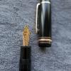
Fritz Schimpf by Scribo Limited Edition Piuma Passione fountain pen
Fritz Schimpf posted a topic in The Mall
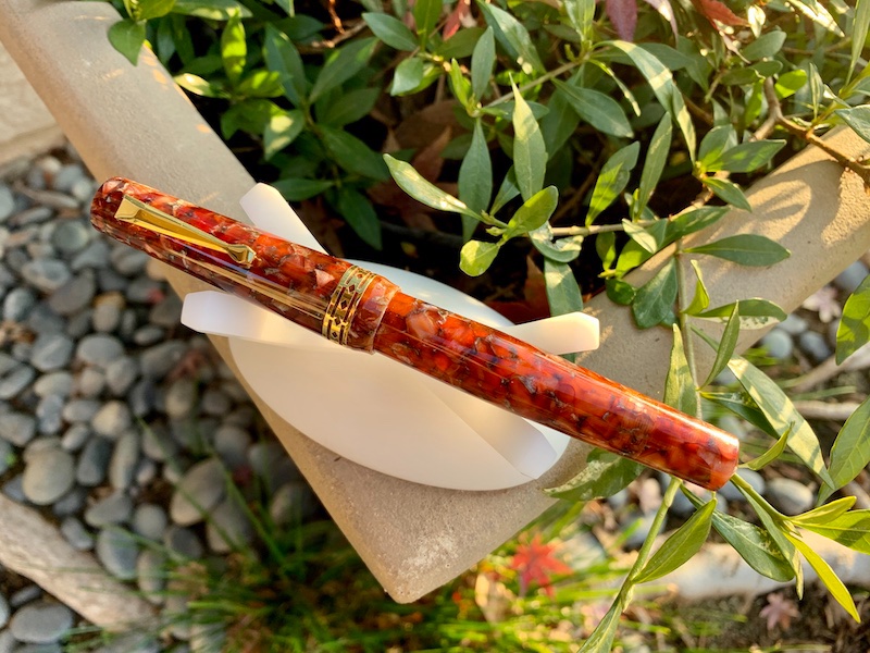
Fritz Schimpf by Scribo Limited Edition Piuma Passione cartridge/converter fountain pens exemplify the Italian word for passion. This passion for the designs, colours and nibs of the highest quality writing instruments, is shared by Scribo and Fritz Schimpf, resulting in the Piuma Passione. The elegance of form is reinforced by the gracefully shaped, silver-coloured clip and the subtle Scribo logo on the cap. Crafted using a refined acrylic resin, the contours of the Piuma Passione provide a fascinating depth effect with harmoniously warm reddish tones. The flexible nib is fully rhodium-plated, crafted from 14-K gold in nib size "F" (fine), which has received the widely respected Fritz Schimpf Italic grind. The combination of nib flexibility with our Italic grind results in exceptional writing characteristics. Due to the exquisite rounding of the writing edge and the lateral corners, the pen’s comfort zone is wide, therefore rapid writing is accomplished with ease. When written without pressure, the nib offers a vertical stroke width of approx. 0.60 mm and a horizontal stroke width of approx. 0.20 mm. With pressure, the vertical stroke width may be increased to a stroke width of approx. 1.20 mm. Flexible italic nibs are ideal due to their ability to make emotions visible, expanding handwriting, conveying a writer’s passion with visual flair. Engraved on the nib’s upper surface is our historic Fritz Schimpf Tübingen (FST) seal logo. This seal was used daily in our shop from the early 1950s until 2010 to officially seal insured letters, parcels and love letters, before they were delivered to the local post office to begin their journeys to those in all corners of the world. We are deeply grateful to Scribo for their magnificent cooperation and shared dedication to the highest quality. The Fritz Schimpf by Scribo Limited Edition Piuma Passione fountain pens are limited to 50 pieces worldwide, which are exclusively available from us, Fritz Schimpf in Tübingen. https://www.fritz-schimpf.de/Neuheiten/Fritz-Schimpf-by-SCRIBO-Limited-Edition-Piuma-Passione-Patronenfuellhalter.html
-
Generally, I am not a fan of dip pens. Although most of my serious calligraphy friends, especially the professionals, use them by preference. Dip pens and I have never gotten along very well. The only type I have used in recent years is glass dip pens for ink testing. When I came across the Sailor hocoro pens by chance browsing an Italian pen shop's web site, I was sufficiently intrigued by several of its features to order one to try out. I ordered one with a 2.0mm italic nib and liked it enough to then order one with a 1.0mm italic nib. The things I like about the design include: 1) The relatively small size, making it very portable (unlike the usual dip pen). 2) The nib hides in the handle when not in use and is protected from damage. 3) The 2.0mm nib comes with a feed and a separate feed can be ordered for the 1.0mm nib. With the feed, the nib holds enough ink for quite a lot of writing, and flow is very good. 4) The pen handle is comfortable to hold, and it has one flat side which keeps it from rolling away. 5) A quick wash with water cleans the nib. The text produced is quite acceptable. Even the 1.0mm italic nib produces good thick/thin line differentiation. Here are some photos: I expect this to become my first line ink testing pen. We'll see how I feel about it after more experience. David
-
-
Hello Everyone, I have a brief window of opportunity to purchase a new Pelikan Souverän M805 Blue-Black fountain pen at a very favorable price. The question is, which nib to choose? I write in cursive and dabble in calligraphy strictly for pleasure. I am retired, so no writing for business or publication is required. Only letters & notes to friends. I have a few gold nib pens, most custom ground from a “B" to a smooth stub, though I also enjoy writing with a fine or extra-fine nib too. I am aware that I can purchase additional nibs later and easily swap them out on the M805. I am also prepared to send a new nib to a nibmeister for customization. And finally, I have read several reviews of this pen that the nibs tend to run to the broad/wet side of the curve. So, having said all of that, the question is, which nib to start out with since I can only afford one at this time? I realize there are probably many more factors that weigh into this decision, but the purpose of my query is not to wade deeply into the minutiae of choosing this nib, I’m just asking for some general advice and opinions from those more experienced than I with this pen. Are the Extra-Fine & Fine nibs true to their names or do they lean more to one step larger? Same question for the Medium nib. Is it suitable for grinding to a good, all-around every day stub/italic, or would I be better starting with the Broad? And finally, what is the general opinion about the all rhodium nib for the M805, or do you think borrowing the two-toned gold/rhodium nib from the M800 looks better on this pen? Additionally, recommendation for a nibmeister to grind an everyday stub/Italic nib would be appreciated. I have some ideas on this myself, but am always interested in the thoughts of others. Thanks very much for taking the time to read this. Any thoughts you may have will be appreciated.
-
A while back, I ordered a 14kt #8 Bock nib ground to cursive italic by Pablo Carrasco for a replacement that didn't work (A sad story from which I will spare you). So, I had this gorgeous and pricy nib looking for a home. By fortunate coincidence, while window shopping Shawn Newton's online store, I found this orphan Knickerbocker in an unusual ebonite sitting there conspicuously nibless. Clearly, an omen meant for me and my nib. The pen arrived today, and I introduced the pen and nib to each other. It was love at first write! Enjoy! David
-
does anyone have advice about a #5 Bock italic nib (evidently from an Omega kit)?
Audrey T posted a topic in Of Nibs & Tines
I just received a beautiful pen from MarkhamJonesPens. The nib is a calligraphy/italic 1.5mm Bock Omega. Although the ink I used (Pen BBS's #448, Waves) is (appropriately) very wet, I had the hardest time getting the pen to lay down ink, even when dipped. I don't think it's the angle -- I am comfortable with sharp italics as well as rounded stubs, and in any case it would write for a while and then stop. Then, after being shaken, it might accept (briefly) an entirely different angle. The type of paper didn't seem to make a difference. It hated them all. -
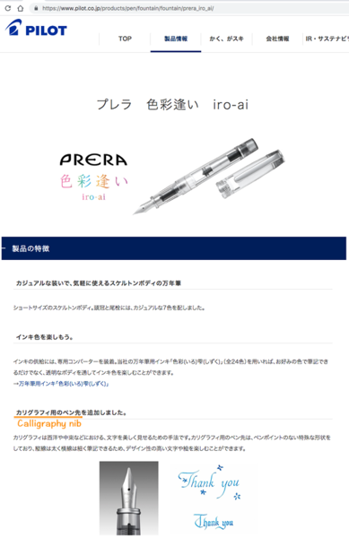
From the album: Translated third-party content
Source: https://www.pilot.co.jp/products/pen/fountain/fountain/prera_iro_ai/ In reply to:© Pilot Corporation
- 0 B
- x
-
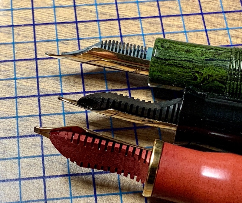
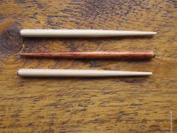
“First look” Review: Radius1934 Superior Primissima Monterosso Introduction Radius pens were made in Italy from 1934 until sometime in the 1950’s. Very little is known about the history of the brand, even by such authorities on Italian fountain pen history as Letizia Jacopini. Here is a link to her brief article: Radius - FountainPenwww.fountainpen.it › Radius. Apparently, Radius was the top of the line brand of its parent company, S.A.F.I.S. And the Superior was Radius' top of the line model. It was made in Turin, as is the Radius1934. The Radius1934 company was established quite recently, and has just issued their first product, named “Radius1934 Superior Primissima” after the founding date of the original company and their best-known model. I believe the founder of the new company is a collector of Radius pens. I do not know if he has any connection with the historical company. This pen was released in 5 resins, each named after a different one of the Cinque Terre villages on the Ligurian coast of Italy. Each color was limited to only 12 pieces. I was fortunate to be able to secure one in the Monterosso (marbled red) color. I ordered mine with a broad nib which I had custom ground to cursive italic. First Impression, Appearance and Design The Radius1934 Superior is a standard tapered cylinder with conical ends. It is about the same size as a Pelikan M800. I was impressed with both the look and feel of the pen. The materials and fit and finish exude quality. The section is tapered with a flare at the end. It is very comfortable for me. The cap unscrews in about two turns. The clip is the same design as the vintage Radius Superior. It goes into a shirt pocket easily and holds securely. Size comparison: Left to right - Pelikan M800. Leonardo Momento Zero Grande. Aurora 88 (with custom binde). Radius1934 Superior. Nib and Performance The 14 Kt nib is reported to be made by Bock, but the feed appears to be a custom ebonite feed. The feed appears identical to that made by Leonardo for their Momento Zero Grande pens. The nib has rather long tines and is just a little flexible and springy. My nib was custom ground by the “nib whisperer” (his self-designation) who works for the vendor. It is moderately smooth and very crisp, loaded with the Radius-branded ink that came with the pen. With this ink, the nib seems on the dry side but with consistent flow and quick starting after an overnight rest. Feed comparison (All with Bock #6 14Kt nibs): Top to bottom - Standard Bock Feed. nib. Radius1934 Superior Feed. Leonardo MS Grande Feed. Writing Sample Filling system The Radius1934 Superior is a piston filler. The pen fills in 10 turns of the piston. The piston appears to be stainless steel and feels very solid. It turns smoothly. It seems to hold just about 1 ml of liquid. Cost and value This pen is priced at around USD500. It is at the high end for a resin pen, yet less than many pens of similar quality with gold nibs and piston filling. I judge it to be fairly priced. Conclusion Radius1934 is a new pen company producing pens modeled after those of the historic Radius pen company. Their first release is a very limited edition of 60 pens in 5 resins - black, amber, red, green and blue - each named after one of the Cinque Terre villages. On first encounter, this seems to be a top quality pen. It is well made with attractive materials and high-end features. I am happy to find another new Italian pen maker of fine writing instruments, and I am looking forward to what other pens they will release. I will update this first look after I have used the pen for a while, if further experience dictates a need. David
-
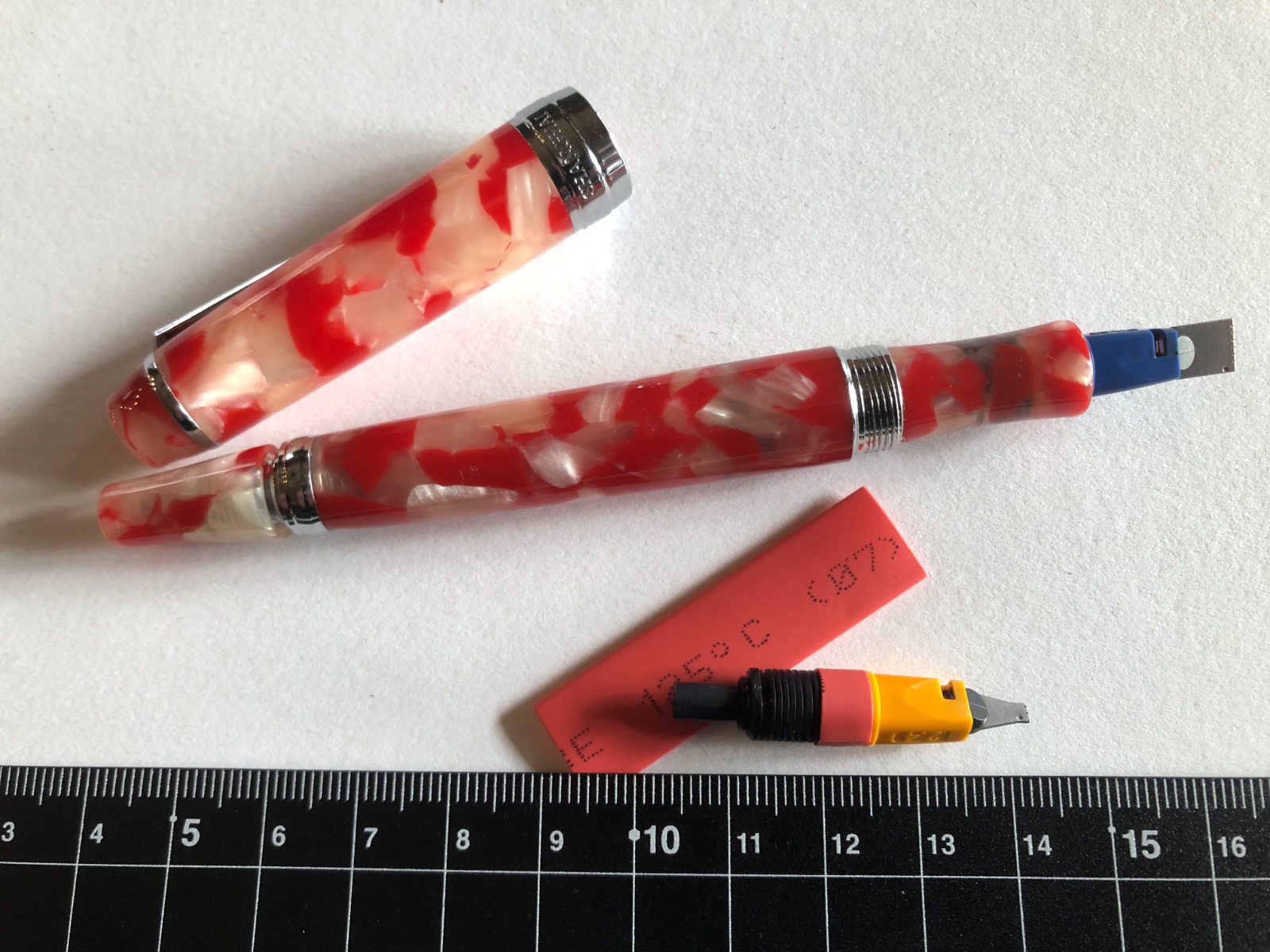
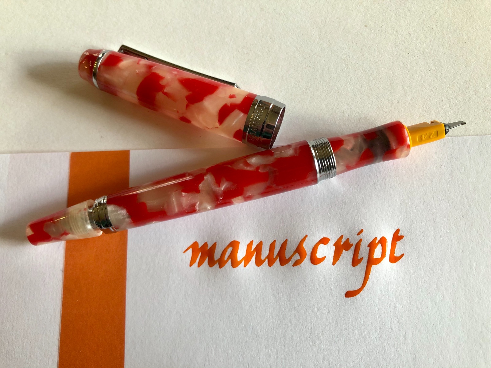
Pilot Parallel italic nibs perform wonderfully in italic calligraphy applications, and they can be successfully ground, hacked, and shaped for a variety of effects. With simple shrink-wrap tubing usually used for electronic connections, the diameter of the nib unit can be expanded to fit snugly into the section of a Penbbs 456 fountain pen. This enables calligraphers to place the high-performing Pilot Parallel nib in a more elegant pen, and to add wide italic functionality — from 1.5 mm to 6 mm — to the Penbbs 456. Use scissors to create a 5-mm-long “collar” from 7-mm heat-shrink tubing. Then, use a hair dryer to shrink the tubing tightly around the Pilot nib unit. The additional diameter enables the modified nib unit to fit snugly into the Penbbs 456 section. The interior diameter of the Penbbs section is about 5 mm, and the interior diameter of the Pilot Parallel is about 4.5 mm, so the tubing needs to increase the diameter only slightly. Because heat-shrink tubing is slightly elastic, it also serves as a type of extended o-ring in this application. My first attempt, with a 10-mm-long collar that covered all of the Parallel feed’s fins, proved too difficult to insert into the Penbbs section. But 5 mm is about right. There is plenty of room within the Penbbs 456 cap for the Parallel italic nib, and the nib starts up quickly after two days of non-use. The Penbbs 456 is a vacuum filler, and it’s also still possible to vacuum ink into the barrel through the Parallel nib. These photographs display the 2.4 mm Parallel nib in a Penbbs 456 in the koi material, described in English as “tiny happiness.” The ink is Diamine marigold.
-

Italic Pens On Tomoe, Midori, Clairefontaine, Rhodia, Etc
bbbdco posted a topic in Paper and Pen Paraphernalia
First a disclaimer…I am fairly new to the forums…joining only in March. And perhaps this topic has already been written to death. But I’ve been writing cursive italic for 40 years. Everyone seems to rave about Tomoe paper for writing with fountain pens. But it’s not my favorite writing paper. I know this can vary from person to person, depending on many different things, the pen, the nib, the ink, whether you prefer some “tooth” or not. Today, I was writing a letter on Tomoe 68 gm paper. I often use an italic fountain pen for my writing….and I write in cursive italic. But I seem to find it difficult to write on Tomoe paper with my italic pens. I was wondering if others had as difficult a time writing on Tomoe as I do. The paper is super thin, which doesn’t particularly bother me. But I think it is the extreme smoothness (almost slipperiness) that gives me trouble. It is so slick that it is difficult to form proper italic letter shapes (I’m talking quickly written cursive…NOT formal italic) and I am not able to get the nice thick and thins that I get with a “toothier” paper. So I got out 6 different types of writing paper that I have on hand: 1. Strathmore Series 400 Calligraphy writing paper 75 gm 2. Rhodia High Grade Vellum Paper 90 gm 3. Tomoe 68 gm paper 4. Triomphe Clairefontaine Vellum paper 90 gm 5. Md Midori Loose leaf paper 70 gm 6. Strathmore Premium Writing Paper 25% cotton 90 g I took out several different pens with different nibs…from extra fine to medium regular nibs to italic extra fine to double broad. I wrote the same sentence on all the papers with all the various pens and nibs. I would say both Tomoe and Rhodia paper produced the most “saturated” colors with a higher sheen. Both are very smooth papers. It is difficult for me to control the uniformity of my handwriting as well on these papers. I just don’t have the control of my pens that I would like to have…especially my italic pens. They simply just don’t “feel” as nice to write on as some of the other papers. The ink lines are slightly thicker on both of these papers. The next smoothest paper was the Triomphe Clairefontaine. I felt I had more control over my pens on this paper. It is slightly “toothier” than the Tomoe and Rhodia. My pens grabbed the paper better, so I had more controll over my pens. The italic pens seemed to work much better on this paper also, providing nice thicks and thins. Next for me was the MD Midori paper. Very similar to Triomphone Clairefontaine, but just slightly toothier. Writing on this paper was perhaps the best for both regular fountain pens and my italic pens with italic cursive. The ink flowed very well, it was nice and saturated. Next was the Strathmore Premium Writing Paper 25% cotton. Actually, I really liked writing on this paper also, especially with my regular nibs. The “toothiness” made control of my regular nibs very easy. My italic nibs did not write as well on this paper, since it is rougher than the other papers. Formal italic would work fine but cursive italic handwriting is a little more difficult. My regular fountain pen nibs worked well on this paper. Nice saturated ink and dried quickly. The last paper, Strathmore Series 400 Calligraphy Writing Paper 75 gm is a bonded paper. So there are very small ridges running through it. Regular fountain pens again worked very well on this paper. But italic cursive writing was the most difficult on this paper because of the ridges in the paper. This paper would be OK for formal italic. The paper itself is the prettiest paper of all 6 that I tried. Since ALL of the paper I tried is “writing paper,” I really did not have any major problems with bleeding or feathering. Comparing the ghosting from best (least show through) to worse (most show through): Best: MD Midori Rhodia Strathmore Calligraphy Paper Triomphe Clairefontaine Strathmore Premium Writing Paper 25% Cotton Worst: Tomoe 68 gm paper My conclusions regarding these papers for the way that I write, and the pens that I use: For both regular nib fountain pens and italic nibs, I prefer both the Midori and Clairefonatine. These 2 papers work the best (FOR ME) as all around writing paper. For formal italic, I would normally use specialty papers….but the strathmore calligraphy paper, as well as the Midori and Clairefontain could also be made to work okay for formal italic. If I’m only using regular fountain pen nibs (not italic), then all of them EXCEPT Tomoe and Rhodia. The Tomoe and Rhodia paper are simply to slick for me. I don’t like how my pens feel when I write on these papers, and I am not able to control my pens well. I suppose you could say they are “too buttery” for my taste. Sorry about the pun. I like to be able to have control and “feel” my pens working on the paper. And I do NOT have a heavy hand when I write. I know most people will probably disagree with me, but that’s just my opinion based on my experience with these papers. In time and with more writing experience, this could change. I’d be curious about how others feel; especially in regard to using italic nibs for cursive handwriting. What paper do you prefer? Which nibs on which paper. And why? -

"steadying" Effect Of Italic Nibs On Cursive Writing?
Cursive Child posted a topic in Handwriting & Handwriting Improvement
Posted this on some older topics, but no responses. I don't have great handwriting, and write cursive. Have been writing with round, smooth, wet nibs mostly. When I started using a (0.6 mm JoWo #6) stub on a weighty (Nemosine Fission) pen, noticed my handwriting is much better. In particular, the slant of my lettering is more consistent. I will try a controlled experiment with the same pen and round nib, but my thesis is that the stub is forcing my hand to write at a more consistent angle. Others have expressed writing better with stubs too, perhaps for the same reason. Does the reasoning follow your experiences, or some other reason I am missing? Certainly, some feedback, as I get with other or finer pens helps to improve the waywardness of my letters, but this stub is very smooth and wet. I am thinking of getting my new Pelikan M805 Fine ground to Cursive Italic - will it give me the same type of benefit? -
I'm fairly new to the world of fountain pens, and would like some advice on the topic of an italic nib. A little background first. I studied calligraphy and italic handwriting quite intensely about 30 years ago from an artist Benedectine Nun, who is now deceased. I completely changed my handwriting from the old Palmer to Italic, which I continue to use. Eventuallly, I even went on to teach a course in college on beginning calligraphy. After 20 some years, I have rediscovered my old artistic interest in fountain pens, calligraphy, and italic. I have 3 old Osmiroid pens (two 65s and one 75) I have all the nibs from extra fine up through B4. All the nibs and pens work fine after 30 years. I've recently purchased some beginning Fountain pens: Pilot Metropolitan, TWSBI ECO, Lamy Safari, and the Pilot E95S....all with either fine or extra-fine nibs. Now I'm thinking of investing in a good italic cursive nib. I've been re-learning to write with my old Osmiroids. I guess my main question at this point is: would getting a specially ground cursive italic nib produce a better writing pen than my old Osmiroids? I know there are places that will grind nibs for you. I have discovered Marc Bacas at Nibgrinder.com. I'm debating whether I should purchase a pen from him, and have him grind a cursive italic for me. Would a custom ground pen like this work better, more smoothly than my old plastic Osmiroid? Or is the Osmiroid considered a pretty good writing pen? And then there is the question: if I do decide to have him produce a nib for me...there are so many nib options: JoWo, Bock, gold, amongst others. He makes 3 different italic nibs...one for formal italic, one regular cursive italic, and a very smooth cursive italic. I'm thinking I want something along the lines of a fine nib. (something between the Osmiroid extra fine and fine.) I see that I can send pens in. Waiting time is 2 months. Or if I purchase a pen from him, it is expedited. He mostly stocks TWSBI pens. Any thoughts you can share with me on this topic would be appreciated. I know there are other options also. I've heard of Franklin-Christoph nibs. And Goulet Pens also sells some italic nibs. Or I could get a Jinhao and experiment on grinding my own. Don't know how tough that is. Just not sure what I should do and would love any input from anyone. Thanks. Dan Mueller
-
Pelikan M205 Translucent Blue Italic Nib Birthday Present ~ As a half dozen Pelikans settled into a nest on my writing desk in 2019, up from two before that, I'd supposed that there'd be no more Pelikans this year. How wrong I was! Late this evening a package from overseas reached me with several birthday gifts from former students now working in the United States. Although my 4 November birthday is a bit more than one week away, receiving gifts carefully selected by those who I've known well for years was a great pleasure. Two 2019 novels (one by my friend, Jack McDevitt, and one by Donna Leon) and a bottle of Montblanc The Beatles Psychedelic Purple ink were in the package. As if that weren't already more than enough, a bubble-wrapped package contained the outer box of a fountain pen. It was a Pelikan M205 Translucent Blue Demonstrator with an Italic (I) nib in the original presentation box in superb condition. I was gobsmacked, bowled over, flabbergasted and completely moved. Such a thoughtful gift for their old instructor showing their kind hearts. Remarkably, not twelve hours before, I'd acquired a Sailor Shikioro Hisakata Uchimizu F nib, which is also a shade of translucent blue. Inked with the gift Psychedelic Purple ink, the I nib writes crisply with extraordinary feedback, unlike almost any other nib on my writing desk. A gift like this has more meaning because of the care the givers used in selecting something which they felt that I'd appreciate. Working as a university instructor has its challenges, but it also is amply larded with blessings, many of them wholly unexpected. Tom K. BLU IM PELIKAN 205 TRANSLUC Outer Box in Blue Inner Box and Guarantee Booklet Within the Presentation Box Pelikan M205 Translucent Blue Italic Nib Barrel and Cap Pelikan Italic Nib Writing Tool in Blue
-
Lately ASA has released lot of pens and believe they will be coming up with lot more in near future. And today I am reviewing another great pen by them which is ASA Patriot. My detailed review is also shown at wordpress page here Link ASA Patriot I had my eyes on Gama Eyas / Gama Hawk for a quite a long time because i wanted an ebonite pen with the rounded top and bottoms. I was just about to buy the pen and then ASA came out with this beauty named PATRIOT and i quickly grabbed the same. DESIGN & BUILT: The pen is a regular sized pen and comes in 5 color options, shiny black, matte black, light brown rippled, dark brown rippled and green rippled finish. Its a regular sized pen which comes with JoWo nib options of F, M , B and 1.1 Italic size. The pen that i reviewed today comes with 1.1 Italic nib. ASA Patriot with 1.1 JoWo Itaic nib It has a clean and minimalist design. The pen open in 2 and half turns which I beleive is the highlight of the pen being an Indian pen. The top and bottom of pen are rounded which are quite nicely done and has been paid lot of attention as it is a handmade pen. ASA Patriot - Top of Cap and Bottom of Barrel ASA Patriot - Uncapped The section of the pen is finished in black shiny finish which is quite okay and provides for sturdy grip. However i would have liked it even more if the section would also have been given a matte finish. Below is the image which shows the pen broken down in to parts, which shows the Schmidt K5 converter also. ASA Patriot - Taken apart The Clip is chrome finished and quite sturdy and the O ring of the clip is well hidden by the rounded cap top. (Update: these are push in type clips, thus no O ring )The Also i got an option to engrave my name on the pen and i opted for the same to be done at the cap which really adds to the beauty of pen. ASA Patriot - Sturdy Clip ASA Patriot - Name Engraving As mentioned earlier the pen is the regular sized pen and below are the few images to show the comparison against various pens. ASA I Can vs ASA Patriot vs Pilot Metropolitan vs Sheaffer No Nonsense - Capped ASA I Can vs ASA Patriot vs Pilot Metropolitan vs Sheaffer No Nonsense - Uncapped This is a well designed pen which is just a class apart in built quality. Actually its a no fuss design. For the detailed review and more images along with the writing sample please follow the link : ASA PATRIOT
-
Hello all. To get down the the nitty gritty, I have a TWSBI 580AL and I LOVE it! I have it with an EF nib and find it to be very smooth. I was looking to get a replacement nib to play around with. I wanted to get a italic nib that is 0.6mm, 0.85mm or pretty much anything under 1mm. I know the mount size is a 5 for this pen I am just a having trouble finding a nib online I can order. If anyone can help me find a nib that matches that description Id be very grateful! I have found 1.1mm italic nibs that are size 5 but nothing under that. Thanks in advance!
-
I bought a Pilot Plumix a while ago as my first stub nib pen. Though initially I had a bit of fun with it, I find I don't use it much - even while I use my flex nibs quite a lot. I thought it was a little bit of money wasted, until today when i found out I could use it as a flat-head screwdriver. With reborn purpose, I think I'll be using this pen a lot more now. Has anyone else found alternative uses of/for stub nibs, or am I the sole madman here? (Embracing for hatemail. Don't worry, I do take proper care of my other pens.)
-
Sorry. No numerical ratings. Size, fit and finish, etc. are perfect. The nib is better than okay, but it can't match a gold nib tuned face-to-face by Mr. Masuyama. Then again, that's not what I paid for, and, by the way, I can swap in a Conway Stewart italic nib that Michael tweaked to my peculiar taste any time I want to. Besides the gorgeous appearance of this pen, its most remarkable attribute is that it is amazingly comfortable to write with for me. I love it! David
-

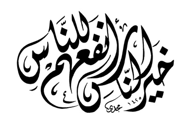
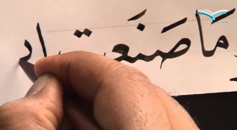
What Nib I Need For Arabic Calligraphy?
osamaabusalh posted a topic in Broad (or Edged) Pen Calligraphy
Hello guys, I was looking for a fountain pen with a nib which is suitable for Arabic Calligraphy, I think that Italic Nib is the good one, but I still not sure enough so I need your help guys. ِArabic Calligraphy requires right-oblique nib with a very sharp edge for a broad (up-and-down) strokes and narrow strokes (sideways). Arabic Calligraphers usually use an ancient handmade pens made of bamboo for the large letters, and 'Hatat nibs with a holder' for the small letters that could be modified by grinding (I found this too hard to write with, this why I'm searching for a fountain pen). By the way, I need a 0.5 mm or 0.7 mm nib for typing a small letters. I attached some pictures showing the Arabic Calligraphy, also the bamboo pen, Hatat nib and the holder. Note: If possible give me an Aliexpress or eBay purchase link or any worldwide online store. Thanks for your time! Thanks for your time, and your help would be much appreciated!
-
OMAS Ogiva Alba, Factory Italic Nib The OMAS Ogiva Alba was released this Fall in a limited edition of 327 pens in each of three colors - green, purple and red. The pen is a demonstrator with a longitudinal grooved guilloche pattern. I am not a huge fan of demonstrators, and none of the colors really inspired me. What prompted my purchase was the opportunity to acquire an OMAS FP with a factory Italic nib at a reasonable price, at least for an OMAS LE with an 18Kt gold nib. It turned out that the italic nib was a special order, which delayed shipment of my pen. And the italic nib is “factory,” in that that is from where it comes to the dealer, but it is apparently a stock Broad nib that the factory circumcises. That is to say, they cut off the tip, including all the iridium tipping material, making it flat and chisel-like, and smooth the corners of the tip. My first impression was positive. The Ogiva shape is a classic. The color I chose was the green. It’s a nice, dark green with a bit of blue, to my eye. The nib initially shocked me. The lack of tipping was obvious. The tines appeared widely separated, raising concerns about excessive ink flow. The tip had such rounded shoulders, I feared the line differentiation would be insufficient for my needs. But read on … 1. Appearance & Design (9) - A nice looking pen, but no Paragon Arco Bronze I have described the general appearance of the pen above. It is pleasing to look at. It has a nice shape, color and hardware, with the classic modern OMAS wheeled clip and Greek Key cap band. But, it doesn’t take my breath away like the OMAS Arcos or Blu Senape celluloids. It’s got stiff competition! … 2. Construction & Quality (10) - Flawless I can find no fault with the materials, fit or finish. In spite of it’s light weight and plastic body, it looks and feels like a high-quality writing instrument. … 3. Weight & Dimensions (9) - Long length, comfortable diameter, lightweight The Ogiva is slightly longer than a Paragon. Or a Pelikan M800! You don’t appleciate it’s size until you place it next to other pens. It sticks up quite a bit when put in a shirt breast pocket, and that’s a negative for me.For me, the section diameter is just about right. That is one of the most important pen parameters for me. I am not especially fussy about pen weights. I have both light pens, like this one, and much heavier ones, for example, my CS Bellivers, and I enjoy writing with them all. … 4. Nib & Performance (8.5) - Good ink flow, very smooth, not very crisp. As mentioned, the OMAS factory italic nib is cut from a B nib and is untipped. It has very round shoulders and writes more like a stub than a cursive italic. It is quite comparable to the Bock Italic/Stub nibs used by TWSBI, Franklin-Christoph and Edison. For a user who wants a broad stub to write in cursive or to use for signatures, this would be an excellent choice. I wanted to use it for italic script, and wish it were crisper. I had read old reports on FPN that the OMAS italic nibs were untipped, but it was still a bit of a shock to see. For the amount of use this pen will get, the lack of iridium tipping is probably not a practical issue, but why OMAS chose to make the nib this way is a mystery to me. I believe I have 11 OMAS pens, and all of them have custom-ground crisp cursive italic nibs that started as M, B or BB round nibs. All have abundant iridium left. As mentioned, I feared excessive ink flow because the tines seemed wide-space, but ink flow is fine, even with moderately wet ink like the Diamine with which I loaded it. It does hesitate starting after a pause in writing but starts again after just a bit of a nudge. … 5. Filling System & Maintenance (9) - Classic reliable piston filler This pen uses the excellent OMAS Piston filling system. It operates smoothly. I am pretty sure the nib is friction fit. I much prefer easily changed nibs like those on Pelikans and Auroras. I cannot comment further regarding maintenance. … 6. Cost & Value (8.5) - High cost. High value? I have been testing a variety of low cost pens with italic nibs the last few weeks. All have steel nibs and plastic bodies. None have the stunning beauty of an OMAS Paragon Arco or of a Pelikan M620 or of an Aurora Mare. Some, but not all, look and feel cheap. But several of them write really, really well and cost a small fraction of the pretty pens I named. The Ogiva Alba is much less costly than those pretty pens too, although still way more costly than my budget italic pens. And it feels to have the quality expected of an OMAS pen. … 7. Conclusion (Final score: 9) - A very good pen, but not my personal ideal. The OMAS Ogiva Alba has many strengths, and most of it’s weaknesses are subjective or a matter of personal preference. I think the OMAS Ogiva Alba would be an excellent choice for some one who wanted to experience this without spending what a celluloid Vintage Paragon, Ogiva or 360 costs. David
-
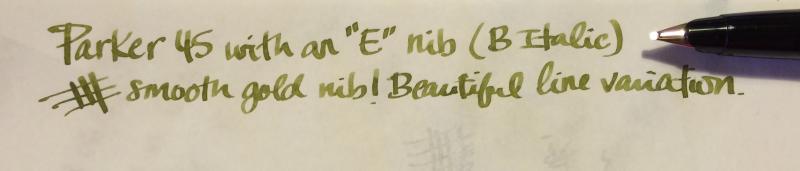
I recently bought a Parker 45 off the bay, which was described as having a "very broad nib." Little did I realize that it was a Broad Italic nib, marked by the "E" on the back of the section...I'm guessing the seller had little idea as to what he had offered. The pen wasn't in the best shape when it arrived, and required some TLC. While it's a lovely writer, the B nib is just a little too broad for my taste and handwriting style. Does anyone know if Parker made 45's with a Medium Italic nib? I do really love a good italic nib, and this one is lovely--I'm assuming any other italic nibs they made are similarly great.
-
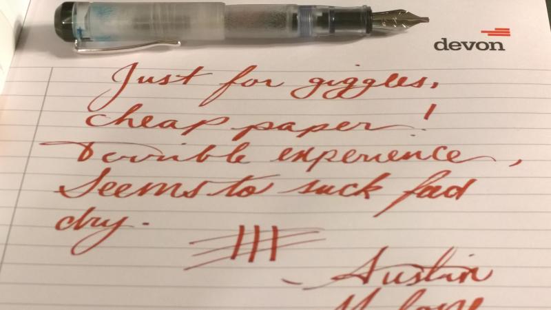
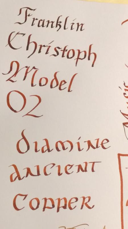
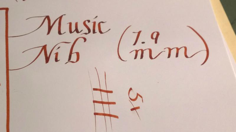
Above is a sample of how the very wet Christoph Nib fares on the cheapest paper I have yet to encounter. I don't have a macro lens, but here goes my best shot at approximating the appearance of the nib. It is beautiful without being gaudy. A Gothic or Old English capital "C" is present, contrary to the "F" generally presents. The music nib has three tines, and the feed has two channels. Rays of what appear to be sunshine are bursting from the center of the nib. The nib does not contain a breather hole, and this has not seemed to affected the flow of the pen. This will hopefully give you an idea of just how much variation can be had with this nib. I estimate about 5-6 times the cross-stroke on the down stroke. Very impressive. This should give you an idea of the size of the nib's "line". It is pretty true to the 1.9 indicated by the people at Franklin Christoph. I have yet to experience a skip, the performance is truly amazing. The main drawback is that this nib is impossible to use on cheap paper because of its wetness. I love using this nib to practice calligraphy or just write really big in cursive. It's a great nib for brainstorming as well as bold signatures. This nib unit was provided for review by Franklin Christoph. All opinions expressed within this review are original and genuine.
-
I have some pens with italic nibs but find holding them at the required 45 degree angle makes my hand hurt after about five mins. Am I doing something wrong? I normally use a standard tripod grip with the nib parallel to the writing line and have no problems with this. Is there a trick to holding an italic pen at the required angle? I hold 1.1mm stubs just as I would a normal pen, but so many sources are adamant about the angling of an italic. Until now, I've been writing a type of italic with flex pens, but would like to give my broad edge pens some use. How is it done without pain? Thanks in advance.
-
I think I've made a terrible and expensive mistake. I have a Visconti Homo Sapiens fountain pen, the one with the excellent "dream touch" nib in fine point. Based upon the recommendation of someone who showed me how his Homo Sapiens wrote an elegant italicized line after he had it worked on, I took the pen to the same place and had the repairman italicize mine. The problem is that my nib was already a fine point, and now that it's been italicized, it's virtually a needle point. It writes scratchy on the page, and it only suggests the smoooooth flow it used to have if you use it on the right kind of paper and hold it at just the exact proper angle. I feel sick about this. I don't want to pay $350 (or thereabouts) for a new Visconti nib. I can't do a nib exchange with Visconti because the existing nib isn't in "like new" condition now. Is there anything another repair could do to make the nib write smoother? Is there any way to un-italicize a nib once it's been ground down? Thanks, : Allen
-
Hello, I was wondering whether there exist cursive italic nibs finer than that of Prera CM? I know that some pen makers offer 0.6 mm italics, but I'm not really sure whether the nibs are finer or not. Is sending a pen for custom grinding a good option? Does anyone know about someone who grinds nibs to good fine coursive italic/stubs?
-
As I have several italics and stubs in my collection , I now realize that there is no such thing as a universal nib grind.Every nib is different in its own way and depending on the mood of the moment writes better or worse. I was just wondering what nib is best in order to grind a medium stub or italic , to get technically the best result I mean should the nib best be: . Gold , steel .flexible , soft? .start position i.e.width of the nib .design of the nib? Thanks for your ideas . .


desaturated.thumb.gif.5cb70ef1e977aa313d11eea3616aba7d.gif)