Search the Community
Showing results for tags 'islander'.
Found 5 results
-

Package From Fosfor Pens Arrived - Picture Heavy
dinuraj posted a topic in Fountain & Dip Pens - First Stop
Fosfor pens is a reputed custom pen maker in India. Manoj Deshmukh (Mr. fosfor) has built up a reputation as a master craftsman and high quality pen maker. I had put my name in his order book for a few pens some time back inspired by fellow FPNersPrithwijit's and Vaibhav's commissions from Fosfor. The package arrived today by courier. I am posting some pictures of the unboxing. Will post detailed reviews later (at least that is the plan) The package Opened package Fosfor wooden presentation box and telescopic boxes Fosfor Rajendran in Woodgrain Ebonite. Polished to a mirrorlike finish With No.6 size medium Schmidt nib Islander in Lava Explosion Acrylic The depth in the material is awesome Again with a silver colored no.6 medium schmidt nib I liked the bluer section. The blue-green Tikona. This pen is larger than I expected. Heavier also. Now, all three brothers coming together in a huddle From a lower angle. The total experience was very pleasant and I will be ordering more from Fosfor in the future. I planning to photograph the pens with better equipment and in better setting later. Will talk about the writing experience as well when posting those pictures. thanks, Dinuraj -
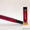
Review Of Fosfor Islander In Conway Stewart Flecked Amethyst
Prithwijit posted a topic in Fountain Pen Reviews
Introduction Manoj Deshmukh of Fosfor pens (http://www.fosforpens.com) is a master pen turner and I always wanted a pen made by him. Given that the Islander model is considered the flagship of his line, it is only natural that I would like to have one of those in my modest collection. Normally Islanders are made of exotic wood burls or hand cast resin that Manoj personally prepares based on individual preferences. Personally, I am not a big fan of wooden pens and didn’t have much faith in my aesthetic abilities in specifying the right colours to cast the resin. Instead I opted to use Conway Stewart Flecked Amethyst blanks that I had got from Vince Coates (http://www.theturnersworkshop.co.uk). I had always thought that the Flecked Amethyst material would be complemented nicely by the silver trims used in the Islander and decided to round off the look with a solid steel polished Jowo #6 nib in broad tipping. Design The Islander design is quite unique and distinct amongs't the India pen models. The cap portion is cylindrical while the barrel has a cigar like tapering towards the end filial. Both the cap and the barrel are ends are flat and polished. The body of the barrel and the cap are polished smooth and shiny. The cap is flushed with the barrel with no step down where the cap and barrel meet. The most important design element of the Islander and the raison d'être of this pen in my collection is the beautiful hand crafted silver band and clip combination. It is an artisanal product and I am not aware of any other pen with such and unique clip/band combination. The clip is springy and it is curved with a raised bottom for easy clipping. There is intricate hand-made design in the band above the clip and it is made of pure silver. One of the joys of getting a Fosfor pen is the customization in terms of section design that Manoj allows you to do to best suit your preferences and comfort. I opted for modified hourglass design which has proved to be extremely comfortable. In hindsight however, the design may have benefited is the edge at the end of the section was rounded off a bit. Size and Balance At 150mm capped, this is not a small pen. Despite it’s length, it is nicely balanced and can easily provide comfortable writing for extended periods. While the cap can be posted with some effort, I use it unposted as I find the length to be too long when you post the cap. The acrylic material is light and yet strong and hence the pen despite being oversize doesn’t compromise on weight or balance. Nib The standard Islander comes with a choice of Schmidt #6 nibs (Model FH 452) in either F/M/B. Schmidt nibs come with their logo embossed and I wanted a cleaner look on my pen. So I decided to go for a Jowo #6 polished steel nib instead which was devoid of any logo. Since I have many nibs with medium tipping, I opted for a broad tipping on this pen. Filling Mechanism My Islander is a non-proprietary cartridge/converter pen that accepts standard international cartridges and compatible converters and it comes with a Schmidt K5 converter out of the box. As I have mentioned in many of my earlier reviews, this is my favourite filling system since in my opinion it represent the optimum combination of value, system longevity, convenience and widespread compatibility. Build Quality Manoj has a reputation for focusing on the details and the pen clearly benefits from his focus and the resultant build quality is impeccable. One can easily appreciate that the pen has been made with care and a considerable amount of time has gone into producing it. Writing Experience Jowo is generally considered as being amongs't the top two or top three western nib OEMs and their nibs are widely used on a variety of pen brands. Their popularity itself is a testament to their general quality. Needless to say, I have been very satisfied with Jowo nibs in general and have quite a collection of them in different tipping. It is little surprise then that I am very happy with how the Islander performs. The broad Jowo unit is super smooth and glides over the paper laying down a nice wet line. There are no skips or false starts and overall the pen is a superb writer. Price and Value Currently as of December 2015, Islander pens are listed for a price that ranges between $75 and $99 based on the type of wood being used. These prices however are for pens with Schmidt nib units. If you opt for Jowo, then there is a slight price premium. I am not aware of any other custom pen-makers who offer this level of quality and individualization at this price point other than Manoj and Mr. L Subramaniam of ASA Pens. Needless to say, these pens are incredible value and the quality lingers in your hand long after the cost has left your mind. Specifications The measurements in this section have been taken with a simple ruler and may not be precise being subject to some amount of parallax error. Length (capped) – 156 mm Length (uncapped) – 141 mm Length (cap) – 70 mm Length (section) – 24 mm Maximum width – 16 mm Minimum width – 10 mm Maximum section width – 12.5 mm Minimum section width – 10.5 mm Conclusion This is my first Fosfor pen and I am very happy with what I have received. It is very comfortable, well balanced and an excellent writer thanks to its Broad tipped Jowo nib. The silver clip and band is unique and adds a touch of exclusivity. I have no hesitation in recommending this model to others.
-
The review is posted at my blog with more images and handwritten pen samples LINK Islander – In the Wild Well this particular pen, ISLANDER from Fosfor Pens was love at first site when I actually saw it in person at Delhi Pen Meet. I had seen lot of Islanders in the Wood online but never saw one in polycast resin. And Rishminder was the guy at pen meet who had the pen made out of polycast resin in tri colors of Indian Flag and i must complement Manoj Deshmukh of the wonderfully executed job. And trust me friends, it was love at first sight. I ordered the pen that very day and waited patiently for 3 weeks while going through the process of selecting colors, clips and bands. It was an amazing experience dealing with him and thus it lead me to ordering few more pens from him. This review is about Fosfor Islander. (Islander being named because it was first commissioned by a person who lived on an island) DESIGN & BUILT: 05/05 Where shall i start ? Actually i was speechless when I first saw the pen. It’s such a beauty. It arrived in very nice cardboard package which actually is a nice case for this big pen. The pen box is the only area where the branding is done. and you won’t find the branding anywhere else. Islander – Glamor Shot The pen is made of polycast acrylic resin which Manoj Deshmukh of Fosfor pen casts himself and thus you have the flexibility of having the pen in any color mix you want. And I actually wanted something brownish orange with white as a base and Manoj has produced a beauty. Islander – Close Up And as far as finish is concerned, I can find not even a single fault. It’s supremely well finished not even a single lathe mark. I can even go to an extent of saying that the pen is the best finished pen of India. The quality of the resin is superb though I beleive that being acrylic it is brittle. So care is needed in that regards. Its an eye-candy for sure. As far as design is concerned it’s a beautifully designed and executed pen. It’s a straight cylindrical pen with barrel tapering at bottom. The cap top and barrel bottom have soft rounded edges. Below are the few images which might help in design understanding. Islander – Capped Islander – Uncapped The cap top and barrel bottom have sublime protrusion i.e. they are raised. Clip is springy and stiff and like the fact the bottom is raised for easy clipping. The band above the clip is above has intricate design and is made of pure Silver. Islander – Cap top View Islander – Cap Side View – Intricate Silver Band Below are the few images of the pen showing comparison with other pens: Fosfor Islander vs Ranga Model 4C vs Italix Parson’s Essential vs Pilot 78G – Capped Fosfor Islander vs Ranga Model 4C vs Italix Parson’s Essential vs Pilot 78G – Uncapped I love this pen and soooo beautiful. And this has taken place in my top 5 pens with steel nibs. BALANCE: 04/05 It’s a perfectly balanced pen when writing uncapped and unposted. But for me it becomes quite large and uncomfortable when cap is posted at back. Yes the cap posts quite securely. The pen length is 149 mm when capped and 133 when uncapped. Below are the images of the pen showing comparative of writing with cap posted and unposted. Islander – Writing Unposted Islander – Writing Posted Since it's a long pen I don’t think there is no need of posting cap. NIB AND INK FILLING MECHANISM: 05/05 There were lot of nib options like JoWo, Schmidt and Ambitious and I opted for Schmidt silver monotone #6 Medium nib which is tried and tested. Islander – Nib unit angled view Islander – Nib unit top view Islander – Nib unit side view Islander – Nib unit bottom view The ink filling mechanism is via converter and cartridge mechanism. It can also be used as eyedropper. Islander – Cartridge Filling Mechanism Islander – Can be used as eyedropper showing inner side of cap above and barrel below This pen writes beautifully and writes wet and is perfect for shading inks. Below are the few images which shows the handwritten review along with test of wetness and line variation. CONCLUSION: This pen is available starting from 70 USD. And is available in different materials like wood, ebonite, acrylic resin. It is my top favorite pen. No.1 in my top favorite followed closely by Ranga Model 4C. Just to tell you all that this is completely handmade pen. Kudos to Mr. Deshmukh. Thank you.
-
Yes, the twins are here and I love them (Pardon the low quality pictures)! Here they are, - Fosfor Sandalwood with a Franklin Christoph HPS #6 Masuyama Needlepoint Nib - Fosfor Islander in Red Burl with the Franklin Christoph #6 Music Nib The F-C nibs were a gift from a friend and I was given the freedom of choosing the nibs. My limited experience with EF or F nibs (limited to lower end Indian and Japanese nibs) left me wanting more and I was on the lookout for something that I could use for sketching and quick notes (among a few other things). The music nib was to continue to practice some scripts for calligraphy. I've been wanting wooden pens for a while now and there was no better marriage than the F-C Nibs and the Fosfor body that I could think of in India. I must admit that the F-C website was very tempting and I will probably pick something from their offering pretty soon. I haven't uploaded more than a single picture as I am not able to do justice to the pens with my shoddy camera skills. Both Fosfor Pens and Franklin Chirstoph have great sample pictures on their own websites for anyone interested. I'm not good with reviews, but here are my impressions about both the pens and the nibs after a few weeks of usage. Experience with the seller(s) Franklin Christoph: I bought the nib units online and their customer support and sales was great, they have a well oiled process. The nibs units were shipped from their store the day after (or I think the same day given the time zone difference) and they knew the details about shipping, exports, etc. The sales folk at F-C were really helpful about the plethora of questions that I as this was the first time I was getting pen parts shipped into my country. They were always prompt and the whole process of buying the nibs from them was really easy and I did like the little containers that the nib units arrived in. Mike Masuyama's chop on the little card was nice for a first time buyer. Fosfor Pens: I've been commenting and reading Manoj's work (Fosfor Pens) here on FPN and wanted to order one for myself and when these nibs arrived, I shipped them off to him for these two beauties. These are my second set of wood pens, I think I'd rank wood higher than ebonite in terms of personal preference, with acrylic a distant third (so far nothing has made me budge on acrylics), and other plastics/resins being a distinct no. Bring on more of those wood pens I say! Manoj was patient with my finicky emails and decision process and helped me narrow down on these two choices for the pen. He updated me through the process and sent me these two lovely pens a few weeks ago. As I've posted in other threads, I'm a sucker for good packaging, and the boxes and the choice for the box material material made it all the more interesting. The small little pouch with the sandalwood shavings that I got was nice touch!Design, material, build and quality from Fosfor Fosfor Sandalwood: It is the understated look of this design that nailed it for me, the shape and the use of the threads on the cap were a great touch to make the pen look lovely. I opted for the unpolished finish for the sandalwood as I wanted to feel the wood when the pen is used. Yes, there are great risks of staining an unpolished wooden pen (I have stained a ball point sandalwood pen with my clumsiness earlier), but we do live dangerously anyway. The use of the red/brown ebonite is lovely (at some later point I might ask Manoj for an ebonite from this lovely colour itself). The natural wood grains on the pen (the swirl and I think one little burn mark from teh turning process or otherwise) add character to the pen. I did opt for this design as will not be posting the cap while writing. My only grouse with the pen being that when the cap is screwed onto the pen, the brown ebonite casing is visible (it does not protrude or create a gap). I'm only guessing that is either a easthatic choice or a utility choice (to insure against wear and tear of the unpolished sharper edges or probably any ink pooling/leaks). It might have been a good bonus if the swirls on the cap and body aligned when the cap was screwed on. Fosfor Islander: Most of the pens I own are understated or are discreet in nature, so I thought I'll mix it up a little with the silver trimmings on the Islander. Given the need for the natural look of the wood to be retained, I decided to go with the Red Burl offered by Manoj instead of my personal favourite of the Sheesham (with no trimmings) for the Islander. As you can see, the swirls are lovely, the polished finish is great and the black ebonite section provides a nice contrast for the nib and the clip on the cap. The tapering end could probably be used for posting, but I don't like posting my pens and I'm guessing it could lead to the natural wear and tear. Apart from the slight offset for the trimming at the top of the clip the pen is marvellous. The balance of the pen is great and I do love the fact that even after the polish that my brain tells me I'm using a wooden pen. As stated earlier, the aligning swirls on the body and cap would have been a lovely bonus. Performance of the nibs from Franklin Christoph HPS #6 Masuyama Needlepoint Nib: The technical details and pictures are available on F-C's website. I'm surprised by the performance of such a thinly ground nib. I must admit that I was apprehensive about it's performance but after clariyfing details from their sales team and using it for the last few weeks, I have become a big fan. Being and EF nib that is ground by Mike Masuyama to approx .25mm according to their website. As expected of such a finely ground tip, it has a smaller sweet spot. The performance is great and it is a wonderful writer both forwards and backwards! As a testing ground, I've used the Needlepoint on papers varying from 70gsm to 100gsm (and copier type, handmade, more threaded, etc.) and I am surprised at how well it handled all the paper. Though I guess this type of a nib would be best used on copier type of paper to ensure a longer life and better care. It almost feels like a mechanical pencil when using the nib and very unlike the EF nibs that I am used to. Here are few quick drawing samples, Franklin Christoph #6 Music Nib: This nib was offered in both a shadow steel and a polished steel finish. It was greatly tempting to buy the shadow steel finish. The eventual aim for me was to be able to use the nib units in different pens as needed when travelling, etc. Both of the pens I wanted from Fosfor are definitely not the travel with them in your pocket kind which meant that the options for a matching body for the shadow steel nib pen reduces drastically. The horizontal and vertical strokes on this pen are great and it glides over paper. I've tried the nib with a few different inks (locally available Bril, Camlin and Sheaffer Scrip inks) and so far it lays down a consistently wet line. I've had a couple of railroad-like situations (what would you call that for a broad nib?) in about 30 pages of writing/doodling/scribbling which I am attributing to the position/writing angle. The flow keeps up with the nib and my writing speed. Here is a quick 'F' in Old English Engrosser's script, The twins have given me great pleasure over the last few weeks and I'm a little unsure of where this new hobby of mine is leading me.
-
I first saw a pen like this on this forum, when manojd showcased a wooden pen he'd made. I wanted a wooden pen for a long time, so when he offered to make me one, I was hooked. Especially when he also explained he made pens from rolling pins! This is the first commissioned pen in my collection. I'm not sure if I can really call it commissioned, since the artist himself designed the pen - I was offered some options, but it really is manojd's creation. The most influential decision I could make was clipless yes or no. I chose clipless. Here is a picture, from his website: This is a beautiful pen: ebonite section polished to a serious sheen, connected to the wooden barrel with a metal insert containing screw threads for the wooden cap; a relatively small but very capacious ebonite (I think!) feed under a Schmidt F nib, ,size 5 I would guess. A comfortable nib with very nice flow: not too wet, never dry, the nib fairly stiff but there is a hint of line thickness variation that I slightly increased by writing a few lines on 600 grit sandpaper. The wood is a beautiful deep dark brown Indian rosewood, well protected against water-based moisture or oils from my hands; it feels very comfortable in my hand. This pen cannot have the cap posted because the metal threads in the cap pose a risk of scratching the wooden barrel; but this is fine, it is long enough and in this way does not become top-heavy. The cap, with its metal insert, inner cap, and silver cap ring near the top, is itself quite heavy. The one half-issue I have with the pen is the metal threads just above the barrel; they are a little sharp and sometimes seem to dig into my fingers as I write, even though I have a fairly relaxed grip (having used fountain pens almost exclusively for decades now). I tend to hold the pen at about that position, or at the section itself, but the section is slender and I like a slightly wider grip, especially when doing more than half a page or so. I would have preferred ebonite threads that are easier on the hand, but visually, the slender section is very nice and I would not want the looks of the pen to change... All in all, I am very pleased with my choice to buy this pen. It is a beautifully made pen that writes just the way I like it. Here is a small writing sample: I am also happy that manojd considered my input when naming the pen...