Search the Community
Showing results for tags 'iroshikuzu'.
Found 5 results
-
Here are 10 blue-black(ish) inks and two “true” blue inks as a comparison. Just for the fun of it. I scanned the sheet and with that most of the inks don’t show their sheen (or it’s not that obvious in the scan) so here are some photos of the inks to showoff some sheen: And for those of you who care about water resistance of inks, here are the inks after 15 seconds water bath:

-
-
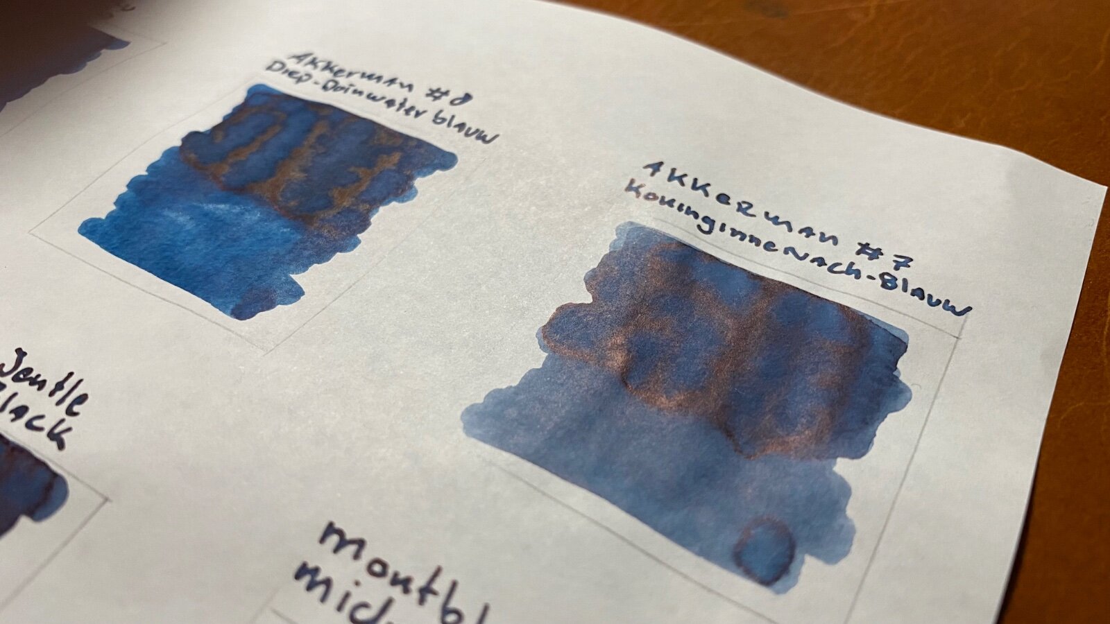
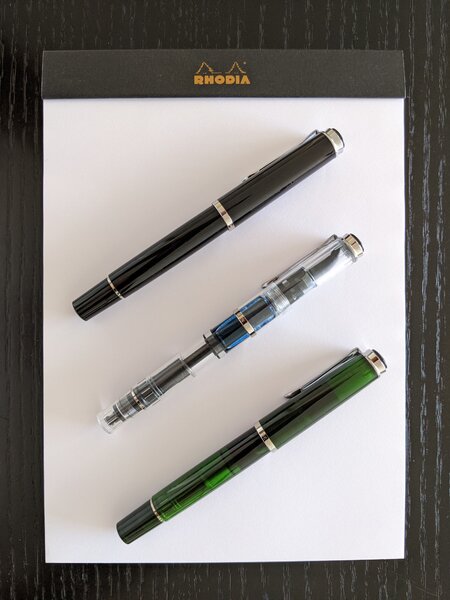
I thought I should put two of my favourite inks next to each other. Pens and ink used: Pilot Custom 823 (f) with Iroshizuku Shin-Kai Montblanc Meisterstück 149 (f) with Montblanc Midnight Blue Paper: 80 gsm Rhodia DotPad In daily writing I carry both pens and they are always inked up with the same inks. In my Tomoe River notebook, I often use them randomly throughout the day. And I noticed that I could only tell which pen the page was written by the linewidth as my fine MB 149 writes more like a medium/broad for my handwriting (which is microscopically small, people tend to tell me). The difference in ink colour does not seem that apparent. I thought it to be fun to put them next to each other to see if there is an actual difference. I did 3 passes of each ink with the fountain pens. The Iroshizuku Shin-Kai seems to have a more blueish tone and with the 3rd pass it turns to a dark (navy?) blue. The Montblanc Midnight Blue has a more greyish look to it and with the 3rd pass it starts to look more on the black side of things. Fun to see the difference as this does not show up that distinctly for me in daily writing. Out of the 100+ ink bottles I always tend to be drawn to the blue (or green)-black kind of inks, my favourites, so far, are (in order): 1. Akkerman #08 Diep-Duinwaterblauw (deep dune water blue) 2. Montblanc Midnight Blue 3. Iroshizuku Shin-Kai 4. Iroshizuku Tsuki-Yo 5. Akkerman #10 IJzer-Galnoten blauw/zwart (Iron Gall) There are some inks on their way to (hopefully) fit my preferences: Diamine Denim, Diamine Blue - Black, Diamine Twilight & Diamine Green Black. Do any of you have recommendations for blue/green-blackish inks I could try?
-
I spent a little bit of time looking here and in the Japan forum, but I did not find a thread that seemed dedicated to Iroshizuku ink. There is of course a lot of discussion of the ink, just nowhere in once place that I was able to find. Mods: I have tagged this thread to ask if maybe I missed an already existing thread. If so, please feel free to merge the comments below into the Iroshizuku thread I somehow missed. If not, I suspect maybe there are enough Iroshizuku fans (and non-fans) and discussion to try and collect a bit in one thread where it might be a fun and informative place for people to sound off on all things Iroshizuku, big and small. Here in Inky Thoughts seems to a good place for such a thread. Iroshizuku is a line of inks by Pilot (24 inks currently, plus the occasional special editions), that come in a nice palette for colors, and there seem to be a fair number of Iroshizuku fans out there, so I thought "surely, there is a dedicated Iroshizuku Ink thread here somewhere", but I was not able to find one (at least not a recently active one). My Iroshizuku thoughts for the day: The overall palette seems a bit blue heavy (even most of the greens at least tint in the blue direction), but every Iroshizuku color I have tried has been a nice experience in subtlety. There are also some fascinating colors in the red/purple/pink/orange hues. There are a couple of grays (one warm-ish, one cool-ish), and only one black (but does one need more than one black? ). For someone like me who likes brown, the Iroshizuku line has nice dark (Yama-guri), medium (Tsukushi), and bright (Ina-ho) browns that in just three inks cover a lot of territory in the brown direction. Sometimes I like something a bit more in the red direction, in which case Pelikan 4001 Brilliant Brown (can be a bit yellow-orange-ish), Diamine Ancient Copper (more orange-red), or Diamine Oxblood (maybe more of a brown-tinted red), but the Iroshizuku browns are a really functional set for me. What are your favorite Iroshizuku inks, and why? Which ones do you find hideous, and why? My top three Iros would be: Yama-guri: I enjoy the warm rich dark brown, and I image sometimes I see a tinge of a green sheen in it that is not at all unpleasant. Shin-kai: because blue-black is my most used ink, and everyone needs at least 5 - 10 different blue-blacks. 😛 Kon-peki: because it is my wife's favorite, and she works in the cobalt metal industry, so a deep cerulean blue makes for a nice metaphor.
-
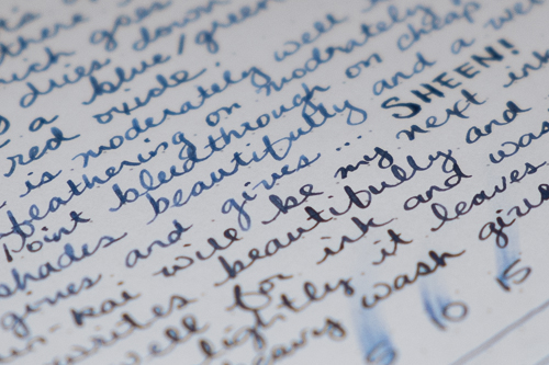
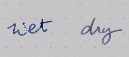
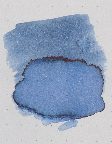
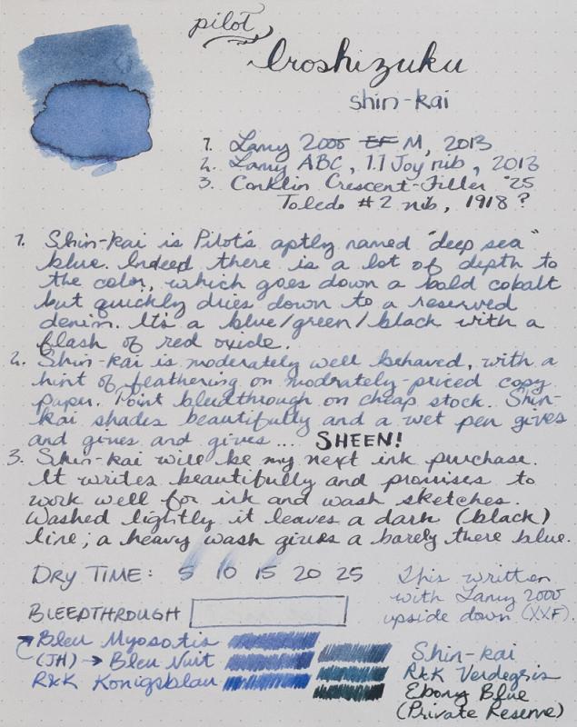
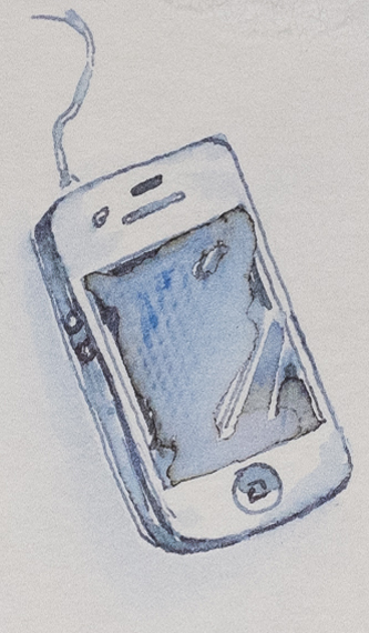
I am not a fan of blue ink. Before I found fountain pens, I used black ballpoint pens. In my pens, I use faded earthtones that lend themselves to ink and wash sketches. Iroshikuzu Shin-kai is the first blue ink I'll buy. It is fantastic. These are photos not scans. This is a difficult ink to describe, much less capture in a photo or scan. However, reasonable care has been taken to ensure color accuracy. As this was a Goulet sample, I haven't had the opportunity to make a proper attempt at sketching with this ink. If there is interest, I'll update later when I've done something worth posting. In the meantime, enjoy a 60 second sketch of my phone. Correction: I wrote in my review that Shin-kai feathers on moderately priced copy paper. It was a fluke. I've now tried it on a number of other cheap papers and no sign of feathering. Fantastic.