Search the Community
Showing results for tags 'grey plum'.
Found 3 results
-
From the album: Shades of colour
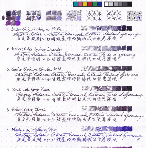
My scanner was challenged as it is to capture any colour differences at all between the first five inks, so I didn't perform any colour correction (which would darken the image and make the differences even less discernible), but only left the panels of colour reference patches from the scan in the image.© A Smug Dill
- 0 B
- x
-
desaturated.thumb.gif.5cb70ef1e977aa313d11eea3616aba7d.gif)
Writing samples in KWZI Grey Plum from my two Moonman 800.jpg
A Smug Dill posted a gallery image in FPN Image Albums

From the album: Nib comparisons
This isn't really a comparison between the Moonman and Bock nib options for the Moonman 800 (the model that looks awfully like a Leonardo Momento Zero), because — just like on the first-run Leonardo Momento Zero I got — out-of-the-box the Bock nib was cut asymmetrically and the tipping was unbalanced in height, so I had to regrind it. All this here shows is that the Moonman nib does an OK job, but isn't awfully fine or crisp, and compared to the Bock nib it writes a little more dryly.© A Smug Dill
- 0 B
- x
-
Grey Plum is one of those colors that I was most excited about in the recent Group Buy from KWZ Ink. The swab posted on the site was all I had to go by, and I admit, I wasn't thrilled by the color there. But I liked the idea of the color, and I like most of Konrad's more complex colors, so I gave it a try. Y'ALL. This is GREAT. Okay, so here's a review overview, with closeups and comparisons below: Right away, Grey Plum reminded me of one of my favorite discontinued inks, Sailor Chu-shu. There just aren't many purple-leaning greys out there. This is a swab where the inks were laid down very heavily (to try to get sheen and to see hue clearly). This means that the color is probably more intense than you'd usually see with a pen, but you see differences and similarities in a different way than writing samples. As you can see, Grey Plum is darker, greyer and cooler than Chu-shu in the swab; Chu-shu often comes off as a near-purple, while Grey Plum is a pretty definite gray. I washed the picture and swab below with water, to see what kind of behavior emerged, and got a really complex and interesting cool wash with blue to violet hues. I really like the tones, but it should be noted that the water resistance doesn't look particularly great - if you're sketching, prefer to go back over washes if needed. You might think you see sheen above, but that's a trick of the scanner. This ink is pretty matte, even on paper that encourages sheen. There's a tiny bit of something, but I don't think you'd ever see sheen under normal conditions. (I don't think you'd want it on this ink anyway.) How does it behave? Dry time is moderate. This is Tomoe River paper, so a 10-15 second dry time is decent. I didn't notice any problems with the other papers I tried. The shading is very pleasant, and great occasionally. I think someone who cared more might be able to draw out more shading (see the "s" in "so good" in the Manners section). The feel is great, just like all the other KWZI's I've tried. The flow is nice, startup is prompt, and it cleans up with no muss. (I have not left this ink in a pen for very long, though; I'll let you know if this changes at all.) The smell, unlike former KWZ inks, is hardly noticeable, on par with Diamine's normal aroma in terms of notability. It's faintly soapy or astringent - in fact, it's really familiar, and I wish I could put my finger on it. The smell of the last batch was my least favorite thing, so I'm happy it's changed. Allure is a really personal thing, but I love this ink. Dilutions is a category intended to show how ink behaves as water is added. It's very non-scientific; the first pass is pure ink, and then I briskly swish the brush for a second or two in clean water, dab it on the rim of the water jar, and make a new swash. It can reveal hidden undertones, or weird plateaus of saturation, where ink looks the same for several dilutions, even as the amount of water increases. This was not a hugely successful attempt this time, and I'm not sure why. It does show the kinds of washes you might get, and that you can probably dilute this ink down to get kind of a fun violet. As you might expect from the above picture and dilutions and swab, there's not a lot of water resistance. I usually perform a couple tests: I put drops on a grid of lines, leave them for 10 seconds, and then blot them carefully. This is the mildest form of water that writing might be exposed to - a tiny bit of condensation from a glass, say. I also write a phrase and then briskly wash it with a brush for ~5 seconds - not scrubbing exactly, but adding friction. I let it sit for 3-5 seconds, then blot. This usually erases any inks that lack water resistance. If they're resistant at this stage, I do an overnight soak. Grey Plum holds up okay to a little bit of water or alcohol, and mostly vanishes with a brush. While it may have minimal water resistance, this is not an ink I'd use for cases where I'd want to be sure of my notes. Appearance in different nib widths is good across the board. It's not overpowering in a bold nib or too wimpy in a extra-fine. I usually write a whole paragraph with each so I have an idea of what they'd look like on a page. (Ideally I'd do a page of each, but life is short, and the inks together give me a good feel for whether an ink will over or underwhelm in large quantities.) If I had to pick a favorite width, it would be broad. I did test Grey Plum on Leuchtturm and Piccadilly papers. I think it looks best on the warm to bright whites. It looks great on Leuchtturm, but Piccadilly is too warm, and it looks dull and flat. (Unfortunately, my scanner doesn't pick up warm paper tones well, so you'll have to trust me.) Fortunately, most papers are less yellow than Piccadilly. On my terrible office paper, I do see some fuzziness of line in a bold nib. Not a surprise - this is not a paper made for liquid ink of any kind. I don't see bleedthrough to the next page, just spots to the back. (No bleedthrough or feathering for either Leuchtturm or Piccadilly, though.) It's totally usable, even on the cheap paper, though it definitely has more presence on the Tomoe River seen above. Overall, I really like this ink, and hope Konrad keeps making it. It brings something new and interesting to my ink stash, and it is a real pleasure to use, too. Paper used: Tomoe River for the two-page spread above. Pens: The title is done with a 1.9mm Franklin-Christoph Music nib. As a lefty, I find italic sort of challenging, and I never practice - and yet I am always sad when things come out poorly. Oh well. The first page is written with a Goulet Jowo medium nib, fairly wet and smooth. The second page is that same medium nib (in the middle paragraph), an EF Goulet nib (top paragraph), and B Jowo from Scriptorium Pens (bottom paragraph). All are fairly wet, though I think the EF is a bit drier than the M and B. All these nibs went through the same pen and feed - I just pulled at the end of each paragraph. Brush: For washes and dilutions, I used a Isabey squirrel mop travel brush. It lays down a ton of water, and cleans up like no one's business.