Search the Community
Showing results for tags 'eye searing'.
Found 1 result
-
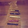
J. Herbin is a French ink brand, whose history claims to date back to 1670. Besides their shimmery 1670 series and some other special editions, they also have a regular line of 30 colors. All though I'm not a big fan of J. Herbin inks, I actually quite like how they design and sell their products--- the idea is clear and the image depicted is exquisite. All J.Herbin inks are revolving around one theme: a reminiscence of 17th-19th Europe/France. There are inks for the Age of Discovery--- some named after the goods from exotic lands, such as Ambre de Birmanie, Cacao du Bresil, Orange Indien, Lie de The, Cafe de Iles, Terre du Feu, Rouge Caroubier...., and some reflecting on a sailors naval life, such as Gris Nuage, Bleu Azur, Bleu Nuit, Poussiere de lune, Rouille d'Ancre. There are also inks showing the elegant lifestyle of bourgeoisie--- Diabolo Menthe, Bouquet d'antan, Rouge Opera, and some hinting the glorious days of revolution--- Vert Empire, Violette Pensee, Larme de Cassis. And all these inks go with a specially designed bottle and package! http://i.imgur.com/j3AKcGi.jpg Each ink has its own lovely illustration. In Diabolo Menthe's case, it's a glass of diabolo menthe-- a peppermint softdrink which is popular among French students during 19th century. http://i.imgur.com/jZcBYZ8.jpg The shape of the ink bottle is similar to those that navigators use on a ship: flat, in order to stand firmly on the desk even during a storm, and with a groove(?) to hold the pen. Like this. http://i.imgur.com/CW2kP2c.jpg Diabolo Menthe, like its name and package suggest, is a VERY BRIGHT mint blue/green color. For some reason I don't know, this impractical color seems to be popular among Taiwanese FP users, and I have always thought about trying a sample some day. Recently I just received a whole bottle from my sister as a surprise gift! Yay! So here are some writing samples. ***Kind reminder: In order to protect your eyes from burning, a pair of sunglasses is highly recommended. 1. dip pen on white paper http://i.imgur.com/BjXHZxr.jpg 2. dip pen on creamy paper http://i.imgur.com/gWBxGET.jpg 3. dip pen on yellow paper(ROSSI) http://i.imgur.com/TV7qbjd.jpg 4. Dauer Feder on MUJI paper http://i.imgur.com/khpH4K5.jpg droplet on tissue paper http://i.imgur.com/zsrlrQ8.jpg Overview: Color: birght and watery, low saturation. Shading: almost none. Sheen: none. Feathering: some. Bleed-through: almost none. Show-through: none. Flow: dry, not lubricant. Water resistance: none. Conclusion: A color for summer. Probably a nice choice for marking or painting, but PLEASE REFRAIN FROM writing a whole page with this ink, let alone on exam papers/ proposals/ essays/ love letters. I'm glad I didn't pay for this bottle....