Search the Community
Showing results for tags 'extra'.
Found 13 results
-
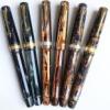
With the recent Stipula Etruria thread that was posted in this sub, I thought it was high time we had a dedicated photo thread for the Montegrappa Extra. This can include the earlier Classica and Historia models, along with the more modern variants including the Extra, Extra 1930 and Extra Otto. The key here is to share what you have no matter the size of your collections or your photography skills, so that we may appreciate, discuss and enjoy the variety of trims, nibs and colours these exquisite pens are available in. My hope is that this will breathe a little more passion into this model and to see our own interpretations of how we use them in the 'real world'. This will also provide a valuable resource for those looking to research the model and perhaps make their own decision to one day acquire an Extra or two. Let me kick us off with two of my favourite Extra's in my collection; an Extra Otto in Lapis Blue with a Fine nib, and an Extra is midnight blue celluloid with the older style barrel imprint and a Medium nib. I am soon to add another one when it arrives from Italy, will post a group shot then. I hope that others will follow with their shots
-
Currently there are many excellent pens being made in Italy and modern Italian pens have captured my heart. I have been a fan of the beautiful Aurora pens for some time and lately the uniquely special offerings from Scrittura Bolognese have enthused me even more. I have a few Leonardos and even two (!) of the very first Radius 1934 pens. I have been delighted with them all because of their beauty, the quality of the nibs and overall manufacture, and most of all the pleasure of writing with them. I didn’t have a Montegrappa, however. Today I set that right and it is truly extraordinary and, I hope, worth sharing here. I am not personally enamoured of sterling silver - the feel and weight of it or the tarnishing - and I hesitated for a long time over the brand, even though the celluloids are very beautiful and the styles of the Extra 1930 and Extra Otto appeal to me very much. And of course the prices for these pens are extremely high, so you have to be sure the pen is for you. Finally I gave in to the temptation, but I ordered a custom design through their website in the Extra Otto model but with gold-plating and a celluloid section. It cost a little more but in my mind the changes to the pen would be more than worth it to me. It is an expensive pen anyway, so to pay a little more to have it exactly the way I prefer made sense rather than paying so much for a pen that may be great but with a few reservations. I chose the zebra celluloid for my pen, which is my favourite of their materials - although I also find the butterfly, lapis, and shiny lines celluloids very compelling too. The custom configurator offered fewer options for the Extra Otto than for the Extra 1930, but the zebra celluloid was available for all parts of the pen and it looked like it would work nicely with gold-coloured trim. Exactly ten days after I submitted the order (which was the quoted production time) I received an email saying that the pen was made and had shipped. The shipping box is marked “handle with love” and the pen arrived in the Extra Otto wooden presentation box along with a nice letter from the CEO telling of his early experience receiving a one-off customised pen as a gift from his father. Montegrappa also supplied a gift, for which I selected a pair of onyx cufflinks. It all made for a nice and special experience to receive this pen. I normally do not care for such fanfare or presentation boxes, but in this case it felt really nice. After such a preamble you want to see the pen, I assume... I chose an extra-fine nib. The pen writes absolutely wonderfully out of the box. It is a true extra-fine line and nicely smooth with just the right touch of feedback to make it feel good in writing. It writes really effortlessly, with good ink flow. You know how sometimes you see the way a really well-tuned fountain pen can put down ink and you are reminded why you love them so much? It is like that. The build quality appears to be perfect. The pen design and materials in real life are stunning to my eye and they surpass even my high hopes for this pen. The celluloid feels great - seriously high quality and unquestionably a premium material. Just as importantly the size of the pen, section width, weight and balance all absolutely match my preferences and it is superbly comfortable, natural and a true joy in-hand. It feels weighty and solid enough to feel special, but is still light enough to be nimble and effortless to control. Opting for a metal section would have front-weighted the pen and given a slightly different balance - but I like it very much the way it is and the slight back-weighting from the piston mechanism makes it rest on my hand very solidly as I write, and the pen is not long. I would not want to swap the feel of the celluloid section for metal and I think my choice was right for me. It is only my first day with the pen, of course, but everything augurs well so far. I am so, so pleased with this pen. I think it may be the most beautiful pen I have and the fact that everything about it also fits my hand so well and it writes so wonderfully is not only a great relief but even a pleasant surprise. Even acknowledging the price I would definitely consider a custom Montegrappa again some day. As Sir Henry Royce famously said, “the quality will remain long after the price is forgotten”.
-

A Montegrappa Classica, A Medieval Fantasy, And Some Thoughts On The Classica Lineage
fpupulin posted a topic in Italy - Europe
At the beginning of this year, I was fortunate to find a Montegrappa classic fountain pen, in the beautiful charcoal celluloid, at a price so good that I could not pass it. I have always been intrigued by the Classica, as the founder parent of an entire lineage in the Montegrappa production, which includes some of the pens that I most appreciate from the maison of Bassano del Grappa. I will discuss this more in detail in the last part of this thread, but meanwhile let me present you my Classica and a work I made with her. The three color versions of the original Classica are in my opinion true classics of Montegrappa and, more in general, true classics in contemporary fountain pens. The turquoise is probably one of the more vivid celluloid ever produced, at a point that its deep shadows seem enlighten from inside the pen body. The elusive cinnamon, often confused with the red celluloid presented for the first time with the Historia, is a rarely seen color and likely the most unique of Montegrappa early contemporary celluloids. Finally, the charcoal, mostly dark grey, with the deep nuances only appearing plenty under certain angles, is a understated, sober, and professional model. Illuminated "correctly", the depth of the celluloid tones is comparable to that of the Omas pearl-gray celluloid of the Seventies. The charcoal color is my favorite of the three of the Classica line for a general use. The cap ring of the Classica, which is mechanically engraved (ti will laser engraved in successive models), does not bear any fret, just the logo and te name of Montegrappa, and the silver guilds. The now famous Montegrappa greek fret will be only inaugurated with the Historia and it was again improved and made perfect the following year on the Extra. Classica can be loaded using cartridges or a dedicated converter, accessible in the usual way, by unscrewing the section from the body, or by unscrewing the blind cap to reveal the end of the converter and operate its piston from this position. It is a mechanism of no great use, since it does not allow to visualize the charge level of the converter, but it is a curious exercise. By making the blind cap integral with the threaded end of the converter you get what it is called a captive converter, actually used by Montegrappa in its Extra and perhaps also in the Extra Otto. In my Classica specimen, the nib is a perfectly tuned, elastic, and smooth fine. When you had an Extra in your hands, you will probably miss its large nib, and the nib number 5 or 6 of the Classica looks a bit small for the size of the pen. On the other side, the Classica has a celluloid section, that many (but it is not my case) prefer to the all metal grip of the Extra. With such a responsive nib, which in line with the size of the tips of Montegrappa’s production is more in the range of an European extra-fine, I decided to test my Classics with a large hatched drawing. And here it is, my Medieval fantasy, depicting three little dragons, or dracunculi. Here you can see the “work in progress”, when I was slowly adding stroke to stroke to complete the drawing. Based on a count made on ca. 3 x 3 cm (approx. 1 square inch) area, I calculated that the drawing required some 130 thousand strokes to be completed… Please note the signature, consistent with the humility of the medieval artist and his sense of sin, due to the vanity of the work: "Francus peccator pinxit", Franco the sinner painted it. As I said at the beginning, Montegrappa Classica is a progenitor. Classica was born in 1999, and it was an extraordinary invention of the Aquila family. The classic design, with its curved and graceful shapes, the aerodynamic body and the flat ends, is almost perfect and will serve as the basis for a whole dynasty of Montegrappa pens: Historia, Classica in resin, Extra, Extra 1930, Extra Otto (faceted), Miya, Miya Argento, Miya Carbon, the fortunate Fortuna series and finally the slim version of the same curves, the recent Felicitá. For those interested in retracing the history of the Classica dynasty, refer to the excellent work of jar in Fountainpennetwork dedicated to the regular modern editions of Montegrappa, in turn a classic in the study of the Bassano brand (https://www.fountainpennetwork.com / forum / topic / 223854-modern-montegrappa-regular-edition-pens /) and to his "Modern Montegrappa Pens", accessible on the Internet at: http://montegrappa-history.com/index.html. They are gorgeously illustrated and surely deserve a look by any pen aficionado. Montegrappa has reiterated many times that Classica and Extra resume the design of a pen from the house from the 1930s, but I have searched the images of vintage, modern and ancient Montegrappa pens far and wide and, however extraordinary they are, I have not never found anyone who can be considered the true forerunner, the sure ancestor of the Classica. With Classica, Montegrappa inaugurates a vein of design and style in its pens that even today, after twenty years, does not give signs of approaching exhaustion, but continues instead more lively and lively than ever. I said that Classica was born "almost" perfect. The blind cap is visually a bit too long, and this slightly unbalances the proportions between the body and the pen cap, which appears short (and is actually shorter than the Extra and Miya hood). I tried to calculate the proportions between the whole pen and the hood only, to see if the designers of the Classica were inspired by a sort of “proporzione armonica", but as far as the relationship is concerned, the fateful 1.618 (the "divine proportion") which is present in the Emblem), the relationship is not exact. Historia, the limited edition launched that same year 1999, maintains the same dimensions as Classica, but already Extra perfects this point. In fact, the body of the Classica is longer than that of the Extra, but what makes the difference is properly the measurement of the filling cone (false in the Classica), which in the Classica is about 1/4 longer. The dimensions of the main body, the area of the thread and the section seem to me identical, even if the section of the Classica is in celluloid and shaped differently from that, wider and in silver, of the Extra. The main metal ring on the Classic cap is smooth, engraved with the logo and the name of Montegrappa. In the limited edition Historia, Montegrappa introduces on the ring its now very classic Greek motif, which still lasts in various lines of pens. With Extra, the ring retains the Greek, but becomes wider and definitely Montegrappa. The same ring width, but without the Greek design, will also be used in the beautiful resin version of the Classica. I insist, Classica was an extraordinary invention, a coup de génie of the Montegrappa designers under the acute vision of the Aquila family. Classica was also the best gift that the company could leave as a legacy to the new owners of the brand, the international group of luxury, based in Switzerland, Richemont, which acquired Montegrappa in 2000. Not only Classica in celluloid continued to be produced, as evidenced by the fact that there are versions in which the silver has the punch of Vicenza (VI, management Aquila) and others with the punch of Milan (MI, management Richemont), but in 2004 the new management also introduced a resin version of the same pen, cheaper but not less beautiful, in blue, red and black. Classica was produced in celluloid of three colors: a classic, sober pearly black, a vibrant cinnamon red, which somehow recalls the hard rubber of the pens of the 20s and 30s of the last century, and a brilliant marine turquoise color, deep and full of transparencies. While the red and turquoise celluloids will be used by Montegrappa, alone or in combination with other materials, for other lines of pens (Symphony, Miya, Miya Silver, Miya Carbon, Emblem, Emotion, Extra APC, as well as various special editions), the red cinnamon has not been used anymore as far as I know, except in Passion and perhaps in the recent Extra Colors of the Sea in coral color, whose celluloid seems to me very similar if not identical to that of the original Classica. Celluloid is also found in the short section of the Classica, below the silver ring that completes the proximal part of the body. This is a detail of great interest to the many pennophiles who do not like metal sections because they find them slippery to their fingers. The nib, with the Greek design that Montegrappa's literature defines as "Palladio", is a measure 5. Visually, I find it a bit small for the size of the pen, but this did not prevent Montegrappa from maintaining these proportions in various of their lines of high-end pens, reserving the big nib No. 8 only to Extra, Extra 1930 and Extra Otto regarding the pens in celluloid, and to the only Ducale Grande among the pens in resin. In my Classic, produced during the Richemont period (the silver punch indicates MI, Milan, instead of the VI, Vicenza, of the Aquila pre-2000 management), the nib is pleasantly semi-flexible. Perfect from the first moment, the nib of my Classic is obviously not calligraphic, but has a certain elasticity that gives it calligraphic qualities and I use it sometimes to play with the Copperplate style script. With the exception of the cinnamon red, the celluloids used in the Classica are those already tested in the Symphony line, produced by Montegrappa in carbon black, turquoise, red, parchment, yellow and dark blue. The pearly black, the red and the original parchment color are used, that same year 1999, for the three liveries of the limited edition Historia, each one produced in one thousand pieces. Historia has the same design of Classica, the same measures, the same charging system (with the removable blind cap to reveal the converter), but the section is entirely in solid silver and the cap ring carries - for the first time - the one which will become almost a symbol of Montegrappa, the decoration with the Greek type "Palladio". On the terminal of the back cone, the silver disk bears the limitation number (xxxx / 1000). The top of the hood, however, is devoid of the beautiful disc decorated with an engraving of the laurel and the date 1912. With the same size and design, Historia wins the duel for the beautiful greek that adorns the ring of the hood. Classic, from its own, has the silver disc that closes the top of the hood with one of the symbols of the house, a refined detail and a motif that Montegrappa will adopt from then on on all its high-end pens. The dynasty inaugurated with Classica has had a growing success. After the limited edition Historia, Montegrappa launched Extra, a pen destined to become almost a symbol of the Bassano's house, reiterated in numerous celluloids before becoming Extra 1930, also produced - to date - in six types of celluloid in the regular edition and in two different celluloids, in antique wood and completely in silver, in further, more limited editions. The “shape” of Classica established the beginning of a lineage that required only some minor changes throughout its twenty-year history. Basically, the cap with a rounded profile and progressively streamlined towards the flat top remained unchanged, as well as the typical, almost cylindrical body, but in reality also curvilinear and tapered in the direction of the terminal, flat cone, and the unusually large, solid silver ring of the cap, together with the terminal tag that bears the logo of the company's founding date. On this "archetypal" design were inserted the successive minor variations which gave rise to Historia - the forefather of the “Palladian" greek fret -; to Extra, with its number 8 nib, the large greek and the silver section; to the sinuous shape of Miya, with its characteristic bulge over the section - then iterated in the silver and carbon version; to the genial Extra Otto, which reinterprets all the motifs of his genealogy in a fairly contemporary version and at the same time recovers an essential part of Montegrappa's DNA in the octagonal design. I leave you, after this long excursus, with a couple of images. The first "summarizes" the dynasty of Classical, presenting an overview of the various models (not all), to suggest the vitality of this lineage in terms of shapes and materials, with its beautiful celluloids, resins, metals and the rarest materials. The second image represents a "chronology" of the dynasty inaugurated with Classica and traces its inventions, the creation of lines, the introduction of new materials. From this historical synopsis it is evident that the Classical heritage, far from being exhausted, has experienced a true creative revival in the last three or four years with new models, new materials and new stylistic elements in the most classic tradition of this extraordinary pen. Not included here are the limited editions that derive directly from this dynasty, many, often beautiful, with rare and unique materials, mostly inspired directly to Extra 1930. I hope to cover this chapter later. Personally, I have no doubt that Classica and its descendants, and in particular Extra and Extra Otto, represent authentic, timeless classics in the contemporary history of fountain pens. -
Hi FPN, I have been lurking for quite a while but this is my first post on here. I currently own a TWSBI 580 and a Lamy Safari, both in extra-fine, I have been considering purchasing either an Edison collier or a Pelikan m400 pen. I like my nibs to draw quite thin lines having come from Uni-ball pens, and I do not have access to a local store that sells Pelikan pens, I was wondering if someone could provide writing samples for a Pelikan extra-fine nib so I can try to assess the line-width. Thank you for your time, ~Chris
-
Save 35% off MSRP on Pelikan Extra-Fine (EF) Nib Fountain Pens in Stock at Paper, Ink Pen with discount code extrafine MSRP Regular Price extrafine PriceStresemann M805: $850.00 $680.00 $550.80 M805 & M800: $760.00 $608.00 $492.48 M600: $555.00 $444.00 $359.64 M405: $495.00 $396.00 $320.76 M400: $500.00 $400.00 $324.00 Through Sunday September 9th save on any of our Pelikan Fountain pens in stock with an extra-fine nib. California Resident? We pay your sales tax! Discount is taken during checkout. Please remember to use the discount code: extrafine Stresemann M805: MSRP $850.00 Regular $680.00 extrafine Discount $550.80 M805: MSRP $760.00 Regular $608.00 extrafine Discount $492.48 M800: MSRP $760.00 Regular $608.00 extrafine Discount $492.48M600: MSRP $555.00 Regular $444.00 extrafine Discount $359.64M405: MSRP $495.00 Regular $396.00 extrafine Discount $320.76M400: MSRP $500.00 Regular $400.00 extrafine Discount $324.00 Thanks for looking in. Discount ends at 11:59 pm PDT, Sunday September 9, 2018. Paper, Ink, Pen is an authorized USA dealer of Pelikan fountain pens located in California, USA.
-
Help ! So many different brands and models. Where do I start My Extra Fine Wing Sung 3003 has developed some intermittent feed issues. Have given it a though clean a couple of times without any success. Halfway through a drawing is not the time to be coping with a drying out or extra wet inkflow. Rather than fussing too much over a 99penny pen I am thinking about a more reliable pen Reading through a few of the threads I am thinking a Chinese or Japanese nib for line fineness. Simple eye dropper or cartridge would be perfect as I always fill with syringe. If there is a pen with finer nib than my W/S this would be perfect. Budget is tight - certainly below 100 Euro and ideally much less. Fine line and constant ink flow are main need. Shape and colour are unimportant.
-
Hi guys, I recently purchased unused Omas Extra 630 via Ebay. I originally did not examine the photos extra carefully, but now that the pen is on my way via mail and couldn't wait to see the pen physically, I went back and checked the photos. I realized that the logo "Omas" is not placed at the center of the nib, and the spacing between the letters seem to be too far away. My common sense tells me that who would make a replica of this beginner's pen, but was wondering if I could get your opinions... I think the seller purchased this pen somewhere and I don't think he is intending to sell fake stuff...just wanted to say this because the way he communicated was very professional. These photos were from the original post on ebay: Thank you!

-
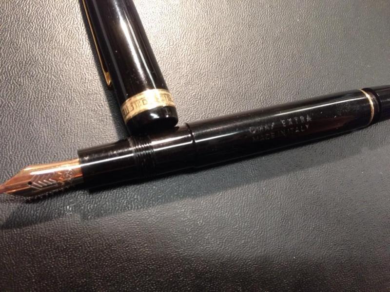
Hi, I have a vintage Omas extra in grey celluloid a beauty in my opinion. It uses a cork with the piston mechanism, but the cork is no good anymore is falling apart and is leaking. Can anyone help me with some guides to a) how to disassemble the piston mechanism and how to replace the cork? Much much appreciated https://imgur.com/a/qv09R https://i.imgur.com/ET7vm0U.jpg https://i.imgur.com/aukO6BS.jpg
-

Namiki/pilot Falcon Owners: Soft Extra Fine Vs Soft Fine. What To Buy?
madlib posted a topic in Japan - Asia
Really contemplating on purchasing a Pilot/Namiki Falcon. Never owned a gold nib before and was wondering if you guys could help me out in selecting the right nib size. So long story short, the very first fountain pen I purchased was a Pilot DPN-70 Desk pen (almost similar to the platinum carbon desk pen). I really adore the line it lays down but it tends to be a little scratchy (i eventually smoothened it with mylar and it writes like a dream, but writes with a thicker and wetter line). I will be buying a namiki falcon but I have absolutely no idea as to which nib size I should buy, should I go for the soft fine or the soft extra fine? Is the soft extra fine nib on the namiki falcon scratchy when compared to the soft fine? I recently purchased mylar paper from goulet pens (no affiliation) and smoothened all your my nibs and I am loving how smooth they run with almost no feedback and i have got so used to it! However, I would not want to risk smoothening the nib on the falcon with mylar (if i do purchase it). I want it smooth out of the box. I write with almost light pressure (probably light to medium). So what would you suggest? Soft extra fine vs Soft fine? I have seen the writing samples on goulet pens and for me it just boils down to how comfortable the nib is, and in short it should glide across the paper with no pressure. Are there any owners of the Pilot/Namiki Falcon who own the pen in Soft extra fine or extra fine, and could share their experience with the pen in terms of: Scratchiness, feedback and smoothness? This would definitely help me in deciding on which nib size to go for! Thanks in advance! -
I purchased this used on a whim. (hopefully that whim wasn't ill-founded) Can anyone tell me if it appears to truly be an Omas? The nib pic isn't very good but it's two tone, rose gold, marked 585 with the stylized angular "omas" above it. The markings on the pen body say only Omas Extra, beneath which says Made in Italy. There is one greek key band on the cap and the clip is plain. My question is two-fold - is it real? And... the plunger end is quite difficult to screw in and out, and the cap doesn't screw on easily either. How can I clean this pen thoroughly? I have filled and emptied it with soapy water several dozen times as well as with Goulet pen cleaner many many times too, still getting some ink out and both threaded areas are "resistant." Is silicone grease the answer for the threads? Thank you in advance for your expertise. Nancy
-
My local pen shop will no longer be carrying Omas, and some time ago I picked up a Dama (Review Link HERE) at a closeout price. Like a big dummy, I went back in that shop and straight to the closeout case... and couldn't resist an Extra (or Ogiva, or Ogiva Extra, or Extra Ogiva...? Man Omas' model names confuse me). Appearance and Design: Classic black lines using resin with gold trim common to many pens, the thing that distinguishes Omas is their use of a Roman pattern in the trim. This pen also uses the roller clip common to several Omas models. Construction and Quality: My Dama experience is that Omas is a decently made "old school" pen from traditional materials (cotton resin and ebonite feed). This is no different. My other experience is that this brand can be troublesome, but this one hasn't been. It definitely needs disassembled and the piston lubed, but other than that everything seems fine. http://i200.photobucket.com/albums/aa163/roomdog/Pens/Omas003_zps17b4606b.jpg Weight and dimensions: Roughly the size of an MB 146. It's approximately 146mm capped and 131mm uncapped (from tip of nib to piston knob). I don't have my calipers handy to measure diameter, but here's a MB 145 for comparison (the angle of the photo makes the difference look to be less than it actually is). http://i200.photobucket.com/albums/aa163/roomdog/Pens/Omas001_zpsdd54ad42.jpg Nib and Performance: A large two-tone 18k nib (Omas' Magnum nib - and much larger than the 145), it writes on the fine side of medium. It's soft and somewhat springy, and very smooth while offering excellent feedback. It's also a "singer", delivering an audible note as you write. It's juicy without being overly wet. http://i200.photobucket.com/albums/aa163/roomdog/Pens/Omas002_zps1364fbde.jpg Filling System and Maintenance: Assuming it's like my Dama, it's a dead simple piston filler that's easy to take apart and service. Unscrew the section and unscrew the piston mechanism. I haven't taken it apart yet though... Cost and Value: This is an older model, so there aren't really "street prices", but I bought it a little cheaper than NOS available on the evil bay (and those prices didn't seem outrageous). I'm happy with what I got for what I paid. Conclusion: A classically styled pen that for the time being scratches my itch for a 146. A very good writer and I'm looking forward to adding it to the rotation.
-
How has your nib prefer eve changed over the years? I used to buy fine and extra fine nibs exclusively until about seven years ago, when I started getting into broad and upwards. Now, my standard nib is is almost always going to be a stub or cursive italic, and wouldn't bother with anything smaller. I think larger nibs can be more demanding to use, but also help in maintaining a clear hand. Any thoughts?
-
I finally have the funds to purchase the ever so lovely Edison beaumont. I have been wondering though how the extra fine nib is. If anyone can tell me their experience with the edison EF nibs (scratchiness, wetness, etc.) it would be very appreciated. Thanks, ~Phil